
8 Ways to Make a Room With High Ceilings Feel Cozy
High ceilings. Love ’em or hate ’em, they’re a popular design choice. Gone are the days of 8′ ceilings (will they ever come back? Probably not), 9′ is the new standard, and the sky’s the limit from there.
While a high ceiling might seem like a great idea, not everyone loves this particular architectural feature. As for my own home (with its vaulted ceiling), I can add alllll the sugar I want, but my high ceiling still isn’t my cup of tea.
Why?
I love a cozy home. A high ceiling makes it harder to create an intimate, inviting space. Impossible? No, but it’s not nearly as easy as a room with 8 or 9′ ceilings.
Of course, many would disagree – there are those whose high ceilings are the high point of their home. But at the end of the day, what you love about your home is personal.
The key is to sit down and listen to your space. Consider its pros and cons, and the steps you might take to make your home feel a little more homey.

Listen to your space, but if it actually starts talking to you, drink less wine (or more).
So, because it’s a topic that’s near and dear to my heart (right up there with Ryan Reynolds (or Gosling, Cornuts, and wine), I’m sharing 8 ways you can make your room with its overly high ceiling look less big and cold, and more warm and inviting.
1. USE BIGGER PLANTS
A big, tall plant is a great way to fill space (as rooms with high ceilings tend to be big) while stopping your eyes at a more natural level – putting a cap on things. Here are the instant wins…
- They take up a big chunk of space, which can be hard to do in a big living room
- Their foliage helps with echoing, which is common in rooms with high ceilings
- The height (ideally 72-84ish inches) creates a good topline for your eyes.
However, not everyone can keep plants alive, so if your green thumb is a little more brown (like mine), there are great fake trees on the market, including…
FAKE OLIVE, FIDDLE LEAF FIG, OR FICUS TREES
- COME TO MOMMA, this is a gorgeous fake olive tree.
- This is pricey, and the pot is janky, but put a basket on the bottom, and this is one darn good lookin’ bush.
- While it doesn’t have reviews yet, this olive tree looks good in the photos (but then so did your Tinder date, am I right???)
- This fiddle leaf fig comes in at 7 feet high and has good reviews.
- This 7-foot-high olive tree could be a great gateway plant until your green thumb grows.
Replace this fig with a shorter plant, and the effect will be way different! Sherwin Williams Alabaster
In this next living room, the plant on the left is better than the one on the right side…
Why?
BECAUSE THE LITTLE GINGER SAYS SO! Just joking. The plant and its pot/holder look a bit too busy and squat, whereas the plant on the left has more vertical lines (even though they’re roughly the same height).
And then there’s this great big mama jamma…

Benjamin Moore Manchester Tan Color Review
The above plant goes to show that there is such a thing as ‘too tall’ when the goal is to make a high ceiling look lower – keep to 8′ or under.
If your room feels a bit echoey with its high ceilings, plants can help diffuse some of the noise.
2. THE BEST PAINT COLORS FOR ROOMS WITH HIGH CEILINGS
The right paint color(s) can make your high-ceilinged room feel a bit more inviting and cozier. Aside from choosing a color that suits your finishes and furnishings (if you’re struggling, I can help), the temperature and depth of your color can affect how your room looks.
PAINT YOUR WALLS A WARM COLOR
In color psychology, cool colors recede; warm colors advance. As for depth, light colors recede, and dark colors advance. And while some of that can be open to perception (especially dark colors), consider painting your room a warm paint color, or a warm, dark color if you’re feeling brave!
If you paint a room with a high or vaulted ceiling, a cool paint color, it could look cold and unwelcoming, especially if you have northern light!
Benjamin Moore Alpaca (above) is a bit too warm for today’s modern home (but you do you, boo!). Sherwin Williams Natural Linen (below) is a more modern, popular warm neutral…

To make your space look cozier, it’s usually ‘the warmer the better’. However, overly warm shades aren’t always on-trend or suited to a home’s finishes and exposure; sometimes you need to find a happy medium, including muted warm colors, as shown below…
Paint Color Review of Benjamin Moore Edgecomb Gray
Color Review: Sherwin Williams Aesthetic White
While the above two rooms could benefit from even more warmth and depth (if the goal is to make them look cozier), the chosen colors are better than gray.
But does the same apply to ceilings?
The Best Whole Home Warm Neutral Paint Colors
SHOULD HIGH CEILINGS BE PAINTED A DARKER COLOR?
Many people want to know which colors will make a high ceiling look lower and cozier, and that comes down to perception AND livability. Some feel that a darker ceiling makes it look lower and more intimate, whereas others feel it’s too heavy OR even vacuous (never-ending). This means there’s no clear answer.
As for livability, while warmer colors could make a high ceiling appear lower and less cold, warm-colored ceilings aren’t always easy to decorate around or live with – do YOU want a beige, gold, or brown ceiling? Maybe you do!
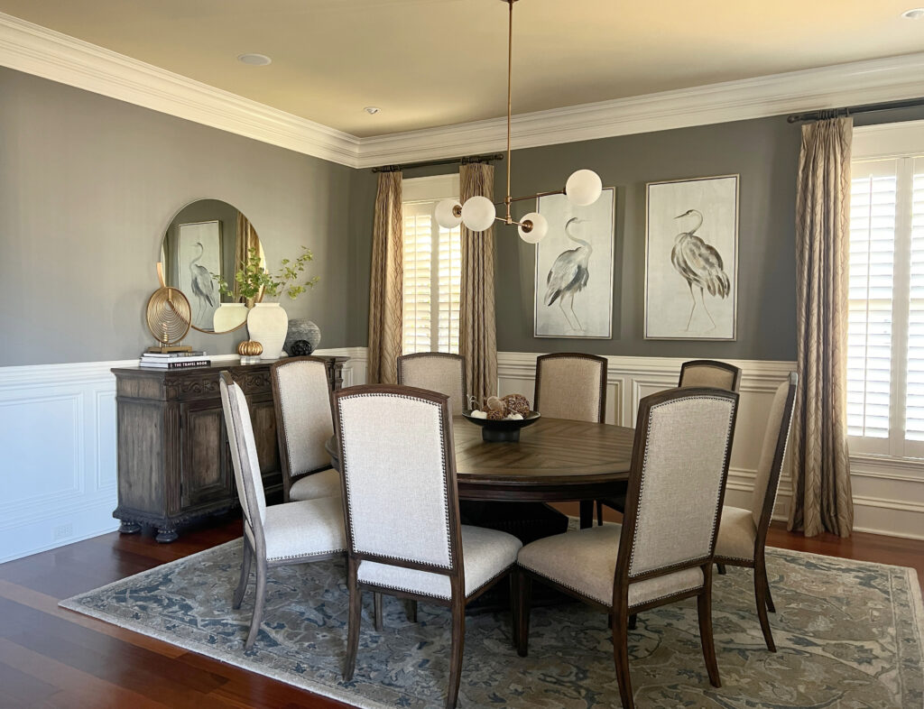
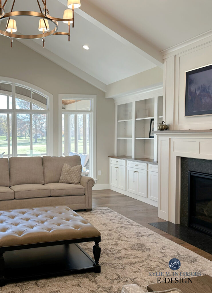
The above dining room has a light-depth ceiling that contrasts with the white crown molding. While this ceiling isn’t high, the soft beige makes this room look more inviting, thanks in part to its warmth rather than its depth.
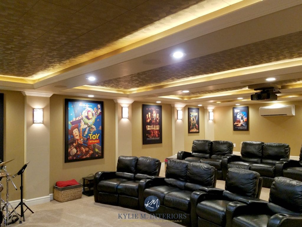
Next, you’ll see a darker, warmer ceiling in my client’s home theatre (one can dream). This darker gold makes this room look warmer and cozier…
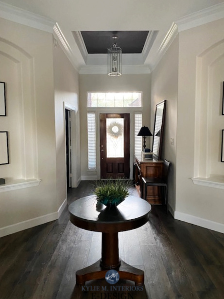
Check out the tray ceiling in this entryway – while it’s dark and warm, personally, it’s too graphic and doesn’t make me feel better about the high ceiling…
Technically, with dark colors advancing, painting your ceiling dark can make a room look smaller and more welcoming. But how YOU feel about it is what matters.
What about something less dramatic?
In this next room, while the gray ceiling adds a bit of interest, I don’t feel like it makes the room look cozier (personally). However, some of that is because it’s a cold color…

What Color Should You Paint a High Ceiling?
Shlong story short, yes, a darker, warmer color can make a high ceiling look lower and more inviting, but it needs to be a livable color in terms of temperature, undertones, and depth.
3. THINK HORIZONTALLY
When considering patterns and the shape of items in your room, think horizontal and stumpy rather than vertical and lean. Of course, you don’t want EVERYTHING to be horizontal, but key decorative and functional pieces can be horizontal to encourage your eyes to travel width-wise rather than height-wise.
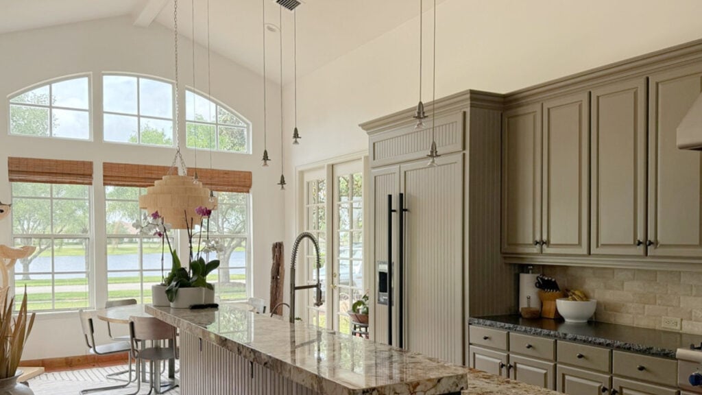
The skookum shape and black of these light fixtures help this high-ceilinged kitchen look more grounded.
The same goes for my booty. When I want to glorify its width, I wear horizontal stripes. When I want to look leaner and taller, I wear vertical stripes. Needless to say, I ALWAYS opt for horizontal. TMI? Never.
Let’s look at some specifics…
HORIZONTAL, LANDSCAPE ARTWORK
Consider pieces of art and mirrors that are horizontal, not just in size, but also in the image itself…
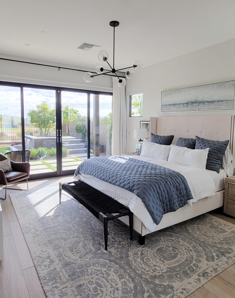
Sherwin Williams Aesthetic White in a south-facing bedroom
- This artwork (above) is horizontal in size and style.
- The long, linear black frame of the bed draws a strong, clear horizontal line.
- Along with a solid toss cushion in a grounding color, there’s a horizontal stripe and a low, long cushion.
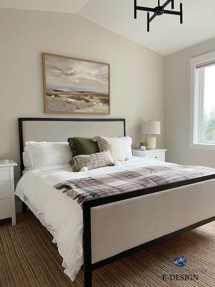
This next bedroom has taller-than-average ceilings…
Notice how the linear art above the headboard keeps things a bit more horizontal, as does the style of the light fixture, drapery rod, and even the row of three dark toss cushions!
FABRICS & DETAILS
A patterned fabric, either on toss cushions, furniture, or drapes, is another great way to make a room with a high ceiling look cozier.
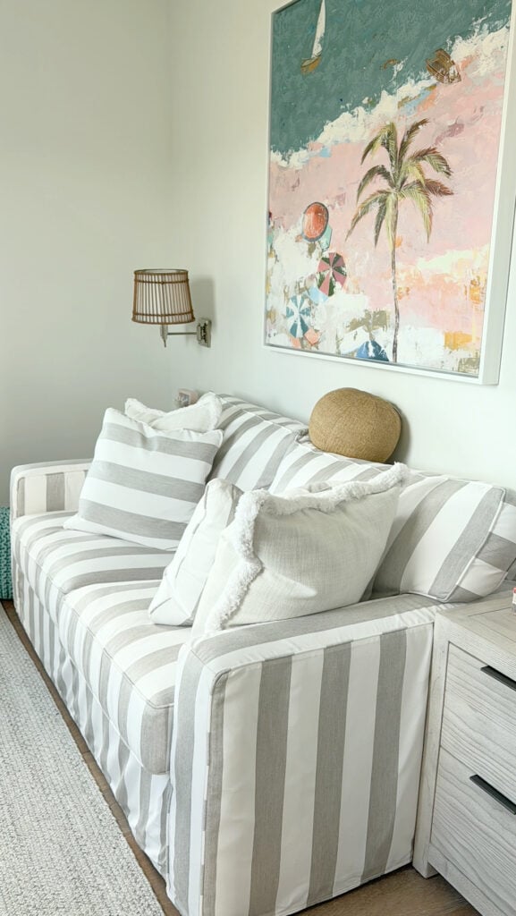
TAKING A CLOSER LOOK…
- Notice how the main fabric of the sofa has vertical stripes, which would help a low ceiling look higher.
- The palm tree in the art has a vertical vibe and wouldn’t help a high ceiling, though the horizontal break between ocean and sand helps a LOT. The fact that the teal of the ocean is stronger than the pink helps, too.
- The best horizontal lines in this room are the side table, the top/bottom of the wall sconce, and again, the break between blue and pink in the art.
Consider your space and how many vertical vs. horizontal lines it holds.
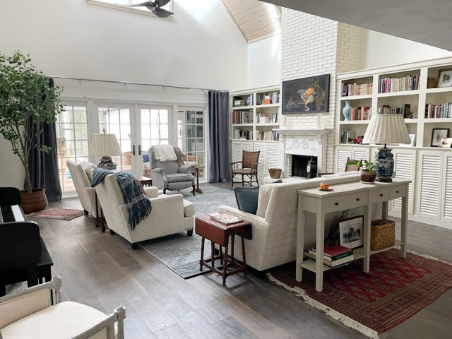
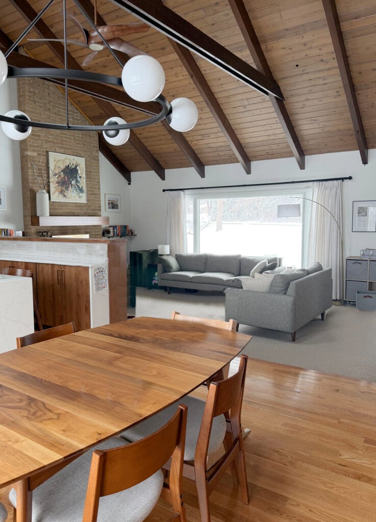
This next photo shows the open-concept living area at our old lake home. Most of the ceilings are 9′ high, but the living room ceiling is 10′, creating a quasi-tray ceiling.
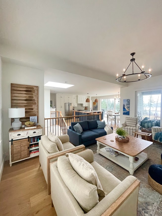
Benjamin Moore White Dove walls, ceilings, trims, and cabinets
Originally, we’d planned on installing beams in this area to make it feel more intimate. However, with the building process being such a gong show, I gave those up, just so we could move on with life…
- The toss cushions on the sofa have a horizontal stripe.
- While the striped accent chairs have vertical stripes, the loose cushions have horizontal stripes. If I come into the room and someone has placed them vertically, I twitch and cry in the corner. Then I make them horizontal again.
- Don’t mind the pile of patio cushions in the top-right corner #lifehappens.
- The oar artwork has a vertical frame, but the oars are very horizontal.
- The chandelier brings the sightline down a bit and adds intimacy.
- All of the furniture pieces are average height – not super high, but not low-profile (although a bit higher wouldn’t hurt; there’s a lake view to consider).
When striped pillows are placed vertically (in any room), a little part of my Ginger soul dies.
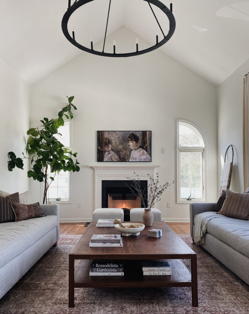
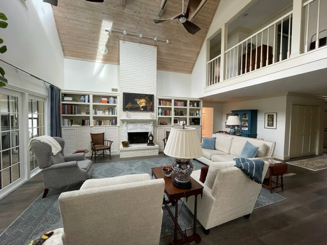
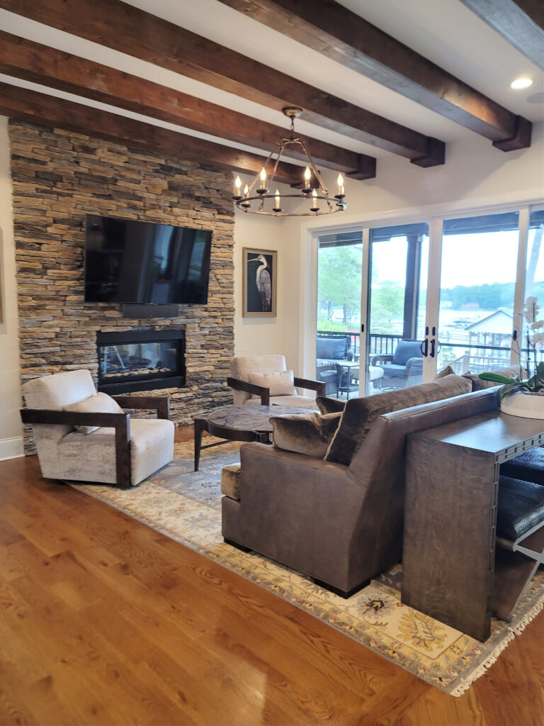
ARCHITECTURE & HARD FINISHES
It’s not always about the fluffy stuff. There are some more ‘solid’ choices you can make that can keep your space looking a bit more grounded…
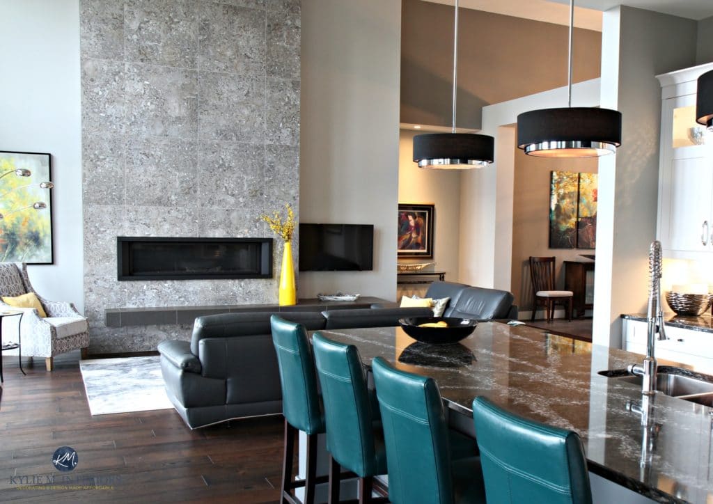
- The fireplace is super linear, as is the floating hearth.
- I love the pendant lights and their graphic horizontal look. The black shades also ground the space, offering a moody ambiance.
- The fireplace tile COULD be laid horizontally if the owner wanted to create a more intimate look (along with adding a floating wood mantel – that would help. Instead, the 30″ square format offers a great balance (and is WAAAY better than a vertical tile).
- The striking teal accent stools draw your gaze and keep you focused on the room’s lower half.
- Notice the yellow vase. While it looks great (as the point WASN’T to lower the ceiling’s appearance), notice how it passively-aggressively encourages your eyes to look up! A more squat vase would be better.
This next staircase has a super high, vaulted ceiling. The dark trim, dark carpet stair runner, black metal spindles/handrailing, and wallpaper accent wall help balance the height of this space, adding visual bulk. This staircase looks intimate yet well coordinated…
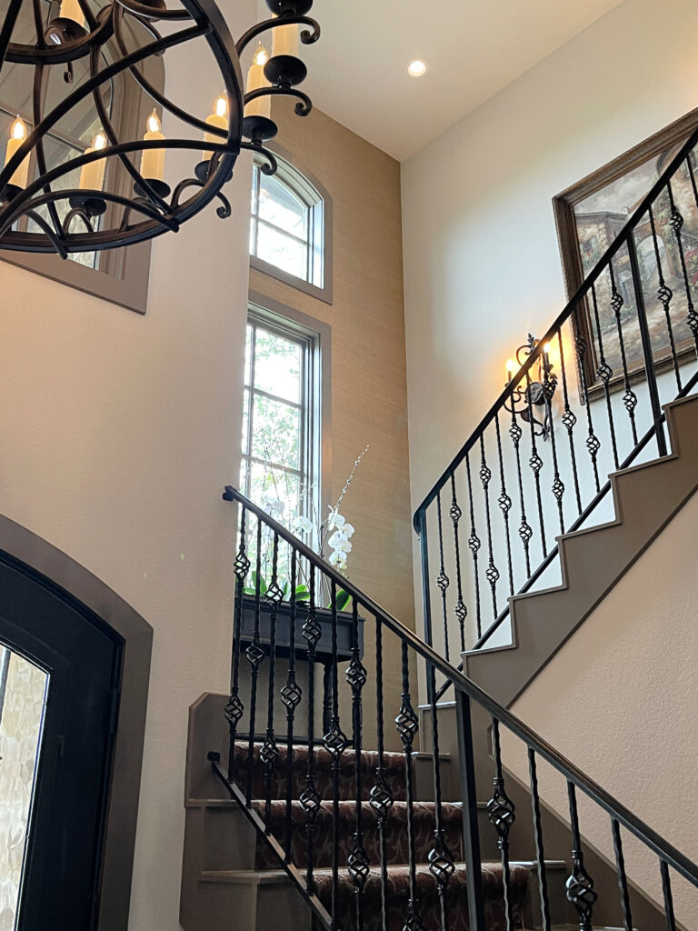
Ideas to Update Your 2000s Staircase
If the above space had nickel or chrome fixtures, glass railings, and white oak steps, the effect would be opposite.
Sometimes it’s not about OVERTLY bringing the sightline down; it’s about not OVERGLORIFYING a high ceiling.
4. INSTALL DRAPES AT THE RIGHT HEIGHT (HIGHER THAN YOU THINK)
While you might think hanging your drapes lower is the goal, it’s not. I mean, sure, you don’t want them sky-high, but you also shouldn’t have them level with the top of your window trim.
However, it depends on how high your ceiling is.
9 to 12 FOOT CEILINGS
This next gorgeous, open-concept space has approx. 12′ ceilings. Notice how the drapes are under the crown molding, but not hugging the top of the window trim – this suits this home’s style and architecture…

The Best Off-White Paint Colors
Could they have hung the drapes directly above the sliding doors? Yeah, but it would make a room like this look too squat and not proportional.
Notice how this next living room has slightly lower ceilings (9′ with a 10′ tray), and hanging the drapes between the windows looks perfectly cozy and inviting…
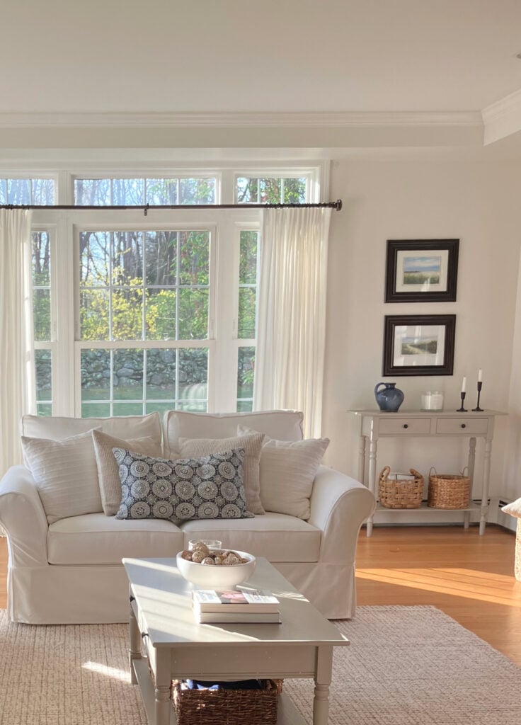
Benjamin Moore White Dove Color Review
This is a great example of ‘making a room look cozier when it has higher ceilings’…while still suiting the architecture.
On the other hand, if the goal were to make this next living room look cozier, they might hang the drapes about 4″ lower.

Farrow & Ball’s Best Blue Paint Colors
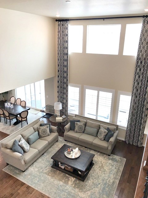
HIGH CEILINGS (12+ FEET)
What about super high, vaulted ceilings? Should the drapes hang above the top window/closer to the ceiling?
Only if you want your ceilings to look as gloriously higher than Snoop Dog on a plane….
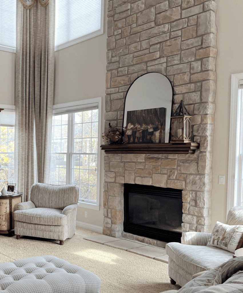
Here’s another great example of drapes that show off a super high ceiling…
The 13 Best Cream Paint Colors
This look also makes the furniture feel less proportional to the space, as the drapes seem oversized.
While I love this next living room and the color on the walls (Sherwin Williams Agreeable Gray), the drapes could be hung about 8-10″ lower, rather than lined up with the bottom of that molding. This would help the room look cozier and feel a bit more balanced (but seriously, I still love this room)…
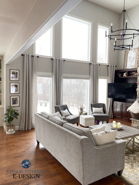
Mind you, I wouldn’t want to hem drapes either.
And remember, not all of my client’s homes (shown in these photos) necessarily want to make their rooms with high ceilings look cozier. I just use these photos as examples of what you COULD do!
In this next cozy living room, the drapes are hung at a great height. Any lower, the room would look squat; any higher, the built-ins would look off…
Notice how the decorative attention is approx. 8′ and lower / The Best Warm White Paint Colors
Sure, 3″ higher would create a nice staggered line, dropping down to the built-ins, but then the drapes would look TOO high for the doors themselves.
DETAILS TO NOTICE
- Love the tall plant in the corner.
- Nothing is sitting on top of the built-ins.
- The space is grounded with area rugs.
- While the furniture is all relatively light-colored, it’s grounded with dark throws and cushions.
- All of the furniture pieces have slightly higher backs – this is better than slightly lower.
- Horizontal art above the fireplace.
Let’s look at the above room from another angle…
A wood coffee table would anchor the center of the room and visually tie the side tables/wood accent chairs together.
Although the ceiling in this next living room isn’t particularly high, it has several features that add to the cozy factor…
The Best Beige Paint Colors (With a Bit More DEPTH!)
Check out this next room on Pinterest (I’m not sending you to the actual website as it’s janky). Notice how the striped drapes keep the flow horizontal. And while I can’t tell what the heck those dark brown things are above the lower windows, you could get this effect with rattan blinds or other drapes.
I did a similar thing in our living room by installing faux blinds on the lower windows…
Sherwin Williams Foggy Day shiplap fireplace, Aesthetic White walls
Truth be told? BLINDS ARE DAMN EXPENSIVE!
We would never, ever close these blinds as a) this room is north-facing and b) we have privacy and a fully-fenced backyard. Sooooo, these are dummy blinds in that they’re only about 42″ long – the length gives them some bulk when stacked up, but don’t cover the whole window.
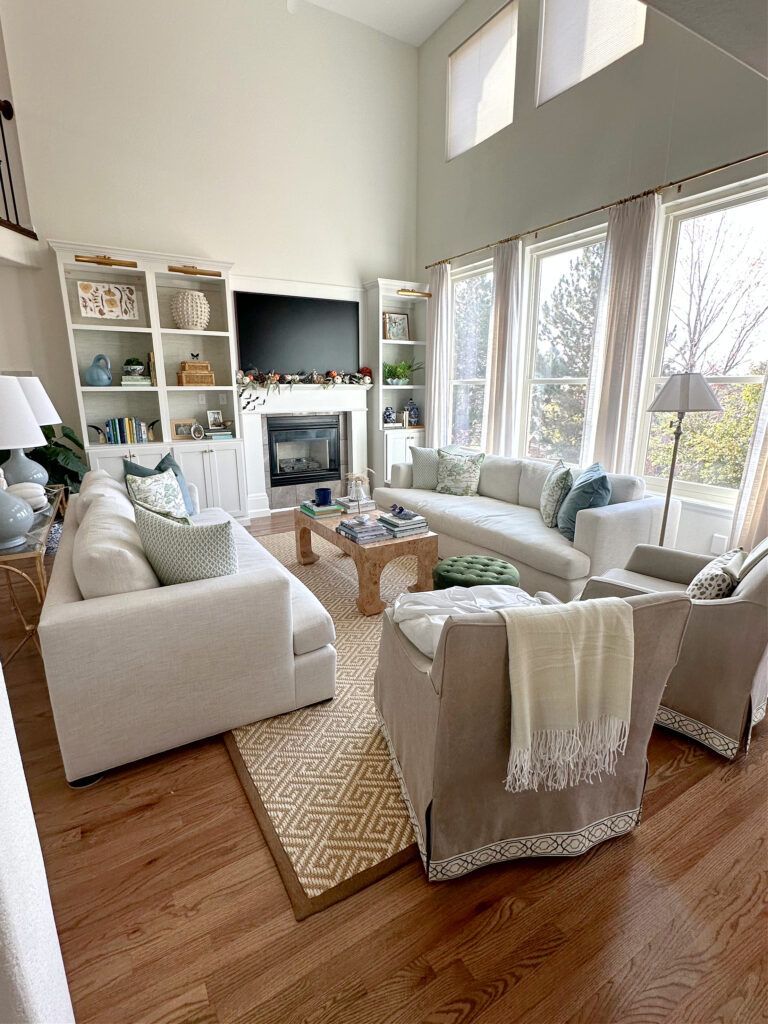
5. ADD EYE CANDY AT EYE-LEVEL
TEXTURE is one of the most underrated and easy ways to make a room look cozy and inviting – especially when you have mad style like my client shown below…
I helped her choose colors for her kitchen cabinets, and I can’t WAIT to see the results!
DETAILS TO NOTICE
- There’s SO much texture in this room, just in the fabrics and soft furnishings alone.
- The accessorizing on the built-ins is ON POINT! Notice how the decor adds color, character, and texture – keeping your eyes looooow.
- The picture lights and drapery rod are in the same metal finish, creating a strong top line for your eye to stop at.
- The top of the TV sits lower than the top of the built-ins – yay!
- I love the scale of the furniture pieces – not too low, not too high – they suit the scale of the room.
This next foyer is a great example of a space that could use grounding (if the homeowner’s wanted a cozier look)…
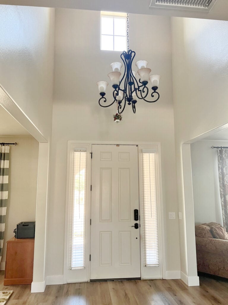
- Paint the inside of the door an accent color that suits the adjoining rooms
- Add a large area rug (not just a postage stamp)
- Choose a light fixture that’s a bit more linear, rather than one that staggers vertically.
- They could even add a belly band, as discussed in ‘Making a High Ceiling Look Cozy with Moldings, Trims, & Beams.‘
6. GROUND YOUR SPACE
Whether you have a kitchen, living room, or bedroom with a high ceiling, it’s important to ground your space – give it a low-lying anchor for your eyes to rest on.
The Best Sage Green Cabinet Colors
A FEW EXAMPLES OF ANCHORS
- Area rugs (that are proportional to the space)
- Painted lower cabinets or a kitchen island
- Coffee tables or ottomans
- Furniture pieces that are eye-catching in style, color, or depth
- Paint the inside of your front door to anchor an entryway with a high ceiling
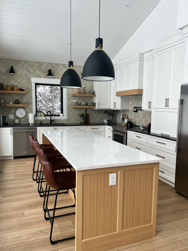
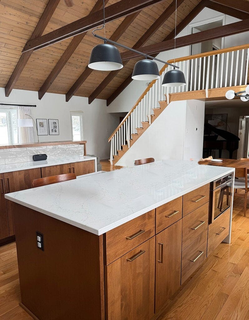
This next open-concept living space is well-grounded thanks to the dark wood-stained island, stools, and area rugs…
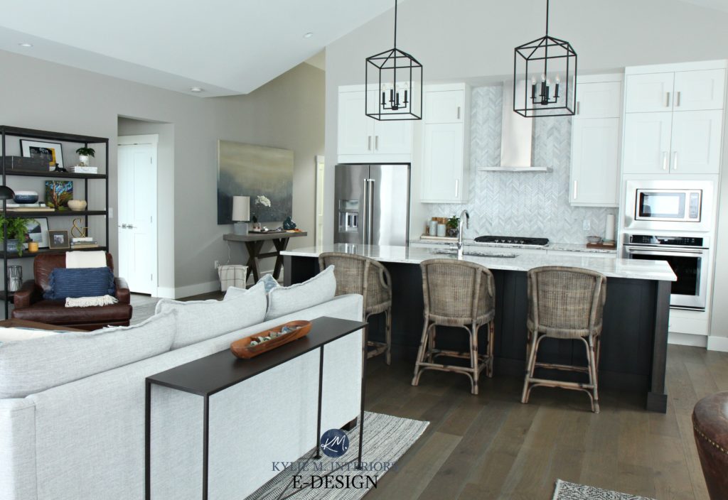
Sherwin Williams Colonnade Gray in a north-east facing room
Let’s say the homeowner (who was previously me) wanted the ceiling to look lower…
- They could take out the vertical range hood and replace it with a cabinet-style hood with an undermount fan.
- Put knobs on the cabinet doors instead of vertical handles (which would require a repaint – this detail would be taken care of pre-install).
- Replace the vertically oriented marble backsplash tile with a horizontal pattern (e.g., traditional, timeless subway tile).
- Add a wood beam to the center of the ceiling’s peak
- Learn more budget-friendly KITCHEN UPDATE IDEAS!
7. CHOOSE YOUR FURNITURE HEIGHT CAREFULLY
The lower your furniture is, the more compact and squat your space can look. Sure, we want to keep the attention on the lower portion of your room, but we don’t want it to look squished.
For this reason, choosing pieces with slightly higher backs is a great way to take up a bit of that air space and make the pieces look more proportional to the room’s vertical height (all within reason, of course).
Or maybe it’s not even about the backs being a lot higher; it’s more about not choosing, squat, low-profile furniture pieces.
In this next room, the goal WASN’T to make the ceiling look lower or cozier, which is why the low-profile leather sofa and loveseat make a lot of sense.
Color Review: Sherwin Williams Repose Gray
In this next living room, while the accent chairs are a bit low, the sofa has a reasonably tall presence that’s in proportion to the ceiling and its raised height…
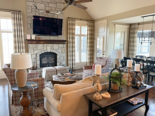
8. THE RIGHT LIGHTING FOR HIGH CEILINGS
If you have a cathedral or angled ceiling, adding a horizontal line (via a light fixture) at a lower level can bring your eye line down a bit.
This next mid-century modern home has my heart. Aside from the fabulous, horizontal light fixtures, I LOVE the wood tones (that are so well-coordinated) and Sherwin Williams Pure White on the walls…
On the other hand, these ‘almost invisible’ pendant lights help keep the vaulted ceiling more present – each to their own – not everyone wants their ceiling level to look lower!
And don’t forget about the kelvins of your light bulbs, they play a HUGE part in how cozy and warm a room looks, regardless of size!
How to Update Older Granite Countertops Without Replacing Them
MAKING A HIGH CEILING LOOK LOWER/COZIER: A SUMMARY
- Use big plants
- Paint your walls the right paint color (ceiling, too)
- Choose horizontal art and home decor
- Install your drapes at the right height
- Add eye-candy at eye-level
- Ground your space
- Choose the right height of furniture
- Choose horizontal light fixtures
READ MORE
What Colors Should You Paint Your Ceiling? White, Medium, or DARK?
Using Trims, Moldings, & Beams to Make a High-Ceiling Look Lower
How to Turn Your HOUSE into Your HOME
Hire one of the top paint color experts to choose your home’s best paint colors.

Updated with fresh images and relevant content for 2026


Thanks for another great post Kylie! Not only do you have the eye, but you are also so skilled at explaining which and why elements do or don’t work.
Wow! Just when I thought I had all the decisions made in the decor of my nearly completed, custom built home, you had to go and make me start second guessing myself again LOL! Seriously, I really needed to read this. Our new family room has 20′ high ceilings and fireplace (this is what hubby wanted!). It feels almost intimidating to me, and it definitely needs something to make it feel cozier and bring it down to earth. I love the idea of adding trim to the wall to break up it up, and some wood beams that echo the wood on the mantel would help in huge way! Thanks for such great advice!
This is a VERY helpful post. I have a two-story livingroom with curved windows AND a corner fireplace. So many design delimmas. I hope this will sign me up for your blog …
Great advice – to focus on 8′ or 9′ point on down. Changed my WHOLE outlook on my new build. I have probably 20 ft ceilings very grand, but now that I live here… the struggle is real! Thank you for this post and the great explanations!
You’re most welcome, Carmen, thank YOU for your note!