
The 9 Best Whole Home Taupe & Greige Paint Colors
When painting your entire home the same paint color, you need a versatile and flexible paint color – no one-trick ponies for you – you need a 20-trick donkey, at least.
Luckily, there is a method to the madness for how light or dark and how neutral or colorful your color should be, and I’m sharing it.
That’s right, if you’re looking for a shade of taupe or greige that’s wickedly gorgeous, you’ve come to the right place. Whether you’re home staging, painting a brand-new home, or updating your current one, these colors have a ton of flexibility for a wide range of exposures, finishes, and tastes.

However, even universally gorgeous neutral paint colors aren’t foolproof.
Why?
There isn’t one color that will look exactly the same in every room in your home – colors will change how they look based on your room’s exposure, interior lighting, surrounding finishes, AND your perception!

It’s like finding a pair of shoes that looks good with every outfit or a wine that tastes good with every meal – it ain’t gonna happen (I’ve yet to find a wine that suits Mr Noodles). Any magical universal paint color WILL shift from room to room.
HOW THE QUALITY OF LIGHT CHANGES A PAINT COLOR
Paint colors will change depending on HOW MUCH NATURAL LIGHT you get in your room.

For example, let’s say you have a 2-storey home. Both floors have south-facing windows, but because there’s a deck on the top level, the bottom level’s natural light isn’t as strong or direct. You could use the same color on both floors, but it will look different from top to bottom!
- A lot of natural light will wash out paint colors, especially the ones we’ll be looking at (LRVs approx. 55+). Just remember, the sun shifts throughout the day, and so will your paint color!
- Rooms with LOW natural light can make a paint color look darker or more shaded than normal.
- Average natural light is when your paint color will appear most true to its form.
And don’t forget to pay attention to the KELVINS of your LIGHT BULBS!
NOW, LET’S TALK COLOR
While there are any number of gorgeous grays (give or take a thousand), gray isn’t trendy anymore in the average home.
This is why greige and taupe paint colors can also be great options for those wanting something a bit warmer – maybe not as warm as the beige trend, but winking at it.
And the MOST IMPORTANT thing of all…
Me. Just joking…kind of. You might not be able to satisfy EVERY room, EVERY countertop, EVERY flooring in your home with one paint color – sometimes, something has to give (and it may have to be you). Be prepared to look at additional colors in your palette if needed.
As the Great Britney Spears says, let’s hit that baby one more time…
You might not be able to satisfy every room, countertop, finish, and flooring in your home with one paint color—sometimes, something has to give. Be prepared to look at additional colors for your palette if needed.
And because we’re trying to find that one-trick pony, the best taupe or greige paint color, the one color that suits as MANY finishes and exposures as possible, it makes sense to start with…
1. SHERWIN WILLIAMS AGREEABLE GRAY SW-7029
Oh, how do I love thee? Let me count the ways…LOTS! Sherwin Williams Agreeable Gray is a greige-taupe that leans considerably into gray, far more than beige (to the point where you COULD call it a warm gray).

As for undertones, Agreeable Gray can pick up blue, green, or purple, but most often favors a very vague green or purple (it’s so vague, it’s not even really a thing – it’s more about me being anal-retentive and loving to hear myself talk type).

Agreeable Gray has an LRV of 60, which is a good place to start. I usually lean a bit lighter when I want an ‘overall’ paint color (read more about my favorite LRV range), but this LRV still works.
Not sure what LRV is? 3 SLAPS WITH A WET NOODLE! It’s SUPER important, and you should learn about it.
While Agreeable Gray is undoubtedly one of Sherwin Williams best taupe and greige paint colors (one of their top sellers), it’s being slowly replaced by warmer colors.
Paint Color Review of Sherwin Williams Agreeable Gray
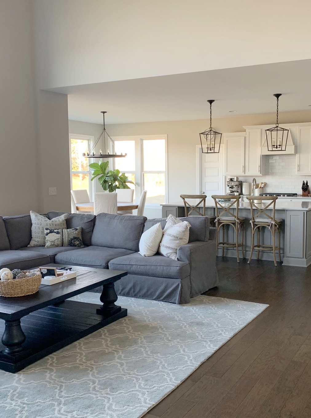
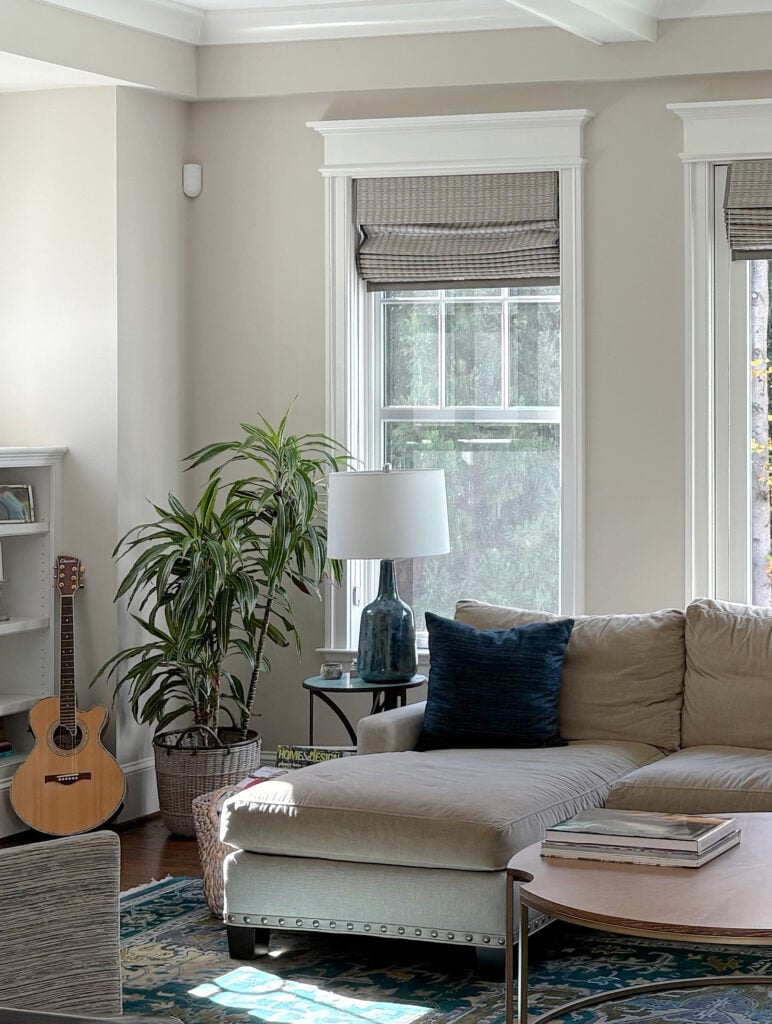
2. BENJAMIN MOORE EDGECOMB GRAY HC-173
Benjamin Moore Edgecomb Gray (also known as Alaskan Skies 972) has an LRV of 63.09, which gives it an awesome depth as a whole-home paint color. Not only is Edgecomb Gray potentially great for every room in your home, but it’s also one of the most popular choices with my Online Color Consulting clients.
Edgecomb Gray is a greige-taupe (like Agreeable Gray with its flexibility in undertones) but a SUPER warm one, that can swing a bit closer to beige than gray.
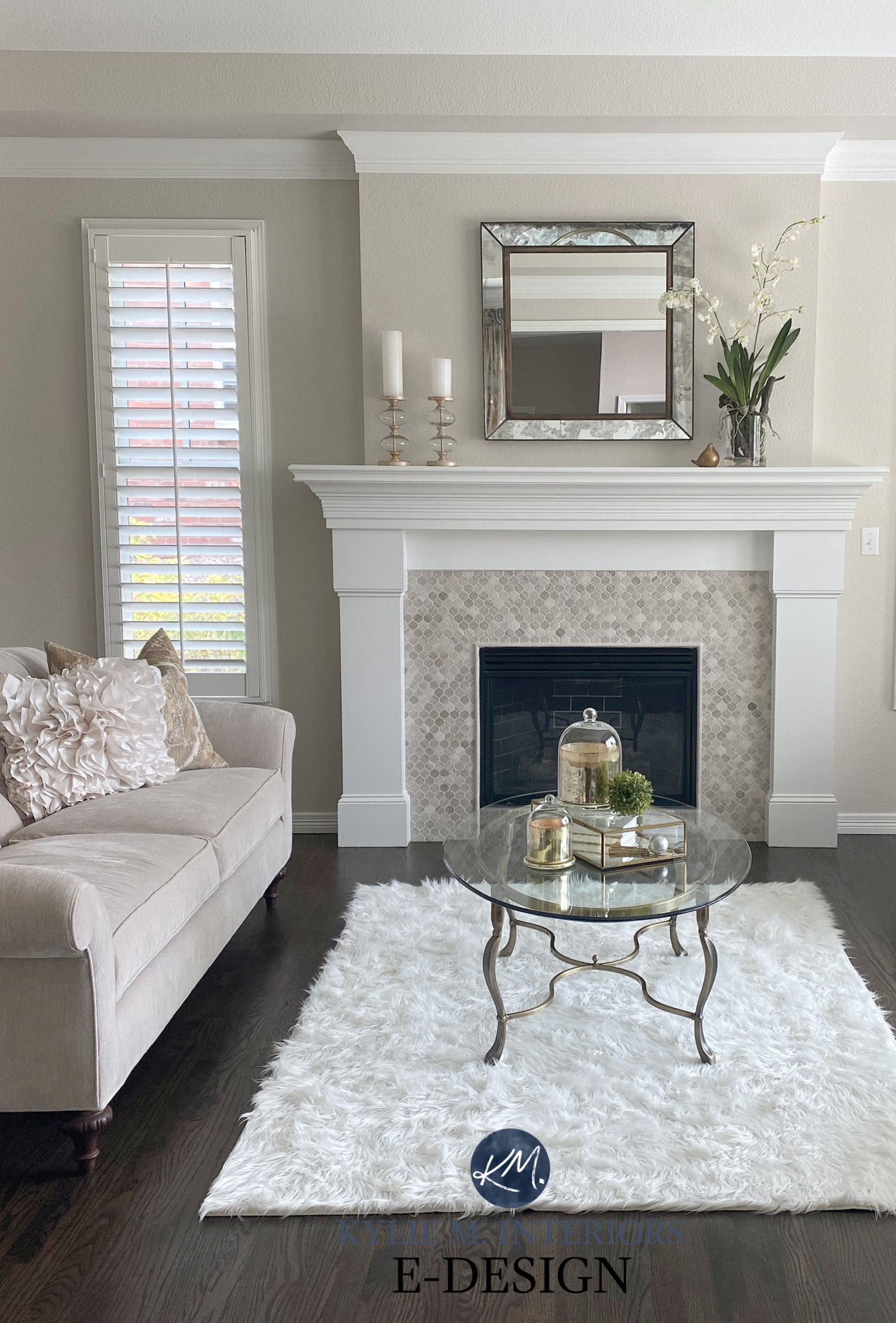
Review of Benjamin Moore Edgecomb Gray
FOLLOW ME ON INSTAGRAM & Kylie M YouTube; I’D LOVE TO SEE YOU THERE!
3. BENJAMIN MOORE CLASSIC GRAY OC-23
Benjamin Moore Classic Gray is the lightest of the bunch, boasting an LRV of 74, which places it right on the border between off-white and light.
Classic Gray is an off-white warm gray/taupe with a very soft, subtle, warm purple undertone. It can pick up a wee wink of pink in the ODD light, but don’t expect it all the time. If you want soft, subtle, and simple, Classic Gray is a great choice.
Here’s Classic Gray compared to some warm grays and another taupe-inspired hue…

SW City Loft | BM Collingwood (warm gray) | BM Balboa Mist (warm gray)
Paint Color Review: Benjamin Moore Classic Gray
All the photos in my blog are from my Online Color Consulting clients, readers, talented photographers, & friends— because real homes deserve to be celebrated (dirty laundry & all!) While not magazine-perfect, they’re packed with ideas & proven color choices to help you create a home you’ll love.
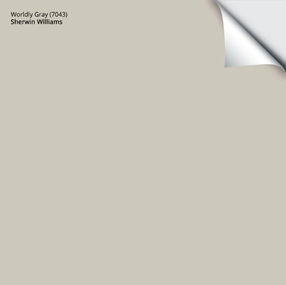
4. SHERWIN WILLIAMS WORLDLY GRAY
If you want a color with a subtle, organic backdrop, Worldly Gray can be a gorgeous choice.
With its LRV of 57 (which is a bit lower than usual), Sherwin Williams Worldly Gray is a light-depth paint color that sits in the greige world…barely. Sometimes you won’t notice any green at all. Just be careful, as if you partner it with finishes that NEED a taupe (purple) undertone, it could be a hot mess.
Sherwin Williams Worldly Gray: IMAGES, Info, & More
Where you want to be most careful with Worldly Gray is with finishes like tiles and countertops (e.g., bathrooms).
Why?
More interior finishes cater to taupe undertones than green ones. This said, Worldly Gray is super subtle in its approach.
Here’s your Peel & Stick sample of Worldly Gray…
5. BENJAMIN MOORE PALE OAK OC-20
Benjamin Moore’s Pale Oak is currently Benjamin Moore’s most popular neutral paint color. With an LRV of 68.64, it’s one of the lighter options on this page.
As for its color, Pale Oak is definitely a taupe. How do we know? It has beautiful, warm, purple-pink undertones.
Benjamin Moore Pale Oak Color Review
In the above photo, Benjamin Moore Classic Gray is the sample on the left, Pale Oak is on the right, and Collingwood is the backdrop color – some of the colors we’re exploring in this blog post!
Here’s your Peel & Stick sample of Pale Oak!
Get the best color advice…
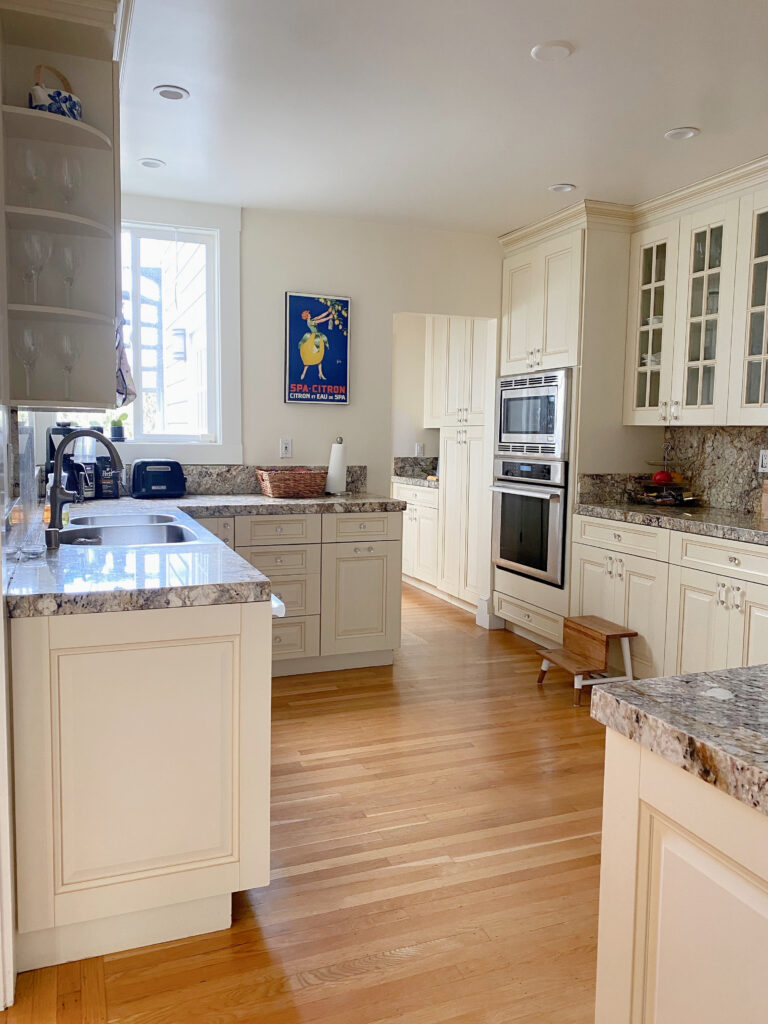
6. SHERWIN WILLIAMS EGRET WHITE 7570
Sherwin Williams Egret White is similar to Classic Gray as it’s a soft taupe that can lean into gray but often picks up more warmth. With trends leaning warmer, this is definitely one to look at.
Being a taupe, Egret White has gentle undertones, but they’re super subtle for this type of color. As for its depth, Egret White has an LRV of 70, which puts it on the higher end of the light range. Just look at how it updated this kitchen and its red-stained wood cabinets…


Egret White is a fun one to watch, how its temperature shifts depending on your room’s exposure (if you’re a color nerd; if not, it’s not really that fun).
Review of Sherwin Williams Egret White
7. SHERWIN WILLIAMS ANEW GRAY SW-7030
Not everyone wants a soft, light neutral—some of you like things a little deeper (wink wink). That being said, if you’re doing home staging, I highly recommend sticking to the above depths for mass appeal, especially if you’re selling your home. However, it would be CRAZY for me not to share this next one.
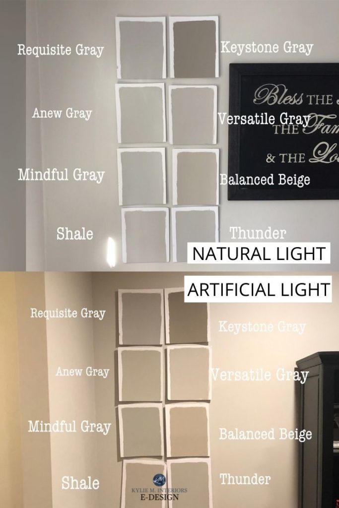
COLOR REVIEWS: SW Requisite Gray | SW Versatile Gray | SW Keystone Gray | SW Mindful Gray | SW Balanced Beige
Anew Gray is a stunning light-medium depth color and one of the best taupe and greige paint colors for those who prefer a little meat on their color’s bones.
While it slightly favors gray, overall, it can appear relatively well-balanced, with more contrast than the lighter version, Agreeable Gray.

Review of Sherwin Williams Anew Gray
99.5% of the photos in my blog are of REAL HOMES from my Online Color Consulting clients, readers, and friends. While not always magazine-perfect, they’re packed with ideas and proven color choices to help you create a home you’ll love.
Anew Gray has an LRV of 47, putting it in the middle of the light-medium greige-taupe world.
Find Anew Gray in this blog post: The Best Paint Colors to Help Hide Dirty Walls!
8. BENJAMIN MOORE RODEO 1584
If you’ve ever seen Benjamin Moore Revere Pewter and loved it, let me introduce you to Benjamin Moore Rodeo (I say that as RP is the OG of the warm gray-greige world).
Some people find Revere Pewter a bit too dark to use throughout their home, but love its overall look. Rodeo is similar, but with an LRV of 59.84, it’s a bit lighter and easier to use on a large scale.
Here’s your Peel & Stick sample of Rodeo…

Like Revere Pewter, Rodeo is kind of stuck between warm gray and greige and can shift quite a bit depending on your room’s exposure. I mean, every color will, but colors that are this close to the edge can either look greige or look gray (more moderate greiges hold more warmth).
Review of Benjamin Moore Rodeo
9. SHERWIN WILLIAMS MODERN GRAY 7632
Modern Gray is slowly winning my heart. At first, I didn’t pay it much mind, but as the need for flexible, warm neutrals gained traction, it came up more often on my radar.
Sherwin Williams Modern Gray is a mild, warm taupe paint color with an LRV of 62. This particular number USED to be my sweet spot until I changed it to a range (60-70).

If you’re not sure about how warm Modern Gray is, compare it to Sherwin Williams Agreeable Gray (#1) and see it swing! In turn, it shows how gray Agreeable Gray can look.
Review of Sherwin Williams Modern Gray
FREQUENTLY ASKED QUESTIONS
Here are some of the top questions and concerns I come across…
WHAT’S THE BEST WHOLE HOME WHITE TRIM/DOOR/CEILING COLOR?
While it can greatly depend on the wall color you choose, along with your interior finishes, generally speaking, check out Sherwin Williams White Snow, Pure White, and Benjamin Moore White Dove and Chantilly Lace.
For exact recommendations, check out this: The Best White Paint Color (singular)
WHAT’S THE MOST POPULAR LIGHT, NEUTRAL PAINT COLOR?
While previous years favored colors like Benjamin Moore Gray Owl and Sherwin Williams Repose Gray, today’s colors are warmer.
SHERWIN WILLIAMS: Accessible Beige is the best, light neutral paint color. However, it’s followed by Agreeable Gray, which is still hanging on for dear life (it was popular last year, too)! Lastly, Shoji White is in 3rd place – love it.
BENJAMIN MOORE: Pale Oak, a gentle shade of taupe, is their most popular neutral. This is followed by Revere Pewter – like Frank’s Hot Sauce, people put this !$%^@# on everything.
If you want to check out some lighter shades, read this: The Best Off-White Paint Colors For Your Whole Home.
So, there you have it, my funny friends. Again, while these might not suit every finish in your home, they should at least get you on the path to color happiness!
QUICK SUMMARY (TL;DR)
- The best light greige and taupe paint colors have LRVs between 60 and 73.
- The most popular colors include Benjamin Moore Pale Oak and Sherwin Williams Agreeable Gray.
READ MORE
Beige & Tan Paint Colors For Your Whole Home
The Best Gray Paint Colors for Your WHOLE HOME!
The 8 Best Whole Home Off-White Paint Colors
The 12 Best Light Taupe & Greige Paint Colors
Get the best color advice…
Check out my Online Color Consulting packages – I’d love to help!

ORIGINALLY WRITTEN IN OCTOBER 2019, OVERHAULED IN 2025 FOR YOU!


Hello! I really enjoy your posts. Do you have a suggestion to paint a ballroom/ flex space. I am adding moldings to the wall & thinking of color drenching space. I want to keep it neutral with a hint of a warm color.
Ooo, neutral with a hint of warmth sounds a lot like SW Anew Gray…I’m not sure if that’s the warmth you’re looking for? I also LOVE SW Egret White and BM Edgecomb Gray for lighter looks!
You have some great options in this post! Any suggestions for a south facing LR/kitchen space with both warm and cool fixed finishes? All trim and crown molding are in Alabaster. Thanks!!
Hey Kim! It’s SO hard to say without seeing the actual finishes, as they probably have undertones/specific needs!
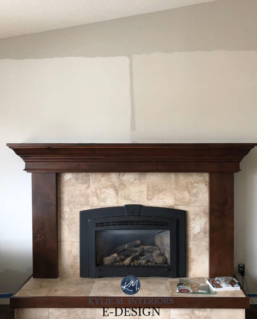
I just came across your blog after choosing Edgecomb gray for my living room. It’s a beautiful color. Can you share the source and fabric for the matching chairs in the first picture with fireplace? They’re stunning!
Oh, I would SO love to, but those were their chairs already!