
How to Find Your Kitchen’s Best Paint Color in 6 Steps
LET’S FIND YOUR PERFECT WALL OR CABINET COLOR
If you’re looking for the best paint color for your walls or cabinets in your kitchen, you might be looking in the wrong spot. That’s right, if you’re looking at your own PERSONAL TASTES, you could be getting it all wrong.
When choosing paint colors, the first place to look is your interior finishes. Aside from sampling properly, coordinating your paint colors with your interior finishes is the most important part of pickin’ em. This doesn’t mean you can’t love the color you choose, but sometimes you have to tuck your personal tastes in your back pocket for a while and tune in to the needs of your space.
This blog post is specific to prioritizing particular surfaces in your kitchen—especially when they don’t coordinate with each other. So, while I have HUNDREDS of blog posts about the best paint colors for dozens of interior finishes (type a word into my SEARCH bar and have fun!), they won’t be as helpful until you learn how to find your room’s best color!
Over 75% of the homes I work with in my Online Paint Color Consulting don’t have perfectly coordinated finishes (even new homes)! This means you have to prioritize the color needs of one finish over another.

However, there’s a good reason why I didn’t title this ‘6 EASY Steps to Finding Your Best Kitchen Color‘. While finding your perfect color will be EASIER once you’ve finished this blog post, there’s a lot of info to go through. Focus on the tips and ideas that are specific to your kitchen.
THE HIERARCHY OF PAINT COLOR COORDINATION IN A KITCHEN
With so many finishes to consider, a kitchen can be one of the toughest rooms to pick a paint color first. Thank GOODNESS you now have a blueprint!
Please note that I considered SO many situations when writing this. I want to hit as many homes/needs as I can! I do my best to cover all bases. If I missed anything, let me know!
First, let’s talk kitchen cabinets.
- If you’re choosing a paint color for your kitchen cabinets, move along to #1 listed below.
- If you’re choosing a paint color for your walls, keep on reading!

You might think your cabinets are the most important surface to coordinate with when finding your best paint color for your walls (if you’re looking for a cabinet color, move along to #1, listed below). The thing is, with one exception, your kitchen cabinets are likely the most flexible part of your kitchen palette. This means they potentially suit the widest range of colors compared to your other kitchen finishes. Let’s break things down into color groups, and you can focus on the one that applies to you…
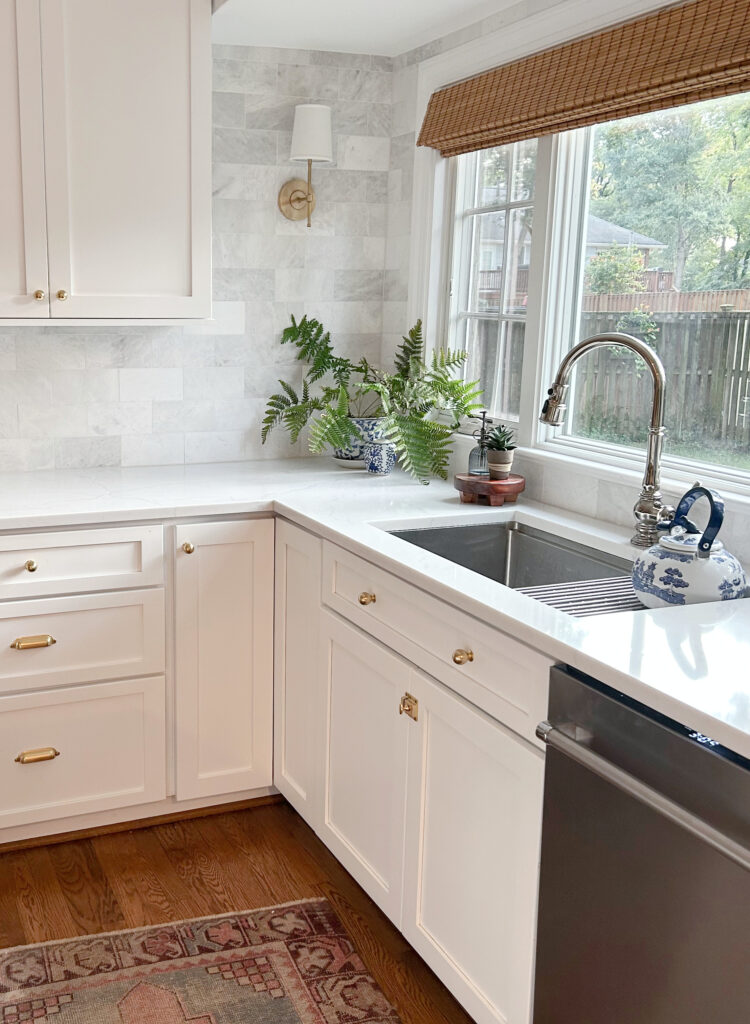
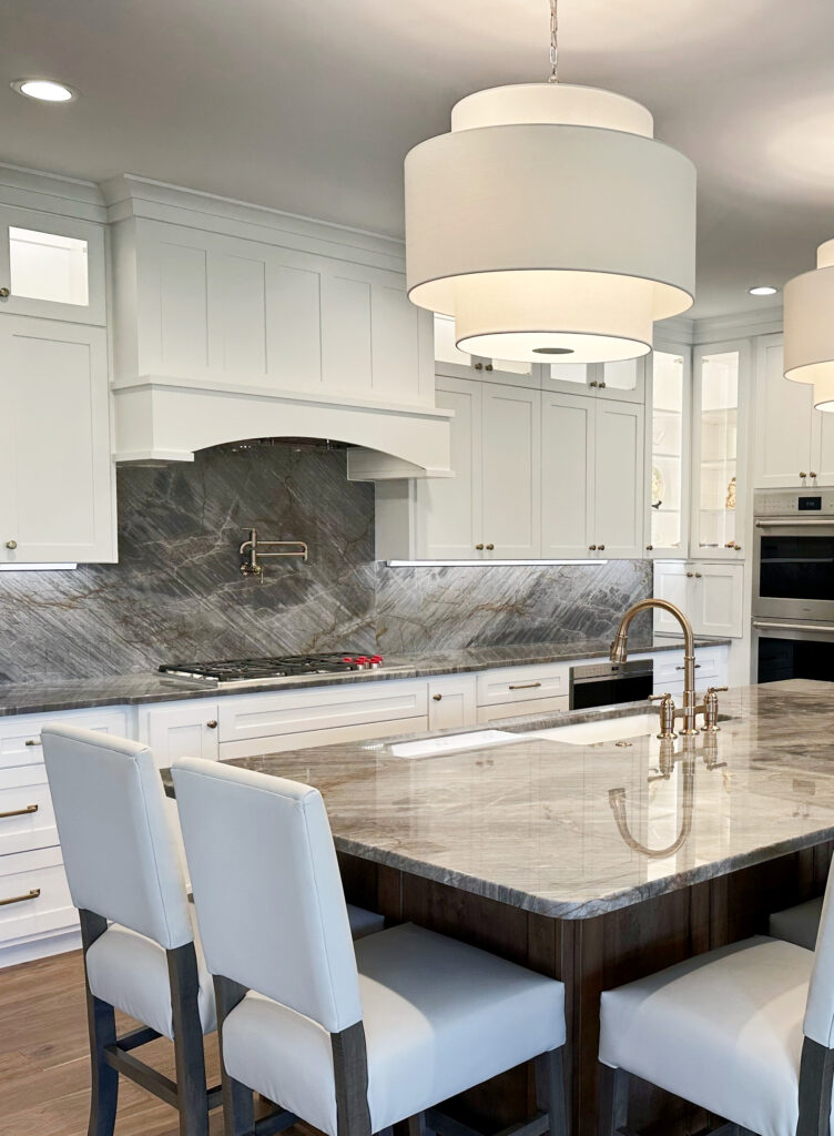
DO YOU HAVE WHITE PAINTED CABINETS?
If you have white-painted cabinets and your shade of white is flexible, listen to the backsplash and countertop first (which you’ll be learning about shortly). Hopefully, these are well-coordinated, but if not, you’ll learn how to deal with them.
In the kitchen below, the cabinet color is well-coordinated with the backsplash and countertop (hmmm, I wonder who chose it…wink wink). This makes it WAY easier to pick a wall paint color that suits them all…
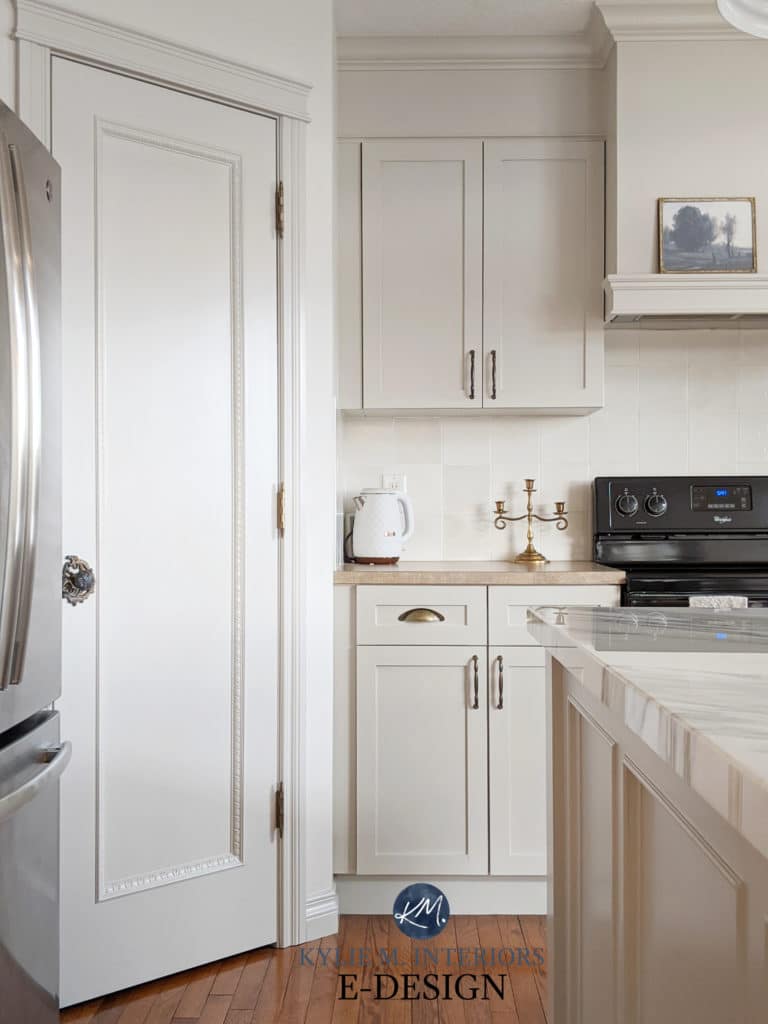
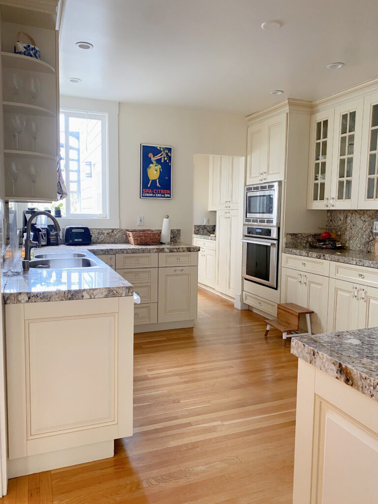
DO YOU HAVE OFF-WHITE OR LIGHT TO MEDIUM-DEPTH CABINETS?
If your cabinets are off-white or close to the medium depths, they’re likely bossier than your backsplash and countertop.
Why?
Because your cabinets are on the same vertical sight line as the walls, there’s more visual connection between these surfaces than the horizontal countertop or a backsplash (which likely has less square footage than your cabinets, even though both are vertical).
In this next kitchen, the beautiful greige cabinets are well-coordinated with the backsplash tile, as they suit similar paint colors—phew!
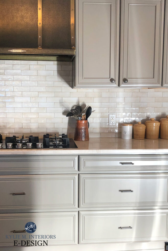
In this case, an off-white or light beige paint color is a great choice. If they didn’t, I’d be humoring the cabinets first.
Thank you to my Online Color Consulting clients for sending in your photos – you make my colorful little world go round!
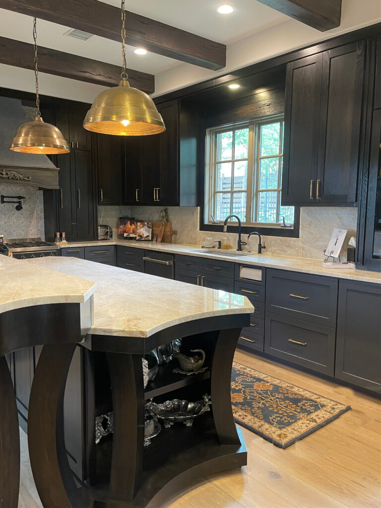
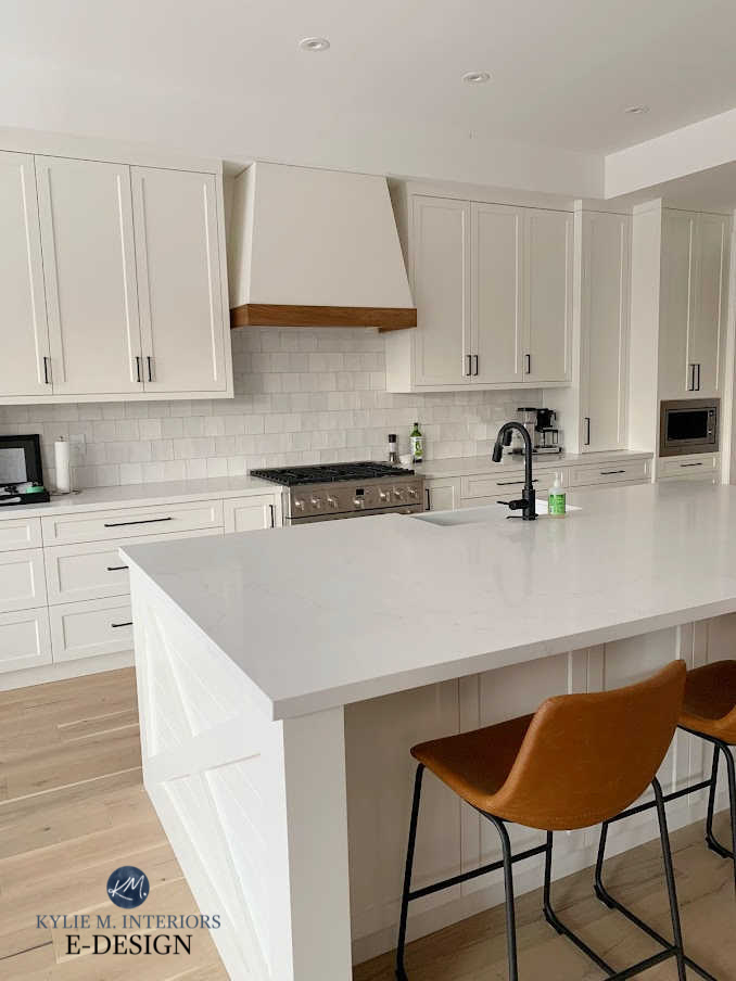
DO YOU HAVE DARKER OR COLORED CABINETS?
Interestingly, dark or colored cabinets are often less fussy than off-white or light to medium-depth ones. This is because darker colors often act as accents to their wall color partners rather than as COMPETITION for them (like light colors can be). In this case, ideally, you can humor all three surfaces with one color, but if you can’t, I would probably lean into the backsplash first, cabinet second, and countertop third.
In this next kitchen, the dark cabinets are super flexible and suit a wide range of colors. This means we focus on the needs of the other finishes first and then see how the cabinets fit in at the end – because they’ll probably suit whatever we choose.
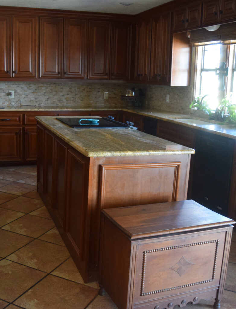
COORDINATING WOOD CABINETS WITH WALL COLORS
While you might think your wood cabinets call the shots, they only do so in the RARE case. Wood stains are (usually) more tolerant than their adjoining backsplash tiles and countertops. Sure, if your cabinets are SUPER red/cherry-toned or have an awkward pink undertone, we’ll keep that in mind, but they still might be more flexible than your backsplash!
Remember, HOW MUCH your finishes connect with your walls matters, too! In this next kitchen, notice how visually detached the backsplash and countertop are from the wall area. Sure, there’s a sliver, but in this case, the wood cabinets (and wood trim) make a HECK of a lot more contact…

Luckily, the paint color looks great with the cabinets and backsplash. While it’s too violet for the Baltic Brown granite countertop, they don’t make much contact, meaning the countertop is the LEAST of the considerations.
Now that we’ve got that out of the way, let’s move along to the Coordination Blueprint for Kitchens and what matters the MOST.
Remember, if you have OFF-WHITE OR LIGHT TO MEDIUM-DEPTH painted cabinets, they matter FIRST.

Because this kitchen doesn’t have a backsplash, the TRICKY cabinet color calls the shots before the countertop.
Otherwise, the first thing to consider is…
1. THE BACKSPLASH
While it might seem like the least important surface, the backsplash calls the big shots—more so than your white, dark, or wood cabinet color and countertop.
Why?
While there are exceptions, because the backsplash is on the same vertical sightline as the walls (and cabinets), your eyes connect these surfaces first. If you don’t get this connection right, it won’t matter HOW GOOD your paint color looks with your countertop or cabinets; things will look off.
In this next kitchen, I suggested several new colors for her wall paint color (and I can’t wait to see the after photos!)…

Now, you might think the cherry wood cabinets call the shots in this room – NOPE. While they matter, the backsplash matters first, followed by the countertop, and then the cabinets…
Why?
Because of the three surfaces, the cabinets are the easiest to coordinate with and will suit a surprising amount of colors!
EXCEPTIONS
- If you have a white subway tile and are painting your walls a non-white paint color, focus on your countertop (assuming your cabinets are easy-going, as discussed above, or wood).
- If you’re choosing a cabinet paint color, your TRIM COLOR matters a lot (we’ll talk about this shortly as it’s a topic unto itself).
- Black countertops suit almost any color. In this case, focus on your backsplash and then your flooring. If you have no backsplash or it’s white, your flooring might call the shots!
- Some kitchens have backsplashes that are small and enclosed, meaning they don’t directly meet any drywall. In this situation, listen to your countertops (again, assuming your cabinets are easy-going paint color or wood).
- If you have no backsplash, naturally, look at your next finishes.
As I mentioned, there are SO many situations to consider – I try to touch on them all!
Make sure to put some white paper next to your lighter samples, as this will help you see their depth and undertones.
Never look at just one paint color – compare six to eight versions of your color to see shifts in undertones, depths, and temperatures. This is how you find your room’s best color!
2. YOUR COUNTERTOP
If you’ve satisfied your backsplash by narrowing down a handful of colors that coordinate with it, look at these colors with your countertop and see which ones work and which potentially clash. If you have four great options that suit your backsplash, but only two of them suit your countertop, you’ve now narrowed down to your two best options!
Even if your finishes aren’t SUPER well-coordinated, there’s a cute lil’ Ginger who’s pretty darn good at finding colors that work…

On the other hand, if your backsplash and countertop are well coordinated and suit all the same colors, you can move along to the needs of your cabinets (this applies to those with wood cabinets, white cabinets, or a range of darker shades).
Whether you’re choosing a paint color for your walls or cabinets, #2 and #3 apply!
3. YOUR CABINETS
If you’re reading this to choose a paint color for your cabinets, move to #4.
If you have white cabinets, as long as they aren’t overly warm or cool white, the color that best suits your backsplash and countertop should work with your cabinet color – assuming everything is reasonably well-coordinated.
You can move on to #4.
However, if your finishes aren’t coordinated with your white cabinets, you might have a bigger project on your hands.

Often, too warm of a white is chosen for a kitchen’s finishes. In this case, you might need to paint your cabinets or change your hierarchy to suit your CABINET COLOR first and work down from there (if possible).
When finishes aren’t well-coordinated, sometimes there isn’t one MAGICAL PAINT COLOR that pulls everything together.
4. YOUR FLOORING
Are you surprised to see your flooring in fourth place? I agree, it seems weird, but as it relates to the vertical surfaces in your space, your floor isn’t one of them. This means it’s low on the list when coordinating paint colors.
Does it still matter?
HECK YES!
But I’ll be honest: I’ve had clients with floors that aren’t well-coordinated with the rest of their kitchen (often beige tiles), and we’ve had to visually ‘let them go a bit‘ to move the space forward. While it would be ideal if they coordinated, due to the budget or other reasons, a perfectly coordinated world doesn’t exist, and we have to stretch things. If that’s not okay with you, I get it; you’ll have to change your floor or live with what you’ve got, as no paint color will make you happy.
In this next kitchen, I had a challenge on my hands. My Online Color Consulting hired me to update her cabinets with color, as well as her island and walls…hoooooweee…
The countertop and backsplash are reasonably well-coordinated, but the floor tile’s orange-pink and golden hues went in a different direction.
In this case, we had to let the floor go (a bit) and listen to the backsplash (first) and the countertop (second). And look how it turned out!

The Best Off-White & Light-Depth Paint Colors for Kitchen Cabinets
On the other hand, if your floor is a wood or a well-coordinated tile, vinyl, or LVT, consider yourself lucky, talented, or both!
This next kitchen is an interesting example – let’s find out why…

Normally, flooring comes in last place, right? Well, what if your countertop is black (which means it suits almost any color) and you have no backsplash? In this case, your flooring gets to call ALL the shots!
Looking to update your kitchen with less STRESS?
Check out my CURATED PREMADE KITCHEN PALETTES!
5. EXISTING WALL COLOUR (if you’re choosing a cabinet color only)
If you’re not repainting your walls, you might think your existing paint color calls the shots. And while it can be in the odd situation, if it’s fussy, it’s the last finish you should consider.
Why?
Because between the backsplash, countertop, and flooring, it’s the least expensive to change. Of course, if it’s easy to please, you’re good to go. However, many of my clients have off-white or light-depth colors on their walls, and they want a similar depth on their cabinets.
Sherwin Williams Agreeable Gray – The Best Warm Gray-Greige Cabinet Paint Colors
If this is you, it probably won’t work unless you paint your cabinets the same color as your walls or a lighter/darker version of them. Let’s find out why…
- Colors that are too similar in depth will likely fight each other as they both want the same ‘color/depth slot,’ and only one can make the cut. You risk a HOT mess of undertones and temperature clashes.
- If your wall and cabinet color are more than 20 LRV points apart, you have a better chance of making it work. However, there are still things to consider (the warm vs. cool challenge).
If you CAN’T change your wall color and it’s affecting your color choice for your cabinets, you may want to keep your cabinets their current color (or wood stain) until you can fix what REALLY ain’t workin’.
Again, asking one paint color to make ALL of your existing surfaces 100% happy is a huge ask, and sometimes it just doesn’t work.
What if you have white cabinets, a white backsplash, a wood floor, and a white countertop with minimal bossy veining?
This is a common occurrence, and in this case, let’s talk about you…
6. YOUR PERSONAL TASTES
Whether you have a white-on-white or SUPER flexible kitchen or have satisfied items 1-4 above, it’s time to think about yourself!
If you love your kitchen’s finishes and they’re reasonably well-coordinated, there’s a good chance you love the paint color that your kitchen has chosen for you. However, if your kitchen finishes are finicky, not your tastes, or not as well-coordinated, you might be looking at colors that stretch your comfort zone.
My next client (below) wanted to keep her existing wall and trim colors, which made choosing a non-white cabinet color pretty darn hard! Luckily, she listened to her little Ginger friend, and her kitchen is well on its way to becoming beautiful!

And sometimes you end up with something that you unexpectedly fall in love with! My next client had a tricky countertop and backsplash combo to consider (they have different undertones). Rather than going with a light color and clashing with one or the other, the best way to bring them together was with some depth…

The Best Dark Greige Paint Colors / Sherwin Williams Urbane Bronze
Prepare to have your comfort zone stretched OR have a kitchen paint color that doesn’t look good with its finishes.
That’s right, if you prioritize your tastes above #1-5, you could be in for a fugly mess. Could it be liveable? Sure, but I’m sure you’re not reading my blog for liveable; you’re in it to find your kitchen’s BEST colors, and the above is the best way to find them.
IF YOUR FINISHES JUST DON’T COORDINATE, WHAT DO YOU DO?
It depends on your home. While there are always exceptions (too many even to begin to cover), this next tip should help you consider your space with the right lens.
Generally speaking, vertical surfaces are prioritized over horizontal ones.
If your countertop and backsplash are the same, that makes things easier!
Remember, if your interior finishes aren’t well-coordinated, there might not be ONE color that makes them all 100% happy – it’s often about finding the next best thing!
PARTNER POSTS…
Kylie M’s Ultimate Guide to Paint Colors & Their Undertones
The Ultimate Guide to Choosing Paint Colors Using LRV
How to Get the Perfect Color: LIGHTEN & DARKEN
How to Choose the Right Kelvins For Your Paint Color
The 5 Blog Posts You Need to Read BEFORE Choosing a Paint Color

NEED HELP
CHECK OUT MY ONLINE PAINT COLOR CONSULTING


Great Article. Painting cabinets is the easy job, but choosing the right paint for your cabinets to match your kitchen is always the hard part for my clients. Well written. Next time I have a client that is having a hard time choosing what color to paint their cabinets I will be directing them here.
Well, thank you, John! If they’re considering white, it’s USUALLY BM White Dove or SW Pure White that win!
I painted my cabinets pure white and walls agreeable gray. Quartz is LG Minuet Viatara. all looked great together. I then went with the trendy Cloe tile. It appeared whites/creams/light grays. For some reason, when the tiler installed it with white grout… it gives off a bluish gray cooler tone which runs into agreeable gray walls. The walls are a bit more green gray/beige. Do I have to rip out the backsplash!? Ugh.