The Best Way to Sample Paint Colors in Your Home
Sampling paint colors the traditional way is hard. Even if you’re looking at the perfect paint color for your walls, cabinets, or trims, you might not know it because you aren’t looking at it the right way.
This is why you need a paint color expert to guide you – someone who’s tried alllll the ways – sample pots, taping together 10 small paper chips – the whole shebang.
So, what is the right way to sample paint? Let’s find out!
YOU NEED A WHITE PAPER OR A POSTER BOARD
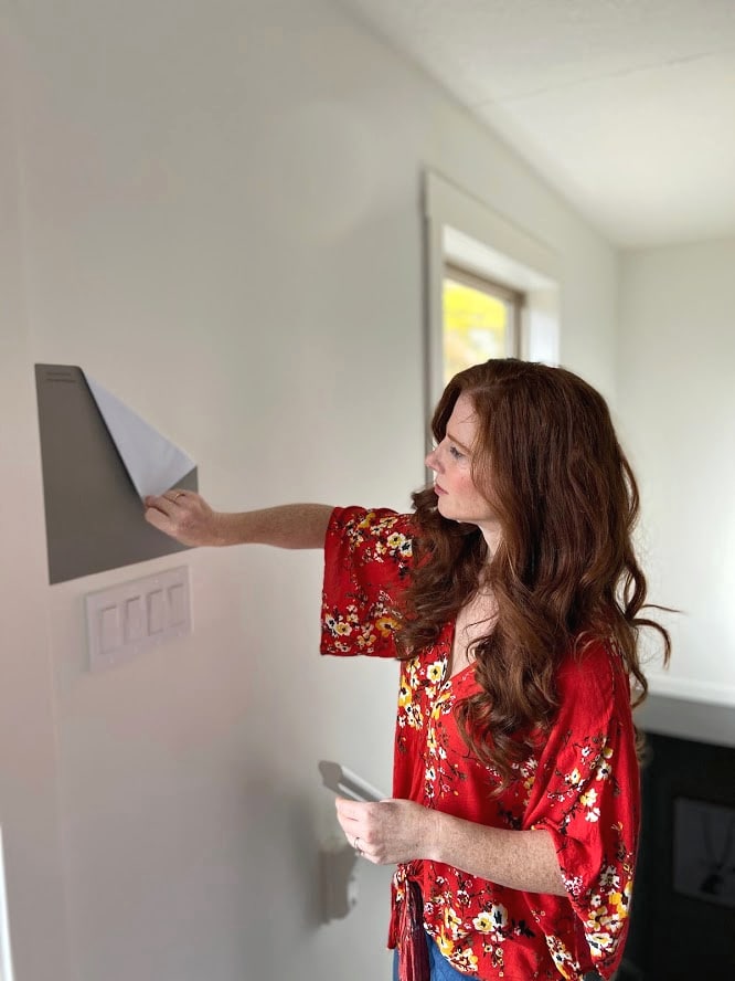
Whether you choose Samplize Peel & Stick paint samples or start with small paper samples, once you’ve got colors in your hot little hands, don’t start slappin’ them on your walls or cabinets yet.
Why?
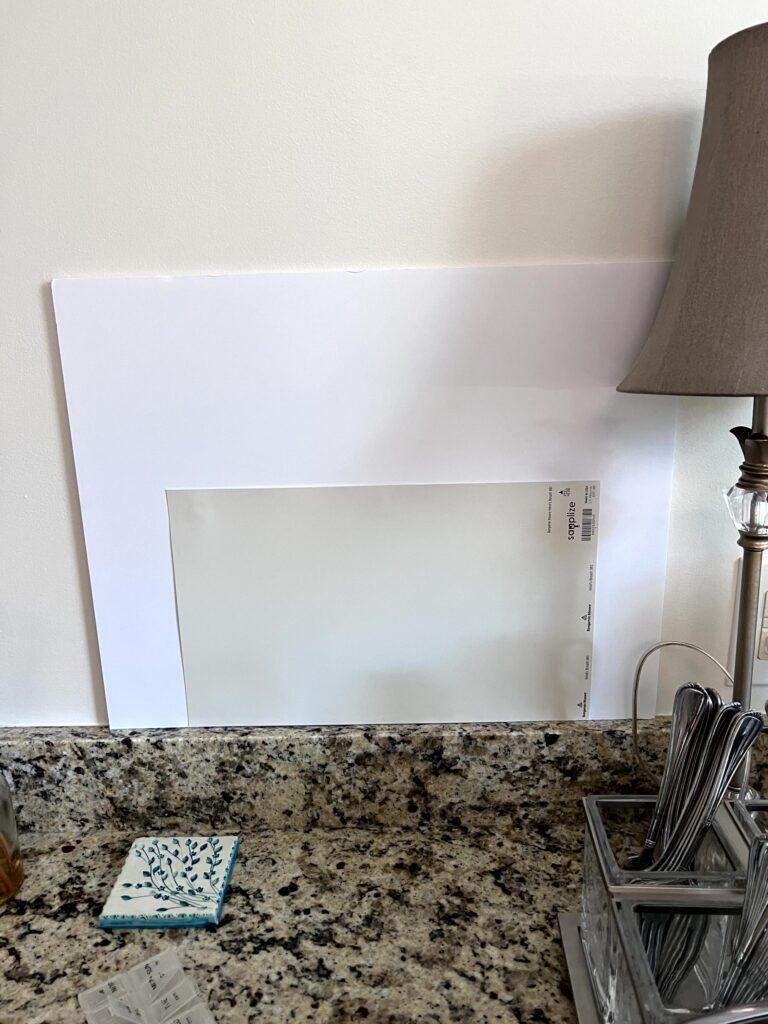
You must separate your old paint color from your new options by placing approx. THREE INCHES of white paper around THREE SIDES of each new sample.
Your old paint color will skew your perception of any new color.
Take a look at this sample…
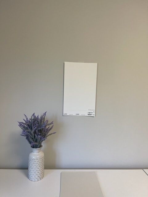
How does this color look to you? Think about its depth and undertones, in particular. It seems pretty passive and light, right?
Take another look at it in this next photo…
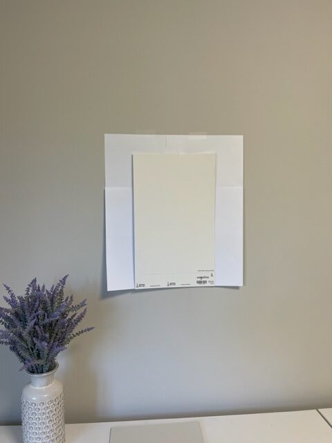
IT’S THE SAME COLOR! The white paper helps you see the actual DEPTH of this color and its undertones/general approach because it’s not directly compared to the old color. Crazy, eh?
While it’s okay to compare old and new to see the difference, don’t judge or choose your new color based on how they compare.
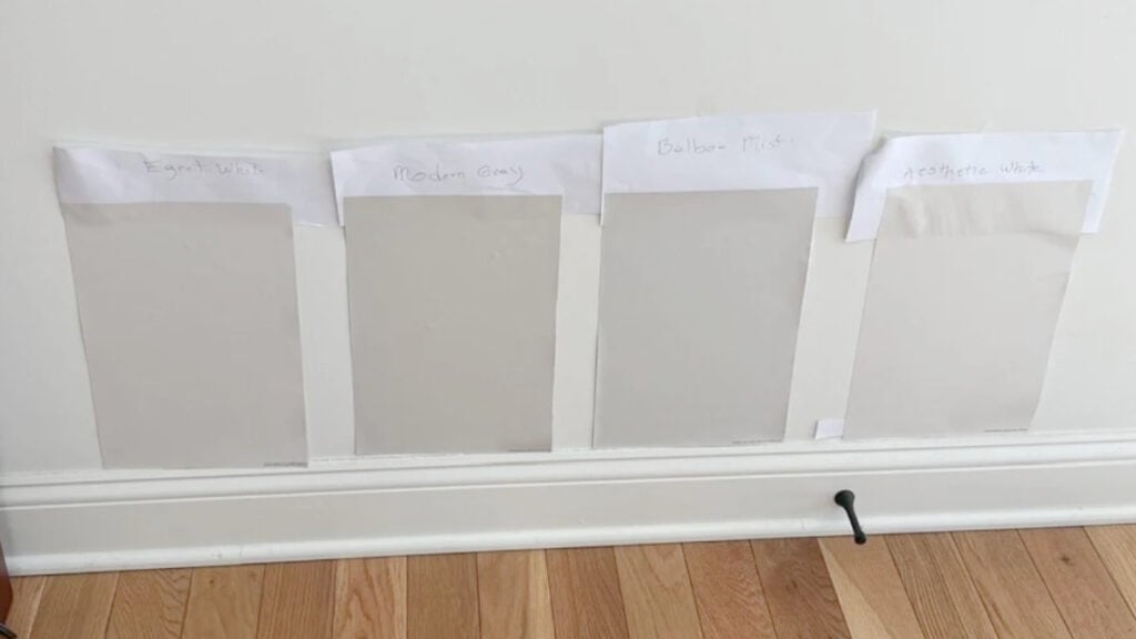
THE WORST PLACE TO LOOK AT YOUR PAINT SAMPLES
The worst way to judge a color is by how it looks…
a) in the middle of your wall or cabinet, with
b) no white paper separating your old color from your new sample.
This is a perfect example of what TO do! Check out my favorite warm, off-white neutrals.
The 10 Best Off-White Paint Colors
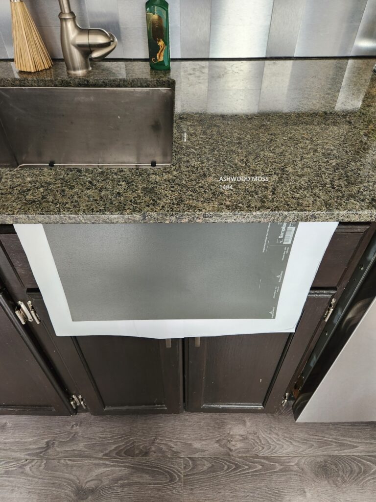
WHERE TO PLACE YOUR SAMPLES ON KITCHEN CABINETS…
When sampling paint colors for kitchen cabinets or bathroom vanity, you might think the best spot to put your sample is right ON your cabinet. Nope, the top, most important spot is…
- With the backsplash – directly beside it and on it, as if it doesn’t look good here, it won’t look good anywhere
- Directly underneath the lip of the countertop, the open edge of the sample should meet up with the countertop (shown below)
- Lastly, on the lower portion of your upper cabinets (don’t forget the white paper surround!)


How to Update Your 2000s Kitchen
Ideas to Update Your 1990s Kitchen
Samples should always be 100% vertical – light reflects differently off angled or horizontal surfaces.
Of course, look at your samples in shaded areas and natural light to get a well-rounded feel for them. Judge them based on how they look in the type of light you most often live in.
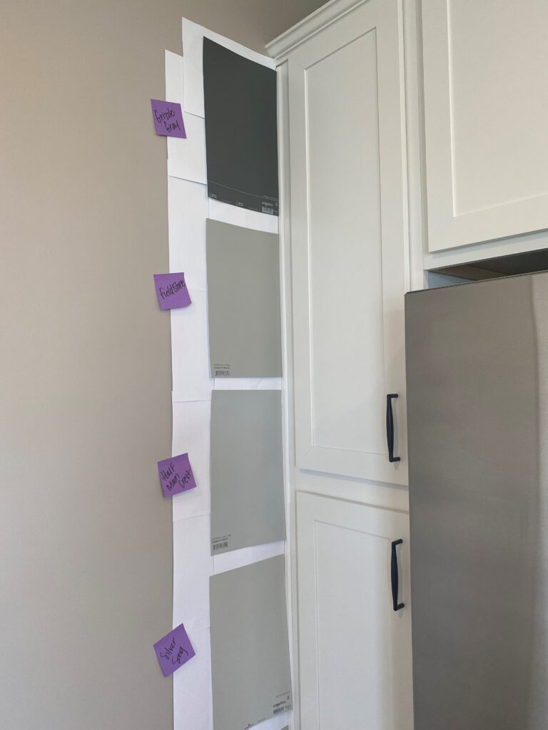
WHERE TO PLACE YOUR PAINT SAMPLES (WALLS)
- Directly next to the trim.
- Next to any vertical surfaces they must coordinate with (i.e., backsplash, fireplace, etc…)
- Sitting right on top of the baseboard, so you can see how the samples/flooring connect.
- While you can place samples in the middle of a wall, it’s best if they relate to or visibly attach to something around them (i.e., the sofa is in the foreground); samples floating on a wall with no reference point aren’t as helpful.
DIRECTLY COMPARE YOUR COLORS…
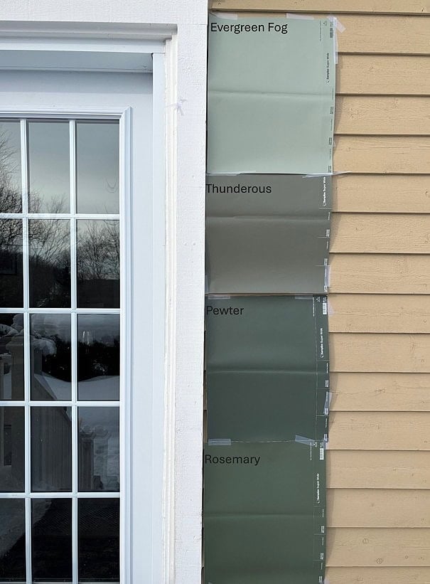
STEP 1: This is one way to sample your colors, as butting them up to each other shows you subtle differences…
The Best Dark Green Paint Colors: Sherwin Williams
The open side of your paint color sample will be butted up against your trim, backsplash, fireplace, countertop, or any other surface it needs to be coordinated with. You can also butt this side up to other samples to see the differences.
STEP 2: Next, separate them with white paper…
The separation between your samples ISN’T as important as the separation between OLD wall colors and NEW colors.
A HELPFUL TIP…
I recommend leaving your peel-and-stick samples on their paper backing so you can tape them to a poster board. Once you’ve narrowed down your colors and are ready to commit, take off that backing and have some fun!
3. DITCH MESSY PAINT SAMPLE POTS – START WITH SAMPLIZE
If you haven’t already chosen Peel & Stick, save yourself time and money – don’t visit the store for color swatches, sample pots, poster boards, and paint rollers/trays. Have Peel & Stick paint samples delivered to your FRONT DOOR in 1 DAY.
Samplize uses each brand’s ACTUAL PAINT on their samples & is less expensive than sample pots – #winwin.
WHEN SHOULD YOU USE SAMPLE POTS OR QUARTS OF PAINT?
There are only three specific situations where I use sample pots or quarts of paint…
- When I need to adjust a color (lighten or darken it from its original version) and see what it looks like before painting my walls.
- When I’ve narrowed down my exterior color options, I want to paint a few large areas of siding with my final choices.
- If I paint my cabinets white, I narrow down the white I want and double-check by making a quart in the exact line/finish of paint I plan to use. The color can change slightly depending on the line/sheen of paint, so this is an important step. However, buying a quart of paint in EACH color I’m sampling is expensive, but Samplize is not.
BTW, IF YOU’RE SAMPLING WHITE PAINT COLORS
Poster board/paper (being a cool white) can OVER-EXPOSE the undertones in whites and off-whites when comparing the two, leaving you with the impression that they are more colorful than they are, especially with warm whites.
The Best Medium-Depth Blue Paint Colors
If the white sample you’re looking at seems overly warm, look at it with and without the white paper and note how it works with your surrounding finishes.
How to Choose the Best White Paint Color for your Cabinets, Walls, & Trim
LIGHTENING & DARKENING PAINT COLORS – SAMPLE POTS
If you’ve recently done an Online Paint Color Consultation with me, I may have suggested lightening or darkening a paint color. On the other hand, if you like a suggested color but WISH it were a bit lighter or darker, most colors can be adjusted!
Tweaking (much different from twerking) paint colors can be the best way to get your PERFECT shade!

Learn all about lightening and darkening paint colors HERE / Benjamin Moore Revere Pewter’s Color Review
What’s MOST important is that you know how to get these samples made…
1. The paint store does the lightening/darkening for you; usually 25%, 50%, or 75% (25% is most common, 50% and 75% are not).
2. You’ll need a sample pot from the brand that supplies the color you like (either a small sample pot or a quart).
If you decide to lighten or darken a paint color, you MUST get the sample pots made by the brand that carries the color –no having Home Depot match up your Sherwin Williams or Benjamin Moore colors (three slaps with a wet noodle if you do that).
Here’s an example of a Home Depot Behr color match to Benjamin Moore…wooooooof.
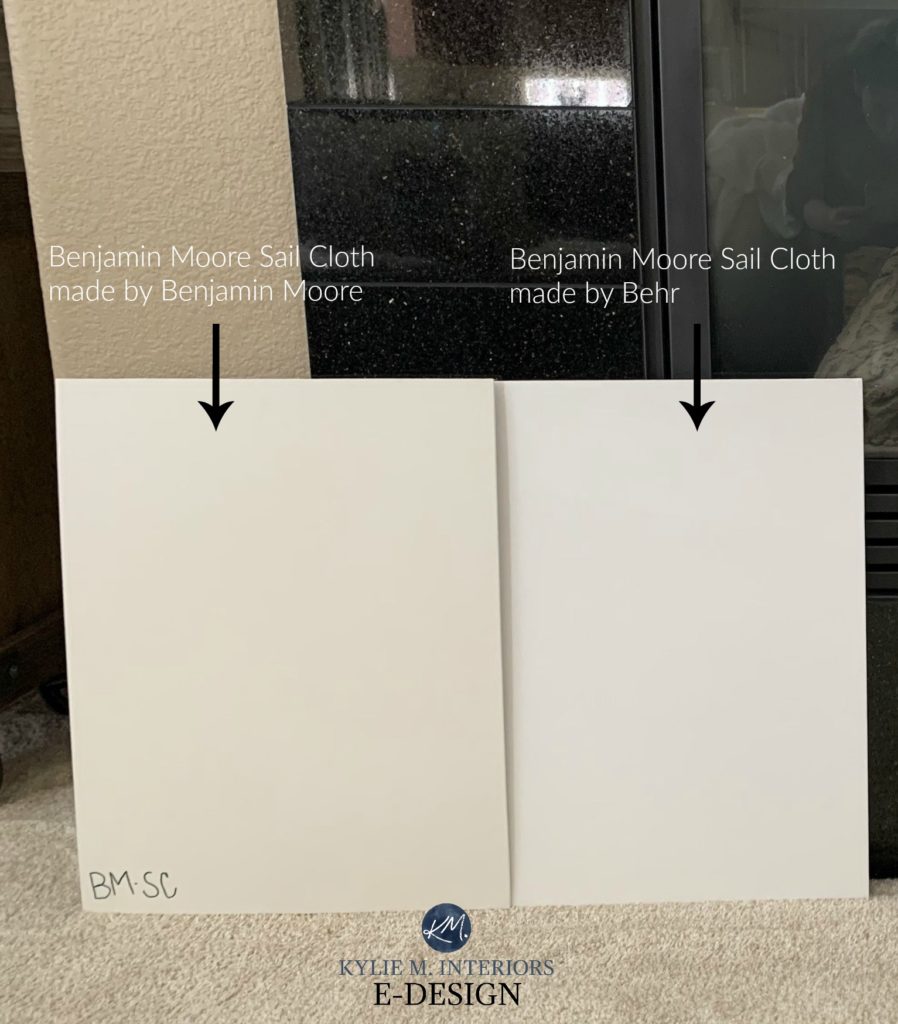
Home Depot Behr color match on the left – actual Benjamin Moore color on the right; sure, it’s the right ‘idea,’ but it’s not the right color.
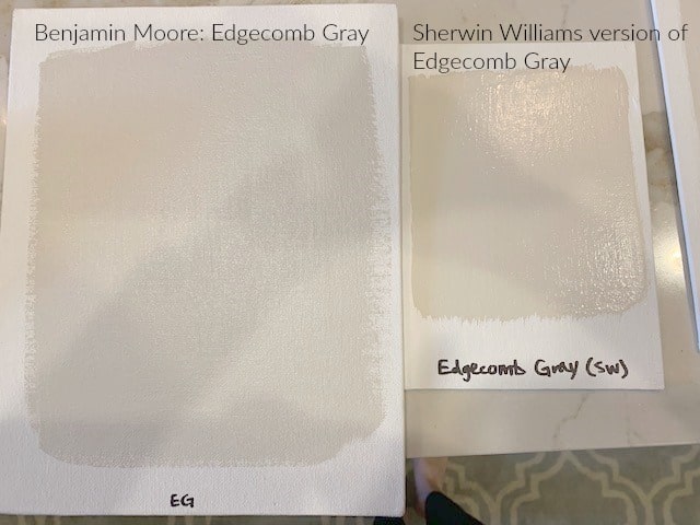
Here’s another beauty…
To paint your sample, I recommend…
- A roller (regular ten or 13mmm nap) is best. Foam rollers don’t give as good coverage.
- It’s best to use poster board or foam board (Elmer’s type) – check out your local dollar store for the best price. They’re smoother than most walls but most effective for sampling purposes (paper just wrinkles).
- I rarely recommend painting your samples directly on the cabinet or the wall unless you roll them on, make sure they’re smooth with no seams, and feather out the edges.
- Two coats of paint, always.
- Remember to leave THREE sides of white around your sample. Painting your samples on a decent foam board is easy. If you paint them directly on your surface, get a poster board and cut it into strips to hang around your painted sample, separating old and new.
- Place the gradations RIGHT next to each other to see the change in depth.
- Check out my favorite white paint colors for kitchen cabinets.
Remember, my goal is to help you learn how to pick the BEST paint color for you AND your room!
WHY DO PAINT COLORS LOOK DIFFERENT ON EVERY WALL OR IN EVERY ROOM?
A paint color starts with a goal: to look its best, as shown on the sample or in the paint can. And while every paint color has an undertone (bias), it can change GREATLY based on…
- A room’s exposure – yup, the quality and temperature/color of light coming in your window will change how a color looks.
- The Kelvin of your light bulbs and the amount of interior lighting you have.
- The surrounding finishes.
Learn about this and more here: Why Your Paint Color Doesn’t Look Right
READ MORE
Everything You Need to Know About UNDERTONES
The Ultimate Guide to White Paint Colors
Is Gray Still Trendy on Cabinets, Walls, & Exteriors?
Get the Online Paint Color Expert that DESIGNERS hire!

Please note that I’m in partnership with SAMPLIZE, and while I do receive payment, I FULLY RECOMMEND this product and don’t make my own color choices without it (I don’t recommend many things, so it has to be good – wink wink).