
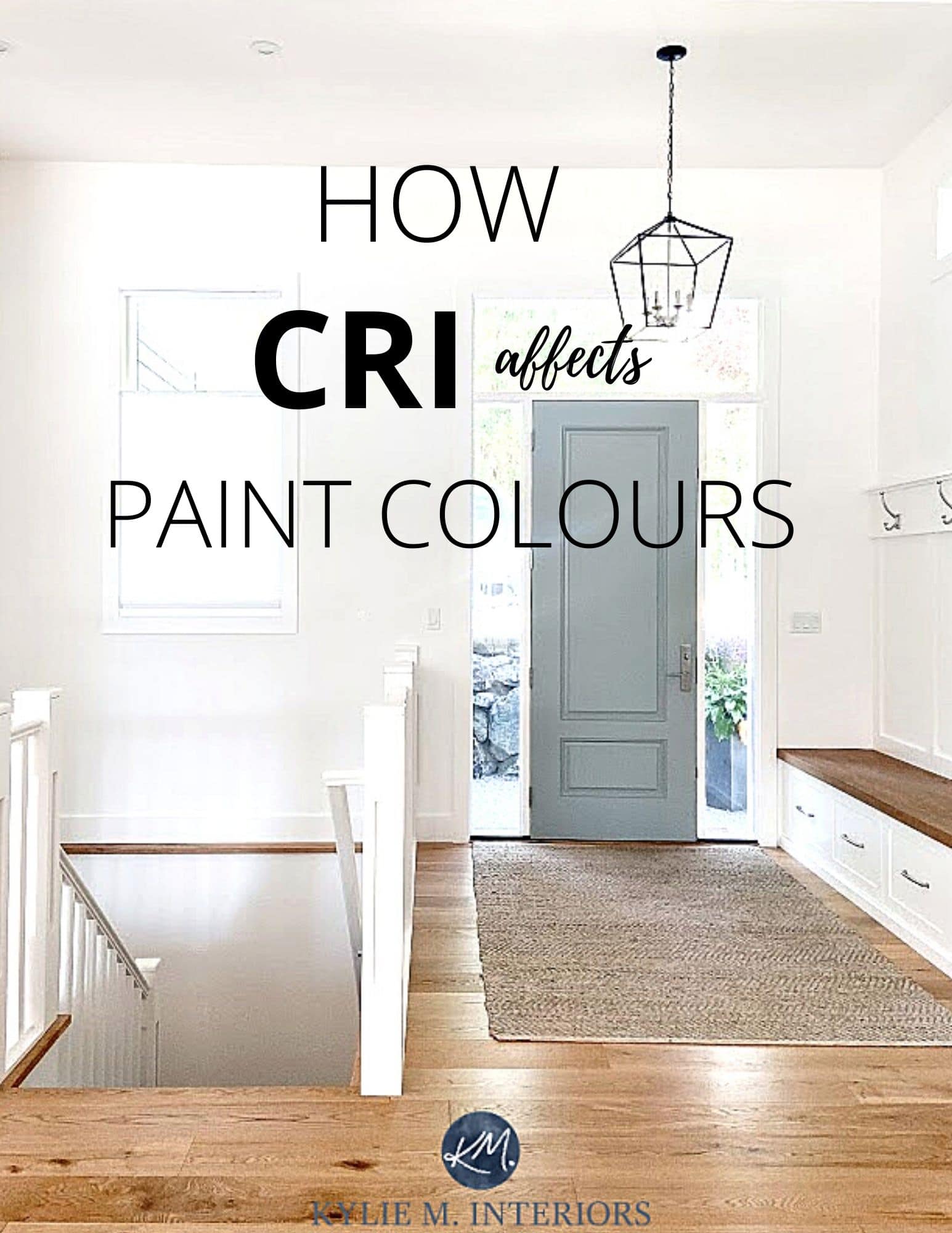
LIGHT BULBS: How a Bulb’s CRI Affects Paint Colors
Does Your Paint Color Look Green (when it shouldn’t)?
When it comes to paint colors, nothing affects our perception more than light—either natural or artificial. So, when a paint color doesn’t look like it should, the first thing you should consider is your light source!

Benjamin Moore Collingwood
Wait, I take that back. You should first consider that maaaaybe you didn’t pick the right color (it’s been known to happen). However, for the sake of brevity (which you know I’m so good at), we’re focusing on the light that’s shining on your walls (I have hundreds of blog posts covering the other issue).
There are two types of light:
1. NATURAL LIGHT
Natural light refers to your room’s exposure. The effect the exposure has on your paint color can vary depending on the size of your windows, whether you have dual exposures, a patio overhang, or landscaping blocking a window.
And no matter your exposure, you can get a green reflection via the reflection off grass, trees, or landscaping.

Sherwin Williams Incredible White
If you want to learn more about how each exposure affects paint colours, you can read all about them HERE.
2. ARTIFICIAL LIGHT
Artificial light is light shining on your walls from interior sources such as ceiling fixtures, lamps, pendant lights, and other sources. All of these involve terms like KELVINS, LUMENS, and WATTAGE. However, there’s one very important term that’s often missed.
CRI
CRI stands for COLOUR RENDERING INDEX and refers to how TRUE a paint color looks based on the light given by the bulb.
If this is a new term for you, stay with me – this is good stuff…

Paint Color Review of Benjamin Moore Gray Owl
Just as LRV runs on a scale from 0-100, so does CRI. A bulb with a CRI of 100 will show a paint color in its most clear, proper form. Ermmm, true based on WHAT?
As it relates to CRI, ‘true’ means how good and clear a paint color will look based on a comparison with natural sunlight or an incandescent bulb.
AN INCANDESCENT BULB – ARE WE GOING BACKWARDS IN TIME? WHERE’S MARTY MCFLY?
Believe it or not, an incandescent 2700K bulb, which is inefficient and has a short life span, actually has a CRI of 100. As the Kelvins go up, that decreases slightly but still leaves a CRI of 95+.
BTW, if you’re not sure about this whole ‘Kelvins’ thing, you’ll find a link to a great blog post near the end.
HOW DOES A LIGHT BULB’S CRI AFFECT PAINT COLORS?
We know that the higher a bulb’s CRI is, the better it will show off the true nature of paint colors. But what are bad, good, better, and best?
The Best Blue & Green Paint Colors for Cabinets
LIGHT BULBS WITH CRI’S BELOW 80
First, anything below 80 is bad. Buying cheap bulbs is like buying cheap wine—you get what you get, and you don’t get upset.
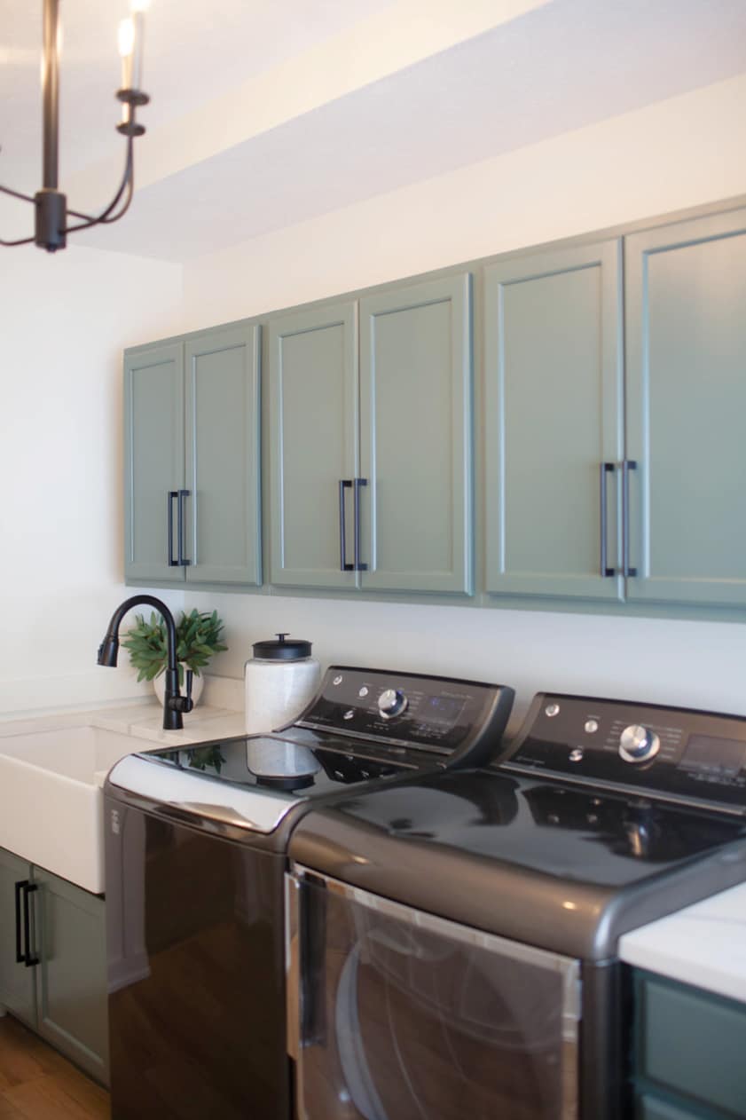
A bulb with this low CRI can make paint colors look washed out and dull, or it can even pick up entirely different undertones, particularly green!
LIGHT BULBS WITH CRI’S BETWEEN 80 & 90
While 80 might be the bare minimum for a bulb, you can and should do so much better. Most stores have bulbs with a 90 CRI. If not, you might need to visit a specialty lighting store.
Here’s a great light bulb with ADJUSTABLE KELVINS & a CRI of 95!!

LIGHT BULBS WITH CRI’S OF 90+
With a CRI of more than 90, your paint color will be shown at its best, but keep in mind, for the average home/room, 90 is REALLY GOOD. If you’re super anal about how your paint color looks, you may want to purchase bulbs that have a CRI of 95+. This doesn’t account for Kelvins (temperature of your bulbs) or LUMENS (output), but it will give you the CLEAREST, most genuine representation of your paint color.
Not only that, but a high CRI also helps to see subtle variations in paint colors, such as shades, tints, and tones.
All About Paint Colors & UNDERTONES

Paint Color Review of Sherwin Williams Pearly White
CRI SUMMARY
MY BEST ADVICE is always to wear clean underwear and drink half-decent wine. You should also be aware of how your bulb’s CRI can affect how your paint color looks. A good goal to aim for is 90CRI. And don’t forget the TEMPERATURE (Kelvins) of your bulbs (link below). Combine that with your paint color preferences and the right LRV, and your walls could look gorgeous!
READ MORE
How Light Bulbs Affect Paint Colours – KELVINS
4 PART SERIES – HOW TO CREATE A TIMELESS HOME
The Right Height to Hang Light Fixtures
Why You Shouldn’t Paint Your Room the Same Colour as Your Friend’s


ORIGINALLY WRITTEN IN 2021, UPDATED FOR YOU IN 2024


I have never heard of this before! Now I’m curious…
Ooooo, I’m glad I piqued your interest! Hope you found it interesting 🙂
Very interesting!! I never knew about CRI. I learned from you about Kelvins and how the paint color can change depending on the number (I’m a 2700 girl myself!).
Isn’t it CRAZY? Imagine what else we don’t know! And three cheers for 2700K! And I love your name, that’s my daughter’s name too ;).
Thank you and your wine!
I had no idea about LRV, CRI, Kelvin and that’s just the beginning. What a relief (maybe not that dramatic) that it’s not my fault that we were dissatisfied with the last wall color choice. Now I have hope that when making decisions for our new house, I can make better color choices using your guidelines and information.
Thank you again
Isn’t it so crazy? You look at a colour and wonder why in the HECK it looks so bad – it’s not necessarily the colour, it might be the lights! I’m so glad you found this helpful ;).
Wow the timing for finding this article is excellent! I was getting ready to pull the trigger on some unique bulbs for my kitchen lights! They require unusual shape and base and I’ve only been focused on lumens and color temperature—- now I need to confirm CRI. Such a helpful article!
There are just SO many things to think about, right?!
OMG, I love You!! Thank You so much for explaining this to me. I just painted my kitchen Benkamine more Alabaster and the cabinets Onyx. I was so worried about the lighting effects now I can get the right bulbs for my new fixtures. I will send you a photo when I have completed the kitchen. Best regards Jodi
WAHOOO, I love to hear this, Jodi, I’m glad I could help and would loooove to see how it all turns out!
This was very informative! I’m hoping a change in bulbs helps our new White Duck paint be less “off”. (It didn’t show in the sampling spots we did around the room)