
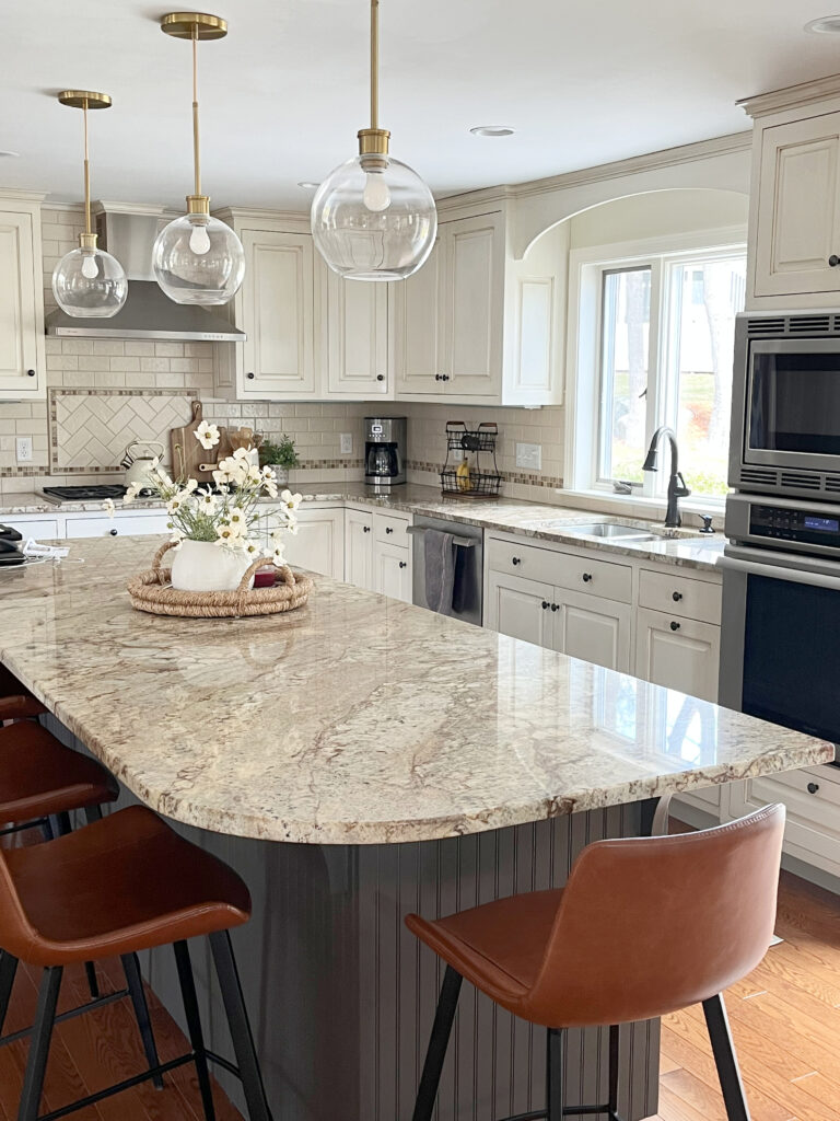
Home Decor Ideas to Update Pink Tile, Carpet, & Countertops
HOW TO MAKE A PINK ROOM LOOK MORE MODERN
I’m a big fan of rose, especially when it’s spelled in French and in my wine glass. However, when decorating, pink countertops, carpets, and tiles can be tough to update.
When used as a decorative touch or accent, pink or dusty rose can look feminine and classic and easily incorporated into almost any colour scheme. But those itty-bitty pink parts are not what today’s blog post is about.
Today, we’re talking about surfaces that are pink, proud, and too pricey to update!
- BATHROOM FIXTURES
- COUNTERTOP
- TILE
- CARPET
- BRICK
So, what do you do if you are STUCK with a pink surface that is too expensive to replace? You keep reading.
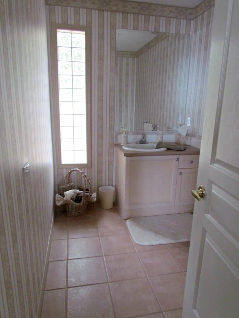
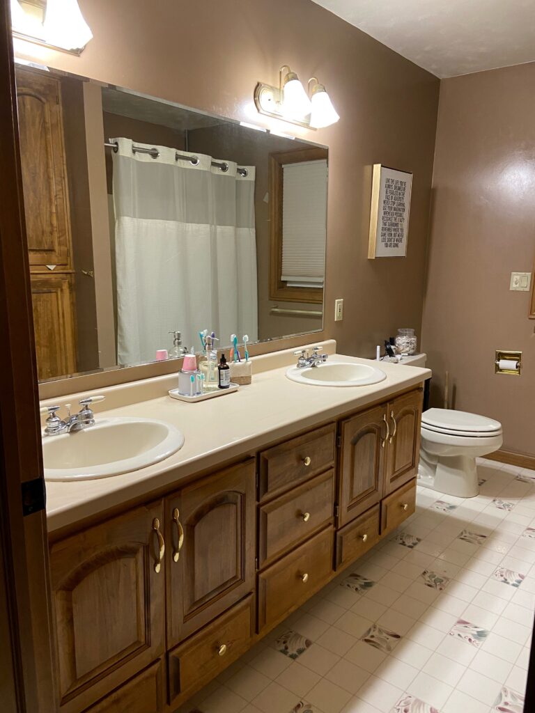
Pink wallpaper, tile, vanity, and countertop – it’s the perfect 1990’s storm!
UPDATE A PINK OR ROSE ROOM USING ARTWORK & DECOR
Artwork is an awesome way to update a room with fixed pink surfaces (carpet, countertop, etc…). And while it might seem odd to accent a room with the colour, you’re trying to get rid of, EMBRACING the pink can help it feel more natural to the space. When you fight against it, you may accent it, doing the EXACT OPPOSITE of what you originally intended.
The key is to find artwork that has a palette that includes pink or rose, along with more modern colors and neutrals. This is a great way to transition pink into a more modern style without alienating it.

KYLIE’S FAVORITE ARTWORK FOR A PINK ROOM
1. FELAN FLOWER BUSH – for a whimsical, Spring-inspired look.
2. FAINT SWATCHES 2-PIECE SET – adding new colors to your palette to play with.
3. GREEN PINK WATERCOLOR STROKES – a modern, romantic vibe piece.
4. WAY TO WOODSTOCK 1 – for a wee wink ‘o pink!
5. PALE BREEZE PRINT ON CANVAS – for a slightly vintage vibe.
KYLIE’S FAVORITE ACCENTS FOR A PINK ROOM (CARPET, COUNTERTOP, ETC.)
There’s a wide range of finishes and products that can accommodate pink, including toss cushions, area rugs, drapes, and decor. While I can’t hit them all, here are a few of my faves…
1. LANDY DAMASK THROW CUSHIONS – for a bit of a boho vibe with a hint of salmon pink!
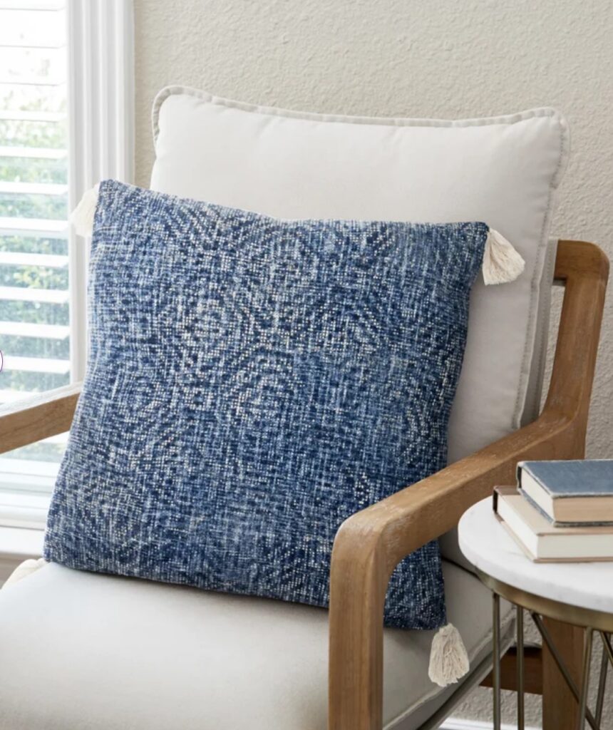
2. THALIA TASSEL TOSS CUSHION – if you want to accent your pink with a beautiful blue hue.
3. LAMONS HANDMADE PORCELAIN VASE – especially if you find a pink-infused floral like the one shown!
4. FALLYN RUG – for a vintage-rug-look at a fraction of the price, especially if your pink surface is a bit more muted.
5. JUJHAR VINTAGE RUG – a gorgeous blend of blue and pink (throw in that blue toss cushion listed above, and you’re set!)
6. FARO RUG – another more gentle, muted take on pink with a luscious, rich brown.
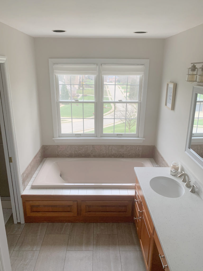
HOW TO UPDATE A PINK OR ROSE BATHROOM
Pink and dusty rose can be found ALL OVER the bathroom, including fixtures (toilet, tub, sinks), tile, flooring, and countertop. And while those items can be quite expensive to replace, choosing the right decor can shift how your space looks.
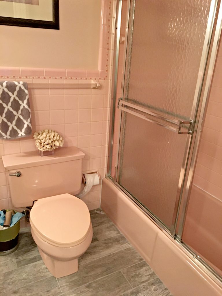
It’s like a Pepto-Bismol conference – but even a bathroom with this much pink can look better with the right decor!
METAL FINISHES
In a bathroom with pink finishes, polished or brushed nickel are the best finishes for faucets, lights, shower rods, and hardware. Black can look harsh with pink (unless you have a vintage pink bathroom with some black tiles).
TOWELS
When accessorizing a bathroom with pink fixtures, stick with white. Even if you love pink and want to accent it, green or blue towels can look tacky—like they’re trying too hard. White towels are best, and leave blue and green for smaller-scale decor.
SHOWER CURTAIN
While it can be tempting to use a shower curtain with some pink in it (and there are some nice ones), in general, a white shower curtain with some texture is a great way to update a pink-inspired bathroom. However, if you’re in it to win it, I’ve got some more interesting options listed below, too!
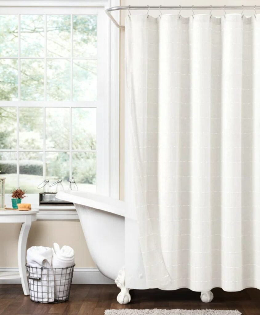
MY FAVORITE SHOWER CURTAINS FOR A PINK BATHROOM
1. WEON SHOWER CURTAIN (INCLUDES LINER) – for a simple, neutral textured look.
2. KIEL SHOWER CURTAIN – simple pattern and texture.
3. HIGHLAND DUNES, WHITE & BLACK STRIPED SHOWER CURTAIN – if your pink bathroom has black tiles or features.
4. PERINE SHOWER CURTAIN BY THE TWILLERY – If you love your pink bathroom and want to lean into it with a fun shower curtain!
5. RAINBOW SHOWER CURTAIN – another fun take on pink, especially for a kid’s bathroom!
6. BRODDRICK STRIPED SHOWER CURTAIN – if you want to ACCENT your pink fixtures.
7. SUNA LINEN SHOWER CURTAIN – it ain’t cheap, but DAMN, it’s pretty!
EMBRACE YOUR PINK THING
(just not in public – wink wink)
There’s something about pink that brings out the fun in a room! Pink gives you an excuse to get girly and add unexpected touches to a room through accents and decor.
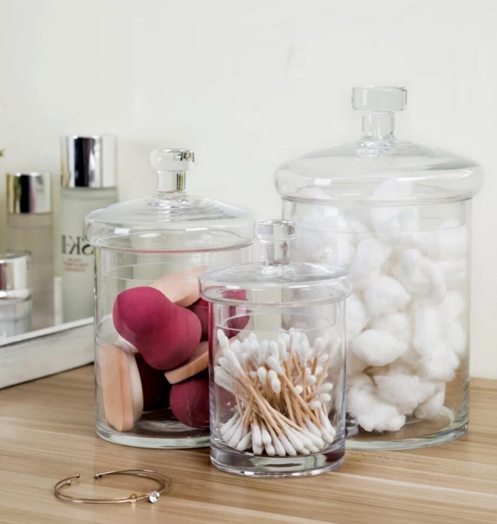
MY FAVORITE HOME DECOR FOR A PINK BATHROOM
2. MASON JAR SOAP CANISTER – then add pink-tinged soap to it!
3. 3 CANISTER SET – add some pink and function simultaneously.
4. SILK PEONY ARRANGEMENT IN VASE
5. FABRIC ARRANGEMENT IN VASE – for a more subtle dash of pink.
THE BEST PAINT COLORS TO UPDATE A PINK ROOM
When it comes to ‘decorating’ a pink room, it’s good to accent with pink. However, when painting colors, many want to avoid pink. But in avoiding something, sometimes you end up accenting it. Instead, if you politely wink at your pink surface, it can be easier to make your pink look more at home.
For example, for my client (below), we chose Benjamin Moore Pale Oak. Pale Oak is a light taupe, so its subtle pink undertone leans into the bathtub rather than away from it.
This next family room has a beautiful pink brick fireplace…
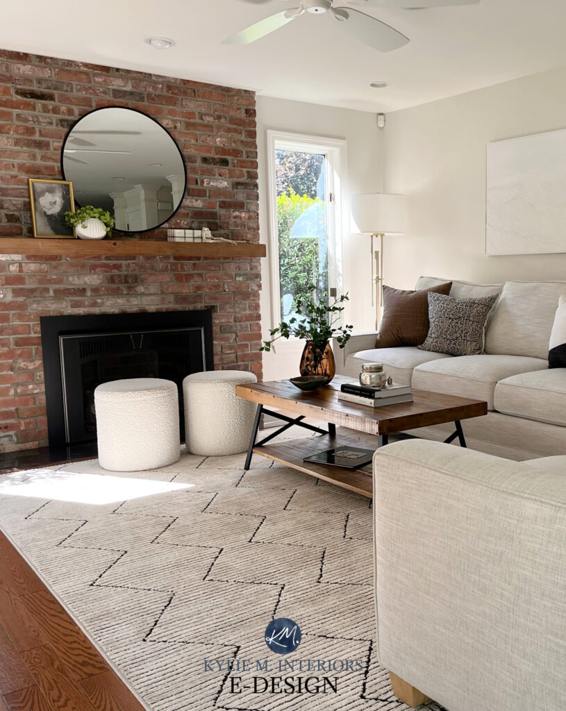
For this palette, we kept things neutral and simple – no pink and no shockingly contrasting accents either. The walls are painted Sherwin Williams Egret White, one of the most GENTLE shades of taupe.
And because paint colors are a creature unto themselves, I’ve dedicated an entire blog post to the topic, which you can check out here…
The Best Paint Colours to Update a Pink Room
Need HELP?
Check out my affordable E-Design and Online Color Consulting Packages!


ORIGINALLY WRITTEN IN 2018, UPDATED IN 2024


Love your blog… Sure hope you can help me!! Karen Sparks
Hi there,
We recently bought a home that is taupe with a pink undertone. It’s not quite in the budget to repaint the entire house. What would be a good choice for the trim to bring it back down to a more neutral appearance?
Thanks.
Hi Kylie,
Thanks for this post – it was super helpful! My daughters new home has two ’70’s bathroom. A total redo is not in the budget. She will paint the ‘pink tile’ bathroom Light French Gray. Would the same paint color work in a ‘teal tile’ bathroom? Thanks so much!!!
Hi Karen! Light French Gray might be a touch too purple undertone for a teal tile bathroom 🙂
Hi Kylie,
Thank you for your reply! I just purchased your one room package for help with the ‘teal’ bathroom. A quick question regarding the ‘pink bathroom’ – my daughter plans to paint the master bedroom SW Silvermist. Again, the (very small) master bath has pink/mauve tile (shower & halfway up walls). Would the Light French Gray be a good choice or would Agreeable Gray be a better transition color to Silvermist? Thanks so much!!! Love your blog!!!
Awesome, thank you for purchasing a package! Now I wouldn’t do Agreeable Gray as i think it will be too muddy. Light French Gray will be more safe, maybe just lighten it by 25% (or even 50% really). NOw I am just GUESSING as I haven’t seen photos, but it should get you on the right path!
~Kylie
I have what I think is “fawn beige”. Sort of a pinky beige. I painted above the tiles “Lauren Lace” from Olymipic (a very light – ALMOST while lilac toward the pink side) which does look good with the tile. I have no idea what to paint the vanity. I had Willow by BM and I have Manchester Tan now by BM. I embrace the pink and accessorized with a pink and cream shower curtain which I love. North facing room. But that darned vanity…..
Hi Julie! That’s funny, you’re the 2nd question I’ve had about that colour! When it comes to particular tones, sometimes it’s easier to use my E-design, service. This way I can spend some time with your room and see exactly what you’re working with, otherwise, I’m just imagining it! If that interests you, it is affordable and fun! https://www.kylieminteriors.ca/online-decorating-design-services/
~Kylie
Hi Kylie,
I am looking to paint kitchen cabinets, but dont have it in the budget to replace my counters which have pink and grey flecks in it. I was thinking something like Natural Cream by BM but scared the green undertones will pull out the pink! Walls are white. I would appreciate some advice!
Hi Alaina, I haven’t seen your home, but a subtle tweak on your worries about Natural Cream would be Elmira White!
Hi Kylie, I have the Kohler Innocent Blush tile bathroom. I tried SW Tony Taupe. I like how it is warm and downplays the pink tile but because there is no window it made the bathroom very dark. Is there a lighter warm taupe color I could try? Thank you Rhonda