
The Best Blue Paint Colors for Cabinets, Islands, & Vanities
MEDIUM TO DARK SHADES OF BLUE
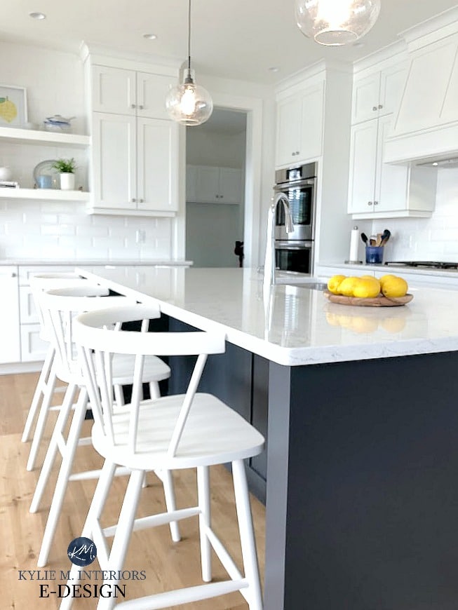
We all know white cabinets are the most timeless and popular choice for kitchen cabinets. But many homeowners yearn for something a bit different, in which case, blue is often the go-to non-white cabinet color. Maybe not for entire KITCHENS (these days), but definitely for kitchen islands and bathroom vanities.
Why?
It’s easier to commit to something a bit different and ‘out of the box’ on a smaller scale vs. a large-scale project like an ENTIRE KITCHEN, which can be costly to redo in five years if you’re tired of the color (or five months if you’re like me). But if you want to do the whole kit n’ caboodle, this girl’s here for it.

While there are ALWAYS exceptions, in order to have a blue island, bathroom vanity, or kitchen cabinets, your room will ideally have the following:
- white or wood main cabinets (if you’re painting your island blue).
- a countertop that has blue in it, or is white/gray (marble look countertops often love blue cabinets/islands).
- has colors in the countertop that would benefit from a blue accent (although there aren’t many that suit blue compared to green, they’re out there!).
- a muted neutral color palette that suits blue as an accent color.
However, not every space can handle color, and a safer but still stunning neutral cabinet color is a better choice. It’s important to a) read about your colors carefully, b) sample carefully and COMPARE colors, and c) choose the color that best suits your surrounding finishes, even if it’s not the first color you had in mind.
Now let’s see what I’ve got up my colorful little sleeves…

1. BENJAMIN MOORE HALE NAVY HC-154
Hale Navy has a cult-like following. And you might start drinkin’ the Kool-Aid, too, if you want a dark shade of blue with a bit more meat on its bones.
Hale Navy is a dark navy blue with an LRV of 8.36. And while it’s killer-dark as far as blues go, its chroma (degree of color saturation) makes it more striking and purposeful.
Benjamin Moore Hale Navy: IMAGES, Info, & More
Why does this matter?
Because some dark blues can appear as soft blue-blacks if they aren’t given decent lighting. Hale Navy tends to have enough ‘color’ that it shows up, even in most low-light situations.
If you’re unsure what to do and want a somewhat foolproof hue (knowing that nothing is ever foolproof), Hale Navy might be your safest bet. For a slightly different approach, consider its lighter partner, Newburyport Blue or Van Deusen Blue.
2. BENJAMIN MOORE CHEATING HEART 1617
Be still, my Cheating Heart. Wait…that’s not how it goes, but it SHOULD be because of how gorgeous this color is!
Cheating Heart is a stunningly dark shade of navy blue, heavily grounded by gray and black. And while you’ll certainly be left with some blue on the table (or on your island, that would be more the point), it’s not overly committed or remotely overwhelming in color.

Benjamin Moore Charcoal Slate’s REVIEW | Benjamin Moore Gray 2121-10 REVIEW
That being said, as mentioned in Hale Navy’s description (and as shown in the above image), Cheating Heart can look more like a soft black with a blue undertone if not offered enough light.
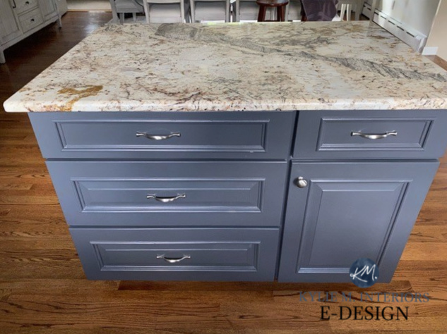
This next kitchen island with a granite countertop shows Cheating Heart at its very…very lightest, as it’s being hit with a good whack of light (whack being a super technical term)…
FULL Paint Color Review of Benjamin Moore’s Cheating Heart
This next photo is a bit more typical of Cheating Heart and how it looks in an average home and lighting situation…
And because you should NEVER pick a paint color without comparing it to similar shades, you might also check out Benjamin Moore’s Wrought Iron and Deep Space.
By the way, the above concrete-looking countertop is actually an affordable laminate!
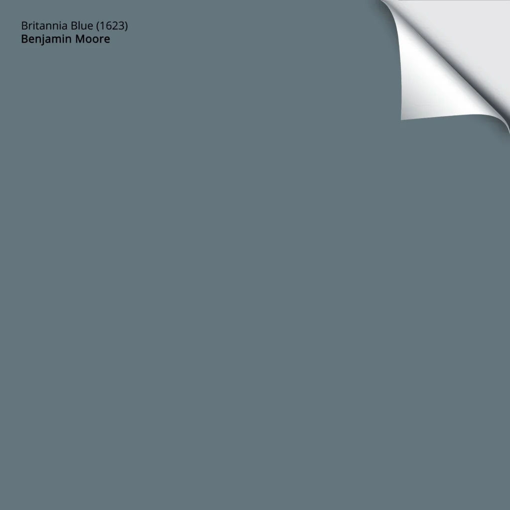
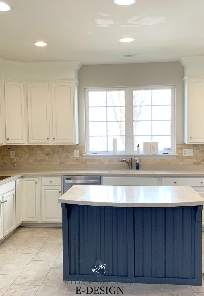
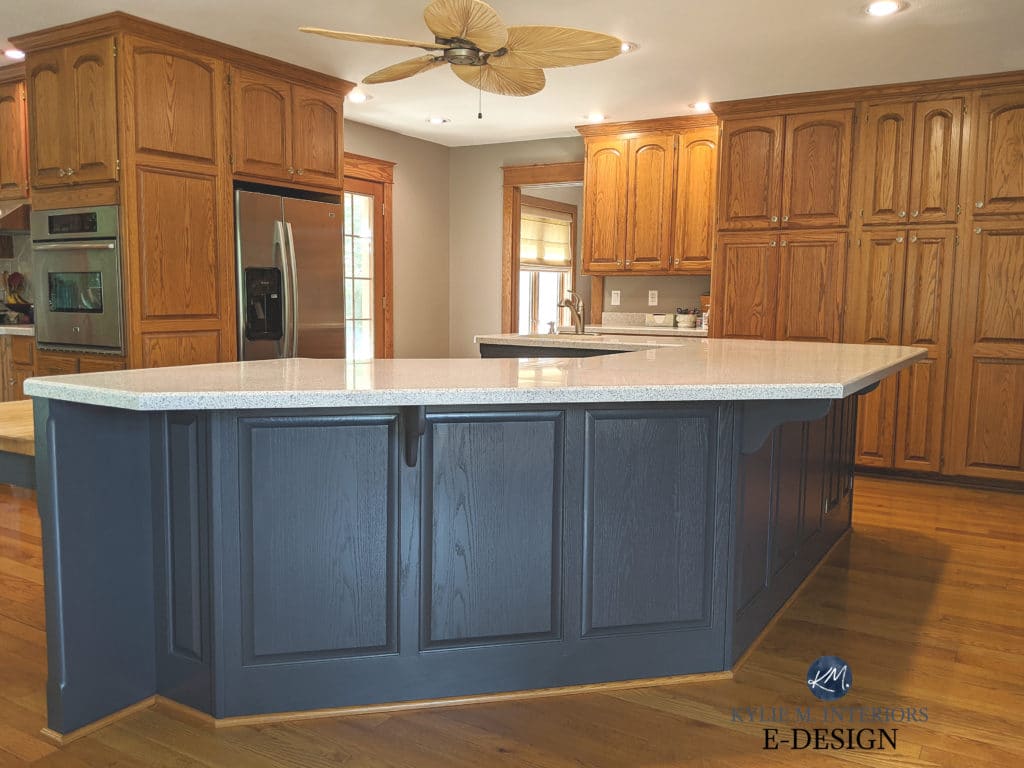
3. BENJAMIN MOORE BRITTANIA BLUE 1623
Not all blues need to be dark. I felt this way when choosing a new paint color for the kitchen island at our lake home…
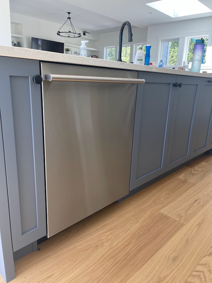
While navy blue is more classic, I wanted a softer approach, one that I found with Britannia Blue. This shade has an LRV of 18.06, so it’s well outside the navy blue range while still showing up to the party with tassels on (and not much else)…
Here’s a Peel & Stick sample of Britannia Blue…
OTHER SHADES TO EXPLORE
- Sherwin Williams Cadet is a stunning blue-gray in the medium range.
- Sherwin Williams Blustery Sky is a medium-depth blue with some green and gray for balance.
- Benjamin Moore’s Van Deusen Blue is a bit lighter and has great energy.
- Benjamin Moore Stillwater is ridiculously pretty (it was in the running for my blue island, along with Sherwin Williams Foggy Day, which is a bit more of a blue-green-gray blend).
The Best Blue-Gray Paint Colors
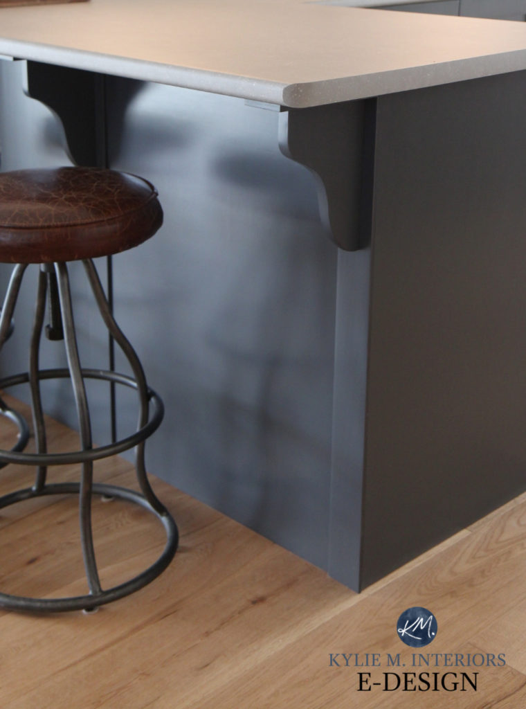
4. BENJAMIN MOORE OCEAN FLOOR 1630
Benjamin Moore Ocean Floor falls within the medium-dark range, with an LRV of 14.13. What makes it a bit different from the usual bunch is that Ocean Floor is smoky, with a moody vibe, compared to the slightly more nautical, cheery look of Hale Navy.
Ocean Floor is a great way to ‘commit to blue’ without going overboard (pun intended via the previous ‘nautical’ reference).
Trendy & Popular Paint Colors for Your Kitchen Island (MIXED BAG!)
In this next photo, Ocean Floor shows off its color a bit more with Benjamin Moore Cloud White cabinets…
Ideas to Update Your 2000s Kitchen
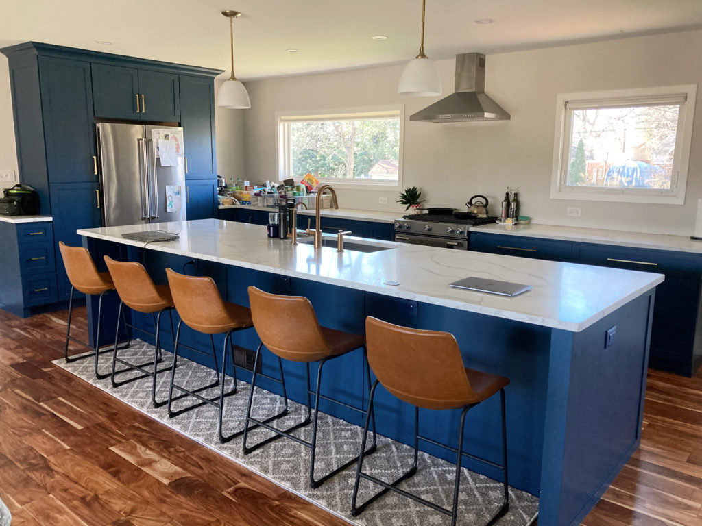
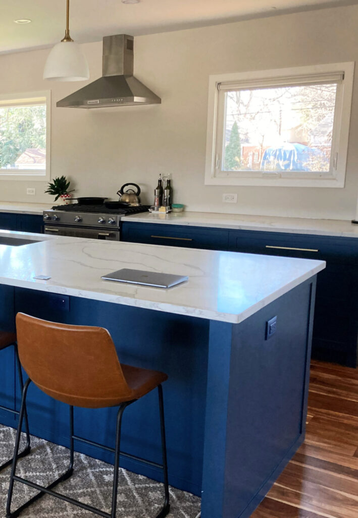
5. SHERWIN WILLIAMS CYBERSPACE SW 7076
You can talk all you want about Benjamin Moore Hale Navy (coming up next), but Cyberspace has my heart.
Cyberspace is a dark shade of blue (some call it gray, which it ain’t); however, unlike Hale Navy, which is a bit more committed to its color, Cyberspace offers a more muted, slightly smoky approach to navy.
Shown above and below, Sherwin Williams Cyberspace
Cyberspace is also prone to looking like a soft blue-black-gray thanks to its reduced chroma (color) and lower LRV of 6. However, if you want a polite nod towards navy blue, it could be the perfect fit.
FULL Paint Color Review of Sherwin Williams Cyberspace
If you love dark navy blues like Cyberspace check out my CURATED DARK BLUE COLOR BUNDLE.
6. BENJAMIN MOORE GENTLEMAN’S GRAY 2062-20
Well, if you think Hale Navy is a striking approach to navy blue, you ain’t seen NOTHIN’ yet!
Gentleman’s Gray comes in hot with a gorgeous saturation, giving you a striking blue hue with a ton of personality…
While Gentleman’s Gray falls within the blue group, it has a decent shot of green in it, unlike many of the popular blues that lean into blue-violet.
All the photos in my blog are from my Online Color Consulting clients, readers, & friends— because real homes deserve to be celebrated (dirty laundry & all!) While not magazine-perfect, they’re packed with ideas & proven color choices to help you create a home you’ll love.
As for depth, with its LRV of 7.26, Gentleman’s Gray offers a wink and a nod at the navy blue world while picking up an energetic vibe along the way!
7. FARROW & BALL HAGUE BLUE
While Farrow & Ball doesn’t have the selection that Sherwin Williams and Benjamin Moore offer, HOT DAMN, do they have some pretty colors!
In particular, Hague Blue is a classic shade that’s been popular for years. While some blues cater to blue-purple and others are pretty balanced, Hague Blue leans into green, giving it a slightly atypical approach to navy.

Shown here with Farrow & Ball’s Calke Green (mad love)
The Best Green Paint Colors for Cabinets
And while it might be ‘classic’, it can be pretty darn fun, too…

Farrow & Ball’s Best Blue Paint Colors
8. BENJAMIN MOORE WATER’S EDGE/VAN COURTLAND BLUE
If you love blues that are medium-depth and heavy on the green, Water’s Edge (also known as Van Courtland Blue HC-145) could be your perfect cabinet color, as shown in this compact kitchen below…

While Water’s Edge IS BLUE, you can expect a reasonable shot of green to show up at the party. It won’t do a keg stand, but it’ll definitely put on a show.
Here’s your Peel & Stick sample of Water’s Edge…

With an LRV of 31.48, Water’s Edge is the lightest color on this page, but still offers a wicked pretty contrast with white countertops or upper cabinets.
SIMILAR COLORS TO COMPARE…
While many of the darker blue paint colors have similar colors in this blog post, the medium-depth range isn’t as well-covered (I don’t always have the images I need). If you love Water’s Edge, you NEED comparisons, so check these baddies out…
- Sherwin Williams Debonair
- Sherwin Williams Whirlpool
- Benjamin Moore West Coast for a bit more vibrancy
The Best Blue-Green Blend Paint Colors
9. SHERWIN WILLIAMS SLATE TILE 7624
Some colors get lost in the fan deck as they don’t have prime placement – Slate Tile is one of those colors.
Admittedly, Slate Tile is a bit grayer than the average popular blue cabinet paint color. However, this doesn’t mean it isn’t badass and beautiful, especially if the darker, stronger blues aren’t your jam (or your peanut butter).

Benjamin Moore Newburg Green is on the right.
As shown above, Slate Tile (left) is a blue-gray with a green undercurrent. Not coastal, not traditional, Slate Tile is a great happy medium between styles.
The Best Blue-Gray Paint Colors
WHAT WALL COLORS GO WITH BLUE CABINETS?
Choosing your best wall color is rarely just about the cabinet color. You should also consider your trim color, countertop, tile, and other finishes. However, a few color groups work in the average room, including…
- Some blue cabinets love being partnered in a palette with shades of beige and tan, including Sherwin Williams Aesthetic White.
- Blue cabinets can look stunning with soft warm grays and taupes with violet undertones, including Benjamin Moore Classic Gray and Sherwin William Egret White.
- Blue cabinets pair well with white walls, particularly when paired with warm white paint colors and cooler shades of white. That said, the cabinets rarely call the shots; it’s the surrounding hard finishes, such as the countertop and tile, that take center stage.
How to Find Your Room’s Best Shade of White
The Ultimate Guide to Choosing Your Best White Paint Colors
READ MORE
The Best TEAL Paint Colors for Cabinets & Islands
The Best DARK Blue-Gray Paint Colors
Farrow & Ball’s 10 Best Blue Paint Colors
Trendy & Popular Paint Colors for Your Kitchen Island (MIXED BAG!)
How to Choose the Best White Paint Color for Your Cabinets
The 12 Best Navy Blue Paint Colors for Cabinets, Islands, Front Doors & More
The Best DARK Greige & Taupe Paint Colors
Need Kylie’s help?
Check out my Online Color Consulting packages; I’d love to help!

ORIGINALLY WRITTEN IN JULY 2019, UPDATED IN 2025


I’m doing my walls in SW Alabaster but was thinking about my cabinets and trim in PPG Delicate White. I want a very shuttle difference .
I’n my powder room I am thinking about SW Black Magic for the vanity. Your thoughts?
Hi Dianne, I’m just not familiar with the PPG brand to really put those all together, but if it were me, I wouldn’t do a different white on the trim and a different one on the cabinets, as they will only expose each others undertones – I would stay consistent and do the same for sure.
Hi Kylie, regarding the different tones — I had just about decided to do my house trim SW pure white but upper cabinets BM white dove. (I was planning to use SW throughout the house except cabinets.) Would that be a problem?
You know, a lot of people will do it. Would I? Nope. I’d worry too much that the White Dove trim, being not as warm as White Dove would look a bit dingy in comparison, and that in turn White Dove would look a touch yellowed. Whereas when they’re the ONLY whites, they level out quite nicely!
I love these colour ideas Kylie! I will contact you when I replace my cabinet doors in the kitchen.
I can’t tell you how relieved I am to see this post!!! I’m having custom cabinetry done for our master bathroom and chose BM White Dove. As I often do, I start doubting my choices after searching the web for anything on White Dove which leads me to comments about it being(or turning) too yellow or too creamy, which i didn’t want. Any insight on that? I loved it’s look when i was at the cabinet shop due to it’s softer appearance. I’m planning on using it on all the trim since the crown molding around the top of the linen closet/cabinet is the same as the cabinets. I’m doing a white subway tile shower with almond color penny tile on shower floor and Marazzi Lounge 14 in cosmopolitan color. Would you go with white dove on the walls or add a neutral color? I’m stuck at that point. The bathroom faces N/NE.
Hi Lisa! Well I know that I wouldn’t put another white in the mix with White Dove, I’d keep going with that so if you want white walls, stick with White Dove. And it can be a warmer, creamier looking white, but it’s more subdued than the others (Cloud White for example). You might notice the warmth of it a bit more up against a pure white subway tile, which is why I ‘might’ consider a neutral on the walls, just to break things up a bit :).
Great Post Kylie! But none of these beautiful colors will work for me. I have a travertine floor that was put in my bathroom
in the 90’s. It has a creamy undertone that leans a bit yellow (I think!) or maybe it is pink beige. The floor has to stay because the shower is also travertine and the shower has 2 clear glass panels. My wall color looks nice and is SW Patience. The problem is the oak vanity (medium brown) and it kind of ugly. Thought I should paint it since it is still in okay condition and get new hardware. I have beautiful brushed gold Kohler faucets that are fairly new. If I paint my vanity some shade of white, will that work? Or should it be the color of my walls? I’m thinking the vanity should be white, but it has to be the right undertone because of the travertine floor. The current countertop is travertine tile but that is going to go and I’ll get quartz with new undermount sinks. I’m doing everything to update this bathroom to a more current look because we want to downsize and sell in a few years (we are empty nesters!) Thanks for any help can offer.
In general -What are the best vanity colors with beige countertop? that countertop is like bone in my throat… do I need to repeat counter color in Shower accent in mostly white the bathroom or just ignore it !
We recently painted our bathroom in SW Essential Gray and want to paint our vanity. Our cermaic tile floor is tan and tub tiles are a lighter shade of beige. Vanity top is off with with light splashes of beige. Can you recommend a color for our vanity? Thank you!
Hello, Is the green on the vanity in the picture above Isle of Pine? If not, what is the name and manufacturer? Thank you
You bet it is!
Hello! What SW griege is used in the photo with the arrow print and white knobs? I don’t think it’s urban bronze. Thanks 😊
Ahhh, that’s Benjamin Moore Kingsport Gray 🙂
Boy is that Agreeable Gray makeover beautiful in the last picture! Nice work!
Hi! I love your blogs, so informative and entertaining! Here’s my dilemma: New house, on the beach, eastern exposure on the front, western on the back. Inside, kitchen cabinets will be BM Beach Glass, Carrara marble countertops, zellige tile white/cream backsplash, light to medium wood floors. I’m debating whether the walls should be SW Pure White or Alabaster or Greek Villa (painter likes SW). Or would you suggest an entirely different white? Thank you in advance!
Painting guest bath vanity BM dark olive. Is it ok to paint the interior of cabinets & drawers dark olive as well? 🤞🏼
I’m loving the cyberspace color on that island and want to do it on mine. I went to my local SW store, and the color swatch is a very dark charcoal with no blue in it. I have held it up to black things and blue things and put it in the sun, and it doesn’t ever show any blue in it. I’ve been so confused. I even called the store and asked if the color had changed, and the man said there is only white, black and maroon in the cyberspace color and that it should not ever look blue. Am I missing something? Thank you!
Wow. Well, I don’t even know what to say – I’ve never had it NOT flash up some blue on me!
I have it on my lower cabinets and it definitely reads as a classy navy. Maybe less so on a swatch.