The Best Classic Cream Cabinet Colors for a Traditional Kitchen
Charming & classic, these paint colors have it all.
So, you’re thinking of painting your cabinets cream. While you might know how I feel about this based on previous blog posts, I’ll admit that some homes genuinely suit cream cabinets and always will!
And then some don’t.
I worry about the ones that don’t because I deal with these daily in my Online Color Consulting work. I’ve had hundreds of clients hire me to help them find colors that UPDATE and coordinate with their cream cabinets and trims and, ideally, tone down their degree of yellow. This is often the case when they want to escape the ‘beige wall’ world and embrace a new, lighter wall color. However, colors that work are few and far between.
Cream cabinets & trims are tricky.

While I’m not here to talk you out of cream cabinets (even though I passive-aggressively am), I am here to educate you on the pros and cons.
If you choose to go ahead with cream cabinets, I have the most beautiful shades of cream to share with you.
Let’s do a quick summary of why cream cabinets can be beautiful or complete buggers.
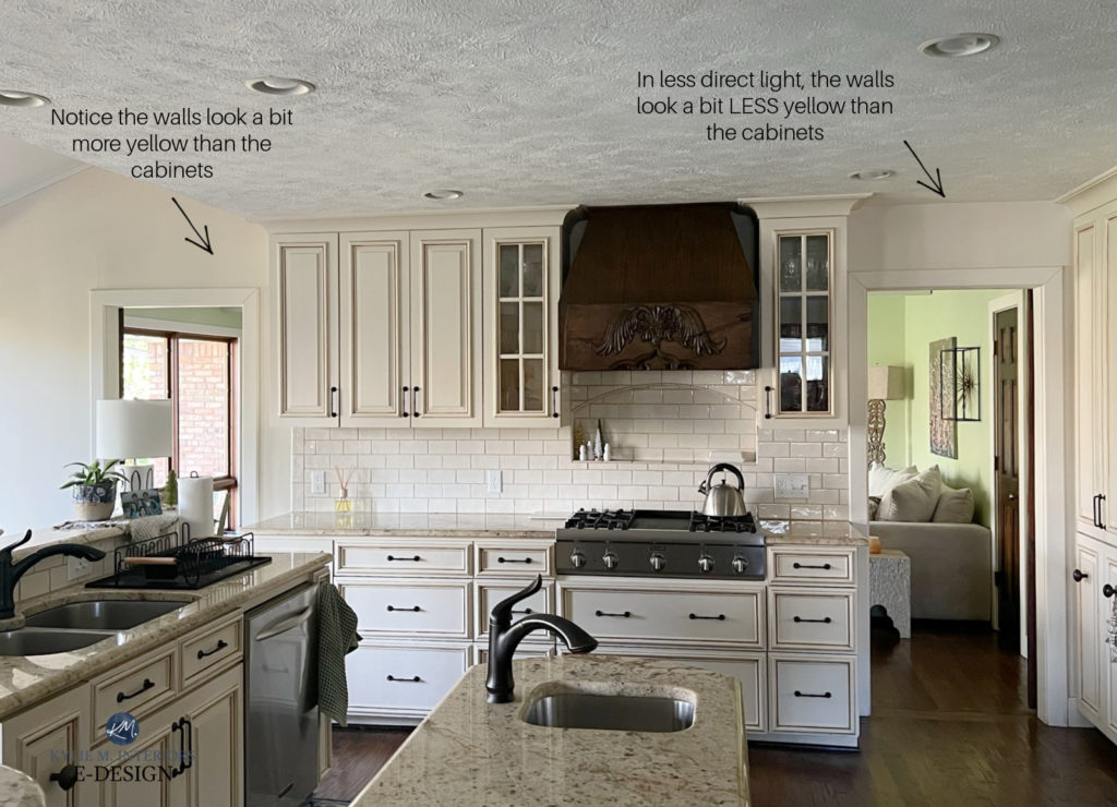
- CON: Cream is a yellow paint color with a neutral added to calm it down. As far as neutral paint colors go, cream is fussy about its wall partners, ESPECIALLY in the light range (e.g., LRVs of 50+)
- PRO: Cream cabinets can be a classic, timeless look in a considerably traditional home with the right furnishings, finishes, and decor to support them.
- PRO: Cream cabinets can suit more country-style homes (not modern farmhouses, but actual ‘country’ – insert banjos HERE).
- CON: These cabinets often suit richer beige and tan colors. While many of these are coming back in style, the combination of finishes and paint colors often dates a home and makes it look like it was designed in the Tuscan style of the early 2000s.
- CON: There aren’t many trendy countertops that suit the yellow base of cream cabinets. You may want to read this block post about timeless countertops, focusing on the black section.
- CON OR PRO: If your trims and cabinets are in a similar LRV range, they should be the same color. While this isn’t mandatory, it creates a flow throughout a home. Many paint their trims cream to match their cabinets, limiting their wall color options in EVERY room in their home. Again, if your home suits this look, amazeballs, but if it doesn’t, it’s massively limiting.
- CON: Because of their limitation in color partners, if you want to change your wall color in the future, you won’t have many options.
- CON: Cream cabinets aren’t trendy (contrary to popular belief). While they’re timeless in the odd country-style, heritage, or very traditional home, they need the right surrounding finishes not to look outdated.
Of course, if you don’t care about looking updated or trendy, you can do cream cabinets & trims till the cows come home (get it…milk…cream).

However, they’ll hold you back if you like to change your wall colors occasionally or need to consider resale.
There, I said it. If you want to learn more, I have a link to an IMPORTANT blog post at the end of this one. But for now, keep on readin’!
LET’S TALK ABOUT CREAM AS A PAINT COLOR
Many of my Online Color Consulting clients say they like cream (for their cabinets, walls, or coffee) but don’t like yellow undertones (insert awkward whistling here).
Make no bones about it; cream is a version of yellow.
Let’s look at our options.
YELLOW-ORANGE: This is the most common and popular blend. It’s also the most flexible for interior finishes.

YELLOW-GREEN: This is far less common. While it shows up in the odd home, it’s not as easy to coordinate finishes with, as fewer finishes have yellow-green hues.

YELLOW-PINK: Interestingly enough, the odd blend can grab a faint pink hue!

From there, it’s about how MUCH yellow you want. Choose a cream that’s calmed down with a neutral base if you want a muted warmth. If you want a noticeable yellow hue, cut back on the neutral and lean into the color.
The best classic cream cabinet colors are reasonably muted but not dull.

HOW DARK SHOULD CLASSIC CREAM CABINET COLORS BE?
It depends on your approach…
IF YOU PLAN ON PAINTING YOUR TRIM THE SAME AS YOUR CABINETS: Aim for a lighter cream with an LRV of 77+.
The Ultimate Guide to LRV & Paint Colors
IF YOU WANT WARM WHITE TRIM WITH YOUR CREAM CABINETS: You can explore creams with LRVs of 72+, up to about 77 or so. The challenge with doing TOO light of a cream cabinet with white trim is that it can look like a mismatch rather than a purposeful layering of colors.
LASTLY, MY EXAMPLE PHOTOS
You’ll find one consistent thread in most of the photos shown below…they’re almost ALL BEFORE photos.
Why?
I’m hired to fix a heck of a lot of cream kitchens. While I have a few ‘afters’ to share, most of my clients want to remedy their creamy conundrum. Also, the ‘afters’ I have are generally more traditional kitchens.
Now, without further ado, let’s check out the hue for you!
1. SHERWIN WILLIAMS CREAMY 7012
Creamy is the lightest cream option on our docket today. Coming in with a reasonably high LRV of 81, Creamy borders the white world…

My client hired me to fix the wall color, which is off with Creamy
While Creamy is, well, creamy, it has far less warmth and richness than traditional cream cabinets – it’s not the most CLASSIC cream cabinet color. However, even then, it pushes the comfort zone of many well-intentioned granite and quartz countertops. This said, some of the older granite countertops suit a color like this.
If you want cream cabinets, Creamy is one of the safest choices. Its LRV and subtlety make it a contender for your trims, too. Don’t get me wrong; you’ll still have an interesting time finding coordinating wall colors, but it’ll be easier than other darker, stronger shades of cream.
Sherwin Williams Creamy FULL Paint Color Review
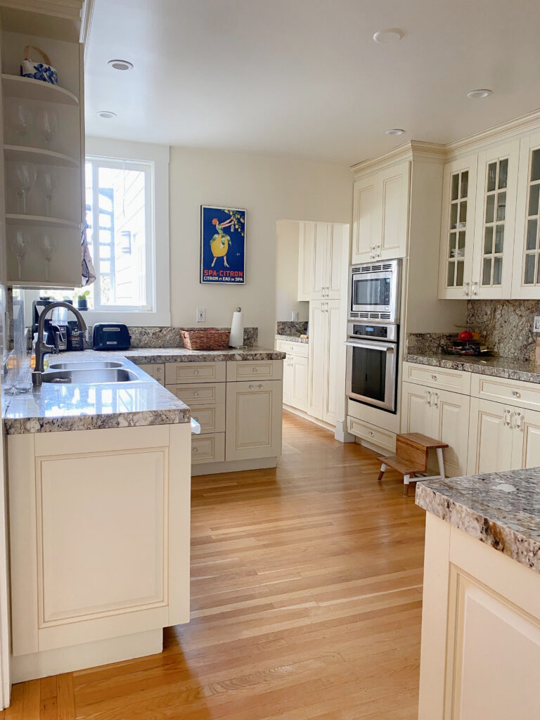
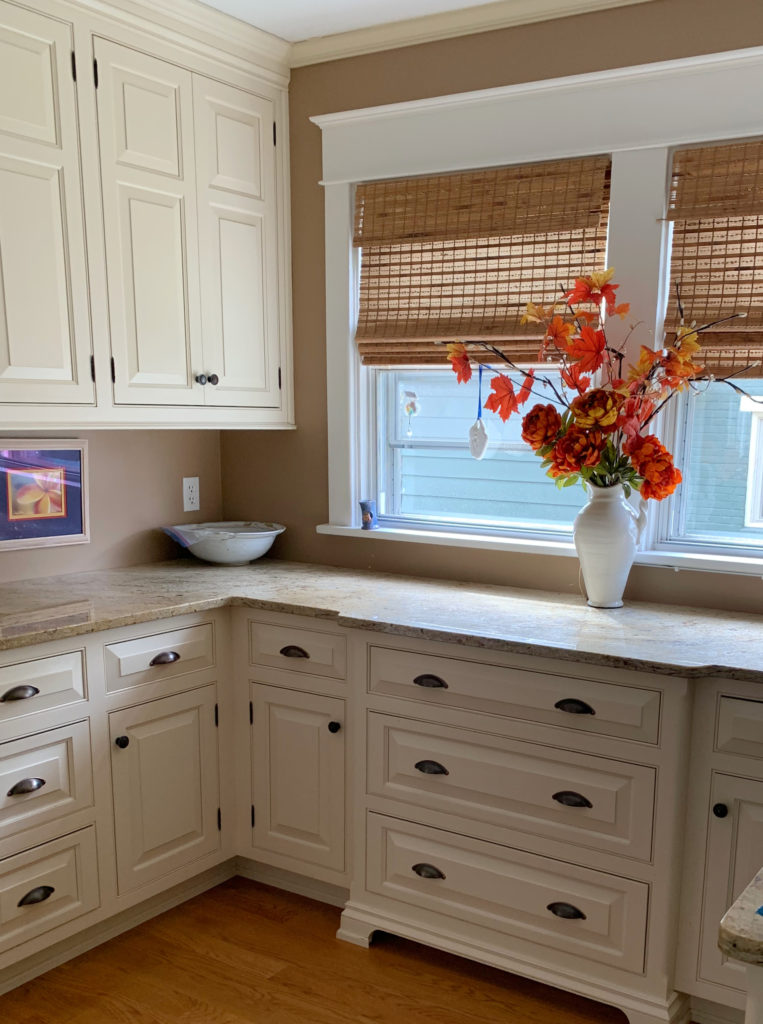
2. BENJAMIN MOORE NAVAJO WHITE
Benjamin Moore Navajo White is one of my favorite classic cream cabinet colors for those who want to commit to cream without overdosing on yellow. This is because Navajo White is a moderate cream, offering a warm, calm base for your kitchen palette.
There are a few reasons why the following Navajo White kitchen looks better than some others…

- The walls are the same color, making Navajo White look more muted. If the walls were different, the contrast could enhance their cream-yellow.
- While the island countertop might not be as creamy, because it’s partnered with a non-creamy island color, there’s a degree of separation.
- Given the character of this home, non-white cabinets make sense.
- And I know the hinges are STRONG, but they make a lot of sense in this lovely old home and weren’t going anywhere in this budget-friendly remodel!
These next Navajo White built-in cabinets teach a few lessons…

My client hire me to help them choose the perfect wall color. In the end, I suggested a WHOLE lot more, as there’s not a single wall color these cabinets, travertine tile, and carpet agree on – the cabinets must be painted (the carpet is iffy with the travertine tile, too).
- Cream cabinets fight with taupes that have a similar depth or are lighter than them, as shown with the taupe carpet.
- While many people think their travertine tile is cream, it’s beige (orange), and a cream (yellow) like Navajo White sits off with it.
- Even a muted greige-taupe like Benjamin Moore Edgecomb Gray (the walls) doesn’t work with the cream cabinets (neither these nor other ones).
This doesn’t mean Navajo White isn’t the best color for your kitchen, just make sure it suits the surrounding finishes perfectly!
Benjamin Moore Navajo White FULL Paint Color Review
3. BENJAMIN MOORE LINEN WHITE 912
Linen White is another great choice for those who want a moderate cream. Check it out in this next kitchen…
Notice how it settles in with the non-white backsplash and creates a classic, timeless look with the timeless, black perimeter countertops. If I were to make a few suggestions for this kitchen to make it more updated (while still maintaining its classic vibe)…
How to Update Older Granite Countertops
- Update the island countertop to butcher block in a stain that coordinates with the flooring.
- I’d paint the island the same color as the cabinets (once the countertop is changed).
- I ‘personally’ don’t love pendant lights with clear glass – they look abrasive to me. I prefer a shade with solid white (glass or fabric) for a softer, inviting light.
Here’s your Peel & Stick sample of Linen White…

4. SHERWIN WILLIAMS ANTIQUE WHITE 6119
Antique White is a great place to start if you want a more classic approach to cream cabinets. This rich shade of cream has an LRV of 72. This is important because if we go darker than this, we end up with beige or tan, not cream.
Here’s Antique White on interior doors and trims. My client was trying to find a good wall color (as you can see, the current whiteish color doesn’t do Antique White any favors and makes it look pastier than my freckled legs in the dead of Winter)…

We considered a range of colors from light to medium. To avoid beige and tan, we also ended up with some stoney, warm gray-greige-taupe options.
If you’d like me to help you with your cream cabinets or trim, check out my Online Consulting Packages!
My next client wanted to update their Antique White kitchen with a lighter, brighter wall color, and we were having a heck of a time. Our best option ended up being…Antique White. While there’s a slight difference (as the cabinets are glazed), this is as close as we could get to a lighter look without clashing with the cabinets.
If you like Antique White, compare it to Benjamin Moore Gentle Cream. Personally, I feel nervous about colors like these, as I’ve spent hundreds of hours helping online clients update kitchens with these colors (and we can’t always update with the colors and finishes they were hoping for).
But if you’re looking for a legit cream cabinet paint color, they might do the job!
While this isn’t Antique White, it’s darn close.
Sherwin Williams Antique White FULL Color Review
The Best MODERN & Flexible Cream Cabinet Colors
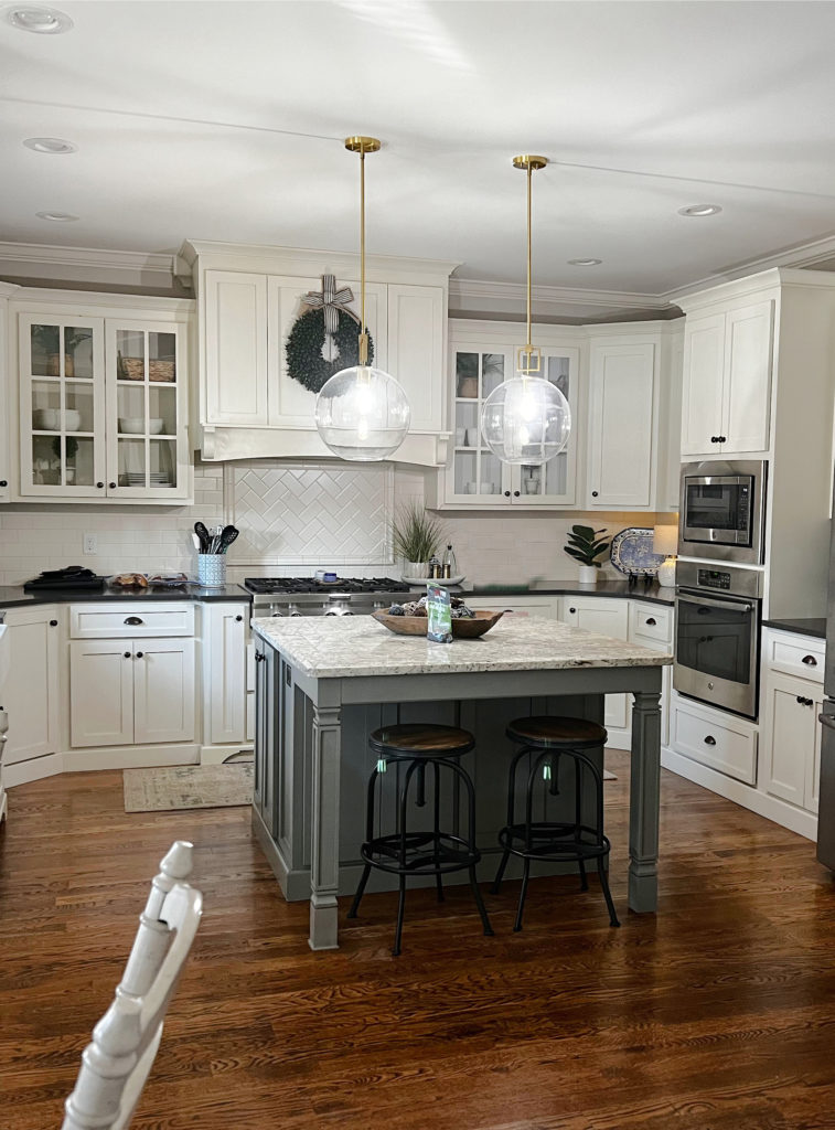
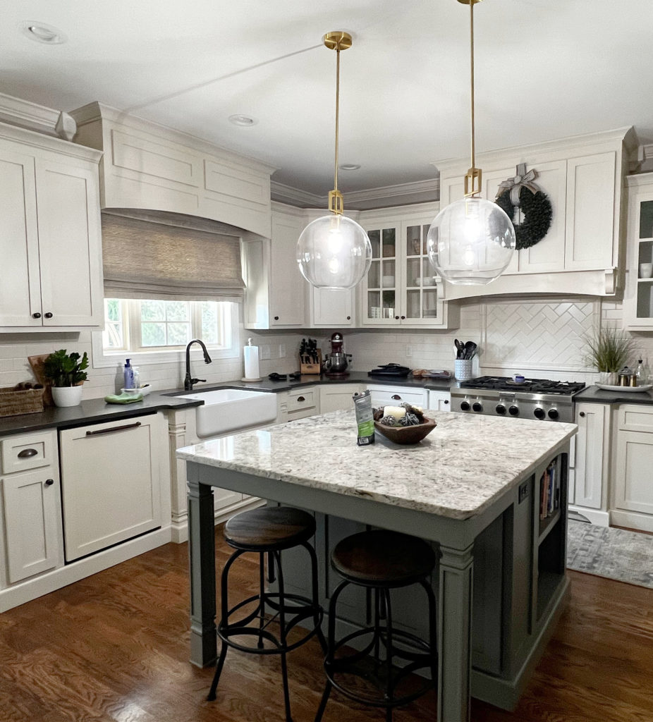
5. SHERWIN WILLIAMS CASA BLANCA 7571
Casa Blanca is a gooooorgeous cream paint color, right up there with Navajo White on my favorites list.

Casa Blanca’s LRV is 76, putting it nicely in the off-white range. As shown above, a color like Casa Blanca, whether on trims, doors, or cabinets, works well with colors with lower LRVs and warmth.
Here’s your Peel & Stick sample of Casa Blanca…

Sherwin Williams Casa Blanca FULL Paint Color Review
A FEW MORE EXAMPLES TO LEARN FROM…
Don’t just choose the cabinet color you love; make sure it ties in with your finishes.
As shown in this next kitchen, the backsplash and countertop are far too cool for the warmth of the cabinets…

Check out this next kitchen in Casa Blanca, and let’s talk about its challenges…

Even if the cabinets weren’t cream, this kitchen’s hard finishes aren’t coordinated as well as they could be.
- Casa Blanca is too cream for the tile floor’s orange-pink and taupe (purple-pink) tones.
- Casa Blanca seems to go with the warm, greige tones of the granite countertop (yay!)
- The backsplash tile is too purple and cool-toned for the cabinets, countertop, and tile floor.
- The walls are painted the same color as the cabinets, so the palette doesn’t have another color or undertone to contend with—this is a good thing.
Sometimes, there isn’t one color/fix that will make a room 100% when the bones aren’t solid.
So, where do we go from here?
- Changing the cabinet color won’t help, as the countertop and tile floor aren’t coordinated.
- Changing the backsplash to a more updated but suitable tile will help ensure that at least three-quarters of the room coordinates with itself.
- Ideally, the tile floor would be changed to coordinate with the countertop and cabinet color.
LONG STORY SHORT: Make sure cream is the right paint color for the finishes in your home.
READ MORE
Light Paint Colors to Go With Cream Cabinets
The Best MODERN Cream Cabinet Colors
How to Update Cream Cabinets & Trims: Common Questions
The Best Paint Colors to Update Cream Cabinets & Trim
NEED HELP?