
The Best MODERN Cream Cabinet Paint Colors
Cream Kitchens for a Fresh, Updated Look
If you follow my blog (thank you), you know that the above sentence was hard for me to type, you know, the whole ‘updated’ concept. Don’t get me wrong, cream cabinets can look ridiculously gorgeous but have limitations.
So, before we get into the most popular, trendy shades of creams, let’s do a little ‘food for thought’…
PROS & CONS OF CREAM CABINETS
PRO: Muted, subtle shades of cream are ‘slightly’ trendy on cabinets right now (there are just bigger trends and more timeless ones at play, too)
CON: When you want to change your wall color in the future, it won’t be nearly as easy as white or wood cabinets.
PRO: When a kitchen palette is done well, it can look next-level stunning.
CON: Most non-designers have a tough time creating the look, often missing the boat when coordinating countertops, backsplashes, and wall colors. It’s not an easy DIY.
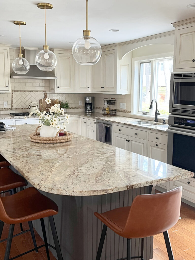
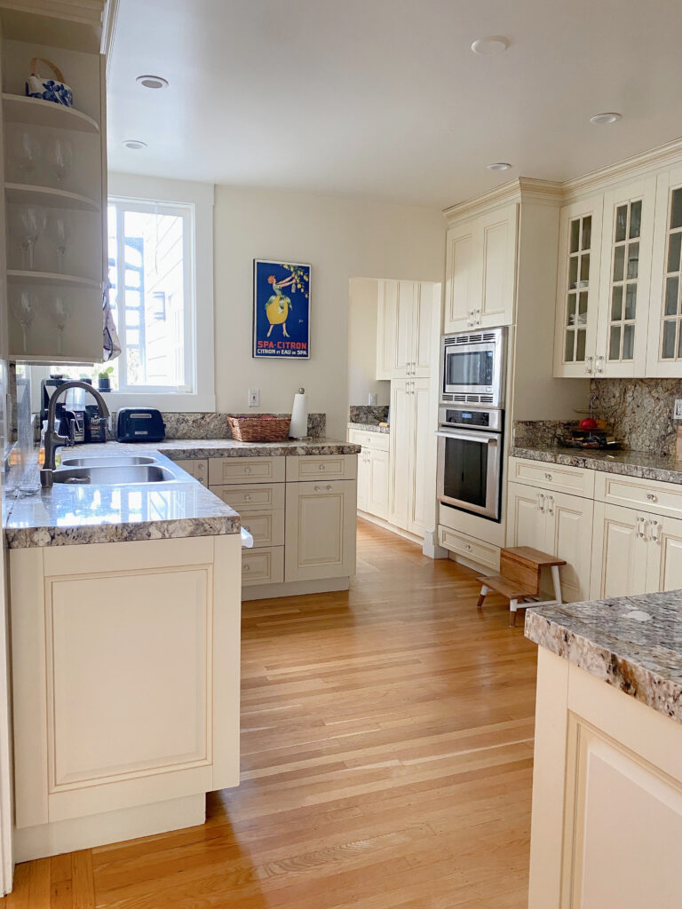
This kitchen has a more traditional look, as cream cabinets were popular in the early 2000s Tuscan trend.
While I could go on and on…and on, if you want to learn more about cream cabinets and their challenges, read this: How to Update Cream Cabinets & Trims: Your Questions Answered.
Now, if you’re still jacked to paint your cabinets cream but want a more modern, trendy version, you’ll want to look for a few things…
1. LRV: The most common LRVs sit between approximately 65 and 75.
2. COMMITMENT TO COLOR: Today’s modern cream cabinets have a low commitment to yellow. In fact, some of them don’t read very creamy until they’re on your cabinets and compared with non-creamy finishes. One reason is that cabinet makers often use lacquer-based paint that can increase the warmth/cream of your paint color.
Lastly, I don’t have many photos of MODERN cream kitchen cabinets. Most of my photos are from the early 2000s or more traditional.
Why?
Well, only a few of my online color consulting clients have requested them. When they do, we chat about the pros and cons, and they usually choose a different color that’s more versatile in the long term.
But it’s your home, and you do you, boo! So, without further ado, let’s find the hue for you…
1. SHERWIN WILLIAMS WHITE DUCK
If I have a client who wants cream-inspired cabinets or has finishes that demand them, White Duck is often near the top of the list.
With its SUPER toned-down backdrop, White Duck offers a whisper of warmth vs. a full-toned commitment to yellow. While it grabs a green undertone the odd time, it’s rare at best.
In this next home, not only are the built-in cabinets painted White Duck, but so are the brick fireplace and walls…

White Duck has an LRV of 74, so it’s in the off-white world but on the lower end of it. This said, with the sheen of cabinet paint (satin), it can look lighter than expected.
Sherwin Williams White Duck FULL Paint Color Review
In this next image, look at the white baseboard on either side of the front door. Comparing White Duck to something white is a great way to see its warmth and depth…

COLORS TO SAMPLE & COMPARE WITH WHITE DUCK
- Definitely Sherwin Williams Shoji White – you’re comparing apples to apples.
2. BENJAMIN MOORE BALLET WHITE OC-9
Ballet White is a timeless cream from Benjamin Moore. Whether you’re painting your walls, cabinets, or exteriors, many reach for it (on their tippy toes…get it?) because of its considerably muted approach. By the way, Ballet White is also known as Muskoka Trail 974 – thank you, Benjamin Moore, for confusing your customers!
Whereas many shades of cream are too yellow for the average travertine tile, Ballet White sometimes squeezes in (as travertine tile is more inclined toward beige, but not everyone wants ‘beige’ cabinets)…

As for depth, Ballet White has an LRV of 71.97, putting it darn close to the wild world of off-white, but with a bit more meat on its bones. When I have clients with finishes that call for a more muted, non-white approach, I sometimes consider Ballet White.
Notice that this kitchen has a soft taupe glaze that ties in nicely with the travertine tile floor and wall paint color…

Benjamin Moore Ballet White FULL Paint Color Review
3. BENJAMIN MOORE CREAMY WHITE OC-7
Creamy White is one of today’s most popular paint colors for cabinets (in this warm world).
Why?
Because of Designers like Studio McGee. This color likely wouldn’t have hit its stride otherwise. Shea McGee makes Natural Cream look effortless and timeless in her kitchen (by the way, Creamy White is also known as Spring in Aspen 954).
Here’s your Peel & Stick sample of Creamy White…
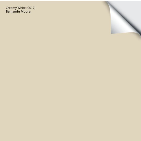
Now, whereas I’m nervous about the average shade of cream on cabinets, Creamy White has me sitting easier thanks to a neutral backdrop that slows this color right down.
Personally, Creamy White is way too strong for the average home for longevity and flexibility. It makes me die a little inside, but you do you.
With its LRV of 70.95, Creamy White is on the low end of the spectrum (just like me) and can read more bisque-inspired because of this.
4. BENJAMIN MOORE WHITE DOWN OC-131
White Down is one of my go-to’s for those who want cream cabinets but are nervous about color. This is because White Down is a considerably grayed-out, muted shade of cream while still offering a gentle whisper of warmth.
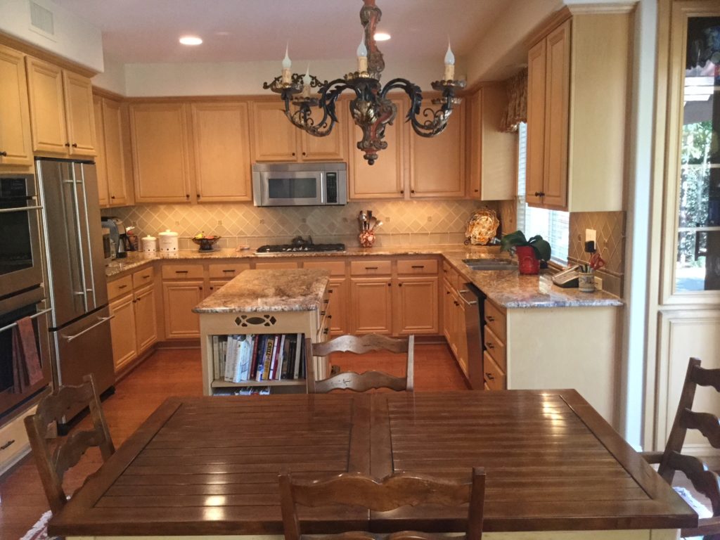
Before, this kitchen’s peach-toned maple wood cabinets weren’t doing anything for the space and didn’t work with the flooring or countertop…
After, White Down offers a soft but bright partnership for the glass tile backsplash and granite. Notice how the wood floor finally has the chance to shine…
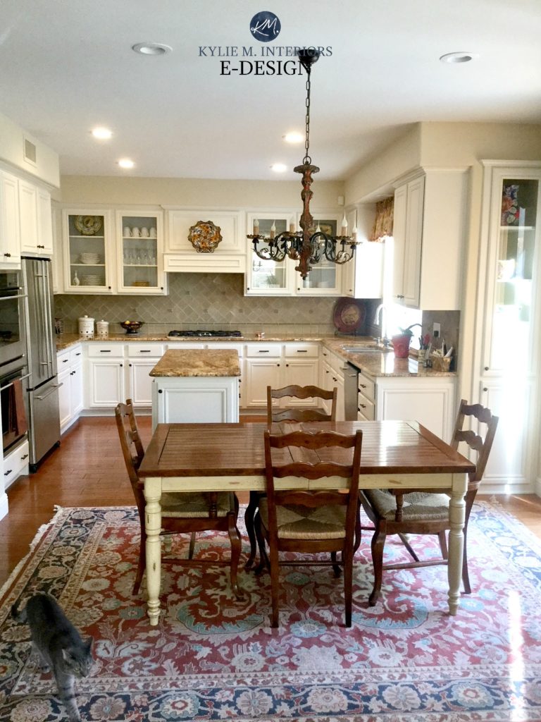
One of the main reasons White Down turned out so well is that it connects with the warm white grout around the tile. And while the granite would’ve loved a warmer, more potent cream, it would have overpowered the backsplash.
When choosing your cabinet color, your backsplash is more important than your countertops.

Sure, it’s all good in the hood if they’re well-coordinated, but they’re slightly (or more) off; the backsplash matters more because it’s on the same vertical sightline as the cabinets.
5. SHERWIN WILLIAMS CREAMY
It’s tough to say whether Creamy belongs in the ‘traditional cream‘ or ‘modern cream’ category, which is why it’s in both!

Creamy is on the high end of the off-white range, winking flirtatiously at the white world with its LRV of 81. And while it has a noticeable warmth, it’s fractional compared to most of the popular cream paint colors in the traditional world.
Sherwin Williams Creamy Paint Color Review
Here’s a good example of Creamy next to warm white cabinets, Ballet White, and ‘less yellow’ cabinet and wall colors…

By the way, if you’re eyeing up Steamed Milk, notice the difference between it and Creamy – Steamed Milk has more orange. As for Neutral Ground, it’s in the tan world, not a cream.
Creamy is also one of the few cream shades that can work WELL on trims and doors, too. This isn’t to say that it will make your life a ton easier when choosing wall colors, but it’s more flexible, for sure.
Modern Paint Colors to Update Cream Cabinets & Trims
READ MORE
The Best Classic Cream Paint Colors for a Traditional Kitchen
How to Update Cream Cabinets & Trims: Common Questions
The Best Paint Colors to Update Cream Cabinets & Trim
NEED HELP?


Good morning, Great post as we head into the new frontier of warmth. I’m going to ask a question about the color that makes you “die inside” a little – OC7. lol I’m considering using this for living room walls where the light is diffused and flat. Most colors turn gray which I don’t want or become washed out. I’ve painted the wall 2 other colors so far and they don’t work (Bone white – love it but just a bit too yellow; edgecomb lightened – right lrv but lost the warmth).
What are the undertones of OC7? Would they work with an accent wall painted October Mist?
Love your posts. Always very helpful!