Update Older Dark Wood Cabinets With Modern Countertops & Backsplashes
Refresh Your Kitchen With These 4 Trendy Palettes
Gone are the days when you could do a full, quality kitchen remodel for under 15k. These days, the average kitchen renovation runs upwards of 50K if you’re lucky, and this can vary GREATLY depending on your wishlist and your kitchen’s size.
So, when clients come to me for update ideas for their homes, my brain starts spinning with options for paint colors, countertops, backsplashes, and hardware. But my first thought is always…
Can I work with what they have – at least SOME of it?
The answer is usually yes. Sometimes, the countertops are easy to update. Other times, it’s the backsplash and the flooring. For this blog post, we’re focusing on keeping those glorious darker wood cabinets, whether they’re from the 1980s or fresh outta 2010. Sure, some kitchens need to be gutted, but in many, the bones are in place for a beautiful, more budget-friendly remodel.
Let’s save some money, honey bunny!

For this blog post, rather than being totally generic, I’m focusing some of my efforts on one specific kitchen and its dark wood cabinets (above), as it offers us some great learning moments.
Because these update ideas can be applied to MANY kitchens.
In looking at palettes, as well as a specific kitchen/case study, you can…
- Learn my thought process regarding dark wood cabinets and the modern countertops, backsplashes, and hardware that can update them.
- Understand what I look at when considering my Online Color Consulting client’s older wood kitchens and their potential and limitations.
This might have you viewing your kitchen in a new way, too!
4 PALETTES TO UPDATE THIS OLD WOOD KITCHEN
Before we jump into the palettes, let’s spend a little quality time with this lovely little space.
You might be surprised that this 1980s kitchen caught my eye…in a good way. In fact, looking at it makes me pretty darn excited.

Why?
a) I put a little Bailey’s in my coffee this morning, and b) dark wood stains are coming back in style. But that’s not all…
- The cabinet door style isn’t necessarily today’s modern choice (shaker is the most popular), but it’s close enough and doesn’t have an arched or cathedral profile (phew). Whether painted or stained, cabinets with arched door profiles are harder to make look modern.
- While the hinges are exposed, thanks to the stain color, they’re practically invisible. If we paint these cabinets white, the hinges will pop, instantly dating these cabinets.
- Minimal grain. This is important as the oak floor has a more noticeable grain; if the cabinets were also grainy oak, it could be overwhelming in such a small space.

But before we get into the nitty-gritty of the palettes, let’s deal with that peninsula. I have two photos of this area, one with beadboard (above) and one with stained wood (below). I’m unsure which is before or after, but I’d keep the peninsula stained like the cabinets.
Why?
While kitchen islands make for great accents, peninsulas don’t.
By treating the back of the peninsula as an accent area, a) it separates it from the kitchen cabinets, making the kitchen look smaller; b) it looks detached from the kitchen and the eating area – not visually belonging to either c) it’s not a natural accent area.
Would it be better if the wall space to the left of the peninsula had beadboard, too? Nope. The peninsula visually belongs to the kitchen cabinets, not the eating nook.
Now for the fun stuff! Considering that I don’t know the budget or what the homeowners do/don’t want to update, here’s what I’d consider…
OPTION 1: WHITE, BRIGHT, & BEAUTIFUL
Smaller kitchens with dark wood cabinets can look a little cramped. While some homeowners like this look, seeing it as more ‘cozy and intimate,’ others want to add a little energy! As for large kitchens with a whole whack of dark cabinets, even they can look a bit weighted and dated without careful coordination.
One of the more popular design approaches includes lighter, brighter finishes (with varying degrees of sheen) to bounce light and add some light-dark balance.
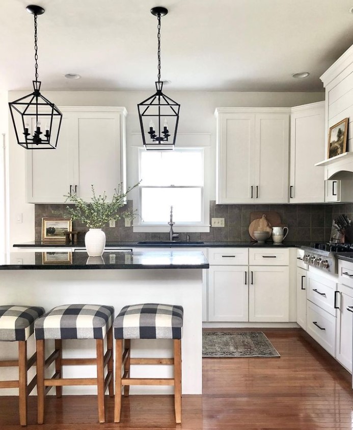
While this kitchen project (below) is from a few years ago, these dark wood cabinets still look great today because of the well-chosen countertop and backsplash (I love the hardware, too)…
Now, going back to our ‘subject kitchen,’ let’s see what we’ve got.

COUNTERTOP: Considering the cabinet’s stain depth and the gorgeous oak floor, let’s start with a white or off-white quartz or budget-friendly laminate countertop (a faux marble look could be nice), offering balance and contrast.

White quartz is the most trendy, popular countertop choice for today’s modern kitchen. And while the white-on-white kitchen will have its day, white countertops will have more lifetime when partnered with wood cabinets. The above countertop is Silestone Et Calacatta Gold, but there are many like it at varying price points and quality levels.

Lauren Liess Washable Area Rug
BACKSPLASH: With a white countertop, I’ll seriously consider installing the countertop material on the backsplash, too (countersplash/slab backsplash). You can do a slab backsplash with an affordable laminate countertop, too, including a faux marble look!
Why a slab backsplash?
The dark cabinets and white countertop create a high-contrast palette. Being high contrast, it has visual interest right off the hop; we don’t necessarily need to add more via a subway tile pattern. I mean, choosing subway tile isn’t a bad idea; you just don’t have to go that way by default – you got options, baby!
Alternatively, if you prefer tile on your backsplash, you might try a white subway tile that matches the white in your countertop (perfectly) or a neutral one that matches one of the colors in your countertop’s veins.
The Best Paint Colors with Dark Wood Cabinets & Trim
VALANCE OVER THE SINK: Valances are a dead giveaway of a kitchen’s age (usually 1980s or 199os). With this kitchen’s overall vibe, it might’ve worked without the scalloped edge. However, given its voluptuous curves, I’d take this bad boy down in a blaze of glory. Sure, this might involve some touch-ups and restaining of the side panels, but life goes on.
Valances are like crow’s feet, showing a well-intentioned kitchen’s age.
STAINLESS STEEL MICROWAVE/HOOD: I don’t mind the black, but stainless steel would be softer against the wood.

CABINET HARDWARE: I love how they’ve used knobs rather than handles, as the scale of this kitchen and its small drawers doesn’t suit handles.
I’d update these little fellas with ones that are more consistently an antiqued gold/brass look. One like this or this would do the trick – sometimes simple is best! I almost fell for the charm of these, but the gold is just a bit too strong.
WASHABLE RUG: The two sides of this kitchen feel miles apart, and this isn’t uncommon, no matter how big or small a kitchen is. I’d add a washable rug in the center of this room to bring them together. This will also give a bit of a break to the wood-on-wood effect, letting the beauty of the cabinets shine a bit more.
The same goes for a kitchen with small throw rugs at the sink and stove. I get if you need the padded ones for medical reasons, but in some kitchens, these dinky lil’ rugs separate your kitchen into functions rather than uniting your kitchen as one.
WALL PAINT COLORS: This palette suits a bright but soft and gentle look with a light gray-purple or subtle shade of taupe. I could even be talked into a subtle, off-white beige as long as it whispers at taupe and isn’t traditionally warm.
OPTION 2: MIDDLE OF THE ROAD & CLASSIC
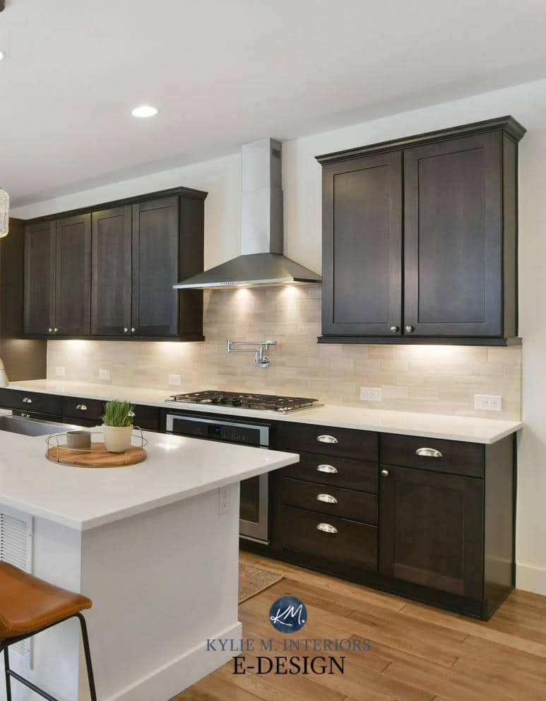
COUNTERTOPS: If white countertops make you nervous (given how trendy they currently are), how about the timeless look of a badass black countertop?
Whether you like granite, soapstone, marble, or quartz, a well-chosen black countertop will set you up for decades of success. From there, it’s about what you partner it with.

BACKSPLASH: For this option, you might consider a simple, white subway tile backsplash with white or very subtle off-white grout. Heck, depending on your wall color, you might explore a range of subway tile colors.
HARDWARE: With a shift in our colorway, I suggest a pewter or antique nickel finish so it doesn’t pop too hard on the wood while humoring the cooler look of the countertop and backsplash.
If your kitchen has exposed hinges, they play a big part in your choice of hardware, as it’s best if the hinges recede into your cabinet color (and they should always match the knobs/pulls).

WALL PAINT COLORS: This palette can humor a range of subtle neutrals, including Sherwin Williams Drift of Mist, Gossamer Veil, Sherwin Williams Heron Plume, along with subtle gray-green-blends.
DARK WOOD PALETTE 3: LET’S GET YOU IN THE MOOD
Usually, just talking about wood gets me in the mood, but sometimes, I need a bit more of a push. In this case, walking into a kitchen with a moody, muted vibe would do the trick (throw in a bottle of wine, and I’m all in).
COUNTERTOP: I’d choose a countertop that’s as black as possible. Whether it has some veining depends on whether I opt for marble, laminate that looks like black marble, quartz, or granite – I would want some interest but err on the side of less is more. I love soapstone, too, but it tends to look softer and more muted, whereas I want a sharper black.
BACKSPLASH: I’d check out a darker taupe tile to keep a low contrast, moody vibe. I also love this slate-inspired one (it shows 4×4 but says 3×6), as the soft gray would transition so well between the dark wood and black countertop.

HARDWARE: Considering the countertop, I still lean into a muted pewter knob.
WALL PAINT COLORS: Let’s warm this bad boy up with Sherwin Williams Modern Gray, Benjamin Moore Edgecomb Gray, Elmira White, or another soft, muted, warm neutral.
DARK WOOD PALETTE 4: AFFORDABLE & FUN DARK
If I’m updating this kitchen on a tight budget (story of my previous life and my wheelhouse when helping clients), I know exactly what I’d do…
COUNTERTOP: Laminate countertops have come a long way. Sure, they’re not real stone and not as hardy as quartz, but they’re a GREAT bang for the buck. For this particular kitchen and its gorgeous dark wood cabinets, I’d eye up Formica Jet Sequoia for its clean black finish and marble-white veins. Check out this blog post to explore more beautiful laminates.
BACKSPLASH: To keep the project more affordable, I’d consider two options…
1. White subway tile backsplash. If I’m up for a DIY, a kitchen backsplash with a simple, white subway tile backsplash is a great place to start.
2. If that seems ambitious, I’d shift gears to a more temporary solution (that can last a long time) – DIY-friendly marble peel-and-stick backsplash.

WALL PAINT COLORS: This palette calls for a calm, cool, collected look with a subtle gray-purple or a bit more color like Benjamin Moore Cement Gray. We could check out cooler shades like Sherwin Williams Evening Shadow or the passive approach of Light French Gray and On the Rocks.
The Best Neutral Paint Colors With Dark Wood Cabinets
Do you have a favorite palette of the four? Do you see the potential to update your kitchen (or bathroom) with some of these ideas? I’d love to see photos!
READ MORE
6 Ideas to Update Your Wood Kitchen
Update Your Wood Kitchen Without a Drop of Paint
The Best Paint Colors to Go With Wood Cabinets
Are Your Wood Cabinets Back In Style?
NEED HELP?
Check out my Online Paint Color Consulting!