
Sherwin Williams On the Rocks SW 7671: Paint Color Review
Sherwin Williams On the Rocks: a popular blend between warm & cool
If you’ve been researching the TOP gray paint colors, it’s no surprise that you stumbled across Sherwin Williams On the Rocks. Not only is it one of the most POPULAR shades of gray, but it also has some of the more subtle undertones, making it versatile for many interior projects.
WHAT TYPE OF PAINT COLOR IS ON THE ROCKS?
On the Rocks is an impressive shade of GRAY. When it comes to a gray that looks like a true gray (no undertones), On the Rocks certainly nods in this direction, but remember – EVERY GRAY HAS UNDERTONES (which we’ll be looking at shortly).

IS ON THE ROCKS A WARM OR COOL GRAY?
On the Rocks is neither warm nor cool; it’s what I fondly call a ‘stormy’ gray paint color, or if you prefer, a SOFT one. Some gray paint colors are ICY cold, whereas others are more obviously warm. While On the Rocks has a tiny wink of warm softness, it’s fractional at best. Just like Malcolm – it’s in the middle.
This also means it can flex A LOT, depending on your room’s exposure. For example, if you have a north-facing room, On the Rocks can lean more into its gray base, looking much colder (violet-blue) WITHOUT looking icy. On the other hand, if your room has south-facing light or afternoon western sunshine, you can expect On the Rocks to look a bit warmer – without looking like a traditional warm gray paint color.
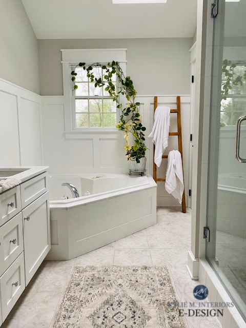
In this next photo, On the Rocks is washed out by a SUPREME hit of natural light (windows and skylights) and photography skills, but all the same, she sure is purdy…
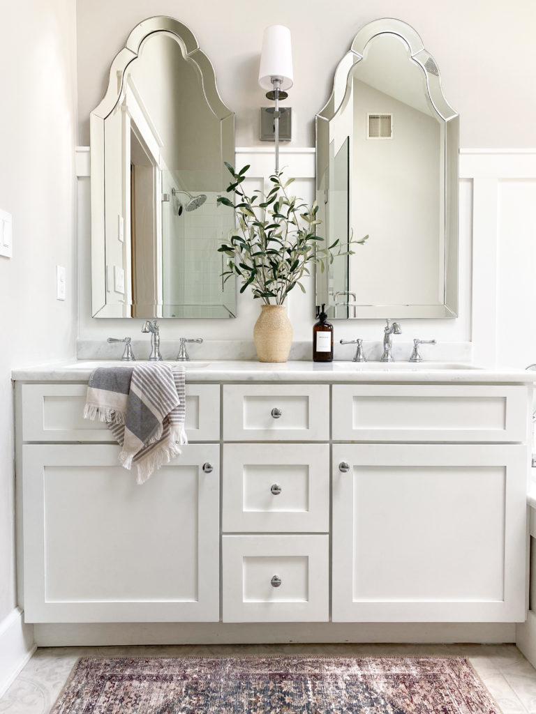
Sherwin Williams Pure White vanity
Here’s the same bathroom with more muted natural light and no interior lighting. All the same, these two photos are as warm as I’ve seen On the Rocks look…
North, East, South, West – Which Paint Color is the Best?
What do the above two photos teach us?
- Paint colors can shift their appearance based on the time of day and the WEATHER of the day.
- You can also expect a shift depending on who’s taking the photo and with what camera.
- The degree of editing that’s done.
This tells us NEVER to choose a paint color based on what we see in a photo – do your research in your OWN home by reading and sampling. Which leads us to…
WHAT’S THE LRV OF ON THE ROCKS?
On the Rocks has an LRV of 62, making it BANG-ON my magical paint number for the ‘average room‘. This LRV puts On the Rocks in the light range (learn more HERE).
Thank you to my Color Consulting clients for sending in their after photos – they make my colorful world go round!
Not sure what LRV is? Finish this blog post first, and then CLICK HERE TO HAVE YOUR MIND BLOWN.
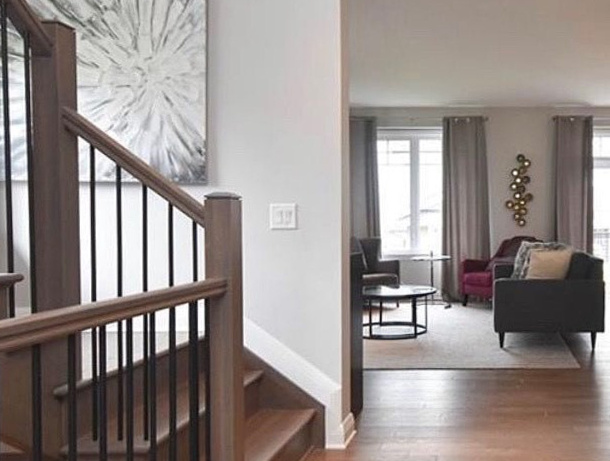
In this next photo, even though the room is reasonably bright, On the Rocks holds its violet hue quite well. To be honest, this is BY FAR as violet as you can expect On the Rocks to EVER EVER look…
USING PEEL & STICK SAMPLES TO EXPLORE ON THE ROCKS!
Like with every paint color, I highly recommend using SAMPLIZE. Samplize is a peel & stick paint sample that you can easily move around your room for over HALF THE COST of traditional sample pots – and they deliver right to your front door!
Learn all about Samplize HERE
WHAT ARE THE UNDERTONES OF ON THE ROCKS? Will it look purple or blue?
On the Rocks comes in pretty soft with a violet undertone. In some lights (i.e. north-facing or cool bulbs), this undertone can lean slightly cooler but rarely looks like a legit violet-blue. On the other hand, put On the Rocks in a room with some solid southern or western afternoon sunshine, and it picks up a TINY bit of warmth (to call it violet-pink would be an overstatement).
This next photo is about as violet as you can expect On the Rocks to look, keeping in mind it’s visually supported by other gray violets.
Long story short, while On the Rocks has a violet undertone, it shouldn’t read like a ‘true violet hue’. As for blue, I’d be darn surprised and would be looking at my paint color’s environment before I considered changing the color itself (i.e. consider the exposure, adjust the light bulb temperatures, etc…).

WHICH WHITE PAINT COLOR GOES WITH ON THE ROCKS?
With On the Rocks, I recommend Sherwin Williams High Reflective White for your trim or cabinets. If you like a slightly softer approach, Sherwin Williams Pure White is just as pretty.
SHOULD I Paint My Wood Cabinets White? A QUESTIONNAIRE
The 4 Best White Paint Colors from Sherwin Williams
IS ON THE ROCKS A GOOD EXTERIOR COLOR?
On the Rocks can work on the exterior as long as you and your home’s finishes are okay with that violet undertone. While it can sit more passively on interior walls, it can show up a wink more on some exteriors. Also, remember that this DEPTH/LRV of paint color can wash out quite a bit if you have a lot of bright natural light.
5 Tips for Choosing an Exterior Paint Color
IS ON THE ROCKS POPULAR?
On the Rocks isn’t as popular as the warmer end of the gray world. However, as it relates to grays that can look that bit cooler, it’s at the top of MY list.
WHICH PAINT COLORS ARE SIMILAR TO ON THE ROCKS?
If you’re looking for an exact match in a different brand, you’ll never get one. However, there are many colors with similar intentions, just slightly different LRVs, undertones and nuances.
- Sherwin Williams’s Big Chill has a blue undertone compared to On the Rock’s violet undertone.
- Benjamin Moore Collingwood is warmer than On the Rocks but has a similar depth.
WHAT PAINT COLORS GO WITH ON THE ROCKS?
I love On the Rocks, but like myself, it’s finicky regarding its partners. You can start by checking out…
- cool gray paint colors that are the same depth or DARKER than it, especially with similar undertone profiles
- it can handle gray colors with blue or blue-green undertones (but doesn’t love committed green undertones as much in some depths)
- On the Rocks DOESN’T love most greige, cream or beige paint colors unless they’re SUPER muted and in the off-white range
- it DOES like to be partnered with white, blue-gray paint colors and navy blue!
Not sure if On the Rocks is right for you? Want a bit warmer or cooler? I’ve got more!
Paint Color Review: Sherwin Williams Crushed Ice
Paint Color Review of Sherwin Williams Big Chill
Is Gray Still Trendy for Walls, Cabinets & Exteriors?
Paint Color Review of Sherwin Williams Repose Gray
Not sure which paint color is best for YOUR home?
Check out my Online Paint Color Consulting – I’d love to help!

ORIGINALLY WRITTEN IN 2019, UPDATED IN 2022


Hi! I wonder if I could just ask a question?! I just need a place to start. My whole house throughout the interior is wherein Williams macadamia. We bought the house a few years ago (house built 2011). The brownish granite, cabinets, tile, wood flooring etc (popular in early 2000). The macadamia looks fine throughout other than the small bedrooms. By the way same color on the ceilings. These little rooms are like little cardboard boxes to me. Not a whole lot of light (one window). I am wanting to brighten these little rooms up without painting the rest of the house right now. I will some day!! I wanted something that would kind of flow with this color ( bedrooms right off of hallway). I would like much lighter though. Not white but maybe a cream type color. I am on first name basis with the staff at Sherwin Williams. I’ve ordered from sampling too! I’m still overwhelmed! We’re not grey people and are glad beiges are coming back! Any suggestions at all?! Any advise would be appreciated! I would love to hear from you!
Amy Travis
Hi Amy! It’s SO hard to say without seeing your home, but you could take a look at colour that kind of blend the cream and beige/tan worlds, colours like SW Eaglet Beige and Chopsticks could be a place to start!
Hi Kylie, I love reading your blog. I wish I had hired you before painting, and my husband is ready to kill me. I have On the Rocks because I wanted BM Nimbus but was afraid it would be too dark. I have green countertops and a grey fireplace in the space, white Chantilly Lace cabinets. Now On the Rocks looks purple, unfortunately. Do you think I could change my lightbulbs and fix this to make it look warmer and more grey/beige? Or do I need to repaint?
Hmmm. That’s a tough one. I mean, funny enough, lower quality bulbs (eg. those with a CRI of 80 or lower) can give off a greenish tint, but it can look a bit…off. YOu might at least try nice warm bulbs, maybe around 2700 and see how that goes? You might not get green, but it could at least soften things!