
The 5 Best White Paint Colors: Sherwin Williams
Warm, Cool, Bright, & Badass – All the Whites You Need…
When choosing the best white for your walls, trims, cabinets, or exterior, it’s hard to know where to start. Once you figure that out, you have to FIND that magical color!
Well, lucky for you, this previous blog post will teach you where to start regarding the 5 Types of White, while this one narrows it down to the BEST OF THE BUNCH.
Heck, you don’t even have to read that other blog post. If you’re feeling brave, order each of these samples and see which one(s) your interior finishes relate to. If that doesn’t work, Benjamin Moore also has amazing options (including one of my favorite shades of white).

Sherwin Williams has some wicked whites, so your chances of finding the perfect one for you and your home are pretty good—especially when you have me in your back pocket (by the way, I pinch).
As you’ve probably discovered, whites can be a real bugger. Not only do you have to think about which undertones are hiding in them, but they’re also susceptible to picking up reflections from the environment, such as:
- Green grass or landscaping outside the window
- Warm-toned woods (flooring/cabinets/ceiling)
- Feature walls
- Strong colored furniture or drapes
- Light bulb temperatures or the color of glass on light fixtures/shades
So, what is a girl (or guy) to DO? Check these out…
1. SHERWIN WILLIAMS PURE WHITE 7005
Pure White is one of my favorite go-to whites, but it’s not a STARK CLEAN white; it has a warm softness. I won’t say there’s enough warmth to make it overtly creamy or yellow, but it takes away that crips cool edge that some other whites have.
Looking at the tiny sample, Pure White can look a bit flat and even a touch dull. On a large scale, Pure White will act quite similar to a legit shade of white, just not as crisp/clean/icy as some others.
Pure White tends to look like a bright white without the starkness or sharpness of popular cooler and brighter whites.

FUN FACTS ABOUT PURE WHITE (FUN…IF YOU’RE A COLOR NERD)
- Pure White is beautiful for cabinets if you are going for a ‘white’ kitchen. However, if you’re looking for a white with a noticeable soft, almost creamy warmth, you may want to check out Alabaster, which is coming up shortly, or one of these warm white paint colors)
- If you’re using Pure White on your walls, I suggest painting the trims/ceilings/walls all the same color but in different sheens
- In a north-facing room, this color will lose its warmth. In a south-facing room, it will warm up, as its roots suggest and as the sun dictates.
- Pure White is a fabulous trim, door, and ceiling color and can be used with warm or cool wall colors.
- With an LRV of 84, Pure White is a SOFT white, not a stark or clean one (the more tint there is, the lower the LRV number goes – read more here)
FULL COLOR REVIEW of Sherwin Williams Pure White

2. SHERWIN WILLIAMS EXTRA WHITE SW 7006
Extra White is said to be Sherwin Williams’ whitest white, as it’s a bit cooler-looking in the fan deck (I might beg to differ; there’s a different one that wins in my books). However, in cabinet and trim paint, it often picks up a subtle warmth, which actually makes it a bit more appealing, if you ask me. However, this does make it finicky if you planned on doing your WALLS and trims/cabinets the same color, as there could be a slight shift in color between these surfaces.
On the small scale, especially in the fan deck, Extra White looks like it has a blue undertone. But you just wait, get that quart or gallon of paint – paint up a sample and see how you feel – it might not be as cool as you think!
Here’s Extra White on the fireplace surround and ceiling…

Here’s a great shot of Extra White with beige walls (Sherwin Williams Natural Linen)…

PROS & CONS OF EXTRA WHITE
- Extra White is great for cabinets if you want a slightly crisp, modern, contemporary look for your cabinets, doors, trims, and ceilings.
- In a north-facing room, Extra White could look a touch too cold for the average home or homeowner (on walls—it’s still great for trims and cabinets).
- In a south-facing room, the warm southern light will add some warmth to your walls and whatnot.
- Extra White has a slightly higher LRV than Pure White – 86 (LRV blog post)
FULL COLOR REVIEW of Sherwin Williams Extra White

Click on the above image to see my E-DESIGN packages!
3. SHERWIN WILLIAMS ALABASTER SW 7008
Alabaster is stunning, especially if you want a softer, warmer approach to white (which is SUPER popular these days)…

Remember the previously mentioned Pure White and how it generally ‘looks like a bright white’? Welllll, Alabaster doesn’t do this. Or, I guess it’s open to perception, but I can’t help but look at Alabaster and see its pretty warmth. Sure, it looks white, but it definitely looks like a soft, warm white.
Alabaster has a lovely creamy backdrop. Those who love white but are nervous about cream usually find it a bit too strong and shift to Pure White or my favorite Benjamin Moore white. But for those who crave a gentle warmth, Alabaster can be the perfect choice for walls, trims, and cabinets.
And while I rarely recommend mixing and matching whites, Alabaster looks beautiful with Extra White trim and doors…
Alabaster is also beautiful on exterior trim if you want a softer, creamier look than traditional white.

Read more: FULL COLOR REVIEW of Sherwin Williams Alabaster
PROS & CONS OF ALABASTER
- Alabaster is one of the best warm whites, as long as you’re cool with a bit more noticeable warmth than average.
- In a south-facing room, the warmth will absolutely rise up. Sample carefully to make sure it doesn’t go too warm for you.
- If you have a north-facing room (or eastern afternoon/western morning) and want white walls, Alabaster can be a great choice. Its warmth adds a touch of balance.
- Alabaster has an LRV of 82, so it has the most tint/depth of the bunch, but it’s still soft and subtle.
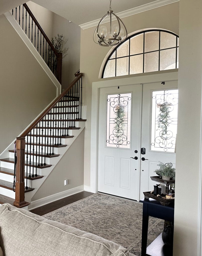
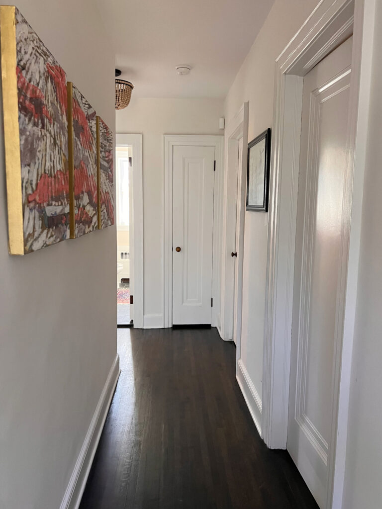
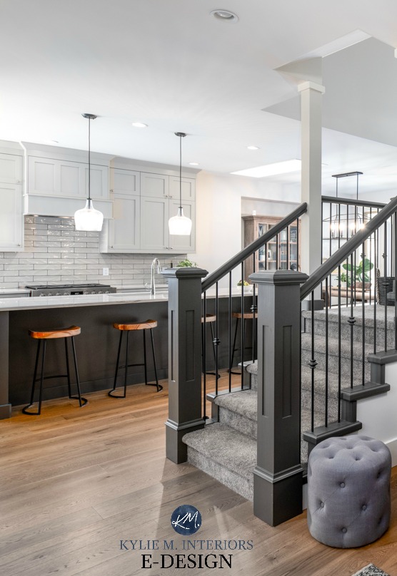
All images on my blog are REAL HOMES from my Online Color Consulting clients, readers, and friends. Thank you for sending your photos; you make my colorful world go round!
4. SHERWIN WILLIAMS WHITE SNOW
While I used to have mad love for High Reflective White, it’s so friggin’ hard to get that I had to put it aside. In its place is a newer shade of white from Sherwin Williams – White Snow.
- White Snow is one of Sherwin’s brighter shades of white with its LRV of 90. Sure, it ain’t 94 (High Reflective White, but good luck getting that), but as far as brighter whites go, it suits the average home.
- White Snow is similar to the popular Benjamin Moore Chantilly Lace – it’s just a wink warmer.
- If you really want to mix and match whites (I wouldn’t), this is one to play with, as long as the trim/cabinet color is a softer/darker white and the walls are a softer/darker white.
- White Snow could look a bit cool in northern light as it doesn’t have as much warmth as some of the more obvious warm shades like Alabaster and Benjamin Moore’s Simply White.
Here’s your Peel & Stick sample of White Snow
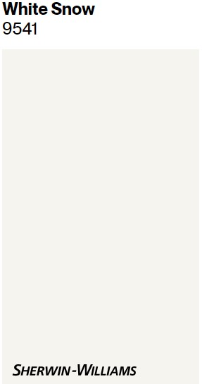
My FULL Paint Color Review of Sherwin Williams White Snow
5. SHERWIN WILLIAMS SNOWBOUND 7004
I’m next-level obsessed with this color. I mean, I love Ryan Reynolds and wine…and Starbucks and Cornuts, but Snowbound takes up a huge corner of my heart (snuggled right next to Ryan).
However, it’s at the bottom of the list because it’s not a no-brainer. I mean, not that any color is, but Snowbound is fussy, more so than the other whites.
But when it works – it’s pure magic.

It’s MUCH easier to find dark colors that suit Snowbound than light colors.
And I didn’t used to love it; in fact, it scared me a little because it’s unpredictable. However, as with so many colors…
It’s about the right color in the right space.

So, let’s hit some pros and cons right off the hop rather than me explaining everything and then repeating it…
My FULL Paint Color Review of Snowbound
PROS & CONS OF SNOWBOUND
- Snowbound is a great way to get passive warmth. If you have southern or afternoon western sun, it WILL be warmer and can easily grab a touch of pink and yellow (depending on the amount of light/surrounding finishes/etc.).
- These pink and yellow undertones sound scary and can be, but it’s about what’s surrounding Snowbound.
- Snowbound does best when it’s on every surface—cabinets, trims, ceilings, and walls. It is next-level stunning when used this way (as shown below).
- If you do Snowbound trim and cabinets, you will have a heck of a time coordinating wall colors with them—it’s fussy, which is why it’s often an ‘all or nothing’ choice.
- This could be your perfect shade if you want a more unique approach to white and aren’t afraid of slightly pink or creamy hues.

The lovely Bahama’s home of my friend, LeMel Jewlery owner, Jen.

Are there exceptions? Hellllls yeah, there are ALWAYS exceptions; I’m just trying to keep things meat n’ potatoes around here to get you started.
- If you have northern light, Snowbound won’t look cold, but it’s not overly warm—it’ll just have an interesting softness.
- Snowbound is lovely as an exterior trim color, but in alllll that natural light, I would worry about it on siding and stucco. I’d wonder if the pink would pop up too much.
By the way, did you know that Sherwin Williams has a whole different line of whites? Learn all about them HERE…
SHERWIN WILLIAMS DESIGNER EDITION WHITE PAINT COLORS
NEED HELP?
Check out my E-design and Online Color Consulting
Chat soon,

READ MORE
The 3 Whites I Would Never Paint My Trim or Cabinets
The 8 Best Benjamin Moore White Paint Colors
How to Choose the Best White for Your Kitchen Cabinets
ORIGINALLY WRITTEN IN 2019, UPDATED IN 2024


Hi Kylie,
I’ve read so many of your posts and really like the way you analyze paint colors, so I’m looking for some quick advice that I’m confident I can trust. Our house has oak trim (to stay). Based on one of your articles, it’s stained more towards the red or orange/red. We want one basic neutral whole house SW color to update the interior walls. It’s a modest 3 BR home, so we’re looking to do it all in one color – not for a “flip,” just for us. We’ve considered Repose Gray, Accessible Beige, Agreeable, Anew, and a bunch of others! With our wood trim, what is your best suggestion that will certainly work and not clash our wood?
Hi Joe! Hard to say without seeing it, along with your other finishes like countertops/tiles/etc…I can’t give you anything with 100% confidence, but I’d be inclined to go a bit warmer than where you’re at as those colours will contrast that bit more with the wood. Accessible is the best of the bunch and definitely worth sampling and you might also look at Sherwin Williams Canvas Tan and Natural Tan as well. Some of these can grab a wink of green, but I think you’re better off there than with the gray-greige bunch. BM Collingwood – that IS one warm gray I’d look at.
Painting the exterior of our South Florida home in Repose Gray. Which white trim would look better… Pure White or Extra White?
Thank you!
Hi Dee, I might actually land in the middle with High Reflective White!
Hi Kaylee,
I have a question, but I cant remember in which one of your blogs I left it on( (I’ve read most of them).
We are building a white pine log cabin. . All bedrooms have 2 exterior walls that are pine log. The floors will be white oak stained in a provincial color. I am trying to decide which shade of white to paint the interior walls and ceilings. I was thinking of sw alabaster or pure white, I would like a warm white, but don’t want walls to look yellow. What would you recommend? Thanks.
Ooooo, if you don’t want too yellow, Pure White will be a SAFER bet for sure, but there is BM White Dove that kind of sits in between the two as well! Those are usually my two go-to warm, but not too yellow whites :).
Thank you so much!! I will look into white dove too.
Hi Kylie,
I just wanted to follow up and thank you so much for answering my questions and for your recommendations. i went with BM White Dove as you suggested and I couldn’t be happier with how it looks. It brings the warmth I wanted, but not yellow, and it looks great against the white pine. I have pics if you would like for your portfolio. Just let me know where to send them. Thanks again!!
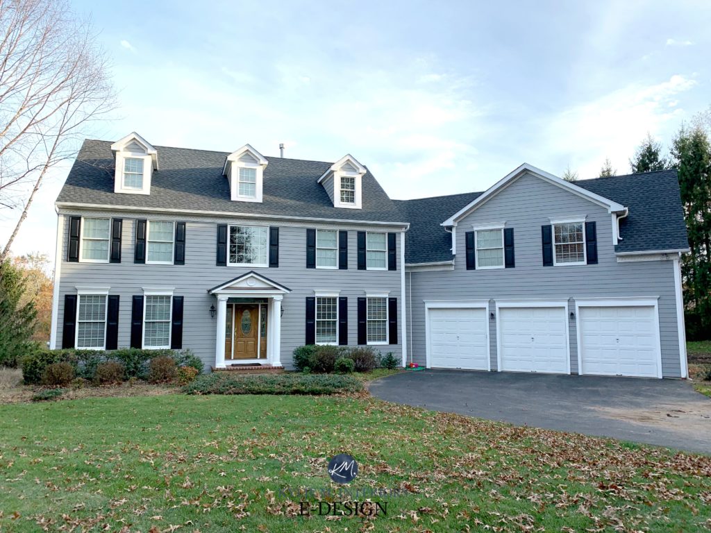
Hello, Kylie! Can you please share the grey paint colors used on the two client photos you showed highlighting SW Extra White on exterior trim? One house is a three-story, grey colonial home, and the other picture shows a close-up of the entryway of another home. I am interested in the names of both grey colors used on these homes. Thank you for your help!
Hi Lindsey! I know one was Sherwin Williams Classic French Gray and I think the other one was Westchester Gray perhaps?
Thank you so much for your help! 🙂
Hi Kylie,
I love your blogs and refer them to people all the time! So informative and you make it so fun! Question. We have SW West Highland White on our kitchen cabinets and baseboard trim throughout our home with rustic window trim and floors. What greige color would you suggest for our East facing family room with skylights that is off our kitchen? It has a greige – leaning towards gray – mortar on fireplace with brown brick. SW West Highland White mantle and armoires on either side of fireplace. Thank you for your help!
Hi Sue! It’s just SO hard to say without seeing the space as between the fireplace brick/mortar, countertop and exposures, there’s a lot to consider. I mean, off the TOP, because West Highland White has quite a bit of yellow to it, you may want to look at a greige with a bit more depth and a touch of green. BUT, that’s not to say this will suit your home and all of its finishes. I would start with the likes of SW Amazing Gray perhaps and work out from there 🙂
Hello! I really need some help, after searching I ended up painting my (west facing room) alabaster, however I think it looks yellowish and I’m not sure about paint the rest of my walls (I also have other windows facing different directions) most of my furniture is beige/ dark wood/ and light beige. I would like it to feel cozy without looking yellow because I’m into the “organic modern” aesthetic. Please I would love if you can help out!
Ooooo, it SOUNDS like you need SW Aesthetic White, which is more of an off-white beige (and my latest obesssion!)
Hi. I’ve enjoyed reading your posts about paint colors. We’ve recently redone our kitchen and running into an issue with SW pure white paint. It’s more warm and off white on the door, walls and trim (using eggshell and satin) and then more cool white when they sprayed the cabinets with a pure white Sw oil based paint. It almost looks like two colors. Have you run into this when using an oil based product? Not sure what to do at this point. Thank you.
Uggggh, yes, I have run into this the odd time. It happens with almost any color as the formulation of the color changes as you go into the different types of paints and sheens. Some are SUPER compatible, whereas with others, there’s a shift. For example, your walls and trims are good even though they’re different sheens and maybe even different lines of paint, but for whatever reason, the oil changes. My best advice would be to get them to tint it to match the REAL Pure White and get them resprayed…or consider doing the cabinets in the trim paint if it’s one that can be used on cabinets.
I want to paint my walls in my living room in a 100 year old bungalow alabaster by SW and need a trim color to go with it. Would love your input.
I HIGHLY recommend using Alabaster for consistency and flow!
I am painting the exterior of my home Sherwin-Williams peppercorn. I am looking for a white trim color that is white, but not blinding. Do you have any suggestions?
Thank you!
What about something like SW Snowbound?
hi Kylie,
I’ve watched so many of your videos! So much information, thank you ! But I have a question, what white , off-white, or cream on the wall would look good with pink/rose flagstone flooring in all exposures? Warm white with yellow undertones, green undertones, or violet undertones? none of the above 😉
Thanks for all your wonderful content!
Hi Kylie, what do you think of ultra white Sherwin-Williams with an L RV of 94.5? It’s in their emerald designer line. It’s probably the same as Valspar ultra white, since Sherwin William owns it. My cabinets are custom and were painted this color. They weren’t supposed to be this color. The sample was old and oxidated in the kitchen showroom. I have a lot of trim and beadboard and didn’t plan on having to have it painted so bright. My floors are a white/black marble style with taupe veining and black/slight white veined soapstone. I guess it will be tough to darken the trim. I haven’t seen any reviews on that paint, so I’m curious about what you think of that color.
Ahhh yes, i was SO excited to discover this color, only to understand it’s not easy to get at every store :|. It’s like, why can’t we just get a white with a higher LRV from SW that’s easy to get!!!! But heck, if you can get it, it can be a great ‘bright simple white’ option!
Hi Kylie–I’ve just discovered you, and you are AMAZING! I’m currently renovating honey oak cabinets in a kitchen with very little natural light. The room seems so dark! I will be adding recessed lighting and would like to paint the cabinets SW Snowbound. What do you think? I don’t want a stark white, but I don’t want to see yellow (or pink) coming through! I’m shooting for a light quartz countertop with small gray veining. Am I on the right track–be brutally honest! 🙂
Oooo Jaime, Snowbound can be SO pretty…but so unpredictable, I just don’t trust it for this. The most TIMELESS approach would be white cabinets, for sure – and it sounds like SW Pure White could hit the mark for minimal yellow-pink. If I were to do non-white cabinets, I would atleast step into the ‘light depths’ like Agreeable Gray and work on improving my interior lighting, which it sounds like you’re doing! Agreeable GRay can be pretty with BM White Dove, too :).
Hi Kylie! I have been following you forever, and SO appreciate your very helpful videos and articles! Would you mind sharing the paint colors used in the first and 15th (the one with hats on the wall) photos, please? Also, I recently watched your videos on countertops and checked out your kitchen packages. Would you be willing to do some packages for laminate options? I have ordered samples from both Formica and Wilsonart, and hopefully will have a selection or two soon. Thanks!
Hey Lisa, I’m sorry for the HUGE DELAY – I get pretty backed-up wiht comments sometimes :). The very first photo is SW High Reflective White and the one with the hats is SW Snowbound with BM Boothbay Gray! And sadly, I don’t have a countertop package right now! 🙂
Thanks for the info! Snowbound looked so stunning in my great room. Made my pink fireplace pop. I think it’s my favorite color now. The old owners of my new house had Dover everywhere (gag).
However, I didn’t want every room “white”, and I am having a hard time finding darker colors to go with it (closed concept 1990 home). Nice to know it’s not just me.
Painting kitchen cabinets Egret, since I have slightly dated granite. The whole thing gives me a headache lol. Your blogs are helpful though.