

Sherwin Williams Touch of Grey: Undertones, LRV, & Info
By Kylie
February 1, 2021
Touch of Grey SW 9549: LRV, Undertones and a Little More
Sherwin Williams newest line of paint colors has me SUPER excited. However, being newer colors, I don’t have any E-Design clients who’ve used them yet (I CAN’T WAIT!).

In order to show you RELATEABLE & REAL homes, I ONLY use photos from my Online Color Consulting clients. This means I don’t always have the quality pics I need, but DEFINITELY have SUPER HELPFUL INFO to help you on your way!
If you end up using one of these new colors and find my reviews helpful, please send photos so others can see how they look!
PLEASE NOTE: Sherwin William Sweater Weather is in the DESIGNER EDITION and can only be made in Sherwin Williams Emerald paint, no other lines.
What type of paint color is Touch of Grey? Is it warm or cool?
Touch of Grey isn’t a warm gray, but it’s also not icy cold either. It’s only slightly COOL with an almost stormy look to it.
If you have north-facing light, you can expect this color to look much cooler and for its undertones to increase slightly. If you have south-facing or warm western afternoon sunshine, Touch of Grey will soften up a bit without looking like a traditional warm gray.
Read more: North, East, South, West – Which Paint Color is the Best?
What’s the LRV of Touch of Grey?
I’m SO EXCITED because not only does Touch of Grey have gorgeous soft undertones (up next), it also has an ideal LRV of 62. This LRV puts it in the light range.
Not sure what LRV is? It could save your paint lovin’ life – read all about it HERE.
What are its undertones? Will it look violet, blue, green or like a TRUE gray?
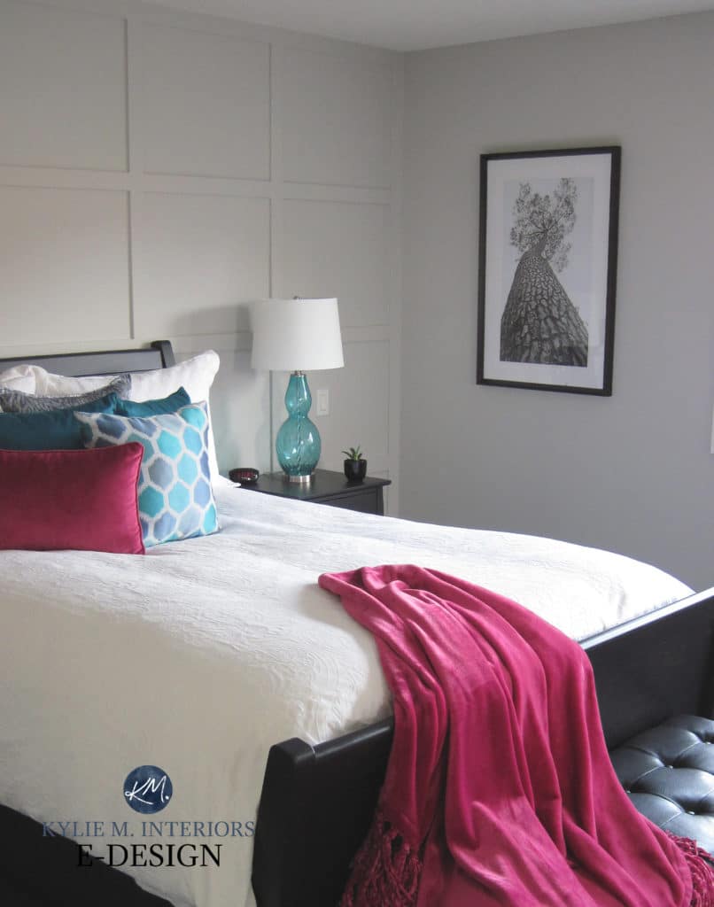
Like EVERY gray paint color, Touch of Grey has undertones – soft, subtle violet ones. They aren’t even HALF as strong as Sherwin Williams Grayish but are just a BIT cleaner, less stormy looking and SLIGHTLY more obvious than On the Rocks.
Here’s the SLIGHTLY more muted On the Rocks…
What’s the best way to sample a paint color?
Like with every paint color, I highly recommend using SAMPLIZE. Samplize is a peel & stick paint sample that you can easily move around your room for over HALF THE COST of traditional sample pots – and they deliver right to your front door!
Here’s a link to the SAMPLIZE site if you’re curious!
What’s the best white paint color for my trim or cabinets?
If you’re using Touch of Grey on your walls, look for a white that’s soft or clean – nothing too creamy or warm.
- Sherwin Williams Pure White
- Sherwin Williams High Reflective White
Read more: The 4 Best White Paint Colors from Sherwin Williams
Is this a good color for my home’s exterior?
Touch of Grey could be gorgeous on an exterior, as long as your stone, brickwork and roof can handle a color with this violet undertone. Also, with an LRV of 62, expect it to look a bit more like an off-white on your exterior, ESPECIALLY if you get reasonable natural light shining on your home!
Read more: 5 Tips to Choosing an Exterior Paint Color
What other Sherwin Williams colors are similar to Touch of Grey?
- Sherwin Williams Mercurial. This is VERY similar to Touch of Gray, just a wink darker and a touch warmer.
- Sherwin Williams On the Rocks. As mentioned above, Touch of Grey is just a bit cleaner/has slightly more undertone than On the Rocks. It’s also a bit less likely to flash violet-blue.
- Sherwin Williams Big Chill. If you’re not so sure about that soft violet undertone, you might prefer the subtle blue in Big Chill – a similar idea, shifted undertones.
What Benjamin Moore paint colors are the same as or similar?
Every color has its own particular nuances and there will be NO perfect match – you WILL see shifts in undertones, temperature and values. If you prefer to use Benjamin Moore paint, you could check out colors with SIMILAR approaches…
- The closest I could find was Benjamin Moore Nimbus, which has a violet undertone but is WARMER than Touch of Grey.
- Benjamin Moore Cement Gray is in the ballpark but is cooler looking and the undertone comes up even more.
And if you’re thinking of color matching between brands, you might want to read THIS first.
What type of paint colors look good with Touch of Grey?
Oh, there’s a TON of colors that work well with Touch of Grey and here are a few to get you started…
- gray-blues could be STUNNING with Touch of Grey, especially those with an LRV of approx. 55 or lower
- some green-gray blends, especially a color like Sherwin Williams Sea Salt
- other comparably cool, stormy grays with slightly darker values and undertones, ie: Sherwin Williams Tinsmith
- Touch of Grey will be FUSSY with beige, tan and cream paint colors
Not sure if Touch of Grey is right for you? Want a color that’s a bit warmer or cooler? I’ve got more!
SHERWIN WILLIAMS SWEATER WEATHER
Read more: Paint Color Review of Sherwin Williams Sweater Weather
SHERWIN WILLIAMS MERCURIAL

Read more: Paint Color Review of Sherwin Williams Mercurial
SHERWIN WILLIAMS AGREEABLE GRAY
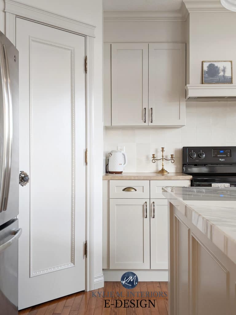
Read more: Paint Color Review of Sherwin Williams Agreeable Gray
SHERWIN WILLIAMS REPOSE GRAY

Read more: Paint Color Review of Sherwin Williams Repose Gray
Not sure which paint color is best for YOUR home?
Check out my Online Paint Color Consulting – I’d love to help!
Chat soon,

Share this!


Meet Kylie
Do you need help, but aren’t quite sure what ‘help’ looks like? Are you drowning in paint samples and decision fatigue?
Does every color you like at the paint store look terrible in your lighting or pick up a funky undertone? I’d love to help.

Hi, I’m Kylie
For over 24 years I’ve helped 12,000+ homeowners and renters make more confident decisions on paint colors and affordable home updates using real home examples and practical, experience-based advice. My goal is simple: help you love the home you have.
Do-it-yourself, the smart way
Grab one of Kylie’s guides
Affordable, downloadable shortcuts to the colors and combos I’d pick for you. Yours to keep, forever.

Homeowner’s Guide: White Kitchen Cabinets
This isn’t another ’10 Best Cabinet Colors’ list, because there is no SINGLE best white for every home and every kitchen.
Learn how to choose a white cabinet paint color that works with your countertops, backsplash, flooring, trim, lighting, and home—so you can rule out the wrong whites, sample fewer colors, and choose with confidence.
158-page PDF – Instant Download
$34.95Accent Colors – And How to Use Them
This isn’t about plastering your home in the ‘Color of the Year’ or following the latest trends (unless you really want to).
It’s about finding accent colors that work with YOUR home, YOUR style, and YOUR comfort level.
Because the best accent color isn’t one you love on a paint chip, it’s one that makes everything around it look better.
118-Page PDF – Instant Download
$34.95
Homeowner’s Guide: Exterior Paint Colors
Painting your home’s exterior is a BIG investment and choosing a color based on a tiny paint chip, a trend or the house down the street can be an expensive mistake.
Learn how to look at YOUR roof, YOUR windows, YOUR brick (or stone) and YOUR home as a whole so you can understand what colors make sense.
The goal? Less guessing, fewer samples and a lot more confidence before gallons of paint go on your home.
206-page PDF – Digital Download
$44.95Exterior Trim Paint Colors
This isn’t a list of ‘the best trim colors’, although you’ll get a ton of links to great shades!
You’ll learn how to look at your home and understand whether it needs contrast, repetition, connection, or a little visual peacekeeping to pull it all together.
Because trim might seem like a small detail…but spread it around all four sides of your home on multiple surfaces and it suddenly has a pretty big job.
118-page PDF – Instant Download
$24.95




Leave a Reply