
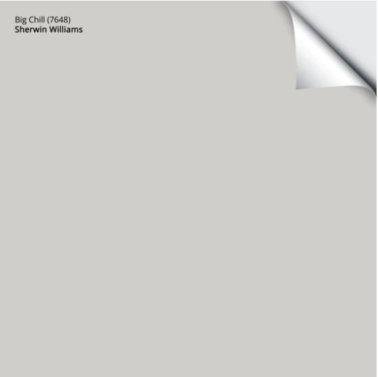
Sherwin Williams Big Chill: Paint Color Review
A popular gray paint color for GOOD REASONS!
While Pinterest has been paying homage to the warmer end of the gray world with colors like Sherwin Williams Repose Gray and Benjamin Moore Revere Pewter, one color has been patiently waiting for its time in the sun (or in the shade, more appropriately), and its time has come!
Or maybe not. Gray isn’t the hot shade it once was, and I receive about 80% fewer requests for it in my Online Color Consulting. However, there are still those out there looking for their perfect shade of gray, and this just might be it.

WHAT TYPE OF GRAY IS BIG CHILL?
Big Chill is a soft, cool-toned gray. However, just because it’s cool doesn’t mean it’s icy cold. Rather than being a traditional gray, Big Chill has an almost stormy approach compared to more icy crisp gray paint colors. When I have clients looking for the elusive ‘perfectly neutral gray paint color (which doesn’t exist, by the way), Big Chill is often one of the colors I suggest.
Why doesn’t a perfect neutral, fool-proof gray exist?
Because there is no such thing as a fool-proof neutral, you know, that ONE COLOR that works everywhere, every time? Nope – it’s all a lie. There are so many things to consider – exposure, flooring, countertops, light bulbs, personal tastes, and how much wine you’ve been drinking. A perfect color for one room can be terrible in another, just based on a change in the environment or personal perception.
Anyway, let’s get back to Big Bad Chilly.
WHAT’S BIG CHILL’S LRV?
With an LRV of 62, Big Chill is considered a light color. There are light colors that can totally wash out when hit with natural light and light colors that lean to the heavier side. This one sits RIIIIIGHT in the middle.
It will hold itself well in a darker, more shadowed room (that has enough artificial light) and a reasonably well-lit room, only washing out a bit at the height of the day. However, if your room gets a ‘more than average’ hit of natural light, it will wash out, as will any neutral in this range.
Not sure what LRV is? It could save your paint-lovin’ life – read all about it HERE.
WHAT ARE BIG CHILL’S UNDERTONES?
If you like slightly cool grays that give the illusion of having no undertones, you might love Big Chill. If you prefer obviously warm grays, you need to get the heck outta Dodge and go to this blog post instead.
This is because Big Chill has a very passive blue undertone. While it can politely nod at the other gray undertones, it’s not as flexible as other gray paint colors. Some blue undertones are crisper and lean easily into the other undertones—not Big Chill. As mentioned earlier, this beautiful shade of gray usually favors a soft stormy look—not traditionally warm, but not icy cold.
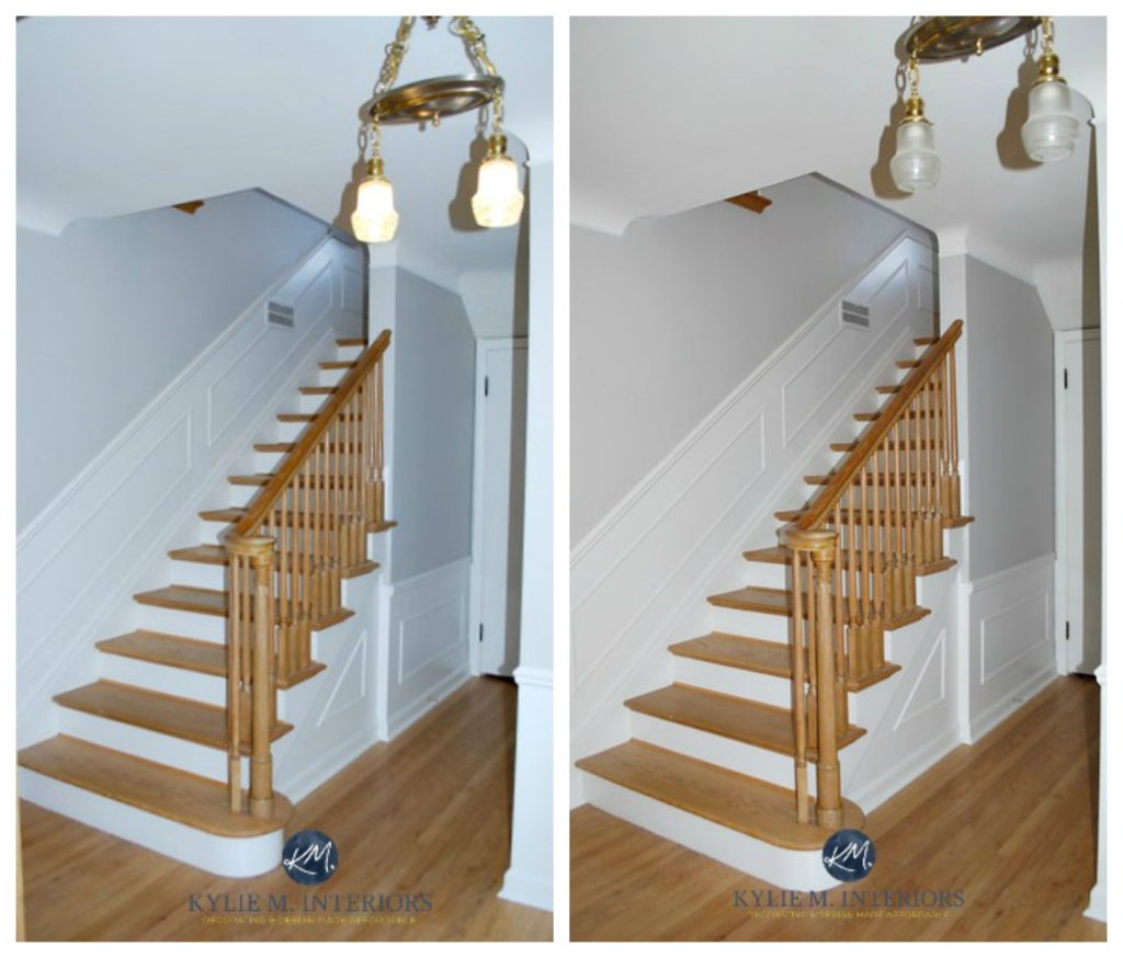
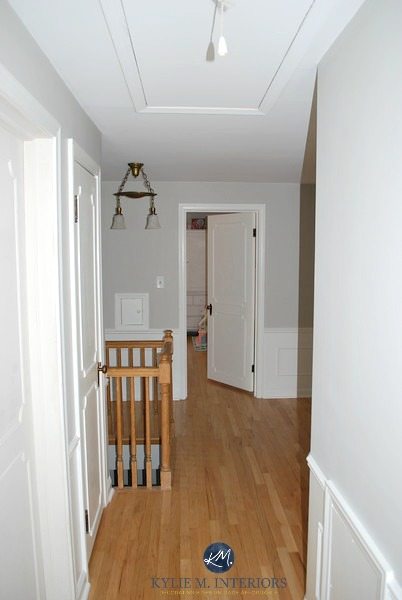
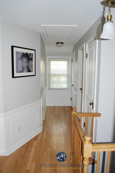
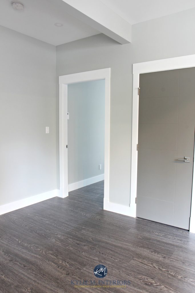
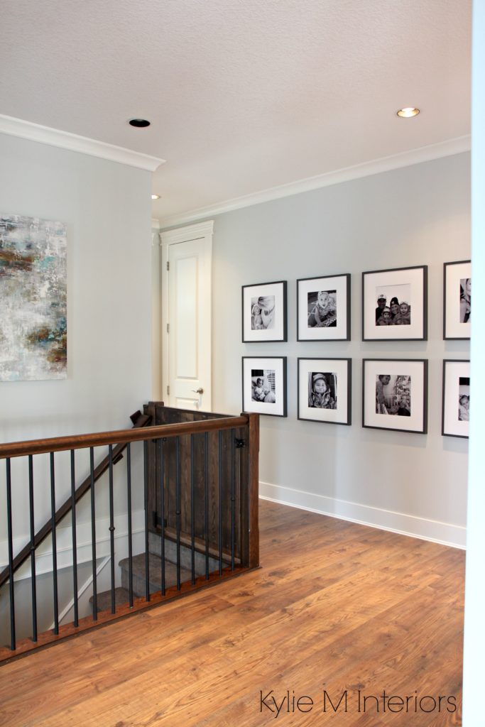
See how lighting can affect how a color looks? The picture on the left with the lights on shows how Big Chill can flash a cool gray-blue. The photo on the right with the lights off shows Big Chill at its natural best.
Paint Colors & Kelvins: Choosing the Right Bulbs
The 12 Best WHOLE HOME Gray and Greige Paint Colors
BIG CHILL IN A NORTH-FACING ROOM
While there are always other factors to consider, you can expect Big Chill to look a wink cooler in a north-facing room as the gray natural light slightly enhances the cool tones of this color.
BIG CHILL IN A SOUTH-FACING ROOM
In a room with southern exposure, Big Chill may wash out a smidge at the height of the day, but most of the time, it should act like a soft, cool, but generally neutral gray.
Here’s your Peel & Stick sample of Big Chill!
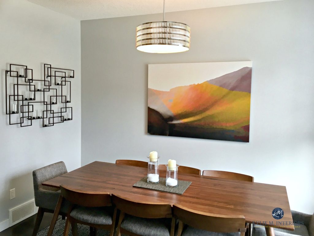
You can also jazz up Big Chill with a feature wall. Check it out in this gorgeous bedroom. MAD LOVE!

WHAT’S THE BEST WHITE TRIM COLOR WITH BIG CHILL?
When I use Big Chill, there’s a range of white paint colors I consider, depending on the look I want…
- Benjamin Moore Chantilly Lace or Sherwin Williams High Reflective White work when I want a cleaner contrast (with Chantilly Lace being the softer of the two)
- Sherwin Williams Pure White when I want a contrast that’s clear, but a bit gentler and softer.
SHOULD You Paint Your Kitchen Cabinets WHITE? A Questionnaire
WHAT COLORS ARE SIMILAR TO BIG CHILL?
Good for you for asking! One of the most important parts of finding your best paint color is to sample and compare similar shades! While you won’t find an exact match for ANY color between brands, however, there are some with similar intentions…
- Sherwin Williams On the Rocks is awesome. It has a similar approach but a bit more of a purple undertone. Believe it or not, a purple undertone suits more interior finishes than blue!
- Benjamin Moore Stonington Gray. Big Chill is lighter and also a bit more neutral-looking, whereas Stonington has just a wink and a more stormy blue undertone.
- Sherwin Williams First Star has the same intentions with its undertone and general look but is lighter with its LRV of 69.
And if you’re thinking of color matching between brands (ie: getting BM to make an SW paint color), you might want to read THIS first.
Read more: Paint Color Review: Benjamin Moore Stonington Gray
Big Chill is also in the running with Benjamin Moore Gray Owl as one of the TOP cool gray paint colors. Compare the two and see how Gray Owl picks up a touch of green (as well as blue) undertone in comparison to Big Chill. Big Chill MIGHT pick up a green – if you have grass, trees or Kermit outside your window which can reflect their green tones slightly onto the walls.
Read more: Paint Color Review: Benjamin Moore Gray Owl
There are SO many beautiful grays to choose from! Deciding which one is BEST for you and your home involves looking not just at your exposure and landscaping, but also at the hard and soft surfaces of your home such as flooring, countertops, linens and of COURSE – personal taste!
What are the best paint colors to put with Big Chill?
Welllll, Big Chill is a WEE bit fussy but does have a few good partners…
- some grays that are darker than it with a blue undertone
- navy blue can be gorgeous with Big Chill!
- Big Chill doesn’t love many strong cream, beige, tan or greige paint colors – there are only a few exceptions (mostly in the off-white range)
Not sure if Big Chill is the color for you? I’ve got more!
Paint Color Review: Sherwin Williams Crushed Ice
The Most TRUE GRAY Paint Colors with No Undertones
Paint Color Review of Sherwin Williams On the Rocks
Paint Color Review of Benjamin Moore Stonington Gray
Paint Color Review of Sherwin Williams Silverplate
Need help picking YOUR perfect gray?
Check out my affordable Virtual Color Consulting packages!

ORIGINALLY WRITTEN IN 2018, UPDATED IN 2021


Hello Kylie, after reading a bunch of your blogs and watching your You Tube videos I selected Big Chill for 3 walls in my living room. The trim is painted SW Pure White. I installed new Flor tiles that have a mixture of copper tones, dark navy-ish charcoal, a very light slate/chalky gray color, mid tone grays, light grays and some sandy colors. I want to do an accent wall in a gray, with an LRV of 25-35 ish. I am deciding between SW Summitt Gray, SW Tin Lizze [it casts a wink of green undertone that I don’t love], SW Classic French Gray, SW Cityscape or BM CSP Urban Chic [a bit on the dark end]. What are your thoughts. I am leaning toward Summitt – but is the very slight purple undertone ok with Big Chill? Thanks so much for weighing in. Beth Milwaukee WI