
The 4 Best Warm Gray Hybrid Paint Colors: Sherwin Williams
The Top 4 Warm Gray Paint Colors that are ALMOST Greige
Warm gray. The two words are opposite, meaning that when they’re mixed, they should create the perfect happy medium—but they don’t. Gray is not a traditionally warm color, and I don’t want you to confuse the word ‘warm’ with the look and feel of actual warmth. A warm gray is still gray, even if it has warm roots.
I often have online clients who request a ‘warm gray,’ hoping for something softer and cozier than the average shade of gray. Sure, there are warm grays, but it’s important not to confuse warm gray with the look of ACTUAL warmth.
And if you’re cool with that, so am I. However, if you want actual warmth, you’re reading the wrong blog post.
Now, if this understanding of warm gray is right up your alley, I’ve got some wicked pretty shades to share. So, let’s chat.
Gray is traditionally a cool or stormy color. Once we enter the warm gray range, some brown or beige muddies the waters.
- Lean warm enough and have a green undertone, warm gray = greige.
- Lean warm enough and have a purple or purple-pink undertone, warm gray = taupe.
The colors we’re looking at are hybrids and open to interpretation as to which group they belong to.
What makes these colors so tricksy is that they might be warm gray or greige-taupe. However, they change their tune depending on your room’s exposure. For example, many warm grays look as they should in north-facing rooms. However, put these same colors in a south-facing room, and that glorious sunshine makes them look like greige or taupe!
So, without further ado, let’s find the best warm…ish hue for you!
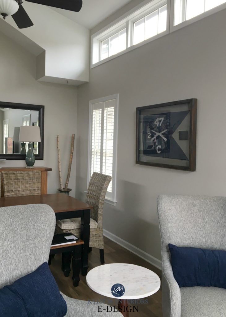
1. SHERWIN WILLIAMS AGREEABLE GRAY SW 7029
Agreeable Gray is one of my favorite warmish neutrals because it’s a greige that can act like a gray. In northern light, Agreeable Gray looks like a warm shade of gray. However, it softens up in non-northern light and picks up its greige-taupe warmth.
Check out Agreeable Gray in this next home…
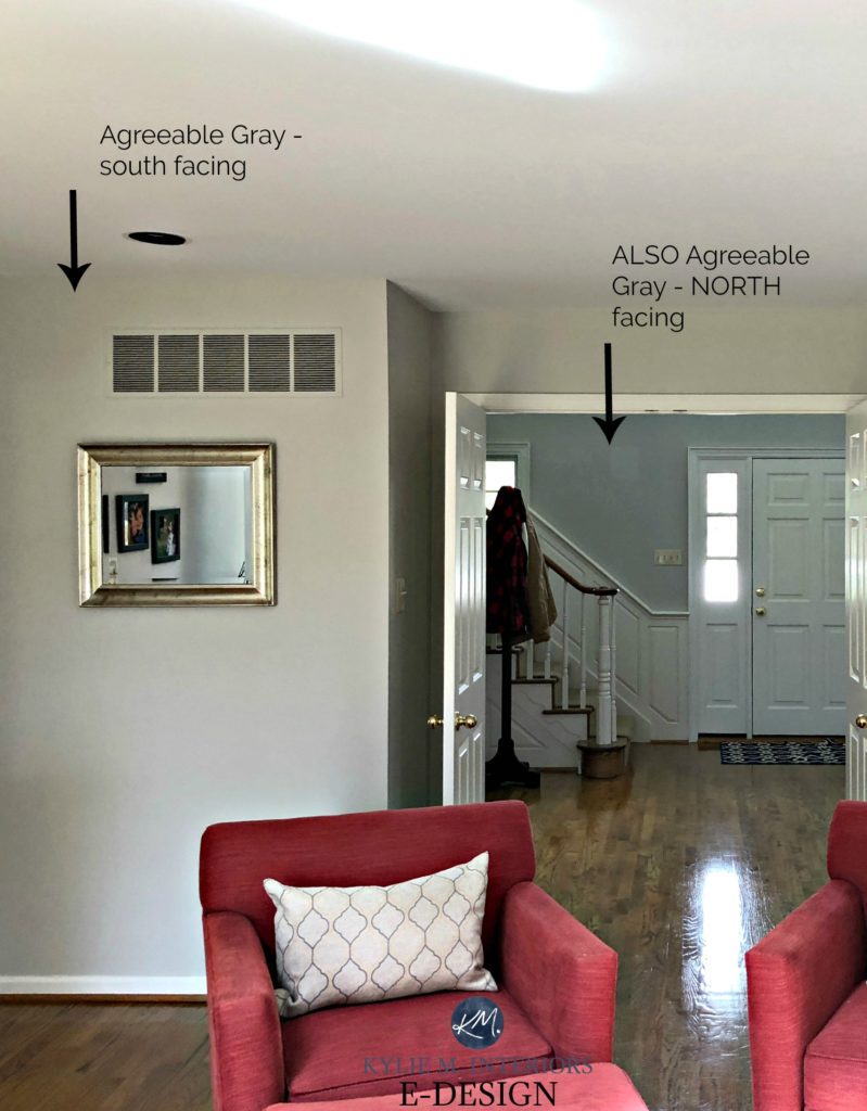
The entryway is infused with a cool northern light. The living room is south-facing (on what’s probably an overcast day from the looks of it).
Will your walls look warm painted Agreeable Gray? In comparison to a cool gray, yes.

- Agreeable Gray has an LRV of 60 which means it’s going to add decent energy and life to a room, but won’t make a dark space look brighter (read more about LRV here).
- Agreeable Gray can pick up any of the three cool undertones, depending on the exposure, interior lighting and the finishes it’s partnered with, although MOST of the time it looks pretty darn neutral.
- Agreeable Gray has a subtle warm undertone – not enough to take over, but enough to stop it from flashing traditionally cool.
- I find that the deeper I go with Agreeable Gray (Anew Gray/Mega Greige/Warm Stone) the warmer it looks. Agreeable Gray is the only depth where it looks more like a warm gray than a greige.
- Does this colour have beige in it? Yes, that’s what’s warming it up, but I’ve never had it look legit beige in any space.
- In a north-facing room, Agreeable can pick up a slight gray/blue look or even a wink o’ green.
FULL Paint Colour Review of Sherwin Williams Agreeable Gray
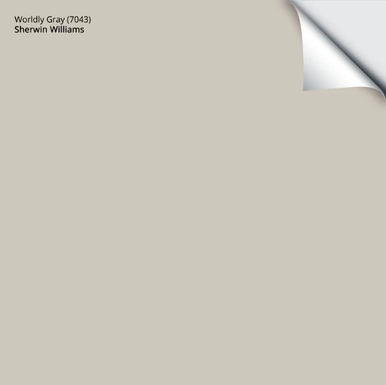
2. SHERWIN WILLIAMS WORLDLY GRAY SW 7043
While it’s illegal in most States, Worldly Gray and Agreeable Gray are like kissin’ cousins.
Why?
Well, they have a similar foundation, but Worldly Gray can pick up a wee flash of green and a bit more warmth. Overall though, it has a simla approach to Agreeable Gray with its flexibility between gray and greige.
Kylie M Interiors E-Design
Worldly Gray has an LRV of 58, so it’s a smidge darker than Agreeable. If this bugs you, have it lightened by 25% to bring it back up a bit, but keep in mind that this can slightly affect the undertones.
- In a south-facing room, you may notice the green a bit more. It will also be slightly warmer.
- The greige/warm undertones may come slightly forward with no natural lighting or in the evenings.
- Like Agreeable Gray, Worldly Gray is stuck in between the warm gray and greige worlds.
FULL Paint Colour Review of Sherwin Williams Worldly Gray
Get your Peel & Stick sample of Worldly Gray…
3. SHERWIN WILLIAMS MINDFUL GRAY 7016
Mindful Gray is a fantastic shade of warm gray, but DAMN is it a chameleon! While it has gloriously warm gray roots, give it the right environment (especially exterior siding or stucco) and it can look surprisingly warm!
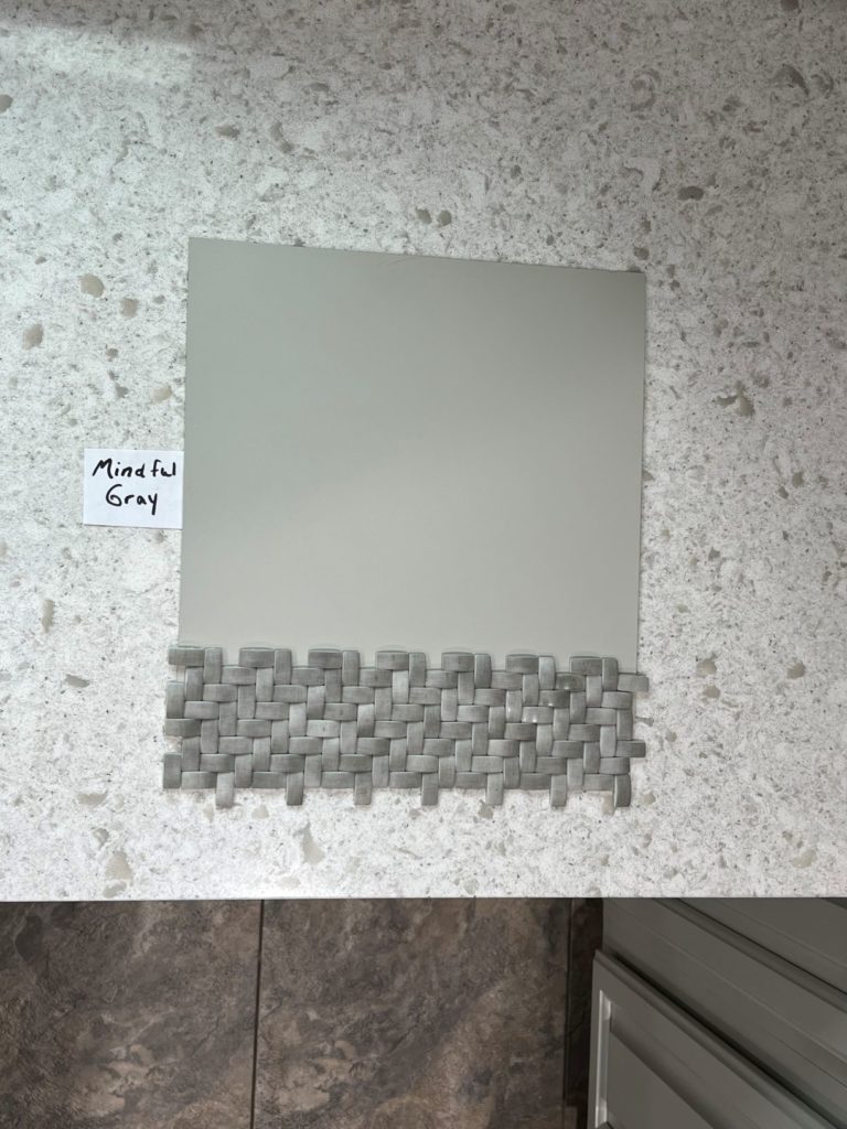
- The LRV of Mindful Gray is 48, so it’s well into the light-medium range and a bit darker than Agreeable Gray and Worldly Gray.
- While it can flex its undertones, expect a mild, slightly green hue (a muddy one at times).
- While Mindful Gray can read like a warm gray on exterior walls, give it southern light (or western afternoon light) OR exterior lighting, and it can look much warmer!
- Too warm for you? Take a look at Sherwin Williams Light French Gray and see if it hits the spot.

While it can look surprisingly warm, look at how gray it is ‘compared’ to warmer neutrals…
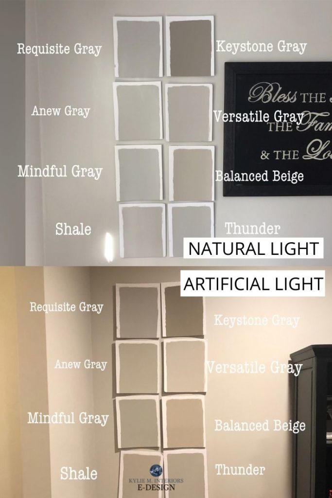
Check out my reviews of Keystone Gray | Versatile Gray | Requisite Gray | Anew Gray | Balanced Beige
My FULL Paint Color Review of Sherwin Williams Mindful Gray
4. SHERWIN WILLIAMS COLONNADE GRAY SW 7641
Colonnade Gray is very (very) similar to the ever-popular Benjamin Moore Revere Pewter. It has similar subtle warmth and depth. However, the subtle green you’ll find in both colors is way more passive in Colonnade Gray. When it shows up, you might have to convince yourself it’s there (whereas Revere Pewter is slightly more obvious).
- Colonnade Gray has an LRV of 52, which is great for a well-lit room but a touch dull for a darker one. It’s 3 points lower than Revere Pewter.
- There’s a good chance you’d never know this color had green in it unless I spilled the beans—which I love to do.
- If you are sensitive to green, don’t pick your nose, and don’t pick this color. I’ve found that folks like you can see it even when it’s not there, so let’s not encourage things.
- Want a bit more depth and undertone? Check out Sherwin Williams Amazing Gray. Looking for a lighter approach, bump on back to Worldly Gray.
- Colonnade Gray is SUPER comparable to Benjamin Moore Revere Pewter – minus the muddy green. To learn about the difference between these two colors, check out this post… Color Review: Colonade Gray vs Revere Pewter

So, there you have it. If those are too gray for your tastes, you probably need to start dabbling in the Wild World of Greige. And if you’re stuck? You know who can help!
READ MORE
The Two Types of Gray Paint Colours & The BEST of Them!
The 10 Best WHOLE HOME Gray and Greige Paint Colours
The 8 Best WHOLE HOME Warm Neutral Paint Colours
How to Transition from Beige to Gray or Greige
NEED HELP?
Check out my Online Color Consulting Services

ORIGINALLY WRITTEN IN 2018, UPDATED IN 2024


Hi! Wondering if you have any experience with Ben Moore’s Nimbus and if you’d consider it a warm gray? I’m having a hard time pinpointing it’s undertones. Also unrelated, have you checked out the hgtv Sherwin Williams colors at Lowe’s, if so what are your thoughts?
Hi Tess! It is a warm gray and has a soft purple undertone (vague) :). And yes, I love the HGTV colours at SW but they don’t make them very easy to access with a fan deck so that i can push them!
Hello! Im trying to find a light gray for my garage that faces east. I have repose gray inside my house but feel it might be a little to drab in a garage with no light. Can you offer a suggestion? I’m thinking light gray but undertones are tricky. Thanks in advance! 🙂
Hello Kylie, we are building a new home and we have not decided on interior wall color. I plan to paint the cabinets in the perimeter of the kitchen in SW Mindful gray as well as the cabinets in two of the other bathrooms. My husband does not want white walls and I’m struggling on deciding which gray I could use on the walls that will look good with the mindful gray cabinets throughout the house. Please advise. Thank you.
Margie Perales
Hi Margie, because Mindful Gray is a light-medium depth, it’s tricky to get some decent contrast. You’ll probably want to hit the off-white range or try SW Agreeable Gray 25% lighter. 🙂
We bought a house and it’s pretty much all a green Greige and then even darker Greige like safari green. In the dining room that gets no natural light. I thought I hated it all and keep trying my go to favorite bm Greige and they aren’t working. I love Edgecomb grey but it made the orangey oak cabinets look washed out and muddy and then it looked pink and cold. Then I tried November rain and although the lightness and green blue tones looked good with the wood it looked terrible with the white trim. Now it’s a mess and I’m getting why they picked the original colors as it went with the wood AND the white. Now I’m lost.
Hi Kylie! Can Wordly Gray work with taupe accents? I painted my house lake Pale Oak and I don’t care for it because of the purple undertones that are so very evident on my walls. However, after the paint job I started looking at photos of homes styled with various shades of taupe because it works well with our walls- like taupe bedding or a dark taupe bedroom door etc. I grew to like to look…I just don’t care for my purple walls. Could I still throw taupe in a room painted Wordly Gray or will the choice to re paint in this color shift me to looking at more green accents and decor? In other words, what undertones pair well with Wordly Grey because it’s a beautiful color! Feel free to link me to other articles on this color if that would be easier. Thank you as always for your expertise.