
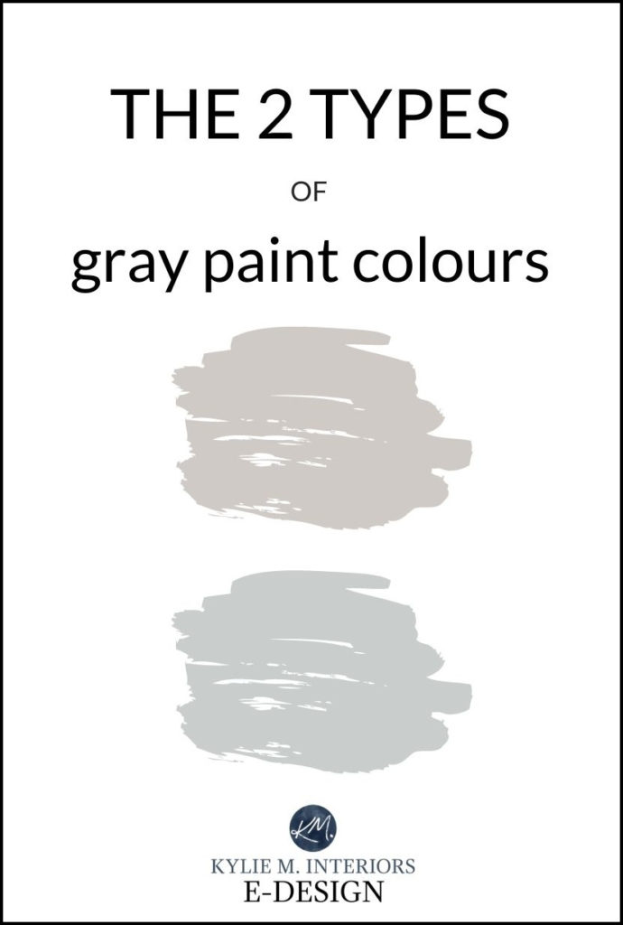
GRAY PAINT COLOURS: THE TWO MAIN TYPES FOR WALLS, CABINETS & EXTERIORS
The Most Popular Warm & Cool Shades of Gray
When it comes to gray paint colours, there are two groups to consider – warm and cool. And along with these two groups come variations in UNDERTONES (just to add another layer to the madness). This means that not only do you need to choose the TEMPERATURE you want but also the COLOUR/undertone you want (remember, every gray has undertones!)
Now, you might think it’s odd that I’m still talking about gray paint colours when they’re an outgoing trend, HOWEVER, I’m also a firm believer in three things…
- living in colours you love regardless of trends (as long as resale isn’t a big concern)
- choosing paint colours that suit the interior or exterior finishes of your home
- wine
With ANY paint colour, all it really comes down to is moderation. In other words, it’s okay to paint a few rooms gray and not worry about resale. It’s NOT okay to paint your WHOLE HOME gray and expect it to appeal to the upcoming trends/buyers. We’re building a lake home right now and EVEN I’M using some gray. Why? I LOVE IT!
MOVING ALONG!
Every gray paint colour has undertones (c’est la vie), but before we go down that deep dark hole, the first thing you need to decide is whether you want a WARM gray or a COOL gray. Just remember, this process is more about what suits the finishes in your home and LESS about what you personally gravitate towards (although hopefully, these two things align).
WHAT ARE WARM GRAY PAINT COLOURS?
Warm gray paint colours are grays that have a bit of brown in them. This bit of brown doesn’t just warm gray up, it also makes it look DIRTY or MUDDY in comparison to cooler shades of gray.
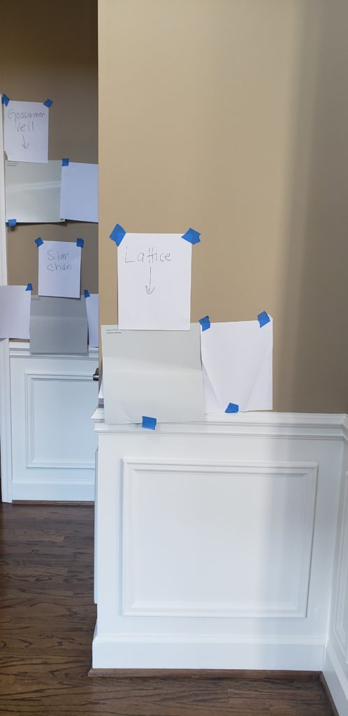
Sherwin Williams Colonnade Gray
The more BROWN there is in a warm gray, the warmer it will look. Add enough brown and your warm gray will morph into greige or taupe!
As warm gray paint colours get DARKER, the majority of them pick up more brown along the way, which is why it’s SO DARN HARD to find good dark warm gray paint colours – they’re few and far between. Sure, some grays like Benjamin Moore Chelsea Gray are classified as warm grays, but you’ll be hard-pressed to see them acting that way in the average home. Remember, just because something IS a certain way doesn’t mean it will ACT this way in your home. For example, I may look like a lady, but I sure as heck don’t act like one (insert man-sized burp here – I learned this God-given talent from my Mom. Just joking…maybe).
Sherwin Williams Gauntlet Gray is an example of a darker warm gray
- In the LIGHTER end of the warm gray world (colours with higher LRVs), MOST of my Online Colour Consulting clients prefer a violet undertone.
- There are more interior finishes that suit a gray with a warm violet undertone than there are ones that suit a green undertone.
- In the DARKER end of things (colours with lower LRVs), there isn’t really a FAVOURITE undertone as it relates to warm grays.
- When a gray with a green undertone goes dark and warm, it often shifts gears into GREIGE.
- When a gray with a violet undertone goes dark and warm, it often flexes into TAUPE.
- Warm dark grays with a violet undertone are often the BEST paint colours for kitchen islands and feature walls.
WHAT UNDERTONES DO WARM GRAY PAINT COLOURS HAVE?
It doesn’t matter if you have a gray paint colour, carpet, countertop or sofa, if it’s a warm gray it will favour either VIOLET or GREEN undertones (the odd one nods at both). And while the odd warm gray can flash a wink blue (ie. Sherwin Williams Repose Gray, which we’ll be looking at shortly), this is more situational based on surrounding finishes or EXPOSURE.
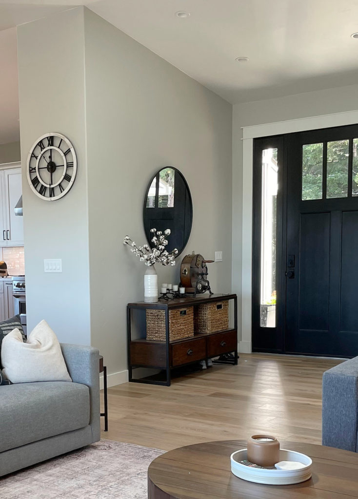
Sherwin Williams Repose Gray
Sherwin Williams Crushed Ice
THE 8 BEST WARM GRAY PAINT COLOURS
While there are MANY more I could share with you, this list will certainly get you started. I’ll refer to a few bonus ones along the way as well.
Why?
Because the best way to pick a paint colour is via COMPARISON!
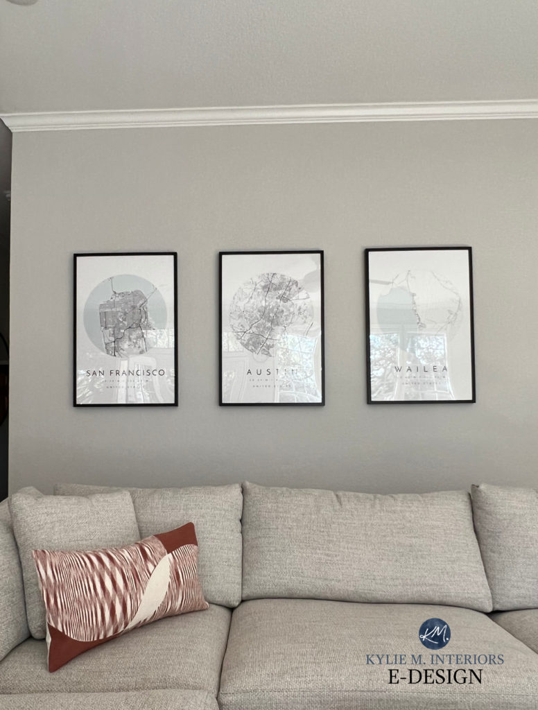
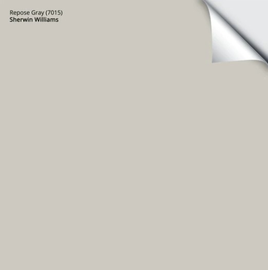
1. SHERWIN WILLIAMS REPOSE GRAY 7015
Repose Gray is definitely one of the more popular warm gray paint colours from Sherwin Williams. With its flexible undertones and slightly darker depth (compared to some of the other popular grays), it suits a WIDE variety of spaces. However, it’s a BIG FAT NINJA, so make sure you read its COLOUR REVIEW IN FULL before you start slappin’ paint on your walls or cabinets.
FULL Paint Colour Review of Sherwin Williams Repose Gray
Get your SAMPLIZE PEEL & STICK SAMPLE HERE
PAINT COLOURS THAT ARE SIMILAR TO REPOSE GRAY
- Sherwin Williams Mindful Gray – PAINT COLOUR REVIEW HERE / PEEL & STICK SAMPLE HERE
- Sherwin Williams Agreeable Gray – PAINT COLOUR REVIEW HERE / PEEL & STICK SAMPLE HERE
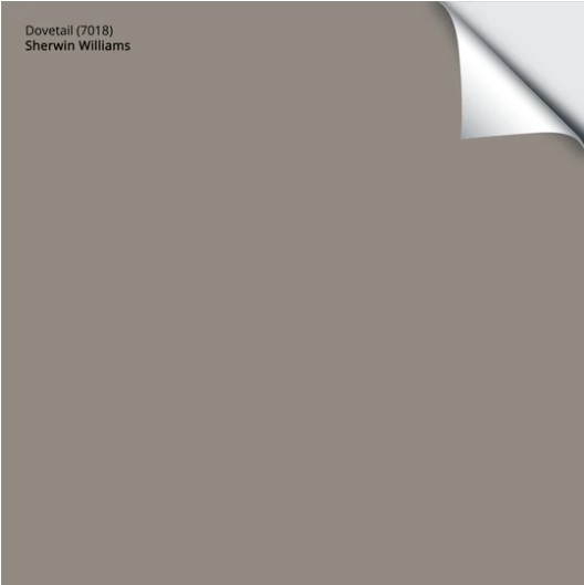
2. SHERWIN WILLIAMS DOVETAIL 7018
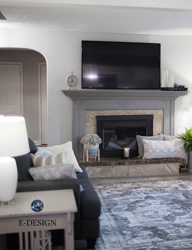
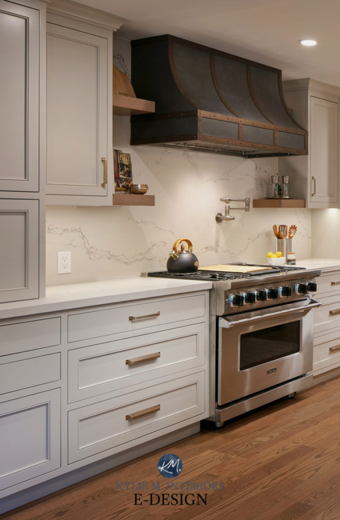
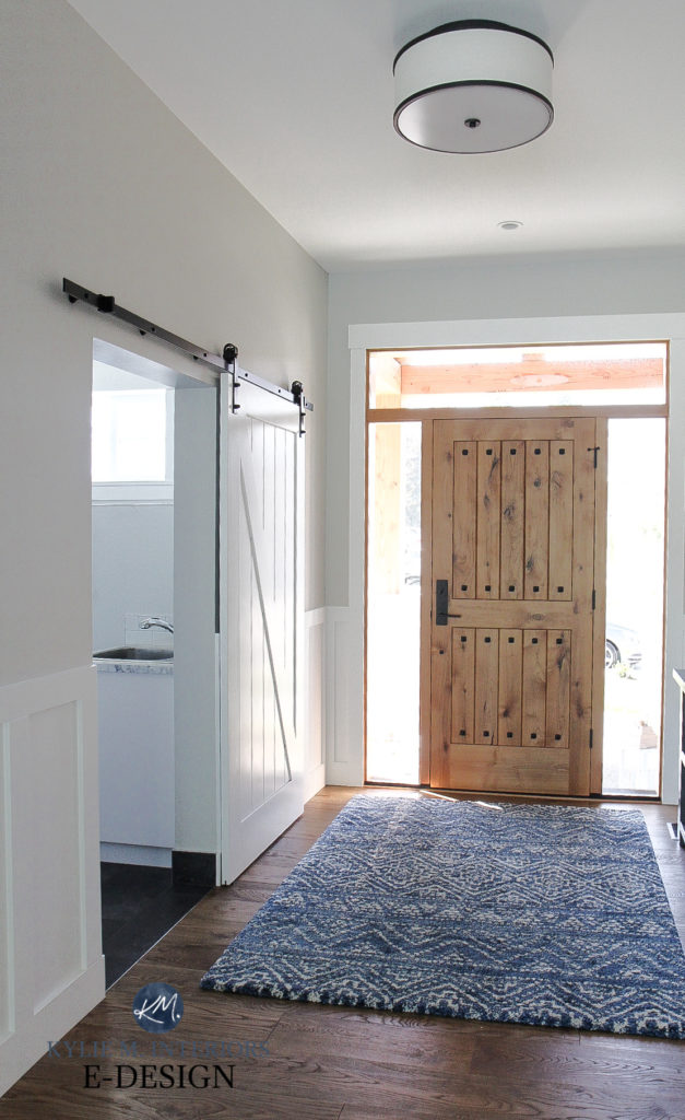
Dovetail is kind of like a darker version of Repose Gray, but its undertones are more predictable, making it a great choice for cabinets, feature walls and DEFINITELY exteriors. In this next living room, you’ll see Repose Gray on the walls and Dovetail on the fireplace surround…
FULL Paint Colour Review of Sherwin Williams Dovetail
Get your SAMPLIZE PEEL & STICK SAMPLE HERE
PAINT COLOURS THAT ARE SIMILAR TO DOVETAIL
- Benjamin Moore Metropolis – PAINT COLOUR REVIEW HERE / PEEL & STICK SAMPLE HERE
- Sherwin Williams Gauntlet Gray – PAINT COLOUR REVIEW HERE / PEEL & STICK SAMPLE HERE
BTW, I really 100% on my Online Paint Colour Consulting clients for my photos, showing you REAL homes with REAL BUDGETS! Thank you to everyone for sending them in, you make my colourful little world go round!
3. SHERWIN WILLIAMS COLONNADE GRAY 7641
If you ask me, Colonnade Gray is a GREATLY underappreciated warm gray and is flexible for a variety of spaces/uses.
Why?
Well, not only does Colonnade Gray have SUBTLE undertones (slight green), it makes a polite nod towards both the warm gray and the greige worlds without a hardcore commitment to either (although this can shift based on your room’s EXPOSURE).
FULL Paint Colour Review of Sherwin Williams Colonnade Gray

Get your SAMPLIZE PEEL & STICK SAMPLE HERE
PAINT COLOURS THAT ARE SIMILAR TO COLONNADE GRAY
- Benjamin Moore Revere Pewter – PAINT COLOUR REVIEW HERE / PEEL & STICK SAMPLE HERE
- Sherwin Williams Worldly Gray (COLOUR REVIEW / PEEL & STICK SAMPLE)
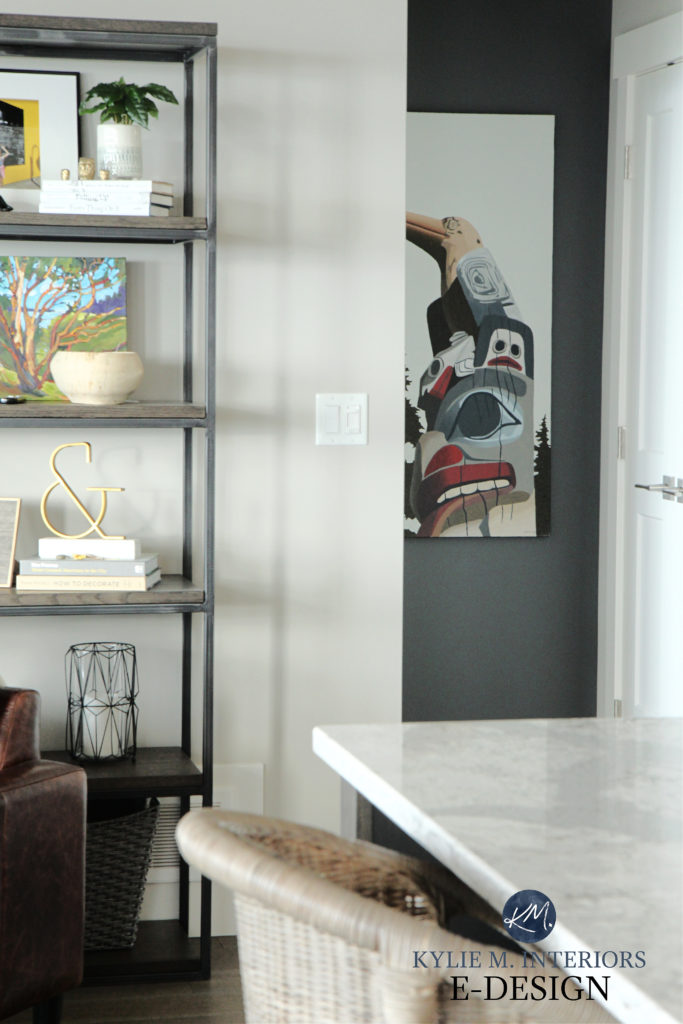
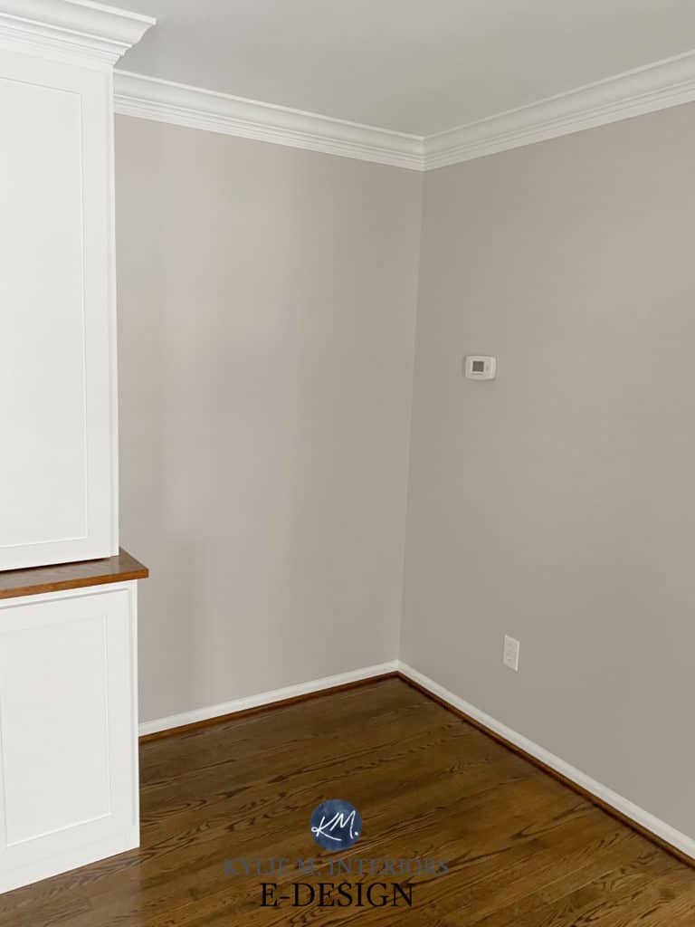
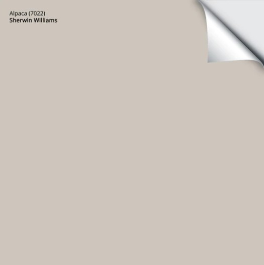
4. SHERWIN WILLIAMS ALPACA 7022
Alpaca is a beautiful warm gray that NODS at the taupe world without jumping in the deep end. And as you can see in this next photo, it has a GORGEOUS violet undertone…
FULL Paint Colour Review of Sherwin Williams Alpaca
Get your SAMPLIZE PEEL & STICK SAMPLE HERE
PAINT COLOURS THAT ARE SIMILAR TO ALPACA
- Sherwin Williams Popular Gray – PAINT COLOUR REVIEW HERE / PEEL & STICK SAMPLE HERE
- Sherwin Williams Requisite Gray – PAINT COLOUR REVIEW HERE / PEEL & STICK SAMPLE HERE
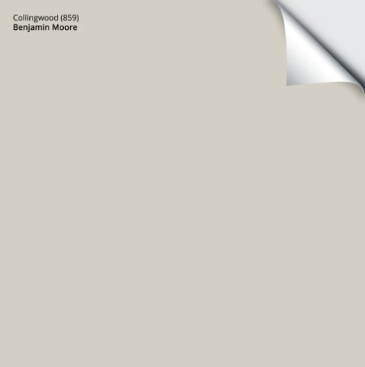
5. BENJAMIN MOORE COLLINGWOOD OC-28
Collingwood is definitely one of my FAVE gray paint colours and I refer it to my Online Paint Color Consulting clients ALL THE TIME. And even though the gray paint trend is going out of style (and beige is coming BACK), there are some warm grays that are WAY more likely to withstand this transition (like Collingwood).
FULL Paint Colour Review of Benjamin Moore Collingwood
Get your SAMPLIZE PEEL & STICK SAMPLE HERE
PAINT COLOURS THAT ARE SIMILAR TO COLLINGWOOD
- Benjamin Moore Balboa Mist – PAINT COLOUR REVIEW HERE / PEEL & STICK SAMPLE HERE
- Sherwin Williams Agreeable Gray – PAINT COLOUR REVIEW HERE / PEEL & STICK SAMPLE HERE
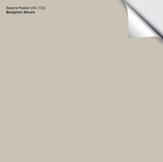
6. BENJAMIN MOORE REVERE PEWTER HC-172
Revere Pewter has been kickin’ it a LONG TIME as one of the TOP gray paint colours. And again, with trends shifting warmer, a gray like Revere Pewter is going to be far more timeless than its cooler cousins.
Get your SAMPLIZE PEEL & STICK SAMPLE HERE
PAINT COLOURS THAT ARE SIMILAR TO REVERE PEWTER
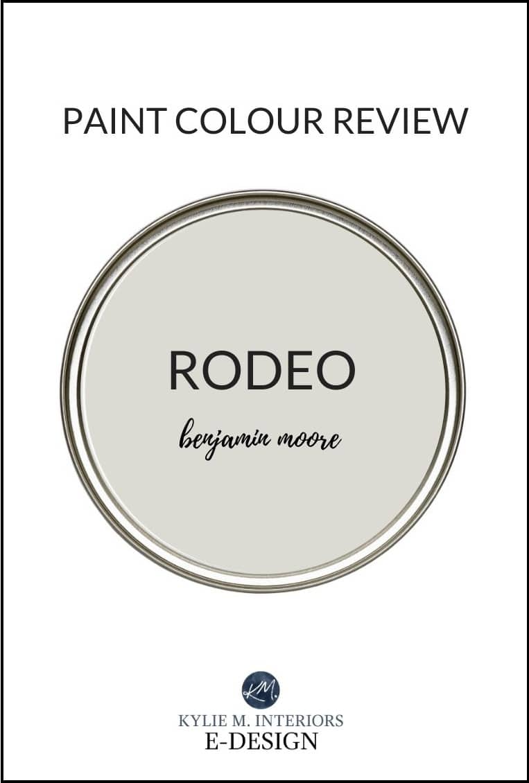
- Benjamin Moore Rodeo – PAINT COLOUR REVIEW HERE / PEEL & STICK SAMPLE HERE
- Sherwin Williams Colonnade Gray – PAINT COLOUR REVIEW HERE / PEEL & STICK SAMPLE HERE
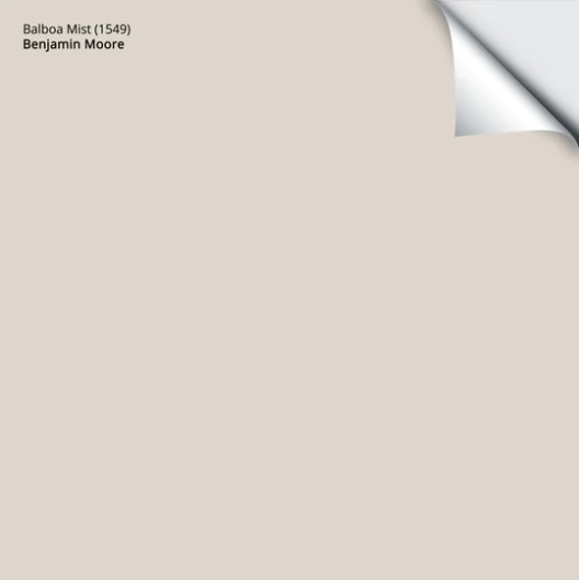
7. BENJAMIN MOORE BALBOA MIST OC-27
Balboa Mist is a popular shade of warm gray with a soft subtle undertone that winks at the warm violet end of things. I’m also seeing Balboa Mist pop up a lot more on kitchen cabinets, a trend that makes me twitch and sob in the corner with an empty bottle of wine*, but hey, you do you!
*I’ll be writing a blog post shortly about WHY this trend makes me die inside.
FULL Paint Colour Review of Benjamin Moore Balboa Mist
Get your SAMPLIZE PEEL & STICK SAMPLE HERE
PAINT COLOURS THAT ARE SIMILAR TO BALBOA MIST
- Benjamin Moore Classic Gray – PAINT COLOUR REVIEW HERE / PEEL & STICK SAMPLE HERE
- Benjamin Moore Pale Oak – PAINT COLOUR REVIEW HERE / PEEL & STICK SAMPLE HERE
- Sherwin Williams Egret White – PAINT COLOUR REVIEW HERE / PEEL & STICK SAMPLE HERE
- Sherwin Williams City Loft (PEEL & STICK SAMPLE HERE)
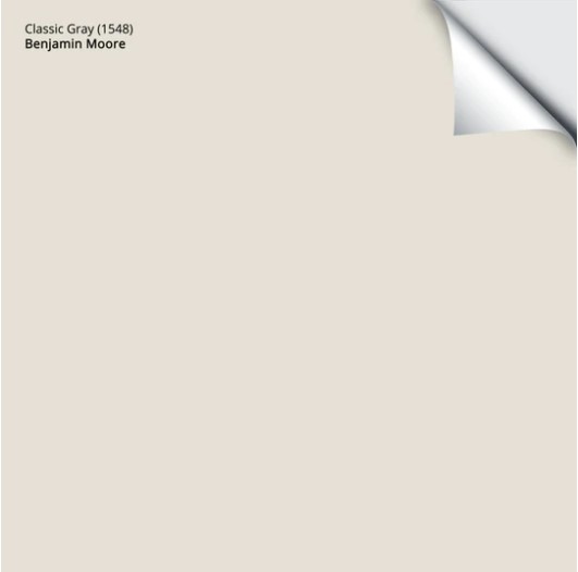
8. BENJAMIN MOORE CLASSIC GRAY OC-23
It would be CRAZY to talk about the best warm gray paint colours without hitting Benjamin Moore Classic Gray, one of my FAVE shades of warm gray on the market.
Why is Classic Gray so popular?
Classic Gray is another shade of gray that’s more likely to withstand the shift to the beige trend and even holds its own in the white trend due to its warmth and higher LRV.
FULL Paint Colour Review of Benjamin Moore Classic Gray
Get your SAMPLIZE PEEL & STICK SAMPLE HERE
PAINT COLOURS THAT ARE SIMILAR TO CLASSIC GRAY
- Benjamin Moore Pale Oak – PAINT COLOUR REVIEW HERE / PEEL & STICK SAMPLE HERE
- Sherwin Williams Egret White – PAINT COLOUR REVIEW HERE / SAMPLE HERE
- Sherwin Williams Heron Plume – PAINT COLOUR REVIEW HERE / SAMPLE HERE
Now that you’ve got a hold of warm gray paint colours, let’s dip our feet in the COOL end of the gray pool…
WHAT ARE COOL GRAY PAINT COLOURS?
Cool gray paint colours WILL have either blue, green or violet undertones. Again, it doesn’t matter if you’re looking at gray paint colours, tiles, countertops, carpet or furniture…
Gray is never just gray
Benjamin Moore Stonington Gray with one of the WHITEST whites
WHAT’S THE MOST COMMON COOL GRAY UNDERTONE?
BLUE is definitely the most common gray undertone. Why? Well, without going down a HUGE rabbit hole, here’s the gist…
- BLUE is the only PRIMARY colour (of the three possible undertones) and is the most authentically COLD one
- To make GREEN, you mix blue and yellow – a cool colour and a warm colour. So, any colour with green in it will have at least a BIT of yellow/warmth
- To make VIOLET, you mix violet and red – a cool colour and a warm colour. So, any violet will have at least a WINK of red/warmth in it.
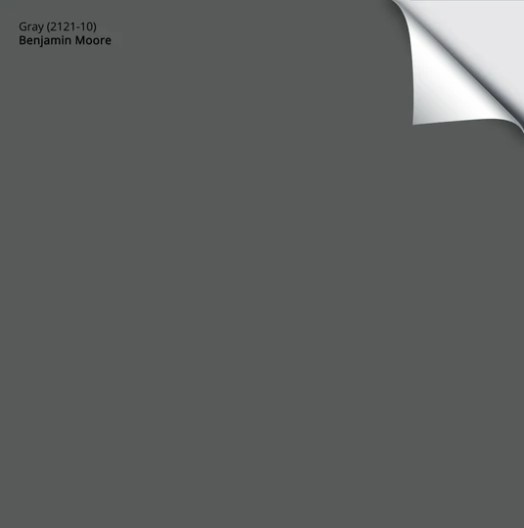
Benjamin Moore Gray 2121-10
- In the LIGHTER end of things (colours with higher LRVs), MOST of my Online Colour Consulting clients prefer a blue undertone as it relates to cool gray paint colours. Green is the LEAST popular undertone and violet sits right in the middle. BUT REMEMBER, even undertones can have their OWN undertones (ie. violet can lean violet-red or violet-blue), but that’s a WHOOOLE ‘nother blog post.
- In the DARKER end of things (colours with lower LRVs), blue is STILL the most popular undertone – both blue-greens and blue-violets. Green is definitely the second most popular undertone in dark cool grays (green-blue), however, there aren’t many to choose from. And sad ole violet, he comes in last place by a long shot.
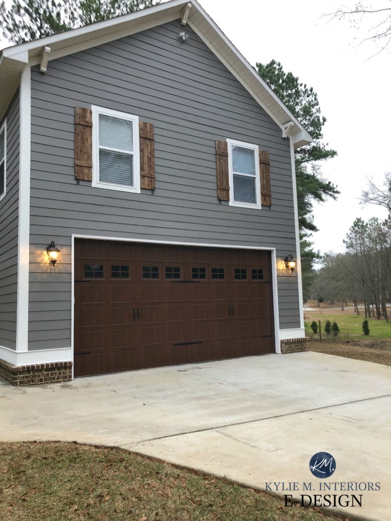
- Dark cool grays are some of the BEST paint colours for kitchen islands, feature walls, front doors and MORE. While they’re still very cool, they lose any ICYNESS via their depth; gaining body and richness instead.
Benjamin Moore Cheating Heart (below) is a great example of a DARK cool gray. It also has a strong blue undertone, making it more of a hybrid between gray and blue, depending on your perspective/perception (I can’t decide which word makes more sense, so I’ll give them both to you)…
POPULAR COOL GRAY PAINT COLOURS….that are actually warm grays
Some of these colours below are WARM grays based on science. But I know you’re not here for the scientific end of things, you’re here for my wit, good looks, a shared love for wine and Ryan Reynolds and a user-friendly approach to paint colours and decorating.
6 Budget-Friendly Ideas to Update Your Home
What are these chameleon colours?
These ‘warm gray paint colours’ are actually some of the more POPULAR shades of gray, such as Benjamin Moore Stonington Gray and Gray Owl. However, not even ONCE have I seen these two grays look warm…even a wee willy wink.
Now, if I were to teach you that these REALLY ARE warm grays and should be treated as such, you’ll be pretty darn confused when they look cool on your walls – which they will. This is why I like to teach about the REAL WORLD of paint colours, the one that’s easier to understand and apply.
Just LOOK at how warm Gray Owl is in the above photo – SAID NOBODY EVER!
THE 8 BEST COOL GRAY PAINT COLOURS
Why are these the BEST cool gray paint colours? They’re the most popular when it comes to my Online Paint Colour Consulting and are the most FLEXIBLE, meaning they suit a wider range of surfaces compared to some of the other grays on the market.
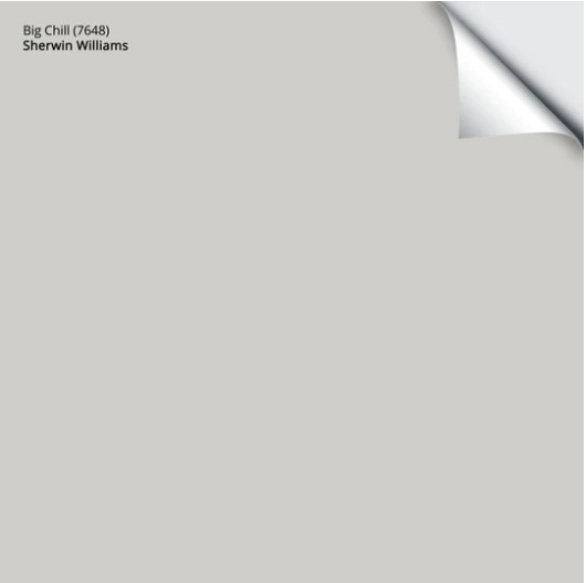
1. SHERWIN WILLIAMS BIG CHILL 7648
With its SUPER subtle and slightly stormy blue undertone, Big Chill is one of my go-to Sherwin Williams gray paint colours.
What makes Big Chill stormy?
The fact that it’s definitely gray, but not ‘icy cold’ like some of the others.
FULL Paint Colour Review of Sherwin Williams Big Chill
Get your SAMPLIZE PEEL & STICK SAMPLE HERE
PAINT COLOURS THAT ARE SIMILAR TO BIG CHILL
- Sherwin Williams Crushed Ice – PAINT COLOUR REVIEW HERE / PEEL & STICK SAMPLE HERE
- Sherwin Williams On the Rocks – PAINT COLOUR REVIEW HERE / PEEL & STICK SAMPLE HERE
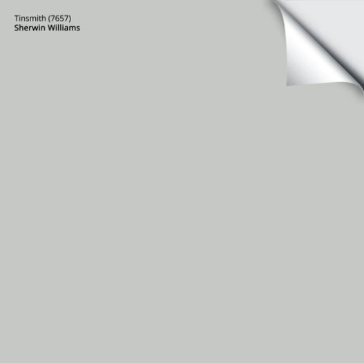
2. SHERWIN WILLIAMS TINSMITH 7657
Tinsmith is a gray paint colour with a bit more meat on its bones compared to Big Chill, and its undertones can even pick up a wink of green. Remember, even UNDERTONES can have undertones (insert wine here).
FULL Paint Colour Review of Sherwin Williams Tinsmith
Get your SAMPLIZE PEEL & STICK SAMPLE HERE
PAINT COLOURS THAT ARE SIMILAR TO TINSMITH
- Sherwin Williams Silverplate – PAINT COLOUR REVIEW HERE / PEEL & STICK SAMPLE HERE
- Benjamin Moore Stonington Gray – PAINT COLOUR REVIEW HERE / PEEL & STICK SAMPLE HERE
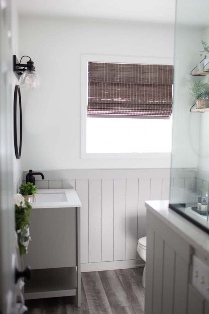
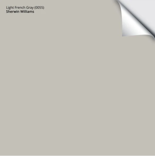
3. SHERWIN WILLIAMS LIGHT FRENCH GRAY 0055
If you’re a fan of a VERY subtle violet undertone, Light French Gray might be the perfect shade of gray for you and your home! And not only that, with its LRV of 53, it holds its own QUITE well in overly bright rooms as well as ones with an average amount of light. (LEARN MORE ABOUT LRV HERE)
FULL Paint Colour Review of Sherwin Williams Light French Gray
Get your SAMPLIZE PEEL & STICK SAMPLE HERE
PAINT COLOURS THAT ARE SIMILAR TO LIGHT FRENCH GRAY
- Sherwin Williams Knitting Needles – PEEL & STICK SAMPLE HERE
- Sherwin Williams March Wind – PEEL & STICK SAMPLE HERE
Sherwin Williams Knitting Needles
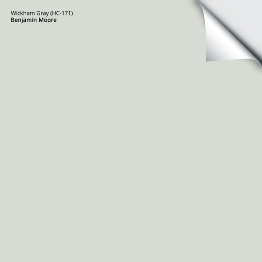
4. BENJAMIN MOORE WICKHAM GRAY HC-171
Wickham Gray is a gorgeous light gray paint colour with subtle blue-green undertones. These undertones usually show up to the party, but they’re rarely obnoxious about it. HOWEVER, I’ll also say that Stonington Gray is more popular.
Why?
You’ll find out shortly!

FULL Paint Colour Review of Benjamin Moore Wickham Gray
Get your SAMPLIZE PEEL & STICK PAINT SAMPLE HERE
PAINT COLOURS THAT ARE SIMILAR TO WICKHAM GRAY
- Benjamin Moore Ice Cap – PEEL & STICK SAMPLE HERE
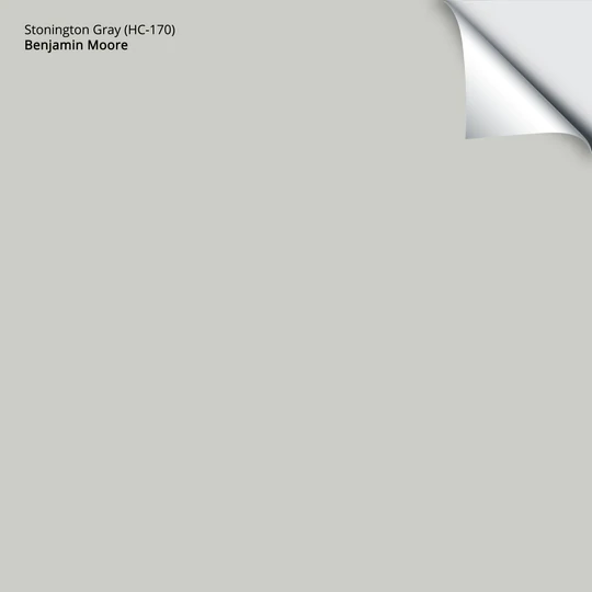
5. BENJAMIN MOORE STONINGTON GRAY HC-170
Stonington Gray is a POPULAR gray paint colour that seems to flow with the trends more than most of the other cool gray paint colours. With its SUBTLE cool undertones (more subtle than Wickham Gray), Stonington Gray is a top choice for a room with an average amount of natural light or even a reasonably well-lit one. If you love a gray with a slightly lower LRV but have a dark room, try paying attention to how much interior light your room has as well as the KELVINS of your bulbs!
FULL Paint Colour Review of Benjamin Moore Stonington Gray
Get your SAMPLIZE PEEL & STICK SAMPLE HERE
PAINT COLOURS THAT ARE SIMILAR TO STONINGTON GRAY
- Sherwin Williams Tinsmith – PAINT COLOUR REVIEW HERE / PEEL & STICK SAMPLE HERE
- Sherwin Williams Silverplate – PAINT COLOUR REVIEW HERE / PEEL & STICK SAMPLE HERE
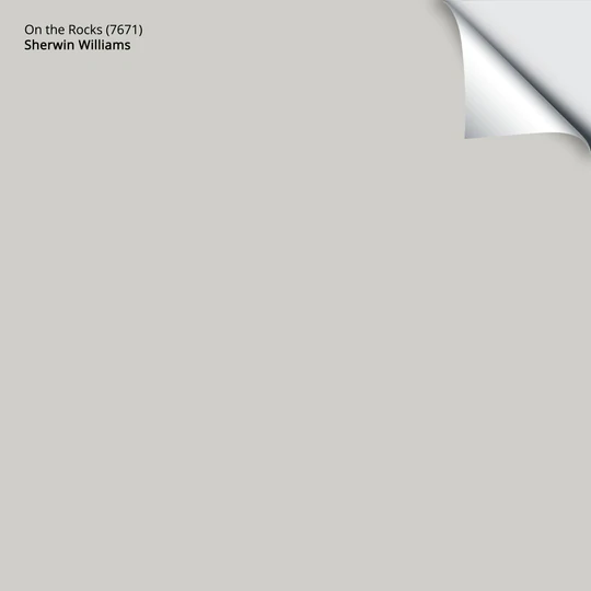
6. SHERWIN WILLIAMS ON THE ROCKS 7671
Coming in close behind Stonington Gray and Big Chill, On the Rocks is one of my FAVE cool gray paint colours.
What’s the difference between On the Rocks and Big Chill?
Whereas Big Chill favours a very mild blue, On the Rocks picks up a bit of violet along the way.
Get your SAMPLIZE PEEL & STICK SAMPLE HERE
PAINT COLOURS THAT ARE SIMILAR TO ON THE ROCKS
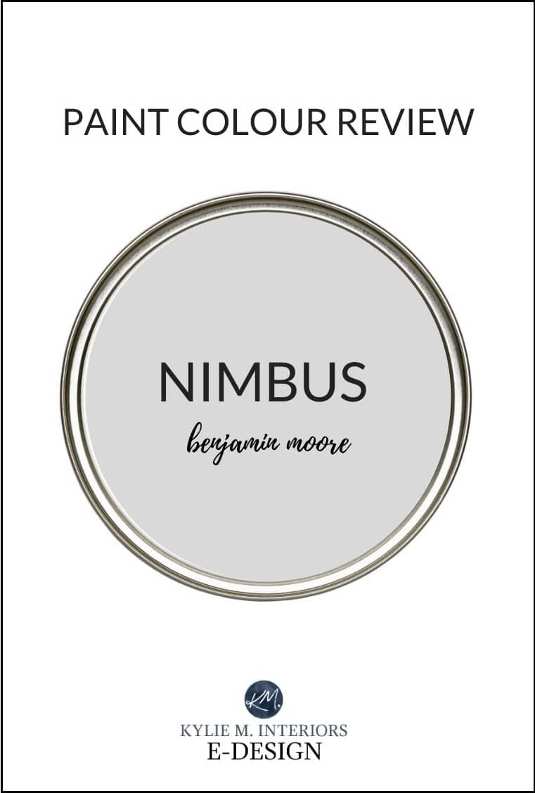
- Benjamin Moore Nimbus (REVIEW HERE / PEEL & STICK SAMPLE HERE
- Sherwin Williams Big Chill (REVIEW HERE / PEEL & STICK SAMPLE HERE
Now, let’s hit the DARKER end of things…
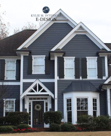
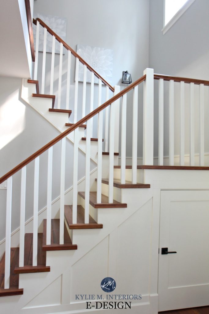
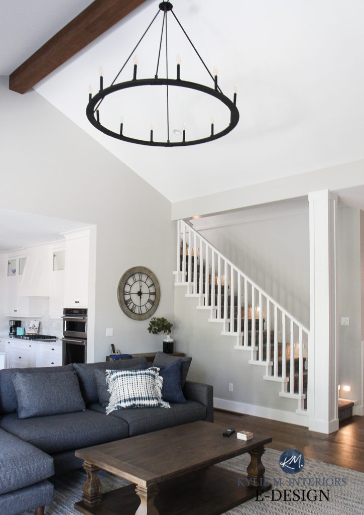
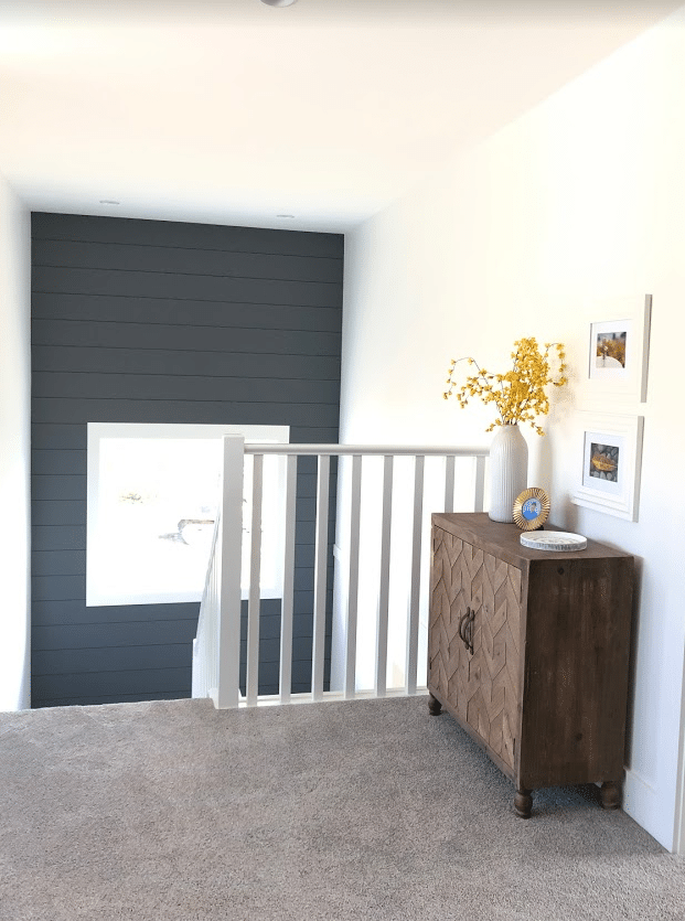
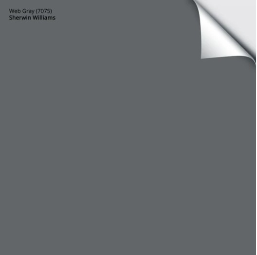
7. SHERWIN WILLIAMS WEB GRAY 7075
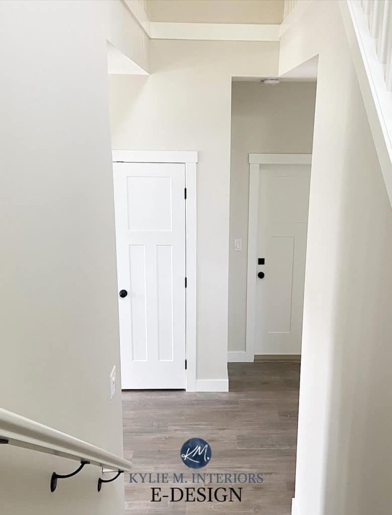
Web Gray is a dark gray paint colour with a flexible range of cool undertones, however, it favours blue the most. Web Gray is OFTEN used for feature or accent walls, cabinets or on exteriors, as shown on this shiplap feature wall in this staircase (see the WHOLE HOME).
FULL Paint Colour Review of Sherwin Williams Web Gray
Get your SAMPLIZE PEEL & STICK SAMPLE HERE
PAINT COLOURS THAT ARE SIMILAR TO WEB GRAY
- Sherwin Williams Roycroft Pewter – PAINT COLOUR REVIEW HERE / SAMPLE COMING SOON
- Benjamin Moore Trout Gray – PAINT COLOUR REVIEW HERE / PEEL & STICK SAMPLE HERE
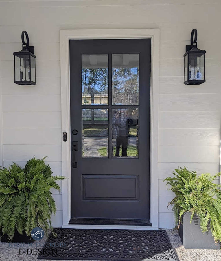
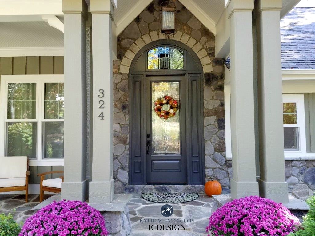
8. BENJAMIN MOORE GRAY 2121-10
If you’re looking for a DARK gray paint colour, Gray 2121-10 is one of the most BADASS shades on the market. With its violet-blue undertones, Gray’s also a great colour for front doors as it suits a variety of stones, bricks and roofs. Please note that you need to mention its colour CODE/number when ordering it or the paint store staff will wonder which ‘gray’ you want (clearly a genius named this colour).
FULL Paint Colour Review of Benjamin Moore Gray 2121-10
Get your SAMPLIZE PEEL & STICK SAMPLE HERE
PAINT COLOURS THAT ARE SIMILAR TO GRAY 2121-10
- Benjamin Moore Charcoal Slate – PEEL & STICK SAMPLE HERE
- Benjamin Moore Steel Wool – PAINT COLOUR REVIEW HERE / PEEL & STICK SAMPLE HERE
So there you have it, a WIDE RANGE of gorgeous gray paint colours to choose from! And if you’re hungry for a little more inspiration…
READ MORE
Is Gray Still Trendy on Walls, Cabinets & EXTERIORS
The 12 Best WHOLE HOME Gray & Greige Paint Colours
How to Create a Timeless Home – 4 PART SERIES
6 Budget-Friendly Ideas to Update Your Home
The Best Dark Gray & Greige Paint Colours
NEED HELP?
CHECK OUT MY ONLINE PAINT COLOUR CONSULTING – E-COLOUR!
Chat soon,


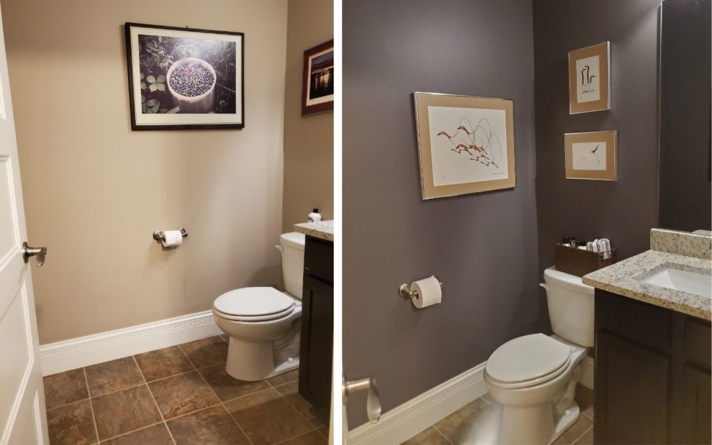
Love your site! Any recommendations for cabinets in a north facing kitchen with fantasy brown countertops? Our walls are currently SW white duck and SW pure white trim. We were thinking about sticking with pure white for the upper cabinets because it connects to the trim but doing a darker color for the bottom cabinets.’we don’t have an island, but more like a “peninsula” of you will 🙂
Hi Stephanie! Take a look at colours like SW Grizzle Gray for the lowers – grays with a GREEN undertone. I also thought about SW Urbane Bronze, but it might be a touch warm ;).
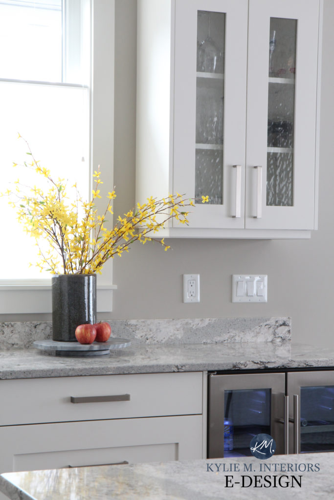
Thanks for posting about gray, Kylie! We just renovated and put in white kitchen cabinets (BM Chantilly lace) and installed Black Pearl Granite with eased square edges for a more modern look and painted our open concept kitchen, living and dining room SW Agreeable Gray because I was too scared to paint it BM Classic Gray as I wasn’t sure about what the undertones of my slab of Black Pearl would be. It turns out that both would’ve worked nicely, as there are green gray and even some violet tones in my granite. I must admit, I find myself wishing I would’ve done the Classic Gray because it is the closest to white I can ever paint my north-facing home. I guess I’ll do that in a few years when my husband recovers from all the painting we just did lol! I did paint the rest of my rooms SW Sea Salt, BM Classic Gray and BM glass slipper so i would be fully engulfed in the gray trend. I really hate that there are “paint trends”. Why do we have to follow others ideas of what’s cool and on trend? I mean it’s nice to see people post exciting and fresh new things but people like what they like and there is so much pressure as it is to measure up in the world. Thank you for recognizing just because the gray trend is over it doesn’t mean it has to fall off the face of the earth and never be used again or won’t come back around for another 30 years.
Hi Holly, what a great note to get! And you’re SO right. While I think trends are great for some, for others it’s just PRESSURE to keep up. And in that, we often lose perspective on what we actually love and are comfortable LIVING IN! Good for you for listening to your gut :).
Gray – it is a complex color… I’m dancing with it myself right now. As I was reading this post I was hanging on your every word – you are always spot on and have truly helped me to notice the subtle differences. I have recently selected some new colors for our home makeover. I’m late to the game but making the move from the off white trim and beige walls we have had for the past 15 years – to the lighter brighter more open feel of white and gray. Our house has quite an open floor plan – I am mainly looking at SW Pure White for trim, kitchen cabinets and moulding we have 3/4 the way up on the family room walls with SW Passive for most of the walls. My one questions as I have learned so much from you regarding LRV is thoughts on SW Dark Night for my kitchen islands base. I wanted to take a step away from using a darker shade of gray for the island and I love the deep green/blue/gray I feel Dark Night has to it. Wasn’t sure if this would work together in your opinion with Passive? I may introduce SW Essex Grey in our back hallway to break up all the use of SW Passive. I just worry about the undertone between Pure White, Passive, Essex Grey and Dark Night and if it feels too dull.
Good morning Kylie,
Thank you for all the helpful tips on your website! I turn to you for all my projects 😊. I am looking to change my brown cabinet to an off white and I chose Cloud Cover by BM. Now, I am trying to decide between the advanced paint by BM vs matching the Color and having them done in lacquer… I am worries about resale value if they are done in paint vs lacquer and whether the advanced paint will hold up and wash well like lacquer…
Thank you for your insight and inspiration, Nawal.
Hi Nawal! I’ve had great luck with BM Advance. LACQUER scares me as it tends to change the colour slightly, often making it look a touch more yellow/dingy. PERSONALLY, I would stick with Advance. I have it all over my home and it’s VERY washable (satin/pearl finish)
Hey Lisa! I’m torn. I love Dark Night (I used it years ago and you’re right, it has an epic green-blue blend to it. I just WORRY that Dark Night is just a touch too colourful/saturated with Passive. I’m not saying NO, I’m just not 100% sold. Funny enough, the slightly lighter Grays Harbor (on the same colour strip, but one up) has me feeling FAR better as it’s not as rich looking, but is still a STUNNNNNNER!
Hi Kylie, thank you for all of the insight you provide! We are looking for a main color for our new construction home. Lots of wall to cover and I have some gray in fixed elements and do like it trend or not, but I don’t want too gray. I definitely lean towards warm grays with slight green undertones. Have considered revere pewter, but have been even more drawn to BM stingray as well as SW Jogging path. Any experience or thoughts on either of those? I keep hoping to see them discussed somewhere! Thanks so much!
Hi Kylie, this was such a great post! I am about to start a kitchen remodel (as in next week, yikes!). I’m going with Carrara marble countertops and am leaning toward Edgecomb Gray for cabinets (actually based on a search that I did on your site for what colors pair well with marble). I’m really curious as to why the gray on cabinets is a trend you feel would be wise to stay away from. I really don’t want to make a mistake! In that same post you mentioned Balboa Mist as another one that would pair well with marble and it’s the one that you specifically mentioned in this post to avoid, lol! I know that “timeless,” is a buzz word right now, but that’s really what I want. I’ve been afraid that white would make the kitchen too stark so shifted to more of a “mushroom”. I want a color that will warm up the marble. Any suggestions you could give me would be so helpful! Thank you!
Hi Bethany! Well, the reason why gray cabinets are risky is because they are (were) such a trend. So, it’s not that they aren’t PRETTY, but they tell you when a home was updated, which means that in a few years, they could really start looking OUTdated and won’t be timeless. I do think warm whites like Balboa Mist will have more longevity than cool ones, but it’s still a risk. Really, the MOST timeless choice is white. As for warmer off-white or light depth colours, again, they’re definitely on trend now, but this too shall pass!
Thank you so much Kylie! I totally understand what you’re saying. Do you have a recommendation for a warm white that will pair well with Carrara marble? My husband wanted more of a “color” to keep things from looking sterile but I totally agree with white being the most timeless. Ahhhh, it feels so hard!