
LRV & Paint Colors: The Answers to Common Homeowner Questions
LRV is a super important tool when choosing your best paint color. Combining this with your personal tastes (how light or dark you want your color to look) and the lighting conditions in your room can help you pick the perfect shade.
But it’s hard when there are so many variables – exposure, light bulbs, chroma (degree of color). That’s why this blog post covers as many LRV topics as possible. This way, you can use it as a guide and companion to my other LRV-related articles.
If you read my last article on LRV (linked later) and how to use it to choose a paint color, you probably know the meat n’ potatoes and even a little gravy…

- LRV numbers range from 0 to 100, with 0 being absolute black and 100 being pure white (neither of which is available in the residential paint market). Our ‘usable’ scale ranges from 2 to 94.
- The higher the LRV number, the lighter a color is and the more light it will reflect – light colors have higher LRVs.
- The lower the LRV, the darker a color appears and the more light it absorbs; dark colors typically have lower LRVs.
However, in my never-ending quest to be a non-scientific color nerd, I have learned a few more things about this complex concept called LRV and want to share them with you.
My other blog post has all the basics you need—this one is about hearing myself talk, which I love to do.

By the way, if you haven’t read the previously linked post, I highly recommend you do (it’s also linked at the end). It sets the bones in place and gives the information you need to understand the upcoming content. This blog post is about my wine-infused ramblings, ravings, and insights into what I’ve discovered about LRV.
DOES LIGHTENING OR DARKENING A PAINT COLOR CHANGE ITS LRV?
HECK YES! When you lighten or darken a paint color, you’re changing how it looks – you’ve altered its DNA, and it will appear lighter or darker, and subsequently have a different LRV.
As usual, this is NOT scientific, but based on me fiddle fartin’ around in my studio with samples, here’s what I’ve found…

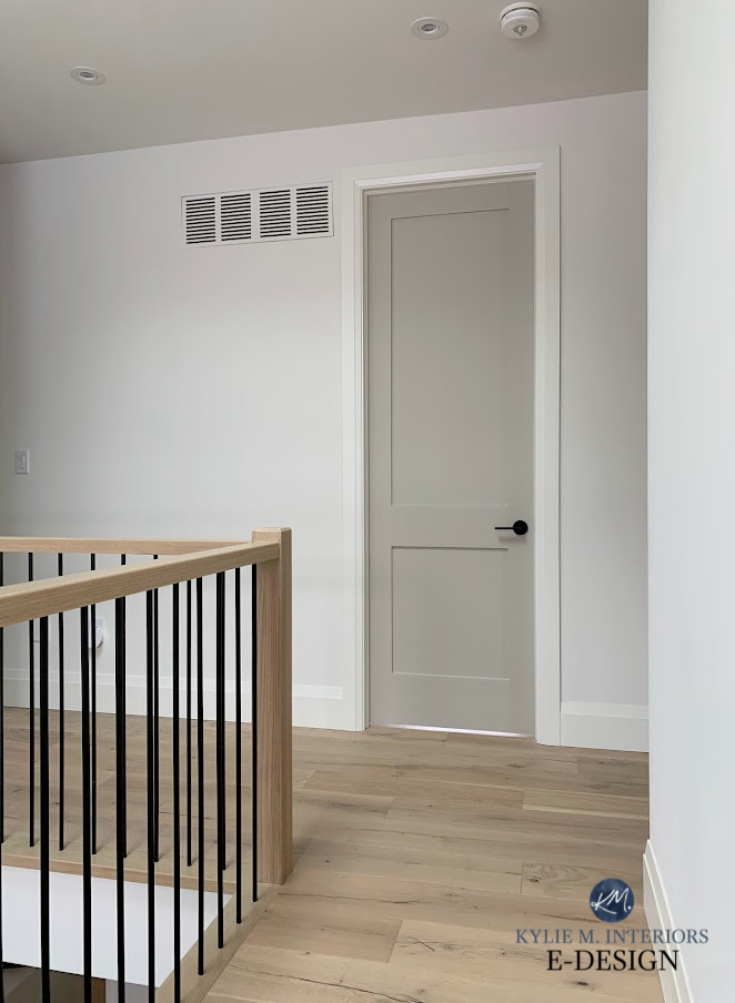
Benjamin Moore Revere Pewter painted interior doors, darkened 25%.
LIGHTEN OR DARKEN A PAINT COLOR BY 25%
Lightening a paint color by 25% typically increases its LRV by 3-4 points. This can vary depending on how much BLACK is in the paint color’s recipe. Black reacts more strongly to being lightened than a color that doesn’t contain black.
- If your paint color has an LRV of 60, reducing it by 25% could bring it down to around 46.
- Darkening a paint color by 25% typically lowers its LRV by about 3-4 points. Again, this can vary depending on the amount of black in the recipe.
Some paint store employees will tell you that 25% won’t make a noticeable difference, but listen up, Buttercup – it does.

- 25% is not a drastic change – it’s a subtle tweak. For some people, a subtle tweak isn’t worth it. On the other hand, if you’re anal (one of my more redeeming qualities) and looking to hit things just right, it could hit the spot.
- I have three colors in my home that I’ve tweaked by 25%, and it made all the difference for me. I’ve also found that my mood increases by about 25% when Tim gives me a subtle tweak on ma butt.
LIGHTEN OR DARKEN A PAINT COLOR BY 50%
Lightening or darkening a paint color by 50% seems to result in an approx. 6-8 point shift. The amount of black in its recipe (amongst other things) can affect how much of a change you see.
THIS IS NOT SCIENTIFIC. But let’s be honest, you aren’t here for scientific info. You’re here for common-sense, user-friendly advice and inappropriate comments about hardwood and wine (often combined).
3 Easy Steps to Getting Your PERFECT Paint Colour
Here’s Benjamin Moore Shaker Beige regular strength…
And here’s Shaker Beige 50% lighter in the same home…

So, if your paint color starts at approx. 53 (like Shaker Beige), you can expect 50% to take it somewhere around 60-ish (math is not my strong point).
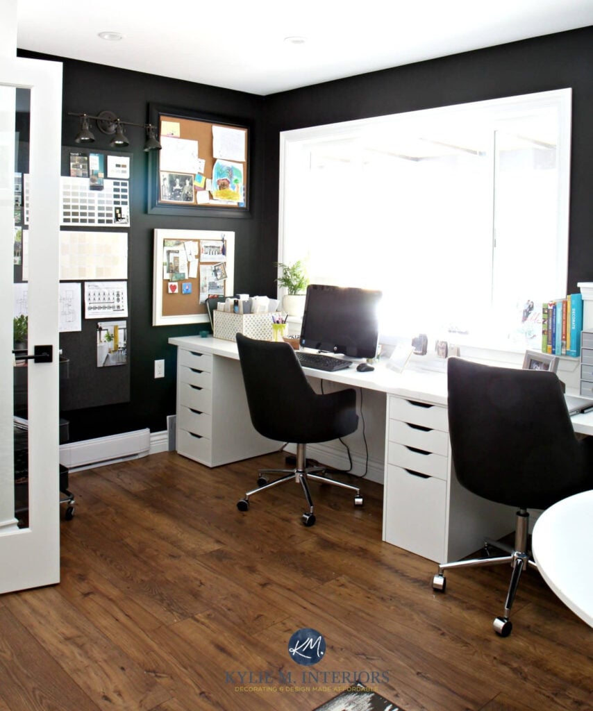
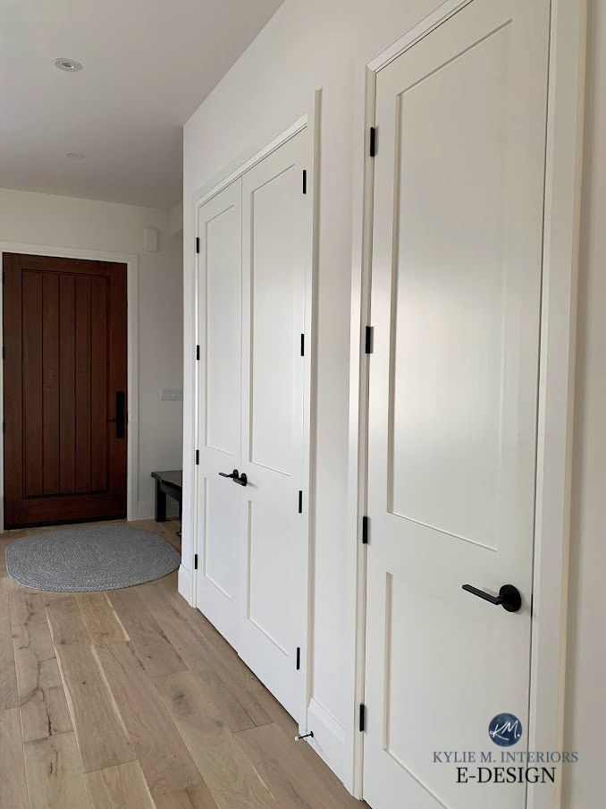
Doors: Benjamin Moore Revere Pewter, 25% darker | Trim: Benjamin Moore White Dove
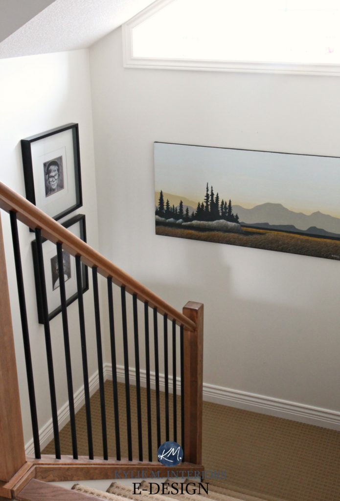
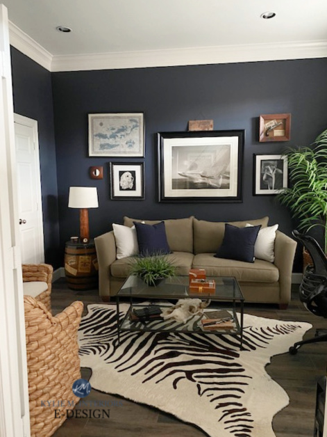
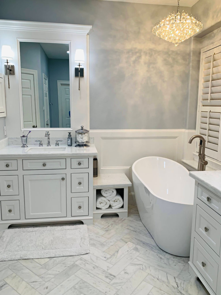
99.5% of the photos in my blog are of REAL HOMES from my Online Color Consulting clients, readers, and friends. While not always magazine-perfect, they’re packed with ideas and proven color choices to help you create a home you’ll love.
But this is where it gets a bit trickier…
WHEN YOU LIGHTEN OR DARKEN A COLOR, DO ITS UNDERTONES CHANGE?
Let’s focus on ‘lightening’ for the sake of explanation. When you lighten a color by 25%, you’re changing its recipe. It’s like making a batch of cookies and taking 25% of the sugar out – they won’t taste the same. Or at least this is what people who cook tell me.
You’ll get a ‘new’ paint color with a higher LRV, and you might see a shift in undertones.
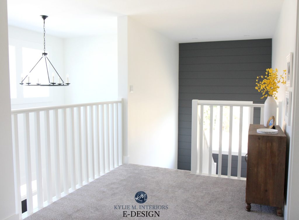
You might not know that the walls and trims in this next home are Benjamin Moore White Dove 25% lighter, but I do, and that’s what matters—it was just the tweak I wanted to see. This is different from the twerk that Tim wants to see.

Benjamin Moore White Dove: IMAGES, Info, & More
The great thing is that you’re usually still working with the original color’s bones. Is there an odd color that this doesn’t work with? YES, especially some shades of white and off-white, but some other colors can be tricky, too. Depending on the tints or colors used to create a particular shade, if there’s only a ‘dash of this,’ that dash can disappear when you lighten the entire recipe.
You’re more likely to really notice a shift when you lighten (or darken) a color by 50%+. One undertone might recede; another might get stronger.
That gray that had a wink of green in it – the green might almost entirely disappear. That greige that leaned more beige might lean a bit more gray. Again, you are still working with the same color, but you might notice a slightly different side of it.

Benjamin Moore Anchor Gray: IMAGES, Info, & More
So, what does ALL of this mean to you?
It means that you can’t make assumptions. Just because I drink a lot of wine doesn’t mean I won’t sit back with a G&T. Just because Tim works from home now, rather than at the bank, doesn’t mean he puts on pants. And just because you lighten or darken a color by 25% or 50% doesn’t mean you’ll get the SAME COLOR; you’ll just get a lighter or darker version. Will it be similar? ABSO-TOOTLY. Will it be the same? No, ma’am.
MOVING ALONG!
USING LRV TO MAKE A ROOM LOOK BIGGER
If you have a small room that you want to look larger, you can use LRV, for sure. However, LRV relies heavily on lighting (interior and exterior) to work its magic.
If you don’t have enough natural or artificial light, no paint color will save you.
Just because it hurts doesn’t mean it isn’t true.
In this next image, Sherwin Williams Worldly Gray looks light and bright where natural light hits. However, it looks flat and dirty where the natural light fades…
However, as a general guideline, focus on paint colors with an LRV of 70 or higher. The higher the LRV, the more light your paint color will reflect.
- If your room is reasonably bright, you might love some of the popular off-white paint colors that hang out in the 70ish to 80 range. Or you might stick to the best, fool-proof white paint colors in the 80s and 90s for optimal results.
- If your room is quite dark, you might stick to mid- to high-80s and into the 90s.
EVEN DARK PAINT COLORS REFLECT LIGHT
When I first started learning about LRV, I read that lower LRV numbers absorb light while higher LRV numbers reflect light. This is true, but kind of misleading.
I’ve discovered that we often get caught up in the idea that dark colors absorb more light than light colors, forgetting that they still reflect it. Even a low LRV color, such as 5, reflects light.
It might not reflect a TON, but it still reflects some.
How do I know that?
Well, I’ve seen it in action thousands of times; unless you’re dealing with a hardcore black (which doesn’t exist in our paint world), every color will reflect some light, as long as it’s given light to reflect.
Let’s check out Benjamin Moore Hale Navy (below). With its skookum low LRV of 8.36, you wouldn’t expect much light to be reflected, but what do you know, there it is…
When a color has a low LRV – let’s say it’s a dark color between 2 and 10, it still reflects some light. Its number generally relates to the percentage of light it reflects. So, if a color has an LRV of 10, you can expect it to reflect 10% of the light given, meaning it absorbs 90%. Of course, this can shift based on how much light it’s given and where the light hits, and…and…and, well, there are a lot of variables.
THIS IS NOT SCIENTIFIC and is based on 25+ years of hands-on experience (and Online Color Consulting of 11,000+ homes) – you can take it or leave it (but you’d be smart to take it – which is also what Tim says to me on Friday nights – wink wink).
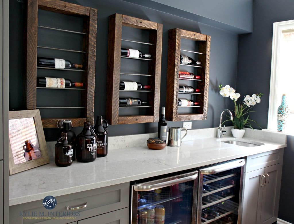
My Color Review of Sherwin Williams Cyberspace
Look at the above photo of the wine bar painted Sherwin Williams Cyberspace (LRV of 6). You’d think it would just be friggin’ dark with an LRV of 6, and it is very dark on the far left and in the middle, where it gets little to no light. But look at its glory on the right! The hue rises and brightens, allowing you to see the ‘color’ of Cyberspace, rather than the slightly blackish tone shown on the left.
Why?
BECAUSE IT’S REFLECTING GLOOOOORIOUS LIGHT!
Even Sherwin Williams Tricorn Black and its ragingly dark LRV of 3 reflects a bit of light…
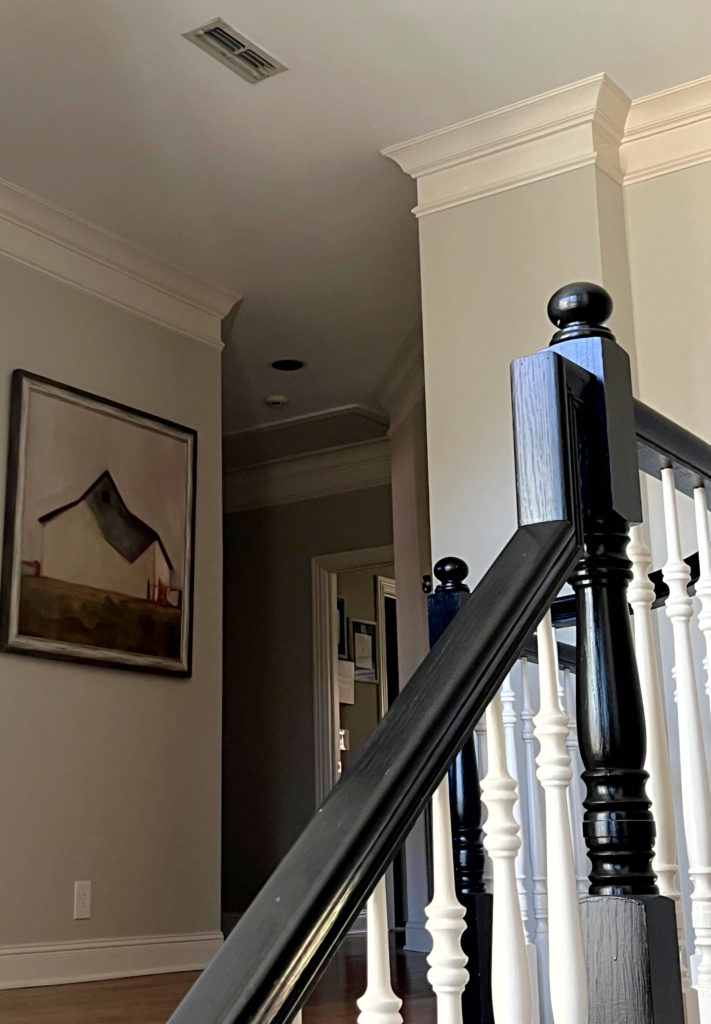
Sure, you can play a lot of this off to the semi-gloss sheen on the railing (btw, satin would be better). However, even in my old home office with Tricorn Black in a matte finish, it bounced a little love at me in the center of the left wall…
Why does this matter to you?
Because you love me and need to humor the crazy lil’ Ginger.
Really, though, let’s say you hire me for an Online Paint Color Consultation, and you want a nice dark gray with subtle undertones for a feature wall. So, I chose some dark beauties for you to explore and explain their overall look and undertones. You look at them and think…
Hmmm, those are super dark grays, but I don’t see those undertones she’s talking about ‘ OR maybe you say…
‘Kylie told me this was a great color for me, but it seems too dark – is Kylie in the cups again?‘
That’s because, on that wee small paint chip, the LRV has put up its feet and grabbed a beer.
There isn’t enough surface area on those small samples for LRV to work its magic. On a large scale, there’s more surface area to gather light and reflect it back—even if only a small amount. This can make the color look slightly lighter than expected and enhance its underlying colors, bringing them to the forefront.
This is also why you need to do large Samplize Peel & Stick samples: to give colors a chance to work their magic! These samples are 9″ x 14″ and can help you see more of what your color has in store for you.
Here’s a Peel & Stick sample of White Dove…
WHY DOES MY PAINT COLOR LOOK LIGHTER ON MY CABINETS VS. MY WALLS?
- Have you painted your kitchen cabinets, and they look lighter than you expected (especially non-whites)?
- Did you paint your trims, walls, and cabinets the same shade of white or off-white, but the cabinets and trims look lighter and brighter than the walls?
Your paint’s sheen (finish) will change how much light it reflects.
The walls, trims, and doors are all the same color.
While its LRV remains the same, the paint’s sheen will reflect more or less light, making your color appear lighter or darker than expected.
- FLAT (ceilings): Reflects no light.
- MATTE (walls): Reflects little to no light (brand/line dependent)
- EGGSHELL (walls): Reflects a degree of light (brand dependent). The sheen is similar to an eggshell or higher.
- SATIN (cabinets and trim): Purposefully and noticeably reflects light.
- SEMI-GLOSS/HIGH-GLOSS (not as popular, but sometimes used on cabinets and trims): Reflects a lot of light, giving a glossier look.
Give a paint color sheen and light, and it’ll give it back to you tenfold!
However, if you’ve chosen a color and worry it’s a wink too dark…
a) Consider how much light your walls get (good or bad) and whether this might shift things on a larger scale.
b) Consider lightening it by 25% or 50%, or…
b) Choose a slightly higher sheen so it reflects more light (as long as you give it light)

Benjamin Moore Edgecomb Gray regular strength walls, 25% lighter on the left, 50% lighter on the right.
LIGHT COLORS THAT WASH OUT IN NATURAL LIGHT
Light paint colors will have a higher LRV (55+). The higher the number, the lighter the color and the more light it will reflect. In my experience, once we hit about 65-70+, the LRV really starts to make a difference in how a room looks—lighter, brighter, and bigger—as long as you have adequate lighting.
However, if you give a paint color with a high LRV a lot of light, it will wash out – you risk losing it all.
Why does this matter to you?
Because the color you chose that looks perfect on a few walls that get moderate light, all but disappears on the super well-lit walls in the same room.
Heck, even the badass and beautiful Sherwin Williams Amazing Gray, one of my favorite light-medium depth greige paint colors, and its LRV of 47 washes out somewhat with intense light…

Notice how different Amazing Gray looks from left to right to downstairs!
Is this a problem?
Well, if you want a color to hold its own in any light, it’s definitely a problem.
Combine LRV with a color that has a lower chroma, and you could have a hot mess of unpredictable undertones on your hands.
No color will hold itself the same/perfect on every wall at all times of the day.
However, remember that the sun moves (or does the earth move? I can’t remember). Anyway, the look and intensity of your natural light (especially east, west, or south) will shift throughout the day, meaning…
- A wall that’s SUPER BRIGHT in the morning could look perfect in the afternoon.
- That wall that washes out at noon could be the best color ever in the morning and afternoon.

Sherwin Williams Greek Villa walls (lightened!) & Extra White trim
What I’m saying is that you have to be patient and know that things will shift.
There might not be a color you love 100% of the time, which means it’s about finding the next best thing.
So, back to that whole LRV, percentage jazz…
My educated guess (without scientific proof) is that if a color has an LRV of 65, you can expect it to reflect approximately 65% of the light back into the room. This guess makes sense based on my experiences.
For my personal use, I use LRV to determine the ‘general depth I can expect a paint color to look in a room with an adequate amount of light—not dark, not obscenely bright.‘
In this next image, notice how bright the warm white walls look at the beginning—this is because this color has a higher LRV, and it’s given a good amount of light to reflect.

Walls: Similar to Benjamin Moore White Dove (Kelly Moore’s Swiss Coffee, but KM no longer exists).
Now look at the walls down the hallway – that LRV doesn’t seem so strong. It hasn’t changed, but it isn’t working its magic because the LRV isn’t given as much light to reflect.
But (a Kardashian-sized one), all of the above changes at nighttime.
HOW DOES LRV CHANGE AT NIGHT?
Just when you think you have it all figured out, the sun goes down on you, and Elton John is singing in your living room (get it?). Seriously, though, regardless of your exposure, the quality of light in the daytime will change in the evening when you only have interior lighting.
So here’s what usually happens…
1. Unless you have an absolutely epic lighting plan, you’ll undoubtedly have shadowed walls and corners at night. In these spaces, paint colors will darken up a bit, depending on how shaded the area is.
The Best Light Blue & Blue-Green Paint Colors
2. Your paint color can appear lighter on reasonably well-lit walls, but only where the light hits the wall. Light travels at its strongest for approximately 3′ (so I’ve been told, with no proof, and I’m no scientist, but it makes sense) and then starts to dim, and your color will shade accordingly.

What does this mean to you?
- If you work all day and spend most of your time in a room at night, you’ll want to choose a color that still looks good during the day but that you love at night (hopefully, you love it all the time, but this isn’t always the case).
- You may need to adjust your interior lighting if you want a paint color to look as you hope. I know; let’s go back to one of my favorite sayings because I DO love to repeat myself…
If you don’t have enough natural or artificial light, no paint color will save you – artificial light being the main factor at night time (obviously).
Create a Cabinet & Wall Color Palette Using LRV
HOW DO YOU GET A PAINT COLOR TO LOOK THE SAME ON EVERY WALL IN THE DAY?
Are you frustrated that your paint color looks different on every wall? One wall is lighter, the other darker. One wall is warmer, while the other is grayed out. Well, you’d better take a deep breath and a big chug of wine, because there’s nothing you can do about it.
Why?

The 20 Best Green-Gray Paint Colors
Depending on the direction and temperature of the light hitting the wall, your paint color will shift how it looks from wall to wall. Short of providing each wall with the EXACT same type/amount of controlled light, there’s no stopping it.
- No, you should never paint one wall a slightly darker or lighter version of another wall to help offset this.
- I also wouldn’t change colors slightly to offset temperature or undertone shifts.
Long story long…it is what it is. But sometimes, when you know you can’t change something, it’s easier to let it go.
Are you exhausted yet? If not, hop back and read my original LRV blog post to tighten up your knowledge a bit more.
READ MORE
Create a Cabinet & Wall Color Palette Using LRV
5 Reasons You Keep Choosing the Wrong Paint Colour
North, East, South, West – Which Paint Colour is the Best?
Gray Paint Colours: The 3 Undertones You Need to Know
NEED HELP?
Check out my E-design and Online Color Consulting Packages!


ORIGINALLY WRITTEN IN 2017, UPDATED IN 2025


I’m thinking of darkening agreeable gray by 25% for my kitchen/living room and entry hallway. It’s an open floor plan so everything is pretty much connected. My floors are very light (gulf sand) and I wanted something darker on the walls to make the floors pop. But not too dark and suffocating. My dining room behind the kitchen is Colonnade gray. I recently signed up for you emails and I will glean what I can from them. Well wish me luck I hope it turns out well!
Good luck! Remember to send pics!
Hi, Kylie!
I have a question about the color Oil Cloth by Benjamin Moore…
If I lighten it by 50%, do you think the color would retain some of the gray undertone or look more green? I love the color but it’s a bit dark for me, but I love how the green is really grayed out in the color. Thanks!
Joe
Hey Joe! It’s ALWAYS hard to say as every colour is different. It’s also VERY HARD to say because it’s part of the Colour Stories collection. So, whereas most normal colours would have, say, 3-4 colours mixed together, the Colour Stories can have 7-8, which means their undertones can vary WILDLY even at full-strength. I DEFINITELY wouldn’t trust it.
Have you tried lightening a dark color by 25%? I love BM Champion Cobalt, but the room is on dark side and the color tends to look flat and darker than I want. The paint store (an authorized BM retailer) told me today that typically dark colors even lightened by 25% tend to look like a different color. He advised me to just pick something else. But I don’t want something else. I want Champion Cobalt, just a bit brighter. (If it makes any difference, ultimately I’m looking to brighten not lighten necessarily. Is there a way to do that other than just going lighter and getting a higher LRV? Does that even make sense?)
Hi Jen, I have – lots! The thing is, there’s no predictable measurement as it varies depending on the colour. Generally speaking though, 25% is quite subtle and while it’s a barely-there shift, I wouldn’t say it looks like a different colour (I’ve NEVER had that happen). 50% – now THAT’S where you really start noticing a bigger difference (but even then, it’s not as drastic as it sounds). As for BRIGHTEN, well, that would be about finding a different COLOUR, one with less gray in it perhaps? I know you’d think that by lightening it by 25% they’d take some black out, but they take a bit out of the WHOLE recipe (paint colours are generally made with 2-8 colours mixed together, so they’d take more than just black out). Does this help at all???
If I mix 2 paints together and they both have an lrv of 55, after mixing together will the new color have a lrv of 55?
That’s a DARN good question. I would have to say, yes, as with the same LRV, there’s no REASON for one to affect the depth of the other, whether you use a 50/50 split or otherwise.
Hi Kylie! I love your content and your blogs have helped me with so many projects. I’m looking to paint an accent wall BM Black Beauty. The Samplize sample feels just a smidgen too stark and “black hole-ish.” But in my experience darker paint colors, LRV of 15 or less, in Samplize samples tend to look darker as a sample and dark colors tend to read lighter once a larger area is painted. Nevertheless, I’m debating between lightening BM Black Beauty 25% vs just doing the original formula. Thoughts?
Hi Kylie, I’m an oil painter and when I lighten colors with white, they get cooler (the hue shifts more toward blue). I mostly use Titanium White, which is a bluish white. Adding more to a mix shifts the mix lighter and cooler. Adding too much makes the resulting color “chalky” in oil painting lingo, which basically means it becomes cooler and less saturated. Do you think this is the same thing happening with wall paint? I wonder if the base they use to mix wall paint is also a bluish white.
Hey Joan, this is an interesting thought! I know that BM uses Titanium White, although I don’t believe all brands do. I’ll have to look into it!
Hi Kylie
I want to hire you but want an honest answer. Please.
I have a problem that cannot be changed right now. I moved into a house that has pink beige floors I am told. Without knowing anything about undertones I purchased an off white leather sofa and chair. Seeing the sofa color elsewhere it looked like a grayish off white to me without any yellow. Well once delivered it has either a yellow or green cast to it, to me. I need help have had 2 “color experts” and one picked the same color as my floor which I didn’t care for in the first place and the other picked off white that doesn’t seem to go with the sofa. I plan to have a large area rug but the floor beyond the LR can still be seen.
Icing on the cake before ordering furniture and before undertone, I repainted my kitchen cabinets. I came from the north and was tired of dark so painted the uppers Chantilly Lace and lowers Newburyport Blue.
Ok I should have gotten a blue sofa/chair but wasn’t using my brain at the time!
Do you think you can help me????? I have been trying to figure this out for over a year. One interior decorator said just ignore the floors they are neutral. Are they neutral and ignorable if pink beige??????
Hey Judy! Why don’t you email me a few photos and I’ll give you my quick, very honest opinion on things. Sometimes there just isn’t a paint color that will fix what’s going on, but sometimes there is!
kylie@kylieminteriors.ca