
Benjamin Moore Edgecomb Gray: A Fresh Home Remodel
E-DESIGN: Home update with GREIGE, WHITE, DARK WOOD FLOORS & more!
If you’ve been feeling tempted to update your early 2000s home, this just might be your tipping point – consider yourself warned.
When my Online Colour Consulting client sent along these after photos, I actually WHOOPED for joy. Why? Well, not only was this family home updated with TIMELESS appeal but its HEART and SOUL were saved in the process.
And while I could listen to myself talk (or type) all day long, I know you’re just here for my wit, charm and the pretty pictures, so LET’S DO THIS!
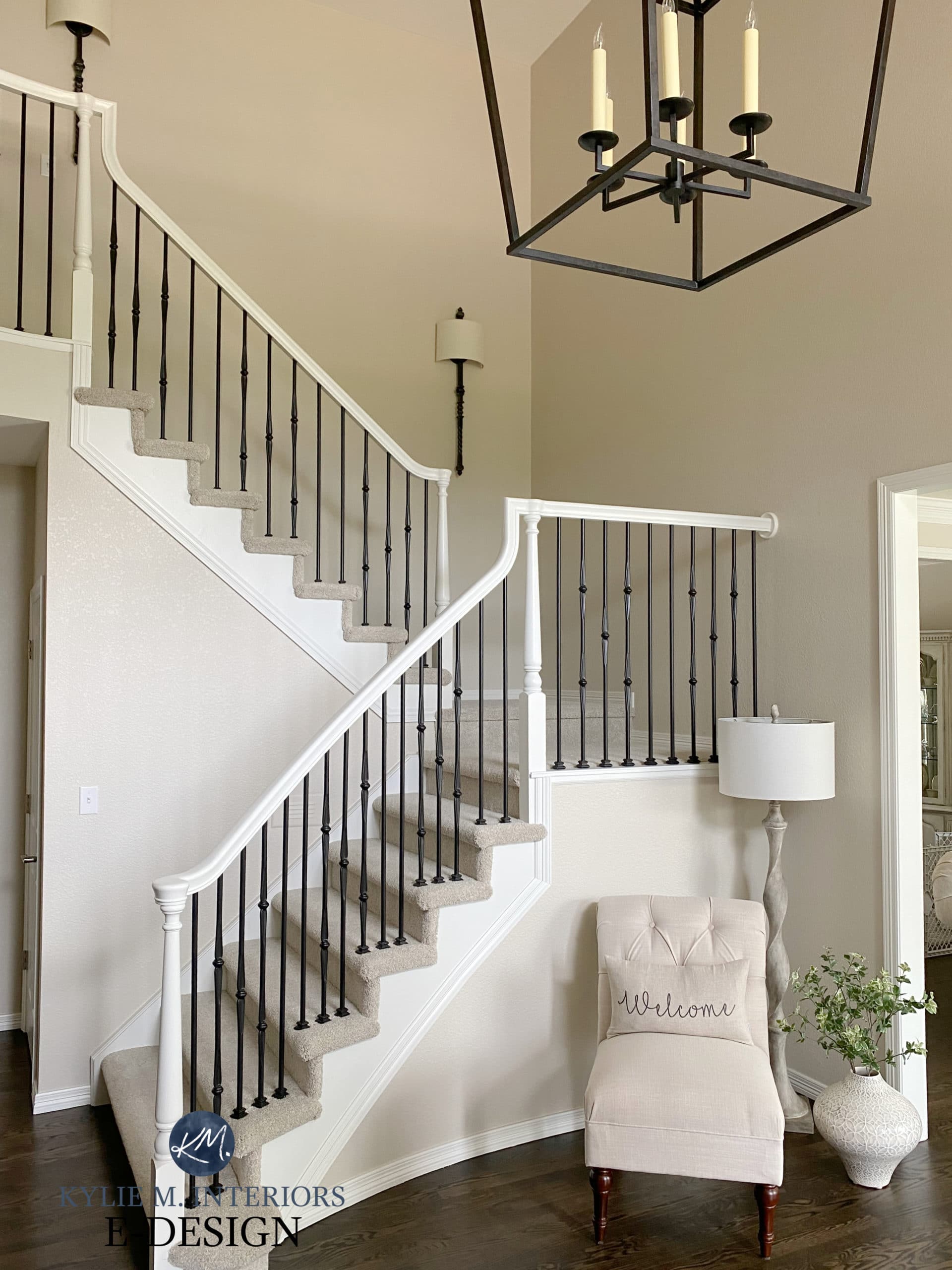
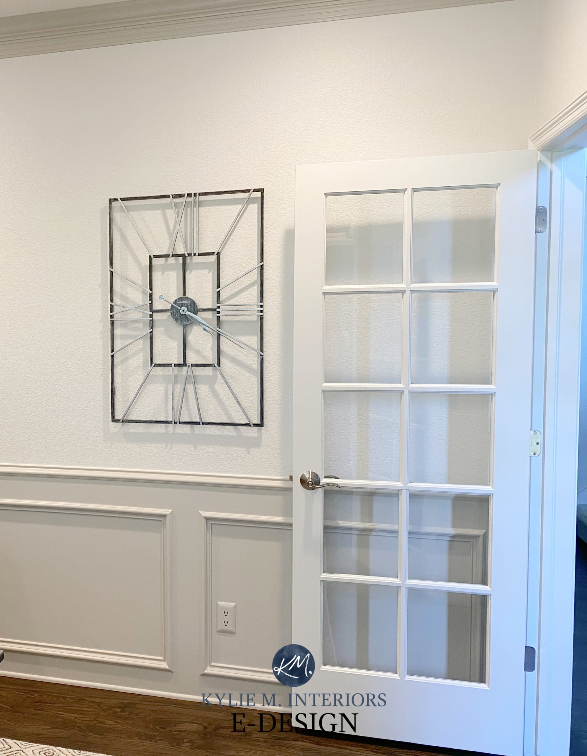
THE ENTRYWAY REMODEL
This space had great bones, just outdated finishes and fixtures…
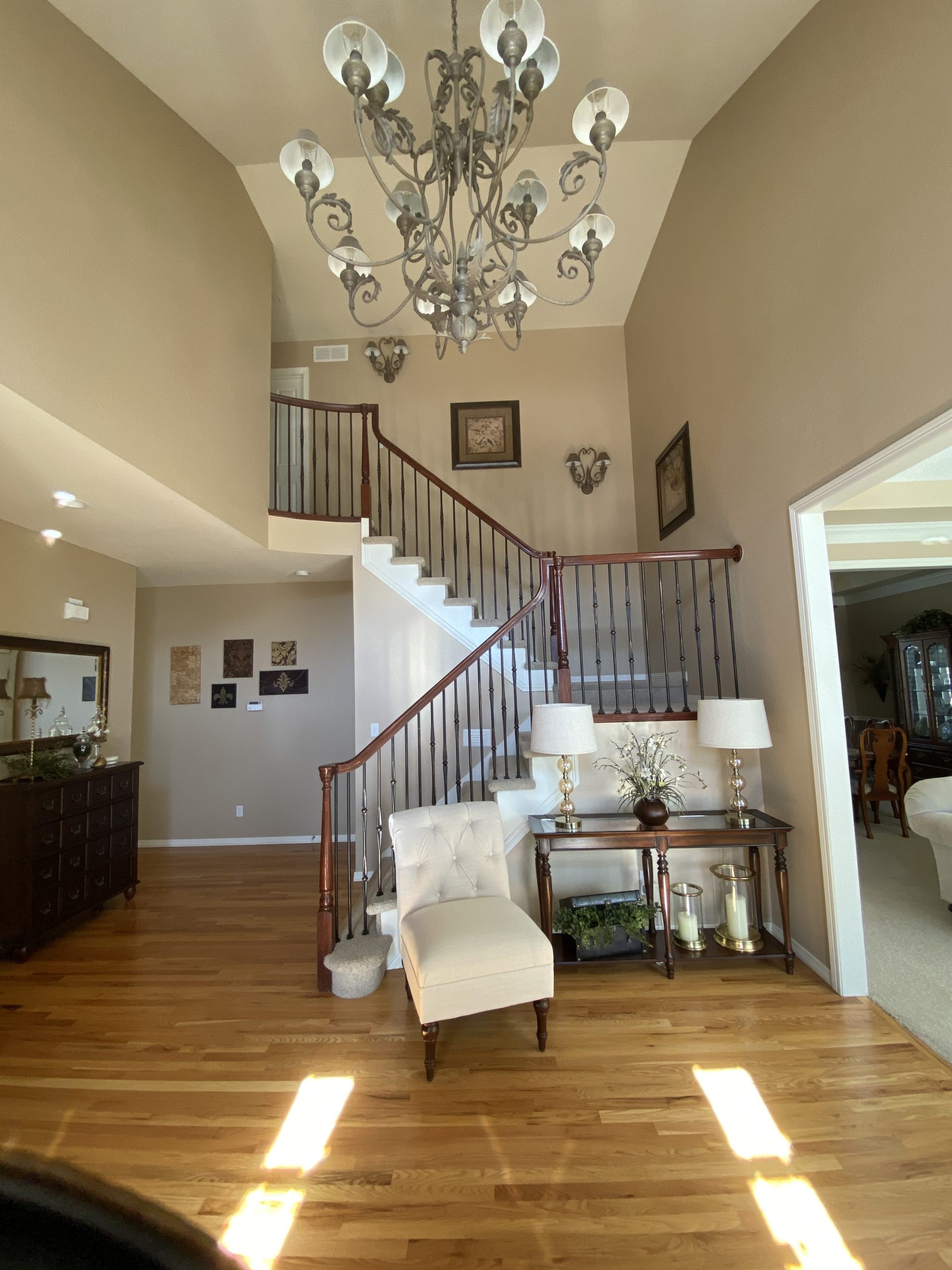
And after…
If you’re wondering about the paint colours, you’ll find a FULL LIST at the end of this blog post.
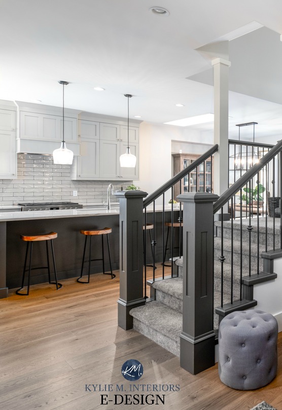
And for all those hubbies who’ve REFUSED to paint the wood railing, remember…
JUST BECAUSE IT’S WOOD, DOESN’T MEAN IT’S GOOD!
One of the MANY things I love is that you’ll see a lot of the same furnishings in the before/after photos. This isn’t just a great way to save money, but a way to keep familiarity and authenticity, as some pieces just suit the home and the people living in it!
I also find it interesting that while EVERYONE else is putting in light natural oak flooring, my clients went the other way and restained their floors in a DARK finish – LOVE IT! Sure, they could’ve chosen some fancy wide plank, brushed finish new floor, but they would’ve spent a FORTUNE doing so.
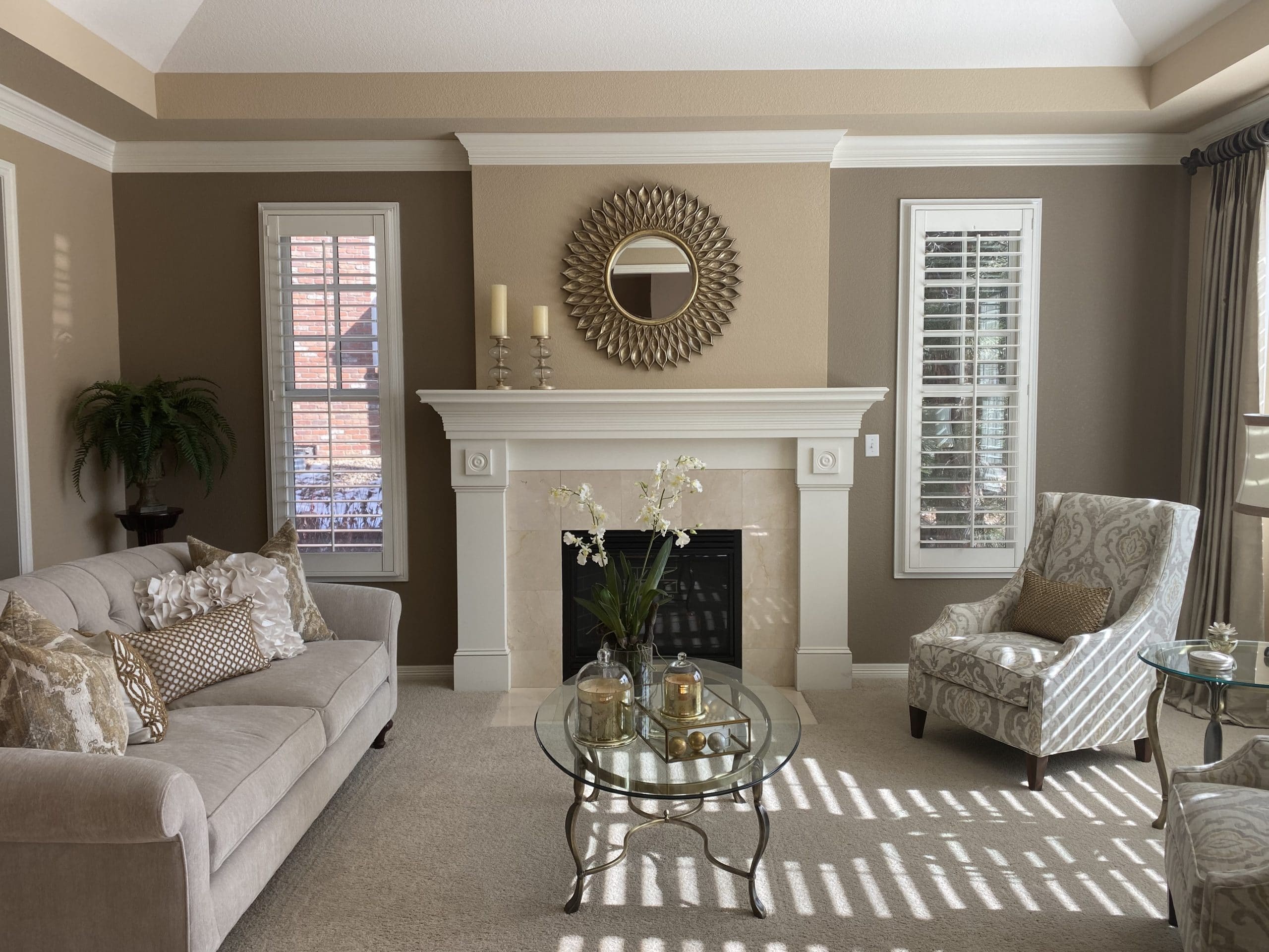
THE LIVING ROOM REMODEL
Again, GREAT BONES, but it was begging for a fresh colour, flooring, and fireplace surround to go with the gorgeous furniture…
Ermmmm ya, it turned out alright…
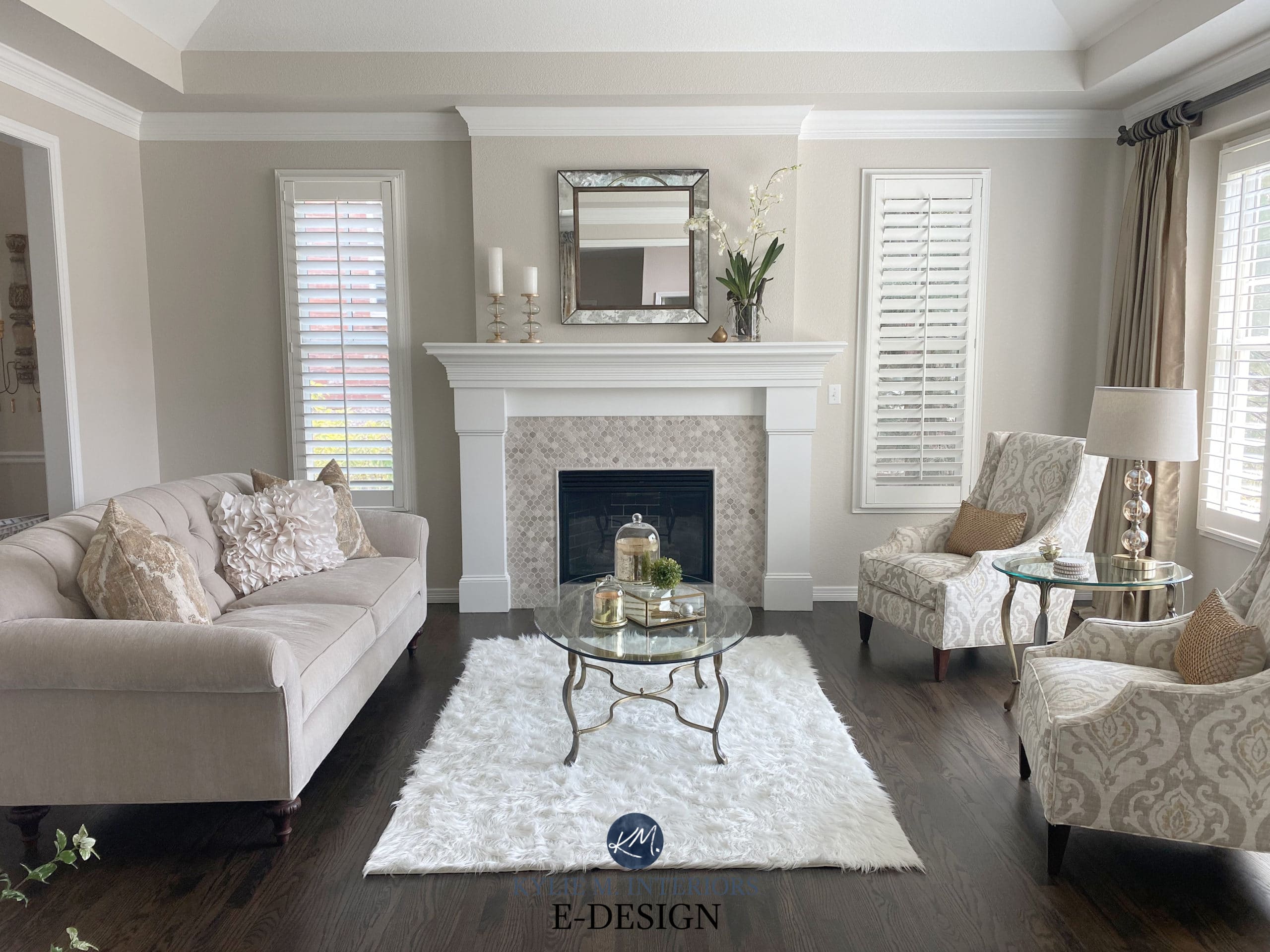
SO STINKIN’ PRETTY! A beautiful modern take on traditional style. And those dark floors are just DELICIOUS!
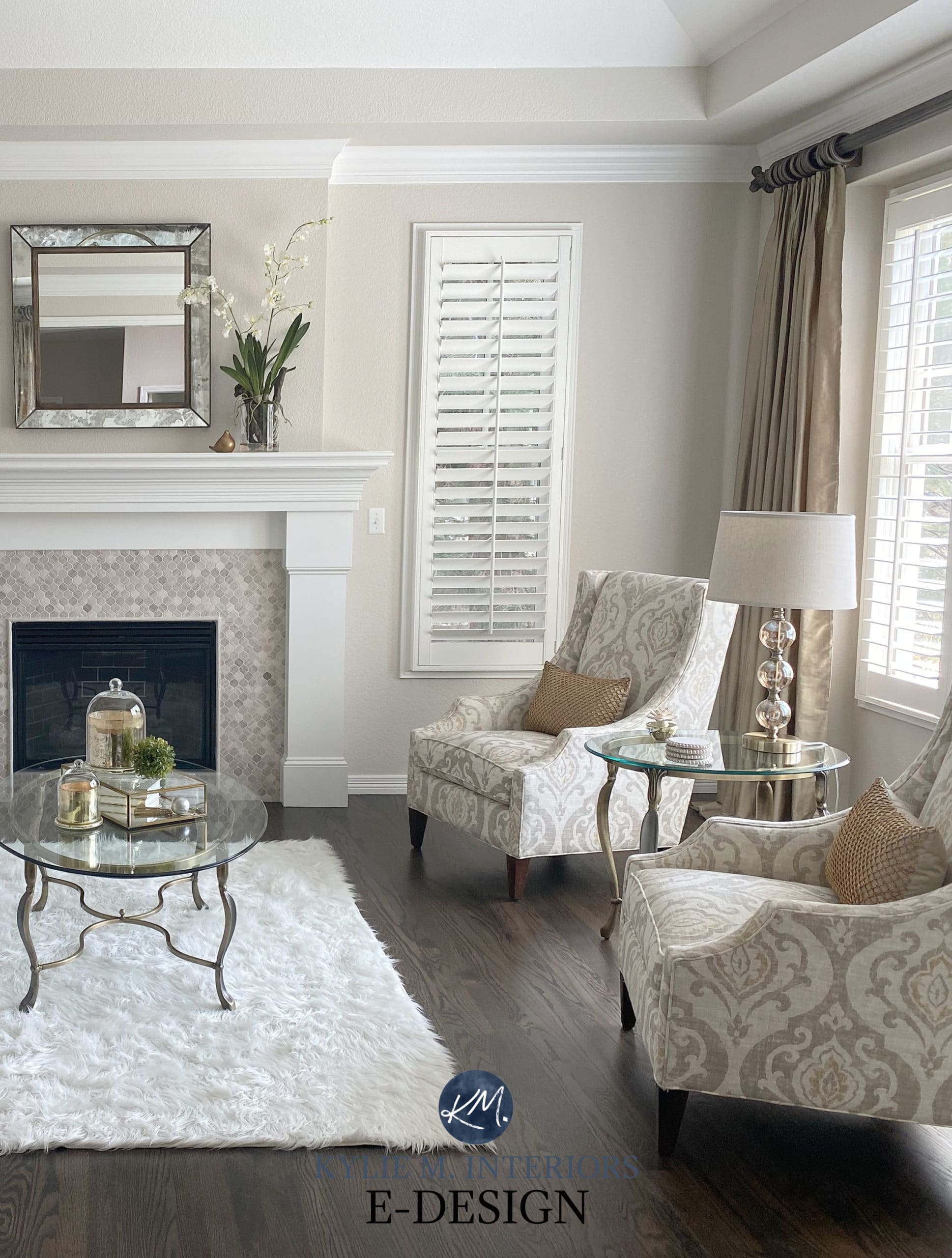
I actually like travertine tile and it wouldn’t have been the end of the world if they’d kept the original fireplace surround…
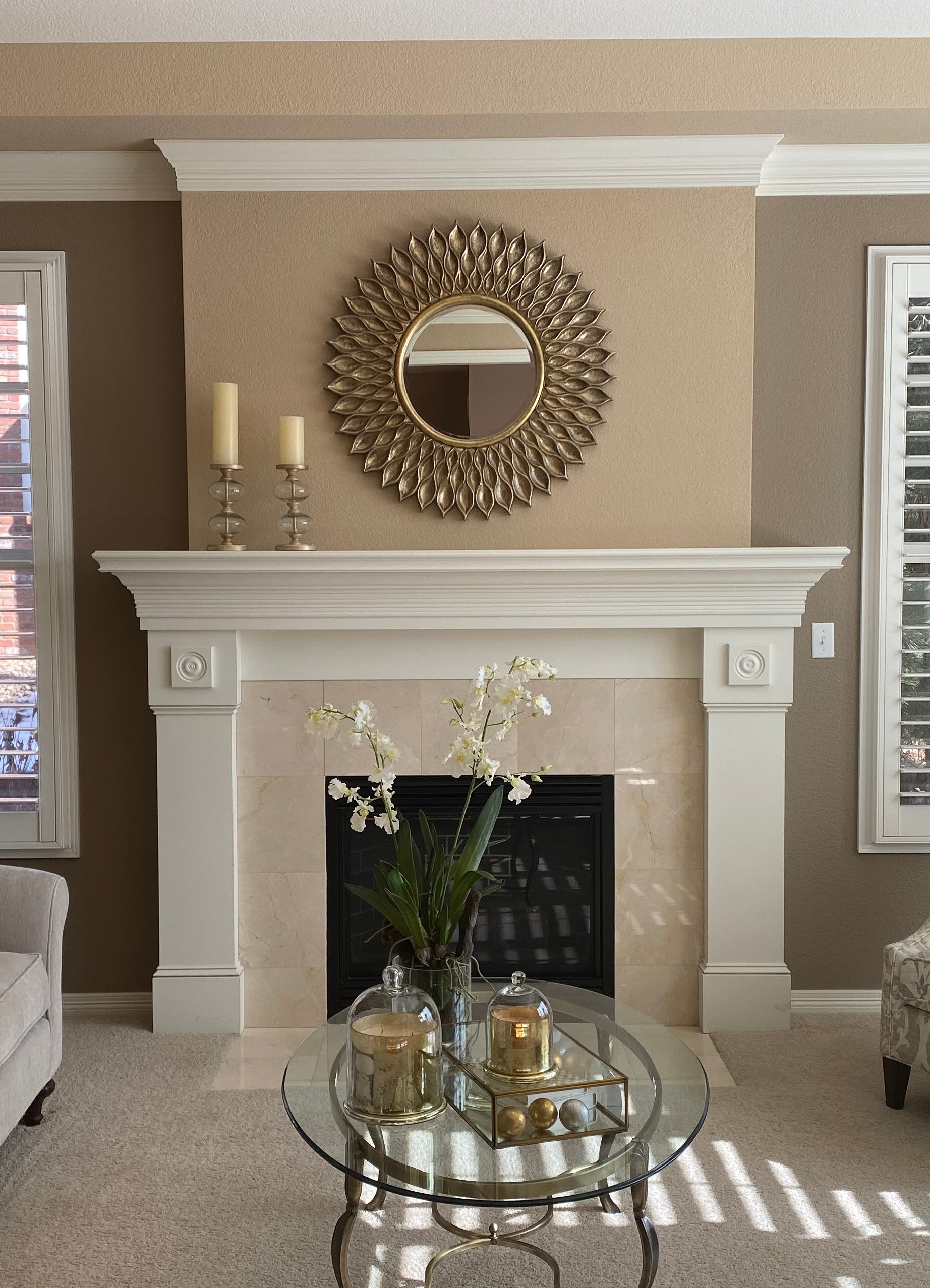
But HOT DAMN, does it look good now or WHAT!?
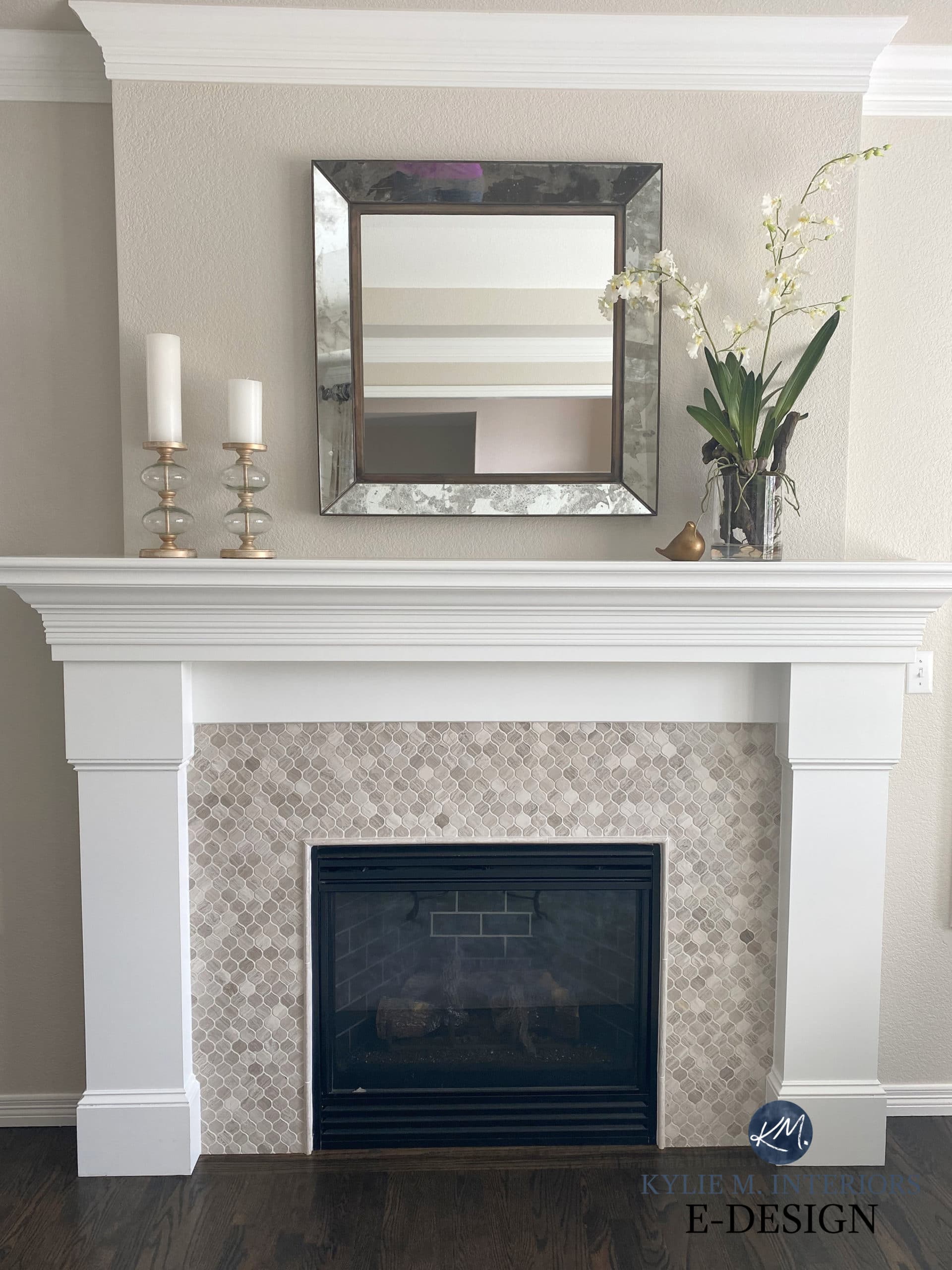
TILE DETAILS AT THE VERY END OF THIS BLOG POST
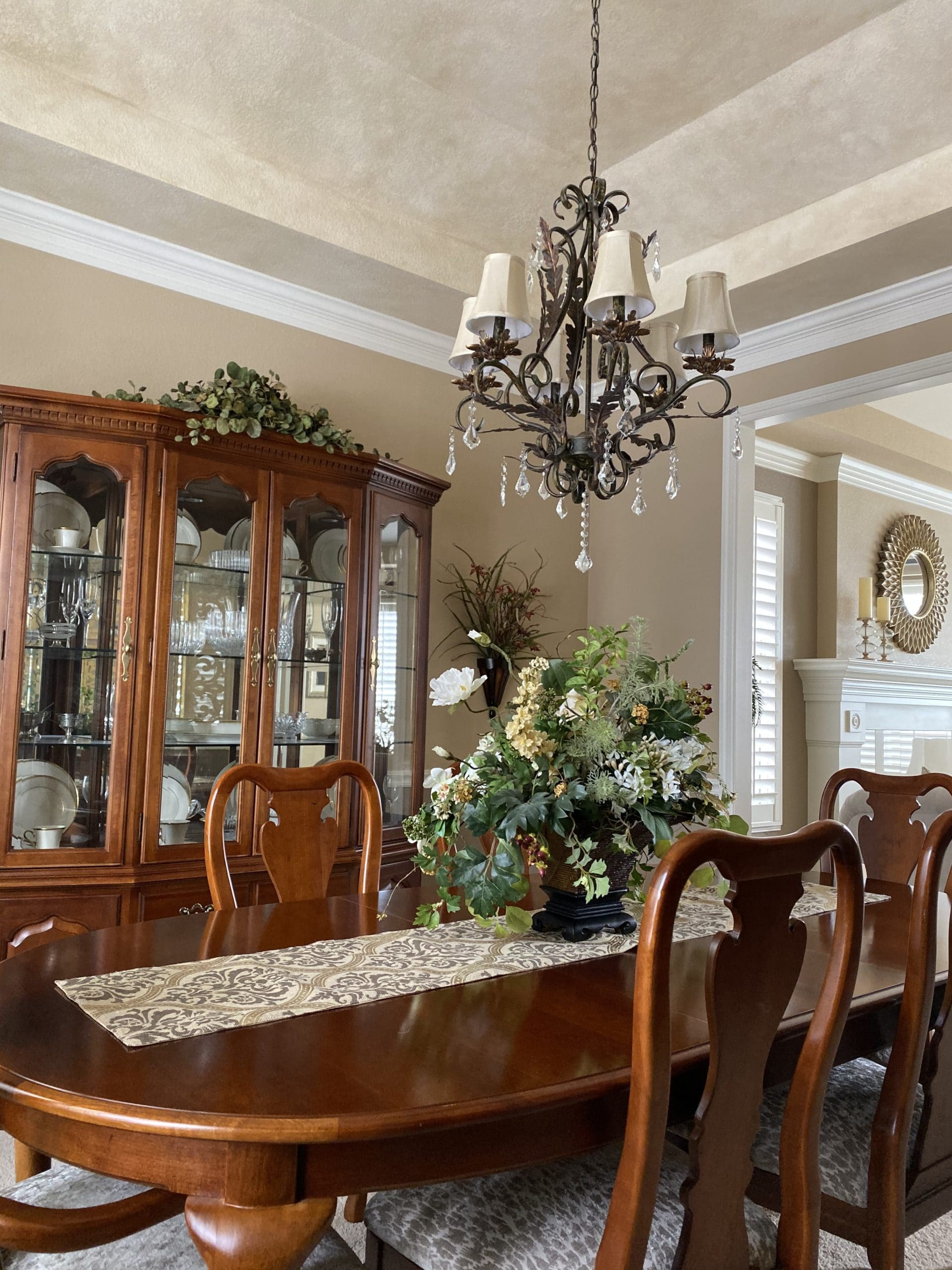
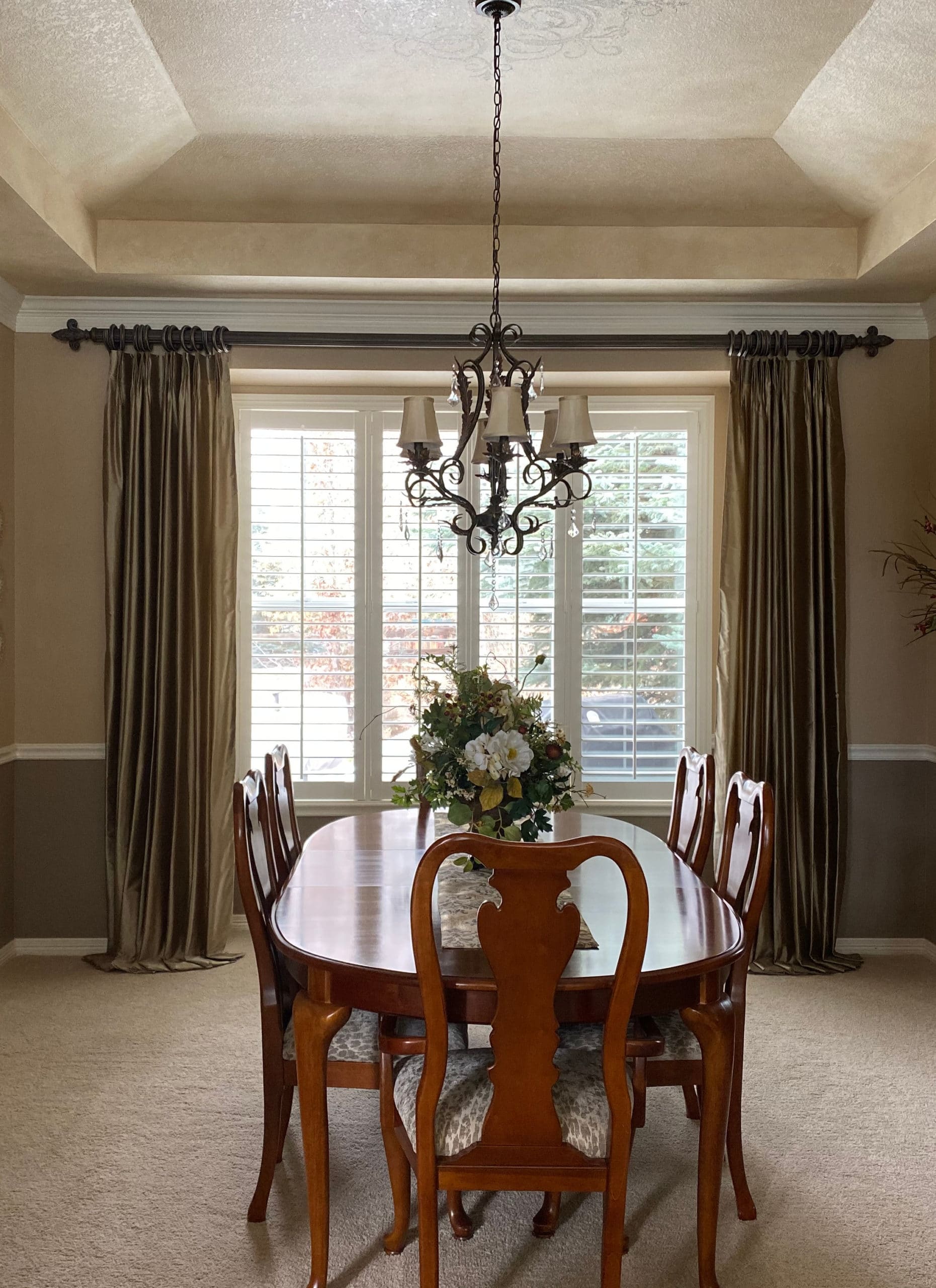
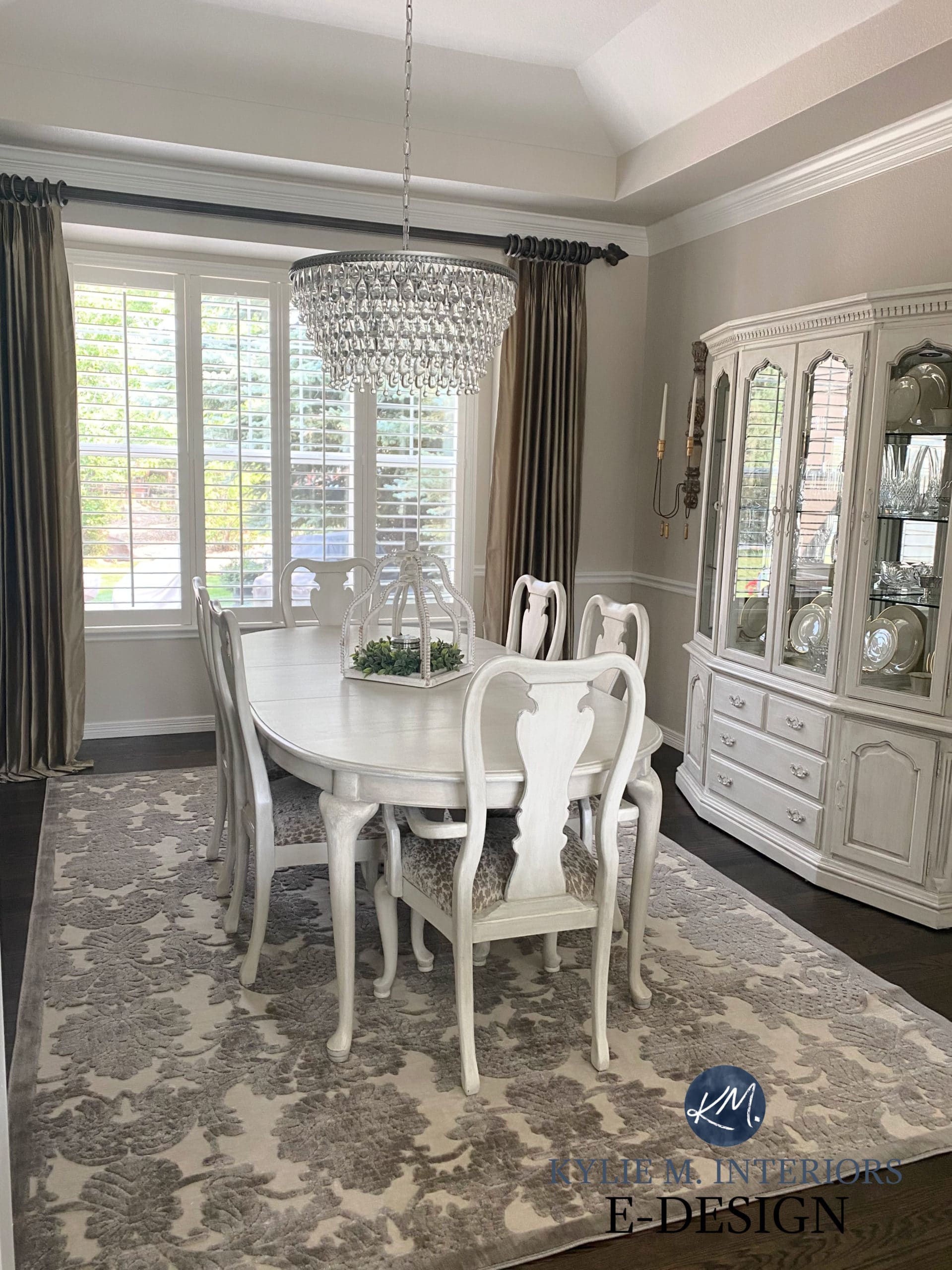
THE DINING ROOM REMODEL
As for the dining room, not only was the wall colour out-of-date but so was the FURNITURE. And that sponge-painted ceiling is AMAZING! Said nobody ever.
It’s like a brand-new home with the charm of a lived-in one!
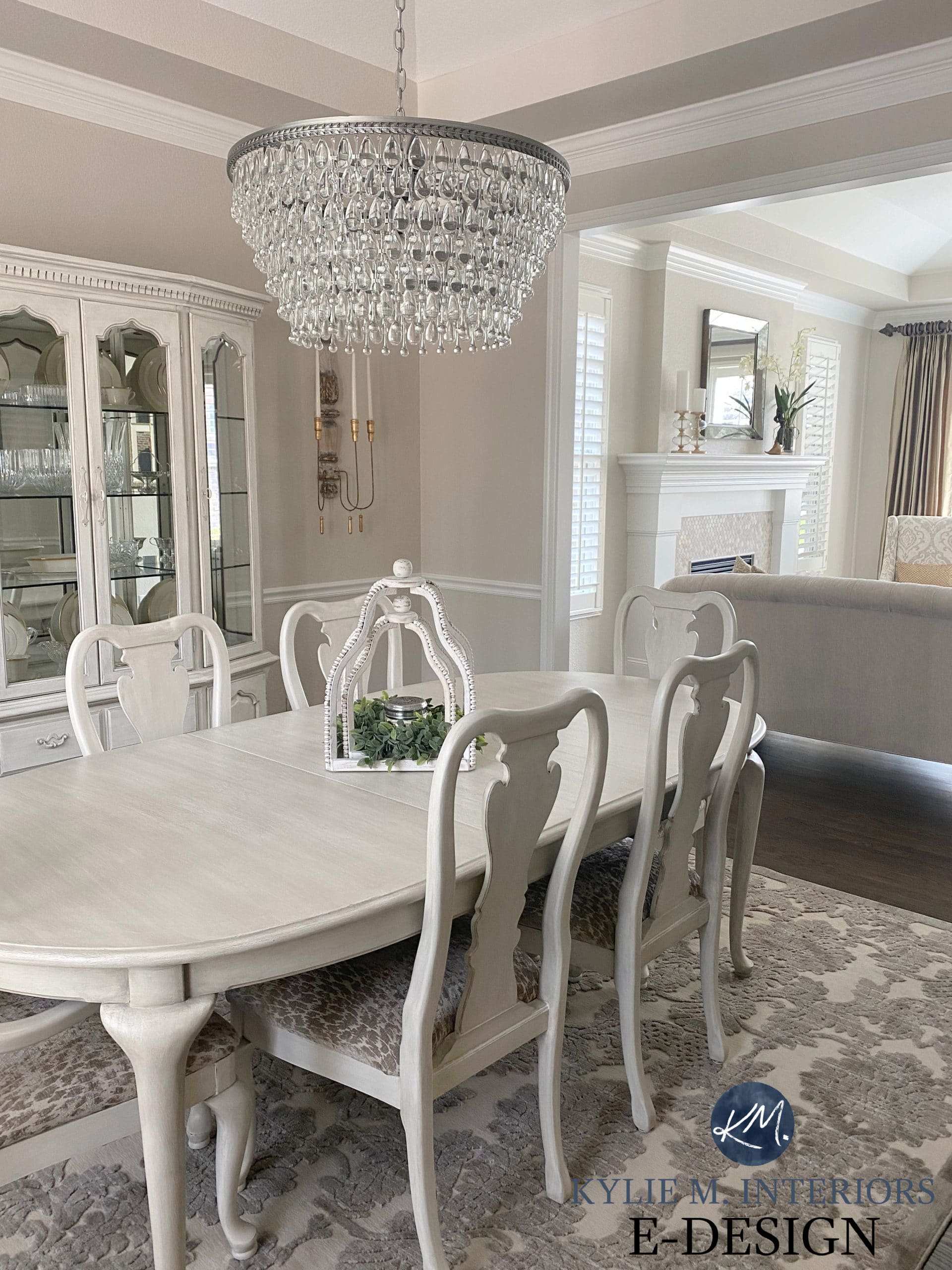
As for the dining set, again, good bones – outdated finish. My client had it professionally painted in Annie Sloan Old White with a gray glaze and it’s freakin’ GLOOOOORIOUS!
Look at how much better the DRAPES look too, the SOUL of this room is so much more at peace…
Now, are you ready for things to get even better?
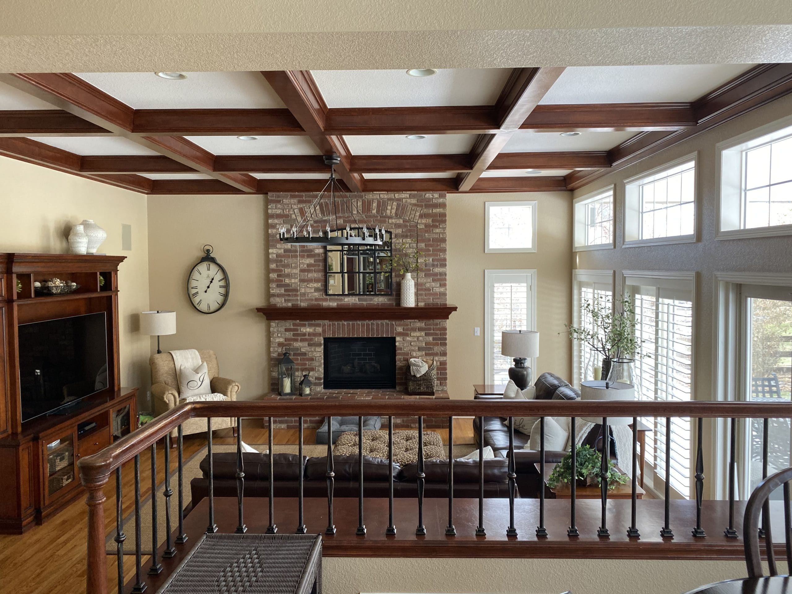
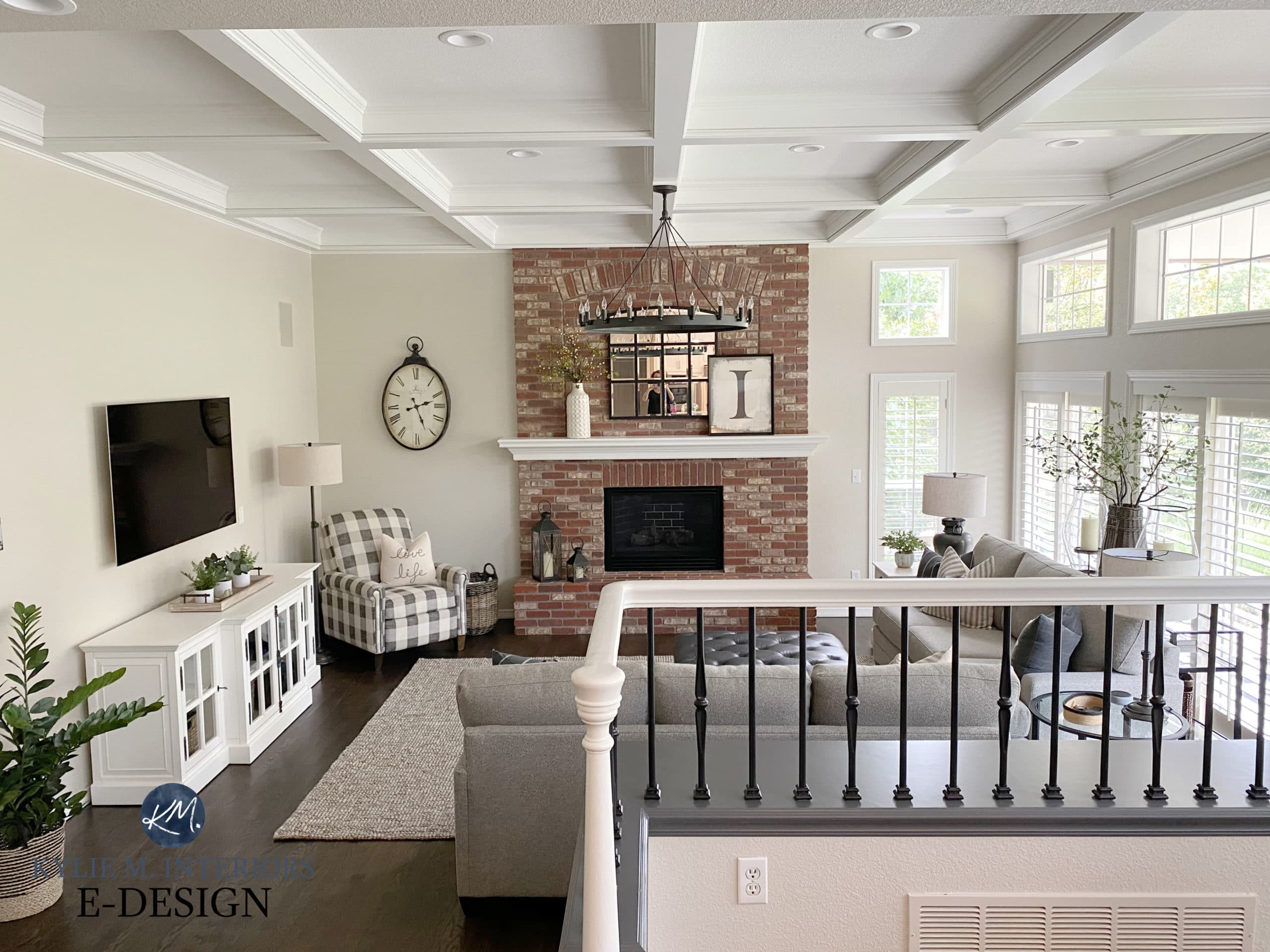
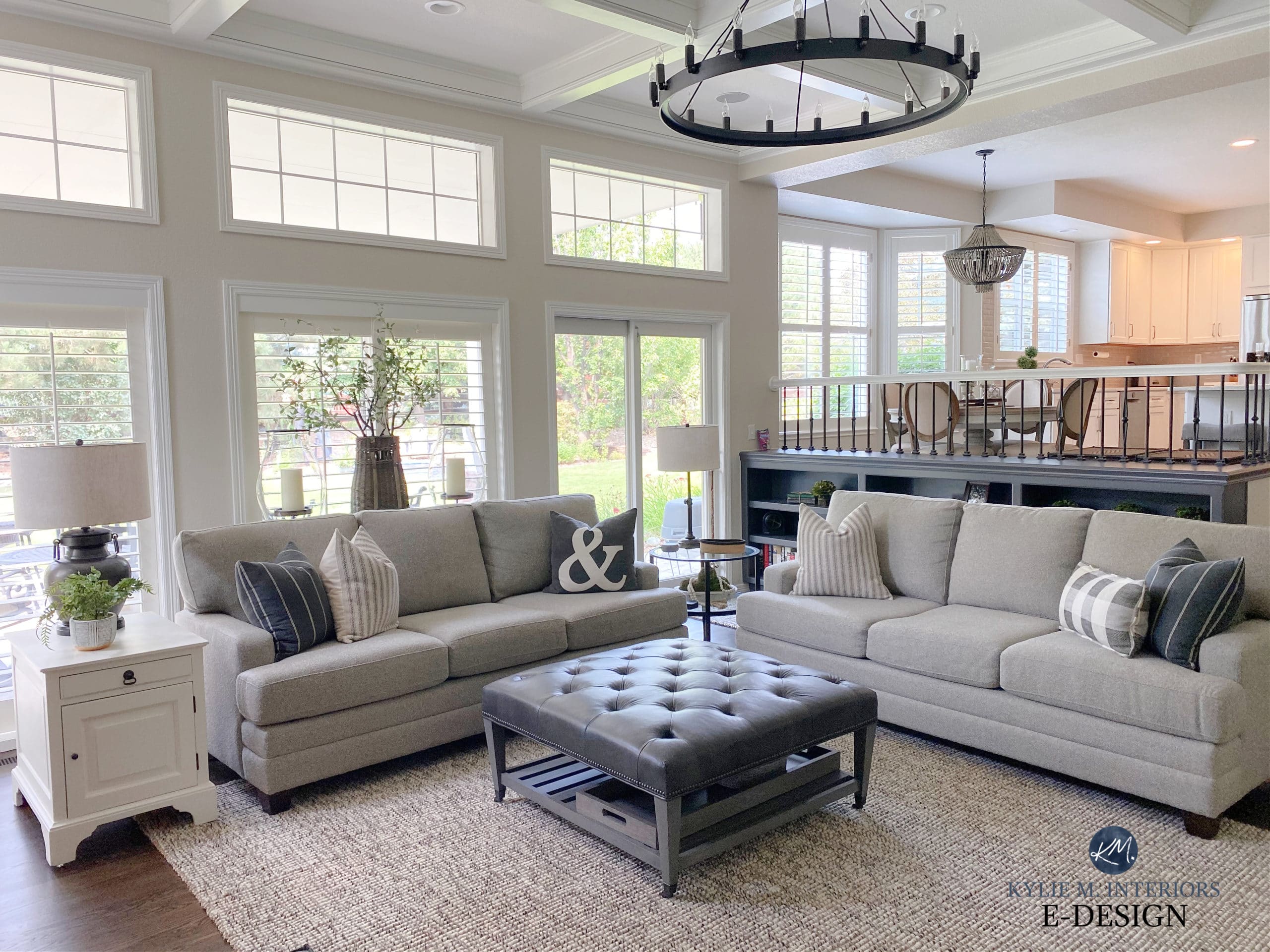
THE FAMILY ROOM
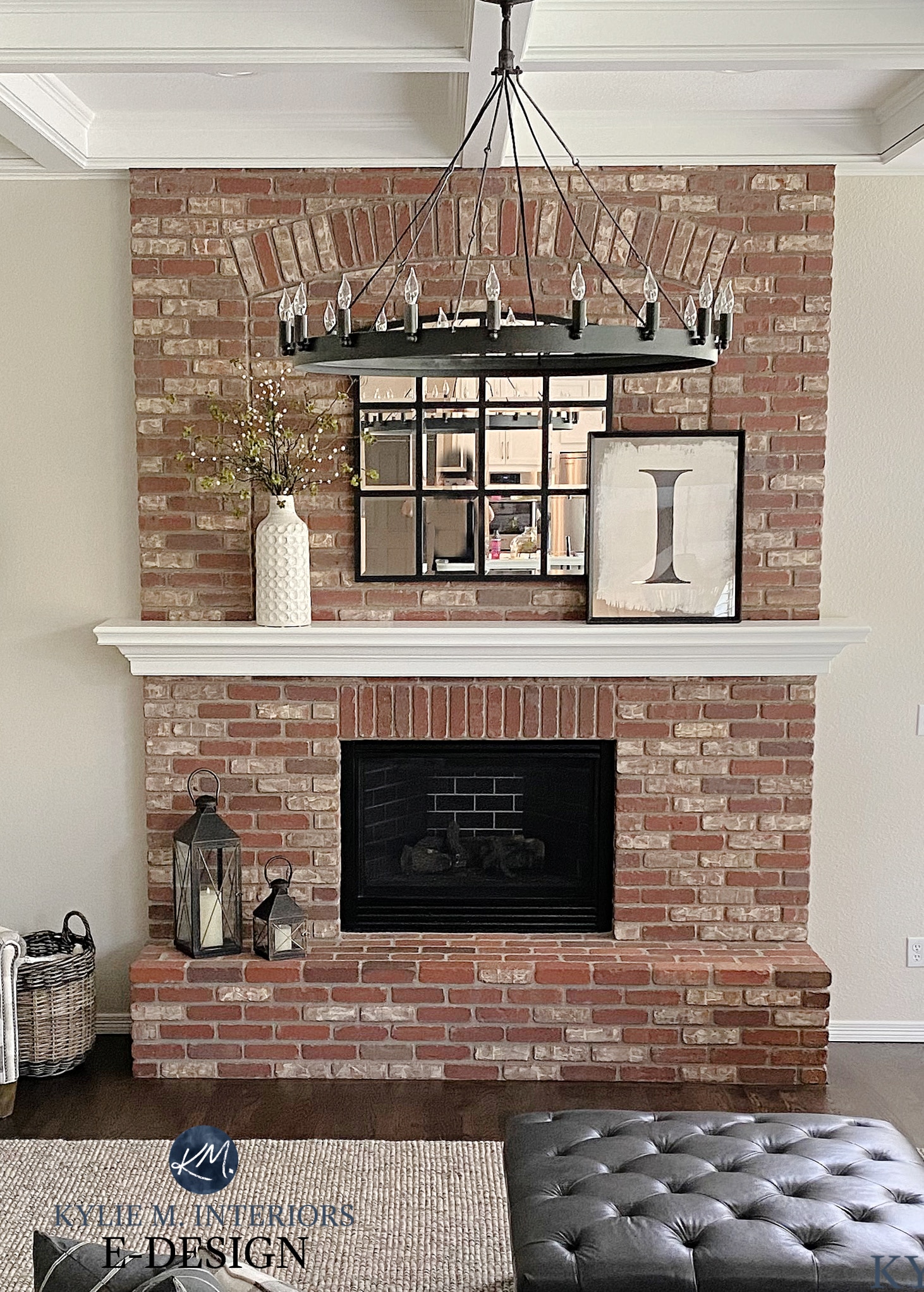
I was so happy my client didn’t want to paint her brick fireplace. Some brick fireplaces are too fugly to be saved, while others are the EPITOME of timelessness and hominess – and this is one of them. HOWEVER, the rest of the room needed to step up its game…
I could seriously curl up in this room in my fave jam-jams, with a bottle of wine and a straw glass of wine and never leave.
This room ALMOST had me at hello, but the cherry stain on the beams was too graphic and red-hued for this lil’ Ginger, even though I would’ve camouflaged nicely…
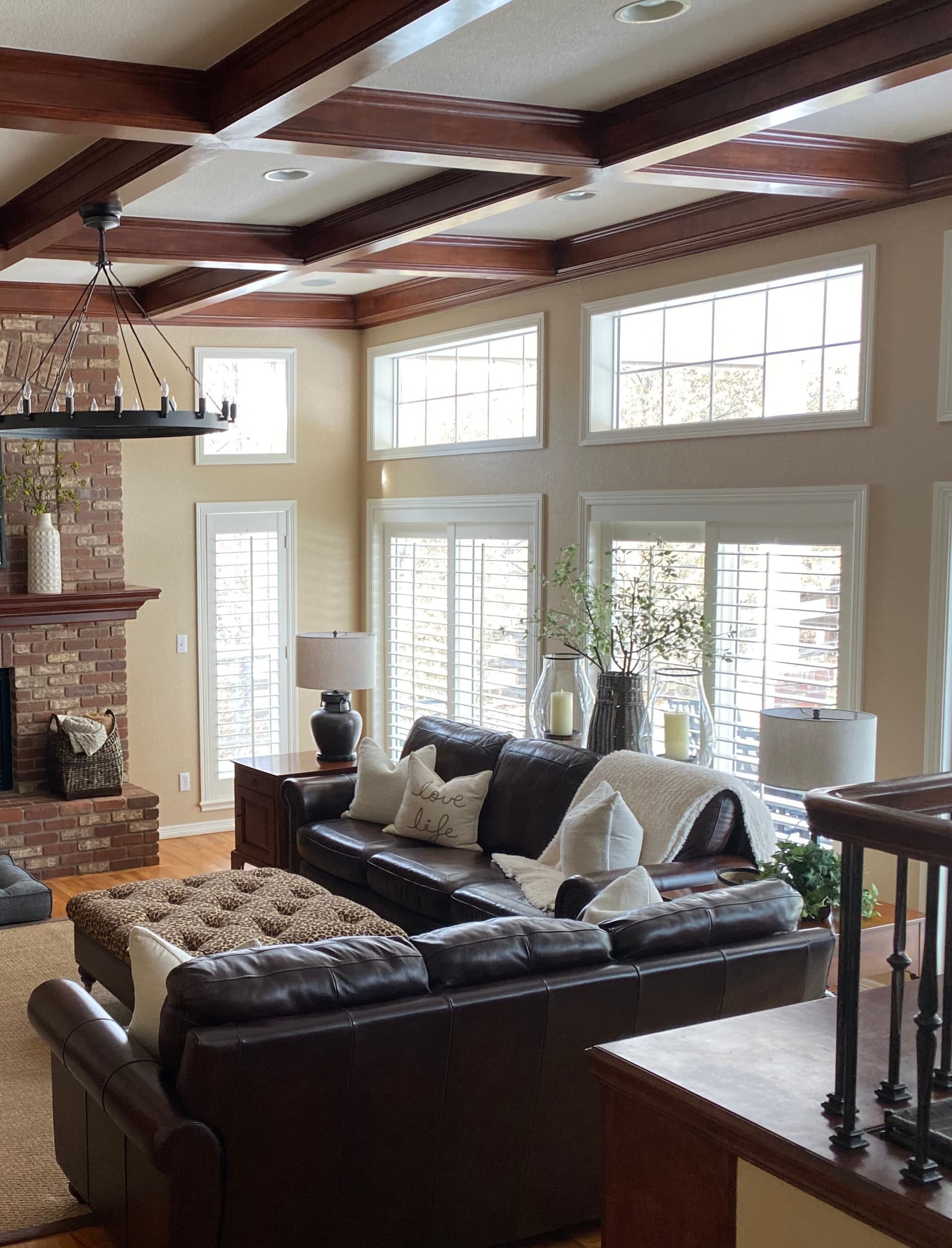
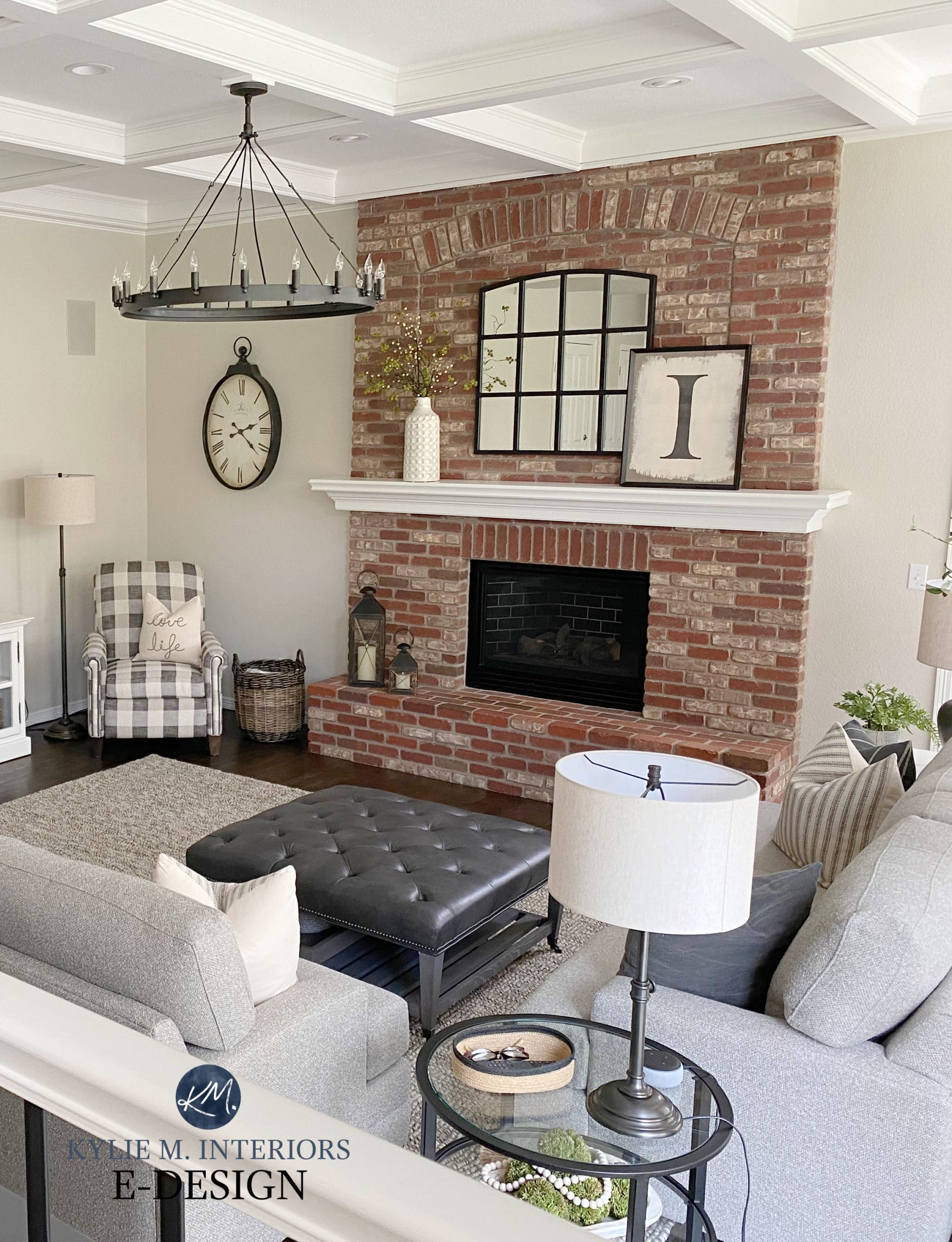
By blending in the coffered ceilings, the room feels brighter and bigger, while still having a cozy vibe…
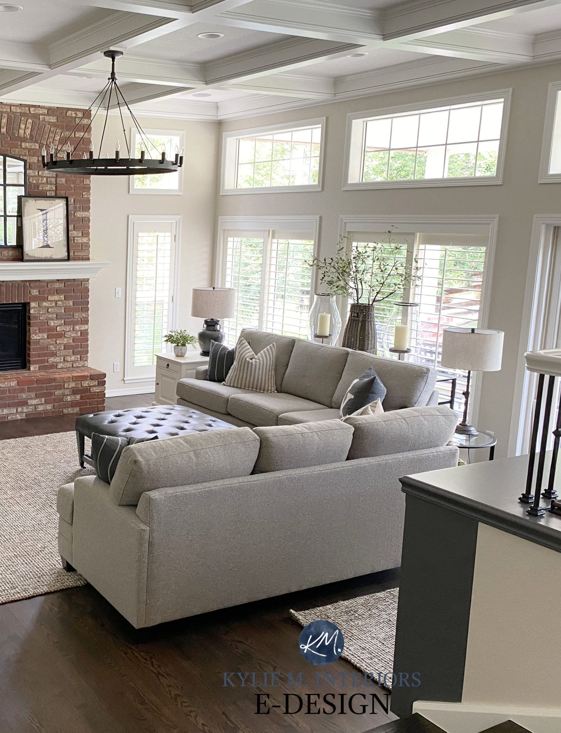
The chandelier looks JUST like the one in our home – mad love.
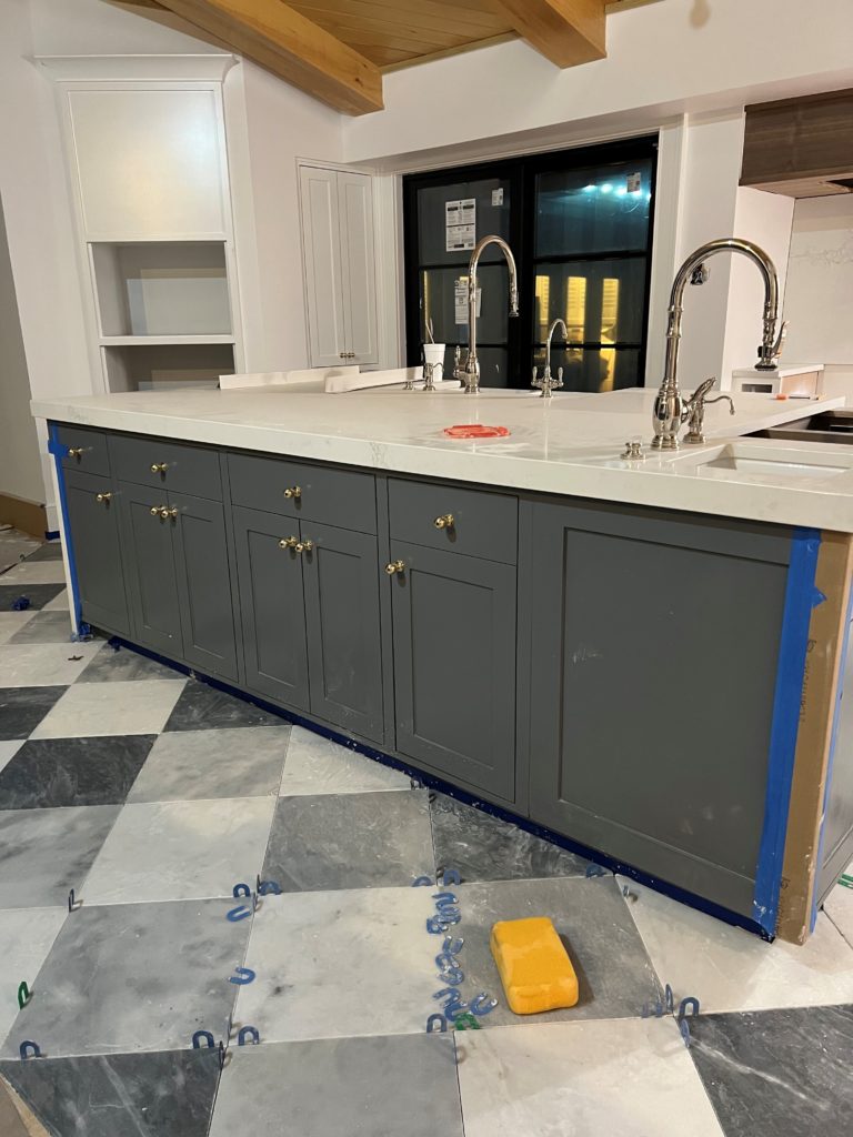
And did you get a sneak-peek of the KITCHEN? That’s a creature unto itself and you’ll see the FULL GLORY of it HERE. BUT WE’RE NOT DONE YET, KEEP READING!
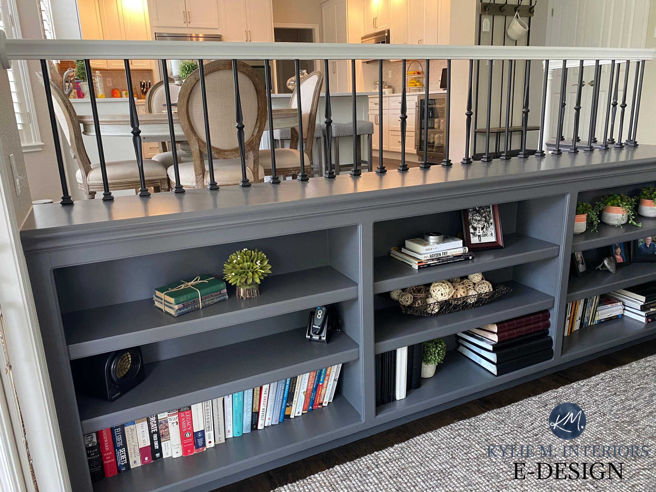
In the above photo, notice the bookshelf supporting the railing. We painted it a dark colour to ground it and give the railing a more modern foundation to rest on (also notice the colour connection with the toss cushions in the above photo).
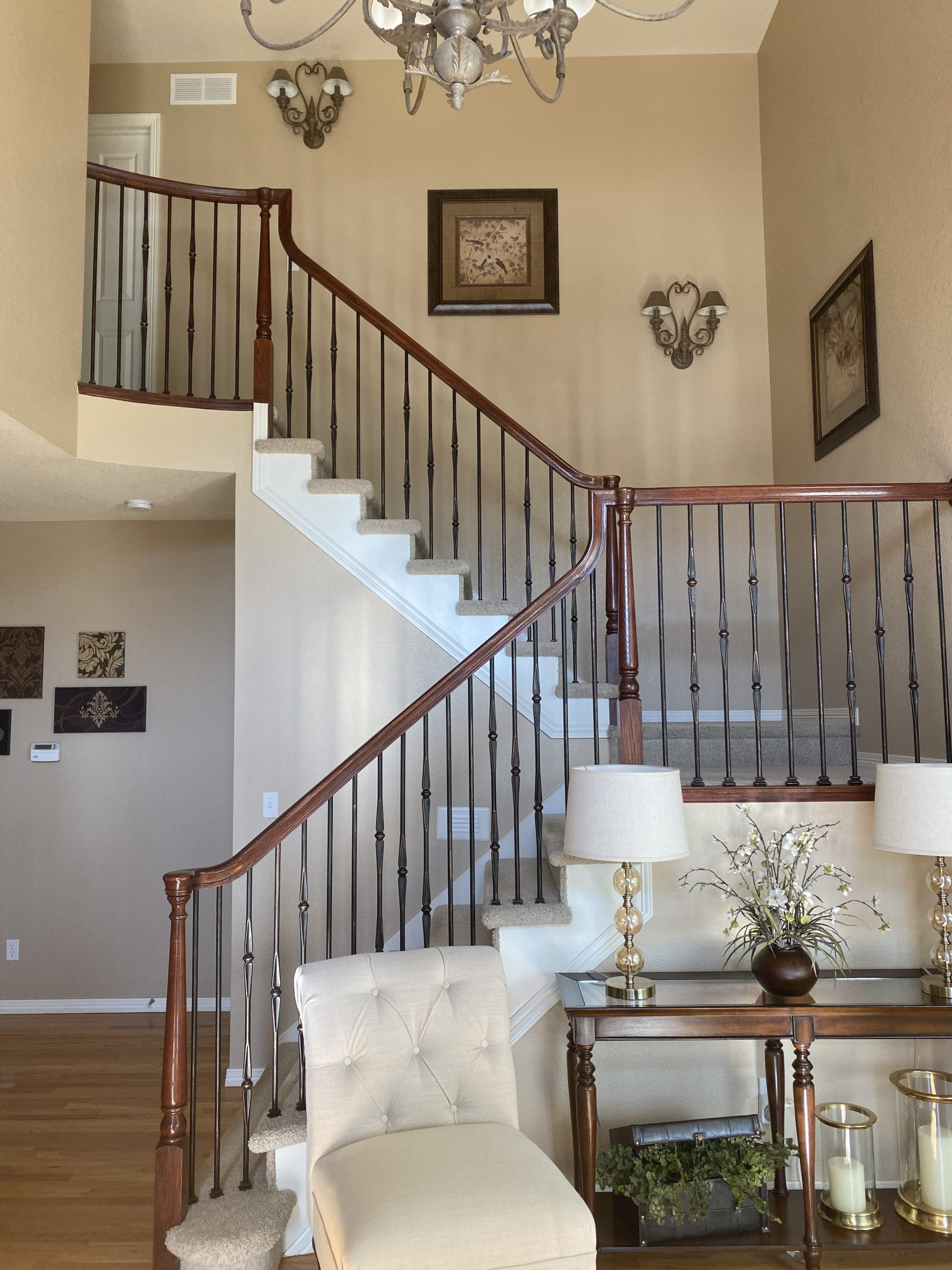
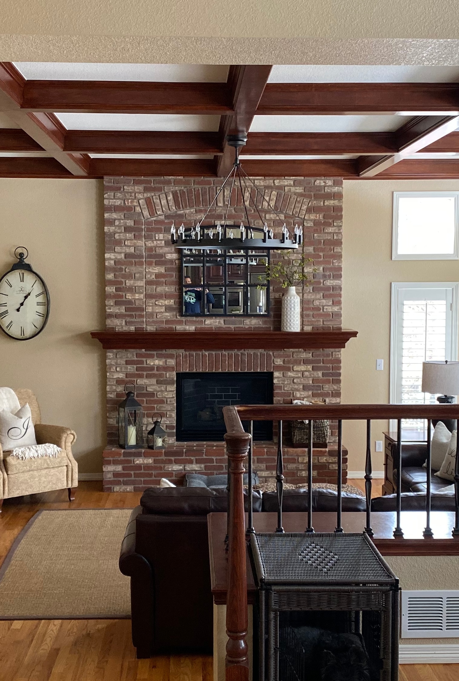
Here’s a good before shot showing the split-level layout, as well as the outdated finishes…
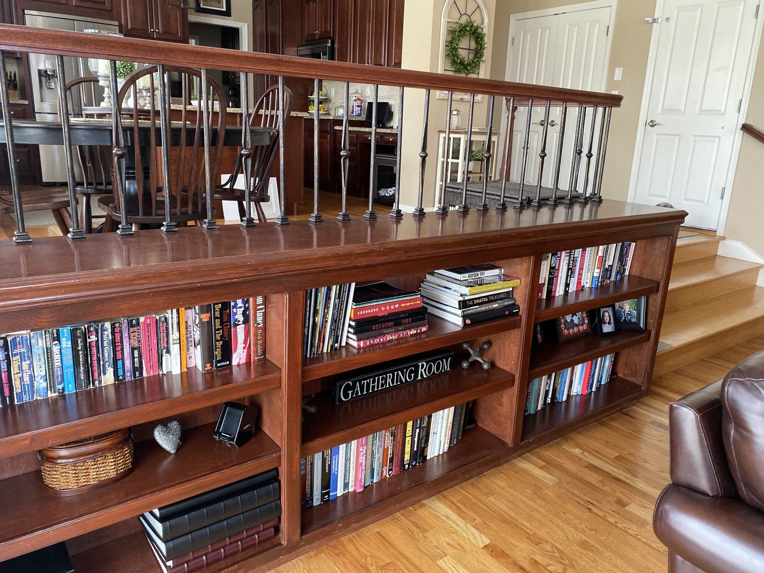
And after. Notice that even the metal spindles were painted for a fresh look…
Back to that brick fireplace. There were many aspects of this room that I loved. I didn’t totally hate the warmer golden wall colour (how’s that for a ringing endorsement). It’s a bit off with the brick, but I’ve seen way worse. Even the beams made sense considering the red-purple tones in the brick. It all looked cozy, but it ALSO looked early 2000s and heavy.
And whether you love painted brick or prefer it raw, this fireplace looks stunning for any style (well, maybe not mid-century, but you get my point)…
Read more: 5 Ideas to Update Your Fireplace
As for the KITCHEN I alluded to earlier, you’ll see it ALL HERE – and it’ll be worth it!
BUT WAIT!
There’s one more room that’s going to knock your friggin’ socks off…
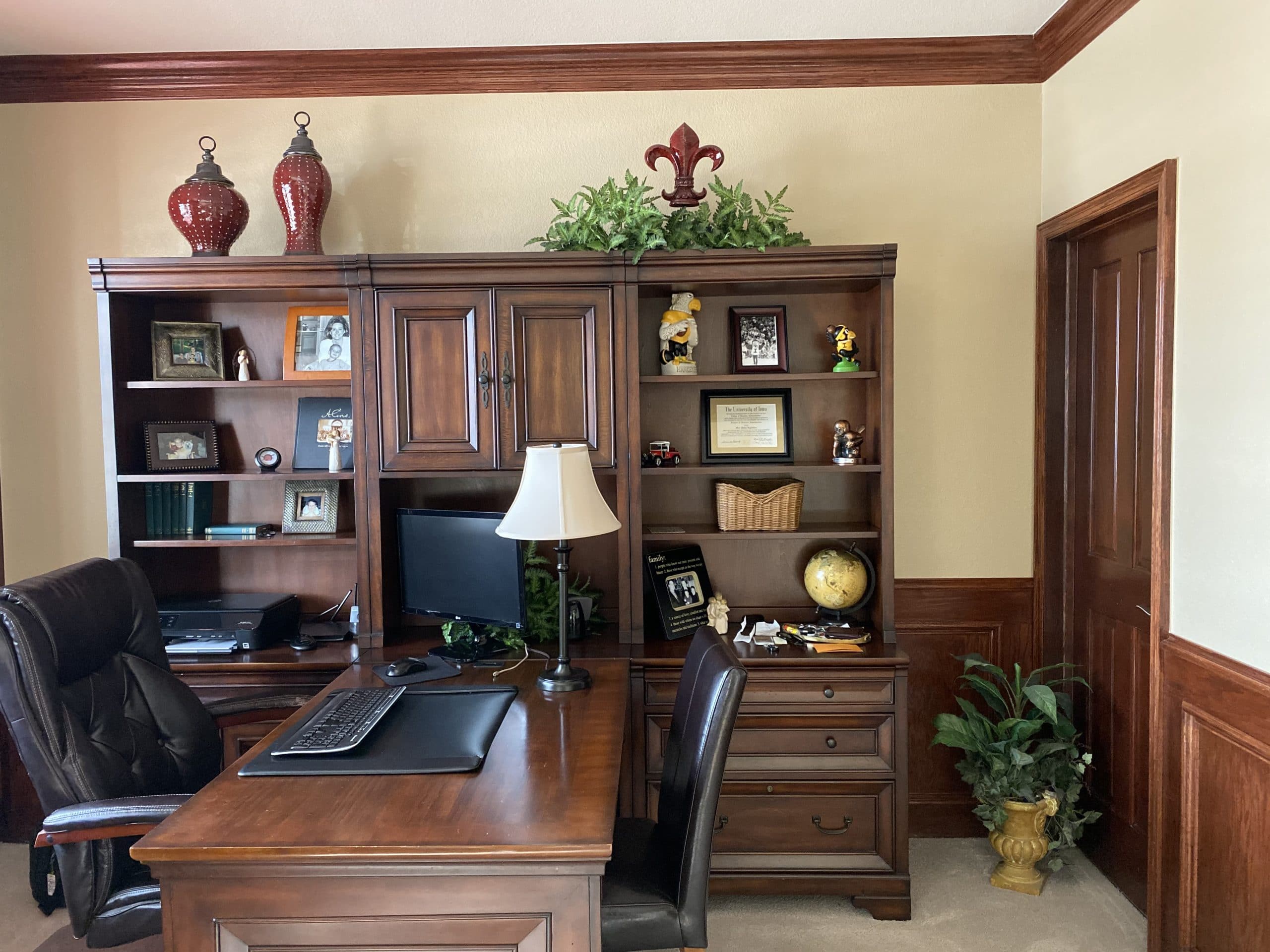
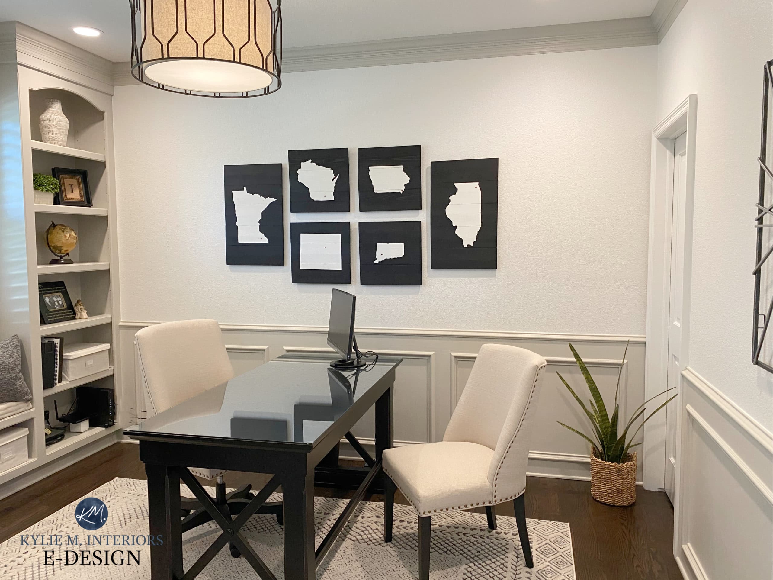
THE HOME OFFICE REMODEL
This home office had such GREAT bones with crown moulding, wainscoting and built-in bookcases, it was just so HEAVY looking…
Okay, seriously, can I move in?
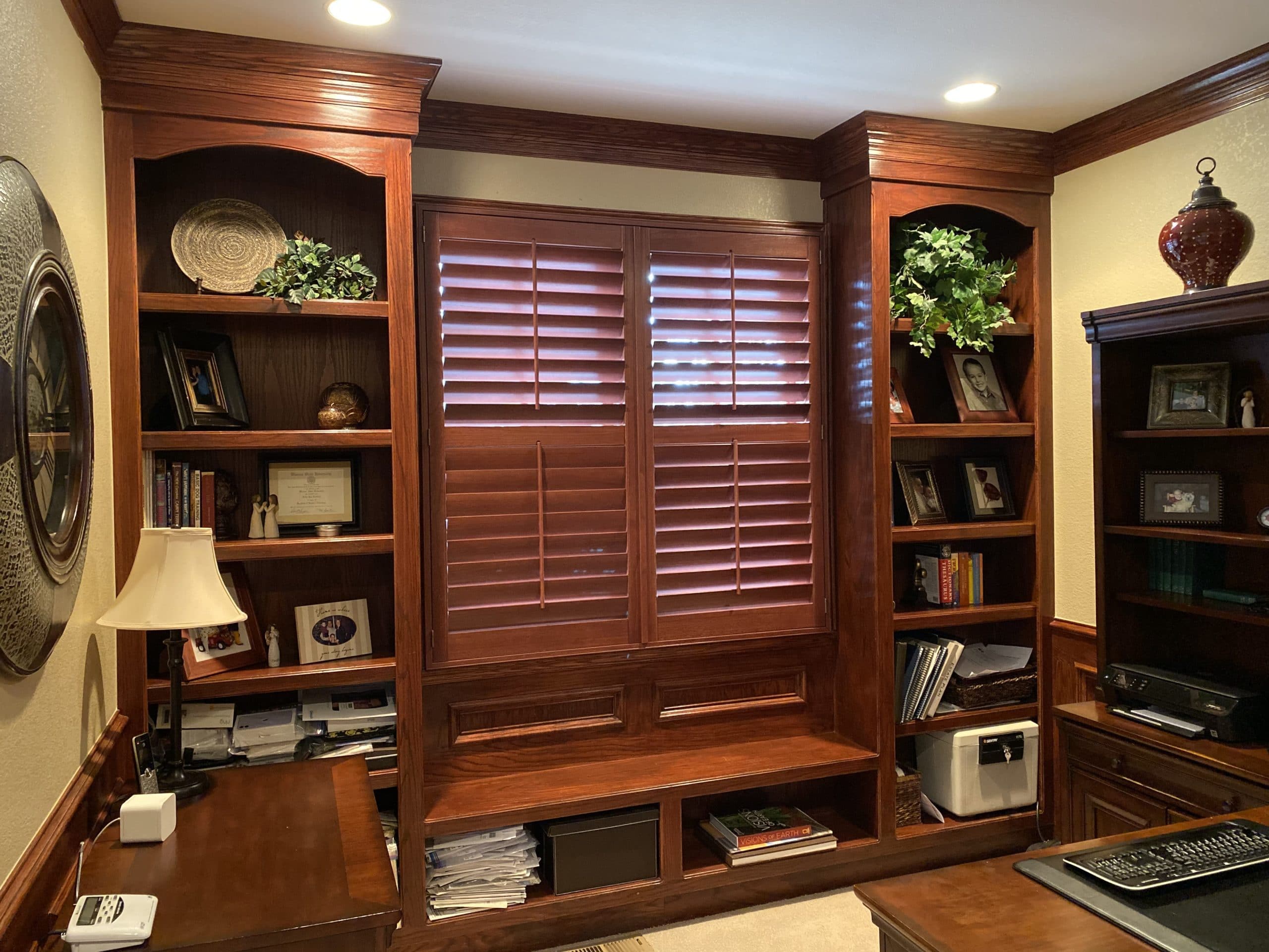
I don’t have a great AFTER photo of the built-ins, it can be tough when shooting into the light. However, you can see a bit of them in this next photo…
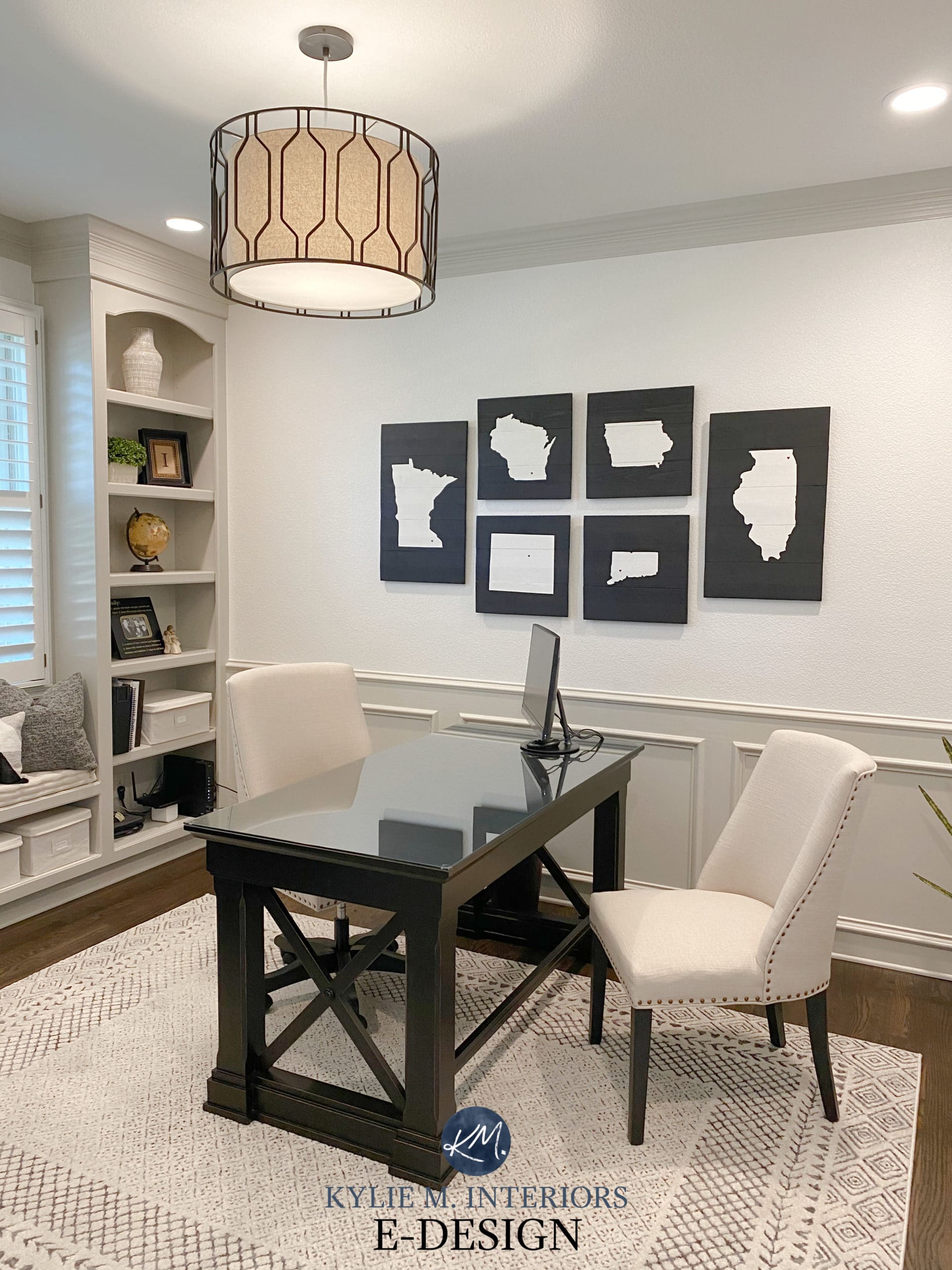
Want to know what colours we chose? I’ve got it ALL at the end of this blog post!
But first, three things…
1. Did you check out the KITCHEN in this home? You should (I know, I’m a bossy lil’ Ginger)
2. Did you know I have an AWESOME SEARCH function on the right-hand side of your screen? Seriously, 400+ articles to choose from – SURELY I have what you’re looking for!
3. Did you know I have an awesome INSTAGRAM FEED & EPIC YOUTUBE CHANNEL you can subscribe to? I’ve reviewed almost ALL of the colours you just saw! True story.
NEED HELP?
Check out my Online Paint Colour Consulting and E-BOOKS!

Chat soon,
PRODUCT DETAILS
LIVING ROOM FIREPLACE SURROUND
Glazzio Tile, French Baroque Series Ash
PAINT COLOURS
Benjamin Moore Edgecomb Gray
TRIM AND CEILINGS
Benjamin Moore White Dove
METAL PAINTED SPINDLES/RAILING
Benjamin Moore Onyx
BUILT-IN BOOKCASE
Benjamin Moore Gray 2121-10
OFFICE WAINSCOTING AND TRIM
None other than BENJAMIN MOORE REVERE PEWTER
OFFICE WALLS
Benjamin Moore White Dove
READ MORE
A New Home in Sherwin Williams Pure White
The 12 Best Whole Home Gray and Greige Paint Colours
5 Ideas to Update Your 1990s Home


What a beautiful transformation! It’s so much fresher and I love the furniture that has been repainted. Absolutely stunning!
What a great fresh look
Thank you Alysa, it’s got a whole new lease on life!
I love this look! I’m creating a mood board and trying to figure out how you mix different w completely different feels and it look so freaking put together and good! I’ve been begging my husband to let me hire you haha and considering it’s almost been a year and 50 plus samples ….. he’s close to giving in I think lol you are so good at this stuff. It’s not easy at all!
Beautiful! What a lovely transformation without a total gut-job. It’s inspiring!
Thank you, Amy!
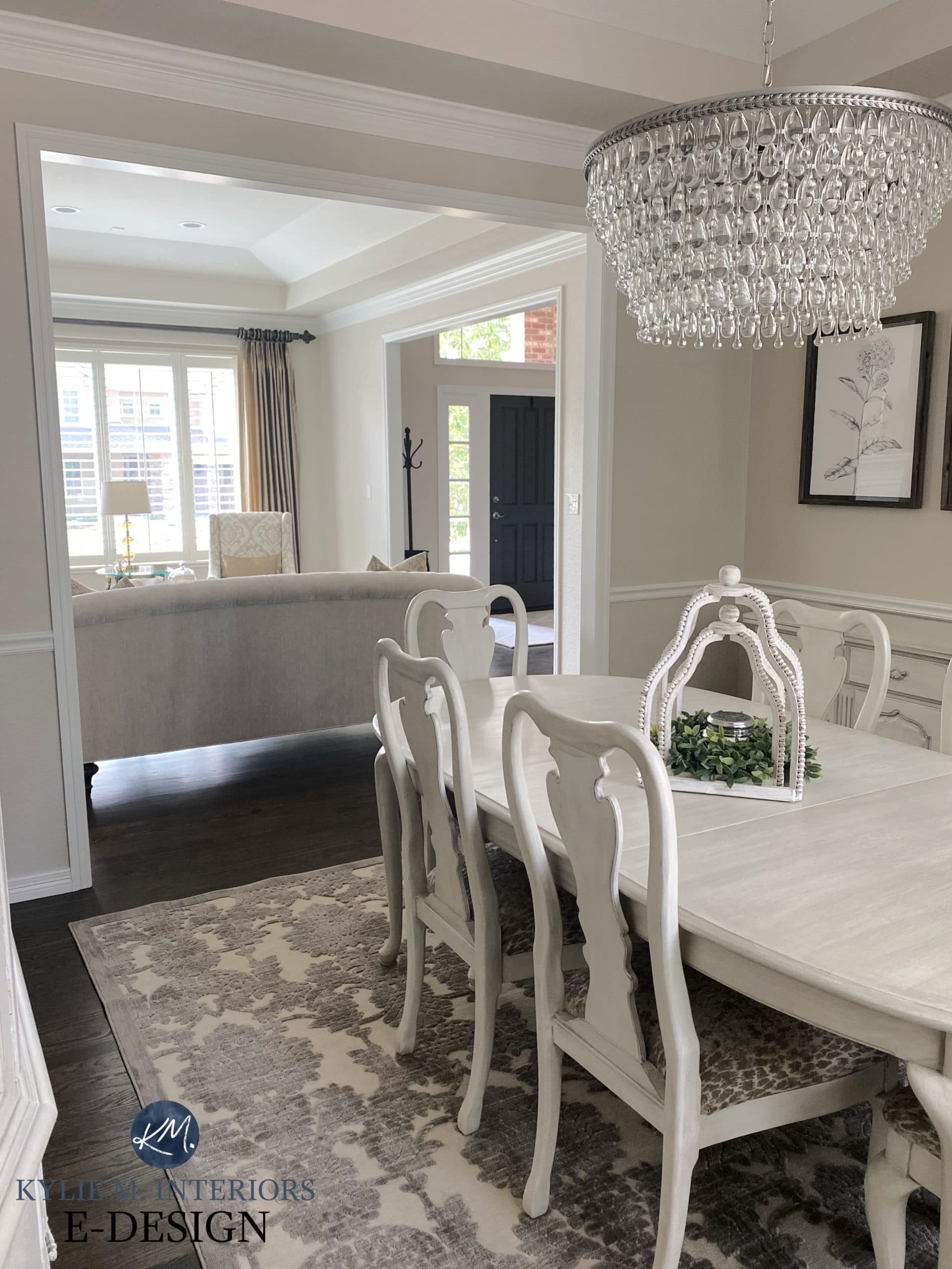
Turned out beautifully! Your client has exceptional taste and the colours you chose are spot on, as always. It’s interesting that there isn’t any art on any of the walls, although, they do have an incredible number of windows. Any idea what’s on the wall opposite the China cabinet in the dining room?
Hi Shelley, I didn’t notice that but you’re right, they have a lot of windows! I added a dining room photo that shows the OTHER side of the room with a snippet of their GOOORGEOUS off-white/black prints – LOVE THEM!
Wow… A+. Just one nit-picky thing… the rug in the living room is way too small. Looks lost.
Thank you Renee! And yes, I do love larger rugs too ;).
Wow! It looks fantastic. I have an old heavy but. nice dining room table and chairs. I haven’t wanted to paint them, but now that I’ve seen this I’m inspired! Now to find someone who can do the same for me. Well done everyone!
That’s JUST what I love to hear Jacki, sometimes you just need to SEE it to believe it :). I bet if you ask on FB someone will know SOMEONE who does chalk painting!
Gee not sure. While it is a huge step forward in time, shouldn’t there have been one color incorporated ? Even just in throws/rugs/pillows such as a light blue or sea foam green? And I have Edgecomb Grey so I do like that wall color but it just reads so monotone. Is it just me? It could be.
Hi Carolyn! It’s ALLLL about personal preference! Some people prefer decorating in ranges of neutrals rather than inserting colour. I find it’s about a 75/25 split! For THIS home, I lean into no obvious colours and prefer the layering of neutrals, but again, it’s all personal!
Wow! Such a stunning transformation that showcases the power of paint. I have been trying to choose a color for my main living areas, which face due East and due West and had crossed Edgecomb off of my list. Now I have to revisit it.
Yes, it really is lovely, as long as you have some good light in those rooms. If they’re LOW light, EG could fall a bit flat at times.
Kylie, I love this ! It truly is beautiful AND relatable! I loved how it was not all wiped away. Would love to see more like this and ALWAYS enjoy your humor and wit!
MARY, I love this comment – thank you!
Whoa! I am IN LOVE with your work and this site!! Wondering your thoughts on pairing SW Creamy walls with SW Alabaster cabinets??? My kitchen is currently VERY similar to the before photos from this project. With the general differences being that our floors are a darker neutral brown (no orange) and the backsplash is an off-white/cream classic subway tile. Also, of note, our windows -of which there are many- are all north facing. Which is why I’m looking to paint the majority of the home in SW Creamy. It’s currently SW intellectual Grey – or sad wet cement as I like to call it. I’m in love with both of those colors but wondering if the combo sounds crazy. I love the idea of doing the hone in creamy neutrals with pops of black or dark grey to ground it. I’m open to a better suggestion for the cabinetry – especially if you think maybe Alibaster would be a better choice for the walls. Though I already know your thoughts on Creamy!
Ooooo, I love sad wet cement!
okay, so I don’t have a problem with Alabaster and Creamy as long as you’re cool with a super low contrast soft approach. I have NO problem with this, however, even Alabaster walls could be pretty! (and make sure the trim is Alabaster too 🙂
Hi … beautiful!!! Is the family room even red be brick fireplace also painted edgecomb gray?
You betcha!
Oh, the brick fireplace is painted with Edgecomb Gray? Was the paint watered-down so that it was more a whitewash? A lot of the bricks look raw rather than painted.
Hi Cam, the fireplace was left as-is – just the walls are Edgecomb Gray :).
Omg, this made me just decide to paint my heavy, cherry dining room after agonizing over it! I am dying to know where you got the chandelier? I am embarrassed to say I have the exact one in the “before” picture and when I replaced the old brass one with I I thought I was so modern!🤦🏻♀️
Hi! Your style is amazing. I have the same color fireplace but the room is rather dark as a lot of the natural light is blocked by my wrap around porch. It’s also east facing. Any suggestions on wall color with the white trim? I feel like the color used in this living room would go flat bc lack of lighting.
Hey Kim! It’s soooo hard to say without seeing the rest of the room, as the furnishings and flooring play a big part too! I’m thinking maaaybe SW Aesthetic White or SW White Duck??
I have very similar wood finishes. In fact my house might have the same builder. Would the Edgecomb gray still look good if the wood finish around the fireplace and stair case had not been painted in a white tone? We would prefer not to paint our wood and we have a lot of earth toned furnishings (in addition to the warm wood). Thank you!
From the SOUNDS of it, it could be pretty!
I love the Edgecomb in your rooms! I am in the middle of a new build and want to use edgecomb, but I am struggling with the trim, shiplap, and ceiling color. I was thinking of white dove but I’m scared of the yellowish tint. Your white seems brighter and more fresh. What white did you use in the photos?
Well, I did use White Dove, but at our lake home I did White Dove 25% lighter and love it just as much! You might also check out SW Pure White 🙂
Hi Kylie! Love the vibe of edgecomb it’s just pulling too pink with my southern light and my alabaster trim isn’t helping. Accessible beige is doing the same thing. Do you have any slightlly greyer/browner paints? I have a LOT of southern light. In fact I only have southern light lol.