
Posted on November 18, 2019 by KylieMawdsley
A Pure White, Navy Blue, & Dark Green Paint Color Palette
If you’re looking for some white home inspiration, you’ve come to the right place.
For those of you who’ve followed me for a while (thanks for drinkin’ the Kool-Aid), you’ll know that 99% of my work is Online Colour Consulting (E-Design). In fact, I take only a limited amount of local projects each year. But regardless, when my sister and brother-in-law decided to build their dream home, I HAD to reserve a front-row seat on that bus. In fact, they bribed me with copious amounts of wine, not knowing they couldn’t have stopped me anyway – we’re family! But I still took the wine.
This post may contain affiliate links. If you make a purchase through links on our site, we may earn a commission.
Another fun part of the story is that Sarah and Brett had been transients for over two years (I mean, not like homeless…but kind of homeless) and were SO excited to finally settle down. However, with a newborn and 2-year-old, settling in was low on the list and they were living out of boxes – literally. ANYWAYS, shortly after moving in, they went on a vacation and while they were away…I kind of took over (which is SO unlike me).
I unpacked every single box, and put my OCD to good use arranging cabinets, cupboards, the garage, storage room and closets – I even folded Brett’s underwear. Using a modest budget (with secret permission from him so I could surprise Sarah), I outfitted the house as much as humanly possible. They had a few basics to start – a sofa, two chairs and a sectional, but really, not much else for me to play with, so I had my work cut out for me!
Are you ready for a tour? Let’s start in the entryway
The Entryway
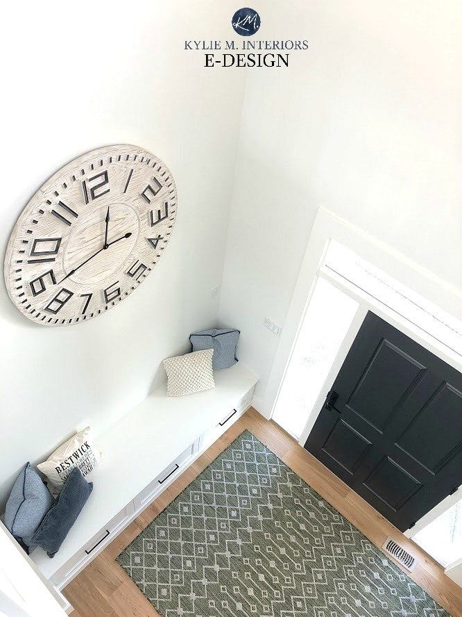
I love this space. It’s still waiting for a high shelf, board and batten and hooks (which is why the clock is so high), but even then, it’s still a beautiful place to walk in to!
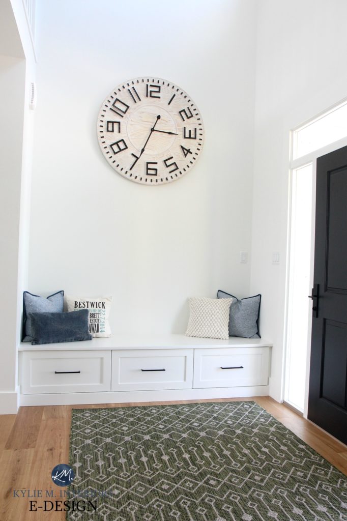
Urban Barn clock (here). Adley area rug (here)
The clock is a big boy at 40″, he’s from Urban Barn and is a glorious beastie. The area rug is an indoor-outdoor rug, so it’s good and hardy for muddy feet and flat enough that the door doesn’t catch on it.
Next, let’s take a peek at that beautiful black front door…
FULL PAINT COLOUR LIST AT THE END OF THE BLOG POST
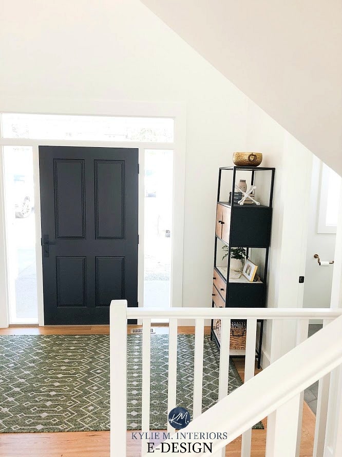
Front Door: Sherwin Williams Tricorn Black
And if you sit your lil’ toosh down on that bench and look ahead, you’ll see a GORGEOUS powder room that makes me GREEN with envy!
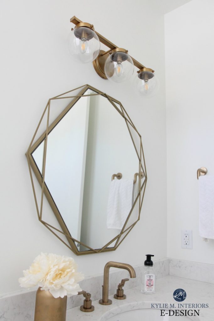
The Green Powder Room
Seriously, I’m lovin’ on this vanity, which was a brave choice for someone who wanted all-white walls! Partnered with the hexagon tile floor and gold fixtures, it’s a small space with a BIG personality.
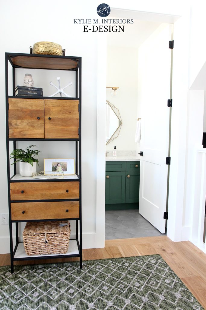
And see how the entryway rug ties into the green in the powder room? It’s ALLLLL about connections baby.
And seriously, look at the link between the vanity hardware and the floor – MAD love.

Hexagon knobs Wayfair (here). Blais Light Fixture Wayfair (here). Faucet TBA. Mirror Home Sense
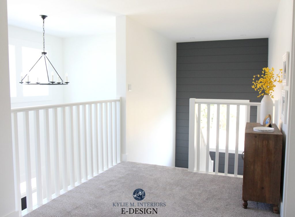
You can also get a feel for the layout, as the staircase going downstairs is to the right of the powder room…
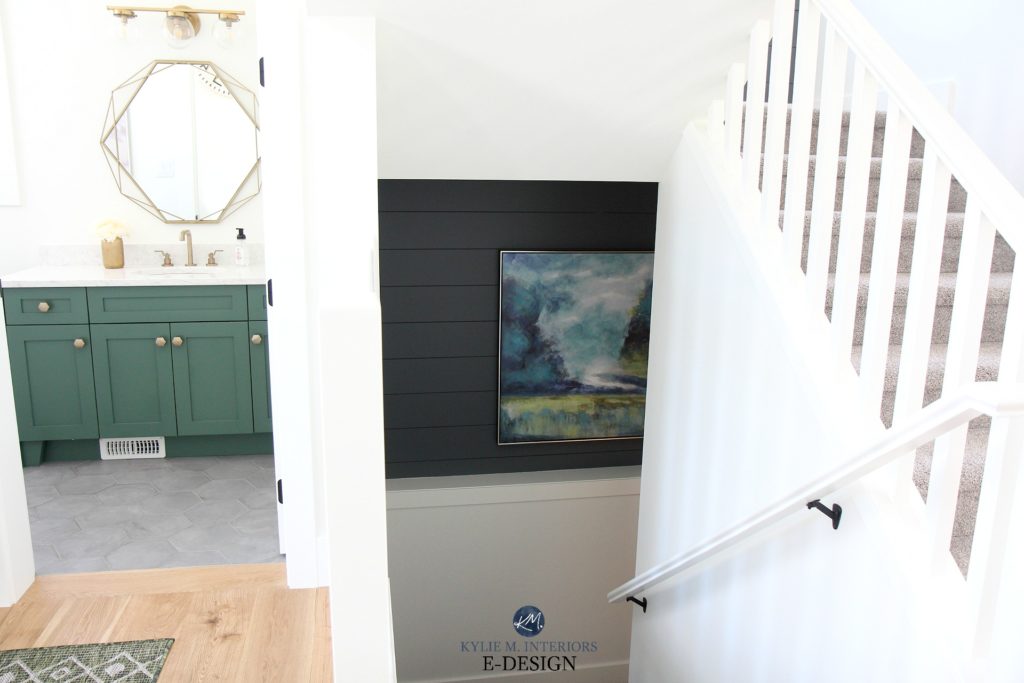
And up as well…

Looking at the last two photos, notice how the shiplap is continuous (but separated by a ceiling) from the bottom stairwell to the top one! I chose SW Web Gray for the shiplap feature wall as it’s a great partner to the kitchen island, which we’ll get to shortly.
And while I know it’s popular to do wood on stairs, it’s also a) expensive and b) not great for acoustics unless you install a runner, which is another added cost. I’m a BIG fan of carpet on stairs and chose it for our own home too. With all of the activity in this area, there’s WAY more sound absorption and it was considerably more budget-friendly. Those reasons are also why we did carpet in the master bedroom (wink wink).
Read more: Where Should I do a Feature Wall and What Colour Should it be?
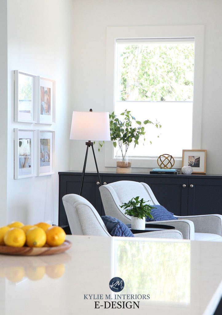
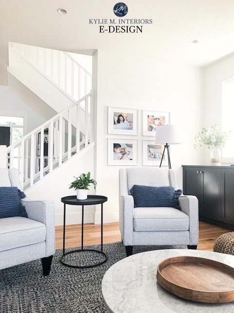
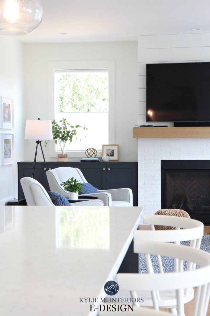
The Living Room
In this open concept home, the kitchen, living room and dining room share the same square footage, so it was SUPER important that we had colour connections via furnishings and accents.
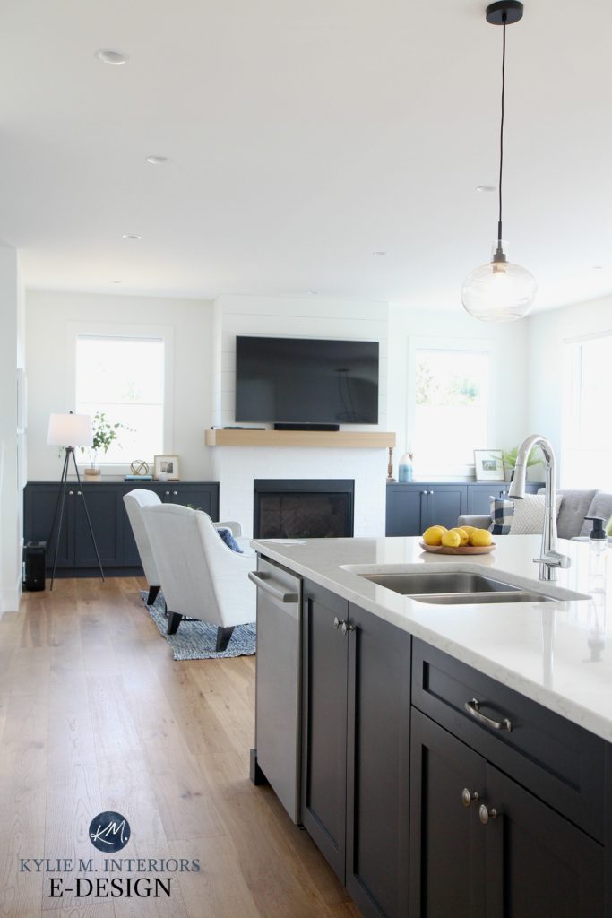
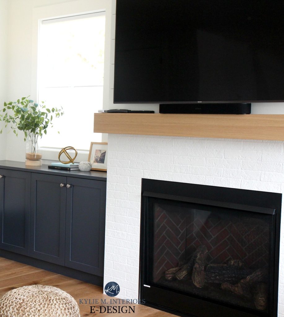
I love the balance of the fireplace and the built-in cabinets, which are also handy for putting kid’s toys in when company comes over.
The marble coffee table wasn’t finished/installed by the time I did the photoshoot (I’m exaggerating, it was just me with my camera, a bottle of wine and a funnel, but I like to sound fancy), so I had to go back with my i-phone and grab a quickie shot, which explains the quality. It’s a stunning table from Vancouver Island owned, BC Marble Products and what a friggin’ amazing slab it must’ve come from – I can’t even IMAGINE an entire kitchen in this product!
The gallery wall was almost the death of me. I couldn’t use nails as there was a vent RIGHT behind the frames, so I used a popular velcro-style hanging strip and may or may not have wanted to shoot myself trying to get the damn things in a perfectly square display. Er…mer…gerd. Call me old-fashioned, but I prefer using nails.
Below, you’ll see that we chose SW Cyberspace for the built-ins which are a) the same colour as the island and b) the darker version of the shiplap feature wall in the neighbouring stairwell. If we’d done the built-ins white, I think we might’ve overdosed a bit and lost the opportunity for some contrast and connection with the adjoining spaces.
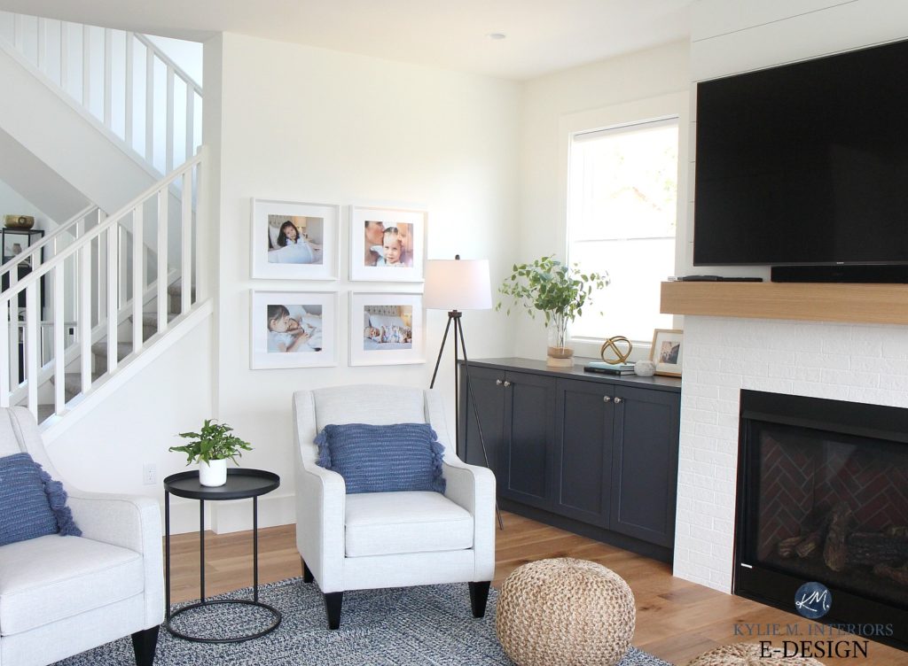
And the fireplace – I just love me some mixed textures. With white shiplap on the top and painted veneer brick tile on the bottom, the textures add some subtle interest, without changing the paint colours.
If you’re wondering what white we chose for all of these surfaces, it’s none other than one of my FAVE white paint colours – Sherwin Williams Pure White. This home has a great blend of south, east and north-facing windows, so you can get a good feel for how it changes on a room-by-room basis!
Read more: North, East, South, West, Which Paint Colour is the Best?
Mosely area rug (here). Odin pouf (here). Higuchi black side table (here) Chairs: n/a. Similar look here/here/here
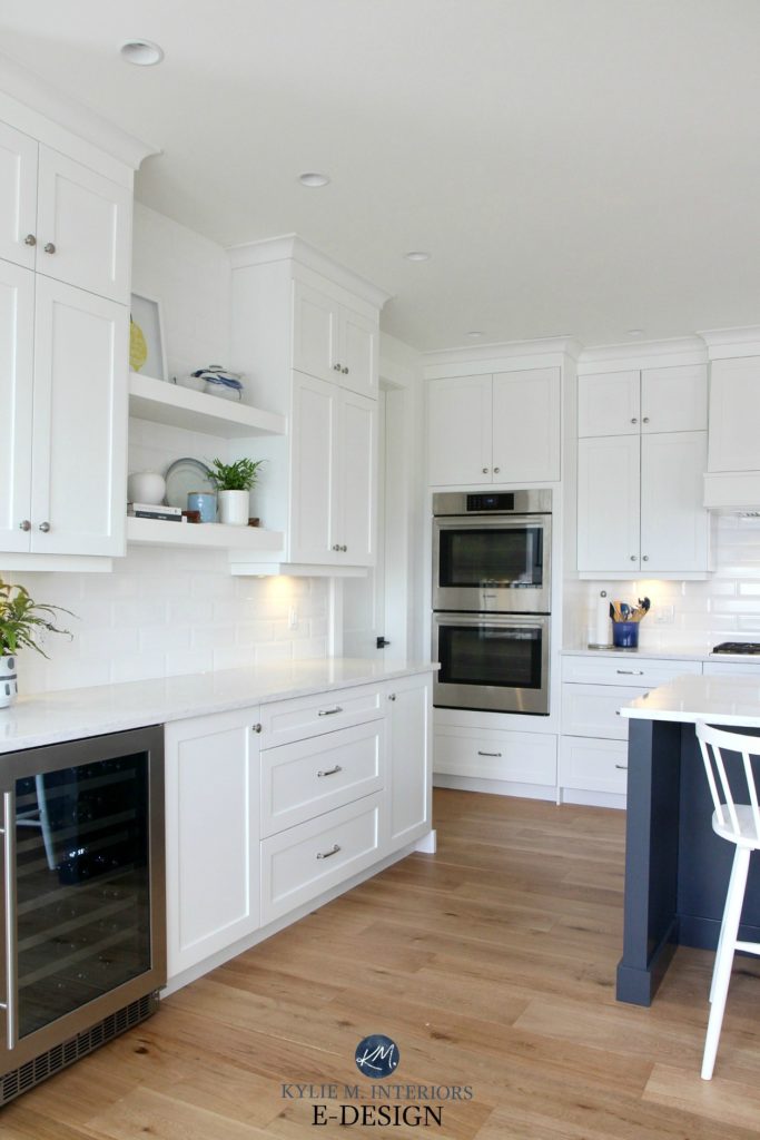
The Kitchen and Dining Room
The kitchen is DEFINITELY the heart of the home in this project as Sarah is an EPIC chef, to which my subtle buddha belly can attest to. And in case this is all ringing a vague bell, you might’ve already checked out the FULL kitchen in this blog post here.
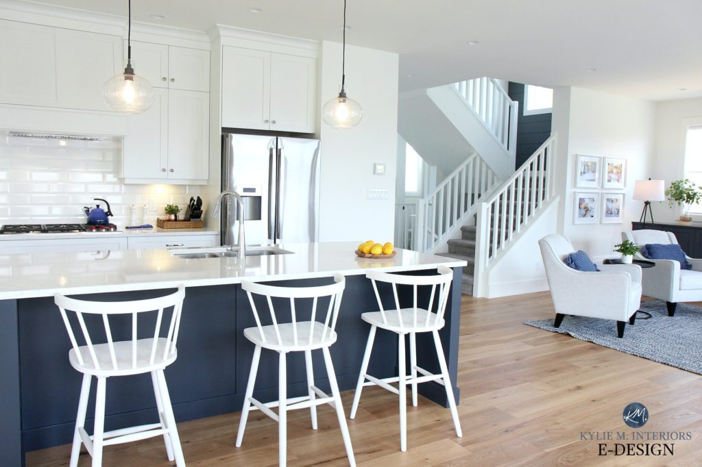
Bar stools from Wayfair (here). Pendant lights (out of stock, but similar version here)
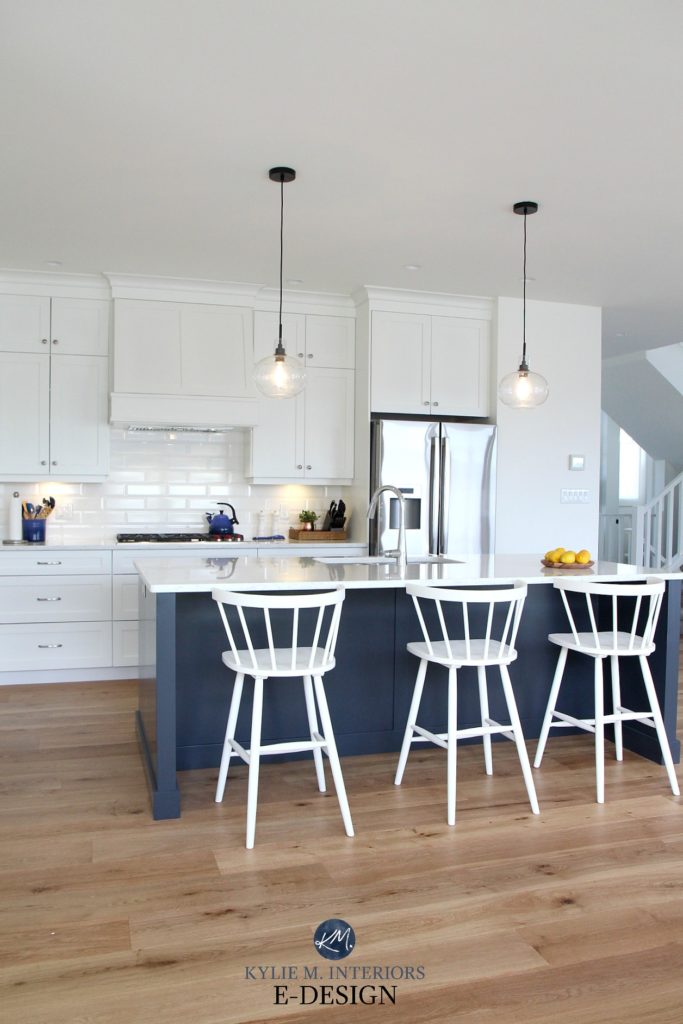
If you’re admiring the floors, they’re an awesome naturally finished product from Goodfellow flooring – durable and budget-friendly! We did the same product in our own home but chose a slightly darker stain (Stone White Oak).
The dining table and chairs also came late to the party, so again, I’ve got a slightly-blurry i-phone for now. Or maybe, you need to cut back on the wine as it’s PERFECTLY clear on my end of the screen, just sayin’.
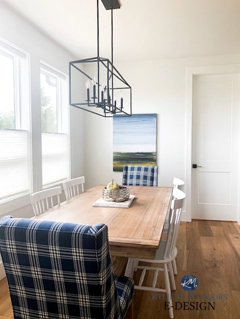
Captains chairs (here). White dining chairs (here). Bradding dining table (here)
I’m in LOOOVE with the two captains chairs from Pier 1, that pattern just slays me. And we actually had that same dining table in our last home, which I loved so much I got it for Sarah too, so I could relive the glory of it again.
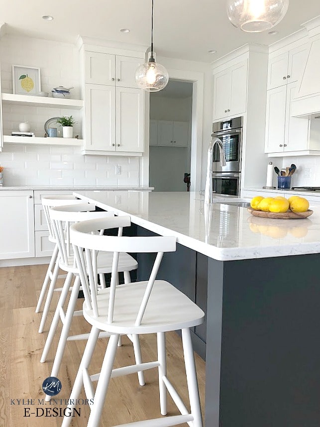
I made sure to coordinate the dining chairs with the counter stools as I didn’t want too many different styles going on and wanted the consistency of the white as well.
And btw, I’m sure you know that the ONLY painter I use in my own home is Delea of Details Painting, so naturally, we got her to paint this one too and she did a great job (as usual).
Read more: Paint Colour Review of Sherwin Williams Pure White
The Playroom
At the top of the stairs, we decided to use the space above the garage for a playroom (originally slated to be storage). But first, let’s look at the landing, leading to the playroom…
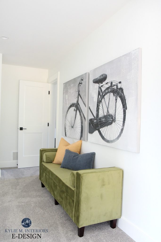
Both the bench and the bike canvas were from my secret garage stash and it’s like they were MEANT for this spot. I’m gonna miss that bench though…
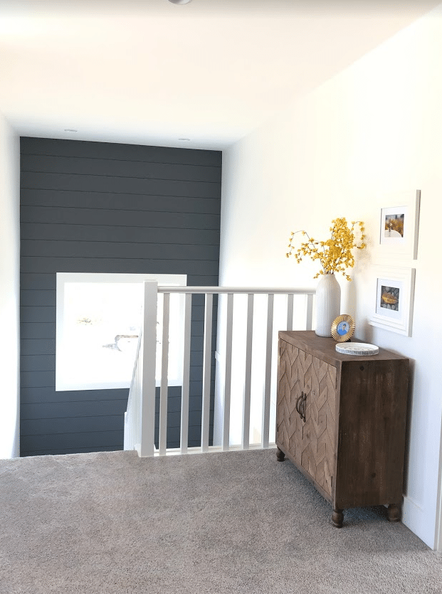
And more of that shiplap staircase wall we looked at earlier…
Light fixture (here)
In the above photo, you can see how the 2 storey entryway opens up to the landing at the top of the stairs, letting SO much light spread throughout the top floor! And that light fixture is one of my FAVES and I have a similar, larger version in our home which is pretty badass.
Now for the playroom…
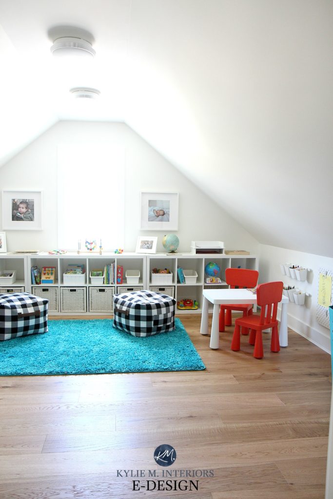
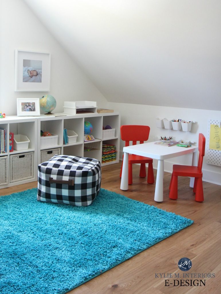
Buffalo check poufs (here)
Seriously, could it be any cuter? I stretched the budget FAR on this bad boy. The cutie-patootie poufs are from Walmart and almost ALL of the furniture and storage items are from good old Ikea!
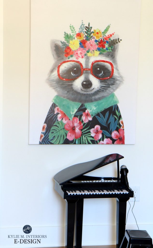
And she might just be my fave thing ever…(Home Sense)
Now, I’m not known for being brief, and there are SO many more beautiful spaces in this home that I want to show you, so from here on out, I’m just going to give you snippets of a few of my fave spots so you can keep your sanity (mine is irrelevant, it’s loooooong gone).
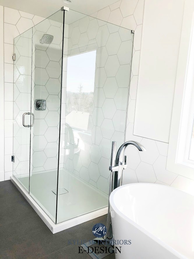
The Master Bathroom

Just look at that large white hexagon tile. Sarah and Brett shouldn’t be surprised to find me showering in their bathroom one day. I know they’re crossing their fingers…
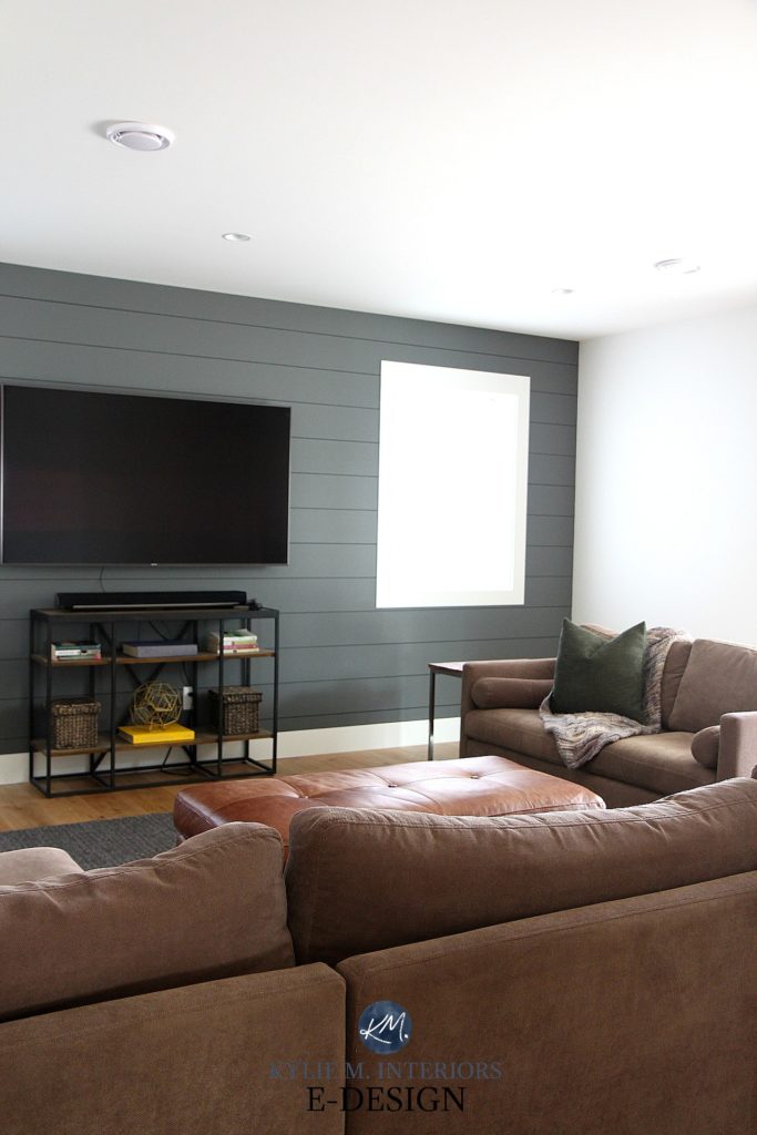
The Family Room
I LOVE the gallery wall in the family room, it’s full of some of my favourite people. And because I used NAILS, it was way easier to hang than the four pieces in the living room!

Really though, by the time I got to the family room, the budget was exhausted (and so was I). I was able to use their original pieces and grabbed a bookcase from my hoard for under the TV! I also love that we were able to continue the shiplap look down here, which was a great way to add personality to this space without spending a ton of money. We went with SW Grizzle Gray, which is a wicked gorgeous darker green-gray.
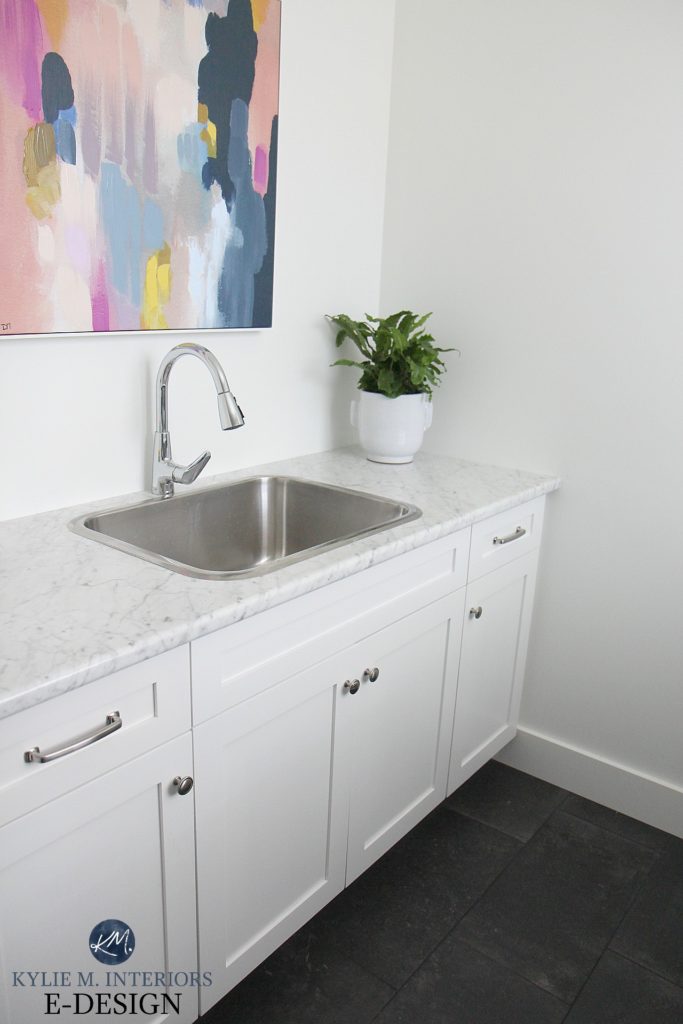
The Laundry Room
We chose a budget-friendly laminate countertop from Formica for the laundry room and it turned out awesome. It looks like marble, without as much maintenance and is perfect for this busy lil’ household.
Read more: The New Era of Laminate Countertops and Why It Rocks
So, there you have it – well, most of it anyways!
Need help with YOUR home?
Check out my E-DESIGN services, I’d love to help!
Chat soon,

PAINT COLOUR LIST
- Walls, trims, ceilings: Sherwin Williams Pure White
- Kitchen and bathroom cabinets: Sherwin Williams Pure White
- Front door: Sherwin Williams Tricorn Black
- Kitchen island and living room built-ins: Sherwin Williams Cyberspace
- Powder room vanity: Sherwin Williams Isle of Pines
- Feature wall in the family room: Sherwin Williams Grizzle Gray
- Feature walls in staircases: SW Web Gray
- FLOORING: Natural Wirebrished Oak from Goodfellow
Comments
Leave a Reply
More Posts

The 5 Best Creamy White or Off-White Paint Colors
THE ELUSIVE ‘CREAMY WHITE NEUTRAL’ When it comes to light, warm neutrals, it’s all in the undertones. And other than pink and green, yellow is the undertone many of my
Read More

The 8 Best Warm Neutral Paint Colors With NO Yellow Undertones!
The Top Light Depth, Warm Colors That Aren’t Cream! When choosing the best warm neutral paint color for your home, whether creamy white, beige, taupe, or greige, your choices are
Read More

The 12 Best Farmhouse Sinks of 2024
FIND YOUR DREAM SINK HERE… While traditional farmhouse design was all the rage in previous years, the embers have definitely cooled. As for MODERN farmhouse, it’s still kickin’ its cowgirl
Read More


Can you share what sheen you chose for the pure white? Perfect! Thanks 🙂
Author
That’s eggshell :).