
Our Open Concept Living Room Update
A Remodel with Edgecomb Gray & Urbane Bronze
Well, we’ve lived in our home for FIVE YEARS, and so far, so good! Our previous homes all had four-year expiry dates (excluding our ‘summer house‘ adventure), but I think we’re in this one for the long haul…ish. And while I’m already pining for fresh new paint colors and some changes here and there (don’t tell Tim), I still love our living room updatel.
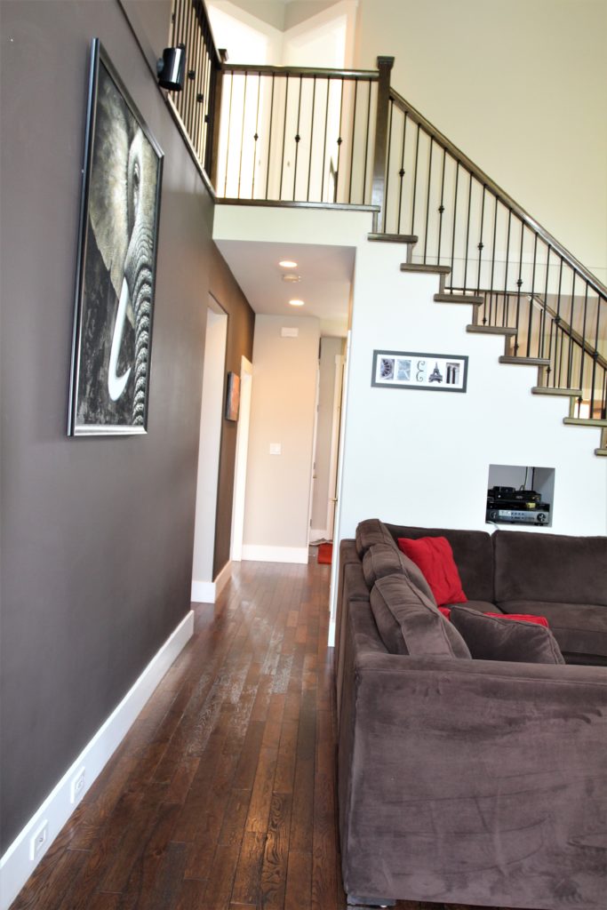
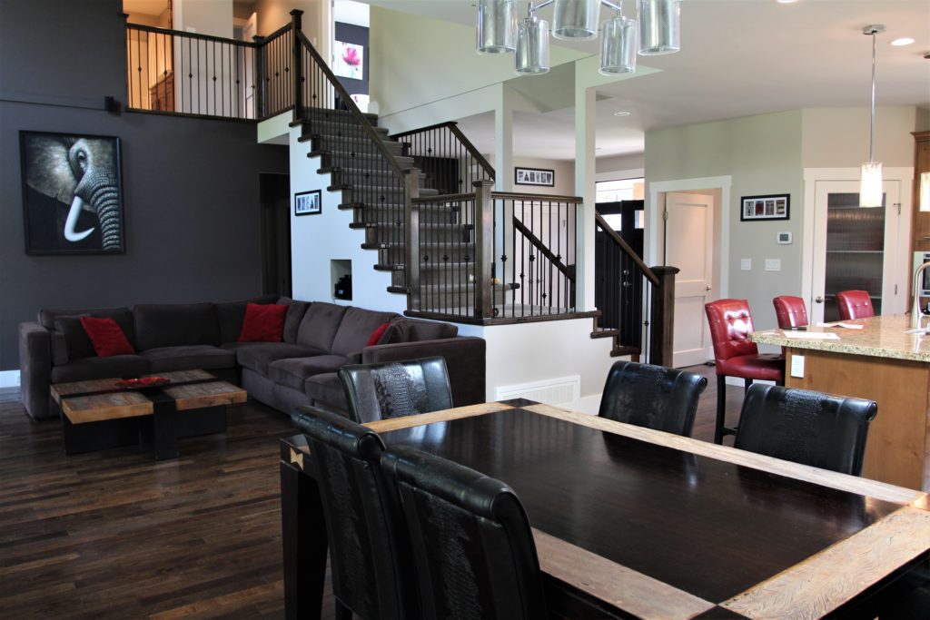
But, before you see the transformation, let’s look at things from the entryway’s point of view…
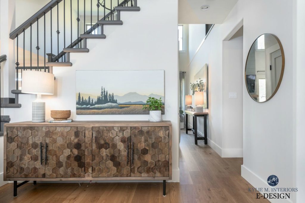
To the left is the kitchen, to the right, is the living room and hallway to the primary bedroom
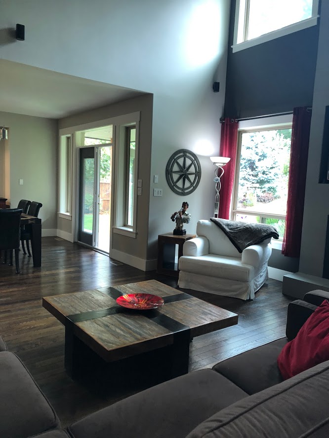
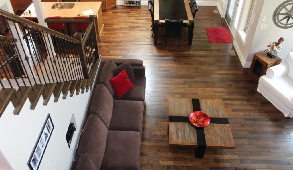
The layout in our home is awesome, as our living room, dining room, kitchen, and entryway are ALL open to each other, separated in the middle by an open staircase (shown above). Compared to our last home, which Maggie fondly calls a box on a box on a box (which is also what our front doorstep looks like thanks to my Amazon addiction), this feels SO much more like home! And it better, because Tim will divorce me if I even mention selling (just joking, he loves my neurotic tendencies and thinks they’re cute…right Tim????).
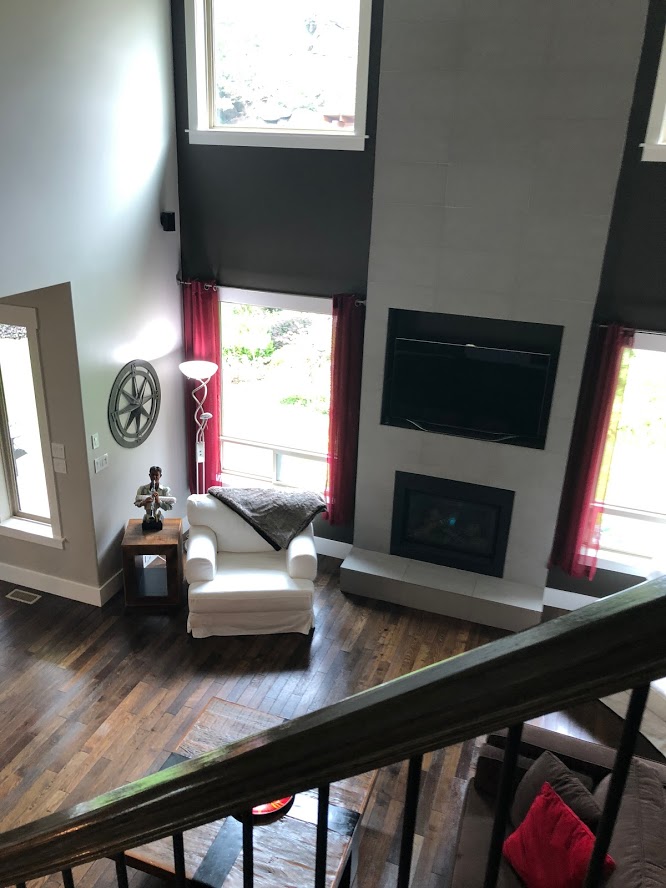
Now, let’s look at what we saw when we first looked at our home…
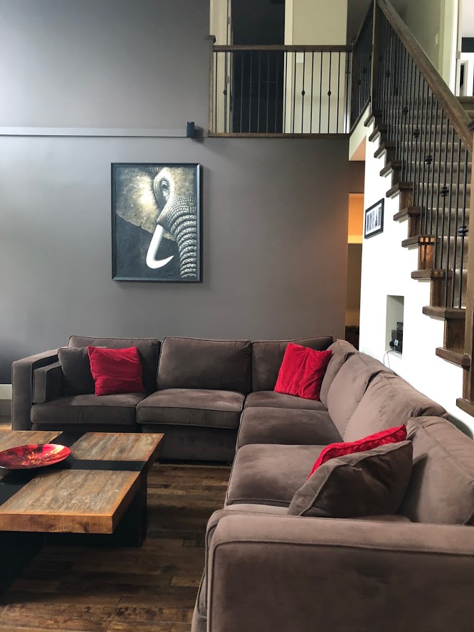
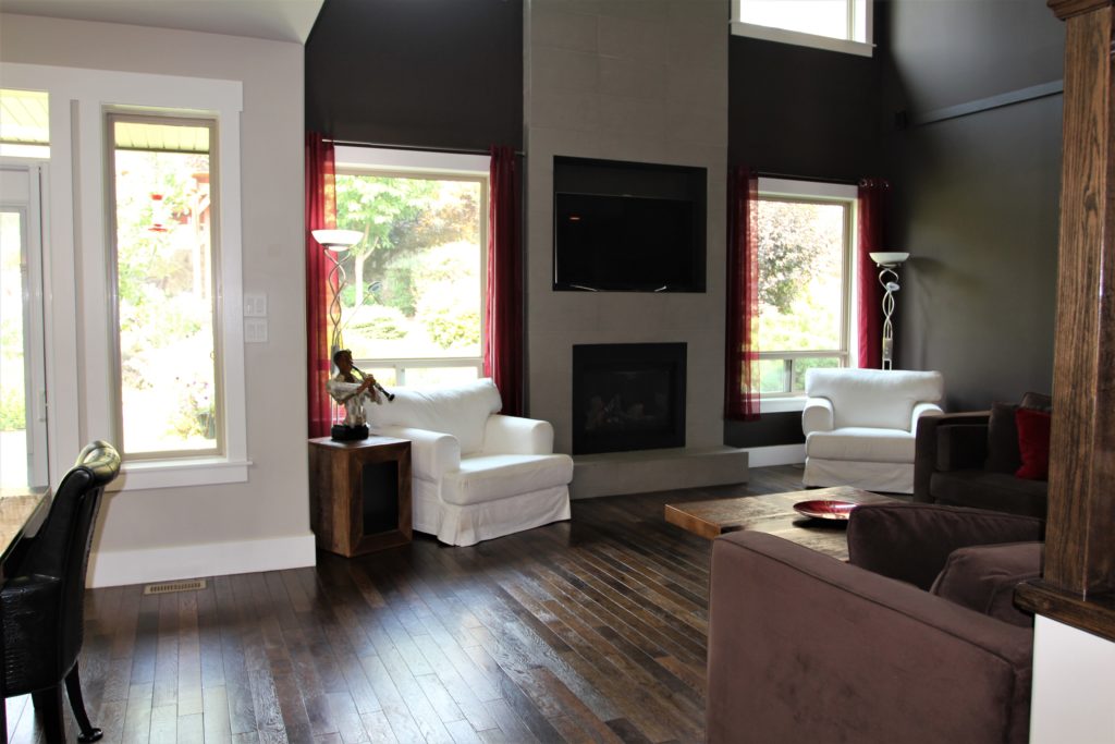
MAN was it was DARK. And while the north-facing exposure and 25′ rock wall behind our home could account for a bit of this darkness, they weren’t the problem – it was the paint…and the floor…and the lighting…and…well, everything. And while I LOVE dark colors and am not afraid to paint a room black if that’s what it calls for – this was all kinds of wrong.
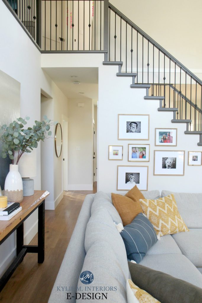
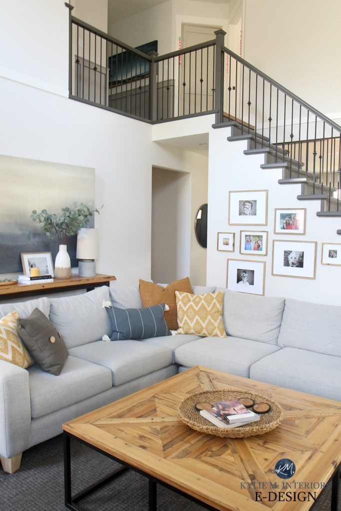
NOW, let’s see its fresh new face…
RIGHT?! Man, I love our home. In the above photo, you can also see a wink of the powder room, which I’ll show you a quick shot of here (it’s 30″ x 72″ so there’s not much to show)…
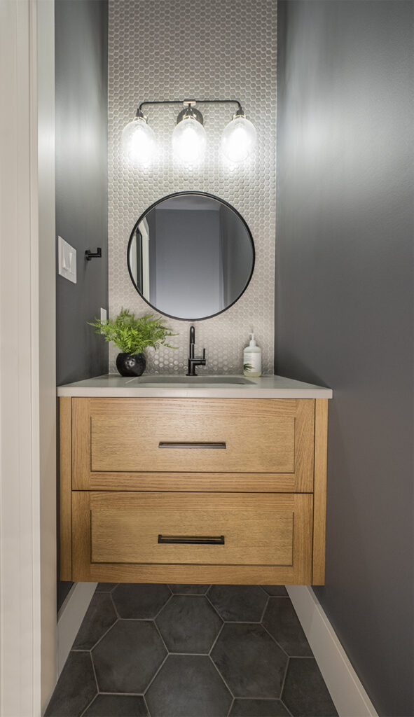
By the way, do you know how hard it is to photograph a small space with no natural light and a MIRROR? I had to bring in the big guns, otherwise known as Dirk, from HA Photography.
Now, back to the living room.
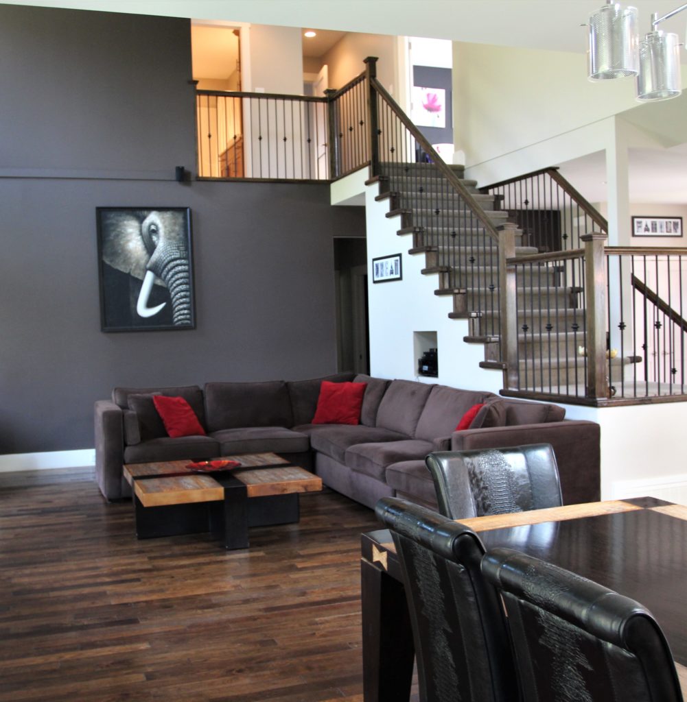
Our living room makes me ALL kinds of happy. It’s cozy, comfy, and my favorite place to hang out with my girls. HOWEVER, before I got to it, it was a bit janky…
The staircase (shown above) is one of the (many) things that sold us on this home, as it’s a bit different from the norm (kind of like someone we know…insert awkward whistling here). It’s a huge element in our open-concept home. You must walk around the stairs to the kitchen, living room, dining room, entryway, powder room, ANNNNND primary bedroom – a 360-degree staircase.
We didn’t have room in the budget to replace the railings, and sanding them down was NOT an option for basic sanity reasons. And besides, there’s NOTHING like a coat of paint (or three) to freshen things up! And thankfully, there was room in the budget to cover up that ridiculous hole holding the TV components. Seriously, who does this?
After…
Railing colour: Sherwin Williams Urbane Bronze
And yes, I DID consider just putting a frame over that opening in the drywall and calling it a day (I hate drywall dust). However, in the end, I decided that doing it the ‘right way’, was the best way. I’m also a HUGE fan of gallery walls and loved that I could stagger the layout of this one with the stairs. Notice the round mirror down the hallway is the SAME mirror you can see in that VERY first photo of our entryway.
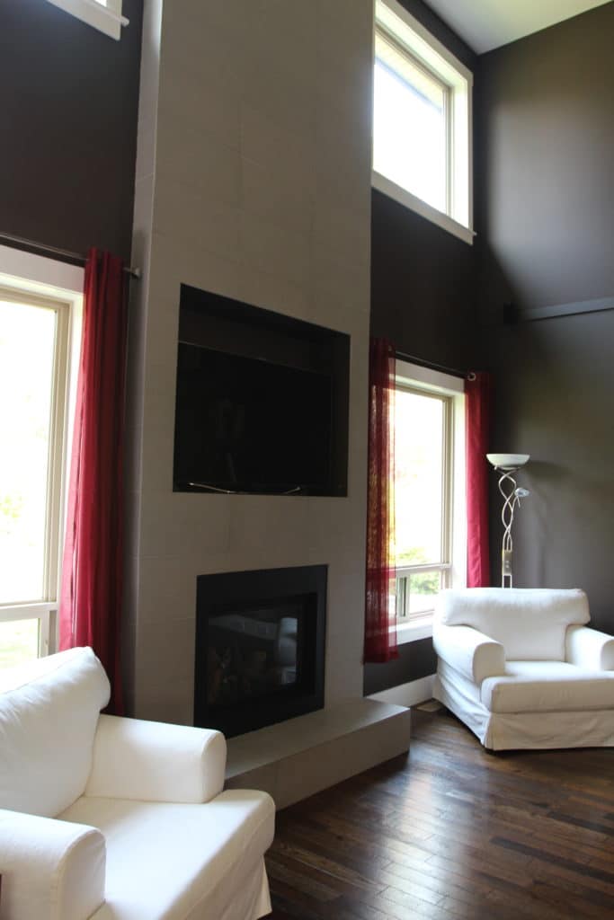
In the next photo, someone thought doing a cut-out for the TV was a good idea. And generally, it IS a good idea, but not if your TV isn’t the exact right size for that particular hole…
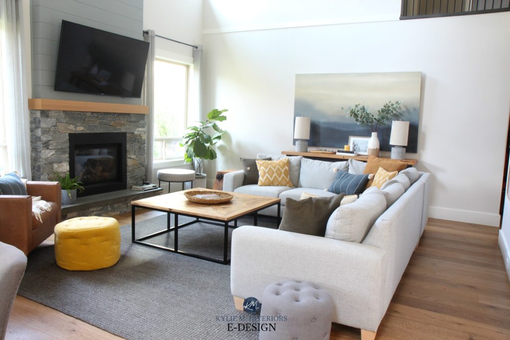
After – SO much better! We left a smaller space behind the TV for the necessary components, bits n’ pieces, and the family jewels…
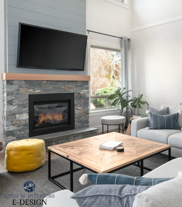
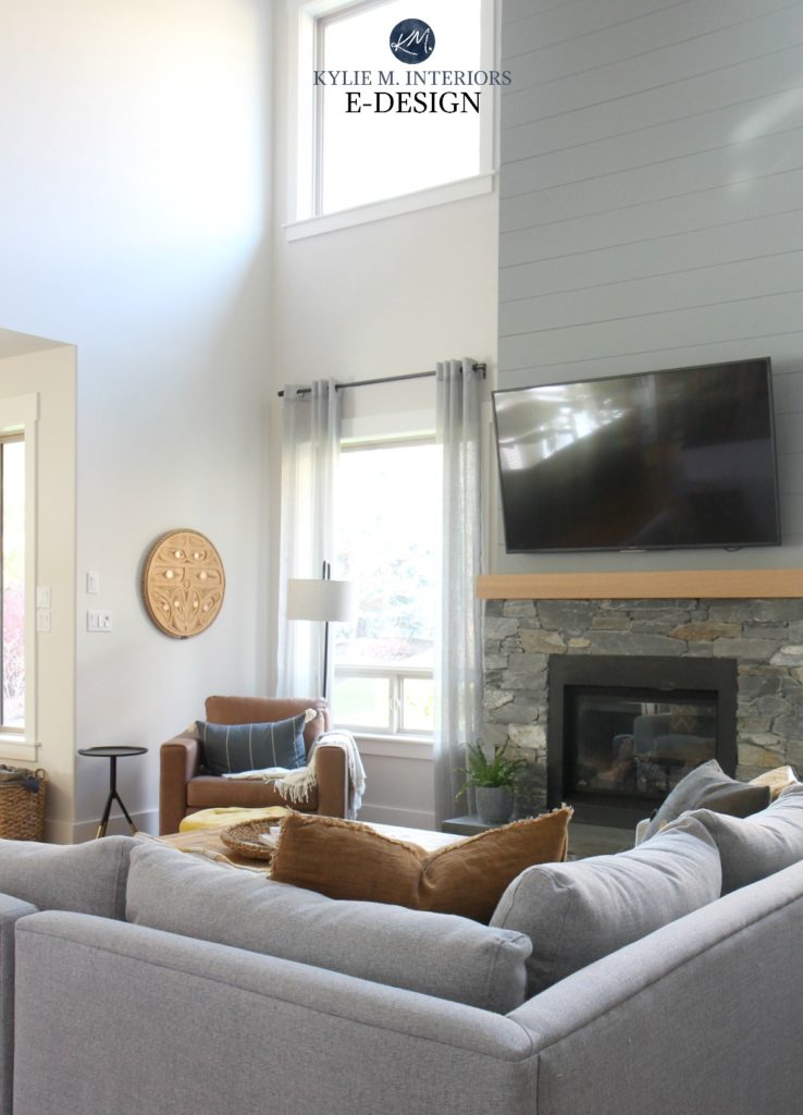
I would’ve loved the full height of the fireplace in stone (18 feet), but it wasn’t happening as this stuff is LEGIT expensive to install (in my next life, I’m coming back as a stone installer). We did a simpler stone surround (K2 stone) with a wood mantel and the remaining 13 feet in painted gray shiplap.
It wasn’t just about getting the old 12×24 tiles off the wall; it was about prepping the wall and getting the new shiplap up and painted – but it was WELL worth it (says me, who stayed on solid ground the whole time).
Here’s another view where I’ve changed the shiplap’s color and the toss cushions…

Now, let’s look at this gloomy little corner of the world – wah wah wah…
And after…
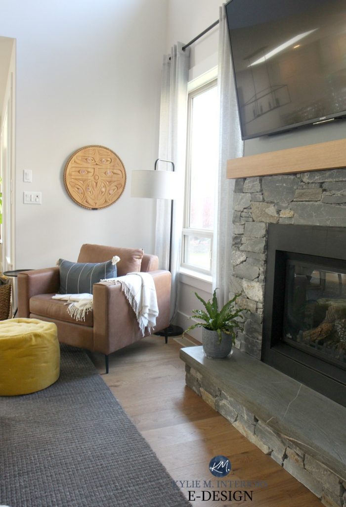
LOOK AT THAT FRIGGIN’ CARVING! I had a local fellow named Noel Brown, make it for Tim’s 40th birthday. Noel is CRAZY talented and created a piece full of heart – perfect for my favorite man.
Let’s take a closer look at this happy little corner! The tobacco brown leather chair is from Urban Barn (no longer available). It was regular $1900. Yup, you read that right, $1900 buckaroos. The floor model was on clearance for $799 – BOOM, sold.
In this next photo, close-up, it’s the worst paint job ever. Delea of Details Painting did two and a half days of filling, sanding, and fixing, just to get our home ready for painting – she’s practically part of the family now.
6 Budget-Friendly Home Update Ideas
I will admit that the chocolate brown sectional looked DAMN comfy, but the brown-on-brown scheme wasn’t quite doing it for me.
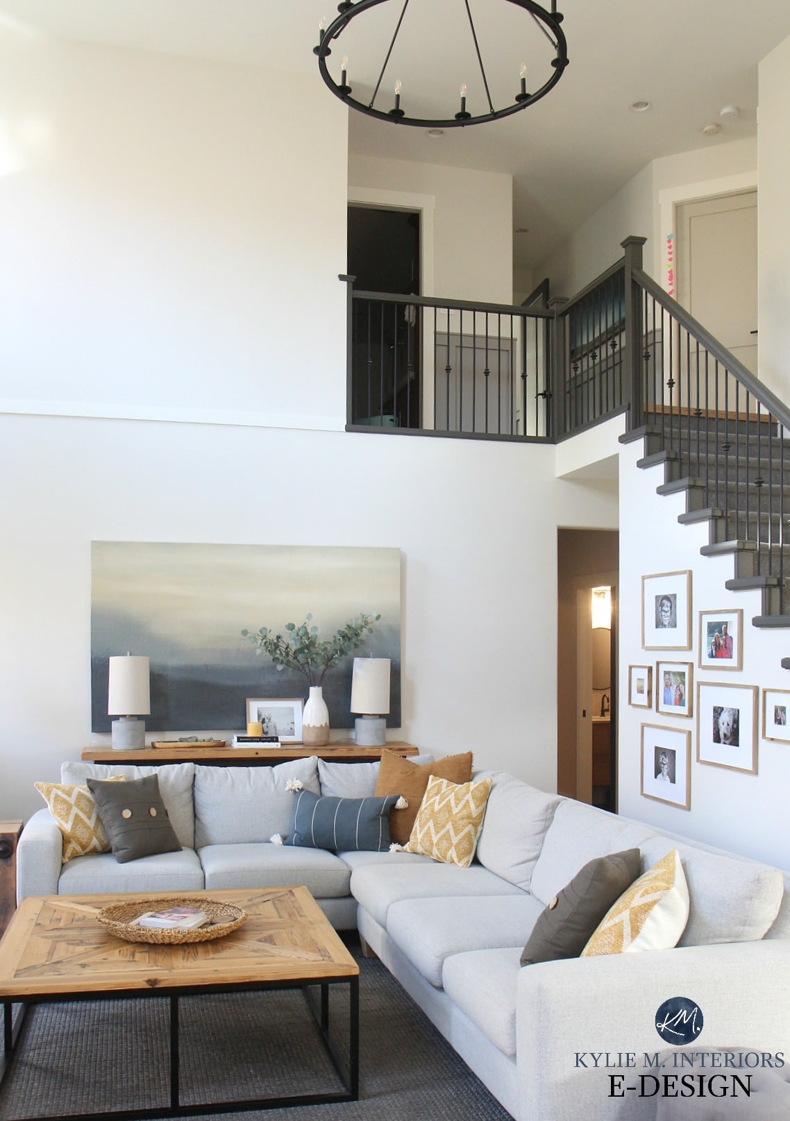
And now (below), I just LOVE it! It’s bright and warm and contrasts beautifully with the warm and cool colors.
Admittedly, I’m already pining for a bit more depth/colour on the walls (again, don’t tell Tim), but I might be able to hold off for six days months or so. Seems crazy, I know, but sometimes I just CRAVE change – Tim’s lucky I’ve kept him for this long.
And seriously, that sectional is THE most comfortable piece of furniture…evah. Coming in at a whopping 9′ x 11′, she’s one beast of a piece and is perfect for accommodating tons of family and friends. It’s called ‘The Bronx Custom Sectional,’ from Urban Barn – my fave local store. Almost everything I own is from there or Muse & Merchant (we don’t have a ton of selection in Nanaimo, other than online ordering, which, as previously mentioned, I am a fan of).
How to Turn Your House Into Your Home
The 10 Best Blue-Gray Paint Colors
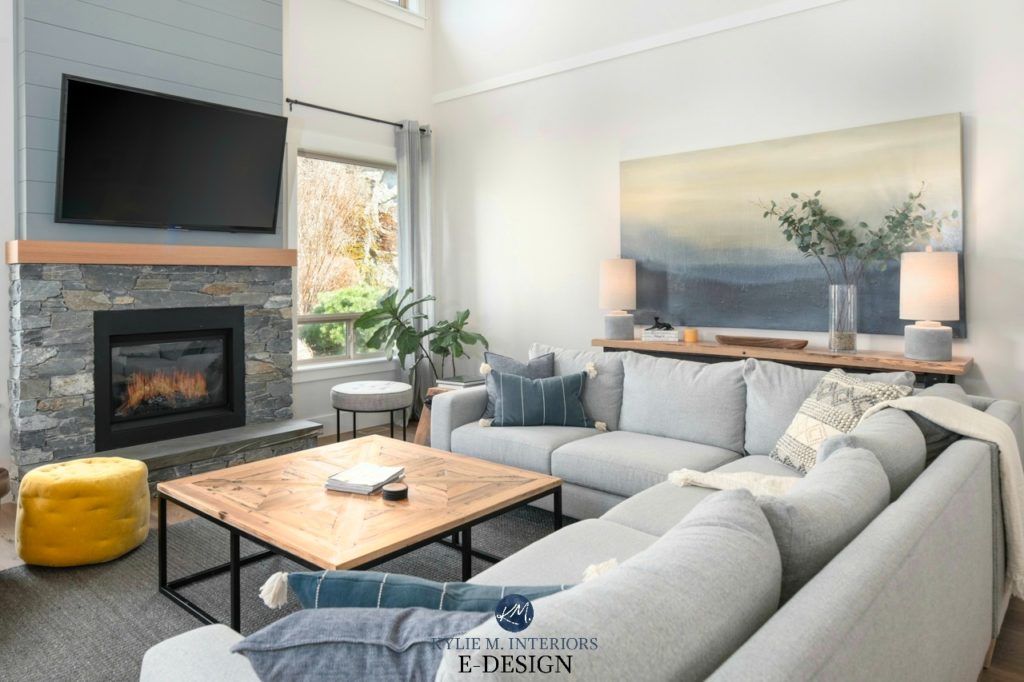
Comparing the last photo with this next one, see how pushing the sectional away from the wall makes the room look much bigger. Also, notice how the area rug helps to anchor the furniture so the pieces aren’t just floating on the floor.
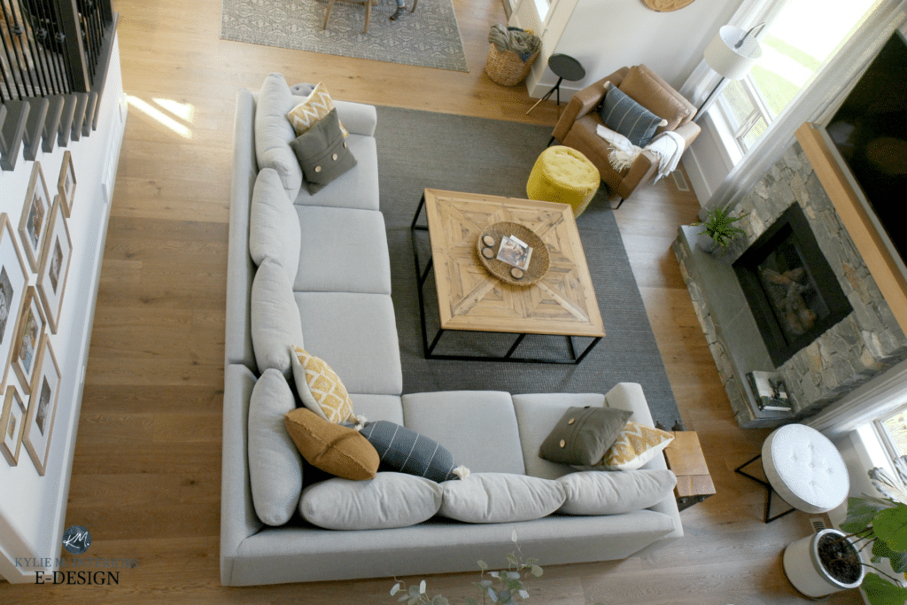
And yes, that is a wicked awesome coffee table. It was a random find at Home Sense, and while it was the wrong finish when I bought it, Tim and our buddy sanded it down and restained it to work better for the room.
As for the area rug, again…Urban Barn, and they don’t carry it anymore.
Here’s another shot from the top of the stairs…
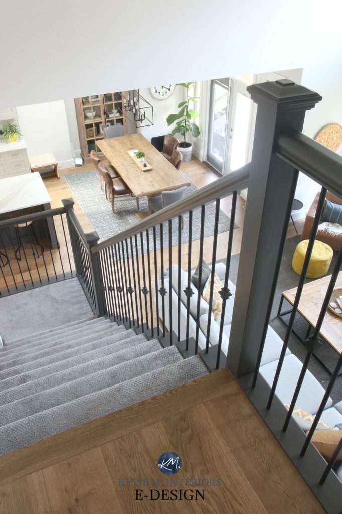
It’s been one year since the railing was painted, and while I’ve had to do some small touch-ups, it’s held up SUPER well, thanks to Delea’s careful work. It took her several days to complete the whole staircase, and I’m sure she’s sending us her Chiropractor bill.
If you haven’t looked at the stairs from the entryway, you can check it out HERE.
Now, back to the bat cave…
The old oak flooring was beaten to heck by the old owner’s two dogs. And because it was such poor quality, we couldn’t even refinish it, so it was out with the old and in with the new! Plus, I wanted a wider plank look anyway…
I know, I know, white oak floors with a natural finish are the most popular, but I wanted to make sure our flooring would last more than the trends, and besides, I like slightly more medium-toned woods, regardless of trends. I chose a lightly stained, brushed, matte wood flooring from Goodfellow, and it’s seriously…my fave thing ever.
WHAT ARE THE PAINT COLORS, KYLIE?
If you’re curious about the paint color on the walls, it’s Benjamin Moore Edgecomb Gray…kind of. Because paint excites me SO friggin’ much, I didn’t just go for regular ole Edgecomb Gray; I lightened it by 75%. Hey, I’d way rather play around with MY home than with YOURS – I am my own guinea pig. And I LOVE how it turned out. It’s like an off-white greige with these super flexible undertones that change as the natural lighting changes. I partnered it with one of my FAVE white paint colors – Benjamin Moore White Dove.
As for the shiplap on the fireplace, I wanted a gray with a whisper of blue-green undertone, so I chose Sherwin Williams Earl Gray to tie in with the stone.
When I post my living room photos on Instagram, I often get questions about the oversized artwork. Sadly, it was a random Home Sense find. I’d love to find a NEW piece to replace it, but it’s hard to find something that humongous with all of the colors I love!
And for the FINAL reveal, seeing as you’ve seen my kitchen and dining room remodel, as well as the entryway, let’s look at the WHOLE kit n’ caboodle (and no, you’re not going crazy, these next two photos are from different angles)…
Need help with your home?
Check out my Online Color Consulting packages!
READ MORE
The Best Off-White Paint Colours
Our Kitchen and Dining Room Remodel
From Dark and Dismal to Gorgeous: Our Entryway Remodel
Chat soon,

ORIGINALLY WRITTEN IN 2019, UPDATED FOR GRAMMAR N’ STUFF IN 2023


Thank you very much for sharing your lovely hone. I love the colours and actually everything you have done. Are you able to share the exact colour name of your Goodfellow white oak flooring please? Is it Sand, by any chance? It looks beautiful and timeless, which is what I am looking for.
Hi Kylie, would you tell us what stain you used for floor? Did you replace or used different stain. Appreciate your reply!!
Thanks
That’s actually Goodfellow Flooring – Riverside Heights Collection and I believe the finish is STONE (it’s engineered wood) 🙂
I LOVE everything you’ve done with this space! I would love to know the color of the walls in your powder room and the tile if you remember – I looked to see if there was a separate post, but didn’t see one. Thanks for your consideration!
Hey Kimberlee, thank you! I don’t remember the tiles, but the bathroom WAS painted Sherwin Williams Gauntlet Gray and is more currently Benjamin Moore Stormy Sky 🙂
may I ask what the dimensions of your family room are?
Hey! They’re approx 18×18 🙂
Hi, Kylie. Knowing that we plan to move within the next 5 years, and we have a fairly open concept house, do you advise painting all the walls the same color? Or can we paint “upstairs” and “downstairs” different colors (in quotes because there is not a definite break between the two)?
While it can depend on the colors you use, generally speaking, you can definitely do two different colors!