
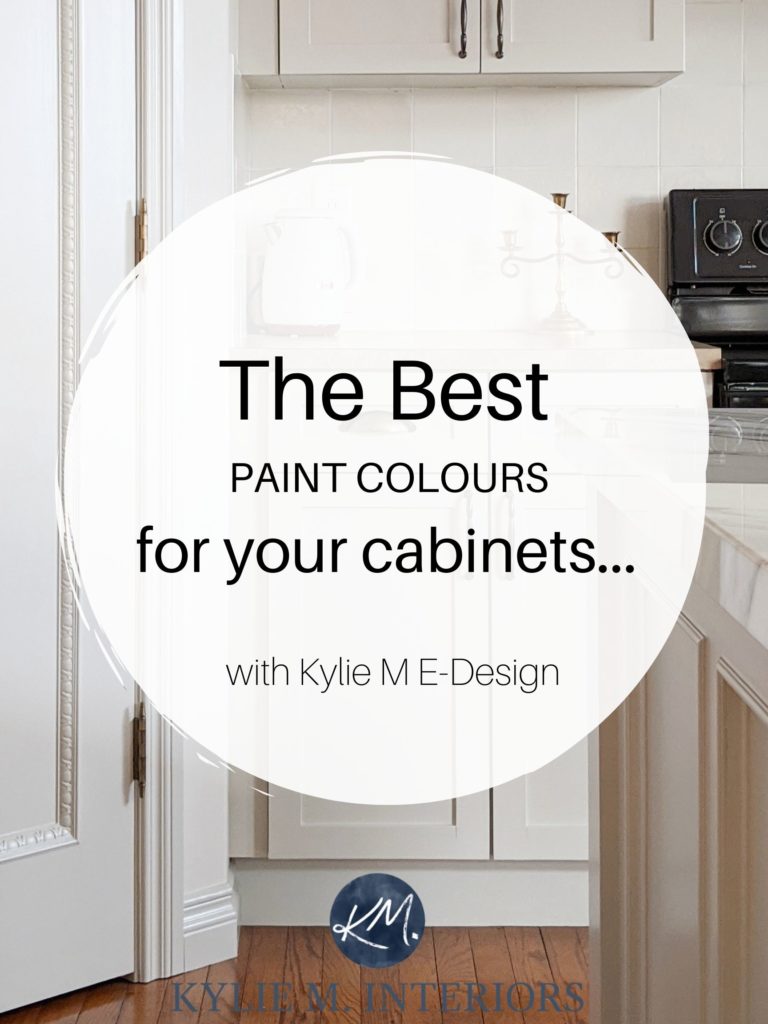
Revere Pewter Kitchen Cabinets, Quartz, & More
Brittanica Warm, Urbane Bronze, & all the dirty details…
It seems that every time I post a photo on my Kylie M Instagram about our kitchen, I get the same questions: ‘What color are your cabinets? Which countertop is that? Is that your real hair color?‘ So, I figured it was time for a blog post with all the dirty details.
First, let’s take a look at what we started with…
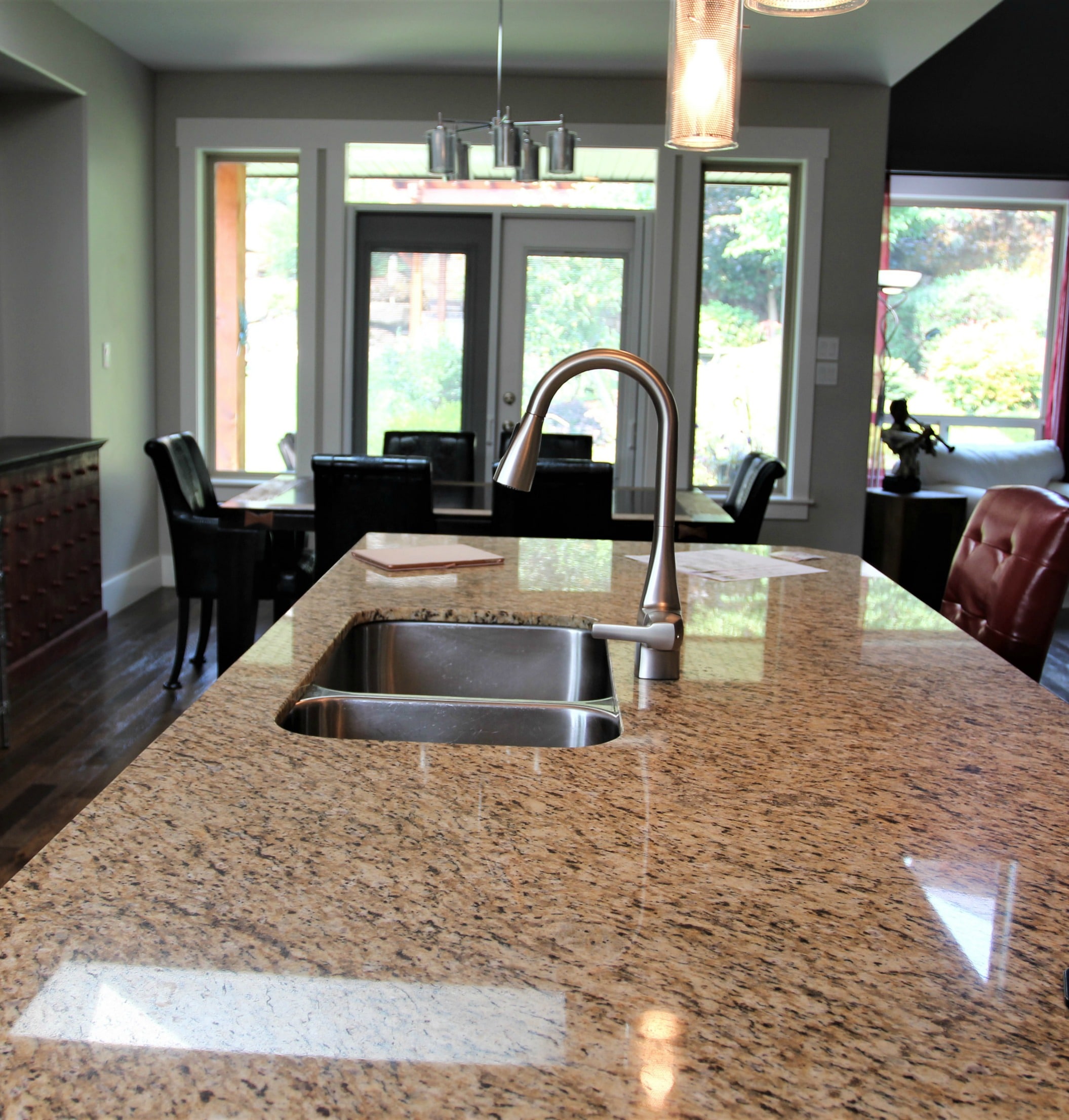
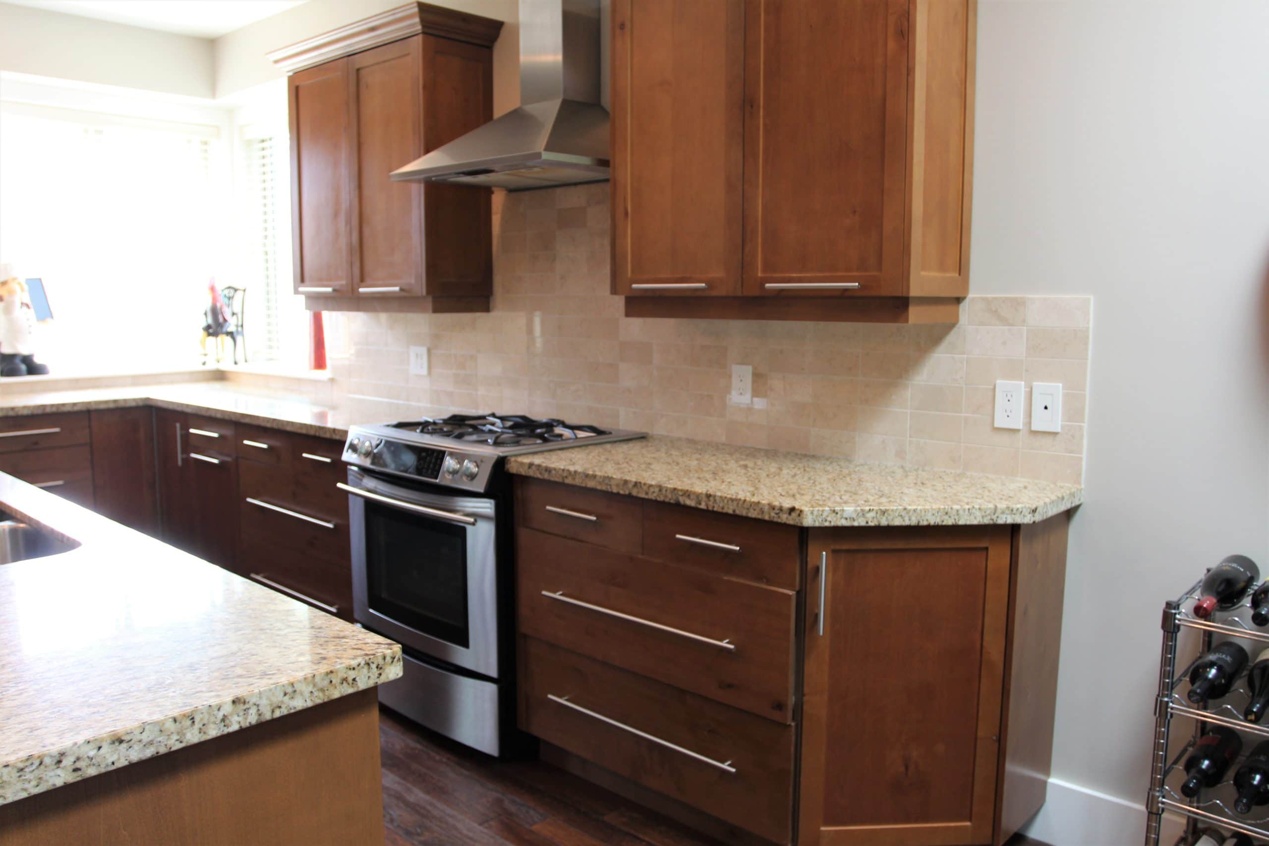
Our home was heavy and dark—dark woods, dark walls, and outdated finishes popular in the early 2000s. While many of the finishes were liveable (like our Santa Cecilia granite countertops), others were worn out and not our style—TIME FOR A MAKEOVER!
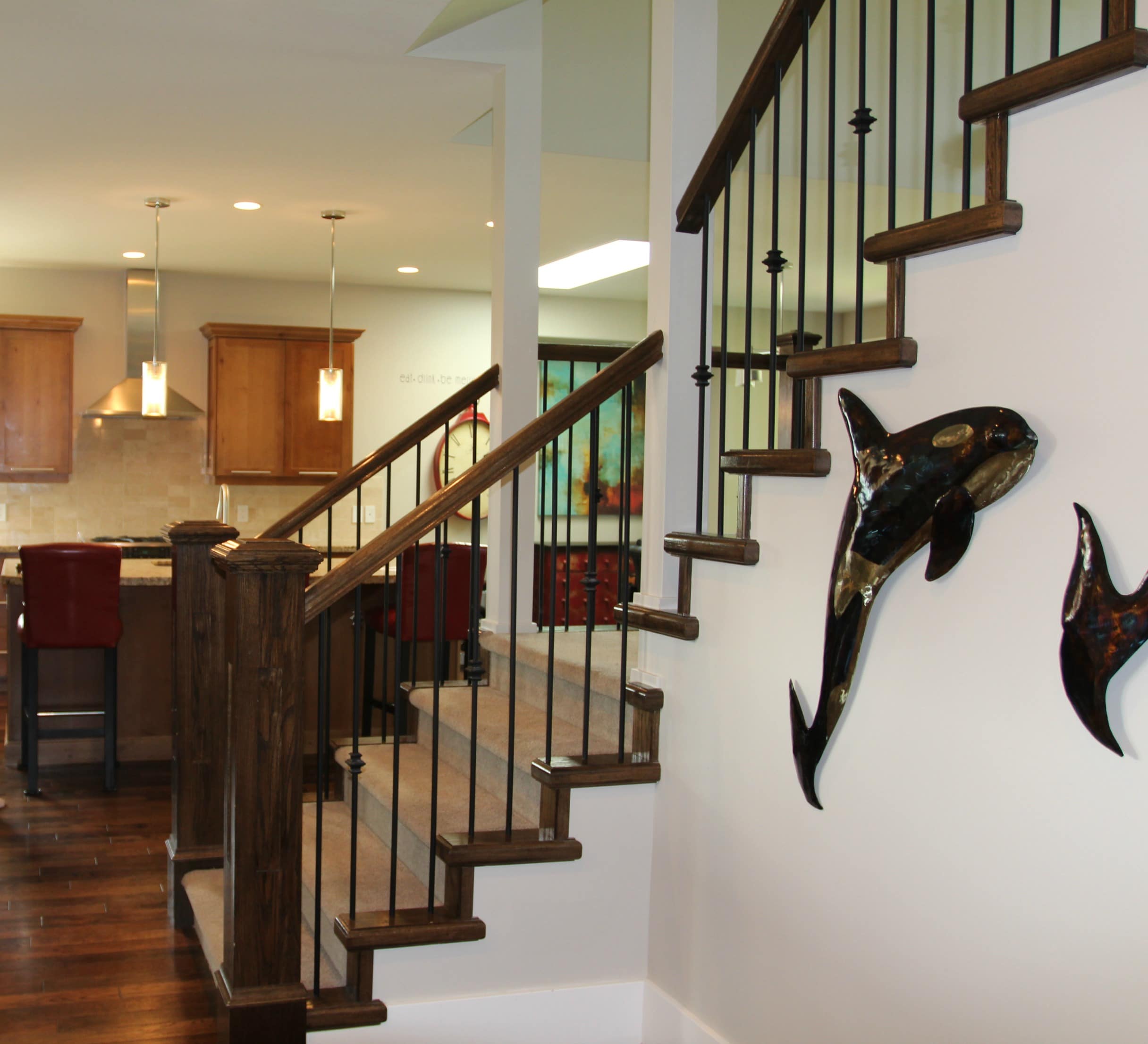
And no, the floor isn’t actually faded in front of the stairs; it’s just a little trick the photographer used to make the surrounding areas pop a little more (kinda wish they hadn’t, but whatever).
Now, it’s not often that I let you guys into my wicked little brain. And let me tell you, it’s a scary place if you don’t know your way around (I get lost ALL the time).
I don’t just want to tell you what I chose for our kitchen remodel; I want to explain why.
But first, let’s take a gander at the before photo, which isn’t bad but has several fatal flaws…

- The cabinets are cheap and are a ‘good from far but far from good’ scenario.
- The hardware is dumb. That’s right, dumb. Look at the way they put the handles horizontally on the doors. Sure, they’re great for a more modern style home, but for a more traditional or even transitional approach, they don’t work. Plus, I couldn’t just install standard knobs/handles without seeing two big gaping holes in the front of the doors #firstworldproblem, but moving on…
- The countertop is Santa Cecilia granite, and I could certainly work with that, but the pink undertones in the backsplash clash with the counter and make me want to twitch and cry in a corner – plus, I want to extend the island.
- The previous owners had two large dogs, and the floor was beat and not quality enough to be refinished.
OUT WITH THE OLD AND IN WITH THE NEW (my motto with husbands too…just joking Tim).
Let’s start with the countertop.
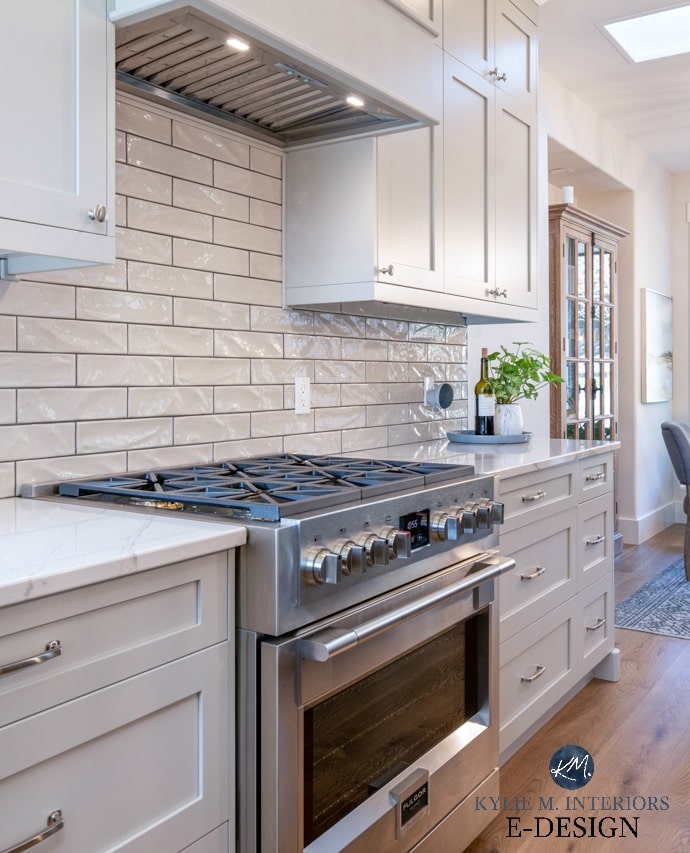
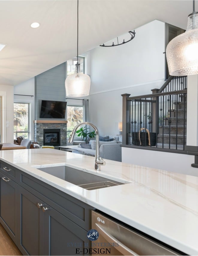
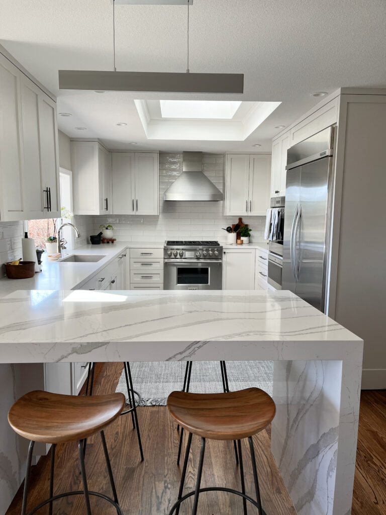
CAMBRIA BRITTANICA WARM QUARTZ COUNTERTOP
When designing a kitchen, the countertop is usually the first thing to consider, short of the actual layout itself (which we couldn’t adjust too much).
Why the countertop?
Well, whereas there are thousands of paint colors to choose from, there are only a handful of countertops you might actually fall in love with. Plus, the countertop is way more expensive.
The second I saw Cambria Brittanicca Warm, I fell desperately in love. It was new on the market, following in the footsteps of the well-known Brittanicca and followed by Brittanicca GOLD, both of which weren’t quite right for us.
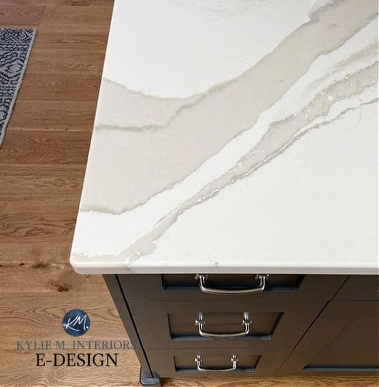
You see, I have a weakness for wine, cheese-flavored rice crackers, and green undertones. I don’t like green undertones in yellow; these make me nauseous, but give me a dark green tucked in a warm gray or beige, and I’m one happy little Ginger.
Follow me on INSTAGRAM!
Brittanica Warm has a soft, off-white base, so it’s not as white as some of the more popular quartz countertops and has a warmer look. It also has that glorious warm gray-greige with the most muted green undertone and subtle taupe. Strange combo, but it works.
The variety in this countertop gives me colors to play with in the future should I want to change something else in the room (which you KNOW I will).
Before…
How to Update Your Older or Outdated Granite Countertops
And after…
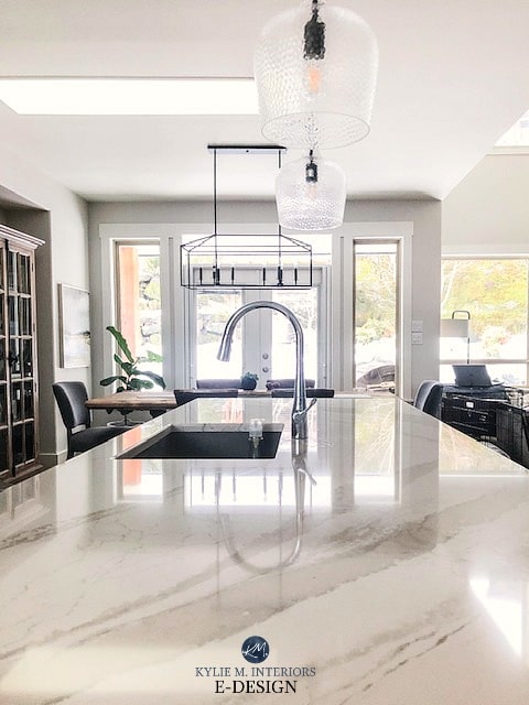
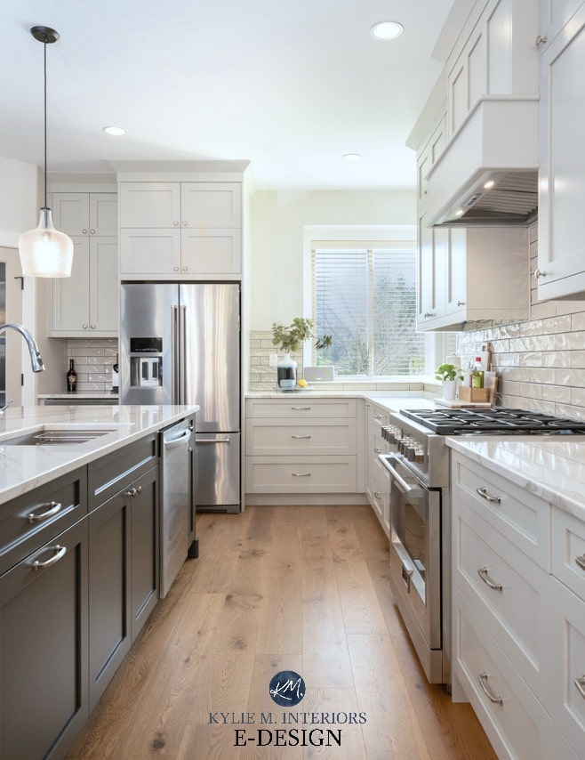
BENJAMIN MOORE REVERE PEWTER KITCHEN CABINETS
I wanted to tap into the countertops’ passive green undertone, and I knew Revere Pewter would do that—it just wasn’t dark enough.
Why?
Well, because cabinets most often have a satin finish, it can make a paint color look lighter than expected where light shines. I wanted a color with a bit more junk in its trunk, but I couldn’t find it. So, instead, I did what I ALWAYS do—I experimented!
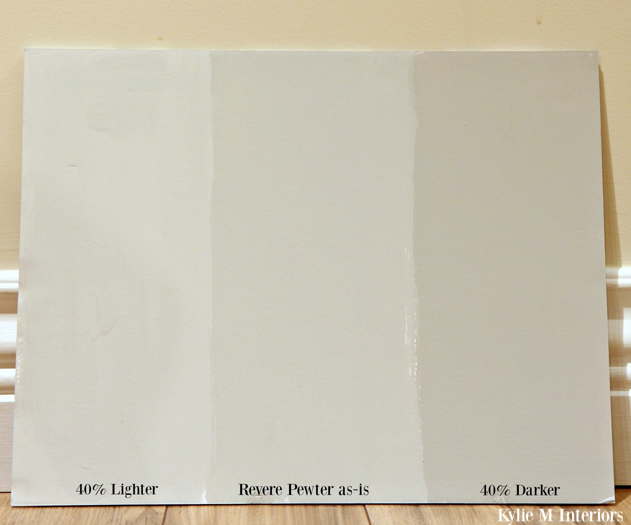
I can’t find my photo of the 25% darker sample, but this one will give you the idea…
Paint Colour Review of Benjamin Moore Revere Pewter
I had samples of Revere Pewter lightened by 25% and 50% (and clearly, 40% because I’m slightly OCD), and the cabinets turned out somewhere in between (they had to be color-matched to the cabinet company’s paint).
I love how it turned out. The green undertone is still passive, and most people think I have gray cabinets when they’re considerably warmer-looking.
Look at my Revere Pewter kitchen cabinets compared to Benjamin Moore Stonington Gray (a more traditional gray with an LRV of 59.36)…
Is Revere Pewter the Best Cabinet Color for You?
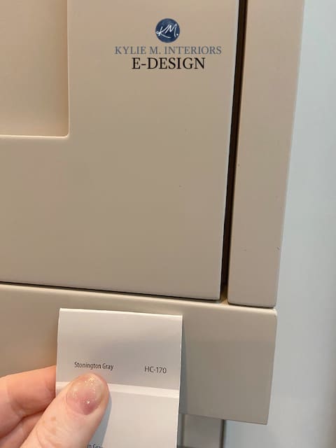
If they were both regular strength, you’d see only a four-point difference in LRV. However, this photo helps show the shift with RP being darkened.
The tricky thing is that when you get a professional photographer (hallelujah) to take the photos, the color can look a bit different than in person (she obviously didn’t take this fugly before photo…
Ideas to Update Your 2000s Kitchen
But she definitely took this one…
But it’s everyday living that makes our kitchen look beautiful…
The New Era of Laminate Countertops and Why They ROCK!
And yes, I always leave cupboard doors open, which is one of my many bad habits. Thank you, ADHD.
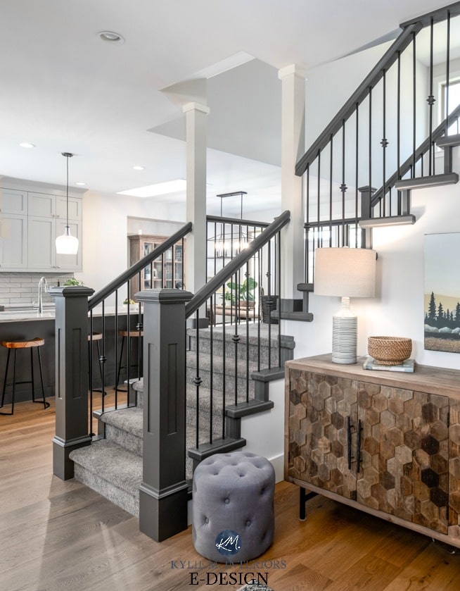
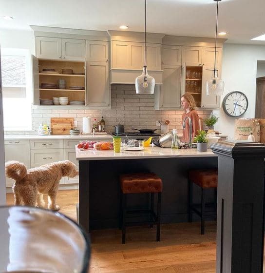
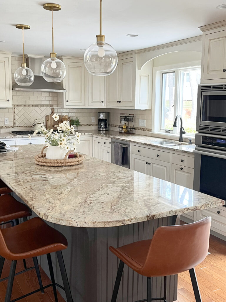
OUR URBANE BRONZE ISLAND
No, it’s not an island with waterfalls overflowing with wine, free Starbucks, and Ryan Gosling in a Speedo. It’s my island painted in Sherwin Williams Urbane Bronze. I love contrast and wanted to hit the island hard with a killer dark paint color (but I didn’t want black or navy blue).
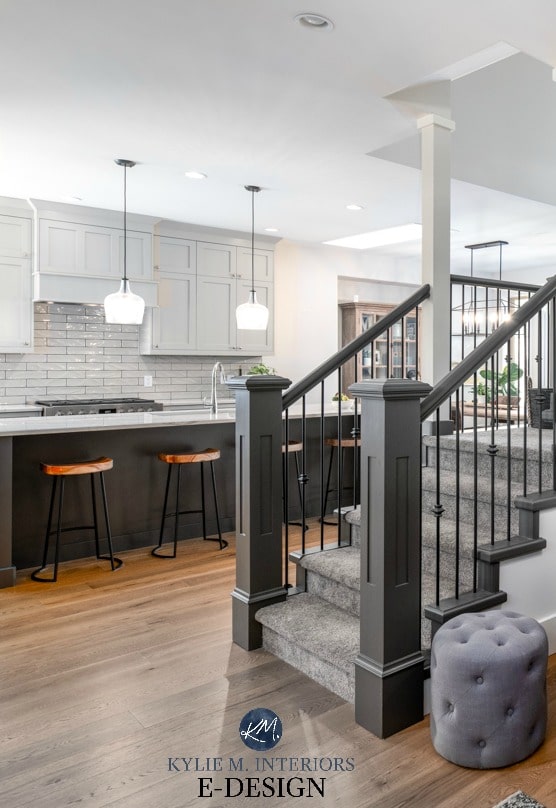
Urbane Bronze is the perfect choice, being a dark greige with a green undertone. Not only this, but I chose it BEFORE it was Sherwin Williams Colour of the Year (2021) – it’s like I know what I’m doing.
Paint Colour Review of Sherwin Williams Urbane Bronze
I love how the green undertone plays with the warmth of our white oak flooring and Revere Pewter.
THE SUBWAY TILE BACKSPLASH
I love the timeless look of subway tile, but I’m not really a ‘white tile’ kinda gal. Instead, I chose a gorgeous glazed subway tile in Ames’ Manhattan series called Mang412 – a super romantic name, I know. I can’t find it on their site, but apparently this guy has it. The color is ‘GRAY’; however, we all know that grays have undertones, and guess what THIS gray has? Green, of course!
Tile installation by BE Tile
I love that the tiles blend with my cabinets, creating a low-contrast look, which I HIGHLIGHTED with dark grout (Truffle, I believe). I love contrast, but only in specific places/doses, and I didn’t want my backsplash poppin’ hard with my Revere Pewter kitchen cabinets.
4 Ways to Add Style with Subway Tile
UPDATED CABINET HARDWARE
I went with cabinet hardware supplied by the cabinet maker, which made life easier than ordering two dozen different styles from Wayfair. However, you can also get them at Wayfair.
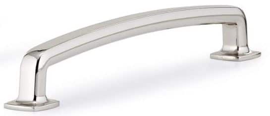
The key to picking hardware isn’t just in the finish; it’s in the fit. This means that a handle or pull needs to FEEL good. It should have a tactile element so that when you grab it, it feels solid and quality (just like a good husband).
If you need hardware ideas for your own kitchen, I’ve got some beauties HERE.
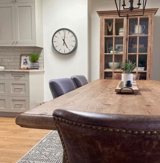
WHITE OAK FLOOR BY GOODFELLOW
I’ll say it time and time again: OAK IS TIMELESS; it’s all about the grain and the stain.
This is why I wouldn’t look at anything but oak when choosing new flooring for our home. I also chose a stain that isn’t super light or dark, giving it more longevity and flexibility.
We used this same floor in the ‘natural’ look in my sister-in-law’s home…

This is an engineered wood product from Goodfellow. Many confuse engineered and laminate, thinking they’re the same thing—they’re not. Laminate is not real wood, and engineered wood is real wood on the top—just not all the way through.
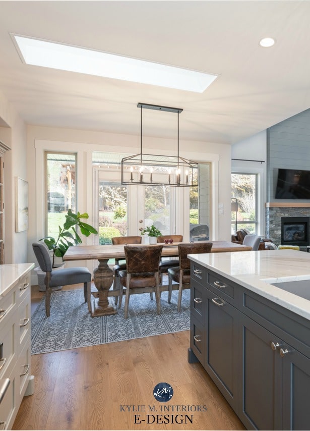
THE PENDANT LIGHTS
While I didn’t want frosted shades or fabric-covered ones, I also don’t love seeing a bare bulb. With their unique textured glass, the shades I chose hide the bulb a bit more than clear shades (no longer available on Wayfair – insert sad face HERE).
The above photo also gives you a peek into our living room.
So, there you have it, all the dirty details and THEN some! And yes, my hair color is real.
READ MORE
Our Entryway Remodel: From Dark and Dismal to DAMN GORGEOUS!
Our Open Concept Kitchen and Dining Room Makeover
5 Ideas to Update Your 1990s Home
4 PART SERIES: How to Create a Timeless Home
NEED HELP?
Check out my Online Paint Colour Consulting packages!


Hey! I absolutely love your kitchen! We are in the process of building and I have chosen revere pewter for my cabinets also! I’m torn on leaving it as is or doing it darker which looks like what you chose? Can you help me with learning what the right tone would be? Our house is open concept with a ton of natural light! How did you know/ decide to go a little darker? They look so creamy, I’m thinking I may need to tell them darker also!
Hi Michelle, if I were to do it again, I would ALWAYS ask for darker, just to give it that bit more depth/body 🙂
Hi Kylie,
Did you use Revere Pewter 40% lighter or darker?
I just LOVE everything you did!
Hey Valerie! Soooo, because it was a colour match by the cabinet company (they use their own cabinet paint) it was APPROXIMATELY 25% darker :).
Hi….I was trying to locate your backsplash tile via your link, but have been unsuccessful. Do you know if it still available? Do you have a link? Thank you.
Your kitchen is gorgeous!!
Ugggh, it’s not available anymooooore, I’m sorry!
Hi
what color are your walls in your kitchen?
I believe in these photos they were BM Edgecomb Gray lightened by 75% (as I love to play with color). However, I’ve since changed to BM White Dove, which I’m OBSESSED WITH!
Hi,
So to confirm, you have White Dove walls, revere pewter cabinets 25% lightened?
How would you compare it to Cabinets and walls all being White Dove? Do you like it better?
Thanks,
Merav
Well, at home here, I have Revere Pewter 25% darker cabinets and BM White Dove walls. At our lake home I did ALLLLL White Dove 25% lighter and LOVED IT. However, both have a different vibe. All White Dove is brighter, simpler, cleaner looking. Revere Pewter adds a layer and a bit more interest. For our home here, I wouldn’t like White Dove cabinets AND walls.
Beautiful kitchen! Are you happy with your quartz countertops? Have you had any issues with stains?
Thanks!
Hey Meagan! I’m VERY happy with my countertops – no issues with stains at all (and I’m not easy on a kitchen). I also love how I did it almost 7 years ago, but it’s color blend makes it STILL applicable for today’s trends!
Love it all! I’m currently remodeling my southeast facing kitchen and using revere pewter on my cabinets and white dove on my ceiling and trim. I’m thinking revere pewter lightened by 50% for my walls. Will that work? I’m definitely not opposed to white dove walls, as yours look fabulous.
You can definitely sample it, but I don’t think I would!