
The Top 10 Most Timeless Interior Finishes
Rather than patiently waiting for our monthly Better Homes & Gardens subscription to appear in the mailbox, we now have 24-hour-a-day access to ‘what’s hot and what’s not’ in the design world. With online websites like Pinterest and Instagram, the revolving door of trends is spinning faster and faster; it’s hard to know where to jump in, with the fear of getting spit out on the other side already behind the times.
Now, I’m sure some of you will get your knickers in a knot over the ideas and advice you read below (if you’re not wearing knickers, that’s a whole ‘nother story). You’re allowed to like trends; there are many I like, too – trends I’ve committed to in my own home. However, if you want to build a TIMELESS home, it’s about finding a happy medium between what will last and what speaks to you personally.
So, how do you build a home that stands the test of time? And why would you even WANT to?

There are two GOOD reasons…
1. RESALE VALUE
When selling your home, either now or in 20 years, nothing dates a home faster than a trend. Anyone living in the early 2000s Tuscan trend that they (or someone else) chose 15-20 years ago can attest to this.
This next kitchen is a great example of an over-commitment to trends…
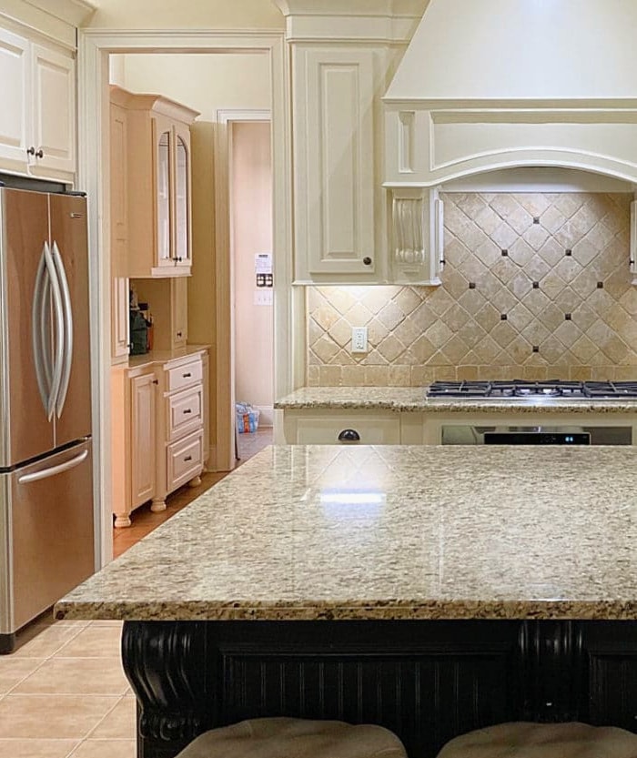
- cream cabinets – trendy at the time with travertine tile (which they don’t suit in the first place)
- travertine tile – no longer a selling feature (personally, I still love it)
- diagonal pattern tile installation- not only did they install a trendy product, but they also installed it in a trendy PATTERN
- speckled granite that was popular in the early 2000s
- unnecessary decorative details (corbels)
- 12×12 beige floor tile
How to Update Your 2000s Home- 6-PART SERIES
And don’t even get me started on the hot mess of undertones – GAG ME WITH A SPOON! And guess what that last sentence does? It tells you I’m a classy broad born somewhere in the 1970s, just like the previous kitchen’s finishes date to the early 2000s.
If you commit to a trend particular to a specific decade, you’ll either date yourself (I would never date myself; I’m way too weird) or your home.
By the way, if you plan on selling your home in the next few years and want to update a few finishes right now, you’d be wise to follow a few trends. As long as they suit your target market and are done tastefully, they can add value to your home.

2. PERSONAL TASTES
Right now, you like your off-white cabinets or Zellige tile backsplash (often installed in the wrong style of kitchen), but what about in five or ten years? While some pick and stick with something, many like to switch things up. Maybe not every month when they’re emotional and hormonal (like me), but at least every few years.
And while some things are easy to switch every few years (if you’re so inclined), others are too expensive and labor-intensive. There’s also the ‘hubby’ factor. Yes, I’m generalizing, but women are often quite happy to switch things up, on average, every 5-10 years.
However, many men are fans of the old saying, ‘Why fix it if it ain’t broke?’

I’m not just talking about soft furnishings or decorative pieces – I’m talking about some serious HARD FINISHES. You know, the ones that are a royal PITA to replace (an acronym, I’ll let you figure it out) and have you breaking open the kid’s piggy banks while they’re sound asleep.
By the way, if you like change (you don’t expect a sofa to stay in your home longer than five years) and resale doesn’t concern you, then I encourage you to have fun with trends and fill your little trendy boots (although apparently, Chelsea boots aren’t trendy anymore, so don’t fill those).

While nothing is foolproof—you can’t please everyone—a few tried-and-true products, patterns, and finishes are the most likely to get you through the next quarter-century or so.
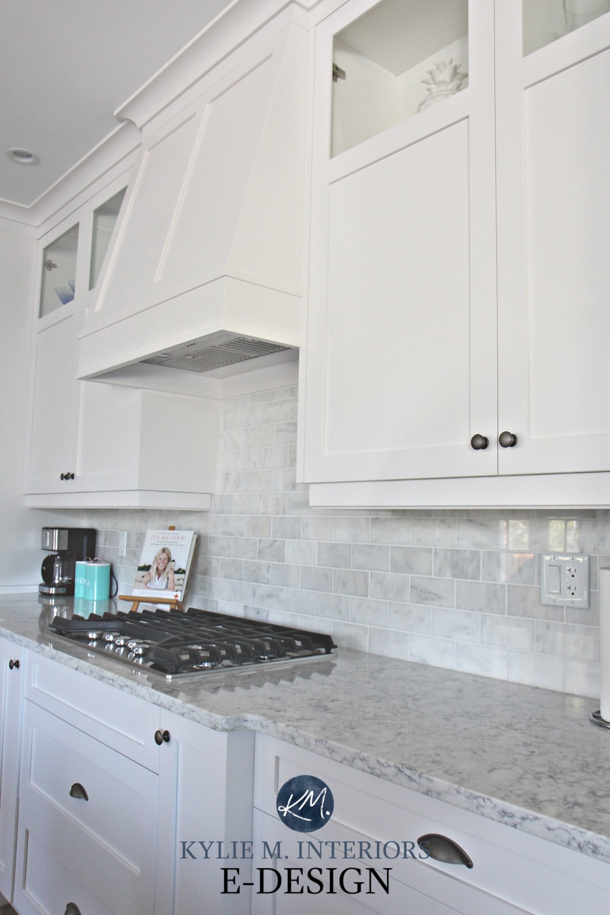
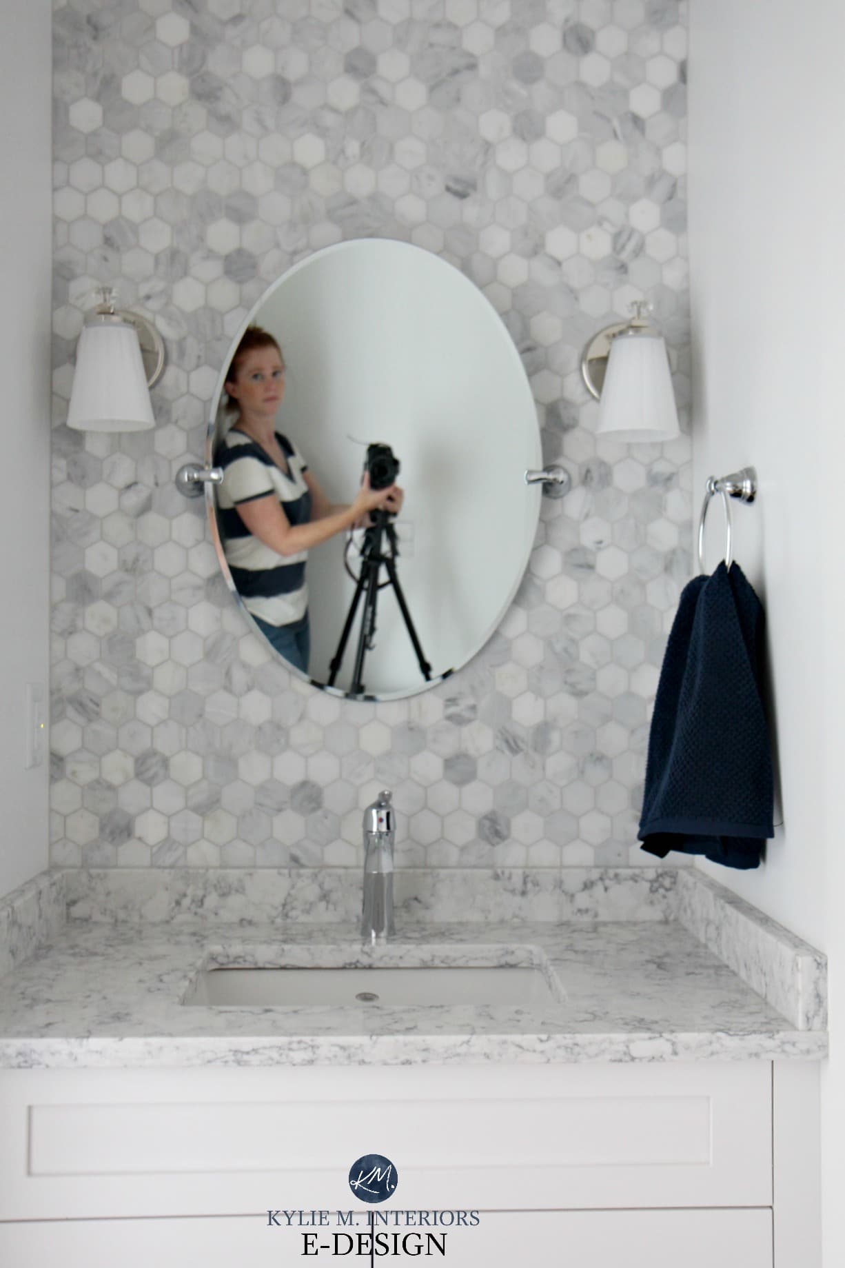
1. SUBWAY TILE BACKSPLASH
It’s ALLLLL about subway tile. It doesn’t matter if you think it’s overdone (something I hear a lot); the fact that it’s used a lot means it WORKS. And there many ways you can add personality to a traditional subway tile without stepping too far into a particular trend (read about these ideas HERE).

WHAT TO PAY ATTENTION TO WHEN CHOOSING A SUBWAY TILE
When choosing the best subway tile, it’s pretty simple…keep it simple.
COLORS. Keep it neutral or white (remember that even neutrals can become dated, as with gray, which is already out of style). Some colors are timeless for a particular style of home or location (e.g., a lake home); however, that same color in a standard neighborhood setting could limit your future potential.
If you have white cabinets and want white subway tile, your tile must perfectly match the cabinets. It’s not always easy, but it’s worth the effort. And please, don’t put a decorative panel behind your stove—just don’t.
SIZE. While I’m enjoying the 3 x 8 look, especially when it’s stacked horizontally, this, too, will fade. In the ideal world, your tile size will be around 3 x 6 for a timeless approach. However, as long as you don’t go super long and linear or stacked (tiles are laid in perfect rows rather than brick layouts), you’ll have several options to choose from.
DON’T FORGET ABOUT MARBLE. Whereas tiles like travertine, encaustic, or Zellige will ebb and flow in popularity, marble is a timeless choice as long as it suits the space it’s in. Again, pay attention to pattern and stick with the classic rectangle/brick layout over hexagon, herringbone, or otherwise.
Zellige, Herringbone, Countersplashes: Backsplash Trends
How to Jazz Up Your Subway Tile Backsplash
2. WOOD FLOORING (OAK)
It’s hard to go wrong with wood flooring as a general choice, but it’s easy to miss the boat regarding finish, color, and size.
THINK ‘MODERATE GRAIN & MODERATE STAIN’
STAIN COLOR: While it might not be a huge trend, a medium-toned wood stain (oak) is the most timeless look. You have to be careful with the overly light, overly dark, gray-washed, whitewashed, and strongly stained woods.
In this space below, while the color of the floor is timeless, the wider board could date things in the coming years. I say ‘could’ because at 7″, it’s on the border.
Above all else, avoid graying or whitewashing your wood floor (unless you live in a lake home or a super beachy neighborhood). This is a trend—er, it was a trend, as it’s already gone.
BOARD OR PLANK SIZE: The ideal board size for longevity is approximately 5-6″. Anything over that is doable right now, but who knows how it will hold up. Anything under 5″ can evoke the ’80s and ’90s.
FINISH: A glossy finish isn’t hot on wood flooring unless you like washing it daily. While a wire-brushed, slightly matte look is trendy now, it’s also a look that’s in it for the long haul, as homeowners are embracing the low-maintenance factor.
SPECIES: Stay away from the exotic stuff. Nuff’ said on that. Moderate grain and stain are usually the best choice.
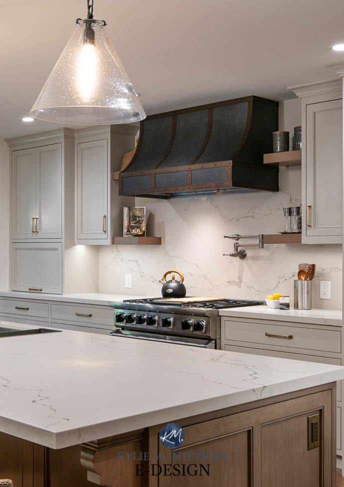
3. CLEAN & SIMPLE LINES
Whether it’s a piece of furniture, fireplace surround, or cabinet profile, clean and simple will last longer than a more ornate, decorative choice. While there are definitely exceptions, like Spanish-style homes that should always BE Spanish-style, the average home suits a simpler approach.
In this next kitchen, my clients could keep their cabinets in a natural wood finish even though they updated the rest of the space.
HOW IN THE HECK DID THEY DO THAT?

The Best Paint Colors with Wood Cabinets & Trim
- The stain color is moderate.
- The door’s profile is reasonably straightforward, with no overzealous details or corbels. Sure, there’s a bit of fluting on the side of the sink cabinet, but it’s no biggie.
- The wood has minimal grain (likely maple)
- There are no exposed hinges
If the doors had a cathedral/arched style with exposed hinges, we’d be looking at more of an overhaul. Instead, a simple white subway tile backsplash (timeless) and quartz countertops (trendy) bring the kitchen up to today’s standards. Should these trends shift, the cabinets and backsplash will keep on truckin’.
4 Affordable Update Ideas for Wood Cabinets!
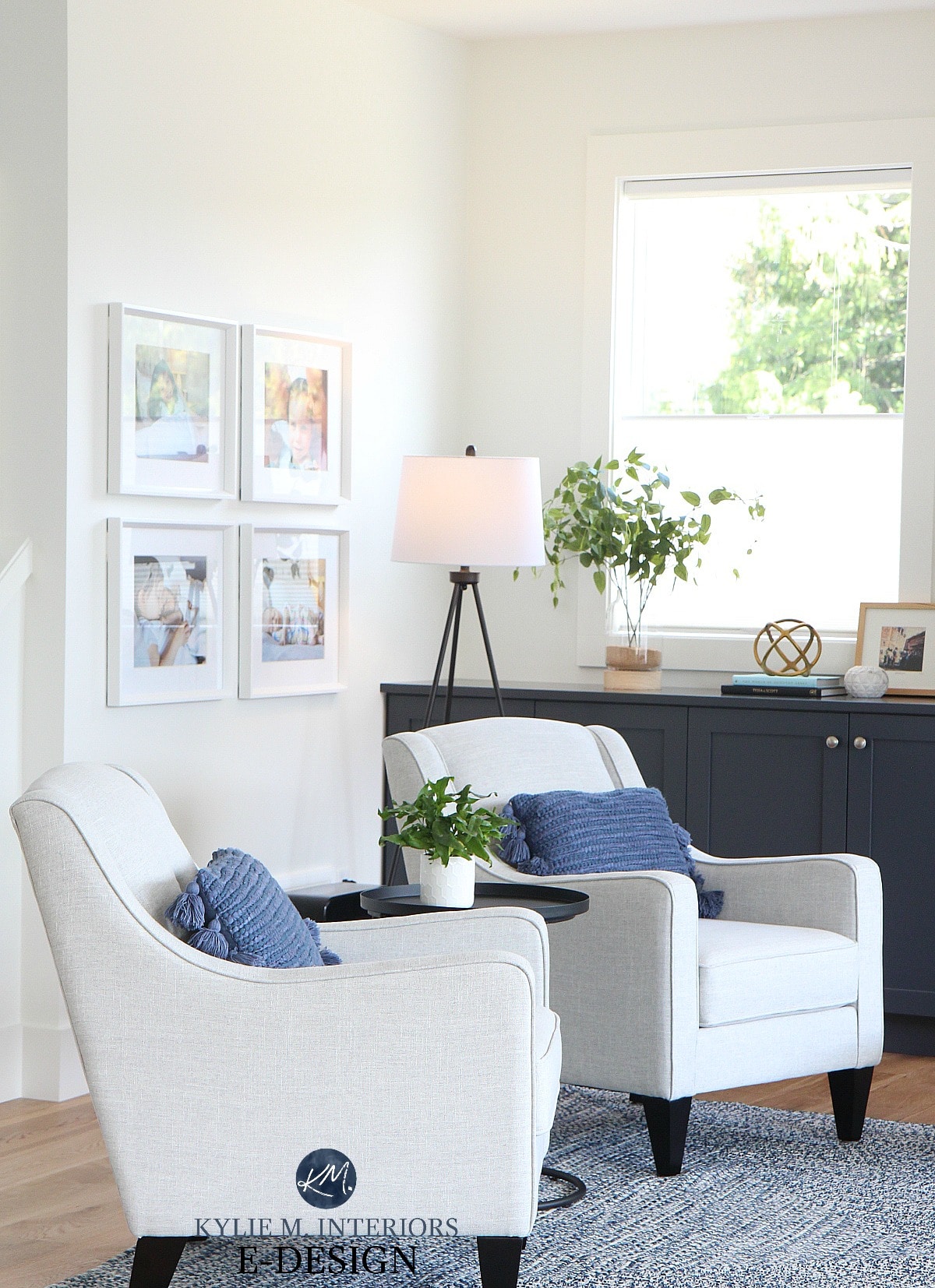
The same goes with furniture. Without going too wild on curves and decorative touches, these fabric chairs will last through many decades of trends (should they last that long with two young kids in the house)…
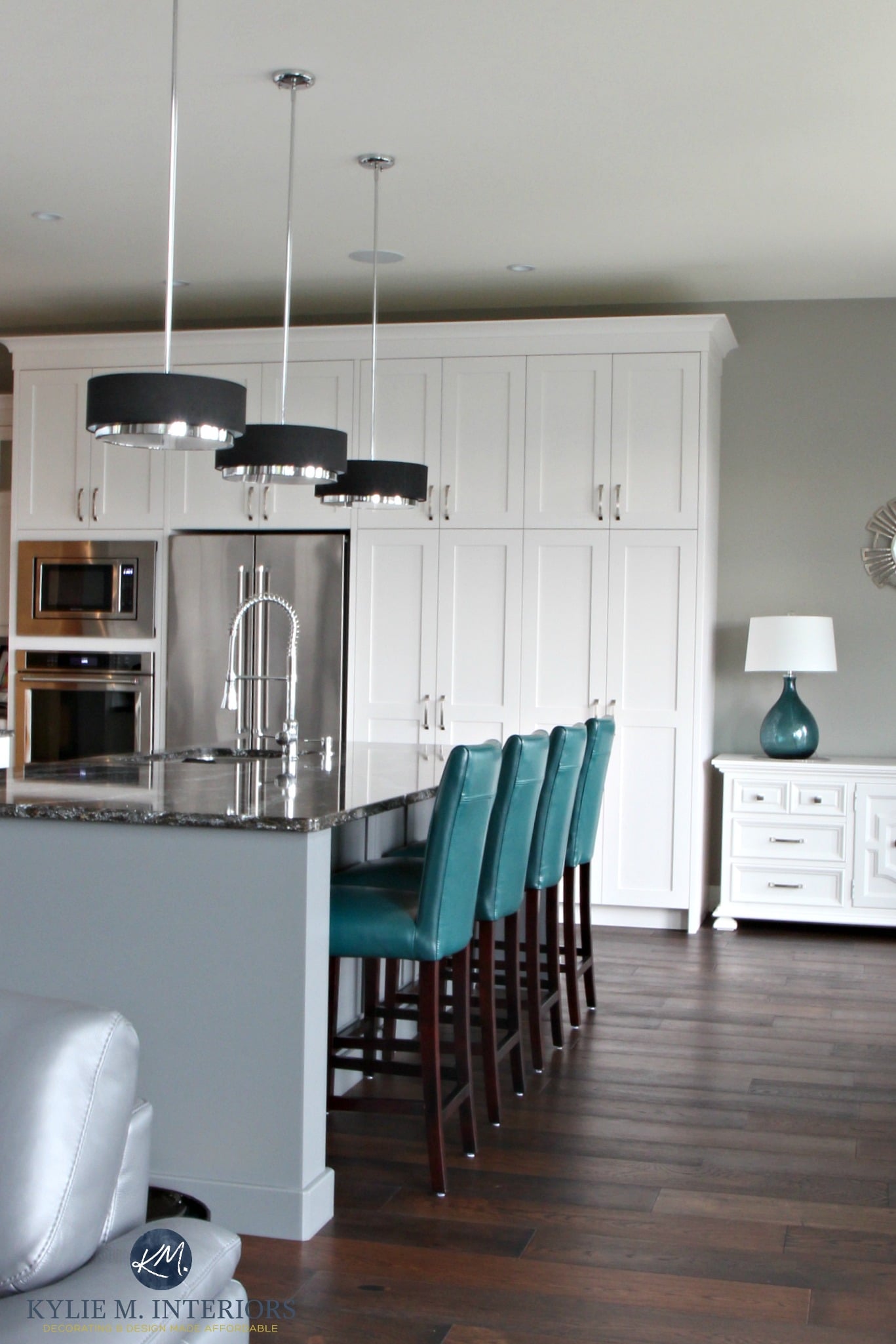
4. CHROME & SILVER METAL FINISHES
It’s not a ‘one size fits all’ approach to choosing metal finishes, but there’s a pretty clear path—and it ain’t paved with gold—but silver.
- Regarding bathroom and kitchen faucets, chrome is the most timeless finish.
- As for light fixtures, chrome, and highly polished nickel are smart choices.
- Interior door hardware is often best in polished nickel, although some older homes manage black or antique brass.
- For cabinet doors, knobs are best on doors, handles, or cup pulls on drawers. Polished nickel is the top finish.
- The smaller the room, the easier it is to commit to a particular trend. However, if you have a bathroom with a walk-in shower, bathtub, and various plumbing fixtures, you might want to consider how hard you commit to a trendy metal finish.
- The older a home is (I’m talking like 75+ years), the easier it is to step away from ‘metal finish trends’ and do what suits the era of the home.
Ideas to Update Your 2000s Home: Lighting & Hardware

This tile will eventually be dated in a newer home, but it will never go out of style in an older home!
5. DON’T COMMIT TOO HARD TO ONE TRENDY COLOR
It’s okay to love trendy off-white cabinets with the understanding that you might tire of them in five to ten years, as long as the other finishes in your room aren’t ‘super trendy,’ too.
Why?
Because painting cabinets is manageable (generally speaking). However, add countertops, backsplash, and flooring, and you (or the next owner) will have one heck of a project on your hands.
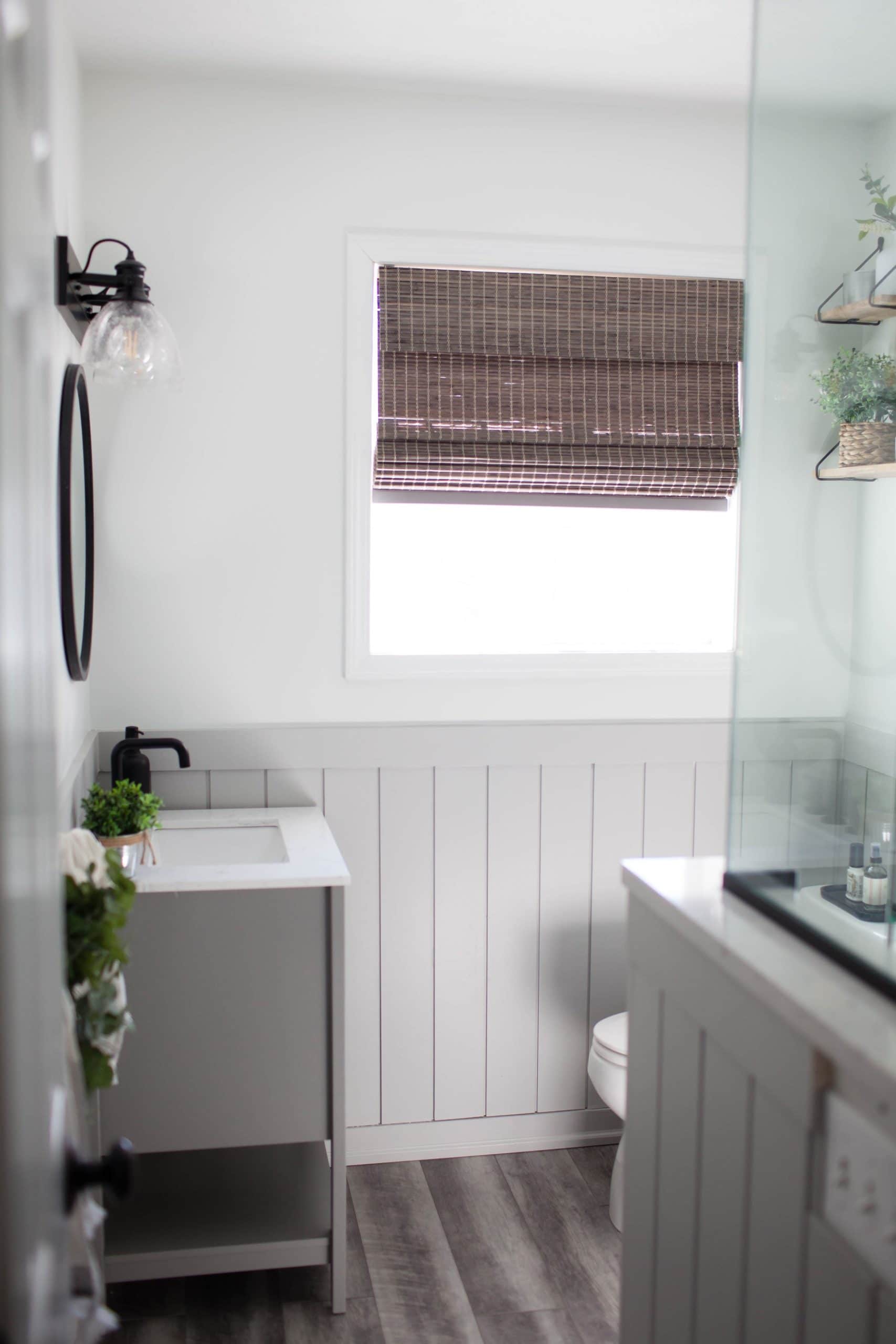
Why is this next bathroom an exception? Why does it work well for the current owner’s tastes and those of a potential future owner?
Sherwin Williams Pure White & Light French Gray
SCALE & EFFORT
Sometimes, it’s about the scale of the finish/room you’re dealing with and the effort/cost it takes to change it.
- the shiplap is easily paintable – minimal cost and effort (this particular chair rail height installation will also last longer than an entire wall of shiplap)
- the vanity is small and very paintable – again, pocket change (color ideas HERE)
- the square footage of the flooring is minimal, making it easier to replace in the future
This means that should the owner get tired of this room, with a bit of blood, sweat, and beer (or wine if you’re me), this bathroom could be changed for under $1000.
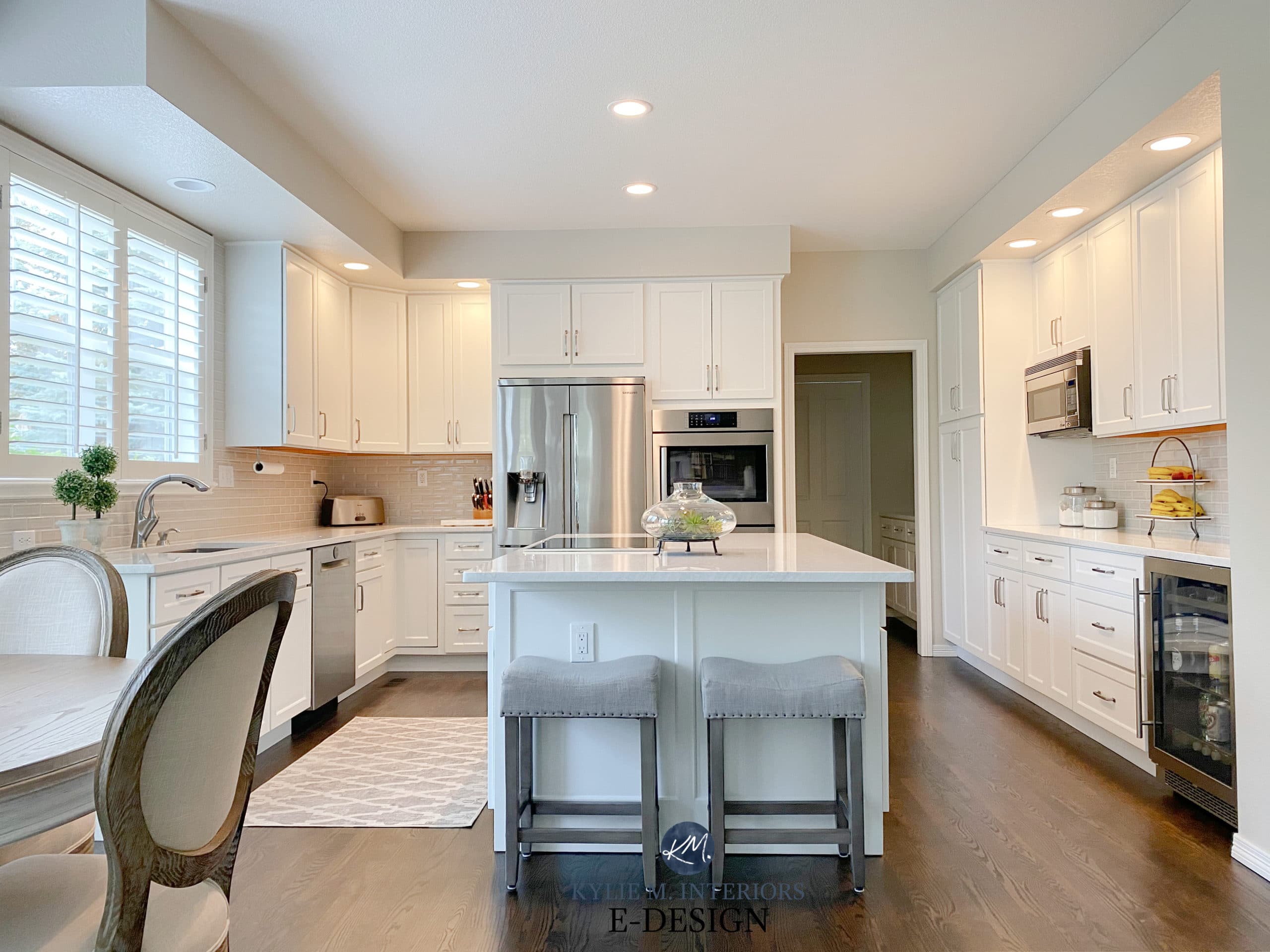
6. TIMELESS WHITE KITCHEN CABINETS
When I hear someone say that ‘white cabinets are so overdone,’ I’m like…
‘HELLOOOOO, that’s because they work!’
You’re welcome to choose gray, greige, green, or the hot color of the moment, but you’ll only limit yourself in the long term. When creating a timeless kitchen that grows with you or the next family who owns your home, white is hands-down the smartest choice.
This kitchen was installed approximately 11 years ago, and while the backsplash clearly shows that, the white cabinets are still rockin’ it.
COLOR. Again, white is best. While not everyone loves white (keeping in mind that no finish will make every single person happy), it won’t date a home like certain colors and wood stains will.
As for cream, I can’t even BEGIN to talk about my clients’ troubles with cream cabinets, but because I like to hear myself talk, I will.
Cream cabinets are gorgeous; I get it. However, in the ideal world, unless your cabinets are wood or a non-white color (that is, anything but cream), it’s best if your trim/cabinets are the same color. So, if you have off-white/cream cabinets, you’d ideally have cream trim. This is where the timeless bus stops, as cream trim will ALWAYS date your home and limit the colors you can use on your walls. Again, there are exceptions, such as older homes that suit a softer approach; however, even these homes show up in my inbox weekly, with homeowners frustrated with how limited their cream cabinets/trim leaves them.
DOOR STYLE. A shaker is often best; however, even a square raised panel has its place, especially in a traditional home.

STYLE. You might be tempted to add fancy details to your cabinets—KEEP IT SIMPLE. That doesn’t mean it needs to be boring, but the more decorative detail you add, the more you’re going to limit your kitchen’s future ‘style’ potential (crown and skirting are always smart add-ons).
The 5 Best Fool-Proof White Cabinet Colors
The 6 Most Timeless Kitchen Cabinet Colors
THE ONE BIG THING TO AVOID ON CABINETS…
Glazes – for the love of everything sane, avoid glazes.
If I had a penny for every client who’s hired me to try to update their kitchen cabinets with a glaze on them circa 2005, I’d have a whack load of pennies. I’m not saying a glaze is terrible for every situation, but it’s not timeless.
I INTERRUPT THIS BLOG POST TO REMIND YOU THAT THE PURPOSE OF THIS POST IS TO CREATE A TIMELESS HOME. I can feel some of your blood pressure rising from here. Don’t worry. If you aren’t concerned with longevity and want to love where you live RIGHT NOW – you can hit those trends as hard as you want!
7. KEEP PATTERNS/BUSYNESS TO A MINIMUM
Whether it’s a quartz countertop or decorative tile, keep the busyness to a minimum. If you love pattern and movement, invest in fabrics that satisfy this urge without making an overwhelming decision with long-term repercussions.
Again, are there exceptions? HECK YES – always, but this article is about good general advice, not exceptions.

These fabric valances are the perfect place for pattern
When looking at a counter or tile sample, you usually view a very small piece. And while it might seem ‘interesting’ on a small scale, on a large surface, it can easily be overwhelming, dominating a space with its personality. Add a few more patterns or busy finishes to the mix, and you’ll have a hot mess.
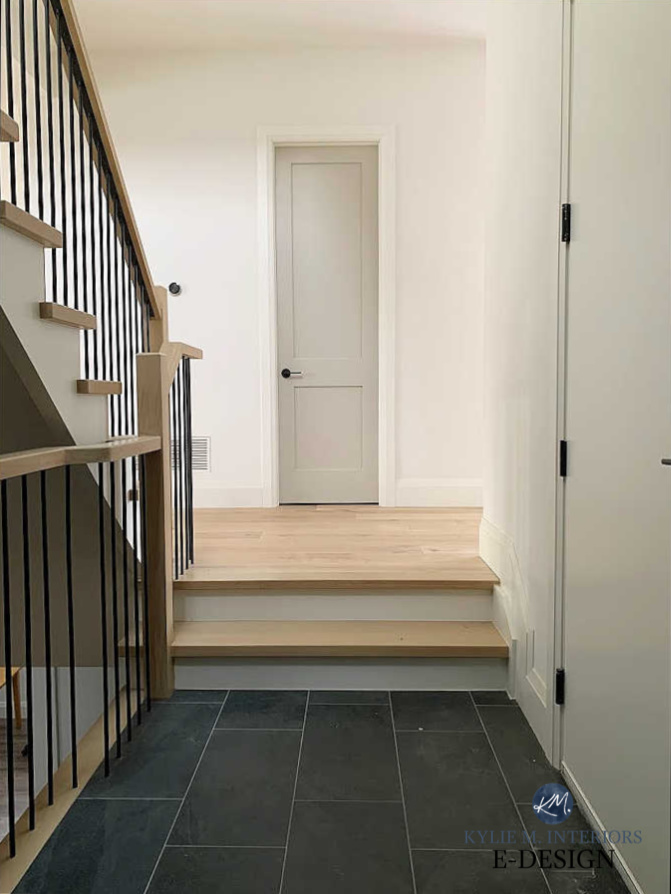
8. CHOOSE WHITE TRIM & DOORS
While non-white trim suits older homes and some authentic farmhouses, it’s more of a ‘personal choice’ in a modern home. If you’re staying in your home for the long haul, have at ‘er. However, if resale is on your mind, stick with the classic white look.
Do My White Walls, Trims, & Cabinets Need to Match?
How to Choose the Best White Paint Color for Trim & Cabinets
The Best NON-WHITE Interior Trim & Door Colors
9. BUILT-IN BOOKCASES
If you want to spend some smart money, invest in built-in bookcases in any room, but especially on either side of your fireplace. Using the previous advice of ‘simple lines and white cabinets’, you’ll have a feature that definitely stands the test of time.

How to Update Your Brick Fireplace
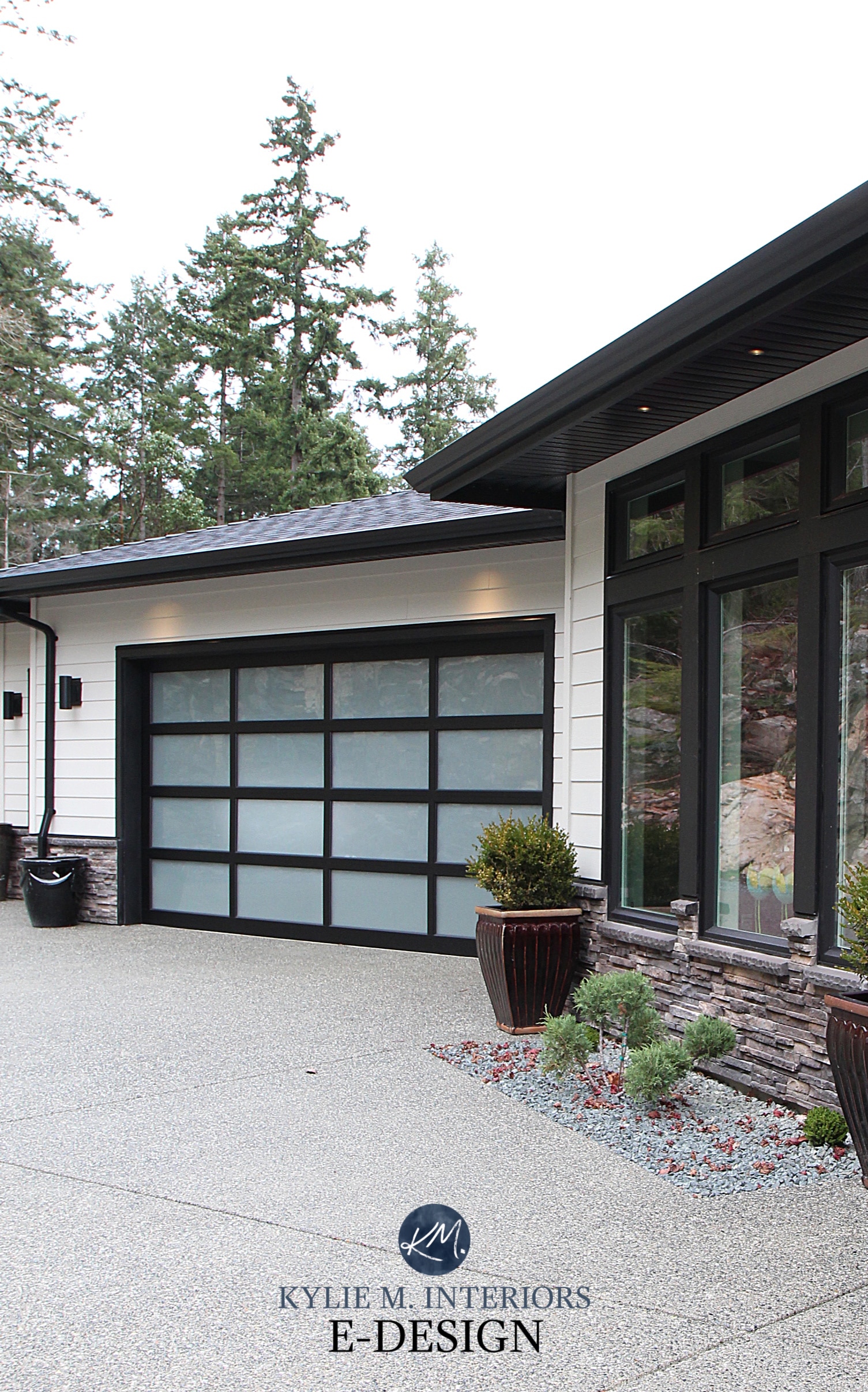
10. CHOOSE WHITE WINDOWS ON THE INTERIOR
Don’t get me wrong, I’m crushing hard on black interior windows and have been tempted to install them. However, they’re a trend, and as it relates to resale, they don’t appeal to the masses.
While you can create a great look by adding black accents to your room, helping the black windows transition/belong, again, they are a limiting feature, whereas white leaves the door (or the windows, would be more the point) wide-open.
What about the exterior?
Because exterior finishes tend to be in it for the long haul, as long as the black windows make sense with the rest of the palette and there are other black elements (e.g., railing, address numbers, light fixtures), black is less of a trend-related issue. This said, the interior needs to have some black elements for the sake of flow.
5 Steps to Choosing Your Home’s BEST Exterior Paint Colou\rs
And one bonus piece of advice…
11. IF IT’S EXPENSIVE TO REPLACE, KEEP IT NEUTRAL
Whether it’s kitchen cabinets, a stone fireplace, or furniture, a neutral or natural product will last longer than a color or pattern. But for all of my fellow color-lovers who are suddenly panicking, don’t worry—there are exceptions (always).
THE COUNTRY OR FARMHOUSE STYLE HOME. When it comes to a home that authentically suits a particular style, color can speak volumes on cabinets, furniture, and much more. Color needs to be carefully considered for those with the more average suburban home who are worried about resale or longevity.
The Best Medium to Dark Green Paint Colors
If you don’t have a particular style of home, you can embrace color in so many WILD AND WONDERFUL ways, but I caution you to commit to it on a permanent surface or one that you aren’t willing to change if needed.
YOU LOVE A COLOUR, AND YOU’VE LOVED IT FOREVER. Let’s say you want to buy a sofa and tend to keep furniture pieces for the long term. For example, you love red and have ALWAYS loved red and want a red sofa. Well then, you go out and get that red sofa – chances are you’ll love it for many years.
However, if you’re a ‘color of the month‘ gal like myself, you may want to keep your colors on decorative items or smaller-scale furniture pieces that can be replaced as needed.
The Best White Paint Colours for Kitchen Cabinets
HOW TO EMBRACE TRENDS IN A REASONABLE FASHION
I want you to love what you love – I just don’t want you to love it too hard on the wrong surfaces. By the way, I have a full blog post on this topic, but keep reading.
PATTERNS
When it comes to patterns and hard finishes, you need to tread carefully. Hexagon, penny tile, trellis pattern, ikat – they’ve all had their time in the sun…and the shade. Of all the patterns, the hexagon will have MUCH more longevity, but if you’re concerned about timelessness, use it on fabrics – not hard finishes. If you’re hell-bent on using a pattern on hard finishes, keep it to areas with a smaller footprint, i.e., powder room floor, kitchen backsplash, etc…
Sherwin Williams High Reflective White
SHIPLAP
Shiplap was hot from about 2018-2022. However, while the odd home can still pull it off, it’s less of a statement piece (modern farmhouse is not trendy like it used to be).

The Best Feature Wall Ideas & Colours
THE ALL-WHITE HOME
The ‘all-white home’ is definitely still around, but it’s fading FAAAST. Again, this blog post isn’t about the trends you love now; it’s about creating a TIMELESS home. With moderation in mind, here are some tips:
WHITE CABINETS: Heck yes, always timeless (here are the best whites).
WHITE BACKSPLASH: If it’s subway tile, it’s always timeless.
WHITE COUNTERTOPS: Definitely trendy. And while some will always love white on white…on white, there will come a time when we’ll know that a home was built between 2018 and 2022.
Black countertops are one of the most timeless choices you can make, but short of that, consider a countertop with some variation that can accommodate cool and warm colors. This way, if white walls are suddenly passe and a new owner (or you) want a change, your countertop doesn’t hold you back.
The 4 Most Timeless Kitchen Countertops
WHITE WALLS. When it comes to walls, I’m less fussy about trends. Because of EVERYTHING mentioned on this page, paint is the least expensive update you can make to a home. So, should your white walls no longer be your cup of tea, and you’ve allowed some flexibility with the previous finishes, you can freshen things up with a new color.
This said, not ALL whites are trendy on walls. Trends are shifting to warmer, softer shades in a big way.
Benjamin Moore’s 8 Best White Paint Colours
A New All-White Home – With a Lil Colour Here & There
As you well know, I could keep on going, but for the sake of brevity and sanity (of which you’ve witnessed neither in the above blog post) I’ll sign off now.
READ MORE
The 5 Best Timeless Neutral Paint Colors
How to Create a Timeless Home That Still Has Personality
How to Follow Paint & Design Trends With No Regrets!
How to Follow Trends While Saving Money
6 Affordable Home Update Ideas
The 8 Best WHOLE HOME Warm Neutral Paint Colours
NEED HELP?
Check out my ONLINE PAINT COLOR CONSULTING

ORIGINALLY WRITTEN IN 2021, UPDATED IN 2024


Omg this is so helpful! We’re going to renovate our kitchen in the next year or two, and given that kitchens are mostly permanent features, I wanted to make sure it would be timeless and I wouldn’t be bothered in a few years by the choices I made. Thank you so much for such a detailed post!
Another great blog post, Kylie. I really appreciate your perspective…and the humor with which you deliver it! My home’s finishes definitely aren’t “on trend” with what’s hot right now, but most of them suit the home and the home’s outside environment, so that makes it easier for me to settle with them and to try to incorporate more trendy ideas with the soft finishes I have. I agree with almost everything that you said above…but I’m not sure that I would ever choose to live again in a kitchen with white cabinets if I could avoid it. I just love how wood tones hide dirt and drips a bit more! 😉 But maybe that’s more of an indictment of my housekeeping skills than an indictment of white cabinetry. Ha!
My feeling is that “subway” tile has become a trend because EVERYONE and his brother is using it. Over and over again!!
I did my bathrooms 8 years ago and you can’t tell when they were done because all the tile is white in a design that has never been on Pinterest! I am in the process of redoing my kitchen and again I will do white tile (along with white cabinets) but not in any shape that is popular (I’m looking at you subway tile!!). I think the madness will have to end someday and then everyone will want to pull out their subway tile!!
PS I just signed up for your color class…and i am looking forward to doing it!!
Are cream cabinets and off-white cabinets the same thing? I want to put white cabinets in my new kitchen but prefer warmer finishes so am looking at a warm off white cabinets. Would you consider this trendy? Where does off-white end and cream begin??
Hi Lauretta, that’s a great question and YES ‘usually’ cream cabinets and off-white cabinets are one and the same. HOWEVER, with the recent trends, there are off-white cabinets that are beige/warm gray/etc…
I would be so VERY VERY careful with cream cabinets or cabinets that are such a warm white that they’re almost cream. I spend half of my days consulting with clients, helping them coordinate with their cream/off-white cabinets that are CHALLENGING to work with. When choosing a colour that’s a warm off-white that has more FLEXIBILITY, I would find one that has an LRV around 82-84 – and I would watch its degree of yellow. For example, I wouldn’t advise going ANY more yellow/darker than SW Alabaster, but BM White Dove is MUCH more flexible. If you compare them to a standard white (ie. SW High Reflective White or even BM Chantilly Lace) this can REALLY help you get a better frame of reference for how WARM they are. You’ll find warm SOFT whites like these are also easier to coordinate countertops/backsplashes with. Now, if you’re looking at the off-white BEIGES, greiges and grays, that’s a whole other story, but again, SUPER trendy and I’m not sure how long they will last.
Thanks very much- I think I get it. I love having a LRV number to guide me. I was actually thinking about White Dove already!
You don’t mention it in this post, but what about a classic kitchen with oak floor, white cabinets and a BLACK countertop? Countertops these days are all about marble it seems, but is black a no-no if I want a classic look?
I’m the OPPOSITE of you- I want to remodel my kitchen ONCE and forget about it for… um… forever. So I LOVE this post.
Such a helpful post! I redid my kitchen in 2015 and chose simple white cabinets, white quartz countertops and white quartz backsplash with a subtle grey vein. I was worried I would get tired of all the white, but I have colourful accessories, and several years later I still LOVE my kitchen! I have greige-looking concrete floors (I live in a hard loft) and my walls are BM Cloud White. It all works!
I LOVE to hear this Valeryna, and comments like these are so helpful for other readers too – I’m so glad you’re loving it all!
I love all of your insight. This article is so true about classic timeless choices. I do agree with you that a different tile or a distinct set-apart square of herringbone tile over the stove has always looked bad. I have a basic question that’s in the gray area. I’m about to install white 3×12 ‘handmade-look’ subway tile backsplash – I think that’s pretty timeless and the countertop is neutral also. Because the hood fan (with cabinets above) is only 9 inches higher that the bottoms of the upper cabinets, I thought that vertical tiles there would make it look taller. What if I did horizontal offset tiles all around the backsplash (U shaped bank of lowers and upper cabinets with the stove in the center and sink elsewhere) and then right there in the middle, as it approaches the stove, I use one row of 90 degree herringbone pattern to turn the tiles vertical in a stair step. Then they would be in a vertical offset pattern just for the width of the stove, and another herringbone stair step back to horizontal tiles to continue. The stair steps in the grout would sort of create a V pointing down at the stove. Is that too much going on or timeless enough?? Better to stick with all horizontal subway tile?
Ok, I’ve decided to do just all horizontal regular brick-lay of the subway tile. The plan I outlined above would only work with 3×6 tiles and not 3×12, which we have already purchased. Should have done a layout first before submitting my question! I do hope someone else wants to try this idea though, because it looks really cool on the poster board I cut to the size of my backsplash. 😀
Hi Kylie,
What do you think about waterfall island and using the same quartz (large veins) as backsplash? Would you consider that style as timeless? Thank you!
Hiya! While I do love a waterfall feature, it really would only suit particular homes for the long-term (ie. contemporary/modern). 🙂
What color are your kitchen cabinets with the urban bronze island pictured? Also, curious about the wall color you used and the name and color of the wood flooring (as a point of reference). I ask because we are leaning white/cream cabinets and urban bronze island. We have urban bronze on the exterior trim and love the color. Also, we are in the process of changing floors and like the look of yours in conjunction with the other colors. It would be great to know these colors and products as a point of reference.
Thanks!
So, the cabinets are actually Benjamin Moore Revere Pewter, 50% darker, although they look SO MUCH LIGHTER in this photo! The walls are BM White Dove and the floor is Goodfellow, Stone in the Riverside collection :).
Oh my goodness, I just LOVE allll of your posts and blogs. I was so close to picking my colors for a full kitchen remodel (goodbye orangy stained maple!) I was so so close to doing RP but like you’ve noted I fear that it won’t have that longevity. Sooo leaning toward the warm whites BUT White Dove looks yellow in my space (cry!) not enough natural light in the kitchen. So now what?? I want that warm soft but fresh and timeless look (with some flexibility). Simply White seems almost to bright for our modest rural country home. Idk tough to visualize. Even considering a warm oak or hickory for bases and island and maybe white uppers?? Help! To many bad choices out there lol.
Many thanks!!
This is very helpful! I would love to pick your brain on hardware! Is the black hardware trendy? I purchased a home with all brushed nickel. Does that scream early 2000’s? What would be a timeless metal choice for plumbing/door knobs/kitchen cabinets?
Thanks
Oh boy, it totally depends on the kitchen! There is such a thing as ‘too much black’ for sure. If it’s quite brushed, yes, it can look early 2000s, whereas a more shiny, polished nickel has more life to it :).
I enjoyed the article but have a question concerning wood floors. I have a house built in the early 2000s with smaller wood flooring. I’m planning on removing carpet from two rooms, but each room connects to the hallway with the current wood floors. How will the transition look with the wood floor planks in different sizes? I am planning on matching the color, though.
Well, you can definitely do this, as long as you know that it will LOOK like you built in the 2000s and updated only certain areas in 2024. Matching the type of wood and stain AND sheen/gloss will definitely help.
Hi Kylie- in regards to glazes on cabinets, are you referring to painted or stained wood & why avoid them? Thanks!
Mostly on painted cabinets. Glazes on white/cream/off-white cabinets tend to pick up an early 2000s vibe and can be tougher to coordinate with (depending on the base color you start with). Glazes on woods, can also pick up an early 2000s vibe, unfortunately as they were OVERused!
Such a great article. My home was built 2005. My kitchen is orange hickory cabinets with brown speckled UGLY countertops. The craftsmanship is impeccable. Anything I can do to upgrade without selling a kidney?
Would you say tight fluting would look bad or trendy on build in library cabinets ( lower half library closet doors?
Oooo, it would depend on the style of cabinets, for sure, and the rest of the home. It’s DEFINITELY trendy now, which worries me – I wouldn’t say it’s super timeless.
Hi Kylie, I love reading your posts..such great advice and I usually bust a gut!😂 ..My question is twofold.. I have a house with very deep windowsills as it was built in 1880 (a log house construction, rustic). The house is quite dark unless I have lamps on. South-facing kitchen. **What light neutral Benjamin Moore colour would you suggest for walls? Also curious if White Dove would look good on my cabinets..possibly my walls as well?** I’m considering changing out my countertops to a quartz. I’m thinking subway tile of some kind for. backsplash. My drapes are an off-white with a slight green undertone. The floor is dark brown engineered hardwood.. I’d like a (not too) warm neutral look but include colour (in decor, I guess?) What do you think?