
How to Use Trends Wisely (Create a Timeless Home With Character)
White cabinets, subway tile, generic wood flooring – does the sound of that combo make you nervous, or stifle a yawn? It shouldn’t, as those can be the foundation for a wickedly gorgeous home that’s full of charm, character, and personality.
However, in your quest to create a timeless home that withstands the ebb and flow of trends, you risk designing a space that’s, well… boring.
To help you on your way, this post, along with my other posts in this series, has ideas that stand the test of time and use trends wisely while creating a home with character and charm.

Creating a timeless home with character is about being inspired – with restraint.
It’s about decorating and designing in a way that, in five years, you aren’t kicking yourself for doing an entire bathroom in forest green or dusty rose. It’s about embracing what you love and what fires your engines without committing on such a large scale that your hubby has a jammer when you want to replace everything in the coming years.

By the way, if you’re a house flipper or selling in the next 2-3 years, this info isn’t as important – TRENDS will be more important. However, if you’re in it for the long haul and your spouse has set a limit on how many times you can replace your sofa, you might find this info helpful. Luckily, Tim hasn’t put a cap on me…yet.
SURFACES THAT SHOULD BE TIMELESS, NOT TRENDY
I say ‘should’ so you can live in your home for a long time without spending a buttload of money updating an expensive surface. In the end, it’s your budget and your home – I’m just a well-intentioned lil’ Ginger trying to save you some angst (and money).
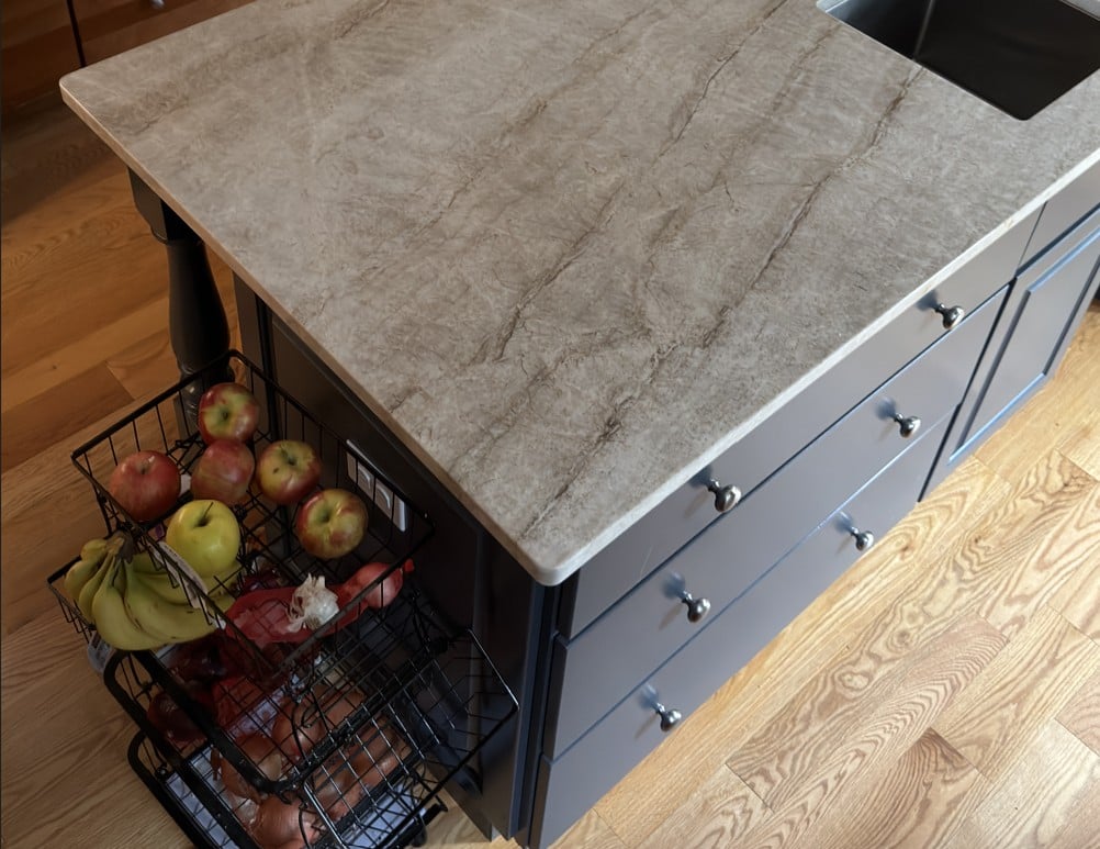
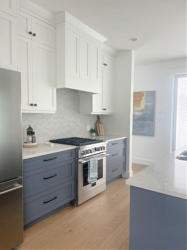
Will Taj Mahal be timeless forever? No, but its neutral palette will help. As for the blue island, that trend is fading, but it’s an easier, more affordable change than an entire kitchen painted blue.
And in an effort to use trends wisely, it makes sense to talk about the big boys first – the ones that should be more timeless than trendy.
- Large, hard, permanent surfaces: Wood flooring, countertops, large tiled areas, carpet.
- Large furnishings: This one does come with a caveat. If there’s a color you love (like teal) and you’ve loved it your whole life and will ALWAYS love and decorate around it – sure, get a teal sofa. However, if the latest color trend in sofas has caught your eye, stick to neutrals, in a non-trendy fabric (ahem, 2000s microfibre anyway?) instead.
- Main living areas, in particular, open-concept spaces.
- Kitchen cabinets (not including islands)
Why these surfaces? Because they’re expensive to replace or repaint. Unless you’re made of money, then you do you, boo.
Are there exceptions? Always. Some homes can pull off dark green cabinets forever. Others look fabulous with a heavily patterned tile floor. But these are the exception, not the rule.

Helloooooo, Ryan, fancy meeting you here. Sherwin Williams Still Water cabinets.
And while I’d like to say it’s hard to go wrong with a neutral, but it’s not; it’s pretty easy. In a world of products chock-full of undertones, research and compare samples before you bite the bullet (my blog is a great resource; type a keyword into my SEARCH and have fun).
For example, many jumped on the gray trend, installing gray-washed wood or laminate floors in their homes, along with painted gray cabinets. Many of these same homeowners are now in my inbox, asking for help updating their gray-on-gray homes.
This whitewashed wood floor and graywashed island are both harder to transition into new trends.
- Gray island? Easy fix.
- Gray accent wall? No problem.
- An entire home with gray flooring? Ooof.
If you’re spending a ton of money, ask yourself if you’ll love it in 5 years, 15 years, 25 years, and so on.
Personally, I’ve had nothing for 25 years besides underarm odor and a perverse sense of humor.
However, I tend to be the exception, not the rule. My ADHD craves change, and my career choice feeds that hunger. The average person needs to be smart about things.
So, long story short (as usual), whether it’s a hard expensive finish (tile/countertop) or a soft one, if it’s an investment, don’t base your choice on today’s color fetish (or any fetish, really, ya weirdo…).
HOW TO ENJOY TODAY’S TRENDS…WITHIN REASON
While I’m not usually a huge fan of moderation, there can be a great happy medium – a way to use trends wisely without going overboard, naked, without a life jacket.
BACKSPLASH
While I’d personally still go neutral and timeless with a subway tile, the backsplash isn’t the WORST thing to update if needed.
![]()
The Best Blue-Gray Paint Colors
SHOWER NICHE
While the placement of shower niches changes (trend-wise), in general, adding a decorative tile to your niche is a way to add personality without going over the top.
How to Add Charm to Subway Tile
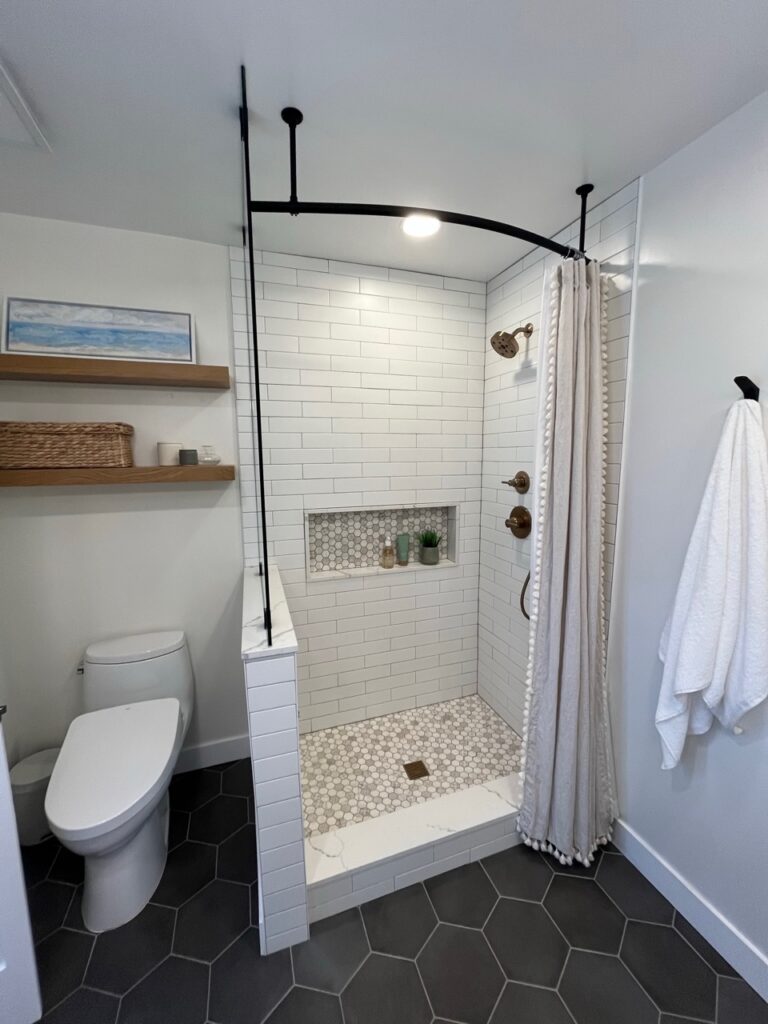
Re: the above lovely loo…
a) Hexagon floor tile is reasonably timeless, especially since it’s a neutral color.
b) Notice the budget-saving shower curtain rather than a glass door – LOVE IT!
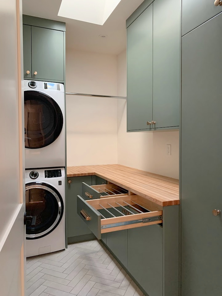
LAUNDRY ROOM CABINETS
Whether you have laundry room cabinets or want to add charm to a smaller bathroom, painting a controlled, smaller cabinet area a gorgeous, trendy color can help create a home with character without kicking yourself in the coming years.
The Best Green Cabinet Paint Colors
POWDER ROOM FLOOR
Powder rooms or small bathrooms can be great places to have a little fun, since the space is often limited. Sure, it still sucks to pull up a whack of tile, but it’s better than an entire kitchen.
Life will surely go on if you need to update 50 sq ft of tile, 10 sq ft of countertop, or a shower surround. On the other hand, if every finish in your bathroom is dedicated to a particular trend, well, things can get expensive.
Or even better…
LEAN INTO DECORATING TRENDS, NOT DESIGN TRENDS
If you’re at all nervous about the longevity of your choices, lean into decorating trends, not design trends.
Sherwin Williams Pure White
And for those in the back, let’s hit that again…
Lean into decorating trends, not design trends.
- Decorating trends tend to be more small-scale and easier to change as trends or tastes (or homeowners) change.
- The smaller your space or surface, the less expensive it’ll be to redo it later if your tastes change or if you’re selling.
A lot of it comes down to moderation. Seems funny coming from me, the gal who drinks with a funnel and owned eight dining tables and 24 chairs…at one time (one of those is a true story, okay, maybe they both are).

Seriously, do I even need to mention the sponge painting/faux finishing phase that we went through (or those of us born before 1980, anyway)?
Specialty wall finishes have a pretty tight shelf life, as do most large-scale trends. Instead, let’s explore a few ways to have some fun while creating a timeless home with character!
USE TRENDS WISELY…ON A SMALL SCALE
The best way to use trends wisely is to focus on smaller, affordable home decor pieces or areas that don’t cost a fortune to replace/repaint. This includes…
- small fabric pieces like toss cushions and throws
- area rugs
- small fireplace surrounds (not full-wall installations)
- affordable drapes
- Inside of a front door
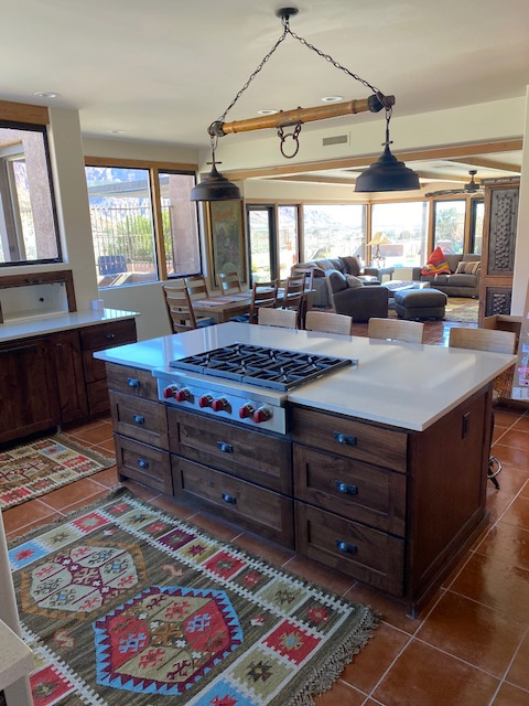
- Kitchen island
- accent wall
- gallery wall
While I can’t hit on all of those (which is something I never said in my bar-star years), let’s touch on a few of the top topics listed above.
1. PLAY WITH PATTERN
I LOVE a good pattern…to a point.
- Would I wear black-and-white polka-dot underwear? Sure, it’s easy to change my underwear or even not wear any in the first place.
- Would I wear a black-and-white polka-dot pantsuit? Well, it depends on how much wine I’ve had, but generally speaking, no. If I did, I would regret it the next day.
When it comes to patterns, it’s best to keep trendy ones on items that are easy to replace, or at least not piggy-bank breakers, if you do want to switch things up in a few years.
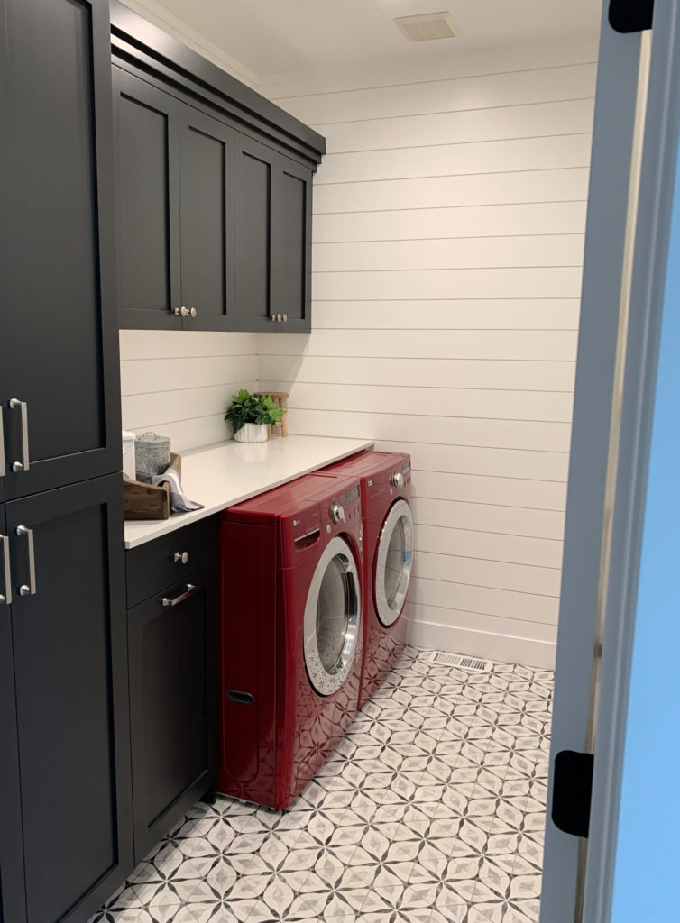
Sherwin Williams Tricorn Black cabinets / High Reflective White (Extra White) walls
Don’t get me wrong—I love (mad love) this laundry room. However, between the patterned floor tile, black cabinets, and shiplap, there will come a time when more than one surface needs updating. Instead, adding a pattern to small-scale pieces can be a safe but fun way to add personality.
- toss cushions
- area rugs
- tea towels
- drapery in a smaller room
When you focus on the ‘design’ of your home, choosing timeless finishes is a great way to create a home that lasts. However, when creating a timeless home with character, you can have a ton of fun while keeping things safe.
Overall, I’m not opposed to a pattern on a bathroom backsplash, as it’s usually a smaller space than the kitchen. Plus, if you have to change it to suit new trends/resale, while it’s a pain in the BUTT, it’s not terribly expensive in the big picture.
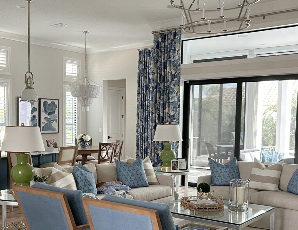
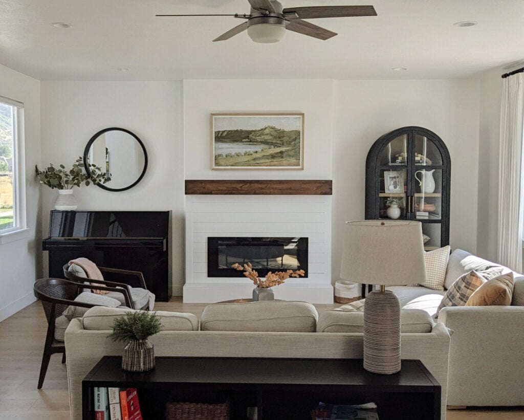
While those drapes ain’t cheap, overall this room shows moderation really well, with the sofas, lamps, toss cushions, and 2 accent chairs.
As shown above, today’s hot home decor patterns, textures, and colors can add character to a neutral palette without going too far.
- Feeling bored? Get new toss cushions.
- Ready for a change without spending a ton of money? Get new toss cushions!

Paint Color Review of Benjamin Moore Natural Wicker
2. ADD A GALLERY WALL
Gallery walls are a great way to jazz up any neutral wall or boring room.
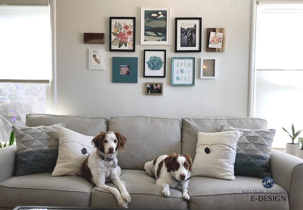
Not as cute as Ryan Reynolds, but they’ll do.
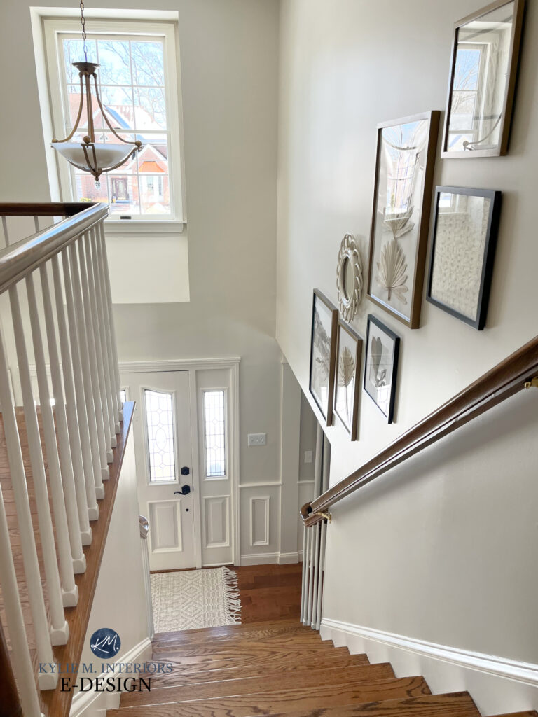
Benjamin Moore Ballet White is on the walls in both of the above rooms – TIMELESS!
3. HAVE FUN WITH AN ACCENT WALL
Pick one wall that’s a natural feature wall (e.g., behind the headboard, vanity, or fireplace), and do something wild and wonderful on that. The trick is not to do MULTIPLE walls or rooms with the same finish.
- Peel-and-stick wallpaper is a great way to add personality without much commitment.
- Well-chosen accent walls are an affordable way to jazz up a room.
The Best Medium-Depth Mushroom, Greige, & Beige Paint Colors
4. EMBRACE TODAY’S TRENDY PAINT COLOR
It can be tempting to paint your entire home one gloriously gorgeous, colorful paint color. However, even in an open-concept space, you can date your home or make it hard to coordinate. Instead…
PAINT YOUR KITCHEN ISLAND
Sure, kitchen island trends come and go, but a) if it goes well with your finishes, and b) it’s a color you love, an island can be a smart, smaller investment in character and charm.

If the homeowner gets tired of this green, it’s an easy change compared to the WHOLE KITCHEN!
The Best Medium to Dark Green Paint Colors
ADD AN ACCENT WALL IN TODAY’S HOT COLOR
Accent walls have long been a go-to for homeowners looking for personality without much commitment.
But are accent walls still trendy?

You might think that shiplap AND a colored accent wall are a double whammy of future regrets. Heck no, this is in a lake home, so it makes a ton of long-term sense.
- Generally speaking, no, accent walls aren’t in style, but there’s always something to be said for the right color in the right place.
- When trends change, or if you need to sell, painting one wall is no big deal.
The Best Places for an Accent Wall
PAINT THE INSIDE OF YOUR FRONT DOOR
Suggesting a gorgeous color for the inside of my Online Color Consulting clients is one of my favorite things to do – it’s such a great bang for buck!

The Best Paint Colors for the Inside of Your Front Door
FREQUENTLY ASKED QUESTIONS
While we covered a heck of a lot above, there are likely a few questions we didn’t address.
IS SHIPLAP STILL TRENDY?
Shiplap has been a hot, affordable design choice for many years.
Will it always suit some homes?
Yup, but the average home will one day show its age with its 2020 shiplap walls. And this is coming from a gal with shiplap on her fireplace. I still love it, but it won’t do my home any favors in five years (I don’t have a cottage, nor do I live at the beach or lake).
More traditional beadboard and wainscoting have a longer lifespan than trends like shiplap and board-and-batten. While there are exceptions (always), shiplap is a riskier choice now than 5 years ago.

SHOULD YOU INSTALL A PATTERNED FLOOR TILE?
No. Okay, fine – if it’s a small space and you don’t mind ripping it out when trends/tastes change, sure. Tile trends change colors, shape, and sizes more than I change my underwear.

This was gorgeous 20 years ago, but harder to update for today’s trends (should you even want to). Something doesn’t need to be ‘modern’ to be beautiful!
Of course, I could go on and on…and on, but that covers a lot of ground and should get you off to a good start!
IS BLACK STILL A TRENDY FINISH?
HECK NO! Did I say that loud enough? Don’t get me wrong, some homes look great with black hardware, everything from cabinets and doors to lighting and faucets; however, trends aren’t just changing…they’ve changed.
Many are still installing black, but within a year or two, they could regret it, especially on kitchen cabinets.
- Today, it’s more common to find black hardware on interior door hardware and light fixtures.
- As for cabinet hardware, polished nickel (and gold, to a small degree) is popular.
- In bathrooms, chrome is hot, with the odd gold/brass popping up.
- Some are doing a mix as a way to transition their home from one finish to another. Luckily, black coordinates well with almost EVERY metal finish.
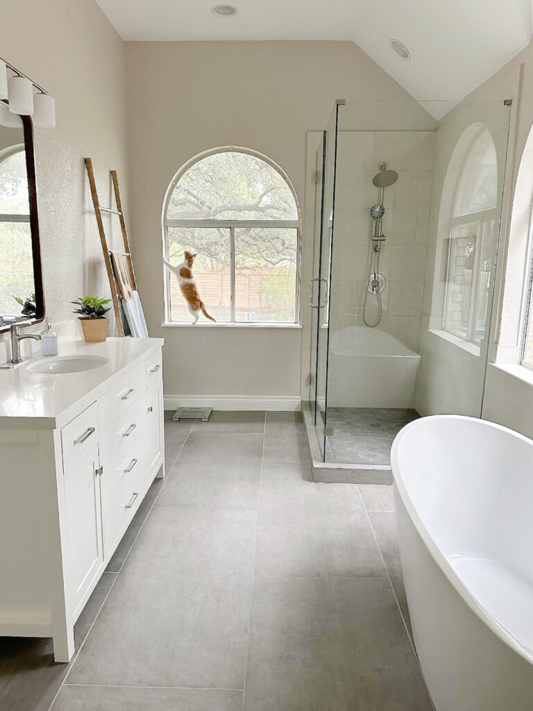
The bathroom of my talented, Online Color client – Jenna Christian
SUMMARY (TL;DR)
- Stick to neutrals for large, hard-surface finishes like countertops, tile, and carpet.
- Large expensive furniture pieces are often best in a solid neutral.
- Have fun with small-scale decorating trends, like a tiled powder room floor, shiplap accent wall, or home decor.
- Use color wisely with neutrals in the main, larger living areas. Use color on accent walls, kitchen islands, bathroom vanities, etc – projects that are easier and more affordable to change when trends shift.
READ MORE IN THIS SERIES
The 10 Most Timeless Interior Finishes
The Most Timeless Neutral Paint Colors
How to Follow Paint & Design Trends With No Regrets!
Get the best paint color advice with Kylie M’s Online Color Consulting

ORIGINALLY WRITTEN IN 2018, AWESOMELY UPDATED IN 2024


Hi Kylie,
Thank you so much for your easy to understand, funny guidance in all your posts. I’m considering Ballet White for my kitchen and living room (semi-open concept?) and. The kitchen has beautiful birch cupboards and other wood furniture that is medium orange toned and the floors are yellow oak. Will the oranges and yellows of all the wood reflect off such a light wall color causing the walls to look yellow???? (The walls are dark gold right now and I feel it takes away from the beauty of the wood)
Thank you I’m advanve from Canada 🙂
Shara
Hmmmm, I think it will be more about the quality of light/exposure as well as your interior lighting that will cause things to reflect a bit more and in general, I wouldn’t worry about it too much as Ballet Whtie IS so calm and restful as while it has that warm creamy base, it has the neutral undertones that quiet things down 😉
Okay, thank you!
Kylie,
Can you email me? I want to discuss options and pricing for your e-consultation for Canadian clients.
Thanks,
Shara
So many great points!! I wish I had understood the importance of neutral furniture and the proper place trends have in homes when I was younger and just starting out on home ownership – so does my husband…and our bank account 😉 Thanks for another helpful article!
This is a great post Kylie! I wish I would have known the wisdom of going with neutrals with regard to tile, etc. when we were building. Sadly I chose things that I liked at the time ( peachy beige floor tile) that are now expensive to replace. Wall color is so much easier to change then flooring and tile work.
Nice work! how would you go about selection of a counter-top? Color and or stone look? Pick up the color of the walls or flooring?
Each item/concept you list is right on target and good advice for us all. Thanks for recapping this in a single post.
This is such great info! Thank you . Helpful, usable, understandable Great article.
Thank you again Kylie! Love your posts.
For some of us, paint is expensive because of an open concept home with 2 story walls (meaning we have to pay someone to paint our house). It’s still cheaper than getting a new floor throughout the house, but painting an entire downstairs is still pretty expensive . On that note, what is your suggestions regarding a neutral paint color? So would a super light off white stand the test of time for walls (such as BM Classic Gray or Windsbreath, etc.)? If so, what are some of your go-to neutral paint colors that are off white for walls? Or do you feel a neutral in a lower LVR is better for standing the test of time?
Are you like me, as far as looking at the decorating in homes that are in movies? Especially those big old classic homes? I could be wrong, but regardless of the age of the movie, it seems like very light neutrals are usually on the walls?
Thank You Kylie 🙂
Excellent advice, top to bottom! And great photos, too!
I pinned this one immediately!! Man is this post excellent. You always have me laughing out loud. So good for the soul . Really really helpful advice. Clear and concise. Much thanks!!
Your posts are always so enlightening, but this one was spot on the best!
“Creating a timeless home is about being inspired – with restraint.”
You are 100% correct. Sadly, most of the clients I work with are one or the other….inspired or restrained. The “inspired” clients need a guiding help to restrain their urges to be “over the top” on all aspects of design while the “restrained” client needs a firm push to leave their comfort zone.
Hi, Kylie! I am grateful for your willingness to educate through your blog! I was hoping you might add a bit of info to this post. I’m at a crossroads needing to choose wall texture for the Sheetrock in our total remodel. I’m not sure I really like much but want a simple backdrop and not a statement forever plastered on the walls. What timeless option is a safe and transitional choice? Thanks a zillion. It’s a bit overwhelming when it seems we all use the same terms but different definitions.
Hi Cynthia! Well it seems in the States there is a lot more texture used on the walls, whereas in Canada its always always just plain flat drywall look – no texture – which to ME is the epitome of timelessness. If I had to do texture I would go for THE most passive one possible…
Thank you soooo much for making time for my question! Happy weekend!
So drapes should be neutral?
What about kitchen cabinets? Are white, woods, and grey the only solid options?
Hi! Drapes are certainly more affordable and you could do something with personality as they are easier to change out in a few years. As for cabinets, in terms of longevity, wood and white are really the 2 BEST options. Even gray will eventually be out of sync. And i LOOOOVE coloured cabinets and if you’re staying in your home for a long-time, then absolutely! But for keeping things more timeless, wood and white are easier to coordinate with in the longterm
THE EXCEPTION: Some older vintage homes can EASILY pull off coloured cabinets without them falling out of style, it’s more the homes that are more modern with coloured cabinets, that eventually run out of decorative steam…
Kylie, I love The arabesque tile fireplace surround. Can you tell me where to buy it? It’s the only fireplace on this blog.