
Benjamin Moore’s 9 Most Timeless Paint Colors
With the ever-changing winds in the color world, knowing what’s blowing in next is hard. Beige, green, greige, cream – seriously, WHERE’S MY WINE!? And whereas trends used to last a good decade, with Pinterest and Houzz inundating us with good ideas, it seems trends are changing faster, like 5-7 years, if we’re lucky.
So, how do you pick a paint color that will last longer than a popsicle on a hot driveway? You do your research, which is why I’m glad you’re here – you’ve arrived at RESEARCH CENTRAL!
Today, we’re talking about the most trend-proof paint colors. This doesn’t guarantee they’ll be 100% trend-proof; who knows what’s coming in the next 10-20 years other than chin hairs and leaky bladders (maybe that’s just me)? However, there are good reasons why these colors make the list, which we’ll explore shortly, as it’s not just the colors themselves that make them a smart choice…
It’s a funny little thing called moderation. While I might not practice it with wine and Cornuts, I do with paint colors.
PRACTISE MODERATION
Trends often focus on a specific color family (e.g., white, gray, or beige). When a trend comes around, we usually commit to it on a very…very large scale, and this color is used EVERYWHERE—white walls, countertops, and cabinets, gray walls, floors, and cabinets, beige EVERYTHING, and so on.
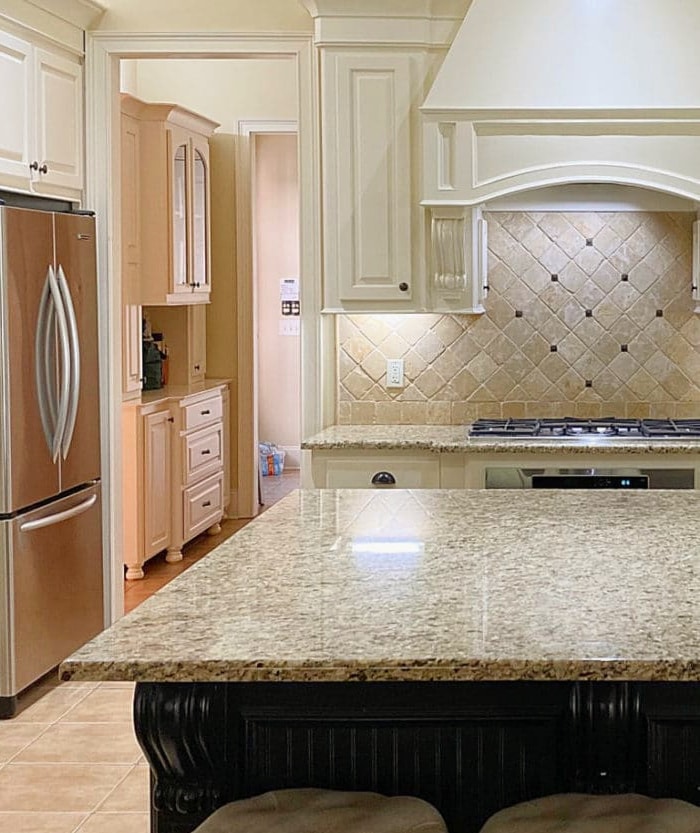
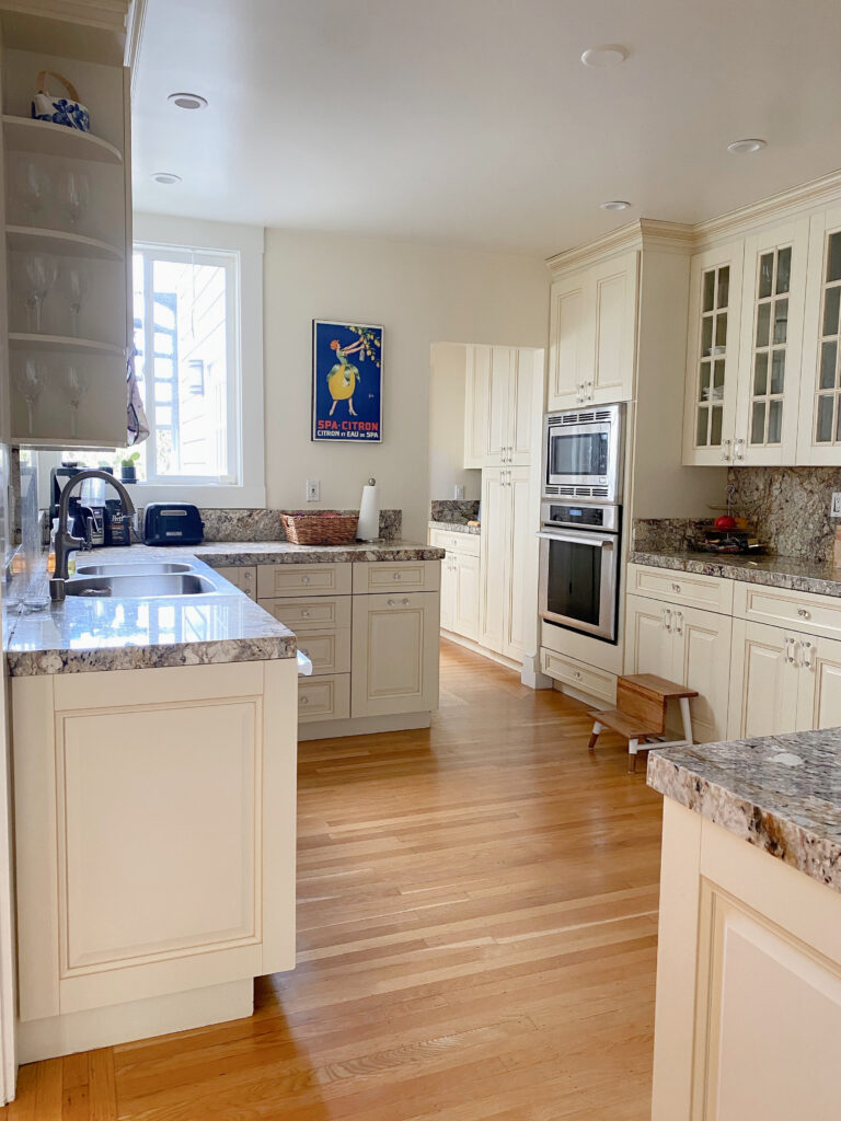
This kitchen had NO chance of survival
When we 100% commit to a trend, we limit our home’s decorative potential in the coming years.
You can commit to a trend; just don’t do it on such a large scale that you tear your entire home and marriage apart to update it. Instead, commit on a smaller scale or check out more transitional and flexible colors (like these) that bridge the gap between trends.
In this next photo, you can tell which decade this home was built in…
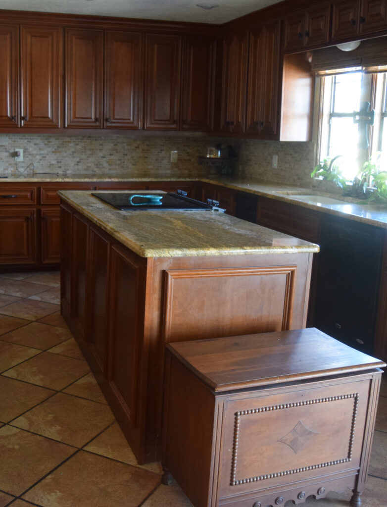
To update a space like the above kitchen, we have to humor the existing finishes, as not everyone can blow up their kid’s piggy bank for a full remodel.
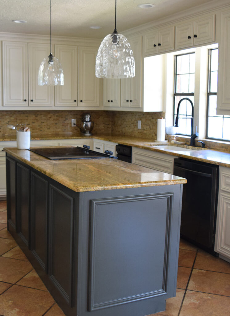
We kept some of the original charm while updating the cabinets and walls with a more timeless paint color. This was done while keeping ALL of the original ‘late 90s/early 2000s-inspired finishes‘ intact – IT WAS A FRIGGIN’ CHRISTMAS MIRACLE, PEOPLE!
Does this mean these colors will work with pretty much any finish?
No, just as there’s no fail-proof wine that goes with steak and Kraft Dinner (I’ve tried), there’s also no fail-proof paint color.
However, these colors are flexible enough to accommodate a variety of trends. Ranging from whites to grays, beige, and even some creams and colors, you get the full gamut. Now, this doesn’t mean they’ll suit EVERY type of countertop, tile, or sofa, but again, nothing is fail-safe or fool-proof.

The Best Paint Colors for the INSIDE of Your Front Door
Does this mean these colors are trend-proof, regardless of the surface or room we’re painting?
HECK NO! We’re talking about walls.
But what about CABINETS?
Cabinets are one of the first places to see the trend of the year/half-decade.
The current trend of painting cabinets a soft greige/taupe/cream makes me want to curl up in a ball, sobbing and twitching in the corner with a mild nod at hyperventilation.
Why?
Because they’re trendy (although admittedly, very pretty, and I have some in my own home). While I’m down with committing to trends on a smaller scale, as it relates to surfaces like cabinets, I know these off-white and mushroom kitchens will be showing up in my inbox in coming years—they’ll effectively date a home.
Schlong story short, when it comes to timeless colors on cabinets, you’re looking at white and only white.
Kylie, what do you mean when you say UNCOMMITTED or COMMITTED?
When I refer to a color as being uncommitted, it’s because it doesn’t want to marry any particular color; it prefers to practice polygamy, having several girlfriends/boyfriends on the side (also known as ‘side pieces’ according to my teenage daughters).
So, whereas one color might commit to gray, beige, tan, cream, etc., uncommitted colors might WINK at many of these colors without 100% committing to any of them.
So, now that we’ve established the WHY and the WHERE, let’s look at the WHAT.

1. BENJAMIN MOORE BALLET WHITE OC-9
Ballet White is a lovely, subtly warm neutral paint color. With its roots firmly planted in cream and tendrils of gray and greige, it’s a great way to get warmth without obvious yellow hues.

Whereas Edgecomb Gray pinched the bum cheeks of both the gray and beige worlds, Ballet White isn’t as close to gray, although it’s far more muted than traditional cream paint colors.
FULL Paint Colour Review: Benjamin Moore Ballet White
If you love Ballet White and are excited to sample it, check out my CURATED PEEL & STICK COLOR BUNDLE – sometimes it’s that wee tweak in undertones or depth that makes one color perfect over another!
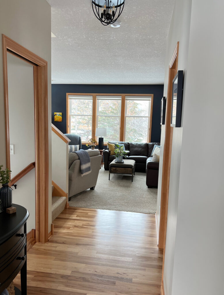
2. BENJAMIN MOORE HALE NAVY HC-154
When it comes to paint colors, there’s no doubt that Hale Navy is one Benjamin Moore’s most popular colors. Not only is it currently used in the average home, but it’s been in use (on a large scale) for at least 20 years.

Hale Navy is one of the most classic and definitely most timeless navy blue paint colors.
Whether you’re painting an accent wall in your bedroom, your kitchen island, or bathroom vanity, front door, or an entire room, Hale Navy has it all covered, literally and figuratively, in paint.
Benjamin Moore Hale Navy: IMAGES, Info, & More
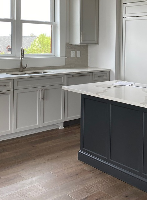
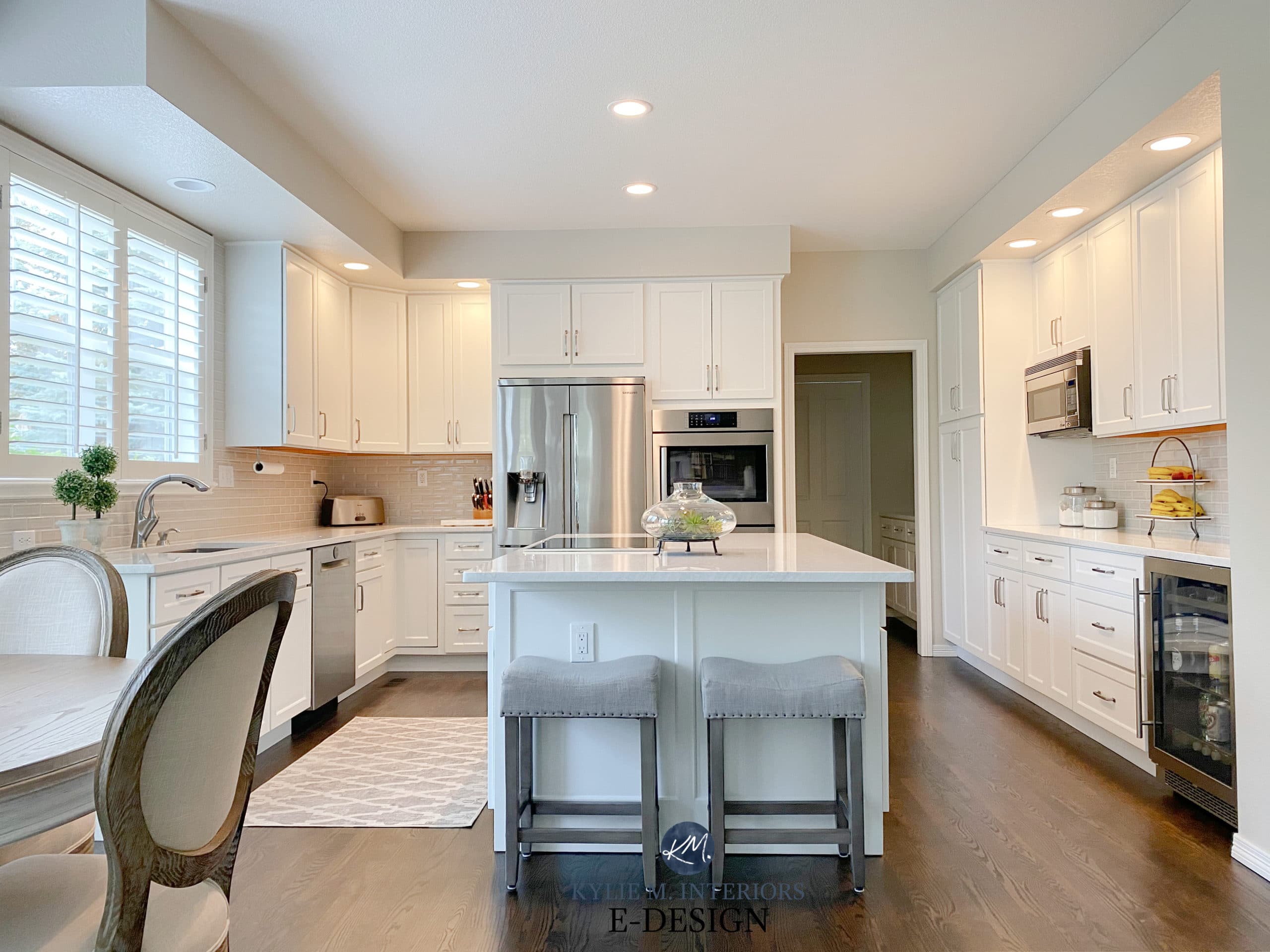
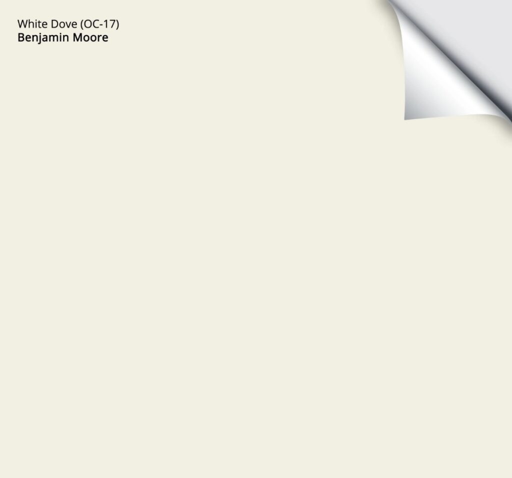
3. BENJAMIN MOORE WHITE DOVE OC-17
If you ask this color cowgirl, White Dove is the best of the warm whites.
Soft, flexible, and warm (sounds like a certain Ginger we all know), White Dove is known for easily humoring a wide range of paint colors, trends, and finishes.
While it doesn’t work with every finish, it’s not a one-trick pony and is popular on walls, cabinets, trims, exteriors, etc.

Paint Color Review of Benjamin Moore White Dove
In fact, White Dove is so popular that it’s been on Benjamin Moore’s TOP 6 list for 14+ years.

Benjamin Moore White Dove with Sherwin Williams Worldly Gray
Again, don’t pick a paint color based on how it looks with itself or against your current color. Compare and sample similar shades.
Here’s a Peel & Stick sample of Benjamin Moore White Dove…
4. BENJAMIN MOORE REVERE PEWTER HC-172
Do you remember what I said earlier about there being the odd exception? This is one of them.
But how is Revere Pewter possibly a ‘timeless neutral’ when it’s gray?
I don’t know. But here’s what I do know.

Revere Pewter is a gray that winks at the greige world with its degree of warmth. It also has a beautiful, earthy green undertone and an LRV of 55, making it a bit darker than the average ‘light depth paint color.’ Those are the bare bones of it.

20 Years of Benjamin Moore’s TOP Paint Color Trends
Something about the above characteristics has made Revere Pewter one of Benjamin Moore’s top-selling colors for over 14 years – that’s some serious longevity for a paint color that was part of a huge trend.
That’s right, Revere Pewter first popped up in the TOP 6 in 2010, and it hasn’t left that list since.

So, while Revere Pewter might not be for everyone, in terms of a timeless color that seems to have a reasonable staying power, Revere Pewter holds some kind of magic.
Paint Color Review of Benjamin Moore Revere Pewter
Would I paint all of the walls in my home Revere Pewter?
HELLLLLLS NO!
However, I’d definitely consider it for a few rooms (assuming they have good natural light and suit it) and shift things a bit lighter and warmer in adjoining spaces.
Remember, moderation is FUN!
Also, of the colors mentioned in this blog post, Revere Pewter is one of the most risky. If not for its being in the TOP 6 LIST for sooooo many years, I wouldn’t have included it. Sure, a whole whack of people love it, but with its gray base and additional depth, it can be a bit cool/dark for some spaces.
5. BENJAMIN MOORE MARITIME WHITE 963
As far as warm colors go – ones that tip their hat toward beige, Maritime White is a beauty.
Coming into harbor with a beige base, Maritime White is definitely warm. However, rather than being rich and golden (like the beiges and tans found in homes built in the early 2000s), it has a feather-light, gentle touch.
Here’s Maritime White looking subtly gorgeous in an older home with dark wood trim and flooring…

The Best Paint Colors to Go With Dark Woods
And here it is in a 2000s home, looking just as beautiful!

My FULL Paint Color Review of Benjamin Moore Maritime White
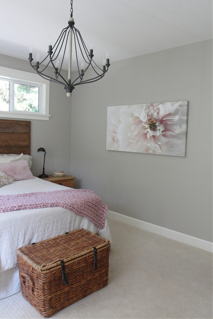
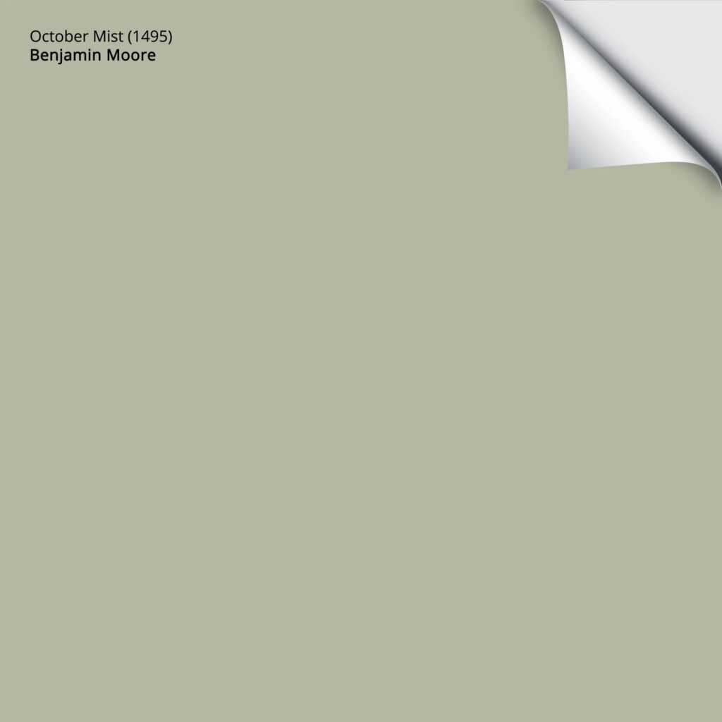
6. BENJAMIN MOORE OCTOBER MIST 1495
While purples, pinks, and reds come and go, blue and green are the two most timeless paint ‘colors’. And when it comes to the wild world of green, October Mist calls the shots.
October Mist isn’t lost in the early Autumn fog. In fact, this glorious shade of green has an LRV of 46.54, which means it’s between the light-medium and medium-depth ranges – she’s got some meat on her bones.
While the EXACT green that’s in style comes and goes, the color ‘green’ can be a perfectly timeless color.
While October Mist isn’t the type of color you paint your entire home, it can be amazeballs on a single room basis.
Here’s your Peel & Stick sample of October Mist…
Benjamin Moore October Mist: IMAGES, Info, & More
7. BENJAMIN MOORE NAVAJO WHITE OC-95
While Navajo White sits on the very edge of my comfort zone as far as the MOST timeless colors go, it’s definitely worth a quick chat.
Why?

While Ballet White is the most muted shade of cream, Navajo White is still relatively calm when it comes to cream (which is a color with a yellow base, and that yellow can be YELLow).
Navajo White offers a perfect balance between overly yellow creams and those that aren’t quite warm enough.
More colorful, traditional shades of cream are only timeless in heritage or country-style homes. The intention of the colors listed here is that they can work in the ‘average’ home, whether the style is transitional, modern, country, etc.
Benjamin Moore Navajo White: IMAGES, Info, & More
8. BENJAMIN MOORE STONINGTON GRAY
Stonington Gray is right up there Revere Pewter in popularity and longevity. And while it might not have the same timeless appeal as RP, it has its place on this list…barely.
Why is Stonington Gray timeless, whereas most other grays aren’t?
That is a great question. I don’t have THE answer, but being North America’s top paint color expert, I have a great guess…
- Stonington Gray has a classic appeal with MINIMAL undertones
- Its name is more familiar than some other grays, having lived in the fan deck for many, many moons.
- It’s on the same color strip as the very popular Revere Pewter and Edgecomb Gray, so it gets some good eyeballs on it.
- Whereas some grays are icy cold and others are overly warm, Stonington Gray has a stormy, but not earthy, look. This might appeal to those who don’t like organic tones, but don’t want to live in an ice box, either.
Benjamin Moore Stonington Gray: IMAGES, Info, & More
Here’s Stonington Gray compared to a few similar shades, so you can see how it compares in temperature…

If you like one of the above colors, here are the links: SW Agreeable Gray | SW On the Rocks | SW Light French Gray | BM Chantilly Lace | BM OC-151 White
By the way, Light French Gray is right up there on the list, too – you can find it in this blog post:
The Best Anti-Trend Paint Colors
READ MORE IN THIS SERIES
The Most Timeless Interior Finishes
How to Create a Timeless Home That Still Has PERSONALITY!
How to Follow Paint & Design Trends With No Regrets
The Most Timeless Cabinet Colors
The Most Timeless Kitchen Countertops
Get the best paint color & home update advice
Check out my ONLINE PAINT COLOR CONSULTING

ORIGINALLY WRITTEN IN 2022, UPDATED IN 2025


I love your color review videos. You clearly demonstrate how to look at paint colors in a new light. While researching Balboa Mist, I notice there are two numbers OC-27 and 1549. What’s the difference between them?
Thank you so much!
Michelle S
Well, funny enough, there is NO DIFFERENCE! They just feature them in different collections and change the number – which is confusing for SO MANY PEOPLE! Any variation you might see is just in the printing :).
Thanks for proving paint color description based on exterior lightening as it totally change what we exactly want that color to look like. Love your tips.keep posting:)
Thank you for the comment Mandeep! It’s this kind of info that makes you feel you AREN’T going crazy, that lighting really does change how things look!