
Benjamin Moore’s 16 Most Popular Paint Colors (2025)
BEST-SELLING SHADES: BEIGE, WHITE, GRAY, GREEN, ETC.
With a world of colors to choose from, it can be hard to decide. Thank goodness you have me (wink wink).
Seriously, though, if you don’t know where to start your color journey, a great place is with the most popular shades – tried-and-true colors that other homeowners and Color Experts like me swear by. Lord knows, I swear more than most, but my advice still stands.

FUN FACT: My info comes from Samplize Peel & Stick, my blog, & Online Color Consulting. We’re undoubtedly the top 2 referrers and supporters of Sherwin Williams and Benjamin Moore paint in all of North America.
BENJAMIN MOORE’S MOST POPULAR PAINT COLORS
I don’t always count whites as ‘the most popular’, as they’ve got a leg-up, seeing as no other color is used as extensively on walls, trims, ceilings, doors, and cabinets – of course, whites are some of the best-selling shades!
But just sose ya knows…
- Benjamin Moore White Dove is the most popular, top-selling paint color. I like to think I had a small (or friggin’ big) part in its popularity. Here’s Kylie M’s Color Review.

- Benjamin Moore Swiss Coffee is in 2nd place (its popularity is thanks to Shea @ Studio McGee). Here’s Kylie M’s Color Review
- Benjamin Moore Chantilly Lace is in 3rd place among Benjamin Moore’s colors. Timeless, classic, and a great, reasonably fool-proof white for many homes. Here’s Kylie M’s Color Review.
Now, let’s get to the good stuff…

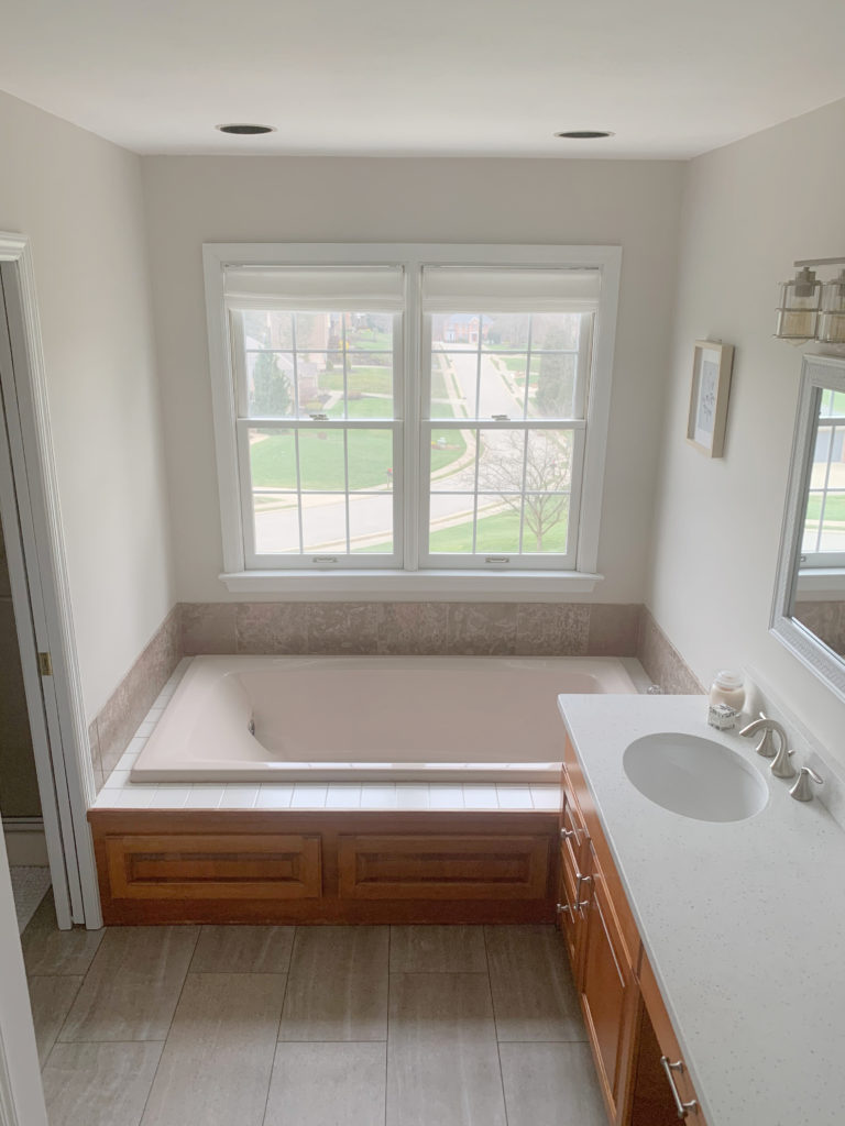
1. BENJAMIN MOORE PALE OAK OC-20
Well, slap my arse and call me surprised – Pale Oak is Benjamin Moore’s most popular paint color? Yup.
Why?
Don’t get me wrong, Pale Oak is wicked pretty, but it’s also a bit…pink. This isn’t to say it’s bad; it’s just something you should be aware of.
When my Online Color Consulting clients fill out their questionnaire, one of the questions is, ‘Are there any undertones you don’t like?‘ Most often, the answer is pink.
Pink isn’t a 4-letter word, especially in a color like Pale Oak.
Pale Oak is a light shade of taupe, nestled in the bosom between gray and beige. It also has a reasonably noticeable, but not overwhelming (although that can be open to perception) purple-pink undertone, making it a hit with many interior finishes.

TOP ROW: SW Egret White & BM Pale Oak | MIDDLE ROW: BM Balboa Mist & Unknown | BOTTOM: BM Edgecomb Gray 25% lighter
WHY IS PALE OAK THE MOST POPULAR NEUTRAL?
I don’t know. Sure, it’s beautiful, but its undertones make it tricky. Let’s see what it can do…
- Pale Oak is beautiful for all of the walls in a room and easily handles a range of accent colors.
- Many look to Pale Oak for their kitchen cabinets. While it can look beautiful, make sure its undertones suit your backsplash and countertop. Also, consider your wall color, as you’ll be limited.
- Some have chosen Pale Oak for their exterior, especially when a particular asphalt roof, stone, or brick needs a subtle taupe-pink hue.
Here’s your Peel & Stick sample of Pale Oak…
If you’ve fallen for Pale Oak, check out these alternatives; sometimes a wee tweak in undertone, temperature, or depth, can make one color the better choice over another: Benjamin Moore Classic Gray (#5), Sherwin Williams Egret White, City Loft.
Benjamin Moore Pale Oak Review: IMAGES, Info, & More
2. BENJAMIN MOORE REVERE PEWTER HC-172
Even though trends are leaning warmer, Revere Pewter remains one of Benjamin Moore’s most popular paint colors, which goes to show how timeless it is.

The Best Non-Whites for Interior Doors
Revere Pewter has an LRV of 55.05, placing it at the lower, darker end of the light range. I’d be hard-pressed to suggest it as a WHOLE HOME paint color, unless you love slightly moodier colors, but it’s fabulous for a single room or two.

WHY IS REVERE PEWTER A POPULAR PAINT COLOR?
There’s not much you can’t do with this beautiful hue…
- Revere Pewter is gorgeous on all the walls in a room, as long as your room has adequate light.
- Unlike most other shades of gray, Revere Pewter is often used on accent walls, trims, board-and-batten, and other feature areas (as shown above).
- Revere Pewter is a gorgeous kitchen cabinet color (I’d know, I used it on my own cabinets).
- It’s also popular on interior doors and trims, although it’s a trend you want to be careful with.
- Revere Pewter can be a gorgeous exterior paint color on siding, stucco, trim, etc. It suits a range of brick finishes as it often satisfies the mortar surrounding the brick.
- More so than some neutrals, Revere Pewter coordinates with a buttload of paint colors – have fun creating a great color palette!

Comparing a paint color to white is a great way to gauge its depth and general intentions.
And because you never should pick a paint color all on its lonesome, here are some Revere Pewter alternatives to sample and compare: Benjamin Moore Rodeo, Sherwin Williams Agreeable Gray, Colonnade Gray.
Benjamin Moore Revere Pewter: IMAGES, Info, & More
3. BENJAMIN MOORE BALBOA MIST OC-27
Balboa Mist has been kickin’ it a long time in Benjamin Moore’s wild world of grays, and has gained a bit of traction recently because it’s warmer than the more traditional shades (some of which are coming up shortly).

While Balboa Mist typically settles as a soft, light, warm shade of gray, it can take on a subtle taupe appearance, thanks to its warmth (as shown below).
As for its depth, Balboa Mist’s LRV of 65.53 places it smack dab in the middle of the light range, which is a great place to start sampling.
WHY IS BALBOA ONE OF THE BEST WARM GRAYS?
- Balboa Mist depth makes it an easy win for the average room.
- Some consider it for their kitchen cabinets, which is one reason it gets sampled a lot, but if you ask me, there are usually better options (with less undertone).
- It’s an interesting choice for your exterior if your stone or roof caters to a gray with a purple-pink undertone (not uncommon).
If Balboa Mist piques your interest, compare it to Benjamin Moore Collingwood, Pale Oak (#1), Light Pewter, and Classic Gray (#5).
Benjamin Moore Balboa Mist: IMAGES, Info, & More
4. BENJAMIN MOORE EDGECOMB GRAY HC-173
There are tons of good reasons why Edgecomb Gray is one of Benjamin Moore’s most popular paint colors (which we’ll get to shortly). But, first, let’s see why this neutral paint color has me wrapped around its lil’ paint-covered fingers.
Edgecomb Gray is a light-depth paint color, straddling the ample crack between beige and gray. This makes it a warm color.
Is it warm enough to look beige? While that can be open to perception, yup, it can wink at the beige world, for sure.
Will it look gray? Again, perception plays a part, and while it can look a bit like a warm gray, it’s FAR more likely to cater to warmth.
WHY IS EDGECOMB GRAY ONE OF THE BEST NEUTRAL PAINT COLORS?
Oooo, boy, I’d love to give you the short n’ curly, but you’re getting the long n’ braided instead…
- Edgecomb Gray is awesome as a ‘whole home’ paint color. It’s flexible with a range of exposures and interior finishes thanks to its depth (LRV) and passive undertones.
- If you need to paint a single room, Edgecomb Gray is a beauty as it accommodates a healthy color palette.
- Edgecomb Gray is an interesting off-white/light color for kitchen cabinets if your backsplash and countertop call for a warmer, but not cream color.
- It’s also a beautiful exterior paint color, complementing tons of brick, stone, window colors, and roofs.

If you love Edgecomb Gray, before you bite the bullet, sample and compare it with Sherwin Williams Modern Gray and Egret White.
Benjamin Moore Edgecomb Gray: IMAGES, Info, & More
FUN FACT: All the photos in my blog are from my Online Color Consulting clients, readers, and friends— because real homes deserve to be celebrated (dirty laundry and all!) While not magazine-perfect, they’re packed with ideas and proven color choices to help you create a home you’ll love.
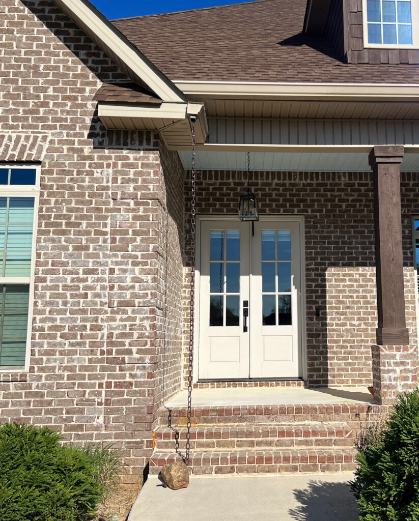
5. BENJAMIN MOORE CLASSIC GRAY OC-23
Although I thought we had moved past this, it appears that Classic Gray is still a top-selling shade.

Classic Gray looks cutie-patootie on this exterior with White Snow trim and Charcoal Slate front door.
Classic Gray is an off-white warm gray-taupe with purple-pink undertones. It was extremely popular with my Online Color Consulting clients five years ago, and although it still comes up frequently, I’m surprised it’s in fifth place.
WHY IS CLASSIC GRAY STILL POPULAR?
While I don’t see it in 5th place, it deserves a spot in the top 20 for the following reasons…

- It’s a beautiful paint color for your entire home, not just a single room.
- If you’re trying to update your millennial 2015 gray finishes, Classic Gray can be a polite nod to the warmer end of things while humoring your finishes’ grayer preferences.
- Classic Gray is an option for kitchen cabinets if your backsplash and countertop need a passive warm gray-taupe approach.
- Classic Gray even shows up on exteriors, as it picks up a beautiful warmth in most exterior lighting.
Before committing to Classic Gray, sample and compare it to alternative colors – sometimes a tweak in depth, undertone, or temperature can make all the difference!

BM Collingwood | SW City Loft | BM Balboa Mist
Along with the above colors, I’d check out Sherwin Williams Egret White and Heron Plume – absolutely.
Benjamin Moore Classic Gray: IMAGES, Info, & More
6. BENJAMIN MOORE HALE NAVY HC-154
ALL HALE THE KING! As the Queen of Color, I wholeheartedly support Hale Navy as the best navy blue paint color – period (or not, I’m currently in perimenopause, so it’s hit or miss).

The Best Paint Colors to Update Red-Stained Woods (or Pink!)
Hale Navy is a classic, timeless shade of navy blue, and it’s no wonder it’s one of Benjamin Moore’s most popular paint colors year after year.

With its LRV of 8.36, it ain’t messin’ around – this is one dark shade of blue. However, it’s not grayed out as much as the popular Sherwin Williams Cyberspace, making it a top choice for those who want a real commitment without winking at the primary blue end of things.
WHY IS HALE NAVY THE MOST POPULAR NAVY BLUE?
I’ve got a buttload of reasons (look it up, it’s a thing), starting with…
The Best Paint Colors with Golden Oak Wood Finishes
- Hale Navy is beautiful as an accent wall, complementing a wide range of gray paint colors, and popular warm neutrals.
- If you need the best shade of blue for your kitchen cabinets, island, or bathroom vanity, Hale Navy is a great color to sample and compare.
- Hale Navy is popular for exterior siding and stucco, as it’s definitely color-forward, but not overly punchy.
- It’s also super popular on the exterior of front doors.
If you’re pumped about Hale Navy, hold onto your britches ma bitches, and compare it to Benjamin Moore Anchor Gray, Sherwin Willams Cyberspace and Naval.
Benjamin Moore Hale Navy: IMAGES, Info, & More
7. BENJAMIN MOORE CALM OC-22
I did not see this one coming, and I’m not calm about it.
Why?
I don’t like Calm. Not only would it not be in my personal top 20, it wouldn’t even be in my top 100.
Why?
Calm is an off-white, warm gray with a purple undertone. Now, purple is a fabulous undertone in so many popular colors. However, it’s almost as if Calm is too light (LRV 75.83) to fully support this undertone without it being… purple.
Here’s your Peel & Stick of Calm…

Can it work? You bet your cute little tooshy it can, but I can think of many other colors I’d explore before this.
Unless a room NEEDS an off-white gray with a reasonably noticeable purple hue, I won’t recommend Calm.
WHY ON EARTH IS CALM REMOTELY POPULAR?
- Calm’s depth makes it well-suited for an entire home, assuming its finishes complement its undertone. It is a soft, gentle color, for sure.
- Many finishes cater to a soft purple undertone.
- I wouldn’t use it on kitchen cabinets or an exterior.
Benjamin Moore Calm: IMAGES, Info, & More
8. BENJAMIN MOORE OCTOBER MIST 1495
I find it fascinating when a brand chooses a Color of the Year, such as October Mist (2022).
Why?
You ask a lot of questions. I like that about you.
Because many Colors of the Year are flops. They’re mildly popular for a month or two, at best, or at worst, get openly mocked online (like Sherwin Williams Redend Point, also known as ‘wet hot dog’).
However, there are colors like October Mist, which pique the interest of many homeowners, not just for that year, but also for subsequent years. What’s so fascinating to me is that paint brands don’t aim to do this EVERY year. C’est la vie.
October Mist is a soft, gentle, organic-inspired green paint color with a gorgeous warm gray backdrop slowing it down.
The Best Light to Medium Green Paint Colors
WHY IS OCTOBER MIST THE BEST GREEN PAINT COLOR?
When it comes to actual ‘colors’, greens and blues seem to last the test of time more than purples, pinks, yellows, etc. This is one reason why October Mist keeps on truckin’. Let’s find out a few more…
Here’s your Peel & Stick sample of October Mist…
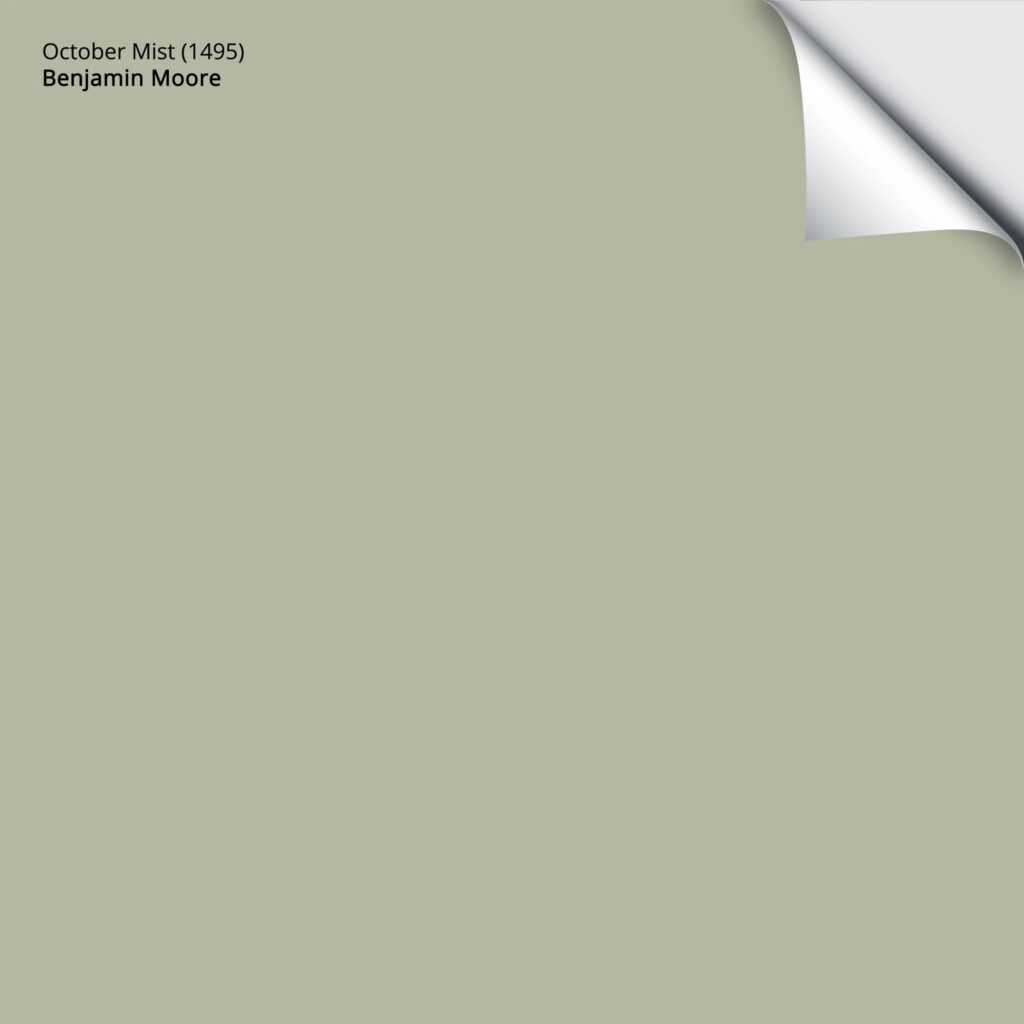
- October Mist is a beautiful paint color that suits a calming, relaxing bedroom, but can also be used in a kitchen or living room.
- Some greens feel like they’re force-feeding color down your throat, whereas October Mist allows you to savor the flavor without choking.
- I wouldn’t say it’s popular on kitchen cabinets, but if you’re looking for a moderate depth shade of green, it’s worth sampling.
- October Mist could also be an interesting exterior paint color, assuming your exterior finishes suit green.
Benjamin Moore October Mist: IMAGES, Info, & More
9. BENJAMIN MOORE QUIET MOMENTS 1563
I wish I could paint the inside of my brain Quiet Moments – there’s never a dull moment inside this vessel of madness (thank you, ADHD).
Here’s your Peel & Stick sample of Quiet Moments…
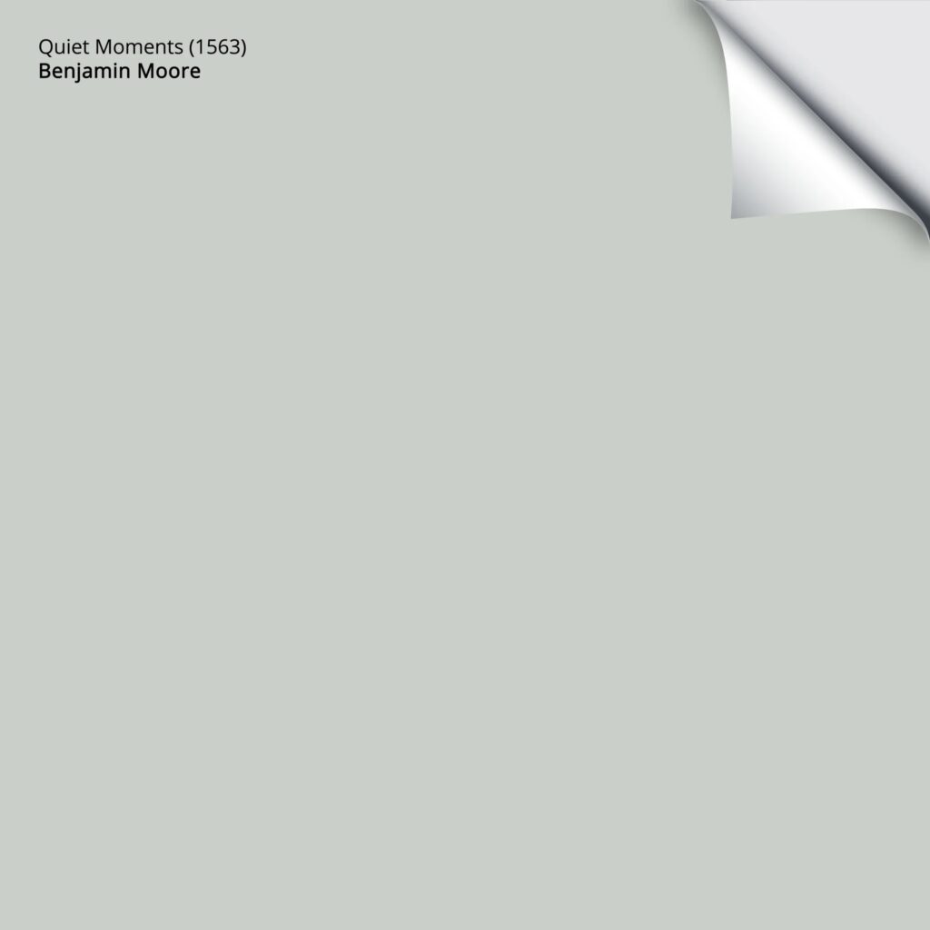
Quiet Moments is a gentle paint color that blends the best of blue, green, and gray. With its LRV of 60.73, it has a slightly moody backdrop, rather than a fresh, clean approach.
WHY IS QUIET MOMENTS A POPULAR BLUE-GREEN-GRAY?
Blue-green-grays are having a moment, for sure…
- Quiet Moments is a beautiful, calming, and relaxing bedroom paint color.
- It’s also a great option for bathrooms if your finishes can support its overall color.
- If you want to create a beach or lake-inspired color palette, Quiet Moments is a great color to start with.
If Quiet Moments has you pondering whether there are other similar shades that could be as good or better, take a look at Benjamin Moore Gray Cashmere, Sherwin Williams Sea Salt, and Silver Strand.
Benjamin Moore Quiet Moments: IMAGES, Info, & More
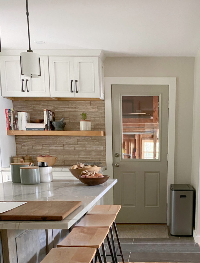
10. BENJAMIN MOORE DOVE WING OC-18
Dove Wing. Hmmm. While it wouldn’t have made the cut for my TOP 10, I understand why it’s here.

Dove Wing is a warm, off-white paint color. While some of the other popular off-whites have LRVs closer to 74, Dove Wing’s LRV of 77.52 places it between the off-white and white worlds – not an easy place to be if you ask this color cowgirl.

While Dove Wing is pretty, this living room would look better with a slightly more beige-based neutral.
As shown in the above photo, Dove Wing can pick up an interesting, almost creamy vibe, but is tempered by a gray backdrop.
And while it’s CONSTANTLY being confused with Benjamin Moore White Dove, make no boners about it, White Dove is way more popular than Dove Wing.
WHY IS DOVE WING POPULAR?
- Bright white walls are slowly falling out of style. While warm, soft whites are still kickin’ it, some are stepping into the off-white world when it comes to their walls, cabinets, and exteriors.
- If you want a simple, color-drenched look, Dove Wing’s LRV offers a simple palette for walls, trims, doors, and cabinets (although I might go for a lighter option on the ceiling…maybe).
I recommend checking out some alternative options like Benjamin Moore White Dove, Sherwin Williams Pearly White, and a few other popular off-white paint colors.

Benjamin Moore Dove Wing: IMAGES, Info, & More
Now, that was a LOT of information to digest. While I could type my little heart out all day long, you might be ready for some quick facts. So, if you need a little more color inspiration, here are #11-20…
11. BENJAMIN MOORE VAN DEUSEN BLUE HC-156
Van Deusen Blue is a gorgeous shade of dark blue. While there are many colors I would put in front of it as far as popularity goes (based on my Online Color Consulting alone), I don’t have a problem with this bad boy.
Benjamin Moore Van Deusen Blue: IMAGES, Info, & More
12. BENJAMIN MOORE BEACH GLASS 1564
Beach Glass is one bodacious blue-green paint color, and it’s no wonder it’s one of Benjamin Moore’s most popular paint colors.

While some blues come in hot with their commitment to color, Beach Glass is tempered by a gray backdrop and a healthy dose of green for balance.
Benjamin Moore Beach Glass: IMAGES, Info, & More
13. BENJAMIN MOORE SEA PEARL OC-19
Sea Pearl (also known as China White) is an interesting color. Soft, pretty, feather-light in its approach, but a bit unpredictable with its undertones, so sample and compare it carefully to similar shades.

COMING SOON! Benjamin Moore Sea Pearl: IMAGES, Info, & More
14. BENJAMIN MOORE BALLET WHITE OC-9
While I’m not surprised Ballet White isn’t in Benjamin Moore’s top 10, it definitely belongs in the top 20.
Ballet White is a soft, warm, creamy-inspired off-white paint color with a ton of flex for rooms, cabinets, and exteriors.
Here’s Ballet White compared to other super popular off-whites…

BM Wind’s Breath (#20, coming up shortly) | BM Simply White | SW Modern Gray | SW White Duck (amazeballs)
Benjamin Moore Ballet White: IMAGES, Info, & More
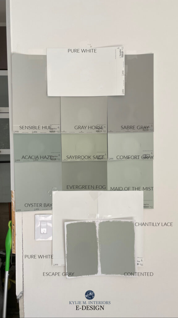
15. BENJAMIN MOORE SAYBROOK SAGE HC-114
I didn’t see this coming. While I love Saybrook Sage, and light to medium-depth greens are definitely popular, it’s never hit my Online Consulting radar – not on a large scale, anyway (I haven’t even reviewed it, which says a lot).
Regardless, Saybrook Sage is clearly a popular green paint color. This is likely thanks to its moderately subtle gray backdrop.
Here’s an overwhelming assortment of colors, most of which are more green-gray than Saybrook Sage, but at least you get your eyeballs on it…
The Best Green-Gray Paint Colors
16. BENJAMIN MOORE GRAY OWL OC-52
I do love me some hooters, and Gray Owl is no exception. This delightful gray has been popular for a long time, and while grays have definitely fallen out of favor, I’m happy to see it’s still kickin’ around.

Benjamin Moore Gray Owl: IMAGES, Info, & More
READ MORE
Sherwin Williams 20 Most Popular Paint Colors
The Best Warm Paint Colors for Your ENTIRE HOME
The Best Off-White Paint Colors
Almost Fool-Proof Paint Colors
Get the Paint Color Expert that Designers Hire…


Kylie! You’re the best. And, something might be going on with your website that you may not be aware of. I know some use AI and/or outsourced writers/editors for website content. This page https://www.kylieminteriors.ca/benjamin-moores-20-most-popular-paint-colors/
has the literal term “hairy crack” and in my few minutes on the site I also read a reference to tinkling on toes, nipples, etc. It’s subtle, but not what I’ve ever noticed on your polished content before. Anyway, from one content creator to another, wanted to let you know. And maybe it’s intentionally cheeky and you used those terms because you like it. If so, very fine.
Best, Jill
Hey Jill, I so appreciate what you’ve written – thank you. So, it’s me and my humor, which is questionable at best. Sometimes I try things on for size (that are roaming through my ADHD brain) and see how they feel. Thank you for this feedback as I’ll make a little adjustment. It can be hard for me to know where that line is, and I’m happy to know when I’ve crossed it :).
Hi Kylie, I painted my north facing room BM Pale Oak. It looks great on three walls, but completely washes out on the largest wall that faces my windows. Looks like a white with blue undertones. Could it be the time of year when the sun is the strongest and brightest? I’ll have to see what it looks like during the fall and winter months. Also I notice BM’s Regal eggshell paint is glossier than it was previously.
Love your blogs!
Patricia M.
OH man, don’t you hate that? Yeah, hang on and see how it shifts in the seasons. To account for that shift, you’d have to change your other 3 walls, maybe more drastically than you might like!