
What Colors Go With Benjamin Moore Revere Pewter?
Revere Pewter is, and has been, one of the most popular paint colors. Ever. Even with changing trends, it stays relevant. But it’s not just the color itself doing the heavy-lifting; it’s the surrounding finishes and coordinating colors that help it look updated rather than out of date.
But between creams, beiges, blues, and greens, what colors go with Revere Pewter in a palette? Or really, the question should be, ‘What paint colors DON’T go with Revere Pewter?’ That’s right, Revere Pewter is more flexible than me in my early 20s – TOES TO NOSE, BABY (if Tim only knew me then…)
In this blog post, we’re going to look at the best color pairings. Whether you have Revere Pewter cabinets, walls, or exterior, if you need coordinating shades, I’ve got ’em right here.

Now, I’m not limiting you to just Benjamin Moore; not when Sherwin Williams has some badass and beautiful shades.
However, it’s not as easy as throwin’ a few colors at you and calling it a day – context matters. So, let’s look at the different needs you might have so you can get headed in the right direction.
- You have Revere Pewter walls and need a coordinating color for an accent wall.
- You need a paint color for a room that’s adjoining Revere Pewter to create a flow from space to space.
- You’re painting your cabinets and need a cabinet color that goes with RP walls.
- Your exterior is painted RP, and you need a trim, shutter, or front door color that coordinates.
What if you have Revere Pewter cabinets and need a coordinating wall color? Well, there might be a few options in the main list below, but there are more options in the 2nd section.
Why?
As a cabinet color, Revere Pewter is super fussy due to its LRV. It’s not dark enough to suit the most popular off-white and light depth wall colors. This means that more often than not, the best wall color partner is some shade of white (or a darker color than RP).
Of course, there are other areas you can find Revere Pewter, but I’m ONLY ONE WOMAN, and there’s only so much coffee and Baileys one can ingest in an 8 hr period (or is there?).

I’ll leave notes below for each color on where I might/might not use it. But I have a few more helpful tips to share with you before we start.
CONSIDER THE LRV DIFFERENCE BETWEEN THE TWO COLORS
Right off the hop, we know that Revere Pewter has an LRV of 55.05. From there, you decide how much contrast you want.
If you don’t know what LRV is, you might want to take a gander through this: How to Choose Your Best Paint Color Using LRV.
A LOW CONTRAST PALETTE WITH REVERE PEWTER
If you prefer a low-contrast, more subtle flow between your paint colors, look for coordinating colors that are 8-20 LRV points lighter or darker than RP (give or take).

A MEDIUM CONTRAST PALETTE WITH REVERE PEWTER
If you like a bit more play between your walls, cabinets, trims, and accent walls, explore colors with LRVs that are 20-30 (approx.) points lower than RP (we’re not including whites, which are 25+ LRV points lighter; they have their own category).
Therefore (which always sounds snobby but serves its purpose), to create this look, your chosen paint colors should have an LRV between 25 and 35 (approx).
A HIGH CONTRAST PALETTE WITH REVERE PEWTER
If a high-contrast look is your jam (or your peanut butter, you do you), look for colors with LRVs that are 35+ points lower than RP (give or take, as it can come down to perception).
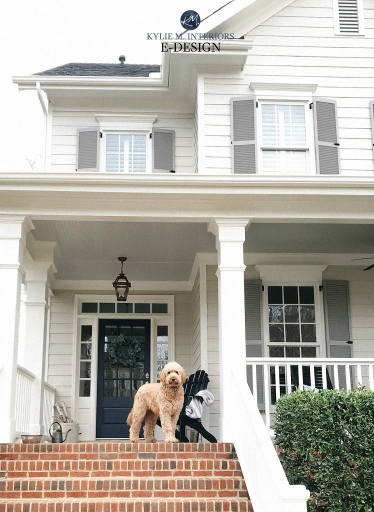
This beautiful home’s shutters are medium-contrast with the Revere Pewter siding. The front door is high-contrast.
In this case, you’ll explore colors with LRVs between 2 and 25, depending on the contrast you want. The lower your new color’s number, the greater the contrast with Revere Pewter!
SOME HELPFUL TIPS BEFORE WE START
Because it’s not always about ‘seeing a pretty color and running with it…
KEEP IT IN THE FAMILY
When it comes to colors that go with Revere Pewter, most have one thing in common – they’re dirty; even dirtier than my mind, which is saying a lot on the best of days.
Clean and dirty don’t get along (with only a few exceptions). So, if you choose a color outside of my recommendations, make sure it has some brown/gray to take the edge off its hue.
IMAGES
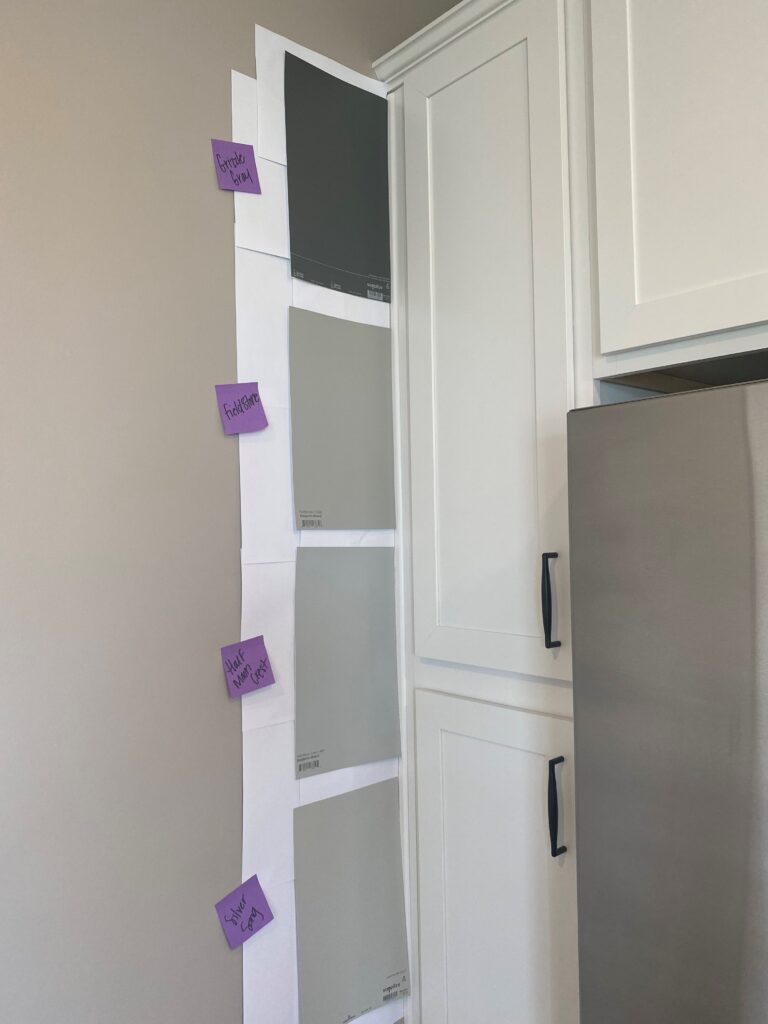
My images are 99% my own; from Online Color Consulting clients, readers, and friends. For this reason, I don’t always have the exact color combos you’re reading about. However, I have other images and info that’ll fill up your color cup!

Lastly, (because I don’t stop talking in real life either), because there are SO MANY COLORS that go with Revere Pewter, I’m focusing on some of my favorites, and will add links to additional shades for you to explore – cool beans?
Now, let’s see what this lil’ color cowgirl has up her sleeves…
THE 7 BEST LIGHT NEUTRALS WITH REVERE PEWTER
While we’ll get to some glorious blues, greens, and darker shades, let’s start soft and easy.
1. BENJAMIN MOORE BALLET WHITE OC-9
COME TO MOMMA! I love this color, and I love it even more when it’s partnered with Revere Pewter.

Ballet White is a soft, off-white, warm neutral (also known as Muskoka Trail 974). It has a creamy base but is far less yellow than the standard cream paint color (which is why I love it; too much yellow makes me twitch).
- Ballet White has an LRV of 71.97, so it’s almost an off-white paint color. It offers a reasonably soft, low-contrast look with Revere Pewter.
- Ballet White is gorgeous for an adjoining room, especially if that area is a transition space, such as a hallway, entry, or staircase (but it doesn’t have to be one of those spaces to look fab).
In this home (below), Ballet White (on the left) is paired with Sherwin Williams Worldly Gray (right). While Worldly Gray isn’t as gorgeous as Revere Pewter, it gives you the general idea.

Benjamin Moore Ballet White: IMAGES, Info, & More!
If you love Ballet White, compare it with…
- Sherwin Williams White Duck
- Sherwin Williams Shoji White (listed shortly)
- Benjamin Moore Wind’s Breath
2. BENJAMIN MOORE EDGECOMB GRAY HC-173
Edgecomb Gray (also known as Baby Fawn AND Alaskan Skies – thank you, BM, for confusing everyone) might seem like an easy win, given its placement directly below Revere Pewter in the fan deck. However, it’s not always that easy.
Why?

Just because colors are above/below each other in the fan deck, doesn’t mean that…
a) they’re lighter or darker versions of each other
b) go well with each other in any situation
Edgecomb Gray is light-depth greige-taupe with minimal undertones. In general, it’s dirty enough to go with RP; however, it’s their LRVs that make things trickier.
- Edgecomb Gray has an LRV of 63.09. This makes it 8 points lighter than RP and a beautiful, LOW contrast partner. Remember, it’s not just depth that creates contrast, but also a shift in color/undertones/intensity/etc.
- However, I only like Edgecomb Gray and Revere Pewter when they’re in adjoining rooms. In the same rooms, their contrast is too low to be effective cabinet/wall partners.
The following example is awesome, as Edgecomb Gray is directly above Revere Pewter, showing the shift in warmth and depth…

SW Versatile Gray | SW Mega Greige | BM Edgecomb Gray | BM Revere Pewter
If Edgecomb Gray is close to what you’re looking for, make sure you compare it with…
- Benjamin Moore Wind’s Breath
- Benjamin Moore Cedar Key
- Sherwin Williams Accessible Beige
Benjamin Moore Edgecomb Gray: Paint Color Review
3. SHERWIN WILLIAMS AESTHETIC WHITE 7035
Nothing warms the cockles of my heart like Ryan Gosling, a full bottle of wine, and a fresh bag of Cornuts Aesthetic White.
Aesthetic White is an off-white, super muted, grayed-out shade of beige. It has a passive warmth that doesn’t overwhelm a space, but adds some contrast with white trim.
- Aesthetic White has an LRV of 73, making it an off-white color and approx. 18 LRV points lighter than RP’s 55.05. This is a ‘reasonably’ low-contrast pairing.
- With its depth, Aesthetic White is best in an adjoining room. While some might want it on their walls with RP cabinets, or the other way around, Revere Pewter must be darkened to make it jibe.
Sherwin Williams Aesthetic White: FULL Paint Color Review!
If Aesthetic White hits your happy place (I won’t tell your hubby, he’s been looking for that for YEARS), compare it to these similar shades…
- Benjamin Moore Sea Pearl
- Sherwin Williams Origami White
- Benjamin Moore Wind’s Breath
4. BENJAMIN MOORE PALE OAK OC-20
If you’re looking for a beautiful, gentle partner to pair with Revere Pewter, Pale Oak is a stunner.
Pale Oak is currently one of Benjamin Moore’s most popular colors.
Pale Oak is a light, feather-like shade of taupe. Being a taupe, it has opposite undertones (pink) to Revere Pewter’s green hue, but this is where the magic is!
Here’s your Peel & Stick sample of Pale Oak…
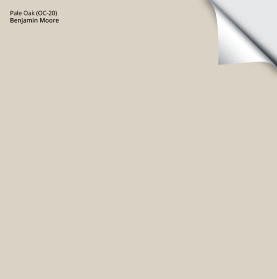
- With an LRV of 68.64, Pale Oak is a light-depth color, slightly higher in the range, whereas RP is on the lower end. This means the difference between the two is approx. 13 points, which is low contrast.
- Because of this, I would definitely use Pale Oak in a room that’s next to Revere Pewter, but I wouldn’t use them in the same room – there isn’t enough difference.
Benjamin Moore Pale Oak: FULL Paint Color Review & Images!
If you like the look of Pale Oak, consider comparing it with a few colors that share similar intentions in relation to Revere Pewter, including…
- Benjamin Moore Classic Gray
- Sherwin Williams Egret White
- Benjamin Moore Balboa Mist
- Ooo, Sherwin Williams City Loft is pretty, too
Remember, if you want a color to be in the SAME ROOM as Revere Pewter, it likely needs to be white (coming shortly) or have an LRV that’s lower than RP.
5. BENJAMIN MOORE NAVAJO WHITE OC-95
Navajo White is one of the most timeless cream paint colors. Whereas some shades of cream come off a bit too YELL…ow, Navajo White’s approach to that particular hue is more muted, while still leaving a ton of warmth on your walls.
- Navajo White’s LRV of 78.26 places it between white and off-white and is reasonably low in contrast. HOWEVER, its warmth adds its own layer of contrast for you to enjoy!
- That being said, they’re best used on a room-by-room basis, not in the same room.
If Navajo White is the soft, creamy hue you’ve been craving, I’ve got a few more for you to sample and compare…
- Benjamin Moore White Down
- Benjamin Moore Gentle Cream
- Sherwin Williams Creamy
- Or, check out my favorite cream paint colors!
Benjamin Moore Navajo White Paint Color Review
6. SHERWIN WILLIAMS SHOJI WHITE 7042
Shoji White is a hugely popular, off-white paint color from Sherwin Williams. Along with the (almost as) popular White Duck, Shoji White looks gorgeous with Revere Pewter.
The next image gives you a good gander at a few of the colors we’ve explored and other potential pairings…

SW Aesthetic White | SW Heron Plume | SW Pure White | SW Pearly White | SW White Heron | SW Origami White
- Shoji White has an LRV of 74, making it an off-white paint color and almost 20 LRV points lighter than RP.
- This difference makes Shoji White a great option for an adjoining room. While you can also explore it for a wall/cabinet combo, not everyone loves the mix of undertones/depth.
Here’s your Peel & Stick sample of Shoji White…
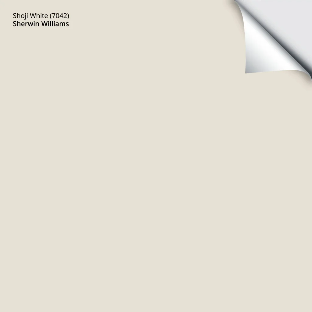
Sherwin Williams Shoji White: IMAGES, Info, & More
If Shoji White looks alwight to you, compare it to a few similar shades, including some of the best warm, off-white paint colors.
7. BENJAMIN MOORE WIND’S BREATH OC-24
If you’ve read all of the above (if not, 3 slaps with a wet noodle), you might’ve noticed Wind’s Breath come up a few times as a great color to ‘sample and compare with other similar shades‘.

Let’s talk about it.
Wind’s Breath is a reasonably popular, warm neutral paint color. With barely there creamy roots, it offers warmth with a great, gray/greige backdrop, calming it down.
- Wind’s Breath has an LRV of 69.59, making it a light-depth paint color, but on the higher/lighter end of the range. The difference between this and Revere Pewter is 14 LRV points, so it’s a low-contrast partner.
- This contrast means that while you miiiight try it with Revere Pewter cabinets (I suggest lightening it or darkening RP to see if it’ll work), it’s better in an adjoining room.

Benjamin Moore Wind’s Breath: IMAGES, Info, & More
If Wind’s Breath has you all a flutter, compare it with…
- The previously mentioned Sherwin Williams Shoji White, White Duck, and Aesthetic White
- Benjamin Moore’s Gray Mist
THE 8 BEST BLUE & GREEN (BLUE-GREEN-GRAY BLENDS)
If your idea of a good time is Revere Pewter with a gorgeous blue, green, or blue-green-gray blend, you’re in the right spot, big boy (or big girl, but that sounds weird).
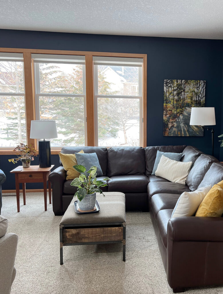
1. BENJAMIN MOORE HALE NAVY HC-154
Hale Navy is a badass and beautiful shade of navy blue. In fact, among Benjamin Moore’s most timeless, popular paint colors, both Revere Pewter and Hale Navy are near the top of the list.
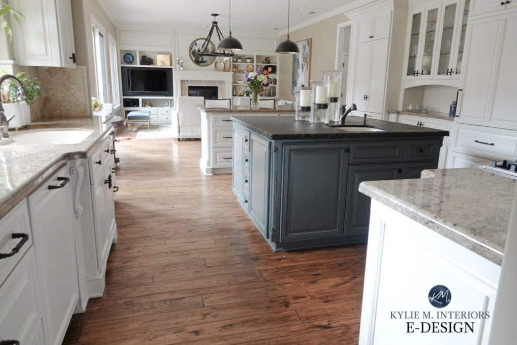
The Best Paint Colors with Wood Trim
- Hale Navy’s LRV is 8.36, so she ain’t messin’ around, this girl’s got DEPTH!
- With its gloooorious depth, Hale Navy is a stunner when paired with Revere Pewter, especially as an accent wall, kitchen cabinets, or island. It’s also fabulous for the inside of a front door or adjoining room – she ain’t no one trick pony.
Benjamin Moore Hale Navy: Images, Info, & More!
Love Hale Navy? Compare it with…
- The super popular, Sherwin Williams Cyberspace.
- You’ll find a few more beauts in this blog post: The Best Navy Blue Paint Colors – steer for ones that are a bit muted vs. overly colorful.
2. BENJAMIN MOORE GRAY MIRAGE
In the same room? Hell nah. In the same home? Absolutely. Gray Mirage is a beautiful, organic shade of green with a gentle touch. It’s a gentle, subtle partner that could be pretty in a room that adjoins Revere Pewter.
Here’s a Peel & Stick of Gray Mirage…
If you love Gray Mirage, you have to check out…
- Benjamin Moore Dry Sage for more depth and accent potential.
- Benjamin Moore Winterwood is a subtle partner for an adjoining room. For a more noticeable shift, look at Chatroom.
3. BENJAMIN MOORE GIBRALTAR CLIFFS 1587
This one is near and dear to my heart, but so is Boom Chicka Pop popcorn, soooo (and yes, I clearly love food and wine).
I used Gibraltar Cliffs in our last home on a few accent walls and loved it. While I didn’t pair it with Revere Pewter, I had it with the very similar (slightly grayer), Sherwin Williams Colonnade Gray, and the combo was amazeballs.
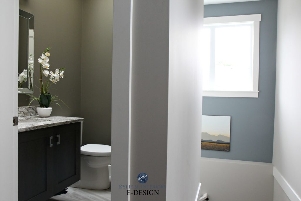
The small bathroom is painted Sherwin Williams Anonymous
But enough about me (said me, never).
Gibraltar Cliffs is a very solid, stormy, medium-depth blend of gray, blue, and green.
- With an LRV of 31.77, Gibraltar Cliffs sits its moody little booty in the middle of the medium depths. This makes it a medium to high-contrast pairing with Revere Pewter (again, perception plays a part).
- With this depth, Gibraltar Cliffs is great for an adjoining room, kitchen cabinets or island, an accent wall, or really almost anything you want it to do for you!
- Learn about more of the Best Light to Medium Gray-Blue Paint Colors
Benjamin Moore Gibraltar Cliffs: LEARN MORE about this beautiful color!
4. SHERWIN WILLIAMS OYSTER BAY 6206
I friggin’ love this color. Oyster Bay is a soft, beachy, medium-depth green-gray with some blue for balance.
With an LRV of 44, it’s a good dose darker than Revere Pewter. Not dark enough to be an accent wall, but goooorgeous for an adjoining room.
If you like Oyster Bay, here are some alternatives to sample and compare – you never know what you’ll fall in love with!
- Sherwin Williams Comfort Gray is amazeballs, and a bit lighter than Oyster Bay.
- Sherwin Williams Acacia Haze offers a bit more depth but has similar intentions.
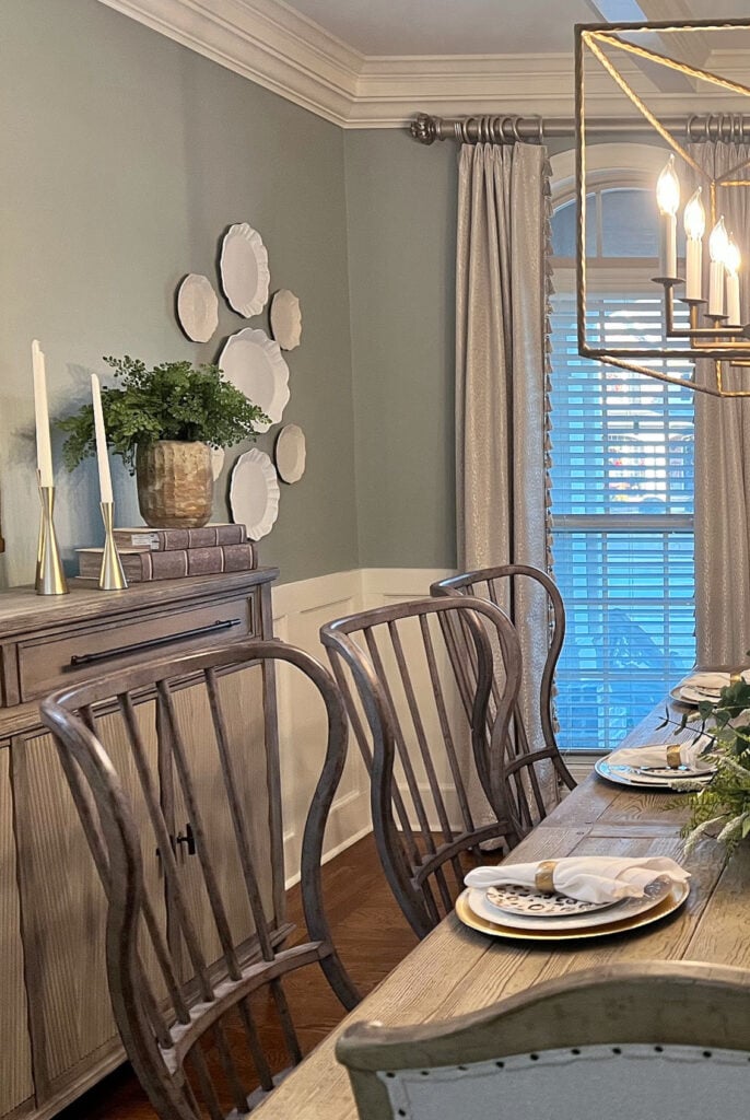
5. BENJAMIN MOORE INTRIGUE 1580
Intrigue is an interesting one. Is it gray, or is it green? Actually, it’s a blend. While I’d say the green is bossier than the gray, it’s not remotely overwhelming.
Here’s your Peel & Stick sample of Intrigue…
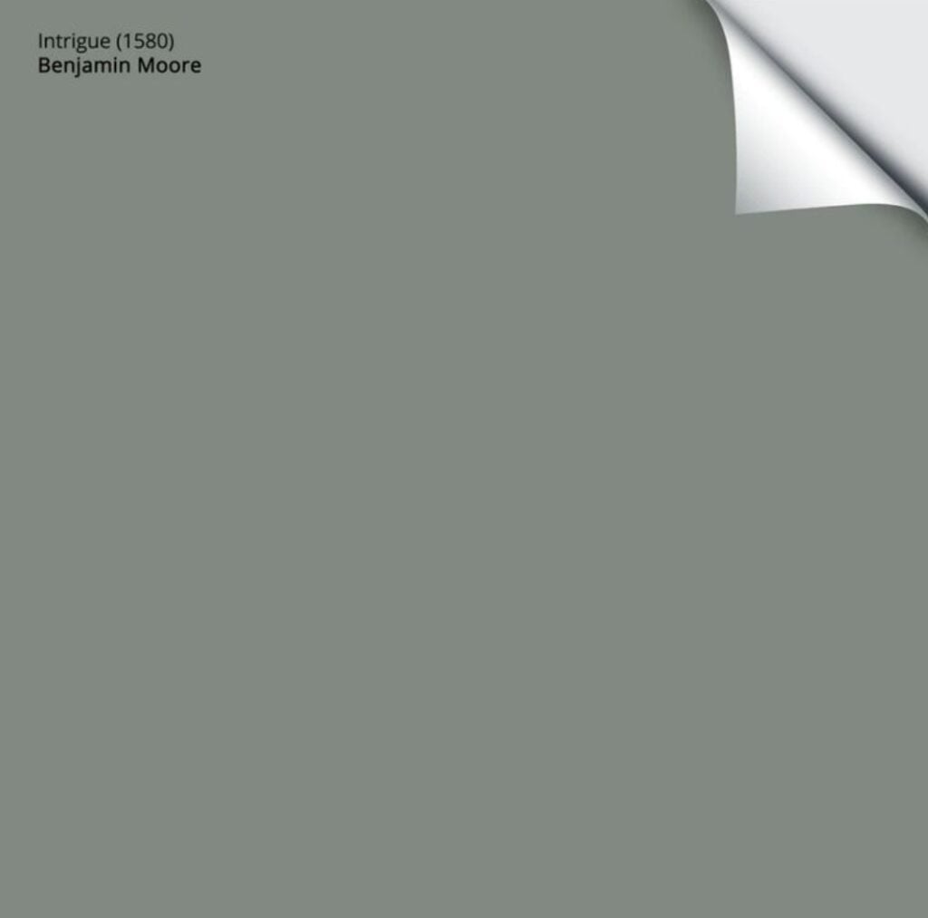
Intrigue has an LRV of 24.43, making it a gorgeous accent color for Revere Pewter, whether for an accent wall, front door, or kitchen island.
Is Intrigue intriguing? Compare it to some similar shades, including…
- Benjamin Moore Rushing River, if you want a bit more color/less gray.
- Benjamin Moore Gray Pinstripe, for more gray and less green (mad love).
One color you won’t find much of here is a lighter blue. Revere Pewter loves blue, so long as it’s DARK. If it’s in the lighter end, it prefers blue with a good dose of gray and at least a bit of green blended in.
6. BENJAMIN MOORE GRAY WISP 1570
While it contains the word GRAY, don’t let it fool you. Gray Wisp offers a beautiful whisper of green, along with blue and gray for balance (so it’s not too punchy).
Here’s your Peel & Stick sample of Gray Wisp…
- Gray Wisp has an LRV of 54.53 – too similar to Revere Pewter to be used as a direct accent, but WICKED pretty in an overall home (room-to-room) palette.
If Gray Wisp is whispering sweet nothings in your ear, compare it with…
- Benjamin Moore Wales Gray, to see a shift towards blue
- Benjamin Moore Imperial Gray offers a bit more depth and is gorgeous with Revere Pewter.
The Best Blue-Green Blend Paint Colors
7. BENJAMIN MOORE OCTOBER MIST 1495
October Mist came out as the Color of the Year (2022) and hasn’t stopped since! This glorious green has a wink of warmth and a soft, muted backdrop, making it an organic, earthy approach to green.
- October Mist has an LRV of 46.54 – not dark enough to accent Revere Pewter, but goooorgeous as a neighbor.
If you like the look of October Mist, sample and compare…
- Benjamin Moore Saybrook Sage for a cooler take, while still flaunting green.
- For more warmth, check out Sherwin Williams Grassland.
- Check out more goooorgeous sage-inspired greens.
Benjamin Moore October Mist Color Review
8. BENJAMIN MOORE ANTIQUE PEWTER 1560
Antique Pewter is one of my favorite darkish greens. Not so heavy it’s overbearing, but not in the light range, this gorgeous green is a great accent for Revere Pewter.
- Antique Pewter has an LRV of 25.4, making it a very solid, medium-depth shade of green.
If Antique Pewter has the bones you’re looking for, compare it to these similar shades…
- For considerably more COLOR, Benjamin Moore Raintree Green is pretty darn gorgeous.
- I’ve got more beautiful darkish green colors HERE.
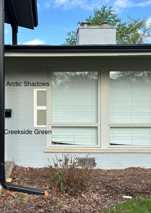
- Benjamin Moore Creekside Green offers a bit more color and warmth.
Both of these greens (below) are good with Revere Pewter, but I like how Creekside Green plays a bit more…
THE BEST MEDIUM TO DARK GRAYS WITH REVERE PEWTER
If you’re looking for an accent wall, front door, or a coordinating color for an adjoining room, check out a few of these bad boys…
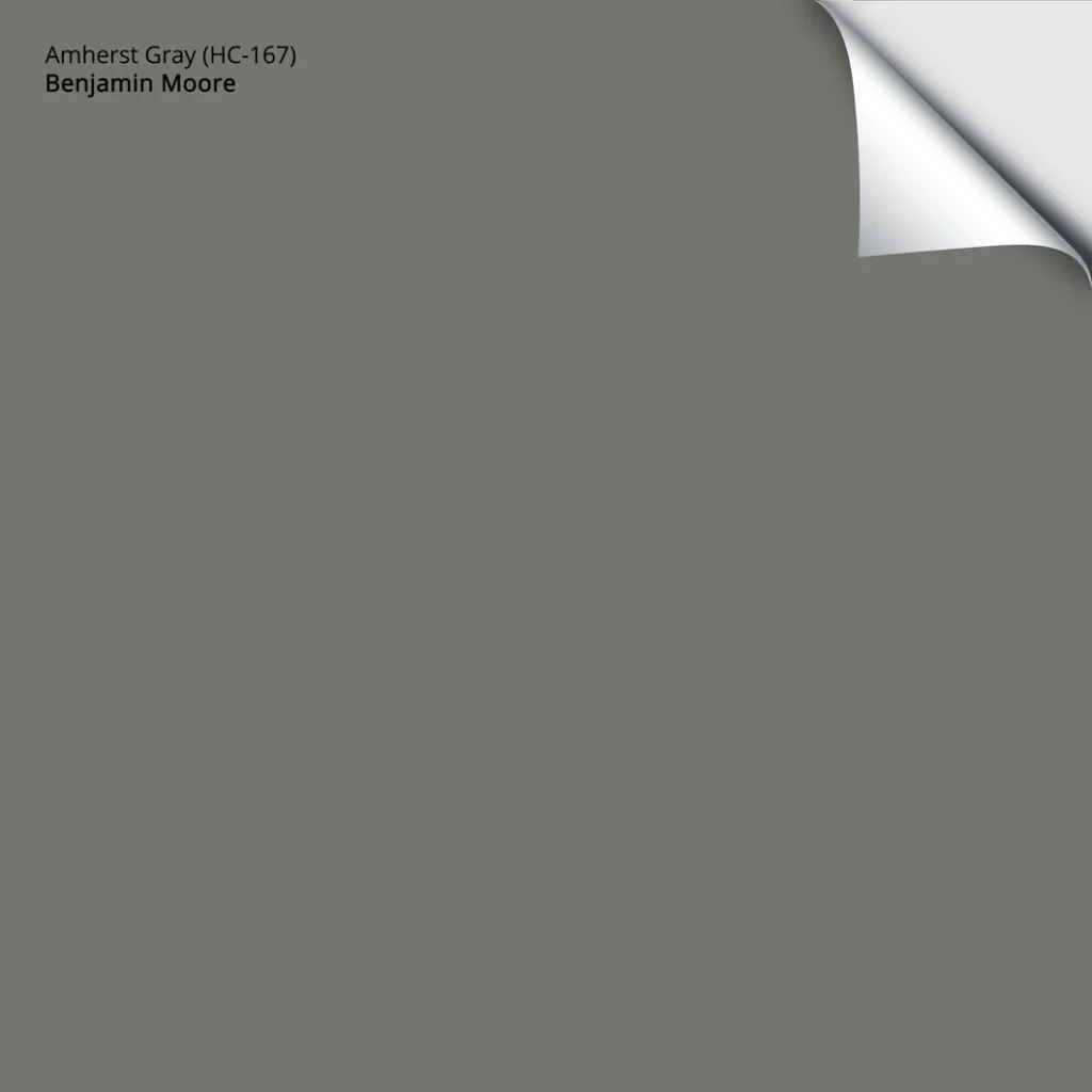
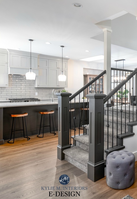
1. BENJAMIN MOORE AMHERST GRAY HC-167
Amherst Gray is a wickedly dark shade of gray with a very slight green undertone. This undertone is one reason why it’s magical with Revere Pewter.
Another reason is that it’s so darn grounding thanks to its depth…
- Amherst Gray has an LRV of 18.8, so she’s pretty skookum and high-contrast with Revere Pewter.
- This makes it a great accent color for a feature wall, kitchen island, or even a moody, dramatic adjoining room with RP!
Here’s your Peel & Stick sample of Amherst Gray…
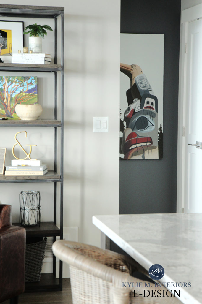
While the quality of this image isn’t fab (I take what I can get!), this shows Revere Pewter and Amherst Gray in the same space…

Benjamin Moore Amherst Gray: Paint Color Review
If you love Amherst Gray, consider comparing it with…
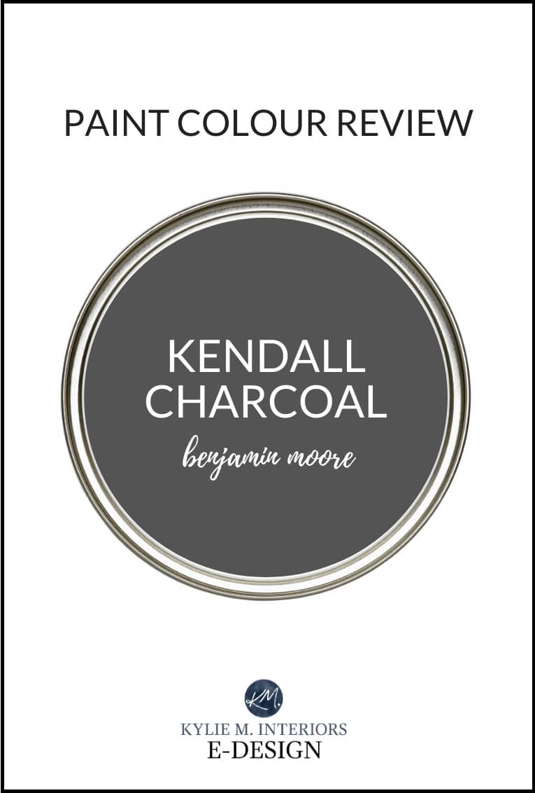
- Benjamin Moore Kendall Charcoal, which is a bit darker
- Benjamin Moore Chelsea Gray, which is a bit lighter
- Sherwin Williams Grizzle Gray, which we’re looking at shortly!
2. SHERWIN WILLIAMS GRIZZLE GRAY 7068
Grizzle is fo’ shizzle my nizzle lookin’ fly. Wait, I confused Snoop Dog with my lil’ Ginger self (yes, I do have an inner gangster, doesn’t everyone?).
Grizzle Gray is a beautiful, dark paint color that’s the perfect blend of green and gray. Whether it’s one or the other is a matter of perception, which is why it’s pretty awesome possum.
In this first image, Grizzle Gray is the top sample, and the main wall color is very similar to Revere Pewter…
- Grizzle Gray has an LRV of 13, so this bad boy ain’t messin’ around – he’s coming in hot n’ heavy with a high contrast look for Revere Pewter.
- With its depth, Grizzle Gray is versatile for a wide range of painting projects – from adjoining walls and rooms to accent walls, cabinets, and doors; you name it, Grizzle’s got it covered…with paint.
Here’s Grizzle Gray on a kitchen island with Sherwin Williams Aesthetic White on the painted main cabinets…
Again, here’s Grizzle Gray, a color very similar to Revere Pewter (Sherwin Williams Colonnade Gray)…
If you like Grizzle Gray, compare it with a few colors with similar intentions, including…
- Sherwin Williams Cityscape
- Sherwin Williams Cast Iron (a beautiful, darker green paint color)
- The previously mentioned Benjamin Moore Amherst Gray
Sherwin Williams Grizzle Gray: Paint Color Review
3. BENJAMIN MOORE KITTY GRAY 1589
Kitty Gray is another color that’s a gorgeous accent to the muted earthiness of Revere Pewter.
This moody, dark shade is a blend of green and gray with a touch of blue for balance, as shown in the next image…
- With an LRV of 15.52, it offers a wickedly high contrast look with Revere Pewter.
- This means Gray Pinstripe is gorgeous as an accent wall with Revere Pewter or on kitchen cabinets, islands, and other uses.

If you love Kitty Gray as much as I do, compare it with…
- Benjamin Moore Gray Pinstripe (LRV 22.04) for a slightly lighter, but still impactful contrast
- Sherwin Williams Gray’s Harbor for a color with similar intentions
- Sherwin Williams Web Gray is another beauty.
The Best Dark, Moody, Gray-Blue Paint Colors
4. BENJAMIN MOORE COVENTRY GRAY HC-169
When it comes to colors that are cooler than Revere Pewter, it prefers them to be the same depth as it or darker – it gets a bit twitchy (as do I) when a color is cooler and LIGHTER than it.
For this reason, let’s check out Coventry Gray. This stormy, stately shade of gray is a beautiful partner to Coventry Gray.
It’s easy to see how a color like this would look pretty with an adjoining room in Revere Pewter.
Coventry Gray’s LRV of 48.18 puts it in the light-medium depths and only 12 points off Revere Pewter’s LRV of 55.05. Wait. That’s bad Math. How about 7 points. Let’s be honest, you’re here for my color skills, wit, and charm, not my Math skills.
- With this type of contrast, Coventry Gray is best used in an adjoining room, rather than on cabinets or an accent wall.
If Coventry Gray is close, but no cigar (or joint, you do you), compare it with…
- Sherwin Williams Silverplate
- Some love Benjamin Moore Stonington Gray, but being 4 points lighter than RP, it’s a ‘bit’ touchy, but certainly doable in a whole home palette.
Benjamin Moore Coventry Gray: IMAGES, Info, & More
4. SHERWIN WILLIAMS IRON ORE
If you want a wickedly dark accent for Revere Pewter, it’s hard to beat Iron Ore (and sadly, BM doesn’t have a great alternative).
Iron Ore is a black paint color, but it’s a soft shade of black with a wee green undertone. It’s great as an accent wall, island, front door, shutters – you name it, Iron Ore has it covered… in paint.
- Iron Ore’s LRV of 6 has it hovering on the edge of the ample bosom of black.
Sherwin Williams Iron Ore Color Review
DO REVERE PEWTER & SHERWIN WILLIAMS ACCESSIBLE BEIGE GO TOGETHER?
As two of the most popular colors across brands, I often get asked whether Revere Pewter and Accessible Beige are compatible.
To get your peepers on them, here’s a sampling of Revere Pewter with Accessible Beige…

Benjamin Moore Natural Cream (goes with Revere Pewter) | Sherwin Williams White Duck, which we touched on previously
Would I put them together? Yes…ish, but I wouldn’t put them in the same room – they’re too similar in depth. However, if I were creating a room-to-room/whole-home color palette, I would definitely have them in the same palette.

Sherwin Williams Accessible Beige: FULL Paint Color Review
You can even use Revere Pewter and Accessible Beige in adjoining rooms, but you might hope that your natural light (a variation of it between the two rooms) helps you explore the differences between them.
THE 3 BEST WHITE PAINT COLORS TO GO WITH REVERE PEWTER
WHITE PAINT COLORS & REVERE PEWTER
While we’ll explore (shortly) the best white paint colors with Revere Pewter, first, you need to understand which TYPES of white work best.
The white range runs from 82-94 (LRV). A white paint color around 82 offers a low-ish contrast with RP, dabbling in the soft medium-contrast range.
As that number gets closer to 94 (especially the 89+ range), the contrast increases with the whites getting brighter.
The higher your white paint color’s LRV is, the more contrast you’ll create.
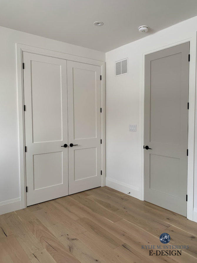
Yes, that door is strangely narrow.
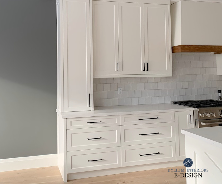
White gets its own category because it’s the color most commonly used in homes. The most common question I get on my Instagram, blog, and Kylie M. Youtube is ‘What’s the best white trim color with Revere Pewter?‘ However, this question also applies to cabinets, adjoining rooms, doors, adjoining walls, and more.
1. BENJAMIN MOORE WHITE DOVE OC-17
It’s an easy win here. In fact, Revere Pewter has a buttload of options for coordinating white paint colors, but White Dove is my favorite.
White Dove is a soft, warm shade of white. This offers Revere Pewter a softer contrast while still being impactful (compared to a true, cleaner white paint color).

Benjamin Moore White Dove: IMAGES, Info, & More
And yes, the very similar Benjamin Moore Swiss Coffee goes with Revere Pewter, but I suggest you read this.
2. BENJAMIN MOORE CLOUD WHITE OC-130
Cloud White is another gorgeous option with Revere Pewter. With a gentle, creamy warmth, but a bit more brightness than White Dove, its contrast is gorgeous. with RP walls.

Benjamin Moore Cloud White: IMAGES, Info, & More
3. BENJAMIN MOORE SIMPLY WHITE
Simply White is another white that goes great with Revere Pewter. It’s the brightest of the 3 mentioned here, but it still has a pretty warm tone.
As for Sherwin Williams, Pure White, Greek Villa, and Alabaster all go with Revere Pewter.
You’ll also find more options and sample images of some of the colors above here…
KYLIE M’S YOUTUBE: Paint Colors that Go With Revere Pewter
QUICK SUMMARY (TL;DR)
- Revere Pewter is a popular, warm gray-greige paint color with a green undertone.
- It goes well with warm, light, neutral paint colors that are lighter than it. This includes muted greens, subtle beiges, and taupes.
- It’s sensitive to blues that are too clean and lack green.
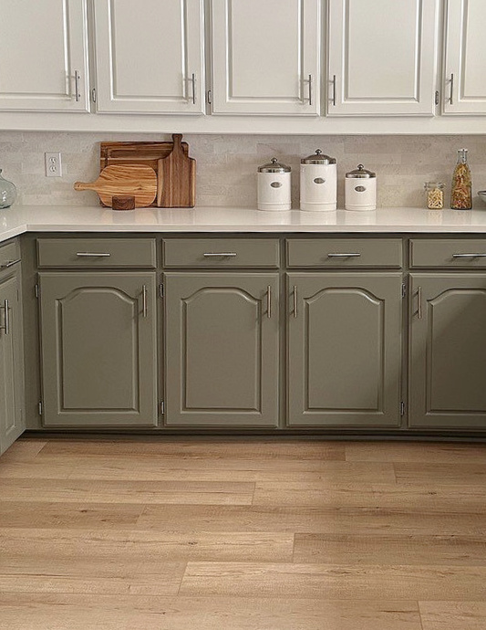
- Medium to dark greens and greiges are beautiful accent colors for Revere Pewter, whether on accent walls, shutters, doors, or cabinets.
- Revere Pewter works best with warm white paint colors
Get the best paint color & home update advice with Kylie M’s Online Paint Color Consulting


Hello
Love your videos. I haven’t seen one on blue/greens that go with revere pewter for adjoining rooms. Maybe I missed it.
I don’t, but seeeeriously, check out BM Raindance and Imperial Gray as places to start! I’ll have to add some to this post, thanks for the reminder!