
Paint Colors & LRV: A Color Experts Guide
What’s LRV & why does it matter?
Have you ever painted your room only to find it looks lighter or darker than you thought it would?
That, my friend, is LRV (Light Reflectance Value).
Before we get into the guts n’ the glory, let me say it took nine hours, three bottles, and 22+ years of experience to research and write this article. And I’m not even remotely scientifically inclined (more artsy-fartsy inclined). However, as an integral part of the Kylie M. Color System, this stuff matters… a lot.
So, let’s grab a glass bottle of wine and settle down for a bit of a read – just because I’m keeping it simple doesn’t mean I’m keeping it SHORT!
WHAT DOES LRV MEAN FOR PAINT COLORS?
Every paint color has an LRV (Light Reflectance Value) on a scale from 0 (black) to 100 (white). This number indicates how light or dark a paint color is compared to pure black (LRV = 0) and pure white (LRV = 100).
A paint color’s LRV tells you its DEPTH (i.e., white, light, medium, dark). You can narrow down your options considerably when you know the LRV range you want your paint color to be in.
That’s right, you no longer have to reference a paint color’s depth vaguely, e.g., ‘it’s light, or it’s dark’—you can state its EXACT depth. While there’s more that goes into it/science, you’re not here for that (if you are, you’re definitely in the wrong place).
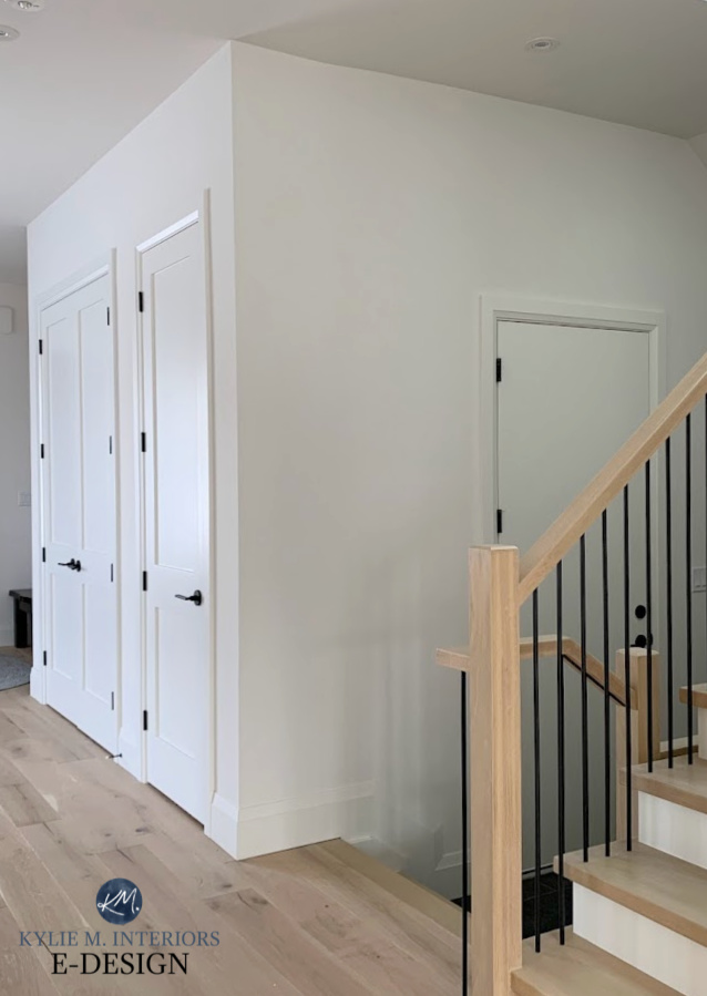
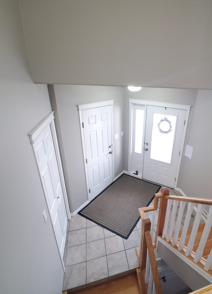
Benjamin Moore White Dove (below) is a white paint with an LRV of 83.16. This LRV reflects a lot of light, as shown on the left side of this photo…
The Best Paint Colors for Light Wood Finishes
However, note the difference in appearance on the right side of the photo, where the walls receive indirect light.
The above is a great example of a color with a reasonably high LRV (83) that uses the natural light it’s given and bounces it around. Alternatively, look at the lower stairwell to see how it reacts when it isn’t given a lot of light to play with.
Colors need LIGHT to come to LIFE!
In other words, don’t expect a color to be a miracle worker if you don’t have enough lighting.
THE ACTUAL ‘USEABLE’ LRV SCALE (for us real people)
While the scale technically goes to 100, in terms of the non-scientific (residential/commercial) paint world, white reaches an LRV of 94 – that’s the whitest white available. This scale goes down to 0 (scientifically), mid-twos are the lowest LRV/blackest colors available in our usable paint world.

Remember, you don’t need to memorize ALL of this (unless you’re a glutton for pushishment). Just take the info that applies to the color/color range(s) you’re exploring and use it to find your best shade!
These numbers will give you a good idea of a color’s depth (how light or dark it is). The ranges below are approximate (two to three points or so) as the lines are blurry (maybe because I’ve had two glasses of wine).
KYLIE M’S LRV SCALE
Others might group depths differently. However, 10,000+ consultations (in-home and online) 25+ years of research, plus 600+ blog posts have led me to conclude the following…
2-10 = DARK PAINT COLOR
10-20 = MEDIUM-DARK PAINT COLOR
20-40 = MEDIUM-DEPTH PAINT COLOR
40-55 = LIGHT-MEDIUM COLOR
55-72 = LIGHT COLOR
73-81 = OFF-WHITE COLOR
82-94 = WHITE PAINT COLOR (with exceptions)
What are these exceptions? Well, some colors have high LRVs, but still have a lot of COLOR (chroma). This means they’re too colorful to be white. These colors often offer a super light, subtle pastel look (and very few of them are even remotely popular, so I don’t focus on them).
MOVING ALONG!
Check out this cute bathroom…
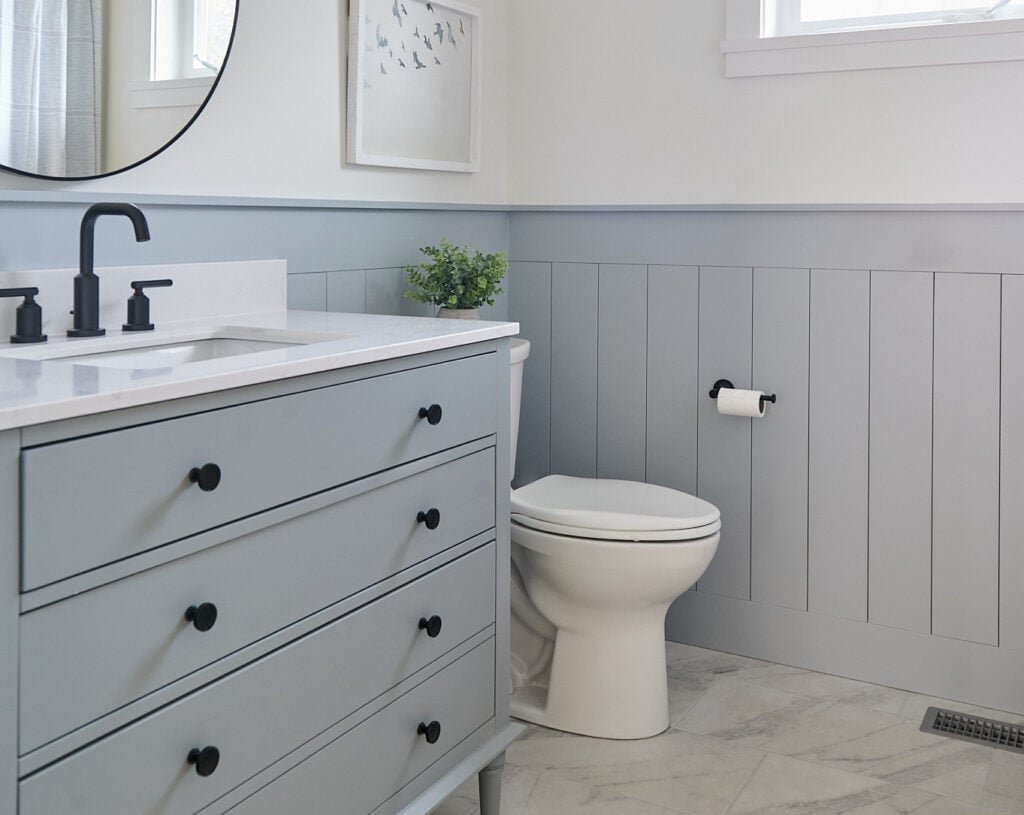
- Benjamin Moore’s White Dove is on the walls, trims, and ceiling. Its LRV is 83.16, which, along with its low degree of color (chroma) makes it a white.
- Sherwin Williams Network Gray is on the lower walls and vanity. Its LRV is 37, which means it falls in the medium range and reflects less light.
- The difference you see in depth between these two colors is represented by their higher vs. lower LRV numbers—cool, eh?
Now, check out Sherwin Williams Rock Bottom. It has an LRV of 7, meaning it’s a DARK paint color and reflects very little light.

The Best Medium to Dark Green Paint Colors
WHERE DO YOU FIND A PAINT COLOR’S LRV NUMBER?
Given how important LRV is to the average paint buyer, I’m surprised some paint companies haven’t made it easier to find.
Here’s where you’ll find the LRVs for a few popular paint brands (or ask a store employee)…
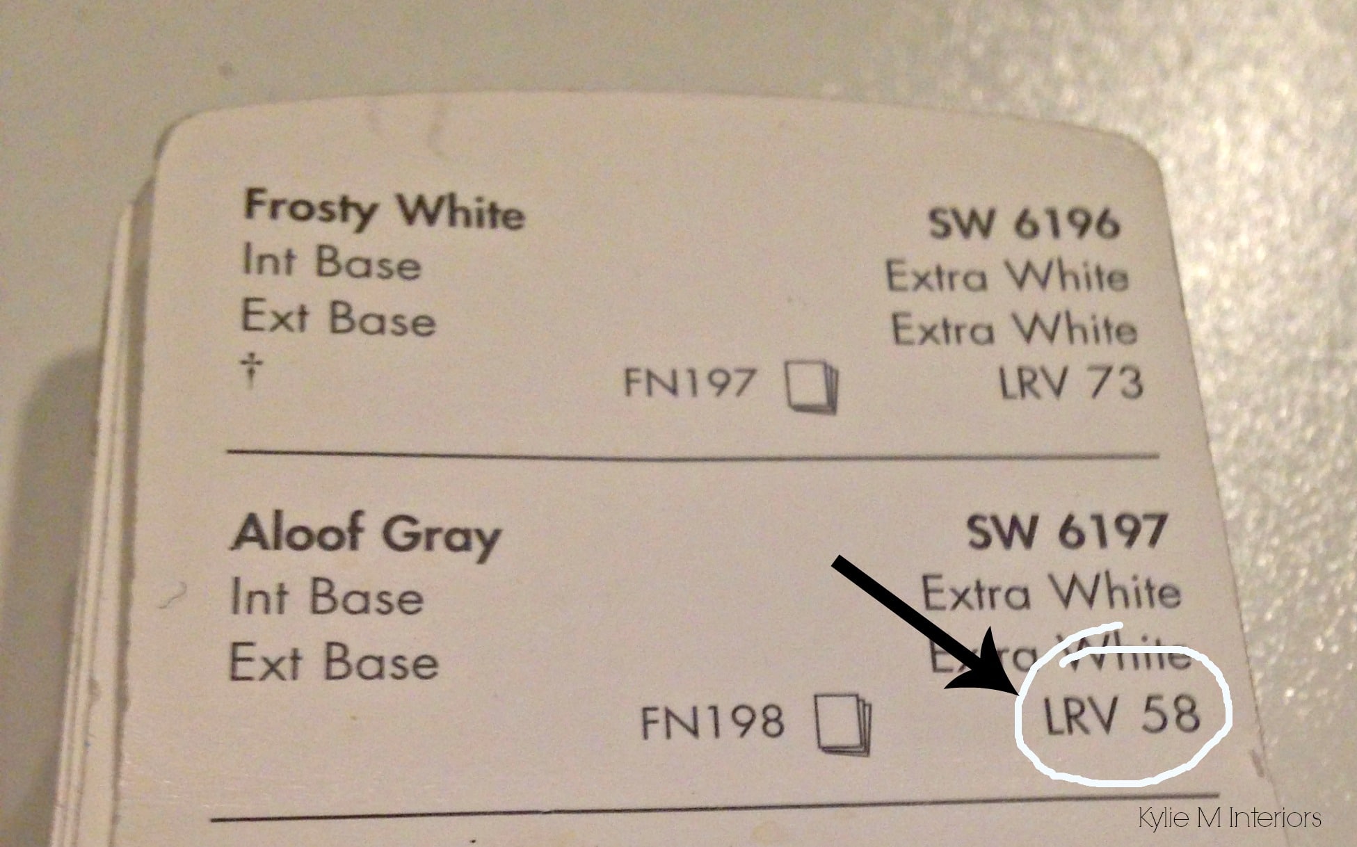
- SHERWIN WILLIAMS LRVs: On the back of each color in the fan deck or on the back of each independent color chip. They also have it listed in the fan deck index and online – thank you, Sherwin Williams!
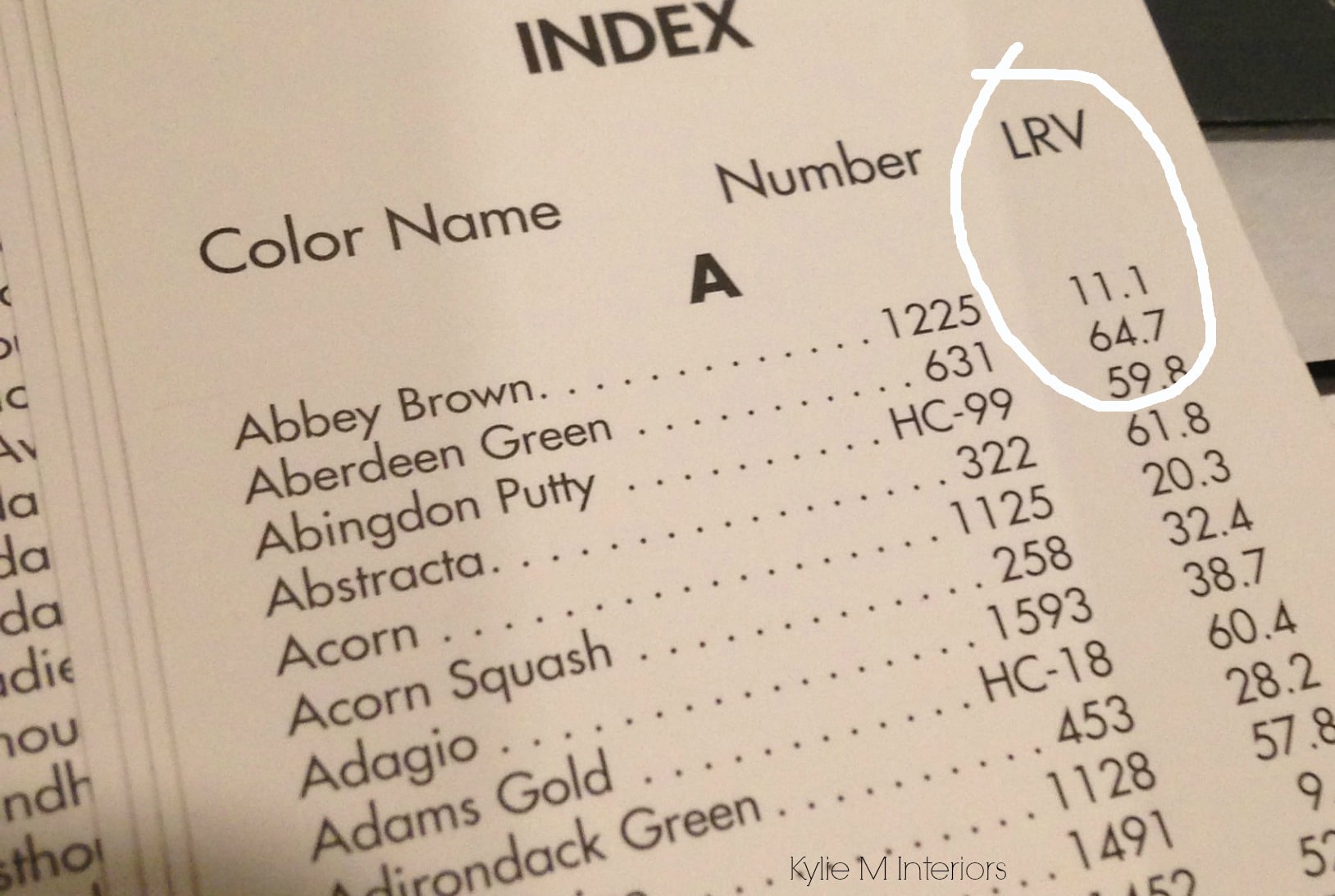
- BENJAMIN MOORE’S LRVs: On the Benjamin Moore website (on that specific color’s page), as well as in the fan deck index.
- FARROW & BALL’S LRVs: They don’t make it easy; you’ll want to write customer service – and good luck with that – thanks for comin’ out F&B
- VALSPAR’S LRVs: Fan deck index
- BEHR’S LRVs: Fan deck index
Here’s what it looks like on the back of the Sherwin William’s color strip (the long row of colors in the fan deck OR on the small samples found in-store)…
And in the index of the Benjamin Moore fan deck…
Wine break. Glug glug glug, I mean sip sip sip. And no, I don’t drink THAT much, it’s just a hobby.
Now, let’s discuss the actual LRV ranges. Again, this is not scientific (others are better at that than me); it’s just a general reference.
WHITE PAINT COLORS & LRV
APPROX. 82+
White paint colors have the highest Light Reflectance Value (LRV) and reflect the most light. The range is from 82 to 94, knowing we don’t have access to whites above 94.
On a side note, just because a color has the word ‘WHITE’ its name (or gray, or beige, or whatever), doesn’t mean it’s white #neverjudgeacolorbyitsname
For example, let’s say you’re trying to find the perfect white paint color for your trims, walls, or cabinets, but you’re comparing several and can’t tell which is lighter. Look at their LRVs, and you’ll know EXACTLY which is the brightest white. From there, compare undertones to see which settles best.

Sherwin Williams Pure White LRV 84 | Sherwin Williams Sensible Hue LRV 46
When you eyeball the whites in this next photo, the only one that’s obviously darker is the sample on the bottom…

Rather than eyballing it, let’s look at their LRVs to see where they stand…
- TOP: Sherwin Williams High Reflective White LRV 93
- 2ND DOWN: Benjamin Moore Super White LRV 87.36
- 3RD DOWN: Benjamin Moore Chantilly Lace LRV 90.04
- BOTTOM: Benjamin Moore Decorator’s White LRV 82.68
Crazy, eh? The shift in these numbers might not seem huge, but on a large scale, you see these LRVs come into play – when there’s more wall space for the color to come to life.
Benjamin Moore White Dove LRV 83.16 | Antique Pewter LRV 25.4
Is White Still Trendy on Walls, Cabinets, & Exteriors?
WHY DOES WHITE OR OFF-WHITE LOOK DINGY IN MY ROOM?
If you choose a paint color with a higher LRV, hoping to make your room look lighter and brighter, but it contains too much gray, it may not fix your problem.
At this point, it’s not about the LRV; you chose a grayish color that’s naturally a bit dingy.
In the next photo, while Benjamin Moore’s White Dove is a popular shade of white (LRV 83.6), notice how it shifts on the upper part of the walls compared to the areas that get natural light – some might call this effect dingy…

The cabinets are Benjamin Moore Chantilly Lace
Personally, I think it has a pretty softness, but if you expect more from your white, you need to clean it up (which can mean more undertone, e.g., yellow or a higher LRV).
Another reason White Dove can look a bit dirty or dingy is that it has less color (lower chromaticity), which means it can pick up more colors from its surroundings. So, give it a room with low natural light and shade, and it can look dingy.
HOW TO PREVENT DINGY/DIRTY-LOOKING PAINT COLORS
If colors still look dingy in the higher LRVs, you have a few options…
- Improve your interior lighting with the right Kelvins, table lamps, floor lamps, and white lamp shades.
- Choose colors with less gray and more color/undertones. Remember, even whites have gray, and most popular off-whites do too.
- Choose a nice, clean white trim to contrast with your color.
A SUMMARY OF WHITE PAINT COLORS
- The LRVs of white paint colors range from approx. 82 to 94.
- White paint colors don’t just reflect light; whites with less ‘color’ or undertone will reflect the color of the light they’re exposed to. For example, if grass or trees outside your window reflect on your wall, it can pick up some of that green hue.
- Just because a color is in the white range doesn’t mean it won’t have undertones—learn about undertones.
OFF-WHITE PAINT COLORS & LRV
APPROX. 73-81
Off-white paint colors have LRVs between 73 and 81. The closer a paint color’s LRV gets to 82, the whiter it appears (with exceptions for colors with a lot of color/chroma, like a super bright, light yellow).
99.5% of the photos in my blog are of REAL HOMES from my Online Color Consulting clients, readers, and friends. While not always magazine-perfect, they’re packed with ideas and proven color choices to help you create a home you’ll love.
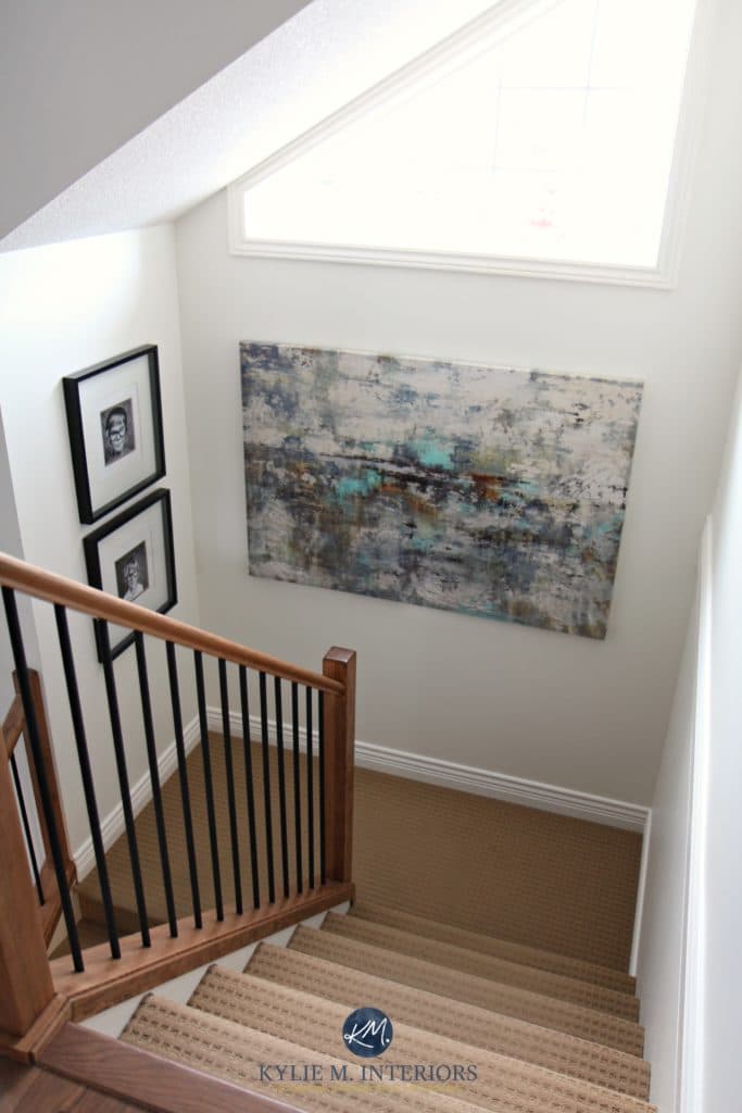
For example, Sherwin William’s Creamy has an LRV of 81—this LRV puts it on the edge of the white range, making it open to perception. In this staircase (below), Creamy looks warm and white, thanks to the natural light from the east-facing window.
Say hi to Doug – a Golden Doodle/Muppet.
However, notice how different Creamy looks down near the carpet/landing on the same staircase.
Paint Colors to Update a Beige Home
In the above photo, Creamy looks less like a warm white and more like an off-white (which it is).
Why?
- Because it doesn’t receive as much natural light to reflect.
- It has a brighter white trim to contrast with.
Another beautiful off-white is Sherwin Williams Aesthetic White. Aesthetic White has an LRV of 73, meaning it’s near the dark end of the off-white range and closer to the light range (which runs approx. 55-72)…
Color Review: Sherwin Williams Aesthetic White
Being a darker shade of off-white than Creamy, you’ll see the contrast between Aesthetic White and white trim or cabinets much more easily.

Sherwin Williams White Duck (LRV 74)
A SUMMARY OF OFF-WHITE PAINT COLORS
- Off-white paint colors have LRVs between 73 and 81 (approx).
- Even though off-whites don’t reflect as much light as whites, they will still wash out in bright rooms.
- Off-whites are popular for resale and as ‘whole home’ paint color options – not too dark, not too light – just right.
- Cool off-white paint colors aren’t remotely popular; only warm off-whites are. That said, if you don’t care about popularity, go ahead and fill your lil’ cool boots!
The 11 Best Off-White Paint Colors
LIGHT DEPTH PAINT COLORS & LRV
APPROX. 55-72
Light-depth paint colors have an LRV (Light Reflectance Value) between 55 and 72. Many of today’s most popular paint colors sit between 60 and 74. Exactly HOW light or dark a color looks depends on how much light your room gets. For example, a room with tons of natural light could make an LRV of 65 look more like 75.

Sherwin Williams Natural Linen (LRV 66)
If you have a dark room, the lack of light could make an LRV of 70 look more like 60.
Sherwin Williams Agreeable Gray has an LRV of 60, which is a great depth start if you’re unsure what you’re doing (you’ll likely want to go lighter from there rather than darker).

Sherwin Williams Agreeable Gray Color Review
In the above image, notice how Agreeable Gray appears on each wall space; it’s lighter on the top-right wall and more clay-like and darker around the door.
Why does this matter?
You might want to adjust your LRV range to higher or lower, depending on how light or dark your room is as a whole.
The light-depth range is the most POPULAR for the average home, especially this specific LRV range.
A SUMMARY OF LIGHT-DEPTH PAINT COLORS
- Light-depth colors have LRVs between 55 and 72.
- Even though light-depth paint colors have lower LRVs (compared to whites and off-whites), they can still wash out with direct hits of natural light.
- In a poorly lit room, some light colors can look flat and drab and won’t come to life – lighten up, Buttercup (with light bulbs).
- In a well-lit room, a color with a high LRV can wash out where it gets direct hits of light. Just remember that this changes a lot as the day progresses, and you have to humor the rest of the walls, too, which may be more shaded.
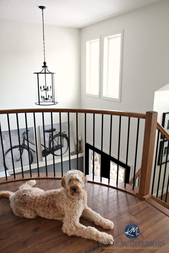
The next staircase is painted Benjamin Moore Collingwood, with an LRV of 61.52. Even with an LRV of almost 62, it washes out in direct bright light…
Paint Color Review: Benjamin Moore Collingwood
If you have a bright room and pair it with a lighter color (usually 55+ is where you’ll start seeing the reflective effect), you’ll have a lot of light bouncing around, as shown in the curved part of the staircase wall above.
Why?
Not only are you giving your walls a lot of light to work with, but you’ve also chosen a paint color that reflects light, as it has a higher LRV.
Subscribe to my Kylie M YOUTUBE channel for more great Kylie M. content!
LIGHT-MEDIUM DEPTH PAINT COLORS & LRV
APPROX. 40-55
Many consultants jump from light to medium, but there’s a HUUUUGE gap in the middle of colors that don’t read as either!
My next Online Color Consulting client was sampling exterior colors with a range of LRVs…

The most important ones for this section are Requisite Gray (45), Versatile Gray (48), Comfort Gray (54), Imperial Gray (46), and Oyster Bay (44).
While Comfort Gray falls within the same light-medium range as the others, it’s in the higher/lighter end of the range.
Did I go too far? STORY OF MY LIFE! Let’s carry on.
As shown in the next photo, a light-medium-depth color like Sherwin Williams Anew Gray offers a nice contrast with the right white trim color.
Light-medium paint colors are also a great starting point when considering exterior colors.
Why?
Natural light can really wash out exterior colors, more so than in the average room.
This is why starting your exterior color journey in the light-medium range can be a great idea.
While you might then choose to go lighter or darker, this range is a good starting point, as shown again with Sherwin Williams Anew Gray…
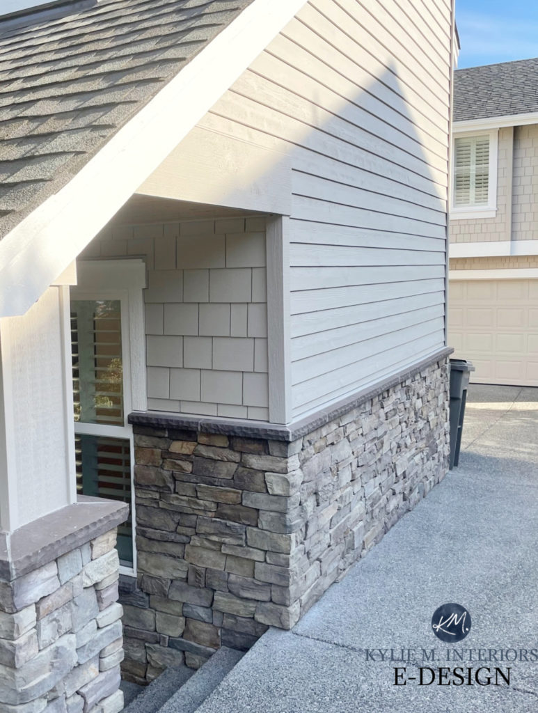
Seriously, look at the difference between the lower half of the siding and the upper half.
A SUMMARY OF THE LIGHT-MEDIUM PAINT COLORS
- Light-medium paint colors have an LRV between 40 and 55.
- Paint colors in the light-medium range hold up a bit better in super bright rooms. They’ll look lighter where the light hits, but won’t wash out as much as whites, off-whites, and light-depth paint colors.
- The light-medium depth is ideal for those who want to showcase moldings or create more contrast between their walls and trim.
- This depth is popular for ‘whole homes‘, but not as hot as off-white and light depths.
MEDIUM-DEPTH PAINT COLORS & LRV
APPROX. 20-40
Medium-depth paint colors have LRVs between 20 and 40. The lower the LRV, the darker the color.
Sherwin Williams Dovetail is shown on this next kitchen island (LRV 26) with Agreeable Gray on the walls (LRV 60)…
Even a medium-range paint color will lighten up when given some light to work with (as shown below). Remember, every paint color has light reflectance (even dark ones).

Notice how Foggy Day (20) lightens on the left and darkens down the hallway.
A SUMMARY OF MEDIUM-DEPTH PAINT COLORS
- Medium-depth colors fall within 20 to 40 (LRV, approx).
- Light-medium and medium-depth colors are great for super bright rooms. ANY paint color will look lighter when light hits it, but the darker a color is, the more it will stand up to an overly bright space.
- This range is popular for accent and feature walls, as well as exteriors, but it can look amazing on all the walls in a room.
- Paint colors with medium-range LRVs reflect a moderate amount of light, especially in the middle of the range.
- In a poorly lit room, medium-range LRVs can look flat and drab, especially neutral ones.
- In a room with poor lighting, paint colors in the medium range will take ANY light they can and reflect it into the space, but don’t expect any screamin’ glory. If you don’t want to choose a lighter color, consider a paint color with more color/vibrancy/less neutral to help counteract the shade vs. going with a more standard neutral paint color.
This next room is painted with Sherwin Williams Retreat, which has an LRV of 21. This puts it between the medium and medium-dark range. If you like colors in this range, you might look for colors with LRVs between, say, 15 and 25.
Sherwin Williams Retreat Color Review
MEDIUM-DARK PAINT COLORS & LRV
APPROX 10-20
Just as with light-medium depth paint colors, medium-dark paint colors are the ‘happy mediums’—literally, between the medium-depths and the dark range.
Benjamin Moore Amherst Gray (shown below with one of the best warm white paint colors on the cabinets) is a medium-dark gray.
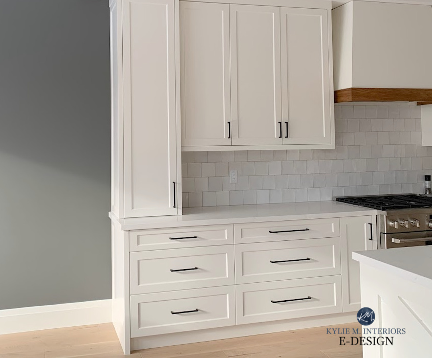
Notice how Amherst Gray appears darker at the top of the wall, but brightens where the light hits.
Why?
Although its LRV is lower, it still reflects light. This means that when hit with light, a color like Amherst Gray will reflect some light back!
Remember, dark paint colors reflect light too!
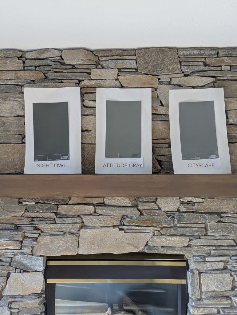
SW Night Owl (13) | SW Attitude Gray (20) | SW Cityscape (22)
Check out the above samples. Notice how Night Owl, with its LRV of 13, is visibly darker than the medium-depths of Attitude Gray and Cityscape (although they definitely wink at the medium-dark range).
A SUMMARY OF MEDIUM-DARK PAINT COLORS
- The medium-dark range runs from approx. 10-20 (LRV)
- Medium-dark colors are darker than the average medium-depth paint color.
- Medium-depth colors don’t have the (sometimes intimidating) depth of traditional DARK paint colors.
- These darker shades are super popular on feature and accent walls.
- Medium-darks are also found on kitchen cabinets, but are far more popular on painted kitchen islands.
- Exteriors look amazing in medium-dark shades, as many of the top shades complement the brick and stonework, as well as white trim.
Benjamin Moore’s Best DARK Gray & Charcoal Paint Colors
DARK PAINT COLORS & LRV
APPROX 2-10
These are the heavy hitters. While not all of these are black, once you get under 6, be ready for a wickedly dark color.
Sherwin Williams Cyberspace (below) is skookum with an LRV of 6. In a well-lit space, this color can look soft, stunning, lighter, and more colorful as the undertones come up. However, in a low-light room, it can appear closer to black and lose some of its color/hue.
In fact, dark colors can almost look blackish in dark rooms.
This next room shows Cyberspace again. Notice how it changes in color and depth from left to right based on the amount of light it receives…
Compare the wall space on the far left with that on the far right. No light = no reflective value.
Paint Color Review of Sherwin Williams Cyberspace
Sherwin Williams Gauntlet Gray (LRV 17) is another popular dark, warm gray paint color…

Color Review of Sherwin Williams Gauntlet Gray
As for black, one of my favorite shades is soft black called Iron Ore, coming in hot with an LRV of 6. Check it out at the end of this kitchen island…
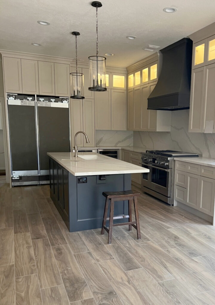
- Compare the end of the island to the range hood: the island gets light and reflects it; the range hood doesn’t.
Cool, eh?
Here’s Iron Ore looking badass and beautiful again…

- The left side of the built-in cabinets gets direct light, making Iron Ore look lighter.
- The right side gets minimal light, making Iron Ore look more ‘black’ than soft black.
Now, let’s go big or go home with Sherwin Williams Tricorn Black, and it’s wickedly low LRV of 3…
The Best Black Front Door Paint Colors
A SUMMARY OF DARK PAINT COLORS
- Paint colors with a lower LRV will reflect some light, but not tons. If a color’s LRV is 10, it will absorb a lot of light and reflect a smaller amount. If you want a dark color to look lighter, give it a lot of light.
- IN A DARK ROOM, dark color won’t come to life and won’t reflect light (as it hasn’t been given any, and it has a low LRV to boot, double-whammy).
- Dark paint colors are super popular on accent walls.
- While some paint their kitchen cabinets a dark color, they’re far more popular on painted kitchen islands.
- Front doors (inside and outside) can look striking in a well-chosen dark paint color.
- While exteriors can be painted dark colors, remember that they absorb more light and can fade a lot faster.
FREQUENTLY ASKED QUESTIONS
LRV isn’t an easy idea to wrap the ‘ole noggin’ around, and you probably have questions. If I don’t answer them below or in this blog post – leave a comment!
WHAT’S THE BEST LRV FOR A DARK ROOM?
Choosing a light paint color may be better for a dark room if you want to brighten it, but it won’t save the day—you need actual light for the paint color to play off and reflect.
One way to add brightness to a dark room, along with LRV, is to choose a color with more chroma/color vs. a more standard neutral paint color (and improve your lighting).
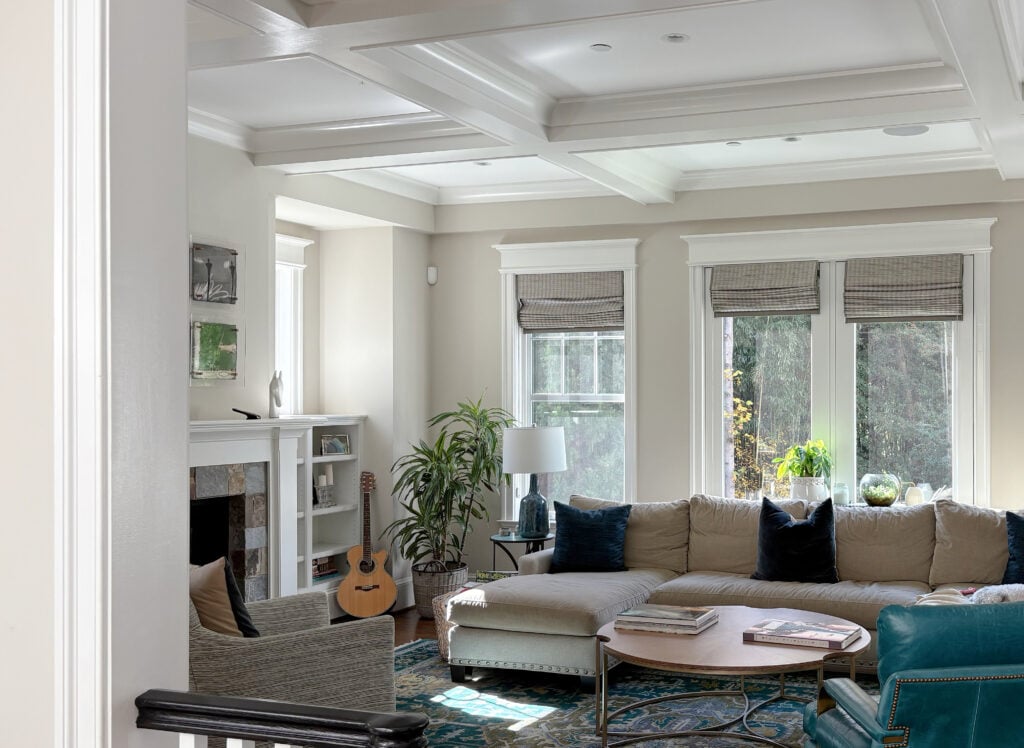
The next photo shows a room painted in one of the most timeless, neutral paint colors: Benjamin Moore Revere Pewter. Notice that there isn’t much light, which affects how Revere Pewter looks—its LRV isn’t being used very well.
In this next photo, the bedroom is painted in Revere Pewter (not the bathroom)…

Paint Color Review of Benjamin Moore Revere Pewter
- The above room has a good amount of natural light on the left side, making Revere Pewter look just right (the bathroom is Wickham Gray).
- On the right side of the photo (outside the bathroom entrance), there’s less natural light, and Revere Pewter looks darker.
This example shows how a neutral that appears perfect in a well-lit space can look drab and dingy in a low-light room, even with a moderate LRV of 55.51.
We need to lighten up, baby!
And to answer your question about the best LRV for a darker room…
- Paint colors with an LRV of 74 or higher.
- Consider how much gray vs how much color your chosen shade has. Even a high-LRV color with a decent gray or beige base can look dingy. Consider a bit more ‘color’ vs less.
WILL NATURAL LIGHT CHANGE MY PAINT COLOR’S LRV?
Natural light won’t affect your paint color’s LRV; it is what it is. However, the more light you give a color, the more light it will reflect, especially if it has a higher LRV.
This dining room (below) is painted Sherwin Williams North Star, which has an LRV of 62. Because the room has a lot of natural light, North Star looks a bit brighter than expected, however…

The Best Creamy White & Off-White Paint Colors
The walls in the staircase are painted Sherwin-Williams Pearly White, (LRV of 77). Because the staircase doesn’t get as much natural light, the walls look darker than the dining room, even though Pearly White’s LRV is considerably higher!
Colors with higher LRVs reflect MORE light; colors with lower LRVs reflect LESS light. But if you don’t GIVE them light, it won’t matter.
So, even if you pick a light color with a high LRV, if you don’t give it light to reflect, it won’t rise to the occasion, which goes back to one of my favorite sayings (I have about 80)…
No paint color will save you if you don’t have enough natural or artificial light.
But, of course, there are those (like myself) who aren’t afraid of a dark color in a dark space – in which case, fill yer lil’ moody boots!

WHEN YOU LIGHTEN OR DARKEN A PAINT COLOR, DOES ITS LRV CHANGE?
HECK YES, it does. Any change you make to a paint color will alter its roots, and the LRV will increase or decrease, depending on the extent of the change.

Read more right here… LRV, Paint Colors & YOU.
When you lighten or darken a color, you’re creating a new color. While it might have similar roots, its DNA has changed. MOST times, you get a ‘lighter version of what you started with,’ but sometimes, the undertones change more noticeably – it depends on which tints were used to make the original color.
I have several lightened and darkened paint colors in my home. I’m a big fan of tweaking colors to get the look I want.
WHAT’S A GOOD LRV?
Here are some basic guidelines to consider. Keep in mind that these are just starting points. If you want a different look, it might be outside of these ranges.
- THE AVERAGE SINGLE ROOM: LRV 60-70
- FOR EVERY ROOM IN AN ENTIRE HOME (PAINTED 1 COLOR): 65-75
- KITCHEN CABINETS: LRV 82-94 (or 45 and lower)
- FEATURE WALL: ANYWHERE FROM 2 (black) to 50, BUT 30 IS A GOOD AVERAGE
- EXTERIOR: 35-60
- FRONT DOOR: APPROX. LRV 10 – 20
Again, the above numbers can vary; these are just good baselines for your color journey.
In this home bar, my client wanted a moody atmosphere, as she called it her ‘bat cave’. But at the same time, we didn’t want it to look too heavy…

The Best Dark Teal Paint Colors
We settled on Sherwin Williams Still Water LRV 10 as the perfect dark blue-green blend. Also, notice how much I love it when my clients know my personal tastes, if you know what I’m sayin’…
On the other hand, this hallway has a range of light, from no natural light to an adequate amount…

Paint Color Review of Sherwin Williams Antique White
We settled on Sherwin Williams Antique White (LRV 72) to add warmth and interest in the dark areas without making the lighter areas too yellow or overwhelming.
WHAT’S CONSIDERED A HIGH LRV?
The higher the LRV number, the lighter the paint color. Paint colors with LRVs of 74+ (off-white and white paint colors) are considered HIGH LRVs.
The Best Light Paint Colors for a Darker Room
So there you have it – LRV in a big, fat nutshell.
PARTNER POSTS…
LRV & Paint Colors: The Answers to Common Homeowner Questions
How to Choose Paint Colors for Any Room
Create a Cabinet & Wall Color Palette Using LRV
Learn More About the Kylie M Color System
Get the best paint color advice
Check out my Online Color Consulting Services!


Updated with fresh, new content and images for 2026


Hi Kylie, this is a really informative post. Thank you for confirming my observations with the LRV.
I am in the middle of having my home prepped (today) and still am deciding on color. My home is a very open concept with lots of light. In general for decor, we are on the contemporary side. Taupe has been on my walls, whole house, but I want to lighten it up without having it too bright or reflective. Color wise, I wouldn’t mind staying in the taupe range in undertones but much lighter, near white because I like to accent with gray and tans in my space. I was looking at Sherwin Williams’ Origami, Sanctuary, Lunar Lite. However, I think they won’t be light enough for what I want to achieve. If this makes a difference, we do not have baseboards or crown molding. For me, this is a clean, more minimalistic and modern look. I mention this because my preference is not to have that contrast between the trim and wall. I could write more! I guess all-in-all, I want to be careful of the undertones as well. No yellow, pink, blue, green…only neutral. Oh, and I also love having my own color mixed. Maybe 40% less for one of the colors I mentioned? Thoughts? Thank you!!!
This was such an interesting and easy-to-understand breakdown of LRV, something that often feels too technical for most homeowners. I really like how you’ve simplified the concept and explained it with real examples, especially how lighting affects how a colour actually looks in a space. The point that “colours need light to come to life” really stands out and is something many people overlook when choosing paint. This kind of insight can genuinely help avoid costly mistakes. Great mix of expertise and practical advice!