
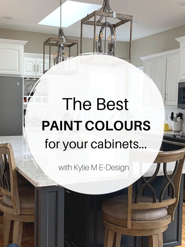
Trendy & Popular Paint Colors for Your Kitchen Island (Mixed Bag!)
ISLANDS, VANITIES, LOWER CABINETS? THESE COLORS HAVE EM’ COVERED…LITERALLY
It’s hard to beat paint when it comes to affordable kitchen and bathroom updates. However, whether you have wood cabinets or ones that are already painted, whipping out the paintbrush can seem like a big job.
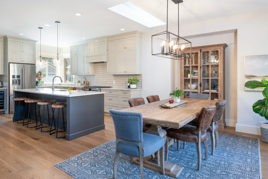
This is why kitchen islands are so friggin’ awesome. On a large scale, they’re small potatoes compared to painting ALL the cabinets. However, they still add a HUGE bang for buck (as do bathroom vanities)! As for lower cabinets, some people are looking to mix it up with white upper cabinets and something a bit more exciting on the lower half (Tim always says my lower half is more exciting than my upper half). However, painting all of your lower cabinets (depending on the size of your kitchen) sounds like a lot of blood, sweat, and beers; hey, if you’re game – count me in!
What colors are BEST? Where do you even START?
Right here. But before we get started, let’s have a little chat.
Not every paint color will suit every kitchen or bathroom—each space has unique needs. This is why it’s so important to sample and compare.
If you don’t know what color you want, have some fun, sample a wide range, and see what complements your finishes.
Once you’ve narrowed down your favorites, research those particular colors to see if they make sense for your space. And if all else fails, you know how to call (or email)—wink, wink.
Now let’s see what I have up my colorful little sleeves…
THE MOST POPULAR ISLAND PAINT COLORS
These are my ‘ride or die’ colors; shades I turn to again and again when doing my Online Paint Color Consulting. While I often veer off the path into a stunning shade of dark green or something more wild and wonderful, these are the first to come to mind.
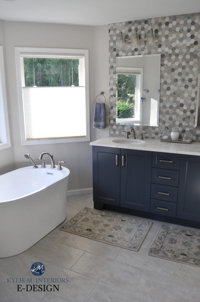
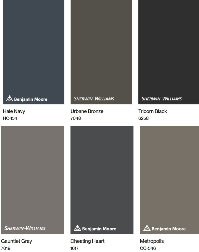
1. BENJAMIN MOORE HALE NAVY HC-154
Hale Navy, from Benjamin Moore’s Historical Collection, is a classic shade of blue. Some navy blues are too strong for the average kitchen and bathroom (e.g., Sherwin Williams Naval), while others don’t pack quite the punch a homeowner is looking for (e.g., Sherwin Williams Cyberspace—a personal fave). Hale Navy sits smack dab in the middle, offering a soft pop of color, but in a stately way. This makes it a great place to start sampling.
With an LRV of 8.36, Hale Navy is in the dark range without being blackish. Stuck between the nautical world and a more traditional approach, Hale Navy is a great happy medium for the average home and homeowner.
Check out this next little gem of a bathroom. With a funky hexagon wall tile and white quartz countertop, Hale Navy pulls into the tile’s blue undertones while grounding the space so the tile doesn’t take over.
If you love Hale Navy and want to see some comparable hues to make sure it’s THE blue for you, check out my Peel & Stick CURATED DARK BLUE COLOR BUNDLE for more stunners!
FULL Paint Color Review of Benjamin Moore Hale Navy
The 13 Best Dark Blue Paint Colors
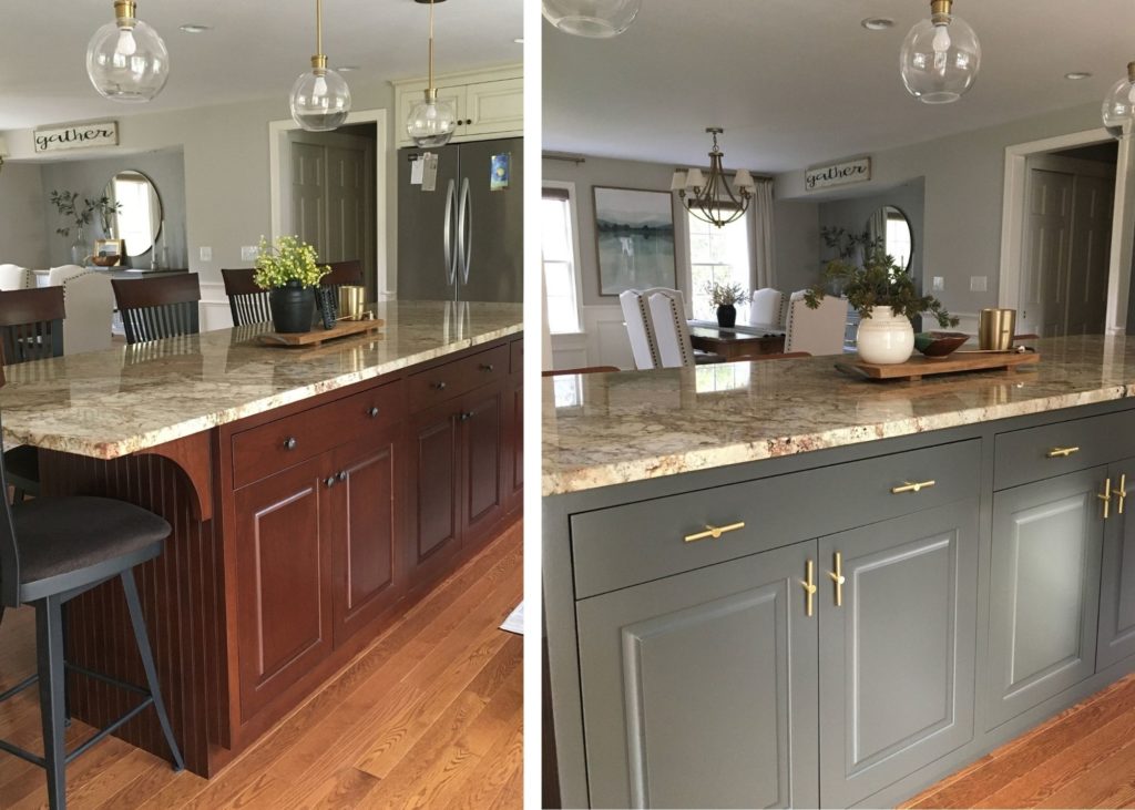
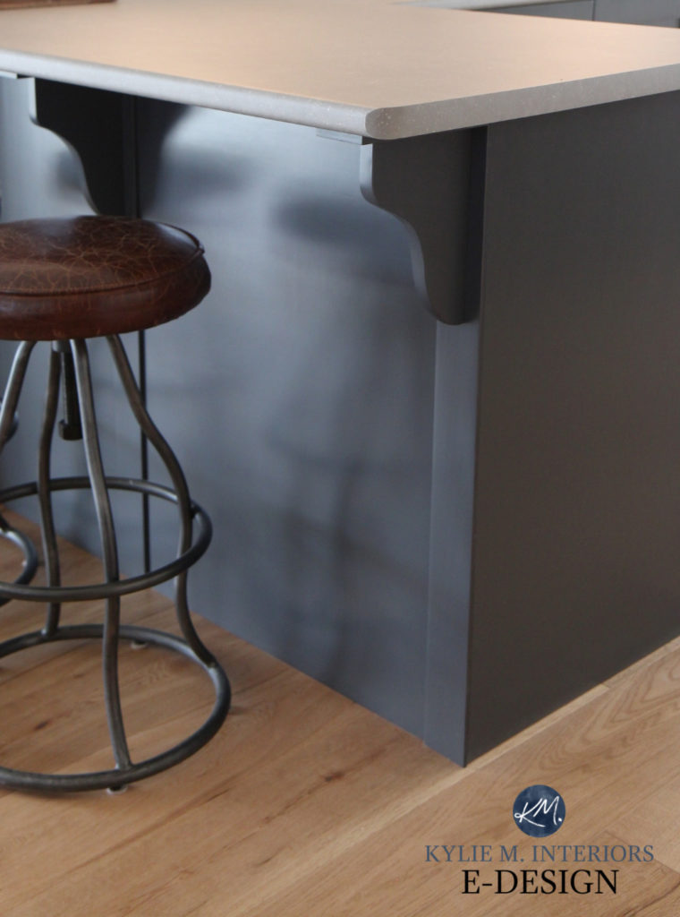
2. SHERWIN WILLIAMS URBANE BRONZE SW 7048
It’s amazing HOW MANY laminate, granite, and quartz countertops look fabulous with Urbane Bronze – it’s like this universally beautiful color! Now, this isn’t to say it will be great with your particular countertop, but of all the greiges out there, it’s the best in my books and an awesome one to start your journey with.
Urbane Bronze island with Benjamin Moore Pashmina main cabinets (maaad love)
Urbane Bronze is a dark shade of greige with a skookum LRV of 8. It also harbors a sneaky but stunning green undertone. We have Urbane Bronze on our kitchen island as well as our stair railings. Ask my husband what color it is, and he’ll say, ‘Ummm, I don’t know, kind of like a warm gray?‘ Ask ME what color it is, and I’ll say, ‘Greige, thanks to that beautiful green hue you see!’ The thing is, Urbane Bronze is open to interpretation, so if you want a wink of color without a big commitment, it could be the perfect choice for you.
Here’s Urbane Bronze in our kitchen with Benjamin Moore Revere Pewter on the main cabinets and White Dove on the walls…
To see colors that compare with Urbane Bronze – maybe something a bit lighter, greener, etc. – check out my Peel & Stick CURATED DARK GREIGE COLOR BUNDLE.
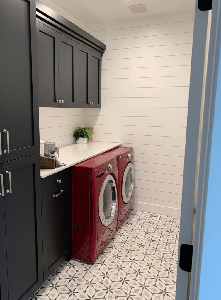
3. SHERWIN WILLIAMS TRICORN BLACK SW 6258
Guess who’s black—black again (epic Eminem reference for my fellow Millenials dipping into the Gen Z pool). Seriously, though, Tricorn Black is wicked pretty. So many blacks pick up blue, violet, or green—not Tricorn Black. This gorgeous shade is Sherwin William’s most popular black paint color because it’s just…black. No secret undercurrents, no ulterior motives, just an uber-sexy, sultry shade of black.
Now, how I don’t have a photo of this on a kitchen island is BEYOND me, but since I only use photos from my readers and Online Color clients, I’ll show you this pretty laundry room instead…
Are you not sure if Tricorn Black is the perfect shade of black for you? Compare similar shades in my Peel & Stick CURATED BLACK COLOR BUNDLE!
4. SHERWIN WILLIAMS GAUNTLET GRAY SWW 7019
While Urbane Bronze might have my heart, Gauntlet Gray has stolen the hearts of MANY of my clients on cabinets, walls, and even exteriors!
This gorgeous dark shade of gray is throwin’ down the gauntlet in the gray world, bringing in WARMTH and minimal undertones. Gauntlet Gray is flexible and non-committal. With its LRV of 17, this gorgeous gray is a great way to ground a kitchen or bathroom without overwhelming it.
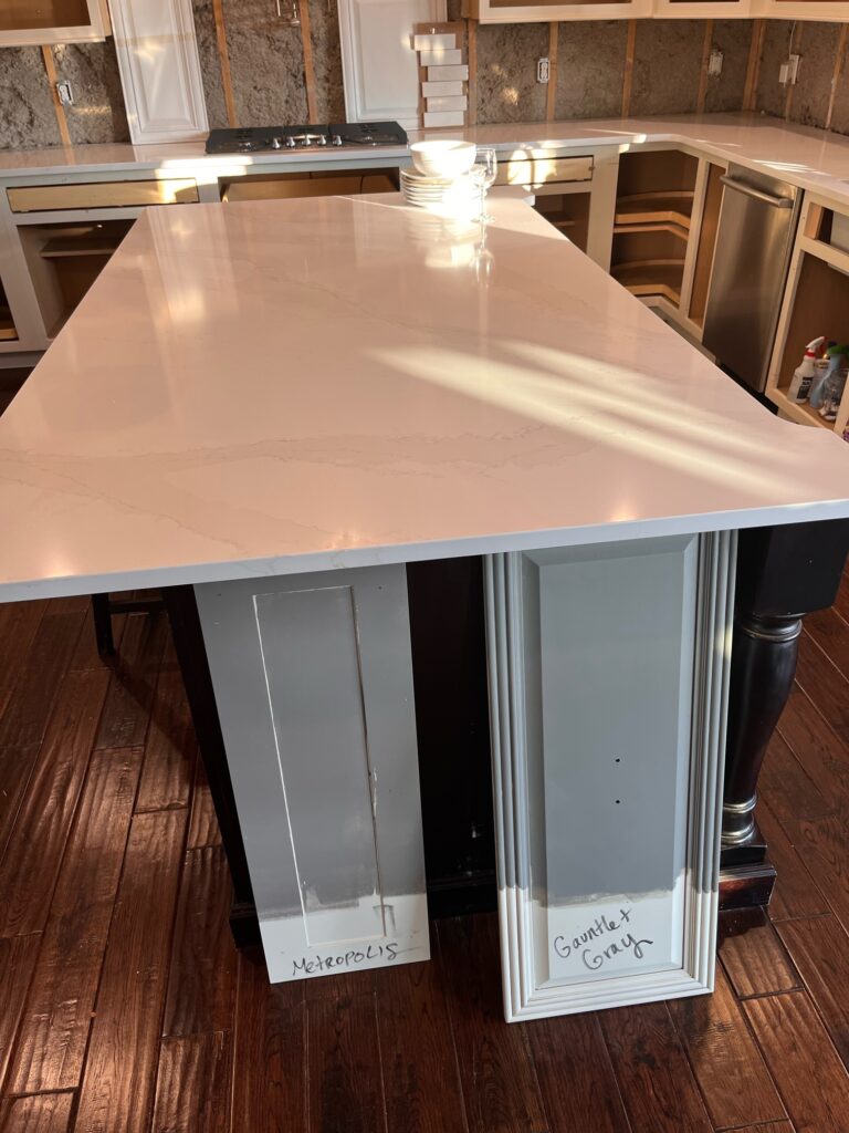
Gauntlet Gray (above right) is often in the running for the same project as Benjamin Moore Metropolis (left), which we’ll be checking out shortly. It really comes down to how much warmth your surrounding finishes need. This is why sampling a range of the same color is important (once you narrow down with COLOR you want to focus on).
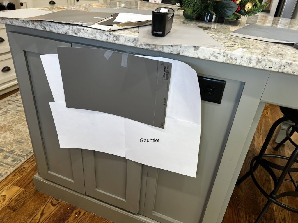
In this next photo, my client wondered if there was a better color for her granite countertop. The current color is Benjamin Moore Chelsea Gray…
FULL Paint Color Review of Sherwin Williams Gauntlet Gray
Chelsea Gray actually looks great with her countertop. However, if you ask me (which she kind of did), the type of warmth in Gauntlet Gray satisfies her countertop just a bit more. This is why you never want to just sample ‘one color’—sample a range of colors, both similar and different, to see if there might just be ‘something better’ out there!
If you want to compare colors similar to Gauntlet Gray, check out Sherwin Williams Dovetail, Benjamin Moore Metropolis (coming up shortly), or check out my handy DARK GRAY COLOR BUNDLE to save time and money!
8 Pendant Lights That Are Like Botox For Your Kitchen Island
5. BENJAMIN MOORE CHEATING HEART
I understand why people love Hale Navy; it’s gorgeous. But if you ask ME which navy-inspired color is my fave, it has to be Cheating Heart (or Sherwin Williams Cyberspace). Don’t get me wrong – Hale Navy is GORGEOUS for cabinets, absolutely, but personally, I love a more muted, gentle approach to dark blue.
However, you might be hard-pressed to call Cheating Heart a dark blue. This is because this wickedly dark shade is a mix of blue, black, and charcoal gray. While its LRV of 8.79 isn’t in the black range, its more subtle hint of blue makes it look pretty darn neutral compared to stronger shades. But it ain’t, this baby is blue.
FULL Paint Color Review of Benjamin Moore Cheating Heart
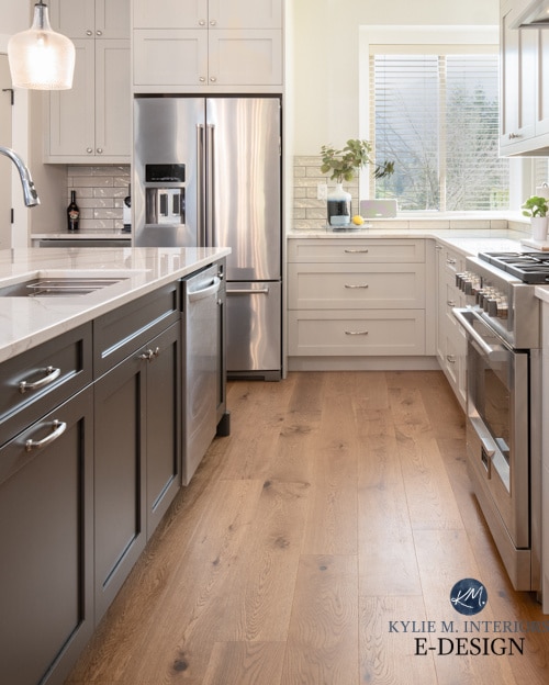
6. BENJAMIN MOORE METROPOLIS CC-546
Whether it’s a new build, kitchen remodel, or just a fun kitchen project, Metropolis pops up in SO many homes.
Why?
Some grays are too cool-toned for some of the older-style granite countertops. Others have the wrong undertone to suit a countertop’s particular flecks or veining, especially more modern white quartz countertops. This is where Metropolis comes in.
Compared to Gauntlet Gray, Metropolis is a tone lighter and a bit warmer—this warmth and depth can hit the perfect spot. Metropolis (also known as Eagle Rock 1469) has an LRV of 24.46, so it’s the lightest option on this page, settling in the more moderate medium depths.
If Metropolis is looking pretty darn good, and you want to double-check by comparing similar shades, check out my Peel & Stick CURATED DARK GRAY & TAUPE COLOR BUNDLE.
My next client painted her wood, cathedral-style cabinets white on top with Metropolis on the lower cabinets only…
FULL Paint Color Review of Benjamin Moore Metropolis
This is about as cool as you can expect Metropolis to look, as it often looks warmer than shown above. It’s likely the higher Kelvin lighting influencing things.
Did you know you can get ALL of these colors in one spot? Thanks to my peeps at Samplize, I was able to partner with them for the previous bundles, as well as this bad boy.
READ MORE
The Best Dark Blue & Green Paint Colors for Kitchen Islands
The 15 Best Neutral Paint Colors for Islands, Cabinets, & Vanities
How to Update Your Oak or Wood Cabinets
The Best Backsplash Tile Ideas to Update Your Granite Countertop
NEED HELP?
Check out my Online Paint Color Consulting – let me choose your colors for you!


Hi Kylie. I’m trying to update my kitchen cabinets in a north facing room. I’m working around existing yellow creamy undertone walls, golden st Cecilia granite and busy brown tile flooring. I’m trying not to go too light to make the floors disappear. I’m considering the following SW colors: canvas tan, natural linen, and natural tan. I’ve ordered samples of all 3 from your sight through sampilizer. I would love your input. Thank you for very helpful blogs!!!
Hi Kylie, i am painting my kitchen cabinets. Benjamin Moore “simple white” but I need a contrasting colour for my island.
Was thinking oh with Balboa Mist or Collingwood.
Countertops are also whitish colour same with floor. I currently have balboa mist on the walls. And collingwood in another room
What are your thoughts? Would really appreciate your feedback.
Love all your content
Just found your blog. We are soon redoing our 1970 kitchen. They are solid red oak slab doors with visible hinges. I was looking to replace, but costs have gone way up, and we have a few projects in this house. I’m going to be adding an island and hopefully a pantry. I have debated sanding down and restaining the cupboards as the trim in our house is the same. It is a medium oak, not orange. I have painted the living room a dark green with grey and bluish undertones. It has warmed the trim up. The other option is to go darker stain. I don’t do white kitchens. I just can’t handle white cabinets. So I’m debating the original medium oak on a slab door or black. If I kept the original color, I think I could come in with a new island and paint it black. Pantry will be harder. How do I integrate that? I love the ideas you have for the soffit. Need to do something with that if we stay with the same cabinets. Will the black cabinets hurt resale? The room is very very bright. We updated our lighting also, which makes it even brighter.