
Sherwin Williams Comfort Gray 6205: Paint Color Review
The most BEAUTIFUL shade of green…or is it?
Are you looking for a relaxing shade of green—a green that’s calming, soothing, and spa-inspired? You’ve come to the right place. However, while Comfort Gray is gorgeous, it might not be the exact green you’re looking for. Let’s find out why.

WHAT TYPE OF COLOR IS COMFORT GRAY?
Ahhhhh, here’s the crux of it all: What exactly IS…Comfort Gray? Well, at its heart, it’s a green-gray blend. However, thanks to its particular blend of undertones, sometimes it just isn’t that green.
Like its lighter cousin, Sherwin Williams Sea Salt, Comfort Gray is a bit unpredictable. Sure, it CAN look like a gorgeous, moody green-gray, but other times, it picks up a bit more blue than expected, to the point that it might not be as green as you hoped.
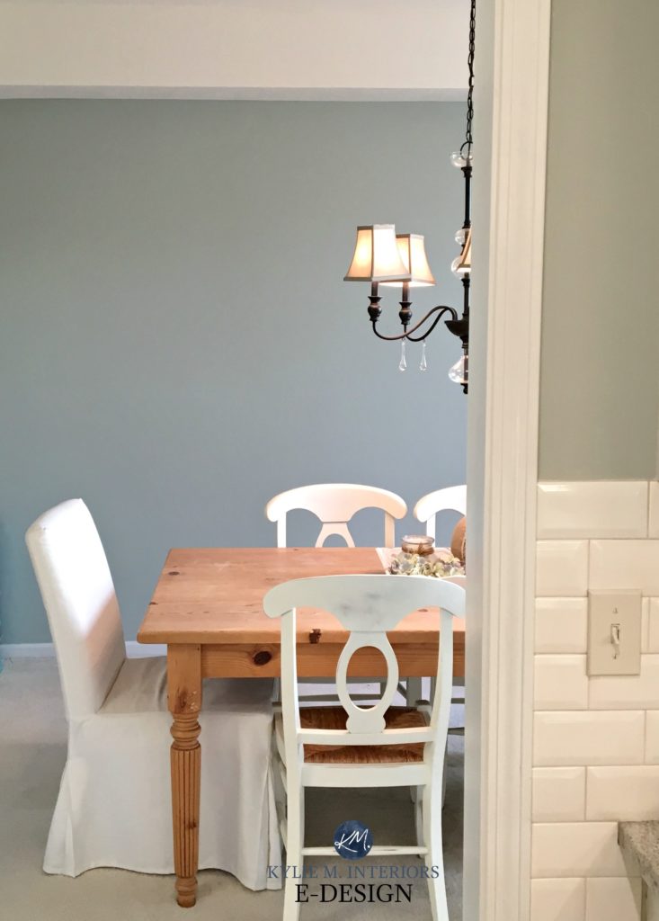
If you were expecting Comfort Gray to look like the wall on the right, it more often looks like the room on the left.
Long story short, it’s green…ish. This doesn’t mean it’s not pretty; just compare it to similar shades (which we’ll do shortly) to make sure it settles how you want it.
Now, being a green-gray that can grab blue, Comfort Gray is a cool paint color. This makes it a great choice for south-facing rooms or spaces with western exposure, helping to balance out the warmth of the sunshine! As for rooms with northern light, while it has a reasonable amount of color, it’s not always colorful enough to withstand a cooler or flatter light.
WHAT’S COMFORT GRAY’S LRV?
Comfort Gray has an LRV of 54, making it a light-medium depth paint color, but it is definitely on the HIGHER side of this range. This slightly lower LRV, along with its extra bit of color, makes Comfort Gray a beautiful choice for bright and light rooms. If your room is dark, it’s hit and miss, as depending on your exact situation, it might not have enough ‘color’ to withstand low light (add a few lamps with white shades!)
Not sure what LRV is? It could save your paint-lovin’ life – read all about it HERE.
The Best LIGHT Paint Colors for a DARK room
WHAT ARE COMFORT GRAY’S UNDERTONES?
As discussed earlier, Comfort Gray is tricky. While it’s green at heart, it has a WHACK of gray in it (whack being a super technical term) and a tendency to grab a blue undertone – more often than not. However, it can come down to perception. If you’ve lived with blues, Comfort Gray might seem super green in comparison. However, if you’re wanting a more legit approach to green-gray, Comfort Gray might seem way too green-blue.
WHAT’S THE BEST WHITE TRIM OR CABINET COLOR WITH COMFORT GRAY?
Comfort Gray is PRETTY darn comfortable with a wide range of whites, including bright and warm ones. Here are a few of my favorites…
- Sherwin Williams Pure White
- Sherwin Williams Alabaster (expect the yellow undertone of Alabaster to show up a bit more against Comfort Gray)
- Benjamin Moore Chantilly Lace
- Benjamin Moore White Dove
The 4 Best White Paint Colors from Sherwin Williams
IS COMFORT GRAY A GOOD EXTERIOR COLOR?
While most people lean into neutral siding or stucco colors, leaving the ‘color’ to the front door or shutters, Comfort Gray is one shade that’s super liveable on an exterior. It’s not just that it has gray to calm it down, its cool vibe offers a beautiful contrast with white trim and windows for a slightly coastal, beachy vibe (without an abundance of color.)

5 Tips for Choosing an Exterior Paint Color
Does Your Exposure REALLY MATTER When Choosing EXTERIOR Paint Colors?
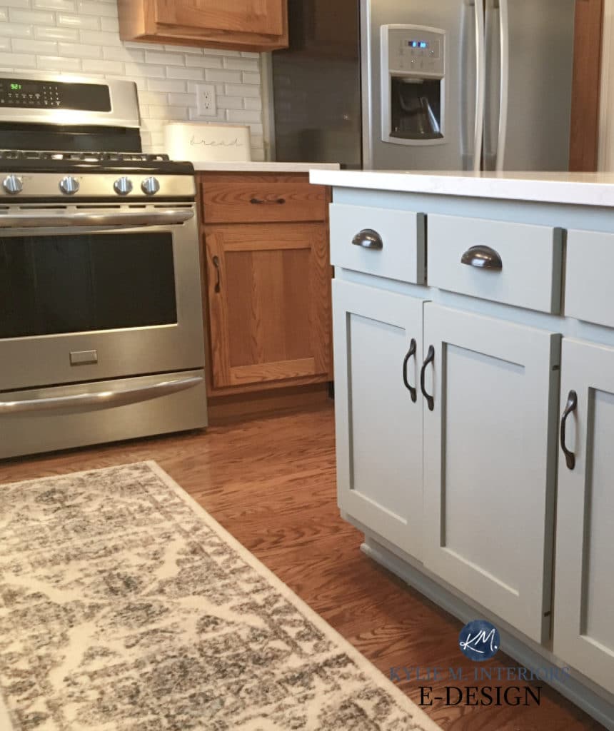
IS COMFORT GRAY A GOOD CABINET OR ISLAND COLOR?
Comfort Gray could be a stunning cabinet color, especially if your home has a subtle coastal or beachy vibe – I wish more people would do it! It’s also compatible with a wide range of today’s most popular white quartz countertops.
How to Choose the Best White Paint Color for Your Kitchen Cabinets
The Best Paint Colors for Kitchen Island & Bathroom Vanities

Get your PEEL & STICK SAMPLE OF COMFORT GRAY!
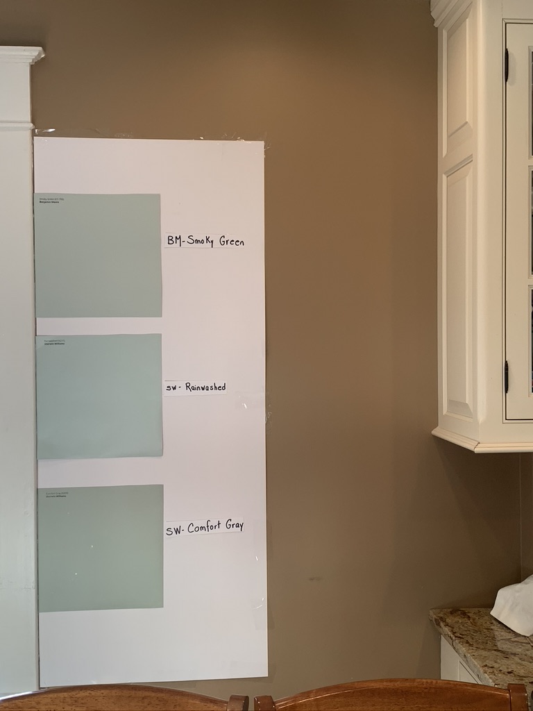
WHAT COLORS ARE SIMILAR TO COMFORT GRAY?
- Benjamin Moore Gray Wisp is a great comparable, especially if you want to see a touch more green.
- Benjamin Moore’s Maid of the Mist (also known as Antique Jade) is similar to Comfort Gray and a good one to sample.
- For a bit more depth, check out Sherwin Williams Oyster Bay (also shown in the previous exterior photo). Along with being a bit darker, Oyster Bay can look a touch greener.
- Sherwin Williams Austere Gray is a touch darker and a bit greener (but not as dark as Oyster Bay or as green-blue).
- I have some beautiful lighter greens in this blog post for you to explore (but finish this one first – we’re not done yet!)
The Best Blue-Green Blend Paint Colors
WHAT PAINT COLORS GO WITH COMFORT GRAY?
Being a moody green-gray blend, Comfort Gray is pretty flexible with its partners…
- some warm light grays with gentle violet undertones
- subtle, warm off-whites like Sherwin Williams Aesthetic White and Origami White
- darker blue-green blends with similar degrees of gray
- a wide range of warm whites, as well as crisp, clean whites
There you have it! Hopefully, you’ve figured out whether Comfort Gray is the color for you. If not, you know there’s more where that came from!
READ MORE
The 13 Best Blue-Green Blend Paint Colors
The 10 Best Light, Relaxing, Calming Paint Colors
Paint Color Review of Sherwin Williams Rainwashed
Paint Color Review of Sherwin William Sea Salt
Not sure which paint color is best for YOUR home?
Check out my Online Paint Color Consulting – I’d love to help!

ORIGINALLY WRITTEN IN 2021, UPDATED IN 2024


We’re at the end of a kitchen renovation and have done our cabinets in Comfort Gray, based off your review (I’d love to send you the pictures once they’re done professionally?!) and I’m absolutely in LOVE. We had the kitchen walls painted Pure White along with the rest of our open floor plan and it is way too much white for me, definitely overwhelming. What color would you suggest we try for the walls? We have SW Pure White on the hood and on other built in cabinets in the dining room so it would need to compliment that as well. Send help LOL I don’t want to take away from the beauty of Comfort Gray but I can’t take all this white
Madison, I would looooove to see photos! If they’re by a professional, they actually need to give you permission for me to put them on my site, but if they’re good with it, that would be amazing! Now, with Pure White on the hood, hmmm. What countertops do you have? Tell, you what, why don’t you email me some photos of your space as it is and I can get my eyeballs on it? kylie@kylieminteriors.ca (don’t miss the ‘m’ between the kylie and interiors, people often do!) Make sure the subject line says, ‘Kylie said she’d look at my kitchen’ 🙂
Omg I’m so glad I came back to this page because I never saw your response. I would love to send you photos!! We haven’t been able to take professional photos yet as we had an issue with our backsplash tile, but can definitely send you my personal ones 🙂 I’ll send them sometime this week!
WAHOOOOOO!