
How to Choose the Best White Paint Color: Cabinets, Trims, Walls
PICK THE RIGHT SHADE OF WHITE
It’s time to get your tighty-whities on, because today, you’ll learn to pick the best white paint color for your cabinets or walls! But, before we get into the nitty-gritty, let me save you a LOT of time, energy, and sanity by saying this…
If you already have something painted white in your room (e.g., TRIM or cabinets) and are not repainting it, I highly suggest you paint, whatever it is you want to paint, the exact same color.
Mixing and matching whites is risky business, as one white can easily make another look dirty, warm, cool, etc. Therefore, if you already have a white surface in your room that you don’t plan on repainting, it’s best to stick with it for your soon-to-be-painted surfaces.
However, you might not know which white you have if a previous owner painted it. In this case, take a cabinet door or piece of trim to the paint store and have them color-match it for you (with a machine, not by eye).

NOT SO FAST…
If you’re not building or remodelling, the white you currently have on trim, cabinets, or walls might not suit your finishes (very common). Be prepared to paint with a new, more suitable white.
If you don’t have a solid paint foundation to start, you won’t get where you need to go.
Now, moving along to the guts n’ glory of this blog post, starting with the types of white.
THE 5 TYPES OF WHITES IN PAINT COLORS & FINISHES
These 5 types of white don’t just apply to paint colors; they’re also a guideline for the types of whites you may (or may not) have in your finishes. You’ll find more details in this blog post.
Let’s start with TEMPERATURE…
1. WARM WHITE PAINT COLORS
Warm whites aren’t stark and clean; they can look softer, warmer, and have slightly (or more) lower LRVs compared to other whites.
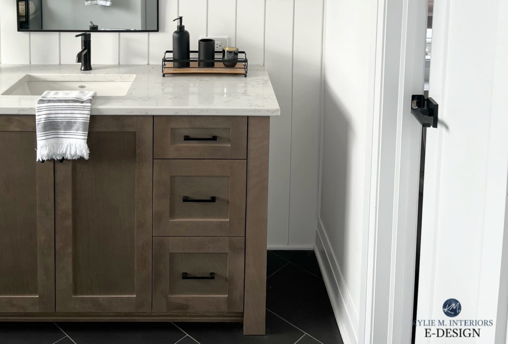
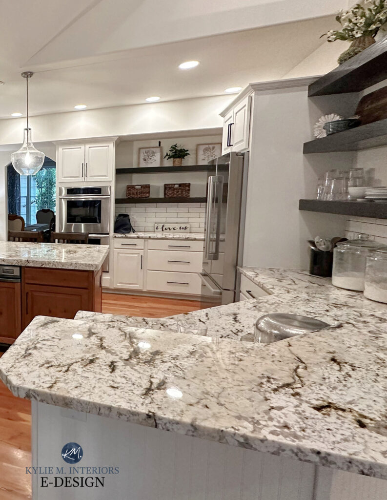
This next countertop might look pretty darn ‘white’, but it’s a soft, warm white that loves the soft warmth of Benjamin Moore White Dove…
The 3 Best Warm White Paint Colours from Benjamin Moore
Benjamin Moore White Dove: IMAGES, Info, & More
If they’d used a BRIGHT or COOL white on the above walls, the countertop would look dingy in comparison.
FUN FACT: Most of the popular white quartz countertops are soft, warm whites – NOT true or cold ones.
2. COOL WHITE PAINT COLORS
Cool whites aren’t flexible or foolproof, which means they are not used as much as warm and true whites. Cool whites can look…
- Fresh
- Icy
- Cold and flat
- The most like a ‘true, bright white’ in its absence. However, once you compare, you’ll see their colder edge.
- Cool whites are most commonly found on white kitchen appliances.
Benjamin Moore Decorators White is a popular COOL, SOFT white…

Decorator’s White is on the bottom – here’s its REVIEW
Numbers 3, 4, and 5 relate to how strong or soft a white is…
3. SOFT WHITE PAINT COLORS: LRV 82-88
Soft white paint colors have more moderate LRVs, averaging around 85, give or take 3. Again, the 5 types of white paint colors blog post hits all the details.
Soft white paint colors include the most popular whites, like Sherwin Williams Pure White and Benjamin Moore White Dove.

Benjamin Moore White Dove: IMAGES, Info, & More | Sherwin Williams Pure White Images, & More
Soft white paint colors can be soft and WARM or soft and COOL, combining two of the five types. Warm soft whites are often found in interior finishes such as countertops and tiles.
Here’s a Peel & Stick sample of White Dove…
4. BRIGHT WHITE PAINT COLORS: LRV 89-91
Bright white paint colors hover around the 89-91 range, including colors like Benjamin Moore Simply White and Chantilly Lace (I have reviews for all of these; use my SEARCH to find them!)

When it comes to bright whites, you can have WARM bright whites and COOL bright whites. (although there are fewer of the latter.) That’s right, a combination of two of the five types of white!
5. TRUE WHITE PAINT COLORS: LRV 93+-
True whites are whiter than my pasty little butt cheeks on a hot summer’s day (blinding at best)…
- These whites sit at the top of the LRV range (approx 93, give or take).
- They can be quite stark. Most ‘contractor’s whites’ are true whites.
- The most commonly used true white is Sherwin Williams High Reflective White and Behr Ultra Pure White. Benjamin Moore’s best version of true white is Chantilly Lace (but its LRV isn’t quite high enough).
- True whites are often found on white subway tile backsplashes, but even then, some of those can be a wink warm!
FUN FACTS: Countertops (quartz, granite, and laminate) often contain warm whites rather than true or cold ones. Tiles often contain true or warm whites and are rarely cool. Whites found in stone and brick can vary from warm to cool to true!
The 5 WHITEST White Paint Colours
Now that you know the basics of the 5 types of white, let’s chat about where to look for them.
FIND YOUR GUIDING LIGHT (EXISTING HOME)
If you’re starting from scratch with an entirely new design/color palette, don’t get your knickers in a knot (if you even wear any); I’ll get to you shortly.
If you’re living in your home and just making some tweaks to your color palette, chances are there’s already a surface in your room with white in it.
This white is your GUIDING WHITE; you don’t want to stray off its path.
For example, if your countertop has a warm white fleck or backdrop, you’ll want to choose a warm white paint color for your cabinets, trims, or walls, rather than a true or cool one.

The Best Dark Green & Blue Cabinet Colors
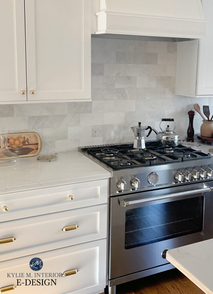
In the next photo, notice how the original warm white of the cabinets is too warm for the TRUE WHITE of the marble backsplash and countertop – the backsplash should have called the shots, as it contains the GUIDING WHITE…
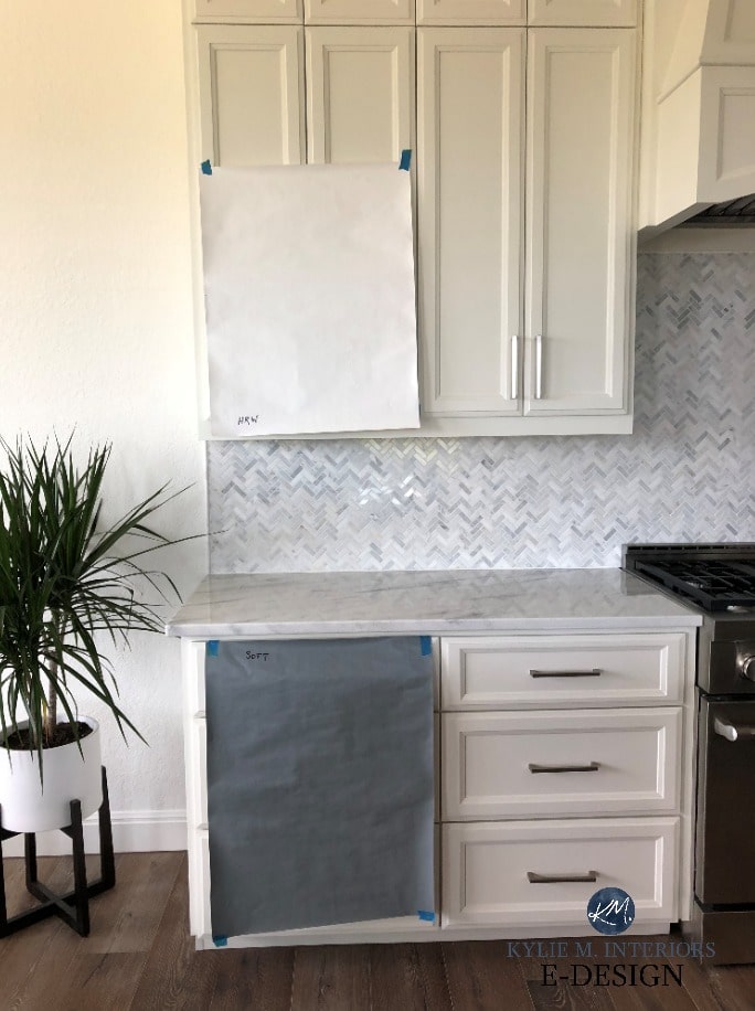
The taped-up sample shows a much better partnership (it’s like I know what I’m doing or something). Because the countertop and backsplash are permanent surfaces, the white paint color must be chosen to coordinate with them.
Choose the white for the home you HAVE, not the home you WISH you had.
In other words, if the white that best suits your home has more warmth than you like, you should listen to your home. If you go with your tastes over the needs of your home, it ain’t gonna look good.

The Best White & Off-White Quartz Countertops
Here are a few places you might find your Guiding White.
- TRIM (the number one shot caller)
- COUNTERTOPS
- TILES
- STONE OR BRICK
- FABRICS (ones that you’ll have in your home for a loooong time)
But how do you know the type of white is in your finish?
Get your fave brand’s WHITEST WHITE (listed below) and compare it to your finish. If the white or off-white in your finish looks warmer or cooler than this white, that should tell you which type of white you should explore.

The Best Medium to Dark Green Paint Colors
- SHERWIN WILLIAMS: Pick up a sample of Sherwin Williams High Reflective White
- BENJAMIN MOORE: Pick up a sample of Benjamin Moore Chantilly Lace. It’s not quite a true white, but it’s as close as BM gets.
- You can also put a piece of white paper on your finish (as shown above). Just keep in mind that white paper is a COLD white and can make a warm white look even warmer in comparison.
Of course, some rooms don’t have a bossy white, in which case you might lean into the color family of your finishes, which gets more complicated.
Here’s the short n’ curly…
IF YOUR FINISHES ARE WARM-TONED (BEIGE/CREAM/TAN): You might choose bright, warm whites or soft, warm whites.

How to Update Your 2000s Home: SERIES!
A Peel & Stick Collection of Kylie M’s Top Warm Whites
IF YOUR FINISHES ARE COOL-TONED (COLD GRAY/BLUE/GREEN): You miiiight choose a cool white, but most choose a bright or soft warm white or a true white (they’re more flexible overall).
On the other hand, if your room doesn’t have a single finish with white in it, you can take cues from the white trim/needs of the adjoining rooms; this way, there’s a flow from one space to another. Only change whites from one room to another if you absolutely HAVE to. It’s best if all of your whites match.
WHAT IF YOU DON’T LOVE YOUR GUIDING WHITE?
Sometimes our Guiding White isn’t our type. Too warm, too cold, too bright, too soft; with all of the whites out there, we can only HOPE our Guiding White suits our tastes.

However, sometimes the stars don’t align, and the white you’re given isn’t your jam or your peanut butter.
In this case, you have two choices…
- Embrace it – it is what it is, and short of replacing it, it isn’t going anywhere. I say this about the junk in my trunk (baby’s got back) – it ain’t goin’ anywhere.
- Shift gears away from white cabinets or walls and consider an off-white or light-depth color instead. This is WAY better than a mismatch.
I see mismatches all the time, in particular…
- White cabinets that are too stark for the surrounding countertops.
- White walls that are too creamy and warm for the surrounding tile or carpet.
- White trims that are too cold and crisp for newly installed finishes.
This one hurt me bad and was so preventable…

The warm white cabinets were chosen first, and the walls should’ve been painted the same white. Instead, they were painted a different shade with the wrong undertones. THE CABINETS WERE THE GUIDING WHITE, and they were ignored – son of biscuit!!!!!
This next home is so STINKIN’ GORGEOUS, it deserves well-coordinated whites, or ideally, the same white on every surface shown here…

While the transition from cabinet to trim isn’t as off, look at where the crown molding meets the top of the range hood. It’s like deja-poo, as I’ve seen this shit stuff before – in fact, way too often.
If your white(s) are wrong, it might be time to regroup and start from scratch.
CHOOSING YOUR WHITE FROM SCRATCH
This section covers a whole wiggedy-whack of situations…
- You’re building your home from scratch.
- You’re doing a full remodel and haven’t chosen any finishes yet.
- The white on your existing trims, walls, or cabinets isn’t the right shade, and you need to repaint with a more suitable color.
No matter what you’re doing, you might not know which white to even START with.

FIGURE OUT THE TYPE OF WHITE YOU WANT OR NEED
When designing a room from scratch, you have two choices…
- Decide which type of white you love (SOFT WARM whites being the most popular). Narrow down your options to one or two favorites. Sherwin Williams Best Warm Whites | Benjamin Moore’s Best Warm Whites. Bring your favorite Guiding White(s) with you to showrooms and suppliers to coordinate your finishes. It’s nice to have two whites, as you might fall in love with a finish that suits one over the other (always take your finishes home, though; never choose anything in a showroom.)
- Choose a main finish (usually the countertop) and see what type of white it needs as a partner. This will be your GUIDING WHITE and the one you’ll use on trims, walls, cabinets, etc…

Choose the white that suits the home you have, not the home you wish you had.
You should now be able to go to the paint store knowing which type of white you’re looking for. Personally, I’m a pinot gris fan myself, but I’ll settle for a nice chardonnay.
If you don’t know what to do, get these whites…
KYLIE M’S TOP 5 WHITE PAINT COLORS
There are a handful of whites I use ALL the time in my Online Paint Color Consulting – rarely do I have to go outside of these shades for the average home.
If you want to learn more about them, click on their REVIEW link!
1. SHERWIN WILLIAMS PURE WHITE SW 7005
Pure White is one of my favorite white paint colors because it’s so dang flexible and versatile. While it’s most popular on trims and cabinets, some use it on walls and exteriors.

Even though it’s a soft, warm white, it LOOKS like a bright white, as long as there isn’t a brighter white it’s being compared to. If all else fails and you don’t know what white to choose, Pure White is often a great choice if you don’t need much visible warmth.
Sherwin Williams Pure White: IMAGES, Info, & More!
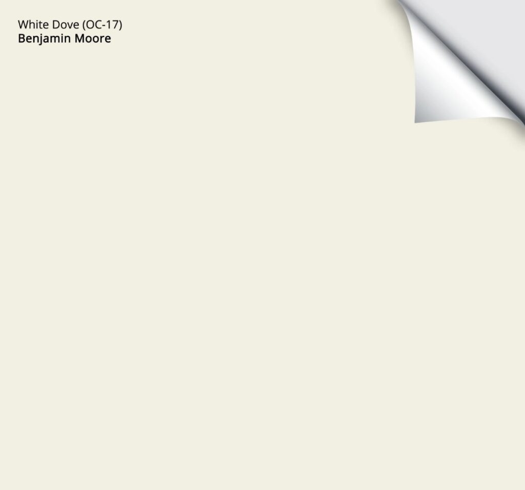
2. BENJAMIN MOORE WHITE DOVE OC-17
White Dove is a soft, warm white that’s similar in depth (slightly darker) to Pure White.
When it comes to the most popular whites for walls, trims, cabinets, and exteriors, White Dove tops the list, especially when ALL surfaces are being painted the same white.


Benjamin Moore White Dove: IMAGES, Info, & More!
3. SHERWIN WILLIAMS ALABASTER SW 7008
Alabaster is softer and warmer than Pure White and White Dove. This makes it a great choice for finishes that need a more muted, slightly creamy white look (common with granite counters from the early 2000s).

While Alabaster isn’t as popular as White Dove, it has its place as a whole-home white paint color for walls, trim, and cabinets.
FULL Paint Color Review of Sherwin Williams Alabaster
4. BENJAMIN MOORE CHANTILLY LACE OC-65
If you’re looking for a bright shade of white, but not a true or stark one, Chantilly Lace is a stunner.
With its LRV of 90.04 and lack of noticeable undertones, Chantilly Lace is a great option for a classic, timeless approach to white walls, cabinets, and trims.
Benjamin Moore Chantilly Lace: IMAGES, Info, & More
SHERWIN WILLIAMS WHITE SNOW 9541
White Snow has more recently made my top list as it’s a newer color from Sherwin Williams Emerald Designer Collection – 9 Whites.

While it comes at a higher cost, White Snow is a glooorious shade of white with only a wink of softness, most comparable to BM’s Chantilly Lace.
READ MORE
Which Two White Paint Colors Go Together?
How to Pick Paint Colours When You’re An OVERTHINKER (OR HAVE ANXIETY)
The Best Paint Colors to Go With GE Cafe Matte White Appliances
Benjamin Moore White Dove vs. Cloud White, Pure White, Chantilly Lace, & More
6 Questions to Ask Yourself Before Painting Your Cabinets White
Need Kylie’s help?
Check out my fun Online Color Consulting packages!

ORIGINALLY WRITTEN IN 2018, COMPLETELY UPDATED IN 2025


Kylie~Please Help!!!
Builder paint is all SW Dover White. Looking to go with either SW Agreeable gray or Worldy and using BM White Dove for trim & doors throughout. The painter suggested leaving the ceilings SW Dover White to have the crown & trim POP! Shouldn’t my whites be all the same?
If you paint an open room off-white like BM Ballet White, should you paint the trim the same color?
Hi Katie! Probably not. Ballet White has a decent depth to it and it really DOES come to life when it has some trim to contrast with. I’d look at BM White Dove :).
I just want to say how awesome you are! My hubby and I love your posts. You really know your stuff, and you are an excellent writer with humor to boot. Thank you for sharing your expertise!
Oh Jenny, thank you, I’m glad you guys think I’m funny – my hubby doesn’t always agree (I think I’m ALWAYS funny 😉
Happy painting!
I love your humor! Don’t ever stop being you! 🙂
Kristy…thank you 😉
Hi! I’m remodeling my entire first floor. Ugh….putting up Half walls of shiplap . Repainting all trim and cabinets. Should I paint the trim/shiplap the same color white as the cabinets?
Hi Nicole, yes, I would recommend that for consistency :).
Wow – so much information on whites. We are repainting our ranch home in Florida. U shaped house and moving from a creamy white (all looks yellow to me now) to a white. Going for the California coastal modern feel with black windows outside and white on the inside. The issue – we have saltillo tile throughout the house. We tried simply white and I see yellow. Thinking of chantilly lace but thought I’d see if you’ve ever worked with a home with saltillo tile. Looking for a clean white look. I want to stop fighting the floors and let them stand on their own. Kitchen cabinets would be the same. We have honed black granite along the perimeter but changing out the island to make it lighter. White with light top. Going nuts on all the options.
Hi Mary! I do find that the Saltillo tiles work a bit better with slightly warmer whites vs stark or cold ones. Take a look at SW Pure White perhaps. I do love Chantilly and it can look great if you have south-facing light, but it can look a bit chilly if you have north-facing light! And whites are THE WORST to sample as the undertones tend to be OVERexposed, so you have to be super patient. And while I never rely 100% on Pinterest, I do sometimes find it easier to base things on Pinterest as in person, those white samples can just look pretty colourful!
I want to paint all the the trim in our house. We have an open floor plan with very cream kitchen cabinets, can I chose a warm white that is slightly lighter and less cream than the cabinets? Can it blend or does it need to match exactly?
Well, Maureen, it depends on how fussy you are. ANY warmer white that’s lighter and/or less creamy than your cabinets will make your cabinets look that much more yellow ‘in comparison’. This would drive ME crazy, but I know not everyone is as nutty about colour as me ;). If it were me, I would be more inclined to match the trim and cabinets. Mind you, if they are VERY VERY cream, I could change my mind on that.
Hi, painting my foyer sw softer tan and would like to paint the wainscoting white. My stairs were painted black and white and the risers are bright white. I am afraid to match the white on stairs to wainscoting because it goes down a long hall way and up the stairs and think it will be too much stark white and would like to warm it up. I have lots of morning and afternoon sun light . there are also french door and closet doors off this foyer. I was looking at benjemen moore glacial or perhaps chantilly lace…or is that too many competing whites ? I would paint the doors ,trim and wainscoting the same color but do not want to paint stairs because I just put down a runner. Any thoughts, advice is greatly appreciated.
I was so excited to see the picture of that green/black counter top, that’s almost exactly what I have! My kitchen cabinets are an orangey oak though. They really do not look good together, but its original 1999! I have to paint the walls right away, but I cant change the counters or cabinets, yet…. I’m thinking SW Pure white for the trim amd walls 😬 maybe that will somehow bring them together?? Somebody stop me if this is a terrible idea!
Hi, I am trying to decide on a white for cabinets. Trim is SW Pure White, but the painter only uses Benjamin Moore. I would prefer to find a Benjamin Moore white instead of having them try to make a match of the SW Pure White. Countertop is absolute black granite, backsplash is white (a very neutral to coolish, true white) and walls are revere pewter. Kitchen doesn’t have windows, but it’s an open floor plan and the light coming in via the great room is south east exposure. Leaning towards BM Super White or Chantilly Lace. Do you think either of these will coordinate well enough with SW Pure White to not look bad together?
Hello! I am learning so much! my cabinets are simply white and looks yellow next to paper white walls. I have a large open area that gets north (2 story entry) and south light. Is my best choice simply white for walls, trim and ceiling. I heard it takes multiple coats and these cabinets aren’t my forever cabinets but they are here for a while.
Ooo ya, that’s a tough one. Simply White doesn’t cover well, for sure, but I’d be nervous to throw in another white with Simply White due to the degree of yellow in it. I would worry about any other white (like BM White Dove looking a bit dingy). Maybe check out SW Alabaster???