
Which Two White Paint Colors Go Together?
WHICH DIFFERENT SHADES OF WHITE SUIT EACH OTHER?
When painting more than one surface white, such as trims, walls, and cabinets, it can be tempting to do ye ole mix n’ match. However, more so than other colors, white is tricky.
It’s easy to make a hot mess of it with whites, with their varying undertones, temperatures, and depths. This is why, with some exceptions, if you’re painting more than one surface white, you could/should use the same white on both (I’ve written a blog post on this, linked at the end of this one).
Why?

When painting something white, the goal is usually to have it look, well, white.
However, once you partner different shades, one will expose the undertones in another. So, while the SAME WHITE on walls and trims can look more or less white, if you put a brighter white on your trim only, your walls might look CREAM, DINGY, or GRAY in comparison.
Why?

You ask a lot of questions – I like that about you. Sometimes, a white paint color’s actual depth and undertones are only noticeable when compared to a DIFFERENT white.
Now, some people want this look, which is why I wrote this blog post. However, not everyone realizes what happens when you partner different shades of white together. If you want BOTH shades to look white, I highly suggest using the same color on ALL surfaces.
And yes, I love using ALL CAPS as I talk with emphasis in real life too.
Let the shift in sheen between surfaces do the work for you.
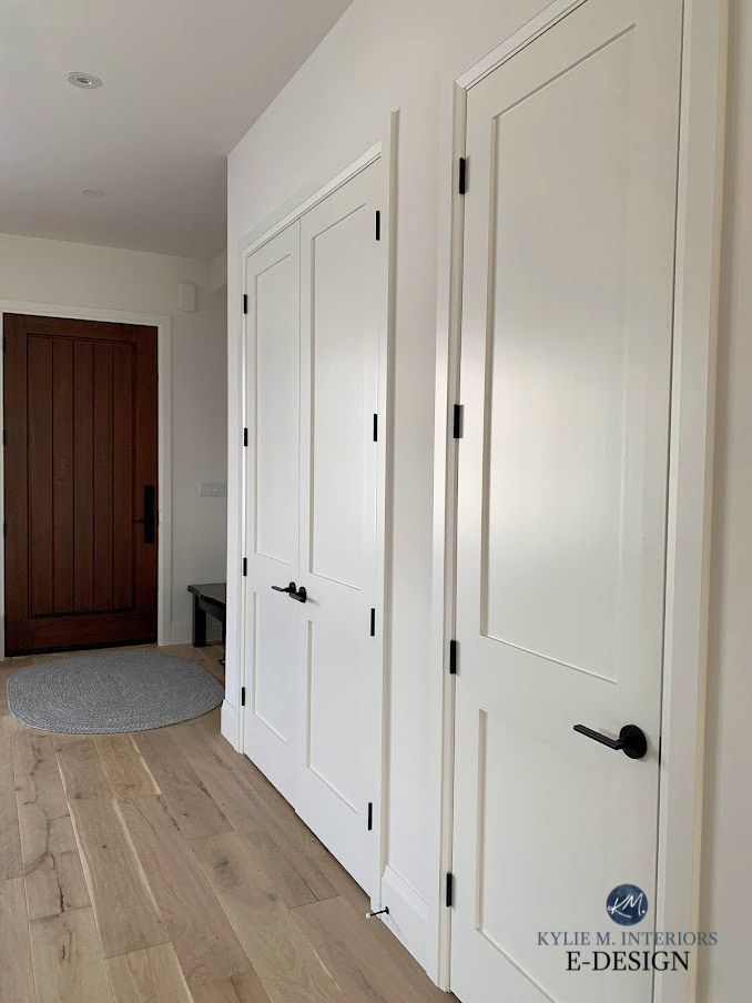
ALL of these white surfaces are White Dove
Before we dive in, did you know that there are 5 DIFFERENT TYPES OF WHITE? That’s right, five. And not all pair well together, so when making a color palette with two different whites, here are some tips and guidelines…
- For a more noticeable difference between your shades of white, aim for approximately 3+ LRV points between the two. Any less, and I wouldn’t bother (although you can). If you don’t know what LRV is, get ready to have your brain explode with excitement and awe after reading this.
- Pay attention to undertones. In particular, don’t pair a cool white with a warm white.
- TRUE whites are the most versatile – especially Benjamin Moore Chantilly Lace, although Sherwin Williams Extra White does the job here and there, as does White Snow.
Look at that pretty shift between the wall and the trim!
And most importantly…
The brighter white, the one with the higher LRV, should ALWAYS be on the trim (or cabinets). The darker shade of white needs to be the wall color.
Are there exceptions? Nope, not really, unless you want your cabinets or trims to look dingy or yellow compared to your walls. Check out this next photo as a GREAT example…
I could say more, but I’m pretty sure that image says it all.
1. SHERWIN WILLIAMS EXTRA WHITE & ALABASTER
Oh, these two are in a PASSIONATE love affair. But there’s one very important detail in their relationship…Extra White MUST be the trim/cabinet color; Alabaster must be the wall color. You can’t reverse this, or you’ll end up with yellow trim/cabinets against your Extra White walls.
Extra White and Alabaster pair well together because, while Extra White as a wall color can be cool, as a trim or cabinet color (thanks to the formulation of these paints), it leans slightly warm. This bit of warmth coordinates with Alabaster and its soft, creamy white warmth quite well.
The Best Paint Colors with Dark Wood
In the above photo, notice how beautifully warm the walls look. This happens when you partner a warm white like Alabaster with a BRIGHTER white like Extra White. If you love Alabaster but don’t want it to look this creamy, it’s best to use it on the trims, doors, and walls as…
If it’s not being directly compared to a brighter white – it will act more like white.
Alabaster has an LRV of 82, so it’s on the very low end of the LRV range for the white group. Extra White has an LRV of 86, so you’ve got a nice 4-point spread there.
Sherwin Williams Alabaster: IMAGES, Info, & More
FULL Paint Color Review of Sherwin Williams Extra White
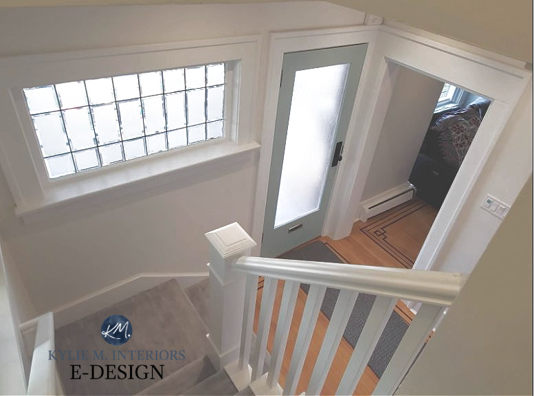
2. BENJAMIN MOORE WHITE DOVE & OXFORD WHITE
This is another example of whites that go together. White Dove is a soft, warm white – not as creamy as Alabaster, but still a gentler approach than the brighter whites. Oxford White isn’t as soft as the usual bunch, but it doesn’t quite hit the bright end either, thanks to its LRV of 86. This offers a subtle shift from White Dove’s LRV of 83.
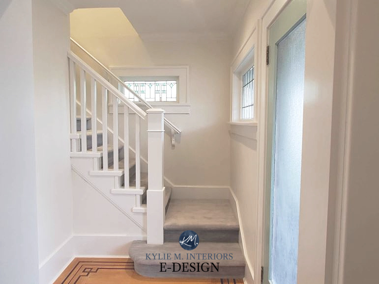
The Best Creamy White & Off-White Paint Colors
Oxford White does a good job of not overexposing White Dove’s warmth, and more so than the previous combo, the overall palette still reads like two (soft) shades of white. However, this can change a bit depending on the lighting (or lack of)…
I rely on my Online Color Consulting clients for their photos (AND LOVE THEM FOR DOING SO!), so I don’t always have the clearest or largest photos to work with. All the same, the above staircase shows White Dove leaning more into its creamy roots against the brighter Oxford White trim and railing.
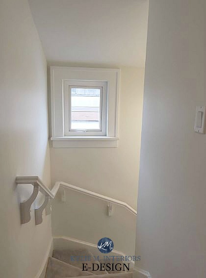
This next photo gives a larger, decent shot of the White Dove and Oxford White palette in action…
Benjamin Moore White Dove: IMAGES, Info, & More
Benjamin Moore Oxford White: IMAGES, Info, & More
3. BENJAMIN MOORE CHANTILLY LACE & SHERWIN WILLIAMS GREEK VILLA
Chantilly Lace is amazing and goes with a wide range of white paint colors, as long as it’s the trim (or cabinets). In this example, Chantilly Lace is on the trim and built-ins, Greek Villa is on the walls…
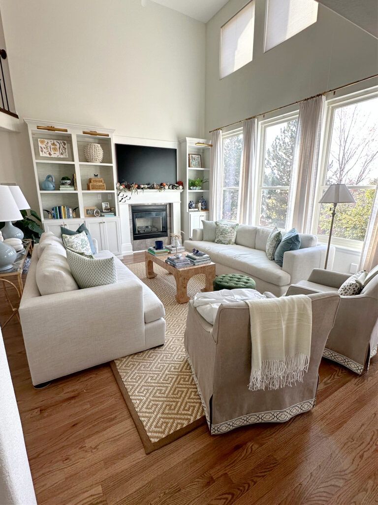
To say I’m obsessed with the above living room would be an understatement. My client did so well with her furnishings and home decor – the accent colors are on point, and so are her colors!
Notice how warm and soft the Greek Villa walls look compared to the brighter white of the Chantilly Lace built-ins – Greek Villa ALMOST looks like a subtle shade of cream!
This is the contrast I’m talking about, whereas one white will expose the warmth and undertones in another.
Greek Villa has an LRV of 86 to Chantilly Lace’s 90, so there’s a decent spread there.
Sherwin Williams Greek Villa: IMAGES, Info, & More!
FULL Paint Color Review of Benjamin Moore Chantilly Lace
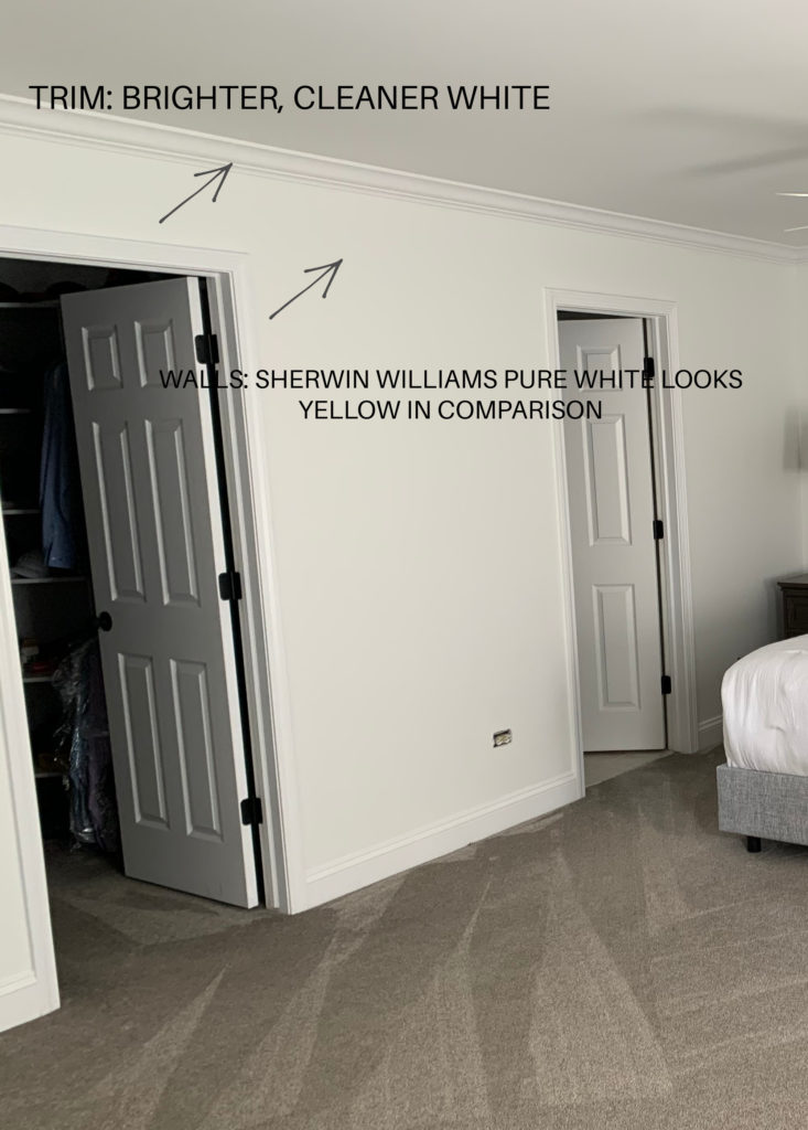
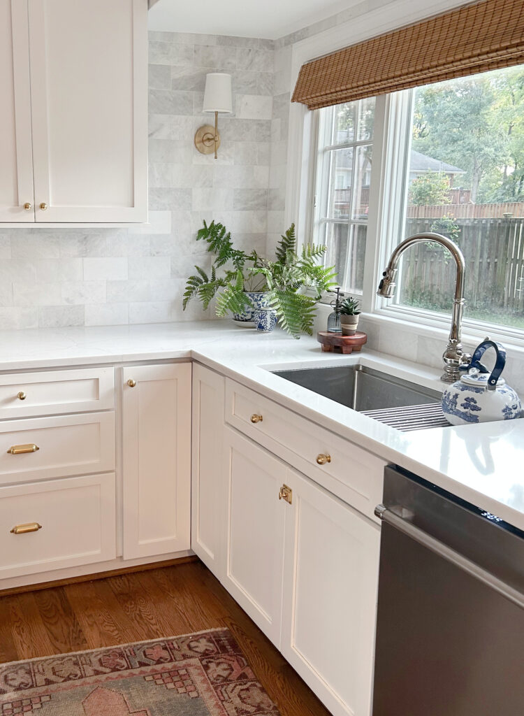
4. SHERWIN WILLIAMS ALABASTER & PURE WHITE
While they barely make the cut, Sherwin Williams Alabaster and Pure White can look good together, as shown in this charming kitchen with beautiful wood cabinets…

You can see Alabaster’s creamy warmth on the walls, with Pure White’s slightly cleaner look on the trim and shiplap ceiling.
All the photos in my blog are from my Online Color Consulting clients, readers, & friends— because real homes deserve to be celebrated (dirty laundry & all!) While not magazine-perfect, they’re packed with ideas & proven color choices to help you create a home you’ll love.
Here’s another shot of Alabaster and Pure White together in a mudroom..


Why do they JUST barely work together? There are two reasons…
- Their LRVs are relatively close, with Alabaster at 82 and Pure White at 84, so there isn’t much difference in depth.
- Alabaster would prefer a white that’s a bit lighter and warmer than Pure White. Alternatively, Pure White would prefer a white with a touch less warmth.
But at the end of the day, they work!
Sherwin Williams Alabaster: IMAGES, Info, & More
Sherwin Williams Pure White: IMAGES, Info, & More
5. BENJAMIN MOORE WHITE DOVE & SIMPLY WHITE
White Dove and Simply White can be gorgeous in a palette together, AS LONG AS Simply White is on the trim and cabinets and White Dove is on the walls. Again, the white with the higher LRV needs to be on trims/cabinets, or the flow will be off.
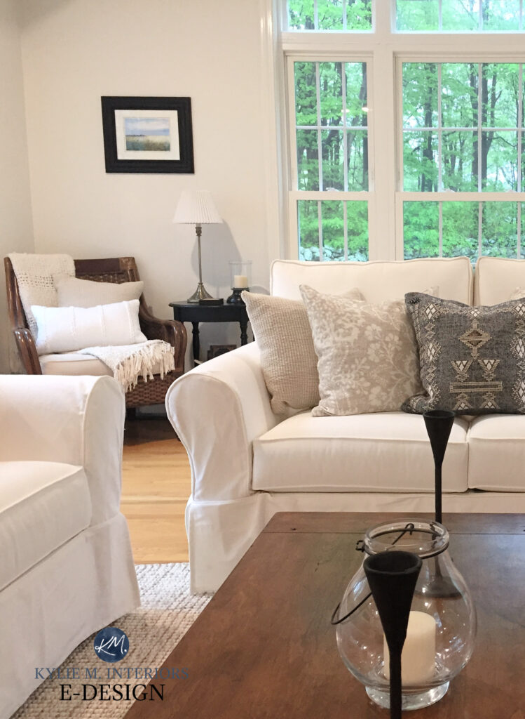
White Dove walls AND trim (Simply White isn’t shown here)
Simply White is a brighter shade of white with a yellow undertone. White Dove is a softer white with a yellow-creamy undertone. And while Simply White is a bit cleaner, it’s a pretty partner for White Dove walls to butt up to.
If you like this look, you might also check out Benjamin Moore Cloud White with Simply White.
Benjamin Moore Simply White: IMAGES, Info, & More
Benjamin Moore White Dove: IMAGES, Info, & More
6. SHERWIN WILLIAMS GREEK VILLA & EXTRA WHITE
Greek Villa is a popular, soft, warm white, and found a great partner with Sherwin Williams Extra White.

Because you want the brighter of the two on the trims (or cabinets), Extra White goes on the trim, Greek Villa on the walls. While I’d prefer more of an LRV spread between two whites, for those of you who love varying shades of white, it’s worth a go.

Sherwin Williams Greek Villa: IMAGES, Info, & More
Sherwin Williams Extra White Color Review
WHAT’S THE BEST WHITE TO GO WITH OTHER WHITES?
If you’re attempting a self-made combo, don’t go all willy-nilly, or you could have a hot mess on your hands. Start with Benjamin Moore Chantilly Lace as the white for your trims or cabinets. Sure, you can dabble with Sherwin Williams White Snow and Sherwin Williams Extra White, but I recommend starting your color journey with Chantilly Lace – and NOT just because she has a pretty face.
Benjamin Moore Chantilly Lace: IMAGES, Info, & More
Chantilly Lace is a classic beauty
Now, I’m sure I’ll get comments about this white vs. that white. Here’s the thing: I happily offer TONS of free info in my blog. If that’s not enough for your needs, please consider hiring me via my Online Color Consulting!
And here’s that as-promised blog post on matching whites…
White Trims, Cabinets, & Walls: Do They Need to Match?
READ MORE
The Ultimate Guide to White Paint Colors
5 ALMOST Fool-Proof Shades of White
The 5 Types of White Paint Colors
The 8 Best White Paint Colors from Benjamin Moore
LET ME CHOOSE YOUR COLORS FOR YOU!
Check out my Online Color Consulting packages.


Regina, I’m in the same boat as you! I LOVE this blog and the humor. Even after careful testing of about ten whites, I think I’ve made a huge mistake in choosing a whole house color. We are doing all the painting ourselves, and it will be too hard to repaint as our entryway has 22-foot ceilings. We started with Simply White, but when the western sun hit it in the afternoon, it looked like the wall had been colored with a highlighter. So we switched to White Dove, which is just okay, but it is more yellow than I anticipated because we have little light and SW Extra White trim. I’m trying to work with it, but the only trim color I’ve found that looks ok with it is Oxford White (a great tip from Kylie). Now we decided to put in Ikea kitchen cabinets and the Ikea white is very white (more like Chantilly Lace), and will not match Oxford White. The Ikea white makes White Dove look even more yellow, makes Oxford White look dingy, and I don’t think I will like Chantilly Lace trim with White Dove. So I’m stuck, and need help fixing what I’ve done. I don’t know what color to paint the trim now because of the cabinets. I don’t know if I should return the Ikea cabinet doors. Picking a backsplash and countertop will be stressful now, too, because the yellowness of White Dove is tricky. I’m bummed that I feel so limited. This is our first house and this process should be fun, but choosing the finishes out of order has made the process a complete disaster. I’m having nightmares about White Dove, paint samples, and LRVs!
Oooo, mixing whites is TOUGH! You might be best off taking your Ikea door to SW and BM and ask each to do a color match (in the exact paint/sheen you’ll use on your walls or trims). See who gets the closest and if it looks good, that’s the white I would shift to – or maybe step away from white cabinets!
Your comment is EXACTLY what I’m going through. New build, should be exciting..10 white paint samples. Did one coat of white dove in the whole house, now the IKEA Axstad kitchen cabinets we have make it look Yellow. We can’t return the cabinets as we live in a super remote area (16 hour drive to the closest IKEA)
Did you return yours, or did you buy a different paint colour?
I am choosing a whole home paint color and trim and it has to be SW brand. We have cool white quartz (MSI Monaco), white cabinets and subway tile, warm hickory mid tone floors. I was thinking of SW Pearly white on the walls and SW pure white trim? I want a pinch of neutral warmish contrast on the walls to separate from white trim and cabinets without feeling too creamy/yellow.
My trim is extra white. Would the walls look better as Simply White, Greek Villa or Chantilly Lace? It’s an East facing powder room.
Oooo, that’s tough. I suppose Greek Villa would be my favorite of the 3, but I might bump down to SW Alabaster.
I love all your tips on Whites. My counters are Miraggio Cove Quartz. I was thinking of doing White Dove on the cabinets and the walls throughout the rest of the house with Alabaster full strength or at 75%. Should I be doing the doors and trim same color as the walls just a different sheen?
Thank you,
Michelle
I wish I would have come across your post earlier. We have painted our first coat of wall paint in White Dove. There is lots of light pouring into the room, so thats why we went for the warmth of White Dove. Now we are adding the IKEA Axstad kitchen which is a bright white, the yellow is really pulling through on the White Dove. Help! What can I do to fix it? Will the 2nd coat look less yellow? Can I just switch to another white? If so what white would you recommend?
I have learned so much from reading your blogs. I am still scratching my head on a wall color to match with Chantilly Lace (trim and cabinets.) I was leaning towards White Dove but not
so confident after reading the comments above. I want a little bit of a contrast between the walls and trim/cabinets. I would love a light creamy welcoming color. We don’t have a lot of bright light coming in and have white shutters throughout. Our front door faces south. I would appreciate any thoughts.
Hmmm, I understand your reservations. For a warm, inviting look, and a welcoming creamy vibe, I wonder about BM Cloud White. I wonder if you might take a look at BM Cloud White. It’s actually WHITER than White Dove, but it has a creamier warmth. It’s definitely low contrast. It comes down to LRV a lot of the time. So, Chantilly Lace is 90, White Dove is 83. Cloud White is 86. They’re all in the white range, but White Dove is the softest, Chantilly Lace is the whitest.
If White Dove isn’t quite warm enough (which I have suspicions of for you) and Cloud White isn’t soft/contrasting enough, you might dabble in the off-whites? OR…you need a white with a stronger yellow, like BM Mayonnaise. I hope this helps!