
The 13 Best Warm Quartz Countertops (2026)
The Most Popular Warm-Toned Quartz & Quartzite Countertops
While white quartz countertops are still in style for many homeowners today, a new wave of countertops has hit the world of kitchen design.
With paint trends leaning warmer, I’m seeing a significant rise in demand for warm quartz countertops compared to the white and gray trend of the last 5-10 years.
*Updated for 2026 with the best paint colors, home update ideas, and timeless design and decorating tips for today’s homeowner.
And if I’ve said it once, I’ll say it again—you do you. If you aren’t concerned with trends or resale, pick whatever floats your little boat. However, if you’re hankerin’ for something warmer and potentially even more flexible than the top countertops of previous years, I’ve got some beauties for you.

A FEW IMPORTANT DETAILS…
Before we start this party, there are a few important things to remember…
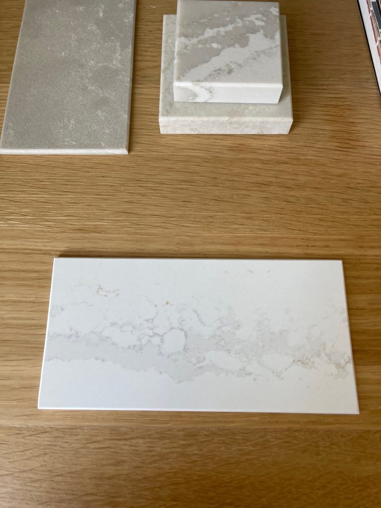
- The countertops listed below are for inspirational purposes. Please visit your local supplier to see the slabs in person.
- Quartzite slabs can exhibit significant variation as they’re a natural product (and must be sealed/maintained). Quartz offers a more predictable pattern.

The Best Colors For Light Wood Finishes
WHAT’S THE DIFFERENCE BETWEEN QUARTZ & QUARTZITE?
Here’s the big difference between quartzite and quartz: Quartzite is natural, whereas quartz is a mix of natural and human-made.
- Natural products like quartzite (and marble/granite) require a degree of maintenance, whereas a quality quartz countertop requires none.
- As it relates to looks, quartz offers a more predictable, more planned-out pattern. On the other hand, because quartzite is a natural material, every slab is unique, although most have similar colorways.

Remember, because quartzite is a natural product, slabs will vary.
Please apply the tips and ideas below as general guidance for your chosen slab to determine what works best.
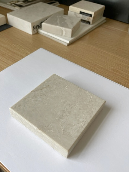
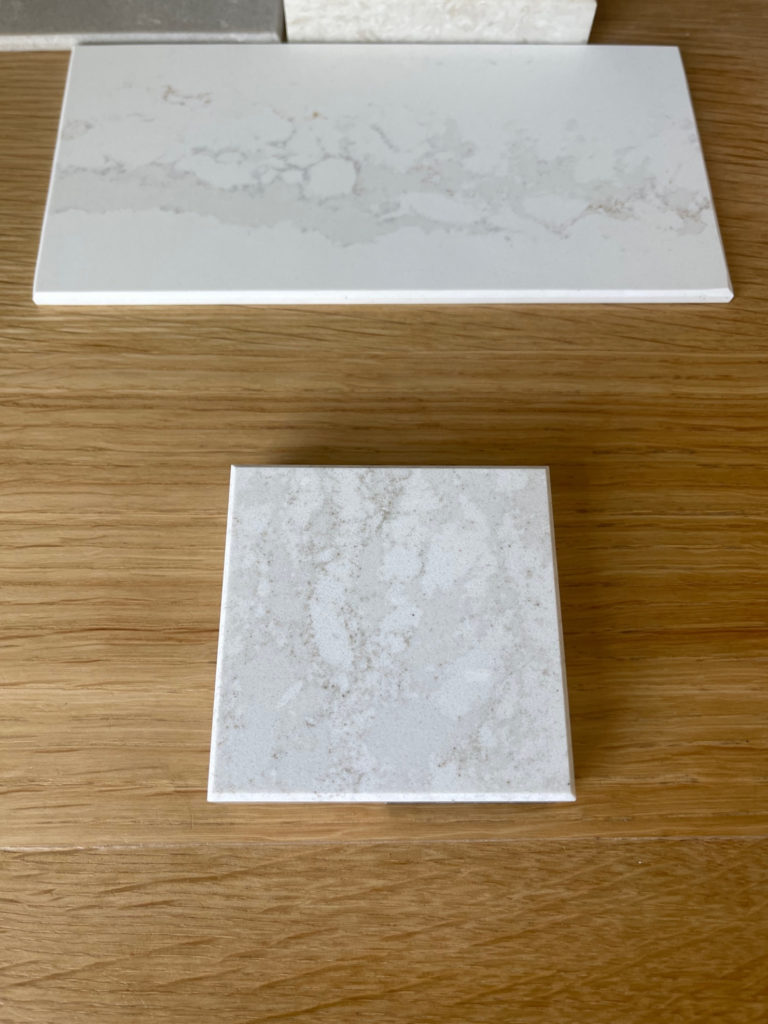
1. TAJ MAHAL QUARTZITE (Perla Venata)
Taj Mahal (also known as Perla Venata) is one of my favorite countertops. While it has a beautiful, warm base, it’s not super committed to beige or tan. In fact, many slabs lean slightly more towards taupe. It also has a moderate amount of veining. While some granite and quartz countertops can be super busy and overwhelming, Taj Mahal’s pattern and colorway keep things calm and low-key.
As shown below, the Taj Mahal is also gorgeous with natural wood cabinets. With the grain of these oak cabinets, using Taj Mahal as a slab backsplash would look gorgeous (or a simple, soft, off-white 3×6 subway tile…
Paint Colors to Go With Golden Oak Cabinets
THE BEST PAINT COLORS FOR TAJ MAHAL
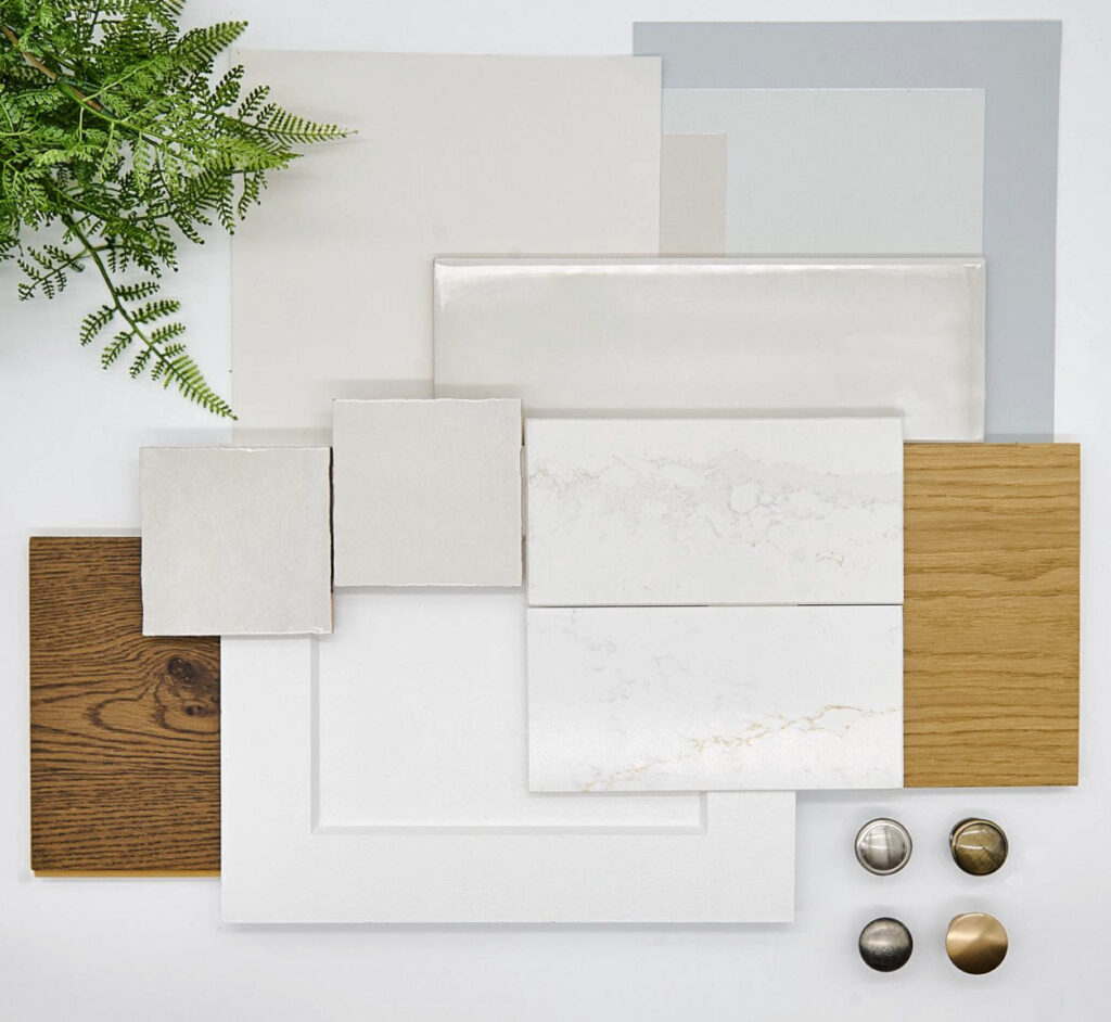
While there are more than these, here are some color groupings to get you started (remember, not every color in these groups is perfect for this countertop, as it’s slab-dependent). Sample and compare to see what suits your room and finishes!
- A range of popular, warm whites, although some can be a bit more of a stretch depending on the depth/look of your slab
- Some muted beige paint colors, again, slab dependent (no strong orange-pink undertones)
- Darker greige paint colors
- And more, these are just to get you started!
By the way, if you love Taj Mahal, keep reading to learn about Perla Bianca!
Taj Mahal Quartzite – FULL Review
2. VICOSTONE MISTERIO GOLD
This one has been sneaking up on me, as all of a sudden, I have more of my Online Color Consulting clients choosing it for their kitchen remodels!

With its noticeably warm, gold and brown veining, Misterio Gold is becoming a popular choice. This is probably due to its commitment to warm, golden-brown veining and a soft, simple white backdrop.

COLORS TO EXPLORE WITH MISTERIO GOLD
Here are some color groupings to get you started (not every single shade in these groups is perfect for this countertop). Sample and compare to see what suits your room and finishes!
- Off-white, light, and light-medium depth beiges
- Medium to darker shades of greige can be gorgeous accents
- There are more, but this is a good start!
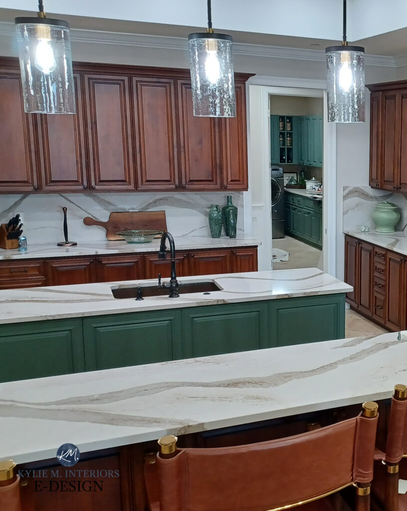
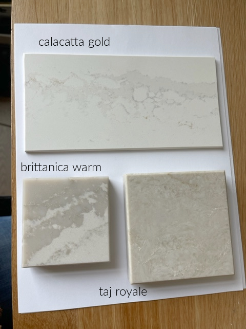
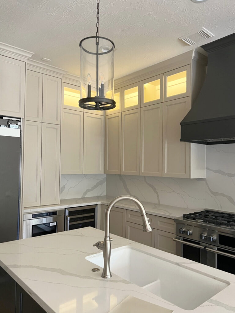
3. BRITTANICCA WARM by CAMBRIA
I love Brittanicca Warm so much that I chose it for our kitchen countertop in our own home!
Is Revere Pewter The Best Cabinet Color?
In my search for the best warm quartz countertop, I wanted versatility that would suit today’s trends while nodding towards future trends.
How does Brittanicca Warm do this?
Brittanicca Warm has a soft, warm, off-white base, warm gray veining, and even a bit of taupe-beige mixed in. In short, a countertop like this is likely to withstand trends, as it can flex towards the slightly warmer or stormier, as well as the cooler end.

Get a sample of Brittanicca Warm at your front door TOMORROW!
And while Brittanicca Gold Warm has more warmth, it’s not as popular with the masses due to its heavy, higher-contrast veining and strong orange/brown.
Paint Colors to Update Red-Stained Wood
THE BEST PAINT COLORS WITH BRITTANICCA WARM
Here are some color groupings to get you started (not every color in these groups is perfect for this countertop). Sample and compare to see what suits your room and finishes!
- Warm gray paint colors with a subtle green undertone
- Soft and subtle warm whites
- Darker greige paint colors
- And more, these are just to get you started!
Click HERE to explore similar styles on Designshop.
4. SILESTONE POBLENOU
If you want a non-white countertop with warmth and a bit more meat on its bones, check out Poblenou.
Poblenou is a light-medium depth PORCELAIN countertop, a great alternative to quartz and granite.

The base color of Poblenou is in the taupe world, with some white flecks scattered here and there.
Here’s a sample of Poblenou right to your front door!
All the photos in my blog are from my Online Color Consulting clients, readers, & friends— because real homes deserve to be celebrated (dirty laundry & all!) While not magazine-perfect, they’re packed with ideas & proven color choices to help you create a home you’ll love.
THE BEST COLORS TO GO WITH POBLENOU
Here are some color groupings to get you started (not every color in these groups is perfect for this countertop).
Sample and compare to see what suits your room and finishes!
- Light to medium depth shades of taupe
- A range of flexible white paint colors
- Medium to darker greige paint colors can be beautiful complements to Poblenou
- If you want more options, you know where to find me!
5. SILESTONE CALACATTA GOLD
Calacatta Gold parks itself in the ‘white quartz with gray veining‘ category (i.e., intended to look like marble). However, because it has a gorgeous rusty orange veining, it has a bit more flexibility than some of its slightly cooler cousins. This is true, especially as it relates to coordinating with some of the finishes from the early 2000s (Tuscan trend).
Here’s your sample of Silestone Et Calacatta Gold
Along with that veining, you’ll find a warm gray with a violet undertone and a softer taupe with a violet-pink undertone. I know these undertones can sound scary, but they’re normal and beautiful for a countertop like this (many people see them as ‘gray’ veins; I’m just breaking it down a bit more for you).

THE BEST PAINT COLORS WITH CALACATTA GOLD
While there are more than these, here are some color groupings to get you started (of course, not every color in these groups is perfect for this countertop).
Sample and compare to see what suits your room and finishes!
- Warm gray paint colors with a purple undertone
- Taupe paint colors in the light to light-medium range
- There are more, but that’s a good start
Take away the guesswork – check out my CURATED KITCHEN DESIGN PALETTES!
6. CAMBRIA WARWICK
Warwick is a newer quartz countertop from Cambria, in their Classic Series.

With slightly more traditional veining (compared to some of the more graphic or wispy veining of other popular quartz countertops), Cambria’s pattern is a combination of speckles and flecks amid an ocean of veining and feather-light pockets of color.
COLORS THAT POTENTIALLY GO WITH WARWICK
Here are some color groupings to get you started (not every color in these groups is perfect for this countertop).
Sample and compare to see what suits your room and finishes!
- Some soft, warm shades of white from Benjamin Moore, and some popular warm whites from Sherwin Williams
- Off-white and light depth shades of taupe
- And more, these are just to get you started!
The Paint Color Expert that DESIGNERS hire!
I would love to give you all the wall and cabinet colors in these photos, but my Online Consulting is how I support my family! Instead, I’ve included links to tons of blog posts full of awesome color ideas and inspiration.
7. TAJ ROYALE by CAESARSTONE
Taj Royal should be gaining in popularity thanks to warmer kitchen trends. It offers an interesting yet more consistent look, with a soft, muted, and warm base, and more subtle veining than Taj Mahal and Perla Venata.
Compared to the Taj Mahal, Taj Royal is more stain-resistant because it’s not a natural product—it’s quartz.
Being quartzite and natural, Taj Mahal is more likely to stain, whereas Taj Royal is more stain resistant (nothing is 100% bullet-proof in every category, but quartz is pretty skookum).
Also, the pattern is more consistent/reliable because Taj Royal is a percentage human-made.
By the way, there’s a laminate countertop that looks DARN SIMILAR to Taj Mahal and Taj Royal – it’s Taj Mahal by Formica (same name, different product). It’s a great alternative to save some serious moula!

THE BEST PAINT COLOURS FOR TAJ ROYAL
While there are more than these, here are some color groupings to get you started (of course, not every color in these groups is perfect for this countertop).
Sample and compare to see what suits your room and finishes!
- Some, but not all, soft, muted beige paint colors
- Darker shades of greige
- Warm whites are often a bit too yellow to be partnered directly with Taj Royal
- And more, but these should get you going!
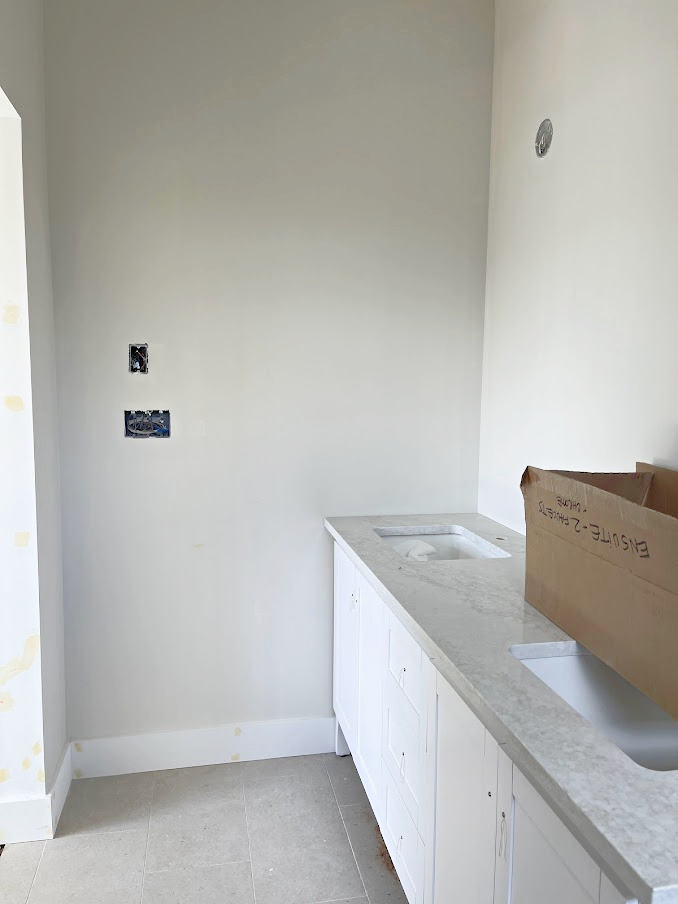
8. PERLA VENATA QUARTZITE
Perla Venata has a relatively wide range of neutrals, from soft off-white ivory to greige, tan, beige, and gray. Depending on the slab you choose, your countertop might favor beige (warmth) or greige/tan, or even pick up some ivory/cream hues.
If you’re worried that Taj Mahal or Taj Royal won’t humor your warm white cabinets, Perla Venata tends to be more flexible toward the whiter, brighter end of things.
THE BEST PAINT COLOURS FOR PERLA VENATA
While there are more options, here are some color groupings to get you started (not every color in these groups is ideal for this countertop).
Sample and compare to see what suits your room and finishes!
- Warm, flexible off white paint colors
- Muted and modern-looking shades of beige and tan (greatly depends on your slab)
- Considerably warm shades of greige (very mild green undertone)
- And more, these are just to get you started!
9. IRONSBRIDGE BY CAMBRIA
Ironsbridge is one of my favorite warm quartz countertops. With a more subtle approach compared to the likes of Taj Mahal and Perla Venta…
Ironsbridge is a great way to get visual interest without it dominating the room.
However, while it has a subtle, soft warmth, it’s less inclined towards beige, tan, and cream and more friendly towards soft greige/taupe paint colors.
See the Full Project Details
Here’s your sample of Ironsbridge!
THE BEST PAINT COLOURS FOR IRONSBRIDGE
While there are more than these, here are some color groupings to get you started (of course, not every color in these groups is perfect for this countertop).
Sample and compare to see what suits your room and finishes!
- Off-whites in the greige/taupe end of things
- Some warm white paint colors, as long as they aren’t overly yellow/cream
- light depth greige and taupe paint colors
- There are more, but these give you a great starting point
If you like Ironbridge, you might also like this similar countertop.
12 Best White & Off-White Quartz Counters
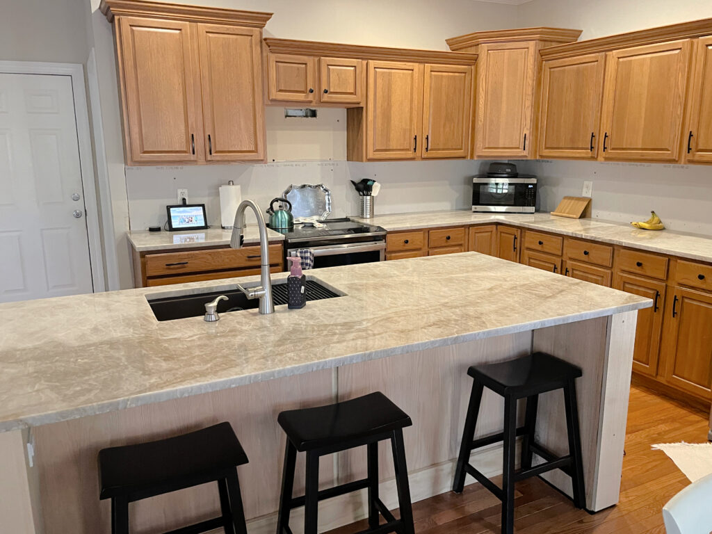
10. MONTEREY BY OMNIA
Monterey is another favorite of mine, so I chose it for our new lake home. I was looking for a versatile quartz with a soft white base and warm greige and beige veining. A countertop like this can politely nod at the warm gray end of things (especially with a green undertone) while humoring warm trends.
Sherwin Williams Aesthetic White with Pure White
THE BEST PAINT COLORS WITH MONTEREY
While there are more than these, here are some color groupings to get you started (of course, not every color in these groups is perfect for this countertop).
Sample and compare to see what suits your room and finishes!
- Warm, soft, flexible white paint colors
- considerably muted paint colors
- some earth-tones such as gray-blue blends
- And more!
The 4 Most Timeless Kitchen Countertops
11. MSI CALACATTA ELYSIO
This gorgeous quartz should gain popularity with warming trends – I can’t wait to see a fully finished project featuring it!

Notice how Calacatta Elysio features a soft, warm white backdrop, rather than a clean, bright one. It also has warm veining that caters to a soft taupe or subtle beige.
COLORS TO EXPLORE WITH CALACATTA ELYSIO
While there are more than these, here are some color groupings to get you started (of course, not every color in these groups is perfect for this countertop).
Sample and compare to see what suits your room and finishes!
- Soft, warmer shades of white – nothing too bright or stark.
- Muted shades of taupe.
- It could also look gorgeous with darker, muted green paint colors, even some dark greiges, and the odd moderate shade of taupe.
- There are more, but these groups should get you going!
12. CAMBRIA RIDGEGATE
Ridgegate is a reasonably new quartz countertop from Cambria. I’ve seen it in action once, and I already love it for those who don’t want a TON of warmth, but wish to step away from white or cool gray quartz countertops.

The Cashmere Kitchen: How to Get The Look
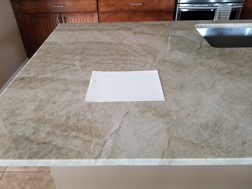
It’s most definitely not as warm as it looks on their website, but it does have a soft, warm, off-white base that’s a nice step away from cooler gray tones and overly warm ones.
Comparing any countertop to white paper is a great way to get a feel for it…

However, understand that the COOL tone of white paper can make a countertop look a bit warmer than usual.
Here’s your sample of Ridgegate!
Here’s another look at Ridgegate in natural light…

You’ll also find LOVELY orange and warm gray-greige-taupe veins that add interest without overwhelming the slab.
COLORS TO LOOK AT WITH RIDGEGATE
While there are more than these, here are some color groupings to get you started (of course, not every color in these groups is perfect for this countertop).
Sample and compare to see what suits your room and finishes!
- Super muted shades of taupe
- Warm, soft shades of white
- Very subtle shades of medium-depth taupe or greige
13. CAESARSTONE CALACATTA STILLSTORM 5115
If you like Et Calacatta Gold, you might LOVE Calacatta Stillstorm – I sure as heck do!

Just LOOK at those friggin’ glorious taupeish pockets of color, along with some warm, brown-inspired veins (they look more gray in this image, but they’re warmer in real life).
THE BEST PAINT COLORS WITH STILLSTORM
While there are more than these, here are some color groupings to get you started (of course, not every color in these groups is perfect for this countertop).
Sample and compare to see what suits your room and finishes!
- Off-white and light depth shades of taupe – maybe some light-medium shades, too
- Flexible white paint colors
- A range of green-gray paint colors could be stunning with Stillstorm
- There are more, but these will get you going on your color journey!
14. PERLA BIANCA QUARTZITE
If you like Taj Mahal but want an alternative, you’ll love Perla Bianca.

Sherwin Williams Best Warm Whites
Just like Taj Mahal, Perla Bianca quartzite (also known as Perla Bianco) has beautiful warm tones that might SEEM beige and tan at first glance, but often cater more to taupe and a flexible warm off-white (not a yellow/cream).
What’s the difference between Taj Mahal & Perla Bianca?
This is tough, as it can vary by slab/block. In general, they share the same color palette, although you might see variation in depths.
You may also notice the veining, which gives Perla Bianca a slightly different appearance. Brothers in Granite refer to this as ‘fish-scaling’.

This is Perla Bianca
Some say that the Taj Mahal is a bit warmer and browner, while Perla Bianca is a bit cooler and softer.
Check them out for yourself, as every single slab is different!
To learn more about the difference between Taj Mahal and Perla Bianca, check out this video from Brother’s in Granite – I sure learned a lot! While this shows Perla Bianca as a bit lighter/softer, remember that EVERY slab is different – it’s a natural stone!
IS THERE AN AFFORDABLE ALTERNATIVE TO TAJ MAHAL & PERLA BIANCA?
There are a few options if you want a similar look while saving some money…
- Perla Rocca is similar to Taj and Perla, but more budget-friendly
- Formica has a laminate countertop that’s called Taj Mahal 9922
A FEW MORE WARM QUARTZ COUNTERTOPS WORTH CHECKING OUT
- DOLCE by VIATERA (Pinterest image HERE as the website photo is a hot mess)
- ETHEREAL GLOW by Silestone (Pinterest image HERE)
- CALACATTA MIRAGGIO GOLD by MSI
- CALACATTA PREMATA by MSI
- LUMATAJ by MSI
- Check this out: The 12 Most Popular White & Off-White Quartz Countertops
MSI’s Most Popular Quartz Counters
By the way, if someone from MSI reads this, I’d LOVE SOME SAMPLES so I can include more of your products on a more official basis!
PEOPLE ALSO ASK…
And, of course, there are questions I get asked all the time, some of which I can answer right here for you!
WHAT’S MORE EXPENSIVE, QUARTZ OR QUARTZITE?
While it can depend on the brand of quartz countertop you buy, Cambria is one of the more expensive brands, and quartzite is generally more expensive than quartz.
WHAT’S THE MOST POPULAR QUARTZITE COUNTERTOP?
Taj Mahal is one of the top quartzite countertops due to its subtle warmth, durability, and versatility.
WHAT’S THE MOST POPULAR QUARTZ COUNTERTOP?
Calacatta Maximus is a hugely popular quartz countertop that mimics marble with a white base and gray veining. Next year, ask this same question, and we could look at something warmer! Silestone Calacatta Gold is another trendy counter that adds a bit of warmth.
WHAT’S TRENDING IN WARM QUARTZ COUNTERTOPS?
Quartz countertops that mimic the look of marble are still popular. These countertops primarily have a white background with gray veining.
However, in my Online Consulting work, I’m seeing a slow shift to some of these warmer countertops, as some homeowners are tired of the white-on-white-on-white kitchen.
ARE GRAY QUARTZ COUNTERTOPS IN STYLE?
While gray quartz has been reasonably trendy in previous years, there’s a big shift into warmer palettes, including soft off-white quartz and warmer quartzite countertops like Taj Mahal.
READ MORE
The 4 Most Timeless Kitchen Countertops
Quartz vs. Granite – What’s The Best Countertop for YOUR Home?
The Best White & Off-White Quartz Countertops
Ideas to Update Your 1990s or 2000s Bathroom
The Best Bougie Laminate Countertops: Budget-Friendly & Beautiful!
How to Update Older Style Granite Countertops
NEED HELP?
Check out my Online Paint Color Consulting!

Originally written in 2023, updated in 2025


What would be a comparable quartz to the Omnia Monterey mentioned in this post? Looks like Omnia is only available in Canada, something for us USA followers. Thanks!
Oh Kristen, I WISH there were a great comparable!
Kylie M, can I ask what you think about Calacatta Taupe quartzite? It’s relatively rare, but you can see some examples here (https://www.houzz.com/hznb/projects/cherokee-triangle-kitchen-pj-vj~6022272) and here (https://www.arizonatile.com/products/slab/quartzite/calacatta-taupe/). I find myself really drawn to it. It has the durability of quartzite but the look of marble, and I like the (more modern-leaning) warmth. It’s taupe, so a blend of brown and grey, without any trace of orange or yellow. It reminds me of coffee ice cream with chocolate syrup! Could look really nice with greige paint. What do you think? Thanks!
Enjoyed your article — thank you! Curious if you have a suggestion for a “warm white” solid countertop to pair with Taj Mahal/White dove? Thanks!
I am doing my kitchen with rift cut white oak, swiss coffee walls, and a beige concrete looking tile. any thoughts on the quartzite color? I am not sure if lavezzi and mont blanc will be too cool looking?
Hi Kylie. Are you familiar with Calacatta Delicato Quartz and if so can you suggest paint colors?
I’m sorry, I’m not at all! If you’d like me to check it out, I do have an Online Consulting service where I can suggest colors, once I see photos of it 🙂
Hi Kylie..Love your blog!! i am struggling with what color subway tile backsplash to install in my kitchen reno. My countertop is Vincostone Cinza and my cabinets are BM Cloud White with OilRubbed Bronze handles. Adjascent walls are BM Stone Hearth and BM Fossil…Help!
Often, your best bet is to make a perfect match of Cloud White for consistency and flow 🙂
What do you think of Silestone Eternal Staturario? It says it can pair with warm or cool. I’m hoping to pair it with SW pure white cabinets.
We have Silestone Calacatta Gold honed counters with walnut vanities in our bathrooms and it’s really beautiful. I especially love the coppery bits and the swirls aren’t overly bold. We bought a large remnant and saved a lot of money. For the kitchen I’m buying Silestone Lusso polished. It’s got creamy white, gray, coppery colors and small overall pattern. I just can’t deal with the giant swoops on the larger countertops used in the kitchen.
Oooo, I LOOOVE to hear this and comments like this help others too – thank you!
Hi!
I found this post to be very helpful, especially since trends are starting to lean towards the warm side again. I noticed you mentioned light depth greige/taupe would work well for Ironsbridge, but what about the darker taupes? Are they a no-go? Our tiles crave a darker taupe and but love that quartz color.
They coooould work, but they can pick up a bit too much violet sometimes, so I would tread carefully! It’d be nice to find one on the border of greige/taupe.
Thank you for the great ideas. I rely on so much of your advice as my go-to for my remodel! What cabinet paint colors would you consider with the more grey-green fantasy Macabus quartzite?
Thank you for this post! It is so helpful. Would you mind sharing the perimeter cabinet color for the kitchen under the heading “ 5. WHITE MACAUBUS QUARTZITE” and cabinet color for the kitchen under “ WHAT’S TRENDING IN QUARTZ COUNTERTOPS?” Thank you so much!
Oooo, I think that one is SW Agreeable Gray!
Hi Kylie,
Thank you for all the helpful information and time posting it!
I’m considering Cambria quartz in Warwick and was wondering if you would share your thoughts on this quartz.
Thanks so much,
Hey Kylie! Loved your take on timeless countertops. We recently bought a 20yr old house with golden oak cabinetry (yikes!) and was totally ready to have it all painted… until, I saw pics of Britannica Gold on counters and backsplash with golden oak cabinets. It totally changed my way of looking at golden oak and it was right up my alley, as I do tend to like warmer finishes. I’m now embracing the golden oak vibe – with SW Natural Linen painted walls & ceiling (kitchen has northern natural light). Even with the new vibe, I do want the cabinetry to behave itself and not POP!
Oooo, I’m so glad you found something that got you EXCITED!~ I would soooo love to see photos, if you’re comfy with that kylie@kylieMinteriors.ca But if that’s not your comfort zone, I TOTALLY get it :).
We chose beautiful Cambria Ironsbridge countertops. Can you recommend a few specific SW colors that would go well with it? I’m leaning toward Aesthetic White and White Dove in the kitchen but for the bathroom, I’d love a slightly darker paint on the walls… something with an LRV around 60 to 68.
Hi Kylie! Wondering if you have any experience with Vadara Ostara Dawn. We are very limited with our options through our builder, but I thought this one was pretty. Thanks! https://www.vadaraquartz.com/designs/ostara-dawn/
I’m sorry, I don’t!
Our cabinets will be Warm White (Kitchenmaid) with a Midnight blue island. We are considering a very light slab of Taj, LumaTaj or the new Calacatta Permata. All are warm but really indecisive……
Hi Kylie,
You share some GREAT information on your site! Thank you for this! 🙂
Can you please share your thoughts on using Cambria Inverness Quartz for a kitchen counter? Any suggestions for cabinet paint colors? I already have BM Edgecomb Grey on the walls in our open floor plan and I’d like to not have to repaint. Thank you! Ellen
What color are your white cabinets painted? I am thinking of doing mine in white dove with BRITTANICCA WARM BY CAMBRIA quartz. Hoping to keep my wall color paint which is Sherwin Williams Relaxed Khaki. What do you think?
Hey Diana! My cabinets are BM Revere Pewter 25% darker. HOWEVER, I do have White Dove walls/trims and could easily consider this for my cabinets!
Hi Kylie,
Great post! Would any of the above counters, because they’re warm, go with White Café appliances? Those appliances are very tricky! We’re thinking of agreeable grey cabinets, but no clue what to do with the countertops. Thank you!!