
The 16+ Best Paint Colors to Update Light Wood Cabinets, Trims, & Flooring
Maple, Cherry, Oak, Pine, & More…
Whether you need the perfect paint color to update your light wood cabinets, trims, flooring, or furniture, the best place to start is with paint (and me, of course). And whereas the word ‘paint’ makes any wood cabinet or trim lover twitch, this isn’t about painting these woods; we’re painting around them.
But (you had to know this was coming…)
This post may contain affiliate links. If you make a purchase through links on our site, we may earn a commission.Just because it’s wood doesn’t mean it’s good…or easy to update.

There are some glorious wood kitchen finishes, many of which are reasonably timeless. Others have had their moment in the sun…and now they’re done.
Make sure that any money you invest in updating your paint color, installing new countertops, and/or backsplash is well-spent (in other words, if you don’t have a good wood foundation, you might be spending all that money for nothin’).

How do you know?
That’s a blog post unto itself. Finish reading this blog post, then check out 6 Reasons Your Wood Cabinets Look Outdated and Are Wood Trims Outdated (I’ve included these links at the end, too).
CHOOSING THE BEST COLORS TO UPDATE LIGHT WOOD
When finding your wood’s best paint color, it’s not about you. Sure, you want to consider your tastes, but in the end…
If it doesn’t suit your wood, it won’t look good.
While yellow and orange-stained woods have their challenges, pink-stained woods are the trickiest as they aren’t trendy and won’t be anytime soon. BUT (it’s a big, Kardashian-sized one), ALL of these wood undertones can look better with a well-coordinated wall color, often one that leans in rather than out.

What does this mean?
Many think they need an opposite color or undertone to tone down their wood stain. Opposites attract and make each other stronger. In doing this, you’re actually ACCENTING your wood rather than leaning into it.
Leaning in means…
WOODS WITH A PINK UNDERTONE: Sample colors that favor a soft pink or purple-pink undertone, most often found in taupe (I have colors listed shortly—keep reading!). Don’t be scared; these are some of the most popular colors (trust the little Ginger; she’s been doing this a long time).

The Best Paint Colors for Pink or Red-Stained Woods
WOODS WITH A YELLOW UNDERTONE: Sample paint colors with a subtle green undertone for contrast or a subtle creamy backdrop. If your wood leans hard into yellow-orange, some beiges can look fab, too. This stain color can be reasonably versatile, suiting some other neutrals, including taupes.
You’ll see some options shortly – keep reading!

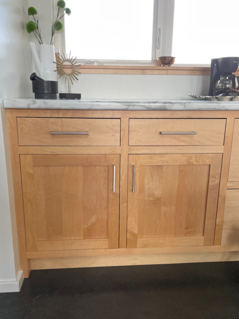
The cabinets have more of an orange undertone; the floor has a yellow hue.
WOOD WITH AN ORANGE UNDERTONE: Sample paint colors that cater to this undertone, particularly beiges. However, this wood finish is versatile, suiting greiges, taupes, and many other colors (colors listed below).

The Best Paint Colors with Golden Oak & Similar Woods
Please note that many of these photos are BEFORE photos to show you different stains—I don’t always get sent AFTER photos (or they don’t come through good enough to use).
Now, without further ado, let’s find the perfect hue for you!
1. BENJAMIN MOORE REVERE PEWTER HC-172
Revere Pewter is a light (on the heavier side of the range) warm gray-greige with a green undertone. While it’s a tough sell in a dark hallway, the average room handles its depth (LRV 55.05) quite well.
By the way, Revere Pewter’s other name is Ice Formations 973 – thank you, Benjamin Moore, for confusing everyone.

LEFT: Revere Pewter | RIGHT: Sherwin Williams Agreeable Gray
Looking at the above photo, while I often recommend Revere Pewter for light-stained woods, I don’t always choose Agreeable Gray. Revere Pewter’s muddy undertone is often a nicer complement to most lighter woods.
Here’s Agreeable Gray looking badass and beautiful in this open-concept living space. Just note the flooring and its light gray wash, which helps Agreeable Gray look more at home.

As for stain colors, Revere Pewter looks amazeballs with wood stains with a blend of yellow and orange. While it can be a bit fussy with some pink-stained woods (or pickled woods), it can handle a wink o’ pink.
Here’s Revere Pewter on the interior doors of a home with considerably light wood flooring…
DOES YOUR WOOD SUIT REVERE PEWTER? CHECK THESE OUT, TOO
Sampling and comparing similar shades is hands down, the best way to find your perfect paint color.
- Benjamin Moore Rodeo, which is kind of like a lighter version of Revere Pewter (kind of).
- Sherwin Williams Gossamer Veil is a gorgeous, muted warm gray-greige with a subtle green hue.
- Sherwin Williams Colonnade Gray can also be an interesting comparable.
To have some real fun, check out my CURATED WARM GRAY-GREEN COLOR BUNDLE (PEEL & STICK)!
2. BENJAMIN MOORE MARITIME WHITE 963 | OC-5
When it comes to colors that bridge the gap between the warm worlds, Maritime White is one of my favorites and a beautiful color to update light wood finishes. This warm shade sits on its beautiful beige butt without a ton of commitment to orange, pink, or yellow undertones.
In this next kitchen, look at how soft and gentle it is with these light orange maple cabinets (slight peachy tone)…

Maritime White sits at the very top of the light world with its LRV of 71.6, winking discreetly at the off-white world with a come hither glance.
Benjamin Moore Maritime White: More Photos & Info!
IF YOU LOVE MARITIME WHITE…
You’ll definitely need to check out…
- Sherwin Williams Moderate White
- Sherwin Williams Divine White
- Benjamin Moore Muslin
- For a full range of similar colors, check out my CURATED BEIGE COLOR BUNDLE (PEEL & STICK!)
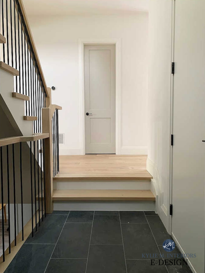
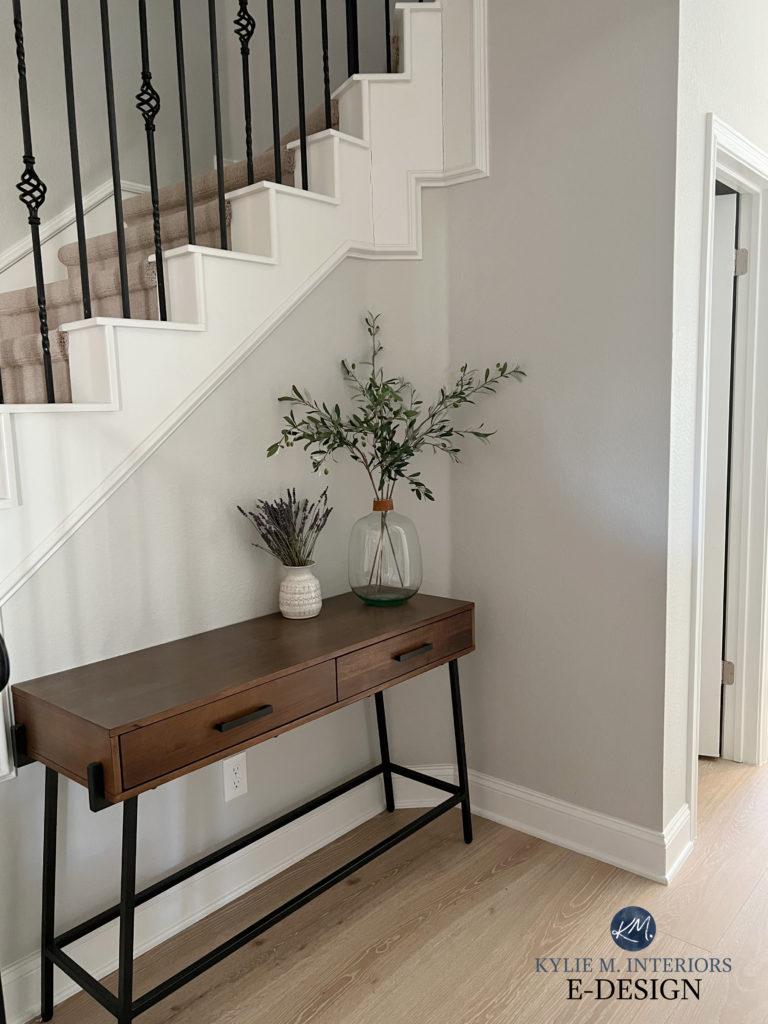
3. BENJAMIN MOORE WHITE DOVE OC-17 | PM-19
As far as the wild world of whites goes, White Dove is usually at the top of my list. This popular warm white is versatile for walls, cabinets, and trims.
Check it out in this open staircase with light red oak flooring…


Even with this floor’s pinkish undertone, White Dove sits soft and subtle.
Benjamin Moore White Dove: IMAGES: Info, & More
I also love Benjamin Moore Oxford White for its soft, simple look with lighter wood flooring and cabinets.
Benjamin Moore Oxford White: Images, Info, & More
COLORS TO COMPARE & SAMPLE
If White Dove is your cup of tea, compare it to…
- Sherwin Williams Alabaster, which is a bit softer and warmer
- Benjamin Moore Cloud White; one of Benjamin Moore’s timeless white paint colors
- Here’s a link to my CURATED WARM WHITE COLOR BUNDLE (they’re Peel & Stick and FUN!)
4. SHERWIN WILLIAMS MODERN GRAY 7632
While Modern Gray wasn’t blessed with a top position in Sherwin Williams’ fan deck, it pops up at the best of times, as shown in this kitchen with pinkish maple wood cabinets…
Notice how Modern Gray’s touch of taupe really satisfies this wood. It also picks up on this undertone in the tile floor and the veining in the white quartz countertop.
SIMILAR COLORS TO SAMPLE & COMPARE
Oh, there’s a world of taupes to explore, starting with…
- Sherwin Williams Egret White is amazeballs
- Benjamin Moore Edgecomb Gray (which we’re looking at shortly)
- Sherwin Williams City Loft
Never pick a paint color all on its lonesome. It’s like dating one dude and marrying him – GET OUT THERE AND HAVE SOME FUN!
Sherwin Williams Modern Gray: IMAGES, Info, & More
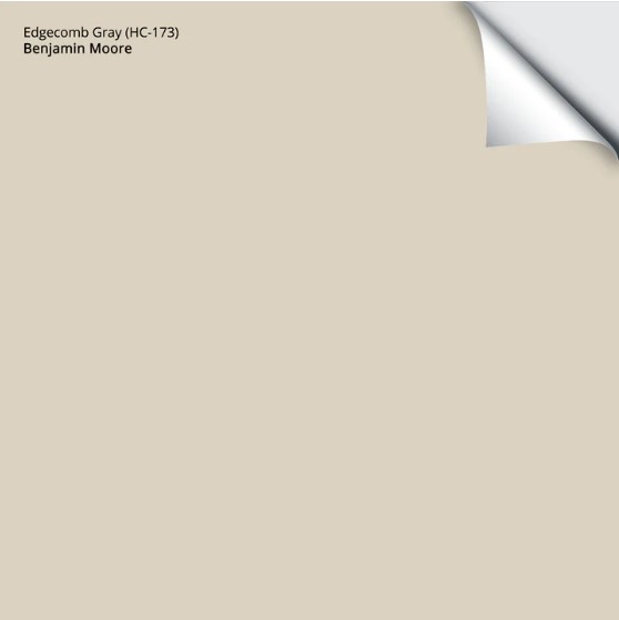
5. BENJAMIN MOORE EDGECOMB GRAY HC-173
You can’t argue with Edgecomb Gray’s popularity. Right up there with Revere Pewter, it’s one of Benjamin Moore’s more popular neutral paint colors.
By the way, in case you’re comparing colors that look pretty darn similar, Edgecomb Gray is also known as Alaskan Skies 972 and Baby Fawn OC-15. AWESOME SAUCE…said no one, ever.
Check out Edgecomb Gray / Alaskan Skies / Baby Fawn (just joking; I won’t do that again) in this staircase with considerably light, stained maple railings and treads…

One of the many things I love about Edgecomb Gray is how great it looks lightened. Sample it at regular strength, and if you think you might like it lighter, try it 25% and 50% – it’s still beautiful!
Here’s your Peel & Stick sample of Edgecomb Gray…
SIMILAR COLORS TO SAMPLE & COMPARE
You’ll definitely want to compare Edgecomb Gray to…
- Sherwin Williams Natural Tan
- Sherwin Williams Accessible Beige
- The previously mentioned, Sherwin Williams Modern Gray
These all pick up the general approach of Edgecomb Gray with tweaks in undertone, depth, and temperature.
Benjamin Moore Edgecomb Gray: IMAGES, Info, & More!
6. BENJAMIN MOORE COLLINGWOOD OC-28 | 859
Ever since gray became trendy 10-15 years ago, Collingwood has been near the top of my list. This is a warm gray with a gentle purple undertone.
Believe it or not, when not ‘contrasting’ wood stains (e.g., with a green), purple-pink undertones are some of the prettiest compliments to a wide range of wood stains!
Here’s Collingwood with subtly stained, natural maple stair railings and flooring…

The Best Gray Paint Colors With Purple Undertones
IF YOU LIKE THE LOOK OF COLLINGWOOD…
There are a ton of great colors to sample and compare to Collingwood, including…
- Sherwin Williams On the Rocks
- Benjamin Moore Nimbus
- Benjamin Moore Balboa Mist
Sample & compare colors to find your perfect blend of depth, temperature, & undertone.
7. BENJAMIN MOORE PALE OAK OC-20
While Pale Oak (also known as Athena 858) scares the pants off many well-intentioned painters, it’s a beauty. What makes many nervous is its pink undertone. That’s right, pink.

Being taupe, Pale Oak has a purple-pink undertone – a bit more than a few of the other popular taupe paint colors. And that’s what can make it SO friggin’ gorgeous with a range of lighter wood stains…
Benjamin Moore Pale Oak: Images, Info, & More
SIMILAR COLORS TO CHECK OUT…
If you love the look of Pale Oak, you MUST sample and compare…
- Sherwin-Williams Egret White
- Sherwin Williams Popular Gray
- Sherwin Williams Modern Gray
- Along with these colors in my CURATED TAUPE COLOR BUNDLE
Your perfect color could be one of those!
8. SHERWIN WILLIAMS SNOWBOUND 7004
Snowbound is one weird color. One minute, it picks up a vague purple-pink (taupe) undertone, and the next, it grabs a wink of pink, and then a vague cream. Either way, I’M HERE FOR IT!

Snowbound can be especially gorgeous with white or red oak flooring with a pink undertone, but it can also work with other stains, as long as the yellow or orange isn’t overpowering.
As for depth, surprisingly, Snowbound is in the white world with its LRV of 83. I say this as if you partner it with a brighter white trim; it acts like a soft, subtle off-white.
I’d also love to give you some comparables, but Snowbound is really a color unto itself!
Sherwin Williams Snowbound: IMAGES, Info, & More
9. BENJAMIN MOORE SEA PEARL OC-19
Sea Pearl (also known as China White) is a bit of a color ninja. While it’s known for flashing a subtle pink undertone, it picks up a touch of green the very ODD time. However, as shown in this photo below, it ain’t hard to see which undertone it favors (it’s the bottom sample)…

The Best Paint Colors for Pink or Pickled Wood Stains
As you can see, these are all great colors to update light wood with a stronger pink hue. However, they aren’t fool-proof—sample carefully and notice how they change throughout the day and on different walls.
SIMILAR SHADES TO EXPLORE
Check out these colors to see if one is a better fit for you and your wood…
- Sherwin Williams Aesthetic White
- Sherwin Williams Shoji White
- Benjamin Moore Classic Gray
- Sherwin Williams White Heron is an interesting color, too
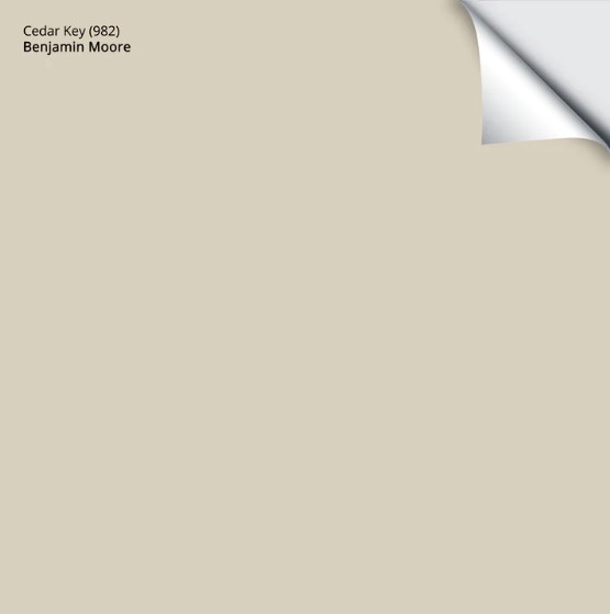
10. BENJAMIN MOORE CEDAR KEY 982
This next photo shows the same samples (as above) on a different wall. In this case, look at the ever-lovely Cedar Key, the top sample in both photos (Sea Pearl is the bottom sample)…

Cedar Key is awesome if you’re looking for a hybrid between taupe and beige. With a touch of both, it can be a modern approach to both without 100% commitment either way!
Here’s your Peel & Stick sample of Cedar Key…
SIMILAR SHADES TO COMPARE
As always, sample and compare to see changes in temperature, depth, and undertone.
- Benjamin Moore Smokey Taupe
- Sherwin Williams Accessible Beige
- Sherwin Williams Kestrel White
Benjamin Moore Cedar Key Paint Color Review
11. SHERWIN WILLIAMS BALANCED BEIGE 7037
Not everyone wants light and bright wall colors with their light woods. Some crave a softer, moodier vibe. While Balanced Beige isn’t overly dark, its LRV of 46 offers a different, lower-contrast approach than some of the previous shades.
Balanced Beige is a light-medium depth shade of dusky beige with a bit of gray to calm it.

SIMILAR COLORS TO COMPARE
There are some WICKED pretty colors that could be good alternatives to Balanced Beige, including…
- Sherwin Williams Accessible Beige
- Sherwin Williams Shiitake
- Benjamin Moore Stone Hearth
WHAT ABOUT COOL PAINT COLORS?
Cold or cool-looking paint colors can work with light woods, knowing that they don’t necessarily lean INTO a wood’s undertones and can even accentuate them, so choose carefully!
If you don’t love your wood’s undertones, some cool colors will enhance them.
12. SHERWIN WILLIAMS FIRST STAR 7646
Some people don’t like the warmer tones often used with light woods, and a color like First Star is a nice, soft alternative. PERSONALLY, it’s a bit too cool for me, but you do you!
This next open-concept living and dining room shows First Star with light laminate or wood-look flooring…

The similar, slightly muddier Crushed Ice is another soft, subtle approach to coolish colors with warmer, lighter wood stains…
Sherwin Williams Crushed Ice: IMAGES, Info, & More
13. BENJAMIN MOORE CAPE MAY COBBLESTONE 1474
There’s nothing I love more than a color that WINKS at its undertone without a hardcore commitment – a color like Cape May Cobblestone.

As shown with the pine trim and light maple cabinet in this bathroom, Cape May Cobblestone is a subtle approach to greige. Sure, it’s technically a WARM paint color, but in contrast to warm woods, it really softens the blow while offering a subtle shift in temperature.
The Best Stone-Inspired Paint Colors: Greige, Taupe, Beige, & More
14. BENJAMIN MOORE STEEL WOOL 2121-20
You’d be surprised at how many wood finishes cater to a purple or purple-pink undertone. In this case, let’s use it and abuse it by slapping it on the walls with a darker shade of gray like Steel Wool. This is a solid, medium-depth gray with purple-blue undertones. While it’s not SUPER obvious in this photo, it grabs soft tones in the flooring and furniture…

My FULL Paint Color Review of STEEL WOOL
15. BENJAMIN MOORE HALE NAVY HC-154
If you want a more striking contrast with your wood trims or flooring, check out Benjamin Moore Hale Navy…
Hale Navy is a classic navy blue from Benjamin Moore. Coming in with a skookum dark LRV of 8.36, it’s beautiful with almost EVERY wood stain, no matter the color or depth!
Benjamin Moore Hale Navy: FULL Paint Color Review
The Best Paint Colors to Go With Golden Oak
16. SHERWIN WILLIAMS EVERGREEN FOG 9130
How could we even THINK of cool colors without going green? Evergreen Fog is one of the prettiest choices with light wood cabinets, flooring, or trims. While it reads as green, a great gray base calms it down.
In this gorgeous laundry room, Evergreen Fog looks beautiful with the butcherblock countertops, vinyl flooring, and white subway tile backsplash…

My FULL Paint Color Review of Evergreen Fog
Here’s another shot of Evergreen Fog as a shiplap accent wall in a guest bedroom…
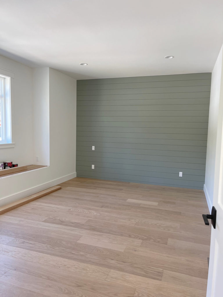
In fact, there’s a TON of light and medium-depth green-grays if you want to contrast your wood…

The Best Medium to Dark Green Paint Colors
The Best Light Green Paint Colors
And last but not least, the BIG question is…
IS LIGHT WOOD STILL IN STYLE FOR CABINETS & FLOORING?
That’s a tough one to answer. As far as Design trends go, the average homeowner is still installing light (or slightly darker) wood flooring and cabinets—most commonly, white oak or red oak, with some maple here and there.
However, trends shift darker if you follow the larger design world (even just on Pinterest). We’re seeing a lot of moodier, moderately deep, and dark-stained woods on flooring and cabinets.

How to Update Your 1990s Home | 2000s Home
That’s right! While the above older granite countertop and backsplash aren’t in style, the depth of the wood stain is making a comeback.
When will dark wood cabinets hit the REAL world of design (not just what you see on Pinterest and Instagram, but a bit more ‘mainstream/everyday homeowners’?’ Hard to say.
While I have yet to see many of my Online Consulting clients commit to dark wood kitchens, medium and dark wood-stained islands are showing up in a big way.

I’m even seeing some soft, medium-depth wood trim show up here and there, but I wouldn’t bank on that coming back…yet.
Would I install light wood floors and cabinets if I renovated my home tomorrow?
Nope, but a) I’m personally not a fan of light wood floors and cabinets for my home, and b) trends are leaning the other way.
READ MORE
The Best White Paint Colors With Wood
6 Reasons Your Wood Cabinets Look Dated
How to Update Wood Cabinets Without a Drop of Paint
NEED HELP?
Hire North America’s Top Paint Color Expert – 10,000+ others have!


I think I have every paint sample known to man and the more I look, the more confused I am. Which of your packages do I choose if I want help with colors for both kitchen cabinets and walls?
Hi Karen! You’d check out the single room (assuming it’s a space unto itsel and not combined with a livingroom/familyroom/etc) and then do the cabinet add-on! I’d love to help!
HI Kylie! It is a space unto itself so I am looking at the signature one room package, which is out of stock. I don’t see the cabinet add on but maybe that’s because the one room is out of stock right now. I’ll keep checking. Thanks so much. I am excited to work with you!
Karen
Any thoughts on SW Greek Villa in a NE facing kitchen with gold St Cecilia granite, beige subway tile, orangey maple cabinets and honey oak floors? Walls are currently SW Tony Taupe but I’d like to lighten it up