
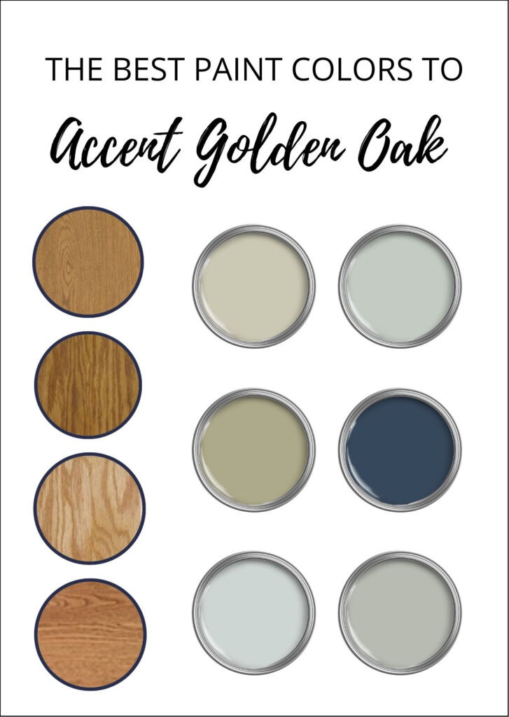
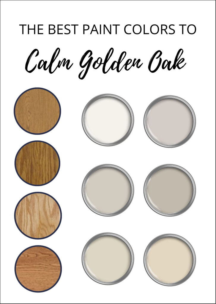
The 14 Best Neutral Paint Colors to Go With Golden Oak (Cabinets, Flooring, & Trim)
Modernize Your Outdated Golden Oak Home With Paint!
I’ve written many blog posts on affordable ideas to update wood cabinets, covering a wide range of wood stains and grains. This one is all about YOU and your golden or honey oak cabinets, flooring, and trim. No maple, no cherry, and definitely no pine—it’s all oak, baby—solid wood and solid good.
And while you can use these paint color ideas with new, modern oak finishes (they’re pretty hot right now), these tips are geared more towards those found in homes from the 80s, 90s, and earlier 2000s.

Let’s check out a few defining features of oak from these decades…
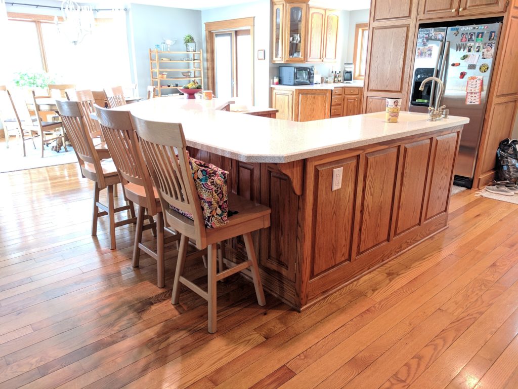
- Golden or honey oak cabinets often have a reasonably glossy topcoat.
- Oak kitchen cabinets have either exposed hinges, cathedral-style doors…or both. The odd lucky bum has neither.
- These cabinets are surrounded by laminate countertops, which is typical of these decades. Details can include a beveled edge or a wood border around the perimeter of the counter, and most have a 4″ integrated counter splash (the bit of countertop that goes 4″ up the wall).
- Golden or honey oak flooring is often narrow, strip-style, not the more modern 5-7″ width.
- This era of oak or wood flooring is often covered in a stronger satin/semi-gloss sheen.
- Oak trim is often thin and simple, not wide and glorious like wood trims from much older homes.
Look at all of that golden oak glory!
Remember, not all golden or honey oak finishes look the same. Some are lighter, others darker. Some are more orange, yellow, red (pink), or brown. Whatever stain you’ve got, if you think it’s ‘golden oak,’ it likely is! If you need more clarification, some photos in this blog post should help.
And remember…
Only a new stain or paint color will change your wood stain—it is what it is. However, the right color on your walls can change your perception.
Now, the first topic we need to hit concerns your INTENTIONS…
DO YOU WANT TO ACCENT YOUR WOOD FINISHES?
To accent wood, we usually start with cool colors, specifically blue, green, and neutrals with these undertones. These cooler hues contrast with golden oak’s warmth, and they bounce off each other, enhancing each other’s best features!
Blobs are just general representations of a color group
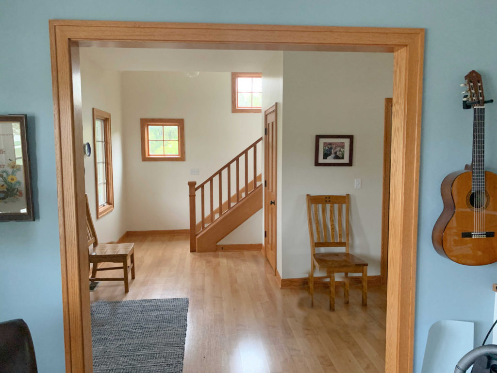
In this next foyer, while the cream color doesn’t blend in with the wood, it doesn’t ENHANCE the wood as much as the blue hue in the living area – both are equally as pretty…
If you love the idea of adding a little COLOR to your walls with blue, green, purple, or something else fun, you might enjoy this blog post: The Best ACCENT Colors to Update Wood.
Why?
Because this blog post is for those who answer YES to this question…
DO YOU WANT TO SOFTEN/BLEND YOUR WOOD FINISHES?
You might not love your oak and wish it were something else (e.g., painted or restained). But for whatever reason (usually a hubby’s or wood lover’s opinion—wink, wink), that oak is staying, and you need to work around it.
Or maybe you love oak (I’m a huge fan, personally) and want the best neutral paint colors to coordinate with it – to make it look its best.

In this case, it’s about choosing colors that complement your wood finish without ENHANCING it. I can’t make your wood stain go away, but I can make it look even better than it does.
Blobs are just general representations of a color group
The thing is, a lot of people come to me wanting to camouflage their wood – to make it go away. The only way to do that is to paint your walls the same color as your wood stain, which nobody is willing to do.
Instead, we need to work WITH your wood stain, lean into it, and find a color that both you and your wood are oak-ay with.
But, as I’ve been seeing since the dawn of time (or approximately 14 years ago when I first started blogging)…
Just because it’s WOOD doesn’t mean it’s GOOD.

What does this mean?
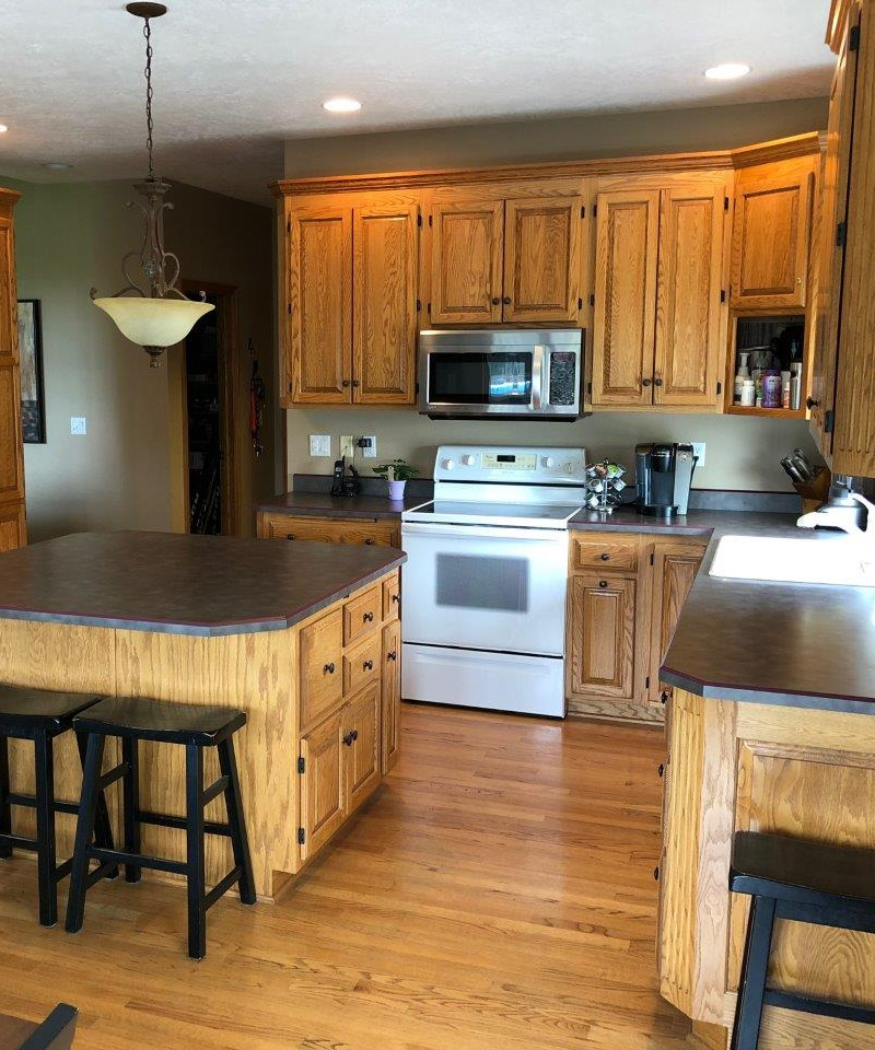
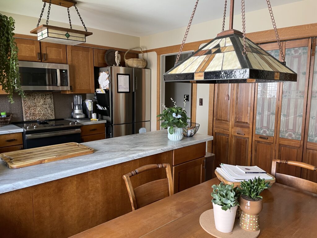
Wood isn’t inherently good just by being itself; it needs to be doing a good job of adding emotional, visual, and ACTUAL value to your home. Some homes, especially 1990s homes, have golden oak flooring throughout. But that’s not the problem; often, the biggest pain point is in the kitchen, where the wood flooring meets the wood cabinets. And as you saw in a few previous examples…
Wood-on-wood isn’t always good.
There is something to be said for ‘too much of a good thing‘ when it comes to wood (which is what I always tell Tim, wink wink). The thing is, your wood cabinets and wood flooring could be beautiful in their own right, but there’s a chance that they’re actually canceling each other out – IT’S TOO MUCH!
For example, check out this next wood-on-wood wonder…
The last time I saw this much wood-on-wood, it was in an inappropriate movie (and the above isn’t doing it for me either).
Why?
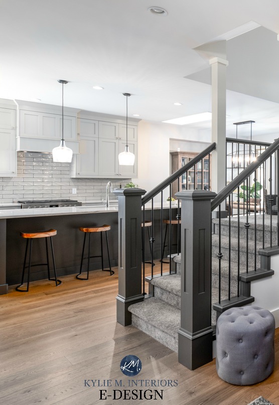
The sheer amount of wood is overwhelming, and one degrades the visual value of the other. My client hired me, as she agreed—she didn’t love how her floor and cabinets (and wood trim) disappeared into each other. But she wasn’t ready to do the whole shebang. Instead, I suggested some pretty island colors, including Sherwin Williams Cyberspace.
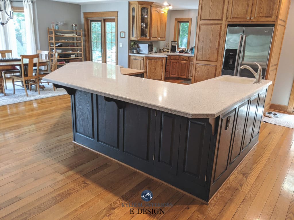
The Best Blue Paint Colors for Cabinets & Islands
JEEZ FRIGGIN’ LOUISE, it’s like this kitchen can breathe again! Before, the floor was no screamin’ glory, but now it looks gorgeous as it has the navy blue island to PLAY with! Not only that, the main cabinets come to life as well, as they aren’t being buried in a sea of wood.
See my CURATED COLLECTION OF ISLAND PAINT COLORS – making your sampling life a heck of a lot easier.
Now, without further ado, let’s see what’s up in my colorful little sleeves…
PAINT COLORS TO UPDATE GOLDEN & HONEY OAK
As mentioned earlier, what do you want your wood to do?
- Do you want your oak to come to life with a color that’s like the Viagra of the wood world?
- Do you want your wood to take a bit more of a backseat, knowing it’s not going away until you paint it or restain it?
Whatever you’re looking for, I’ve got some great colors for you to explore.

We’re going to hit it all, starting with one of my faves…
1. BENJAMIN MOORE EDGECOMB GRAY HC-173
As far as popular warm neutrals go, it’s hard to beat Edgecomb Gray (although this color and this color sure try). Edgecomb Gray is like the half-sibling of beige and gray – it’s related to each, but not 100% by blood.
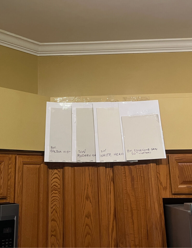
BM Balboa Mist | SW Modern Gray | SW White Heron | BM Edgecomb Gray lightened
This makes Edgecomb Gray a great option for golden oak, which can also hover between worlds – not quite red oak (although it can wink at it pretty hard), but not super yellow (again, a polite nod).
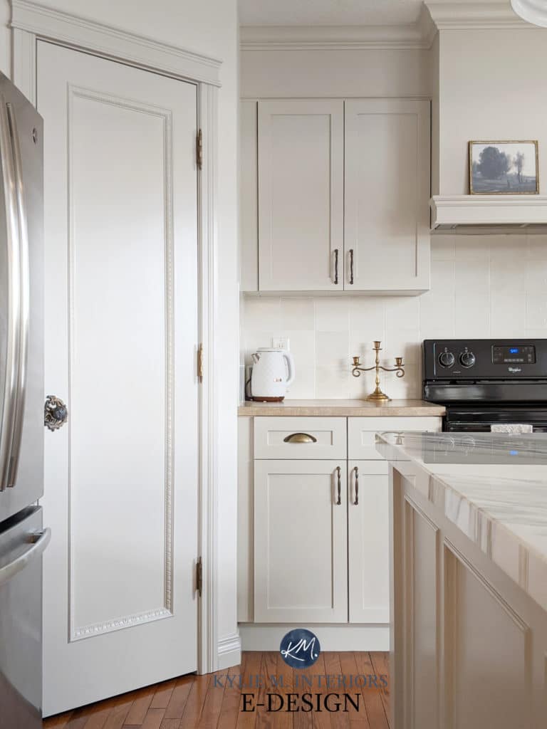
This next client consulted with me about their walls, and we chose Edgecomb Gray. After the walls were done, they also consulted with me about the stair railing as they weren’t happy with the black they chose (and I agree—it’s too harsh).
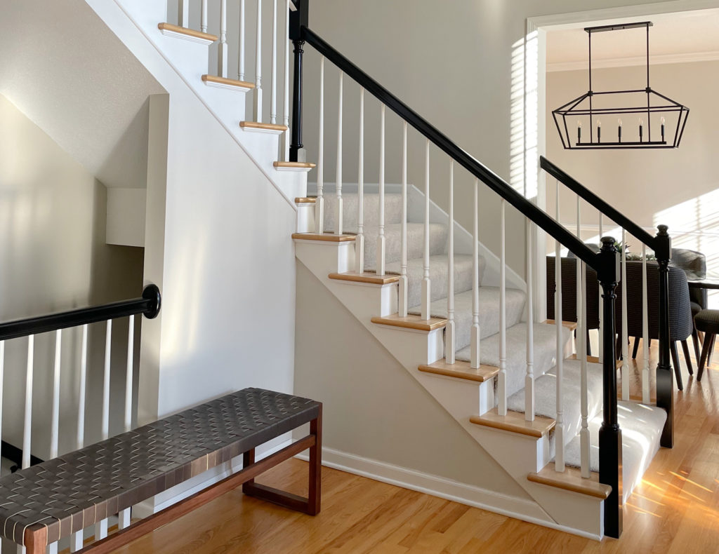
Ideas to Update Your Staircase
While the railings are a work in progress, notice how pretty Edgecomb Gray looks with the golden oak flooring, wood stair treads, and the carpet as well.
Remember, it’s not just about you and your wood (ya, I’m talking to you, Larry, Bob, and Darryl). Often, your wood stain is the least of your concerns – be sure to humor your other finishes and their needs, too!
It can be easy to get caught up in our wood stain, especially if we don’t love it. However, MORE OFTEN than not, other, bossier finishes need to be accommodated!
FULL Paint Color Review of Benjamin Moore Edgecomb Gray
2. SHERWIN WILLIAMS AMAZING GRAY SW 7044
Amazing Gray is a beautiful color that slightly accents golden oak. With its light-medium depth, Amazing Gray has a bit lower contrast compared to colors with higher LRVs. It’s a greige, meaning it’s like a warm gray with some beige in it and a soft green undertone.
While this next door trim is more likely maple, not golden oak, it shares a similar undertone to some oak cabinets and finishes…

It’s easy to see how a color like Amazing Gray (or Benjamin Moore Revere Pewter – coming up shortly) offers a soft, organic contrast to a warmer wood finish.

SW Analytical Gray | SW Argos | SW Sensible Hue | SW Magnetic Gray | BM Wales Gray
FULL Paint Color Review of Sherwin Williams Amazing Gray
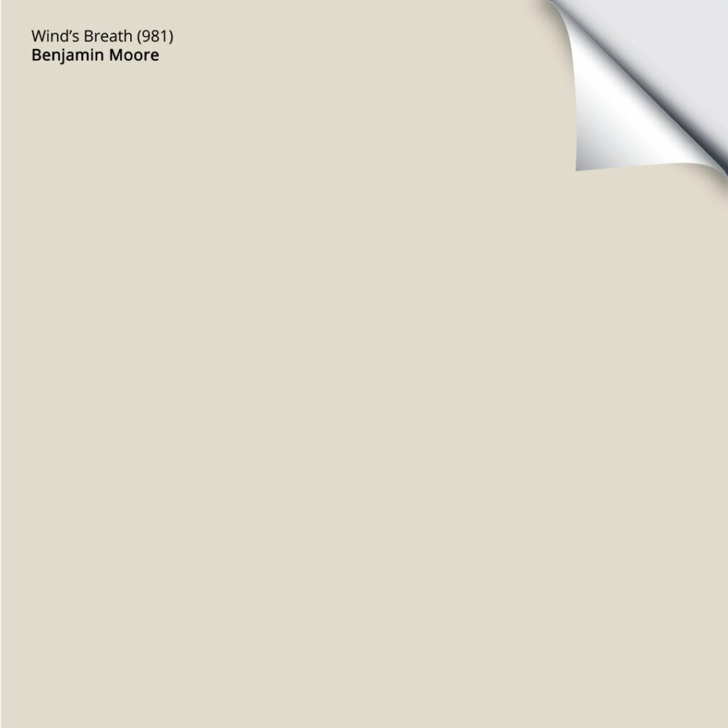
3. BENJAMIN MOORE WIND’S BREATH OC-24
Oh, bestill my beating heart, to hear the wind’s breath…just joking; I ain’t that fancy (as I refill my glass from a box of wine). Regardless, Wind’s Breath can be absolutely stunning with golden oak cabinets, flooring, and trim.
Why?
Whereas many warm neutrals commit to a certain shade or undertone, Wind’s Breath is a hybrid color – a color ninja, meaning it can morph into a range of warm neutrals with minimal commitment. Cream, tan, a feather-dusting of gray? Wind’s Breath has it covered.
This beautiful shade is a great choice if you neither want to highlight nor camouflage your wood tone – you just want a color that looks friggin’ gorgeous.
FULL Paint Color Review of Benjamin Moore Wind’s Breath
A few of my fave colors that are similar to Wind’s Breath include Sherwin Williams White Duck, Benjamin Moore Ballet White, and Sherwin Williams Shoji White.
PEEL & STICK SAMPLES MADE WITH REAL PAINT – ON YOUR DOORSTEP IN 1 DAY!
Get your PEEL & STICK SAMPLE OF WIND’S BREATH here.
4. BENJAMIN MOORE REVERE PEWTER HC-172
As far as gray goes, it’s hard to beat the timeless look of Revere Pewter.
While some grays are too cool for the long haul, and others are too flat-looking with golden oak, Revere Pewter is often the perfect shade, as shown with the golden oak flooring below…
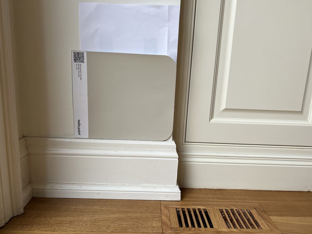
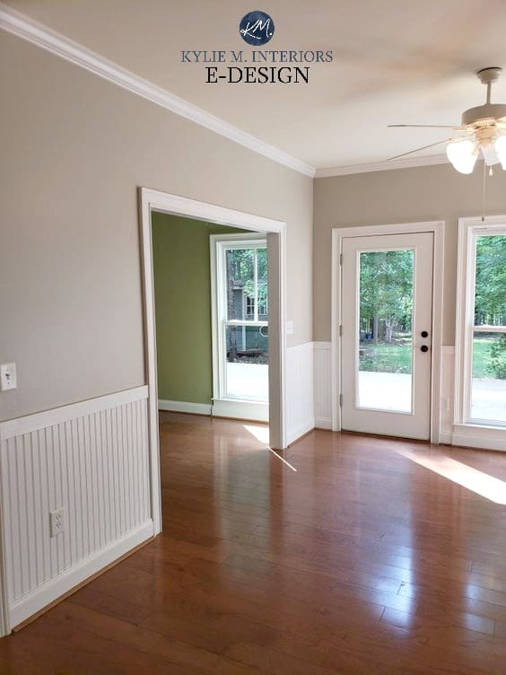
Revere Pewter is a warm gray-greige with a beautiful, earthy green undertone. It also has a bit more depth than the ‘usual gray bunch.’ With an LRV of 55.05, Revere Pewter is on the lower, darker end of the light range, making it a really calming, classic partner to golden oak.
Will Revere Pewter accent oak, or calm it down?
It can all depend on what you currently have on your walls. If your walls are beige, well, Revere Pewter will lightly contrast with your oak in comparison. On the other hand, if your walls are currently a stronger shade of blue or blue-green, you might find Revere Pewter the PERFECT, calming partner to your oak finishes.
While this next home has more red oak than golden oak, look at the difference between the main room, with its Revere Pewter walls, and the back room, with the stronger green hue.
FULL Paint Color Review of Benjamin Moore Revere Pewter
Neither of these colors makes the floor look LESS RED; it’s about not making it look MORE RED than it needs to!
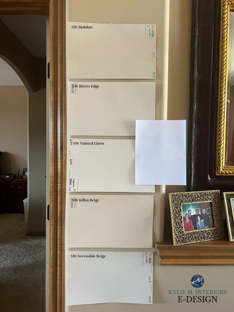
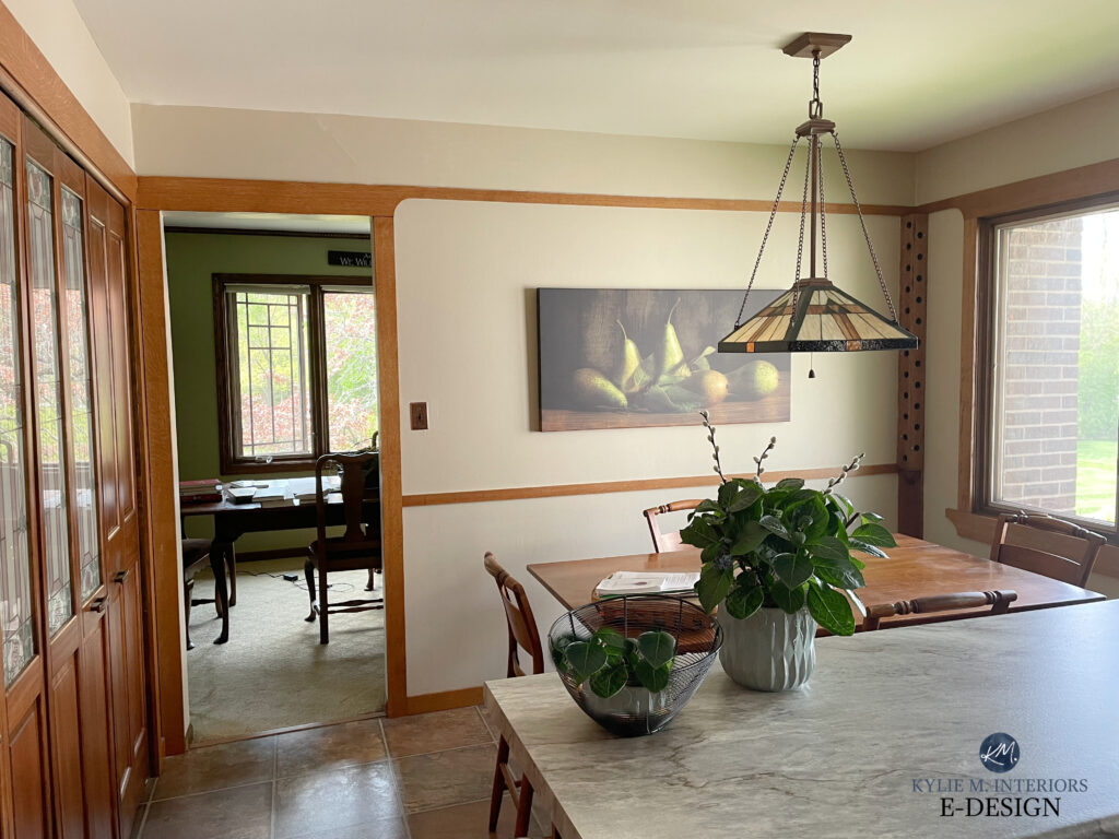
5. SHERWIN WILLIAMS NATURAL LINEN SW 9109
If you want a warm paint color for your walls that doesn’t overreact with your oak but also doesn’t entirely blend in (woof, nobody wants that), you have to check out Natural Linen (color review HERE).
Beiges have a bad rap, thanks to the early 2000s. However, the new age of beiges is so much different – SO MUCH BETTER – beiges that include shades like Natural Linen…
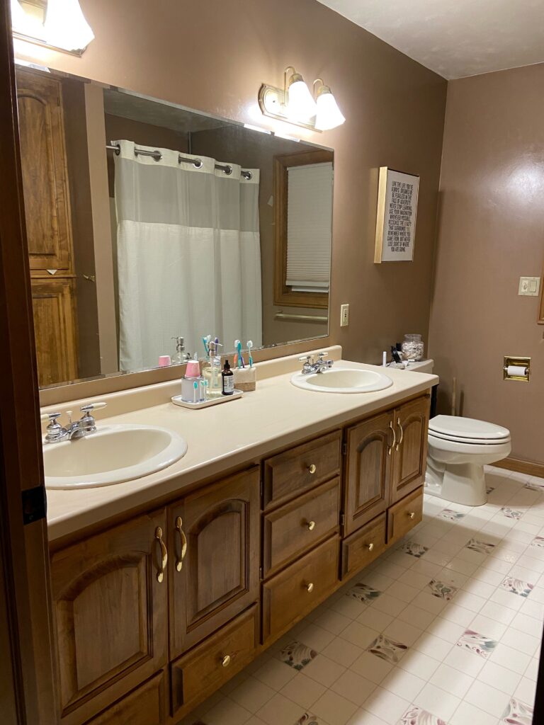
This trim isn’t oak, more like maple, but it’s got a golden-oak vibe (brownish)
If you ask me, Natural Linen is the PERFECT beige. While it centers on an orange undertone (like most golden oaks), it’s flexible towards orange-yellow and orange-pink – JUST LIKE MANY GOLDEN OAKS! Natural Linen is also a great depth for the average room. With its LRV of 66, it sits in the middle of the ideal range for the average home.
Again, comparison is key, so check out the similar looks of Sherwin Williams River’s Edge, Accessible Beige, and Benjamin Moore Muslin.
To see my top shades of beige, check out this CURATED LIGHT BEIGE COLOR BUNDLE.
6. SHERWIN WILLIAMS SHOJI WHITE
When it comes to popular warm paint colors, Shoji White is at the top of a lot of lists.
Shoji White is an off-white warm neutral. It’s tucked between the ample bosom of cream, gray, and taupe, with minimal allegiance to any. This offers a TON of flexibility for a range of wood stains and undertones.
While this next wood flooring is too dark to be golden or honey oak, you can still see how beautiful Shoji White looks on the painted cabinets and how it helps to update the older granite countertop…

Sherwin Williams Shoji White: IMAGES, Info, & More
7. SHERWIN WILLIAMS MALABAR SW 9110
Now, if you’re a bit more traditional and you like warm neutrals with a bit more meat on their bones, you might love Malabar. While the most ‘trendy’ beiges and tans are lighter and a touch grayer, Malabar is still a step above the heavy, saturated beiges of the early 2000s.
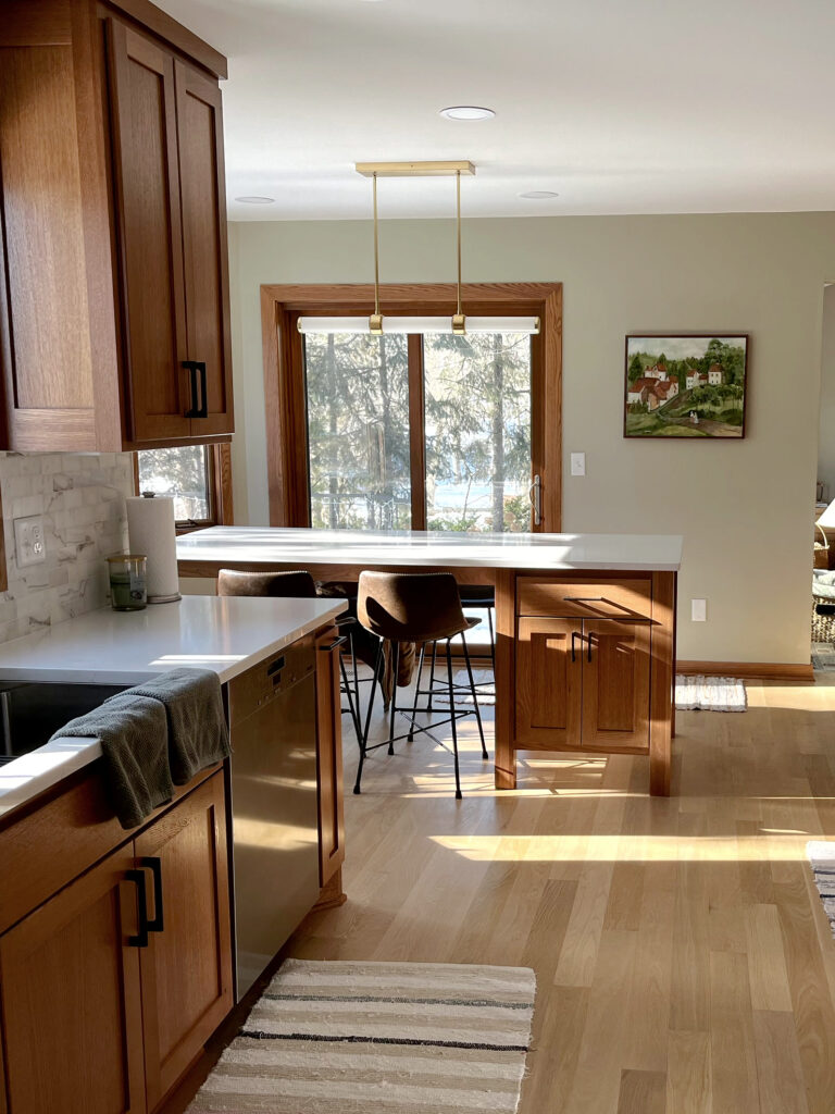
As shown in this kitchen, Malabar flows nicely with orange-toned woods…
The 14 Best MODERN Beige & Tan Paint Colors
8. SHERWIN WILLIAMS ALPACA SW 7022
While violet can be cool-toned (if it’s violet mixed with blue), a warm violet can be a beautiful, updated partner to golden oak. Whereas blues and greens directly contrast, and some beiges blend a bit more, the right violet tone is a great happy medium between the warm and cool worlds.
One of my favorite warm gray-taupes to suggest to my Online Color Consulting clients is Alpaca. With its warm violet undertones (violet-pink, whereas violet-blue is cool), colors like Alpaca can look a bit more modern than some shades of beige without bouncing off the wood as much as blue and green hues.
FULL Paint Color Review of Sherwin Williams Alpaca
Alpaca runs in the same world as other warm grays and taupes like Benjamin Moore Collingwood, Balboa Mist, Pale Oak, and Sherwin Williams Popular Gray.
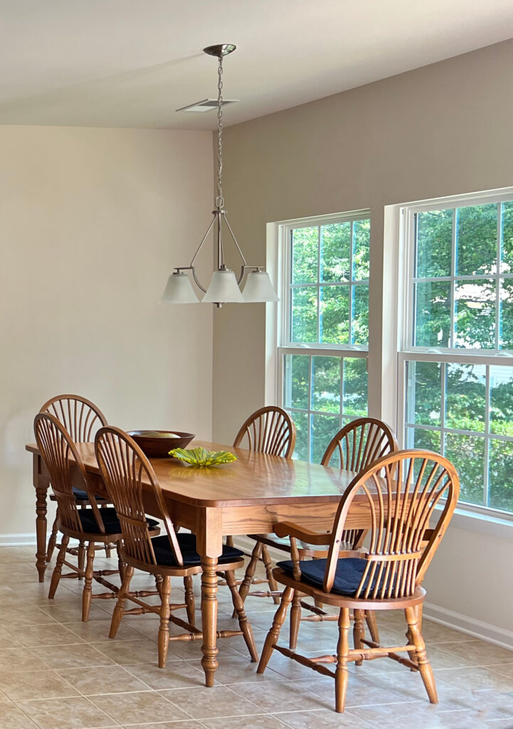
9. SHERWIN WILLIAMS MODERATE WHITE SW 6140
As far as light beiges go, it’s hard to beat the beauty and balance of Moderate White. Like most golden oaks, Moderate White sits on an orange base with some flexibility towards orange-yellow and orange-pink tones.
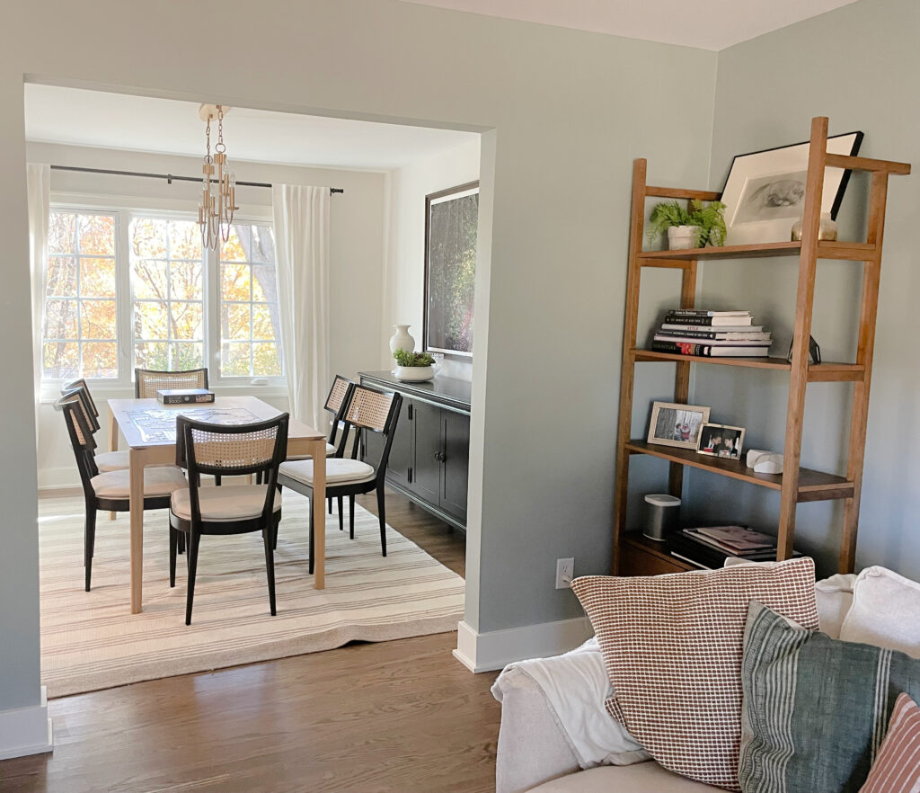
And unlike the OLD beiges, Moderate White is more modern-looking because of its depth. This gorgeous warm neutral is an off-white with an LRV of 74. Look at how beautiful it looks with this traditional golden oak dining set.
FULL Paint Color Review of Sherwin Williams Moderate White
This next photo shows the very similar Sherwin Williams Divine White, with golden oak flooring and a maple handrail…
FULL Paint Color Review of Sherwin Williams Divine White
By the way, I have Color Bundles for EVERY COLOR GROUP. If you want a bundle for a specific color/depth, leave a comment, and I’ll send the link (rather than inundate you with links throughout this blog post).
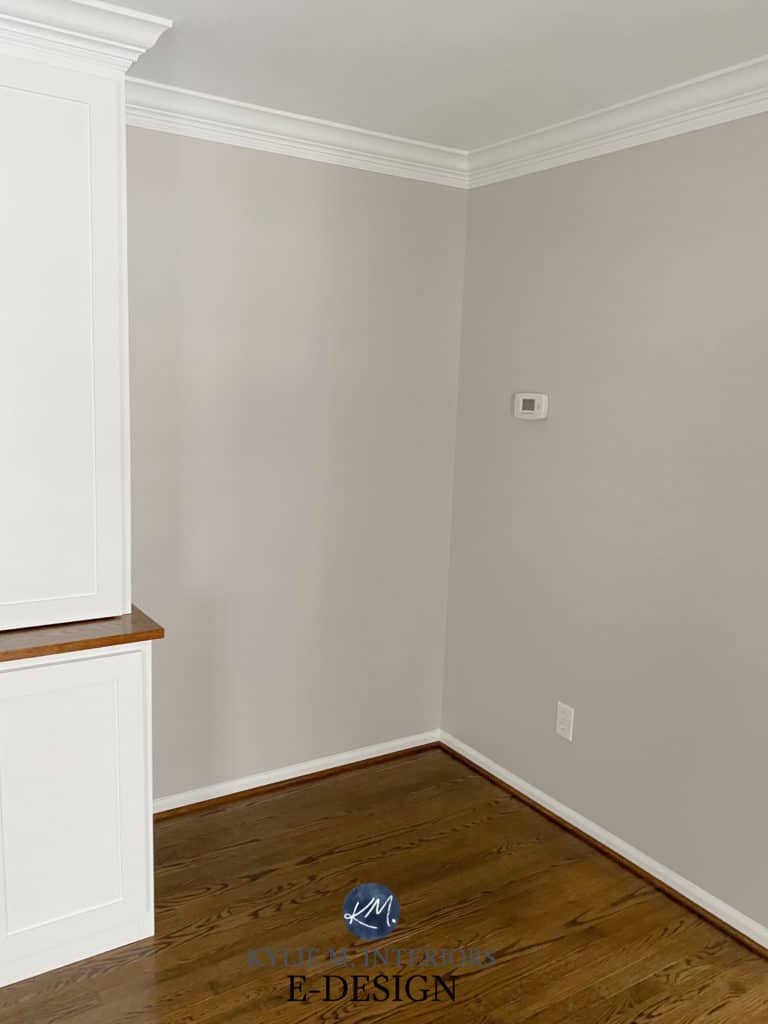
10. BENJAMIN MOORE PALE OAK OC-20
Pale Oak isn’t just one of Benjamin Moore’s top-selling paint colors; it’s also wickedly pretty with golden and honey oak finishes.
With all the glorious natural light shining in, it’s tricky to get a feel for Pale Oak in this photo. Look in the corner between the window and cabinet to get the general idea…

Pale Oak is a light-depth shade of taupe. While some get nervous about its slightly increased undertones (pink-purple), most are won over by its overall approach to a neutral, warm tone, and a more modern look.
Benjamin Moore Pale Oak: IMAGES, Info, & More
As for these next colors, they dip a bit more into the color pool, which means they can slightly enhance the warmth of your oak. To see MORE like these, visit the link below!
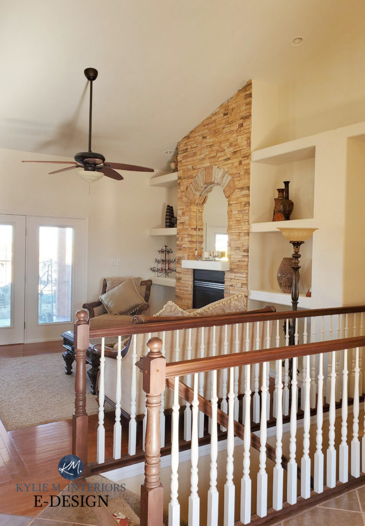
11. BENJAMIN MOORE IMPERIAL GRAY 1571
Imperial Gray is a gorgeous color, mixing blue, green, and gray in a melange of magic. Because it has a lot of gray, Imperial Gray can accent oak or any wood, but it’s more calming than a color with less gray and more color (e.g., Sherwin Williams Rainwashed, which would offer considerably more contrast with a wood stain).
This next photo shows Imperial Gray in a living room with muted golden oak flooring (more brown than rich orange-yellow or pink).
Sure, it accents the wood a bit, but just because it’s slightly accented doesn’t mean it’s bad—it comes down to the look you love for your space. If you’re curious, the dining room is painted Benjamin Moore’s Silver Satin.
Compare Imperial Gray to similar shades to see which is best for your space. Check out Benjamin Moore Beach Glass, Gray Wisp, and Sherwin Williams Argos.
The 18 Best Blue and Green Paint Colors for Bedrooms
12. BENJAMIN MORE PARIS RAIN 1501
If you want to accent your wood without making a huge statement about it, check out colors like Paris Rain. Paris Rain (also known as Mountain Air CC 636) is green-gray. A cool shade of green (green-blue) would accent the wood trim and cabinets even more. However, because Paris Rain is a warm blend of green and gray, the palette is a bit calmer and more organic-looking.
This next kitchen has my heart. While the oak cabinets and trim have a touch more red-pink than most golden oaks, the contrast with the wall color (similar to Paris Rain) is a great example of ‘accenting your wood stain’.
If you like the looks of Paris Rain, you’ll want to do some comparisons. I recommend checking out my Curated Green Color Bundle to save time and money in your sampling journey (paint sample pots are the worst). Never pick a color based on how it looks alone. When I compare colors for my home, I try to hit 4-6 similar shades to see the ebb and flow between temperature, depth, and degree of color (chroma).
13. BENJAMIN MOORE DRY SAGE 2142-40
If you’re looking to jazz things up and want a color that accents and contrasts with your wood finishes, look no further than GREEN. Green directly contrasts with the warmth of ANY oak, making it a great partner when you want your wall and wood finishes to play with each other. One of my fave shades of green to jazz up almost any wood finish is Dry Sage…
Dry Sage has an LRV of 34.63, making it a very solid medium-depth shade of green. Combine this with a golden oak floor, cabinet, or trim, and you have one gorgeous combo on your hot lil’ hands.
While you can get a similar effect from cool greens (greens that mix with blue), because Dry Sage is a warm green (green-yellow) with a lovely greige base to calm it down, it contrasts while still looking organic and natural.
14. SHERWIN WILLIAMS FRONT PORCH SW 7651
While gray isn’t trendy anymore and warmer shades are moving in, not everyone wants warmth on their walls – ESPECIALLY when their golden oak offers enough warmth as it is!
Keeping in mind that cool colors add contrast, and with the thought of not going too far, check out Front Porch in this bedroom…
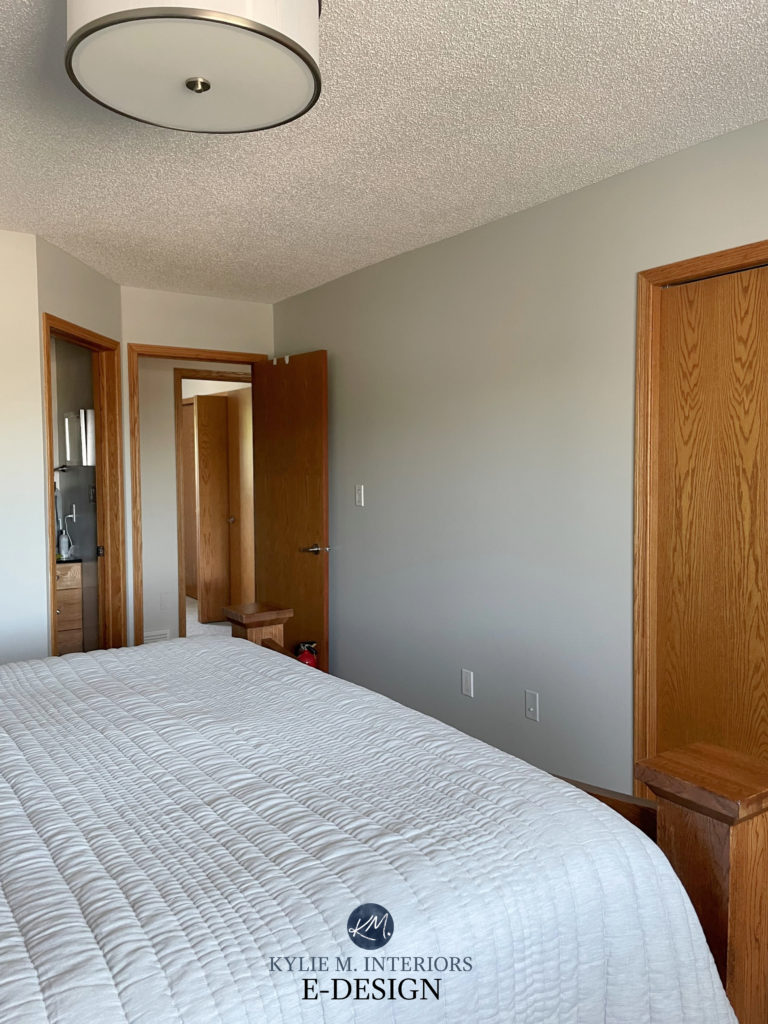
My client wanted a soft, muted shade to complement her beautiful oak trims, doors, and furniture. Front Porch is a gooder because while it’s gray, it has a beautiful, slightly coastal backdrop of green and blue. The slightly stronger undercurrent of colors offers some subtle interest and contrast against wood stains.
Well, that’s a whackload of colors to explore. And of course, there’s always more learnin’ to do…
Oh yeah, and here’s that link!
The Best COLORS to Accent Wood Finishes
READ MORE
4 Palettes to Update Older Oak Cabinets
Ideas to Update Your Golden or Honey Oak Cabinets (non-paint)
How to Update Your Wood Cabinets (5-PART SERIES)
Ideas to Update Your Outdated Granite Countertops
NEED HELP?
CHECK OUT MY ONLINE PAINT COLOR CONSULTATIONS

Chat soon,


Thank you for all the suggestions Kylie! After hours and hours of reading and re-reading your posts, today we finished painting our hallway (with oak trim staircase and terra cotta-ish tile from 2000)…SW Natural Linen. I love how it blends in with everything. It changes colour throughout the day based on light coming in from the front door side light, the south facing side door and the west facing patio doors. Absolutely thrilled!
AHHHHH, Denise, I SO love to hear this. I would also love to see photos…if you were so inclined. But if that’s not your comfort zone that’s totally okay too! kylie@kylieminteriors.ca
Doesn’t it just feel so good when you hit THE color and your home breathes a sigh of relief??!!
What I wouldn’t give for a piece or two of advice from you! I appreciate you not excluding rooms that are literally all medium honey oak; not just a table or one piece of furniture. You have houses that have the trim, windows, cupboards, tables, and chairs as oak, yet your choices are a breath of fresh air. I’d be honored for you to provide me with suggestions~
Oh Carla, THANK YOU! What a great comment to get! I try to cover as much as I can with the photos I have from readers and clients!
Love this article! My home is a 1990s showpiece with Golden Oak everywhere. Thank you for an informative article. I’m curious about the blue shade in the foyer that beautifully enhances the golden oak?
Honestly, you’ve opened my eyes to the potential of all my golden oak. Thank you!
Hey Mary Sue, I’m so glad! And of COURSE, I don’t remember the name of that particular blue. To eyeball it, maybe BM Dusky Blue or Fantasy Blue???
Hi Kylie
What are the other compatible stain colors shown in the curated palettes?
I have red oak floors on my entire main floor that appear red-orange to me. We’re planning to reface our kitchen cabinets and love the look of stained cabinetry. I’m looking for a stain color that works with my floors.
We’re either going to install painted island cabinetry or add a peninsula. Then I’ll install rugs to break up all the stained wood.