
The 10 Best Light Green Paint Colors
THE MOST POPULAR SHADES OF GREEN
While color trends come and go, some colors—including green — last the test of time. However, what makes green ‘trendy’ or not depends on the type of green it is (which we’ll be looking at shortly).
Now, before you go slapping any ole shade of green on your walls, you need to figure out what you want…
- Do you want an INTENSE green, a more muted, neutralized shade, or something in the middle?
- What depth of DEPTH of green do you like? Soft and subtle with a higher LRV? Dark and moody with a low LRV? Or something in the middle?
- What TEMPERATURE or type of green do you like? Warm or cool?
How does your perception of this cool green change from left to right? We’ll explore this more shortly.
Once you’ve narrowed things down, focusing on the type of green you want on your walls, cabinets, or exterior is easier.
WHERE DO LIGHT GREEN PAINT COLORS WORK THE BEST?
When choosing the best green for your space, you might consider a few things, including your room’s exposure and the surrounding finishes, such as…
GREEN IN SOUTH-FACING ROOMS
In rooms where the sun beats in (south and western afternoon sunshine), a cool green (green-blue) can help balance the space’s visual temperature. Learn more about south-facing rooms here: The Best Paint Colours for South-Facing Rooms.
NORTH-FACING ROOMS
If your room is north-facing, it could feel a bit cool and flat. Painting a cool-toned room with a warm, light green paint color (green-yellow) is a nice way to add softness and passive warmth.
The Best Paint Colors for North-Facing Rooms
ROOMS WITH A LOT OF WOOD
You know I’m a huge fan of hard wood, and nothing accentuates it like green. So, if you love your wood cabinets, trims, flooring, or furniture and want to show them off, you’re in the right place.

Whereas a warm color can blend in with your wood finishes, cool colors can contrast and accent them, making them look even more gorgeous!

1. SHERWIN WILIAMS LIVEABLE GREEN SW 6176
If you’re looking for a soft, spring-inspired (but not remotely minty) light green paint color, Liveable Green could be the shade for you.
With an LRV of 61, Liveable Green falls within the light range, providing a reasonable contrast with the perfect white trim. It also has a good degree of color (chroma/intensity) that lets the green show up to the party without waving its tassels at you.
However, what’s confusing is that Sherwin Williams states it’s a cool green with a warm yellow-gray undertone. Pardon? So it’s warm and cool?
Maybe what they’re alluding to is that Liveable Green isn’t overly warm or cool and settles on its green laurels moderately (only a bit warm).
This also means it could swing either way, depending on your room’s exposure or the Kelvins of your light bulbs!
COLORS THAT ARE SIMILAR TO LIVEABLE GREEN
It’s important to sample and compare colors to see the ebb and flow of temperatures, depths, and intensities. Here are a few shades to explore…
- Benjamin Moore Tea Light is very similar but a touch cooler.
- Benjamin Moore Silver Sage is a neat comparable; it’s a bit grayer and calmer.
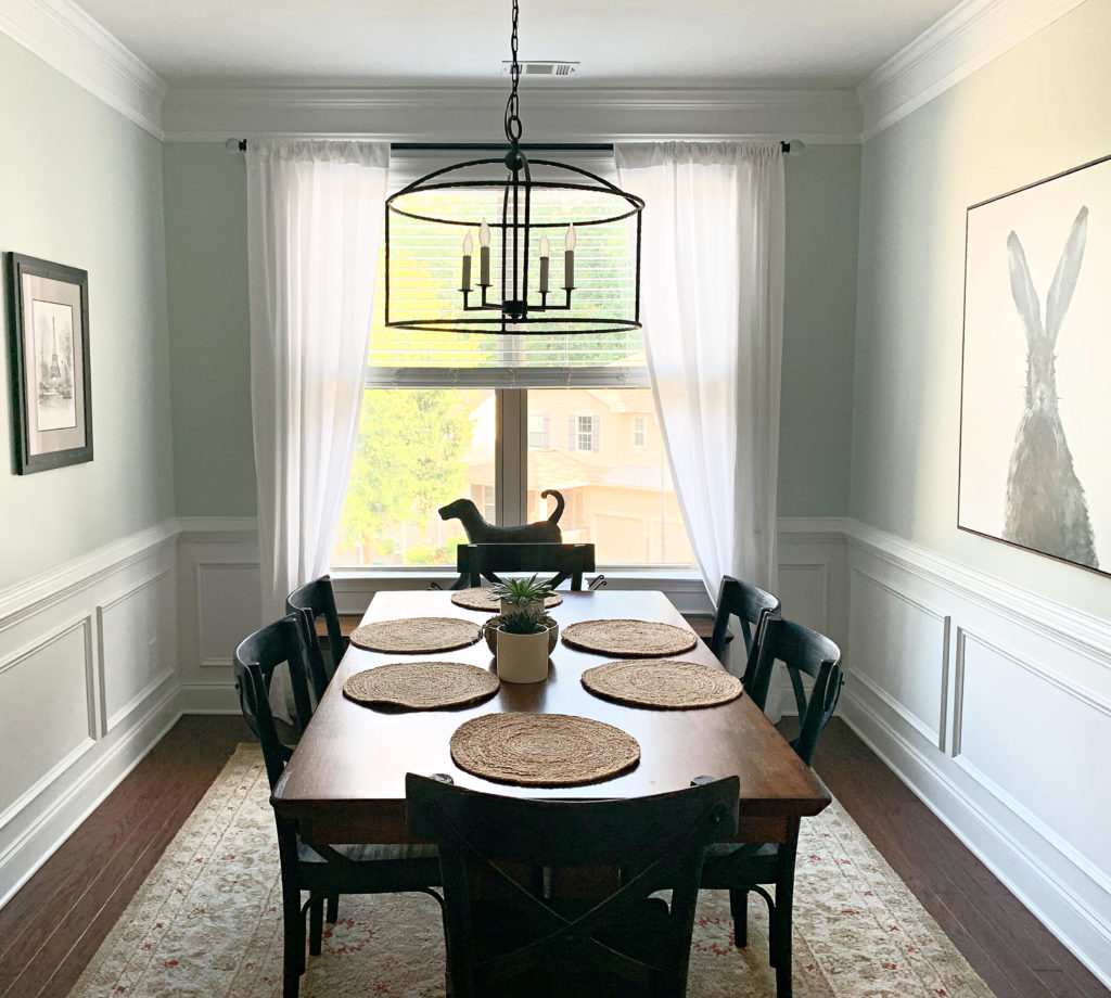
2. BENJAMIN MOORE OCTOBER MIST 1495
There’s no doubt that October Mist is one of the most popular light green paint colors – and for good reasons, too…
1. It has a noticeable green color but is nicely tempered by a warm gray base, giving it a more organic look. Hands-down, it’s one of the most popular green-gray paint colors.
2. Its LRV is 46.54, putting it in the light-medium depths. This gives a nice degree of contrast with white cabinets and trims, as well as wood cabinets, flooring, or trim.
3. Being that bit more organic and muted leaves it flexible toward a wide range of partners (just like me! Just joking. Maybe). Seriously, though, it suits many of today’s popular neutrals, especially warm off-whites.
4. October Mist is often considered the most calming, relaxing shade of green, thanks to a blend of the above points (depth and degree of color vs neutral).
FULL Paint Color Review of Benjamin Moore’s October Mist
COLORS THAT ARE SIMILAR TO OCTOBER MIST
You never want to choose a paint color all on its lonesome. COMPARE COMPARE COMPARE. Notice temperature, intensity, and depth shifts to see which settles best in your space!
- Sherwin Williams Softened Green is great if you like October Mist but want a bit less gray and more color.
- Benjamin Moore Croquet AF-455 is another great option that nestles itself in the ample bosom between the intensity of Softened Green and the muted approach of October Mist.
Get some of my favorite GREEN PEEL & STICK PAINT SAMPLES!
3. SHERWIN WILLIAMS ANCIENT MARBLE SW 6162
Ancient Marble is one of my personal favorites. Why? I love its degree of green (color/intensity), but I especially love its greige base, which makes Ancient Marble a warm green paint color.
Compare Ancient Marble to Liveable Green (#1) and see the shift. Whereas Liveable Green looks fractionally warm on its own, compared to Ancient Marble, it’s more colorful and cooler. See which green best suits your space!

COLORS THAT ARE SIMILAR TO ANCIENT MARBLE
- If you prefer a warm green with a bit more depth, check out Sherwin Williams Grassland.
- For a bit less green, check out Benjamin Moore’s Spring Thaw.
4. SHERWIN WILLIAMS SEA SALT SW 6204
As far as cool shades of green go, there’s one that’s all that and a bag of chips (salt & vinegar, obvs.), and that’s Sherwin Williams Sea Salt.
Sea Salt is green-gray. It rarely looks gray (unless you compare it to a REAL green, then it looks super muted), but its degree of color isn’t remotely overwhelming.
However, its ability to change its hue on a whim gives me low-grade diarrhea. For example, notice how Sea Salt shifts in this next room…
On the left, it leans green (thanks to the warm Kelvins in the light bulb). It leans more blue-gray in the middle and right, with green as a vague afterthought.
Now check it out in this family room – that’s looking pretty dang blue to this color cowgirl…
Ahhh (below), there’s the subtle green you might expect to see (more so on the left side of this photo)…
Chances are, this room is north-facing
Long story short, no matter how popular it is, if you’re relying on Sea Salt to be green, don’t. Count on it being PRETTY…pretty unpredictable (like my humor).
FULL Paint Color Review of Sherwin Williams Sea Salt
COLORS THAT ARE SIMILAR TO SEA SALT
- Sherwin Williams Pearl Gray and Sea Salt are RIDICULOUSLY close. Sample both and see which one settles the way you want with your lighting/finishes.
- If you like Sea Salt but want a bit more color and less gray, Benjamin Moore’s Crystalline AF-485 is a stunning shade.
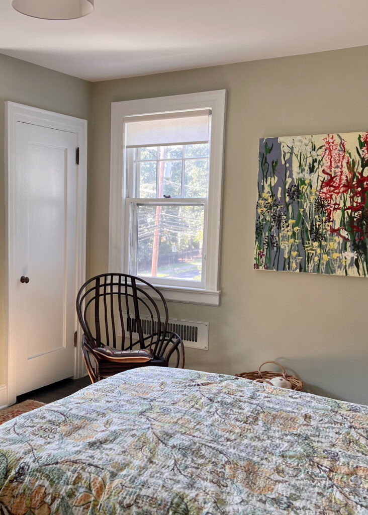
5. BENJAMIN MOORE FERNWOOD GREEN 2145-40
Fernwood Green is a beauty. It doesn’t have the modern gray-green-blue blend that you’ll find in many of today’s popular light green paint colors; it’s in the LEGIT green zone with a beautiful wink of warmth.
Fernwood Green is warm without getting too funky or chartreuse-inspired, and it would add life to a cool-looking north-facing room, especially. With its LRV of 57.98, it’s a light-depth paint color, but one with a bit more body than those closer to my MAGICAL LRV range.
Similar to Fernwood Green in southern or afternoon western sun
North, East, South, West – Which Paint Colour is the Best?
PAINT COLORS THAT ARE SIMILAR TO FERNWOOD GREEN
- If you like the warmth of Fernwood Green, you might love Benjamin Moore Dried Parsley, which picks up what Fernwood throws down with a bit more warmth!
- Also, sample and compare Benjamin Moore Guilford Green, which settles quite nicely between Fernwood Green and Dried Parsley!
- If you want a comparison in Sherwin Williams, there isn’t one, so you’ll ask SW to color-match it. While color matching doesn’t work 100%, that’s as close as you’ll get to Fernwood Green!
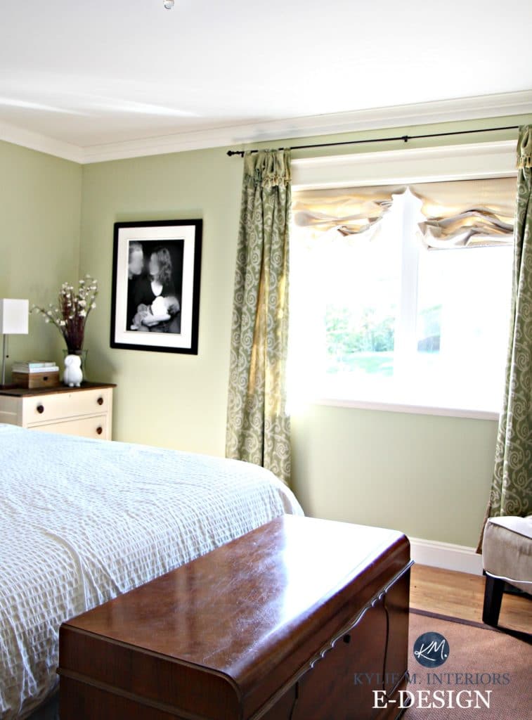
6. BENJAMIN MOORE NOVEMBER RAIN 2142-60
November Rain is one of the lightest passive colors on this page. This gentle misting of green is well-blended with greige.
Some greens have a little greige, but November Rain has more than average, taking a huge edge off this color. In fact, you could even call November Rain a light, warm gray (almost greige) due to the subtlety of the green—it’s all in your perception!
Check out these beautiful warm grays and greiges for a more neutral approach (vague green undertones).

With an LRV of 71, November Rain is on the high end of the light range, winking at off-white. Your trim color should be pretty bright and simple to show November Rain at its best.
The Best Paint Colors to Update Wood Trim, Cabinets, & Flooring
COLORS THAT ARE SIMILAR TO NOVEMBER RAIN
- If you like the IDEA of November Rain (super muted) but want more depth, check out Benjamin Moore Gray Mirage.
- If November Rain’s warmth appeals to you, but you want even more, Benjamin Moore’s Old Prairie has a similar depth and intention but more warmth.
7. BENJAMIN MOORE PRESCOTT GREEN HC-140
Prescott Green is a beautiful, cool, light green paint color. With a dash of blue and a grounding dose of gray, Prescott Green is a soothing, calming shade that tends to keep its allegiance to green, but as you can see in this next photo, it ain’t by much!
COLORS THAT ARE SIMILAR TO PRESCOTT GREEN
- If you want a lighter look with the same general blend, check out Benjamin Moore Hollingsworth Green – make sure it doesn’t look too toothpaste/minty (unless that’s what you’re going for, in which case, you do you, boo).
- Sherwin Williams Contented is gorgeous for a similar look with more gray, as is the lighter, Filmy Green.
Get your PEEL & STICK SAMPLE of Contented
The 20 Best Green-Gray Paint Colors: Sherwin Williams
8. SHERWIN WILLIAMS SOFTENED GREEN SW 6177
Softened Green is a darker shade of green (while still being considered lightish). Its LRV of 49 parks it in the light-medium range rather than the ever-popular light range. But just because it has a bit more meat on its little green bones doesn’t mean it’s not a great fit for many rooms.

Get your PEEL & STICK SAMPLE of Softened Green!
Softened Green is a warm green, but not an overt one. Its warmth is subtle, so you’re nowhere close to lime, chartreuse, or olive green.
Like Liveable Green, Softened Green tends to read pretty ‘neutral’ in its temperature and can shift depending on your room’s exposure, making it pretty flexible (unless your room NEEDS an obvious warm or cool color).
The Best SAGE Green-Inspired Paint Colors
9. BENJAMIN MOORE SPANISH OLIVE 1509
Spanish Olive is a GORGEOUS shade of green. With a lovely, warm gray base, Spanish Olive is a warm, subtle green that says a lot by offering a little!
Spanish Olive has an LRV of 52.55, so it’s in the light-medium range but on the lighter end.
In the photos above and below, notice how Spanish Olive changes from one end of this room to another…
This room has a south-facing light.
10. SHERWIN WILLIAMS AUSTERE GRAY SW 6184
For this last green, I’m coming on soft and easy. Austere Gray is green, but its reasonably strong gray base calms it down, creating a super soothing, muted shade. However, Austere Gray is a sneaky green. While you might think it’s dominantly green, there’s a gorgeous blue that can sneak up on you.
In this next photo, look at how gray-blue-green Austere Gray looks (it looks more gray than anything)…

Sherwin Williams Pure White cabinets and trim
But in this next photo, which is getting some late afternoon western sunshine, look at how warm it leans! While it won’t usually be this warm, that’s exposure for you!

The Best Green-Gray Paint Colors
COLORS THAT ARE SIMILAR TO AUSTERE GRAY
- If you like Austere Gray’s approach but want a lighter shade, check out Sherwin Williams Conservative Gray, which has an LRV of 63 (to Austere Gray’s 51).
- If Austere Gray isn’t cool enough and you want to see a bit more blue, check out Sherwin Williams Comfort Gray and Benjamin Moore Gray Wisp.
At the end of the day, if you’ve explored all of these greens but they’re a bit too colorful, you might want to check out the wild world of GREIGE!
READ MORE
The Best SAGE Green-Inspired Paint Colors
How to Choose the Best Green Paint Colour For Your Home
The 13 Best Light Blue Paint Colors
The Best Medium to Dark Green Paint Colors
The Best Blue-Green Blend Paint Colours
Paint Colour Review: Sherwin Williams Evergreen Fog
NEED HELP?
Check out my Online Paint Color Consulting!

ORIGINALLY WRITTEN IN 2019, TOTALLY OVERHAULED IN 2025


Hi Kylie. I love your ideas and creativity! We just painted our kitchen Benjamin Moore Lenox Tan and the dining room Benjamin Moore Carolina Gull (both Sherwin Williams custom match colors). Now we’re getting ready to paint the laundry room. We wanted to paint this room a shade of blue. The ceiling, trim and cabinets are white and the counter top has a mixture of cream, grey and tan. I really like BM Palladian Blue, but I’m thinking it might be too light compared to the other two paint colors we just used. So then I thought maybe Sherwin Williams Interesting Aqua 6220, Meditative 6227 or Jubilee 6248 might look better. What do you think? Or, do you have other suggestions? Thank you.
Hi Beth, great quick question! Normally I refer people to my Online Consulting, but you caught me at a good time 🙂
Okay, so I LOOOVE Carolina Gull almost as much as I love Palladian Blue, however Palladian Blue is in a slightly different colour family from Carolina Gull, also the blue of it is a tough sell with the green of Carolina Gull. So, if you want that ‘look’ but in a colour family that is better suited to Lenox and Carolina then you’ll want to check out these….
1. Prescott Green. More green than Palladian and still not quite in the same colour family, but it’s the green in it that is a bit more compatible with Carolina (although I like Palladian better, Prescott is still pretty)
2. Blue Grass. Just a weeee bit lighter than Palladian with a tiny tiny bit more gray in it – making it a slightly better fit
3. Flora (an Aura b.m. colour) is an AMAZING colour. Now it’s closer to Carolina Gull than not (so you could have it lightened by 1/4) however I’ve seen this one in action and it flees throughout the day between greeny blue and then to bluey green – it’s pretty awesome!
4. Purple tones also look great opposite Carolina Gull and while purple isn’t everyone’s thing it does look great with grays (like in your countertop). Check out Gull Wing Gray as it’s gray with a purple undertone with a WEEEEE bit of blue in it – making it not obnoxiously purple. Just humour me 😉
I hope that helps you out!!!
~Kylie
I’m glad you found it helpful and hope you found a few faves!
Chat soon,
~Kylie
Have you done a Blog on your favorite coastal/beachy colors? I’m gathering a palette of Benjamin Moore paints to repaint my entire home. My vision is: blue, green, aqua/teal, driftwood gray/brown, sandy brown/tan, and a creamy off- white for trim and maybe even an orangy coral (not too pink) just for fun. I know it’s winter time currently, but if you haven’t done a blog like that already, I would love it if you did.. I think I have most of my palette pretty much figured out, but I just can’t decide on a blue. I have chosen a beautiful, soft, natural green- fernwood green. I’m looking for a blue just like that. Not too light so it’s powder blue. Not too dark and bold. Not too much green or gray. Any suggestions? What are your favorite beachy blues? Thanks, Sara
Hi Sara! If you’re looking for a blue that’s along the same lines as Fernwood – but blue, not green, check out BM Smoke. Now I don’t know if it will suit your home/furnishings, but it is a pretty grayed-out blue!
~Kylie
Queen Anne Lilac! Sherwin Williams. I painted my bedroom walls. Just finishing the woodwork with original white. SW. STUNNINGLY SOFT
My bedroom at my old house was painted this color! Loved it. Going to use it again in our new house.
My master bedroom is east facing with 2 windows. I’m looking for a green color that doesn’t have a lot of gray. Could you tell me if Guilford green or Prescott green would work? I’m struggling with this decision and could really use and appreciate any help you could give this old gal. I just love reading everything you’ve written about, you’re by far the most knowledgeable source for paint colors I’ve ever come across!
Hi Vicki! Well, it all comes down to personal preference and perception! I would say that Guilford and Prescott are GORGEOUS greens that have soft and subtle neutral backdrops, but nothing OVERLY gray. And they are both wicked gorgeous, good for say, a country or farmhouse look. Guildford is the ‘greenest’ by far, whereas Prescott is a green-blue and with your exposure, I would worry that it would feel less green for you. If you cleaned up Guilford just a wink, you’d hit something like Spring Meadow, which comes across a wink greener and shows the slightly more greige base (gray/beige) that is tucked into Guildford :).
Do you have any thoughts on which of the above greens pair well with each other? I have Carolina Gull in my living room and want a green for my eat-in kitchen which is adjacent. I thought maybe Sandy Hook Gray? We have Sherwin Williams’ White Duck in the other areas on the same floor. We’ve got a lot of oak furniture and stained glass shades in the kitchen and it’s just not a house that suits any sort of modern colours. I love love love the Carolina Gull with our rustic red brick fireplace and cranberry velvet drapes but it sure is a hard colour to pair with!
Hi! In the above you show a mudroom using Avon Green, which I love! Can you share what color of white you used to paint the walls to give it the refresh you mentioned? It is absolutely beautiful and lets the green shine.
Oooo, I believe it was BM White Dove!
Do you think Sage Green will go with honey oak orangey kitchen cabinets and natural linen?????
Oooo, it depends on the green, but off the top of my head – YES!
OOOOOOOPS!!!! ……
Do you think Dry Sage will go with honey oak orangey kitchen cabinets and natural linen?????
Oooo, I LIKE the sounds of this!
I am struggling so much with a green for my kitchen, it currently looks like a patchwork quilt from all the samples I’ve tried. Everything either looks too yellow, too blue, or too grey. It will be going up against dark wood cabinets (with a reddish hint), and Sea Haze grey in the living room, with quite a bit of South sun coming in. I have Mysterious blue as an accent in some rooms and love it, so am looking for something tonally similar to that but less dark.
I have tried Lush and Avon green and they both look so much more blue from the swatch to the wall. I have also tried High Park and like the tone but it feels to light/ maybe a bit too grey.
I would be beyond grateful for any recommendations.
Oh Angela, it’s just SO hard to say without seeing your space and its finishes – I’d literally be throwing thoughts at an empty wall! I do have a great colo consulting service that can be fun and SUPER effective! https://www.kylieminteriors.ca/hire-kylie/
Hi Kylie, I love the green walls in the kitchen of photo #3 from the top. Would you know which green that is? Thanks for all you do!
Hey Ryal, thank you! That beauty is Benjamin Moore October Mist! In this lighting I find it looks a BIT greener than usual, almost a bit more like BM Antique Jade (but not quite) 🙂
I have Livable Green in my “parlor“ and Sea Salt in my bedroom and adore them both.
Your great articles on how light impacts colour helped us recently select Grey Cashmere for our west facing family with a full wall of windows. It is gorgeous!
Thank you for all the information and wisdom you share.
Wahoo, I’m so glad it was helpful – thank you for your comment!
We are building our new rustic house in the mountains…I’m liking the exterior colors dried thyme not sure if urbane bronze is the right choice. Paint intimidation ! Guide me please
Hey Stephanie! It toooootally depends on the exterior finishes, including the color of the roof, windows, and any stone or brick. Off the TOP, I would lean into Urbane Bronze as it’s more natural, whereas Dried Thyme is a more committed COLOR. I mean, it’s green and lovely, but it’s definitely more of a ‘color’. I also love SW Porpoise, which is a bit lighter than Urbane Bronze. Or, maybe you land on a happy medium, somethign like SW Thunderous, which is QUITE lovely, as is the slightly darker, Cast Iron.
Hi Kylie,
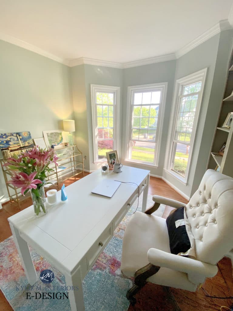
I am totally in love with the rug colors under the table in November Rain’s first picture. Do you have any idea where that came from?
Also, I am painting a Sunday School classroom that has no windows (with yucky fluorescent lights) but white IKEA organizer cabinets/cubes and wanting to use a SOFT green that’s not too bright – that would be welcoming but zen for the boisterous children. Would Sea Salt be a recommendation?
Thanks for any guidance 🙂
~Amy
Please, please, please do a review of Svelte Sage!
I definitely can! Unfortunately, I don’t have any images of it, so it would just be ‘info’ 🙂