
The 3 Types of Green Paint Colors (& How to Pick Your Best One)
Shades of Green & Everything In Between
When choosing the best green paint color for your home, you’re often one small step away from a room that looks like Kermit or Shrek designed it. This is why it’s super important you do your research (by the way, you’ve come to the right place).
As with every paint color, it’s never as simple as ‘choosing the color that tickles your fancy.’ Picking the best green for your space is about tuning into your surroundings to see which type of green your home asks for. And while you’ll find everything from olive and chartreuse to pickle and sage, there are generally TWO TYPES of green to choose from…
- WARM GREEN
- COOL GREEN
- NEUTRAL GREEN
Choose the right green, and you’ll be giving yourself personal high-fives. Choose the wrong green, and you’ll be twitching in the corner, cursing your wall’s pea soup, baby poop, or mint-inspired color.
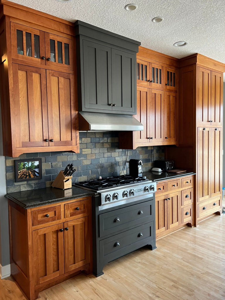
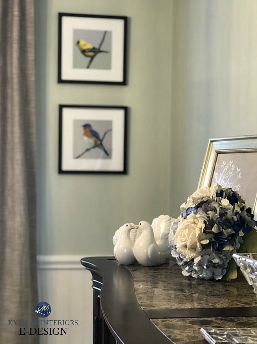
This SUPER dark green-gray is striking with the wood cabinets.
Remember, I’m not just a TELL you what to do decorating and design blogger; I’m a DIY, TEACH you how to do it kinda gal!
Long story short, if you want pretty greens, I have tons of blog posts listed at the end. But for now, let’s LEARN!

WARM GREEN PAINT COLORS
Green with a YELLOW undertone is a warm green. When my clients want a warm green shade, they usually crave a green on the more subtle end of the warm range. This means that while there’s yellow mixed in, it’s a very small amount. This passive approach avoids the pea soup and chartreuse end of things (colors that I personally love…in the right spot).
- Warm green paint colors with a strong neutral base tend toward greige or tan. If you add enough neutral base, your warm green will become the undertone rather than the dominant color.
- Warm green paint colors can help balance out cool northern light or flat eastern light.
Warm green paint colors have a yellow undertone that can be virtually unnoticeable depending on how much yellow is mixed into that batch.
In this next photo, we step out of green and into GREIGE, which means it’s a warm neutral with a green-yellow undertone…
Sherwin Williams Anonymous
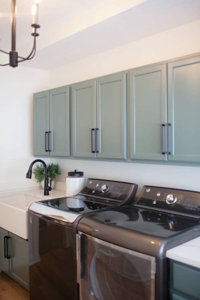
I absolutely fell in love with the subtle green warmth of Benjamin Moore’s Arctic Shadows, shown on the lower cabinets in this kitchen remodel.
See the before and afters HERE
COOL GREEN PAINT COLORS
Cool greens are green paint colors that lean toward blue. As it relates to ‘colors,’ green-blue or blue-green (where blue is more dominant than green) are the most popular shades these days.
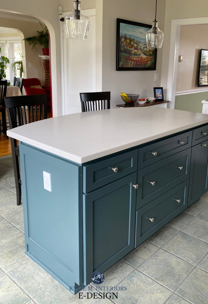
Sherwin Williams Billiard Green is one badass and brave shade of green – similar to hunter green.

This next photo shows a green-gray…right?
You might look at that photo above and think, ‘Ermmm, that ain’t green; that’s BLUE.‘
It can be both! This is Sherwin Williams Sea Salt, a well-known green-gray. However, because of Sea Salt’s particular makeup, it just loves leaning blue. I have clients who find it too green (when they want a green/blue) and others who find it too blue—it’s a bit of a ninja!
Benjamin Moore Prescott Green
- In the lighter range, green-blue can appear minty if it lacks enough gray.
- Lean considerably into blue, and you’ll hit the teal/aquamarine end.
- If you add enough gray to your cool green, you’ll get a shade of GRAY with a green-blue undertone.
- Cool green paint colors balance rooms with warm southern or afternoon western sunshine.
Benjamin Moore Dark Pewter – a GORGEOUS green-blue blend.
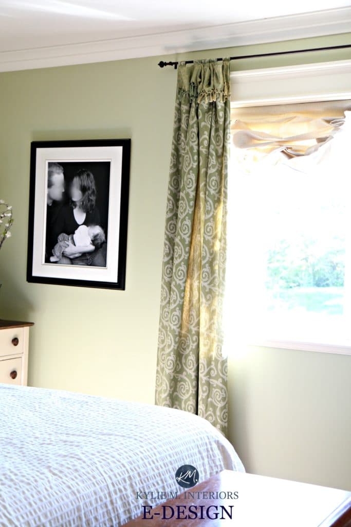
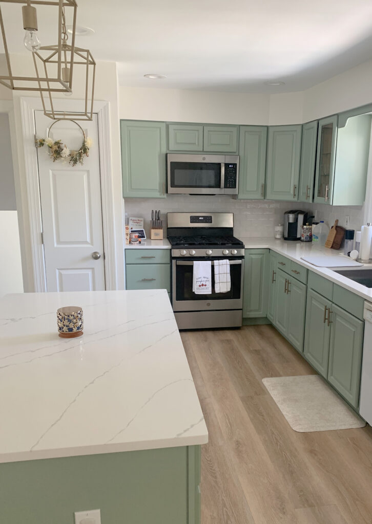
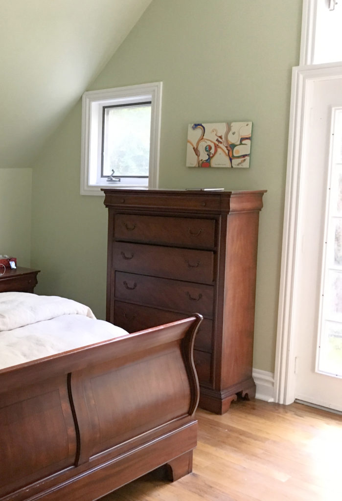
As shown in this next kitchen, a slightly cool green like Sherwin Williams Cascade Green can offer a somewhat vintage vibe…
This previously shown bedroom is also painted the ever-gorgeous, Cascade Green…

NEUTRAL GREEN PAINT COLORS
Short of hitting the primary end of things, it can be hard to land on a green-green, you know, one that doesn’t lean obviously warm or cool. And really, I can’t say that many people are looking for that green. Most of my Online Color Consulting clients know which green they love, and it’s often a definitive preference for WARM green or COOL green. Taking this further, they also love green as an undertone in cool or slightly warm neutrals.
Let’s look at Sherwin Williams Liveable Green, which is about as close as we get to a true green with a neutral base…
How to Choose the Right Kelvins For Your Paint Color
Here’s your Peel & Stick sample of Liveable Green…

PAYING ATTENTION TO YOUR HOME’S INTERIOR FINISHES
When choosing a color, consider your exposure and personal tastes, but don’t forget about your finishes!
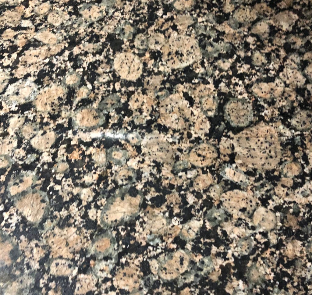
A countertop like this demands a COOL green paint color
For example…
- If your countertop or tile has green in it, find out if it’s a warm green or a cool green. If unsure, bring home a wide range of green paint colors and see which clash and connect.
- If your surrounding finishes have violet or pink undertones and crave a green hue, I suggest a cool green over a warm one. Just keep in mind that opposites attract and can make each other STRONGER!
Because this tile’s green is slightly cool and stormy (and subtle), it prefers green paint colors with similar traits.
On the other hand, if your room has reasonably flexible finishes, you can pick almost any darn green you want…
Farrow & Ball’s Green Smoke (the tile floor has MINOR violet-pink undertones)
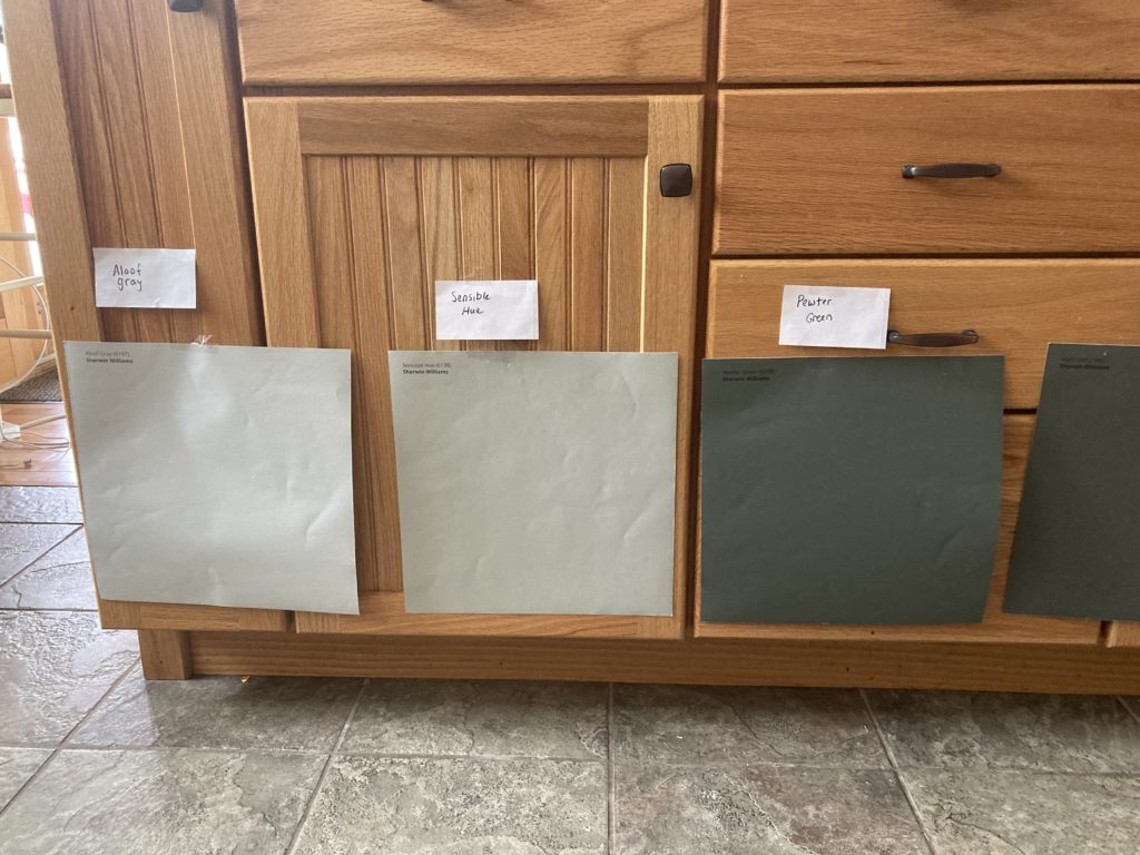
This next homeowner wanted a soft shade of green to complement their wood kitchen cabinets. Comparing two similar shades helps you see the shift in temperatures, depths, and undertones…

Benjamin Moore Cheyenne Green (left) & Herbal Escape (right)
GREEN PAINT COLORS IN NORTH OR EAST-FACING ROOMS
If you’re hoping to paint your north-facing room green, I highly suggest reading up on the best paint colors for north-facing light. The quick n’ dirty is that northern light is gray with a subtle cool (blue) undertone.
Sherwin Williams Evergreen Fog & Pure White
What does this mean?
If you paint a north-facing room green with a cool blue undertone, you might find things look a tit bit nipply as your northern light encourages this combination even cooler. If you want to BALANCE the temperature of your natural light, and if it suits your room’s interior finishes, consider the following…
- Warm green paint colors.
- Warm grays with a green undertone, as even these have a touch of yellow hiding in them.
- Greige with a slightly more noticeable green undertone is a good choice if your room lacks natural light.
The 10 Best Gray & Greige Paint Colors

East-facing rooms are similar to north-facing rooms. While they have a bright light in the morning, they can feel relatively flat and drab in the afternoon. So, just like north-facing rooms, they often benefit from a warmer, cozier green or a more noticeable green undertone.
In this next photo, this paint color is similar to Sherwin Williams Acanthus. While it’s a warm green, it’s not overwhelming and can be a great happy medium if you and your north-facing room disagree on which way to go…
However, give this same room some strong afternoon western sunshine and a warm green paint color like this, which could look more like Benjamin Moore Fernwood Green!
Why?
The afternoon western sunshine will add warmth to the walls, making the paint color look toastier than expected! EXPOSURE MATTERS (especially if it’s indecent).
GREEN PAINT COLORS IN SOUTH OR WEST-FACING ROOMS
When it comes to south or west-facing rooms, you’re dealing with the other side of the thermometer – the warm one. And if you want to paint your south or west-facing room with your favorite shade of green, you may want to do your research first.

This is why you hire North America’s top color expert – she matches colors and finishes like this, from a computer screen.
To give you a quick summary, south-facing light is warm and yellow-hued. As for west-facing rooms, they’re flat in the morning light but pick up warmth in the afternoon, dipping into orange and pink as the day wears on.
What does this mean?
South-facing rooms or rooms with western afternoon sunshine will add warmth to your walls. So, if your walls are already a warm hue, you risk tipping the scales a bit too far for visual comfort.
This next room looks gorgeous with Benjamin Moore Caldwell Green on the cabinets…
The 18 Best Blue & Green Paint Colors for Bedrooms
However, PLEASE remember that how a paint color looks online can be much different from how it looks in your home.
Why does this matter?
In the above photo, look at the cabinet in the bottom right corner. Do you see how the green looks darker? That’s how Caldwell Green looks in more muted light. The upper cabinets are getting hit with…
a) awesome exterior light
b) interior lighting
c) a great photographer who knows how to show a room at its best
This means your paint color will look different if you don’t have the same environment (or photography skills)!
This also means you may want to tweak things if you’re considering a WARM green. South and west-facing rooms often suit…
- Green paint colors that lean into blue as the cool temperature can help to balance the warm sun visually.
- Cool neutrals such as gray with a green-blue undertone.
- Greige paint colors with a green undertone but lean closer to gray than beige.
WHAT’S THE BEST GREEN PAINT COLOR?
While it depends on many variables (e.g., depth, degree of color, etc.), Sherwin Williams Evergreen Fog is a popular shade of green, as is Benjamin Moore’s October Mist. In fact, both of these colors happened to be ‘Colors of the Year’ at one point, adding to their popularity.
A few more popular shades of green (plus more green blog posts after this info).
- Benjamin Moore Vintage Vogue (beautiful on kitchen islands)
- Benjamin Moore Camouflage (the best for open layouts and bedrooms)
- Sherwin Williams Ripe Olive (awesome for a front door)
- Sherwin Williams Softened Green (a beautiful, calming bedroom color)
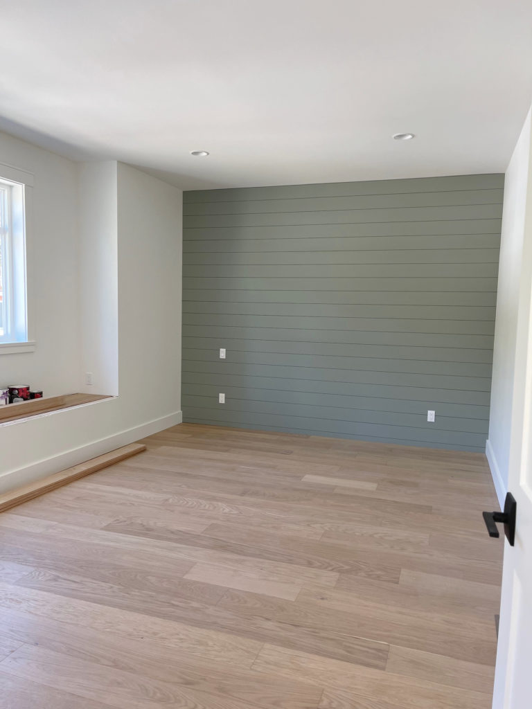
- Sherwin Williams Dried Thyme (fun for a feature wall!)
READ MORE
The 15 Best Medium to DARK Green Paint Colors
Light to Medium Green Paint Colors for Bedrooms
Benjamin Moore October Mist Paint Color Review
The 10 Best Paint Colors to Reduce Stress & Create Calm
Paint Color Review: Sherwin Williams Evergreen Fog
NEED HELP?
Check out my ONLINE PAINT COLOR CONSULTING PACKAGES!

ORIGINALLY WRITTEN IN 2022, UPDATED IN 2025


I noticed in your article above in the two-tone kitchen with Dove white on top you mentioned that the lower cabinets were painted with Benjamin Moore antique shadows and then you have a link to go back and look at before and after. When I click on the link and go in it says it’s Benjamin Moore antique pewter. Did the name change or is one of these a mistake?
Ahhh, my bad, it IS Antique Pewter :).
Hi Kylie:). I want to paint my cabinets in my kitchen, but I’ve hated them for 8 years and TERRIFIED to make the wrong decision. How much would it cost to send you pictures? Thank you:)
Hi Bridget, I would love to help! While I’m out of office for a short while, once the packages are open you can see what works for you here! https://www.kylieminteriors.ca/hire-kylie/#packages
Hi Kylie, Can you please recommend a sage green or green gray that may work with a faux cool marble with gray blue and black veins? I have a black vanity and window. it’s for a tiny bathroom. Thank you!
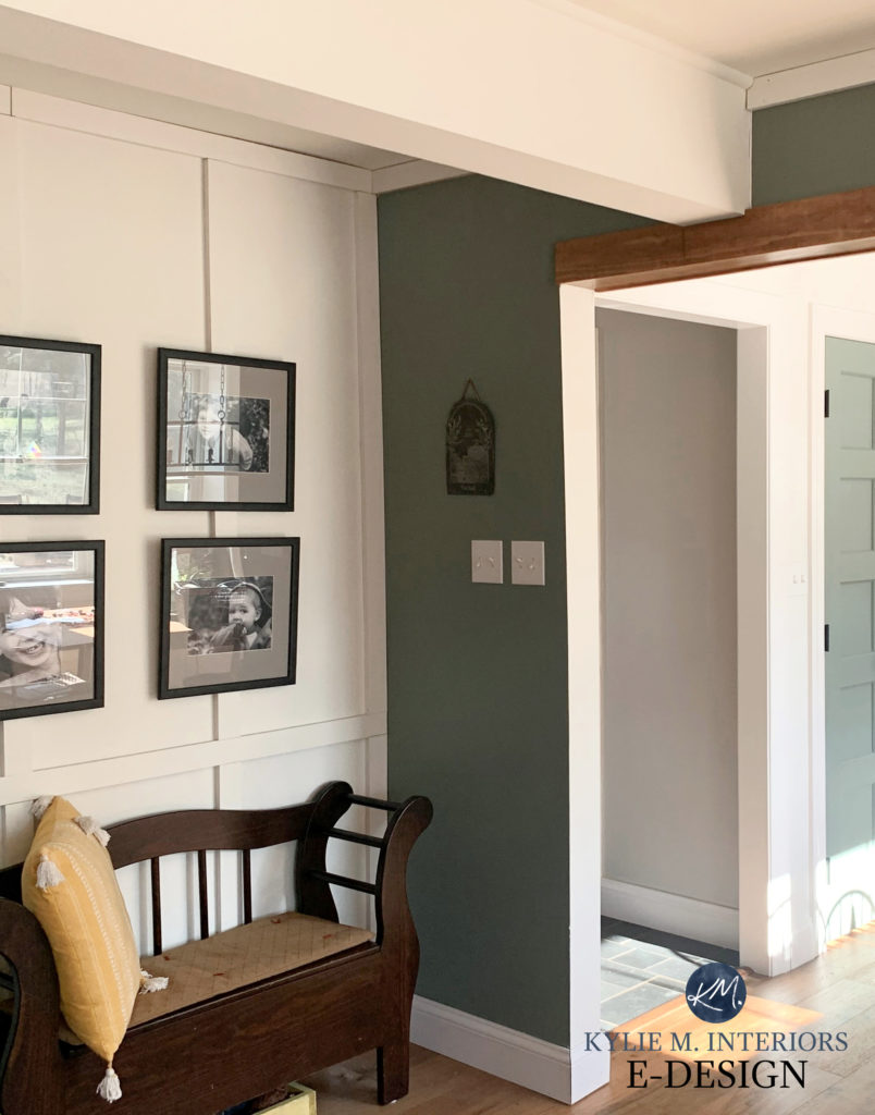
hello, thanks for the post. I love the green office room in the north facing section. what color green is this? I scoured the page and am not seeing it listed. I want to recreate that look in a north facing room. thank you for all the attention to detail you provide. the exposure, LRV, and color temps are all so important and you always focus on this. I have used your page a lot during my reno. much appreciated.
Hey Kat, that’s the LOVELY Farrow and Ball Calke Green!