
The 15 Best Paint Colors for East-Facing Rooms
Wondering why your paint color looks so different from morning to afternoon in your east-facing room? Because eastern exposure isn’t easy – I curse it and throw a quarter in the jar every time (I’m on my 3rd jar).
However, once you understand and accent how your paint color might change from morning to afternoon, it can be easier to find your room’s best paint color.
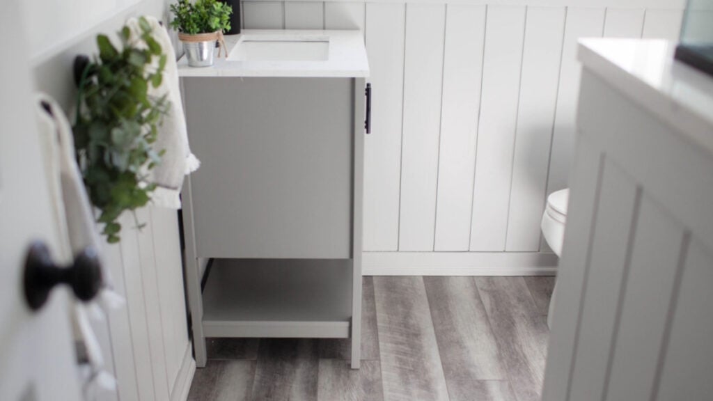
To help you on your colorful way, I’ve strapped on my big girl undies, pulled all my thoughts together for you (scary), combined them with my 24+ years of color experience and 12,000 consultations, and finally made some sense of it all. However, it’s a lot of info, so you better get comfy.
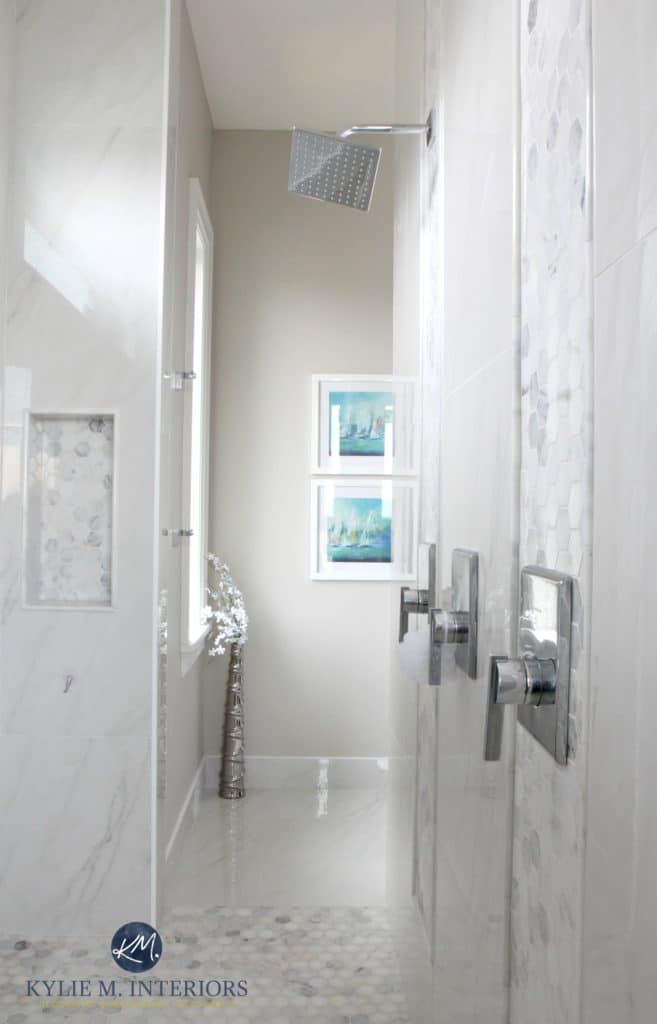
EAST-FACING LIGHT & PAINT COLORS
When discussing the best paint colors for north and south-facing rooms, it’s a bit easier to pin down good color options as their natural light is a bit more reliable throughout the day. However, with east-facing rooms having split personalities, it isn’t clear-cut, and there’s no exact recipe for the perfect paint color. Let me rephrase that…on a larger scale…
There’s absolutely no way to predict exactly how a paint color ABSOLUTELY WILL look in any exposure – there are waaaay too many variables. However, with knowledge and experience, you can narrow down your options and end up with your best color.
MOVING ALONG!
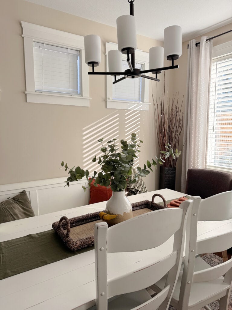
PAINT COLORS IN EAST-FACING MORNING LIGHT
Rooms with a prominent east-facing morning light get a gentle, slightly clean dose of warm sunshine in the early morning (but not the same as the more intense golden warmth you’ll get in a west-facing afternoon). As the sun rises, you’ll also notice a lot of shadows.
- Warm paint colors can be slightly enhanced in eastern morning light without picking up a strong glow (unlike western afternoon light).
- If you paint your east-facing room a cool paint color, it could feel refreshing and soft in the morning and, if it has enough color (chroma), it can hold up well in the afternoon.
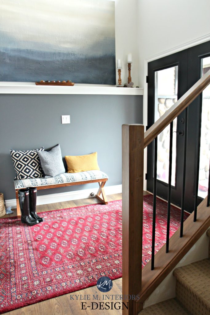
- You might find that blues that lean green can look a bit softer and more inviting, overall.
- Green-yellow, more so than green blues, can offer a soft warmth to an eastern room. However, ensure they’re not too neutral, or they could look murky in the afternoon.
As we move towards noon, the light will slowly get brighter and whiter, and the chances of being judged for day drinking (which you may be doing shortly) will be greatly reduced. This bright light can start to wash out colors, making them appear lighter.
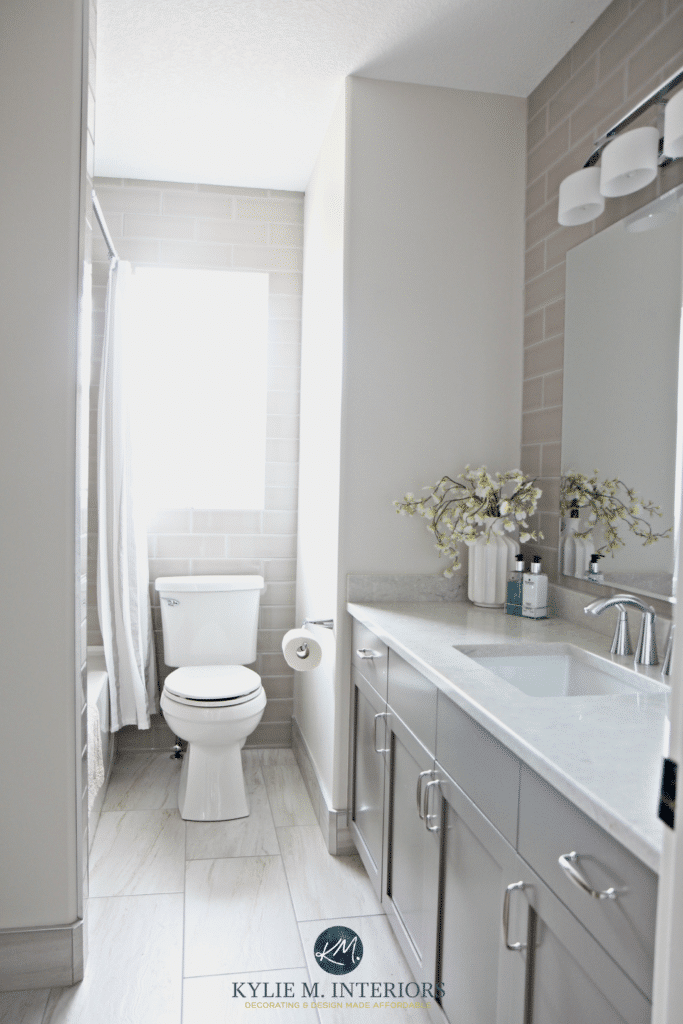
For example, in the above photo, check out the walls facing you; they’re a bit shadowed, but the paint color on the wall with the TP holder is completely washed out as it’s getting a direct hit of Eastern light.
PAINT COLORS IN EAST-FACING AFTERNOON LIGHT
Whether it gets a little natural light or a lot, an east-facing room will look grayer and flatter in the afternoon – I can hear the crickets chirping now- oh wait, that’s my phone with a message – which I’ll never check.
- Warm colors can help balance the more shaded, slightly dull look of east-facing afternoon light. The more neutral the colors, the dirtier they can look, so choose wisely. As mentioned earlier, look at those with a bit more color (chroma).
- If you choose a cool color with a bit more ‘color’ and less gray, you may find it holds better in the afternoon.
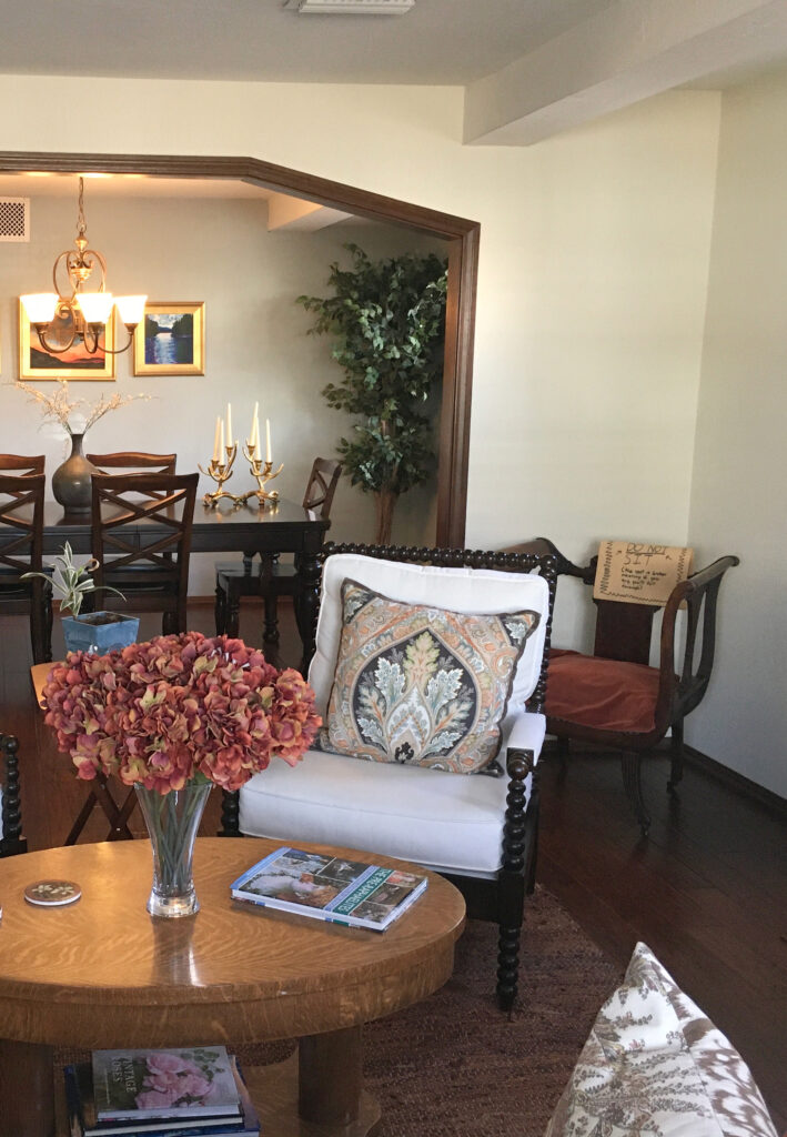
- A gray paint color’s inherent bias (scientific lean towards a certain color) can be a bit more noticeable in east-facing afternoons. That said, there are so many other things affecting paint colors that I wouldn’t put too much on that. Sample your colors carefully and see if you notice more undertone in the afternoon light!
- If you go for cool paint colors or gray neutrals, you may want to add warm accents and texture to your room for balance and visual warmth.
Don’t expect a paint color to save you and your room – help it out by giving it LIGHT!
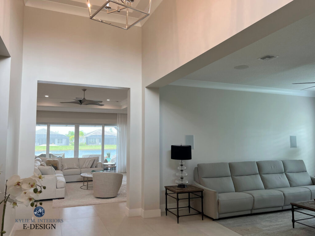
Notice how the same paint color (Sherwin Williams Aesthetic White) changes on each wall
WHEN CONSIDERING YOUR EXPOSURE, IT’S ABOUT YOUR ROOM AS A WHOLE
It’s easy to get caught up in how our paint colors look on a wall-to-wall basis. However, natural lighting changes drastically throughout the day, as will the paint color on your walls. How your room’s exposure will affect your paint color is never predictable.
When considering your room’s exposure, focus on the overall appearance and FEELING of your room. The natural light your room receives (quality/amount/etc.) can easily affect this.
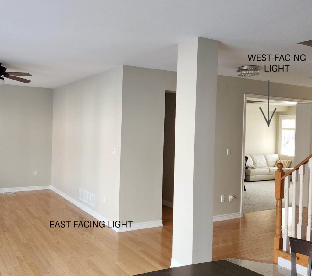
Afternoon east-facing light, morning western natural light, and the same paint color.
Here’s a short list of the many factors that can affect how your paint color looks (related to exposure).
- How big your window is
- How tall your wall/high your ceiling is
- If you have landscaping outside the window that partially blocks light, or the light filters through it
- How close to the equator are you
- The time of year
- You live in a place that’s cloudy a lot of the time
- If your neighbor’s home or a tall building blocks some light.
STEP 1: IT’S ALL IN THE TIMING
I know, this is a TON of info – it’s like verbal diarrhea on my end, so I can’t imagine how it’s being received on yours (might be time for a wipe). So, you can take that all into consideration OR take a deep breath, totally ignore me (Tim has an uncanny knack for this), and start sampling paint colors.
But before you do that, take a quick second to answer these two questions…
- Do I use my room more in the morning or the afternoon?
- Am I more comfortable in warmer colors or cooler colors?
If you can’t find a color you love at BOTH times of day and can’t adjust your interior lighting (I bet you can), decide whether you naturally lean toward warm or cool colors (and decide which temperature your room best suits). Then, choose the color you like the most during the time of day you’re in the room.
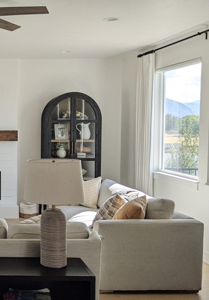
Does this mean you completely ignore the other half of the day?
No, you just don’t give it priority. And while you may LOVE a color in the morning light, but not the afternoon, as long as it’s ‘okay’ and doesn’t go against your religious beliefs, it might just be a good choice.
But what if you’re in the room in the morning AND the afternoon?’ Well, then we move on to STEP 2.
STEP 2: LIGHTING IS YOUR FRIEND
For the time of day when your room is at its drabbest (the afternoon for eastern rooms), use interior lighting as a supplement. This can give your paint color an ENTIRELY new look and make it more livable during shaded hours. Taking the time to improve the lighting in your room will make ALL of the difference in the world in how your paint color appears and how your room feels.
In this next photo, look at how much the different light bulbs change the look of the paint color (Sherwin Williams Shoji White)…
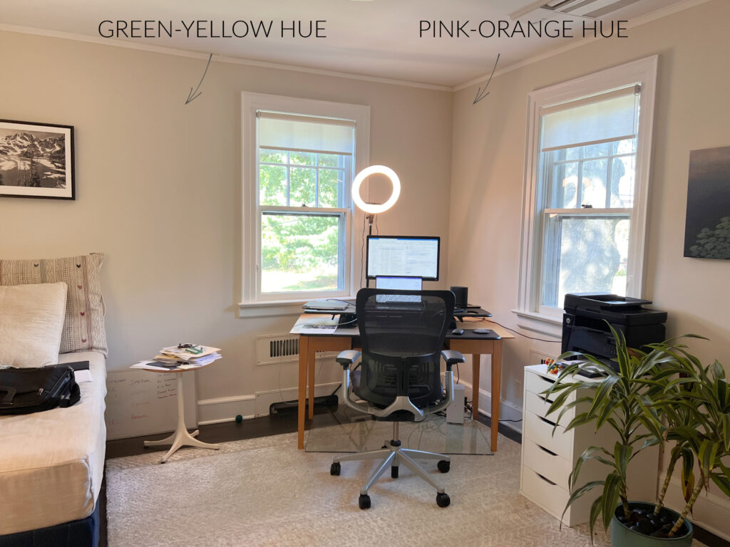
How the Kelvins of Light Bulbs Affect Paint Colors
While they say that ‘daylight’ bulbs best mimic natural daylight, that’s a dang cool light (5000K) and isn’t always a ‘liveable light’ compared to what we’re used to with our old-school bulbs. I would opt for a warmer light (lower Kelvins) over a daylight bulb…unless I’m in a doctor’s office. Even then…
So, what is a girl (or guy) to do now? DRINK UP BUTTERCUP! That’s right, you might need to call in the reinforcements (Mr. Pinot and Ms. Merlot) when choosing the best paint color for your east-facing room. So, grab that sippy cup, and let’s get started.
This is where the fun starts!
THE BEST PAINT COLORS FOR EAST-FACING ROOMS
Remember…
- You might not find a color you love at ALL times of the day, which is why your interior lighting plan is so important!
- Exposure doesn’t matter NEARLY as much as the needs of your room’s interior finishes, size, etc.
- Be patient with your paint color; it’s likely doing its best, given the drastic shift in natural light!
I mention afternoon light a lot in the comments below. This is because it’s harder to accommodate, whereas east-facing morning light is much more flexible!
1. SHERWIN WILLIAMS CASA BLANCA SW 7571
Casa Blanca is a slightly brighter shade of cream than Gentle Cream, which is coming up shortly). It offers a gentle, slightly cheerful warmth to an east-facing room, making it a beautiful color to wake up to and a warm and inviting one in the afternoon light.

FULL Paint Color Review of Sherwin Williams Casa Blanca
2. BENJAMIN MOORE CLOUD WHITE OC-130
Cloud White is a white paint color with a creamy backdrop. With this bit of yellow, Cloud White has the warmth to stand up to a flat eastern afternoon while looking soft and subtle in the morning hours.
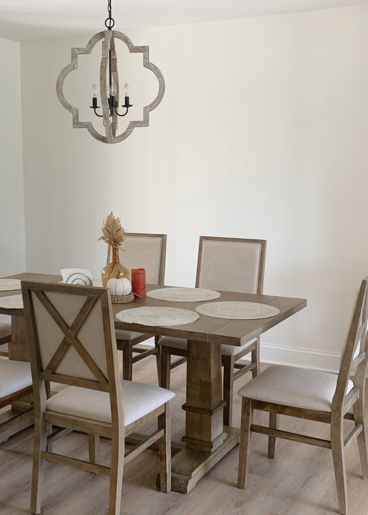
FULL Paint Color Review of Benjamin Moore Cloud White
If you’re considering white for your east-facing rooms, focus on warm whites (yellow undertones) and ones that are perhaps a bit BRIGHTER than the softer, creamier end.
- Benjamin Moore Simply White
- Sherwin Williams Cheviot
- Sherwin Williams Greek Villa
3. SHERWIN WILLIAMS NATURAL LINEN 9109
Natural Linen is a light shade of beige. Like ANY color, it can lose some of its luster in the afternoon light; however, it’s still a beautiful, muted, warm neutral. If you want warmth on your walls without too much gold, Natural Linen can be a great fit.
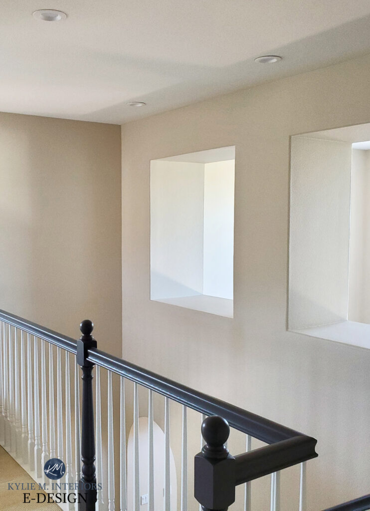
Just remember, it can lose some of its warm appeal in the afternoon. That said, your interior finishes take priority over your exposure. In my experience, Natural Linen suits A LOT OF interior finishes, which is why I’ve included it…even if it falls a little flat on you. Either you’ll still love it, or you might choose a beige with a bit more noticeable warmth.
If you like the look of Natural Linen but want a lighter shade, here are a few to explore…
- Sherwin Williams Moderate White
- Sherwin Williams Divine White
FULL Paint Color Review of Sherwin Williams Natural Linen
4. SHERWIN WILLIAMS RAINWASHED SW 6211
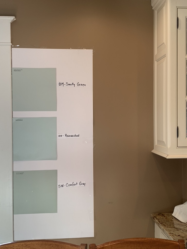
Rainwashed is a beautiful blue-green-gray blend. In the morning, Rainwashed is a beautiful shade of light blue with a whisper of green and gray. In the afternoon, you might notice its cool hue come to life a bit more, but it won’t look any lighter and brighter.
In this next image, notice how Rainwashed has less gray and more color than Smoky Green and Comfort Gray…
FULL Paint Color Review of Sherwin Williams Rainwashed
5. BENJAMIN MOORE MUSLIN OC-12
Muslin is similar to Natural Linen but has more undertone (orange). So, if you find that Natural Linen is a bit flat for your space, Muslin offers a similar degree of warmth with just a bit more backbone to stand up to those gray hours.
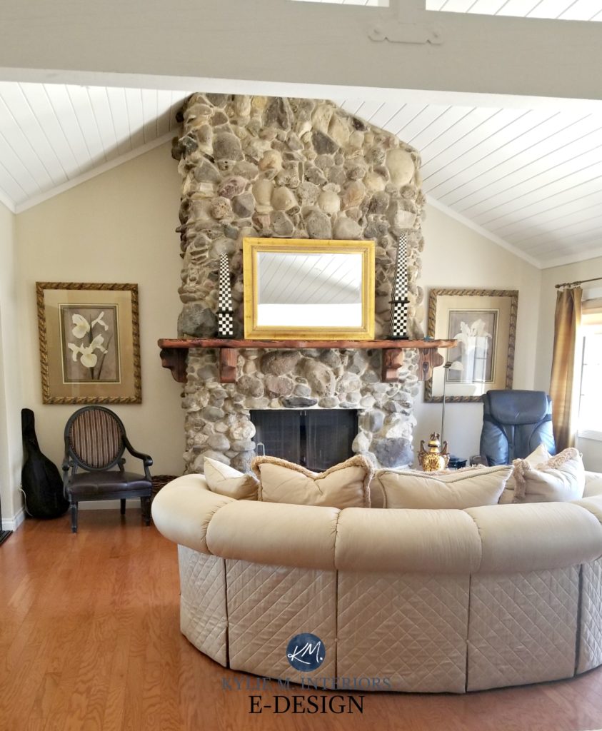
Look at the difference from the left wall to the right – all thanks to natural light!
FULL Paint Color Review of Benjamin Moore Muslin
Many of the colors that I recommend for east-facing afternoons (in particular) ALSO suit north-facing rooms!
6. BENJAMIN MOORE BALBOA MIST OC-27
Balboa Mist is a light shade of gray that winks politely at the warmth of taupe.
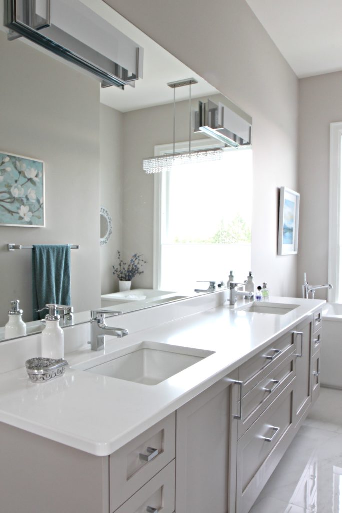
The undertones in Balboa Mist often appear purple-pink. If you don’t love these undertones, you might want to be careful, as while they’re reasonably subtle compared to some other colors…they ain’t THAT subtle.
FULL Paint Color Review of Benjamin Moore Balboa Mist
7. BENJAMIN MOORE NATURAL WICKER OC-1
I LOVE Natural Wicker for an east-facing room. Some homeowners love heavy cream but get nervous about too much yellow. The great thing about Natural Wicker is that it’s a REAL cream-beige hybrid. Compared to Gentle Cream, you’ll see that it has a similar yellow-orange blend, but Natural Wicker has a bit more gray, which calms it down. Add a bit of warm interior lighting, and you’ve got one gorgeous east-facing room!

Remember, you can’t change the fact that many colors WILL fall flatter in the afternoon. If you want to avoid that, you need to choose a color with more life/color.
Just remember, it has to suit your interior finishes, AND you have to live with it at ALL hours of the day!
Alternatively, choose a color you and your room love and improve your interior lighting (I know, I’m like a broken record). If you don’t have enough lighting, Amazon sells battery-operated wall-mount sconces!
8. BENJAMIN MOORE FERNWOOD GREEN 2145-40
Maybe you want to leave the neutral world entirely and embrace some COLOR in your life! Color is a great way to battle those afternoon Eastern blahs.
Fernwood Green is a charming shade of leafy green. Being a warm green (green-yellow), it will sit strong in the flat afternoon light while not being completely obnoxious in the morning hours.

Sure, I could go wild and crazy and suggest dark shades of green or some beautiful medium-toned blues to you, but these colors are intended to appeal to the masses and the AVERAGE home – not a particular set of personal tastes! I offer an awesome Online Paint Color Consulting service if you want something fine-tuned for you and your home.
9. SHERWIN WILLIAMS KILIM BEIGE SW 6141
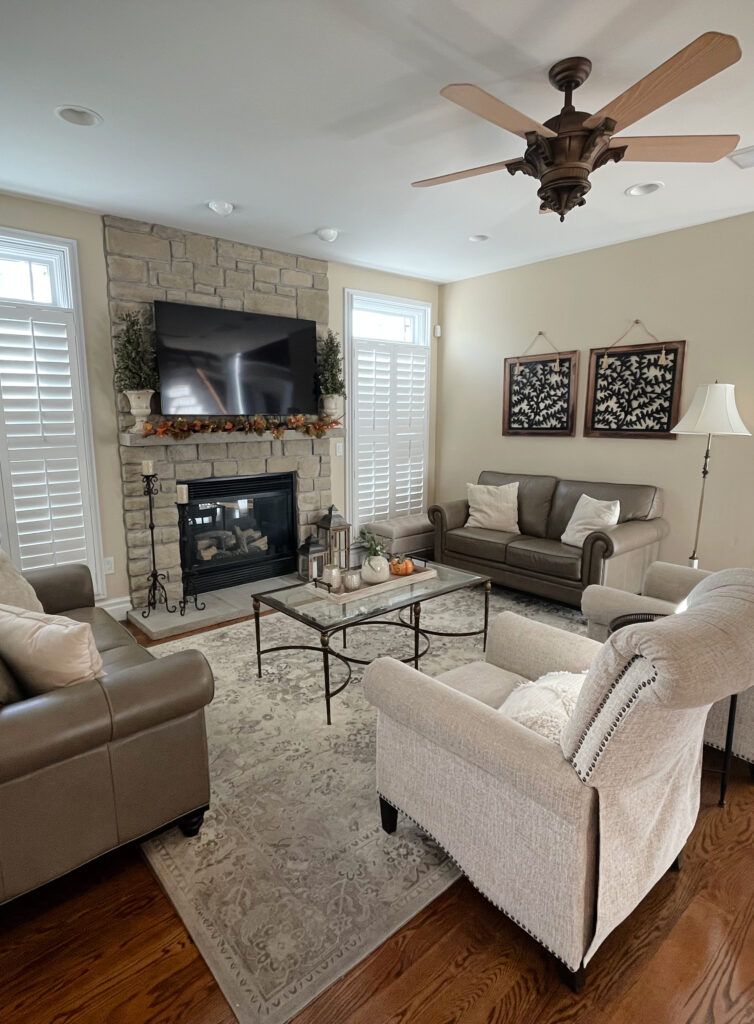
Kilim Beige has a lot more meat on its bones than the more modern beige world. With an LRV of 57, Kilim Beige is darker than Natural Linen and Muslin. While it has the same intention – to be a warm beige, it has more depth and noticeable undertones.
FULL Paint Color Review of Sherwin Williams Kilim Beige
10. BENJAMIN MOORE TAWNY ROSE 2173-20
For this one, I thought I’d have a little fun! Tawny Rose is a darker, rust, cinnamon-inspired shade with a gorgeous red-orange-brown blend. If you want to warm up your east-facing room and add some personality, a color like Tawny Rose will do the trick.
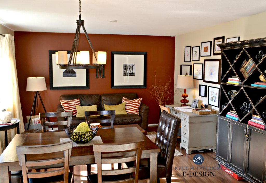
Benjamin Moore Tawny Rose with Gentle Cream
What’s awesome is that it’s not only a ‘whole room’ paint color but also a great accent wall color. This is a great way to add personality to your room without overwhelming it.
Why Does Your Paint Color Look Different or Wrong?
11. SHERWIN WILLIAMS SEA SALT 6204
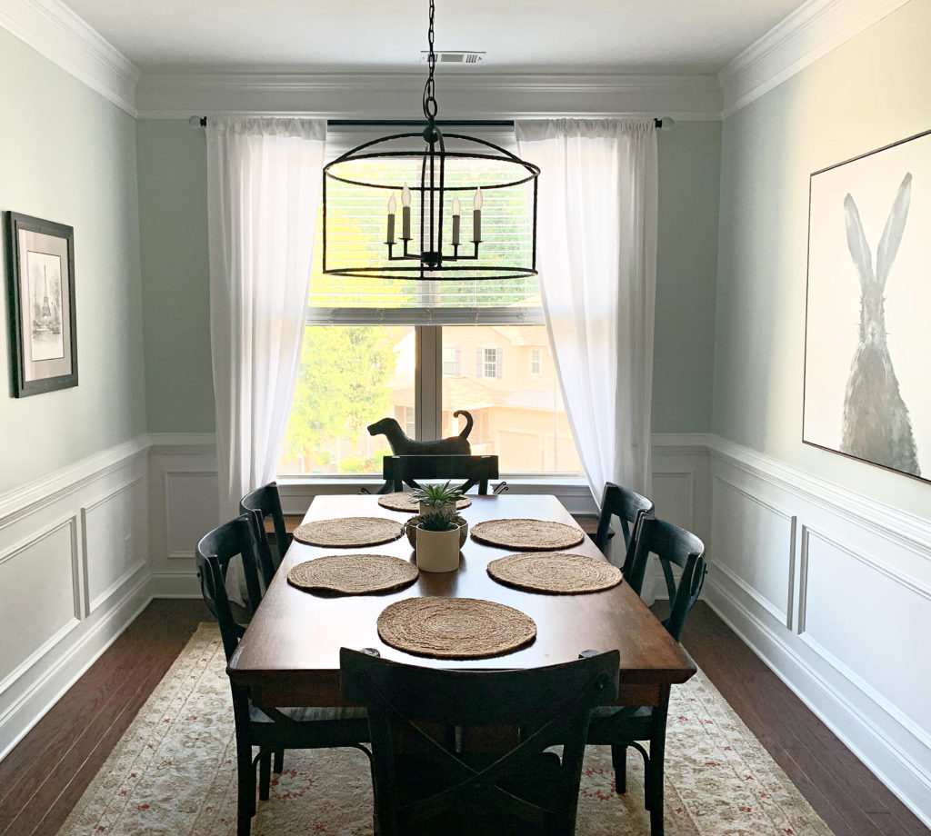
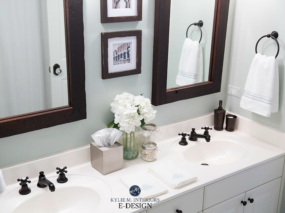
If you like the idea of Rainwashed, but it’s a bit colorful for your tastes, check out Sea Salt. Sea Salt is a muted green-gray. And while its roots suggest it might ALWAYS look green-gray, this color ninja is well-known for leaning into blue. However, overall, it has a more toned-down approach compared to Rainwashed.
Sea Salt can look as green as it does in this dining room…
Or as blue as it is in this bathroom…
FULL Paint Color Review of Sherwin Williams Sea Salt
12. BENJAMIN MOORE WOODLAWN BLUE HC 147
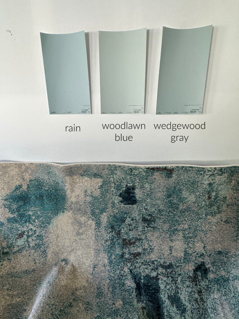
If you’re in the mood for blue, it’s hard to beat the comforting look of Woodlawn Blue. Woodlawn Blue is a light green-gray that OFTEN appears with some blue.
In this next photo, Woodlawn Blue looks a bit softer and warmer compared to Sherwin Williams Rain. This is thanks to the green in it…
What is the Best Blue Paint Color for Your Walls?
Again, I’d love to show you the wild and wonderful end of color, but that would appeal to the minority. Instead, I’ve selected colors with a BETTER chance of working in the average home. If you want color suggestions personalized to you and your home, check out my ONLINE PAINT COLOR CONSULTING – I’d love to help!
13. SHERWIN WILLIAMS CONTENTED 6191
Contented is a light-medium depth shade of green-gray that appears green-blue while still remaining wholeheartedly green. However, it does have some gray to calm it down, leaving you with a softened, more muted approach to a light evergreen color. Remember, it will lose a bit of its glory in the afternoon eastern sun, so get those interior lights going!
The Best Green-Gray Paint Colors
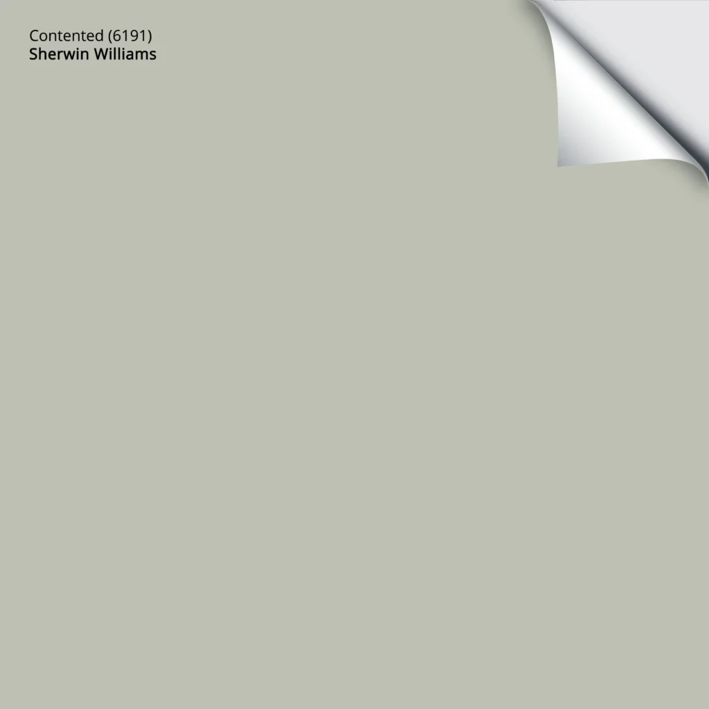
Get your PEEL & STICK SAMPLE OF CONTENTED
14. SHERWIN WILLIAMS MOODY BLUE SW 6221
I want to show you the more FUN end of cool colors, as we did with Tawny Rose in the warm section. I am a BIG fan of Moody Blue. It’s a medium-toned mix of blue-green with a touch of gray to calm it down. It adds richness and warmth to a room just via its depth.
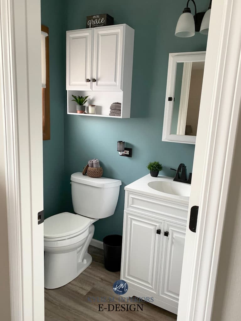
And it’s not just for accent walls. At this saturation, you can cover an entire room in Moody Blue’s glorious blue-green hue!
The 13 Best MEDIUM DEPTH Blue Paint Colors
15. BENJAMIN MOORE CLASSIC GRAY OC-23
Classic Gray is a gentle, off-white, warm shade of gray (also perceived as taupe). A warm gray like this can look flat in a room without enough light, but its gentle softness can help offset any dull light in a reasonably well-lit room.
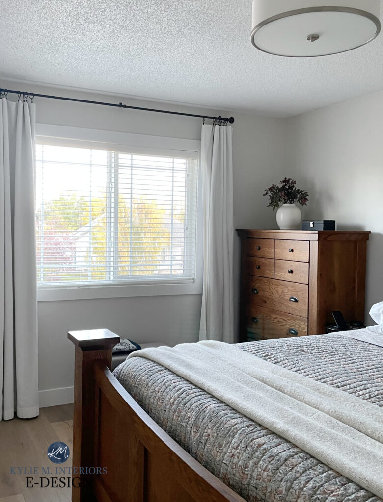
FULL Paint Color Review of Benjamin Moore Classic Gray
Will Classic Gray look dingy or dirty?
It can. Any warm shade of gray, greige, or taupe can look dirty in certain lights – it’s the nature of the beast, as these types of neutrals have brown in them! It comes down to a) whether your room SUITS dirty colors (many/most do) and b) whether it’s a color you love, regardless of whether it’s dirty or not. Personally, I LOVE dirty colors!
You might look at the above suggestions and think, ‘Hmmm, why are there so few grays?‘

While colors like Balboa Mist and Classic Gray (and others) can be beautiful, grays, greiges, and taupes can be tough in east-facing afternoon light – especially if your room isn’t super bright.
Why?
While some shades of warm or stormy gray are good in the morning, many will look dirty, dull, and uninspiring in the afternoon. Cool grays often fare better because they don’t contain brown, and their undertones can pop a bit more. However, the average home doesn’t suit many cool grays (in the lighter range), as many popular finishes need at least a little (or a lot) more warmth.
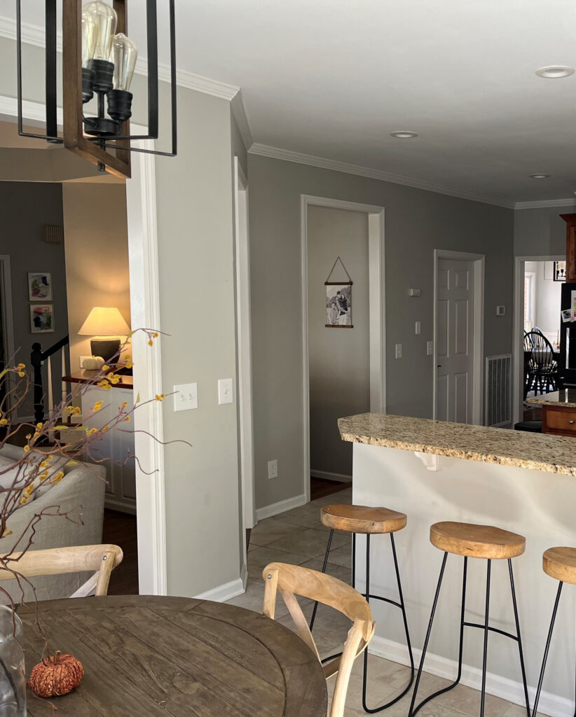
If your eastern windows are LARGE and you don’t have landscaping or an overhang blocking them, it will be way easier to get away with a gray, greige, or taupe (good interior lighting, too). All the same, I might still choose those that are a bit more inclined to grab an undertone than not.
Just don’t expect a paint color to save your room all by itself.
COORDINATING WITH INTERIOR FINISHES
Oh, you don’t get off that easy – there’s a whole ‘NOTHER side to choosing the best color for your room – your interior finishings.
The interior of your room adds a whole DIFFERENT set of rules, but there is only SO much I can do with a blog post! If you don’t know which paint color is best for your exposure, countertops, flooring, you know who can help.
READ MORE
The Best Warm Off-White Paint Colors
The Best WHOLE HOME Taupe & Greige Paint Colors
The 8 Best Blue and Green Paint Colors
Get the best paint color advice with Kylie M’s Online Paint Color Consulting!

Written in 2017, updated in 2023



Kylie, you are a breathe of fresh air, so glad I stumbled upon your knowledge. We bought a house to remodel for ourselves (2adults) and the main living floor is great room/kitchen combo. My hubby loves his grays and I love my beiges so we settled on flooring called Titus Beige (Beige with heavy feathering of Gray, plays in light). Kitchen cabinets will be shaker style in Sherwin Williams Pure White and quartz counter/island is undetermined as of yet. The entire great room is about 700sq feet and has an Eastern facing 16 foot slider doors that have an expansive view of all of Phoenix, mountains & city lights! So paint color choice is agonizing. We’ve tried a few other paint samples but so far we have a big painted sample of Anew Grey (LRV 47) as hubby had it in last house, but house was much bigger…..so we wonder if Anew might look too dark/heavy when it’s not getting full sun. We tried Agreeable Grey but it looked SO washed out in the strong East sun. Ugh! I read that you suggests having paint lightened by even 25% can do the trick…..do you think Anew Gray could be our Perfect Paint for my gray Guy and this Beige Beauty at 25% lighter??? Would love to see you do a video ASAP on Anew Gray????. PS- talking to hubby about ya a lot, so he’s curious about ya….”ya know, Kylie says…..”. Luv, Kelly & Grant in Phoenix
Hi Kylie ~ I am desperate. My master bedroom looks like the face of a clown. I am tired of trying colors. They look one color in one wall and another completely different color in another wall. I have tried 27 different colors , Benjamin Moore and SW.
The bedroom has SE light. But there is a hallway in the bedroom with two separe closets with not much natural light. I started with grays and toupee colors. The colors were different in the hallway than in the actual bedroom part. So tomorrow I am going to test browns for accent walls and beige or whites for the rest of the wall. I’ll see if it works. If it doesn’t work , I am going to need your help. How much do you charge to work directly and privately with me to choose the right colors. I need brown for accent walls and creamy beige fr the rest of the walls. By the way , the master bathroom is kind of open to the bedroom, so I like to do the same as the master bedroom. The bathroom area have a big half moon window SE and the west room, which is a separate room have a small East window. The catch here is that I have painters coming to paint in two weeks. So I have to have my colors selected in a week and a half. I will know by Wednesday 6/3/2020. Would you be able to help me ?
Thank you !
I adore the paint colour you showed in the first bathroom in the east morning light (with the marble). May I ask which colour this is?
Ahhh, that’s Benjamin Moore Classic Gray, 25% darker :).
Sorry to harp but why can’t you put the paint color codes on your swatch graphics!? It’s hard to follow when we constantly need to scroll up and down to see what the color looks like and what you wrote about it with the way you order them… and speaking about that — clockwise!!?? Really!? The world reads English left to right so at the very least to keep things consistent if you ordered the descriptions left to right, line by line it would make better sense. But you really sit there writing this and intend to make us match up paint colors to descriptions reading forwards on the first line and backwards on the second?? I’m sitting here thinking “okay is this right? Where are the purple tones in this, am I reading about the correct color??”
Way too confusing.
Hi Niko, the swatch graphics are just general placeholders. I’m sorry you don’t find the free information I put there up to your standards! It does take many many hours just to put this info together and I do my best :).
Lots of criticism Niko. If it’s not for you then move on. She’s the best color advisor /specialist out there.
Oh, Marisa, I love you ;). Thank you.
Hi Kylie, what do you think of SW Crushed ice. We get lots of light and have a morning east and evening west house.
Wondering the same. We did Crushed Ice in a powder room without windows and it’s nice, but wonder how it would be in my whole house.
I do love Crushed Ice and when I moved into my last house, most of the walls were painted in it. Personally, I found it a bit drab and flat in varying exposures, and the undertones were a bit too unpredictable – but that’s my experience/perception!
Kylie – We have just purchased a home and must completely repaint the interior before we move in. (So I have been spending hours on your website lately!) The open concept family room/kitchen has all east-facing tall windows/slider door. However, those look onto the back patio which is covered by a slatted pergola painted ‘redwood’. Would this change any of your recommendations for warm whites/off-whites? Thank you!
Hey Laura, it totally depends on the surrounding finishes, including the flooring/fireplace/countertop/cabinets/etc… These call the shots FIRST and then the exposure comes into play!
Hi Kylie, and thank you for your wonderful posts! How do you feel about Edgecomb Gray for a room with one SE facing window? Or do you prefer something creamier like Natural Wicker like above? Thank you!
Hey Christine! As long as the room gets reasonable light, EG could be lovely! If it’s just not warm enough for you, Natural Wicker is lovely, as is SW Natural Linen and BM Maritime White 🙂
Hi Kylie- Thank you so much for writing such a great post explaining what to look for in your paint color and how it will work in a particular room! I’m looking for a light blue (leaning more true blue vs green) and I’m hoping that this helps solidify what color to go with. Quick question- at the start of this post you have a graphic titled ‘The Best Paint Colors for East Facing Rooms’ with four paint cans and I’m trying to figure out what blue you used (top right corner)? Sorry if it’s written somewhere and I’m just missing it. Thanks!
Hey Christine! I always use those paint cans as super basic placeholders and they aren’t specific colors. Now blue can be blue-green or blue-violet and it sounds like one that comes off more or less BLUE or that leans SLIGHTLY violet will be more up your alley. However, believe it or not, that little paint lid is a blue that leans just a WINK into green. It also depends on how much GRAY you want to see in your blue. Based on my wee little circles, you want a reasonable amount of gray. Take a look at BM Blue Lace (so stinkin’ pretty). I also love Sherwin Williams North Star and Lullaby :). Good luck to you!
Hello, how do the new SW designer colors work in East/west exposure? Like sunbleached, mortar and sanctuary. Thank you
Following…
I like all three and am considering using one throughout the interior whole house
RE: SW Marshmallow 7001
Hi, Kylie!
I appreciate you. And your words. (This is one professional writer speaking to another, here!)
Marshmallow, Pure White, or Cheviot (my order of preference)?
My question should not be so hard, but we’re talking about white paint here. (You ask me, I think WHITE puts the pain in picking PAINT.) So I’m asking you – the expert!
I’ll give you a WINK of background. Couple of winks, maybe.
My kitchen/dining/entry area gets the most light from the east, though I have one large and one smallish window facing south. We spend more time there in the afternoon/evening. I prefer warm, but I am also looking for clean.
My samplizes arrived (exceptional resource, thank you!) the other day and I’m going bonkers. I’m down from 13 whites to 3. Cheviot, Pure White, and Marshmallow. Marshmallow seems nice at all times of day and I gravitate toward that most often in “blind” tests. There are a few bad paint pickin’s in my history and I don’t want to do it again – especially on this scale.
Since Pure White and Marshmallow didn’t make your list, I wonder what you think. How will they behave?
All construction is new. The walls, ceiling, and trim will all be the same white color. All the rooms on this level will be white.
Cabinets are quarter sawn white oak with a light stain (they’ll look similar to Schuler’s cappuccino finish on SQ red oak).
Floors will be lighter than that (the character/cathedrals in the wood are close to the cabinet color)
Quartz countertop will be Cambria Britannica Gold Warm. I’m going to use a transparent material for the backsplash ONLY where needed.
I’m working on a layered lighting plan and have read your blogs on how important light is, so I’ll be taking that into account, too.
Thoughts about Pure White and Marshmallow? Any other colors you’d recommend I try?
Thanks for your wonderful contribution to this world (one of many, I’m sure). You make life better for those of us who believe our surroundings matter in a big way.
Heidi
Oh, what a LOVELY note to get, thank you, Heidi!
SO…if you’re doing Cambria Brittanica Warm, that HAPPENS to be the same countertop I have. And I have white walls. Are you wondering which white I chose? Benjamin Moore White Dove! Now, if you actually chose Brittanica GOLD (as your note says Cambria Brittanica Gold warm), that’s differnt as it’s more grounded, warmer, and has more orange/rust to it.
Now, even though I might not include a color on a list, doesn’t mean it won’t work, it only means there are others I like more. However, this can TOTALLY open to change based on a space and its finishes (and the homeowner!). For some thoughts…
MARSHMALLOW – I rarely refer to as it can grab a wink o’ pink (or even more than a wink) that makes me DARN NERVOUS! I wouldn’t do it. There, does that help eliminate one?
PURE WHITE – Mad love. Now I personally want a bit more warmth or warmth AND softness in an east-facing room given the afternoon light, but you DO get some southern sun to help it out, this is good.
CHEVIOT – I haven’t had the chance to use it much (haven’t had clients pick it). For what I read above, it’s my fave for you, as long as you’re okay with its degree of yellow/warmth.
If White Dove is an option (but only made in BM paint) check it out. In my kitchen/dining/living I have ‘mostly’ northern light, but get a touch of south in my main living areas. This being said, I have it in EVERY exposure throughout my home and love it everywhere!
If you don’t mind the pink in Marshmallow but also wouldn’t mind a touch of balance with yellow, check out the brighter look of SW White Flour. And while it’s probably way more muted than you want, White Heron is neat, too.
HOWEVER, long story short – I lean into White Dove (if I had to choose from only SW, probably Cheviot, maybe Alabaster). Of course, I say all of this without seeing your space, but those are some thoughts from THIS side of the screen :).
Remember to put some white paper next to your samples. If they’re on your current wall color, your opinion could be swayed. While the cool tone of white paper will OVER EXPOSE a white’s undertones, it’s also a great way to get a feel for things.
Let me know how it goes!
Chat soon, Kylie
RE: SW Marshmallow 7001
Kylie,
Wow, thank you for the in-depth response! That info is super helpful.
The countertop is Brittanicca Gold Warm™ Quartz, and you’re right, it has more rust. Does that change your opinion on colors?
I’ll eliminate Marshmallow now that I see the undertones more prominently. It wouldn’t have worked well with the colors of the countertop. Thanks for saving me!
Benjamin Moore IS an option and in fact, I bought a samplize of White Dove (AND SW Alabaster). They’re hanging with the others, attached to my husband’s long level so I can move them around together.
I forgot about using white paper against the samples, so I added those as well, and wow, it is amazing what you see! I think I will order a sample of white flour before I make my final decision.
It’s sunny today (not a given in PA!), so it’s a good day to explore. And that makes me wonder about the weather: does it affect paint color much and should I lean into warmer colors to negate the crappy weather here? According bestplaces.net our weather is more than crappy. Rain: 47 inches vs. 38 US average. Snow: 82 inches vs. 28. Sun: 162 days vs. 205.
I know you’re busy and I appreciate your time. If you have any strong opinions about the countertop or the weather, I’d love to hear them when you get a few minutes.
I’ll keep you posted.
Thanks again!
Heidi
RE: Trim Color for Cheviot
Hi Kylie!
I’m back. We went with Cheviot (40% off!) on all the walls and ceilings. I was going to do the trim too, but it’s such a beautiful color, I think a different white could accentuate it even more. If I paint the trim a different white, I was considering either High Reflective White or White Snow. But you were right on the nose with Cheviot and I wanted to see what color you thought would be the best complement. Do you have any thoughts on that?
Thank you!
Heidi
Hey Heidi! I’m so glad you love it! NOw, HRW, is tricky as they actually give you Extra White and add white tint – it won’t be as white as the HRW sample – they’ll tell you it’s HRW, but it’s not. I’m thinking maybe BM Chantilly Lace coudl be a better, safer choice? White Snow is pretty and subtle, too!
I’d loooove to see photos when it’s all done! kylie@kylieminteriors.ca
I realllly like Chantilly Lace. OK. I’ll use that one. I will definitely send you pics and I don’t think it’ll be too long now. Thanks SO MUCH for the quick response. We just picked up the trim tonight. 😍
Hi Kylie, ive read all your blogs on paint and im still stressing to find a color. Our shower tile is Volakas Grigio gloss on shower wall and the same on bathroom floor but the matte finish. We painted walls Repose gray and it had to much purple undertone for me so i had my husband prime over it. Ive put samples up of passive and reflection they are to blue for me. My bathroom is small and theres not much wall space to paint. Above toliet, and a wall when you walk in. My bathroom faces East. My vaniety is white as the quartz counter is as well. It has some slight gray veining in it which is very settle. Ive considered Agreable gray, Gossimer veil, crushed ice. i put a sample of agreeable gray on wall it looked purple. To me the room needs some warmth. Any advice would be so appreciated. Im really stressing myself out over such a small room. Thank You, Happy New Year!
Hello Kylie,
What are your thoughts on SW Sanctuary? I saw it in a friend’s home and loved it, I could not understand why it isn’t more talked about. I have an east facing living room with lots of natural light. Thank you kindly!
It’s quite a gorgeous color! It’s tough, as I only use photos from my clients/readers/etc and I haven’t had any of my client chose Sanctuary for their project yet! It’s also one of the newest colors to the paint scene (4 years, but in the paint world, that’s very new), so it’s just gaining traction now!