
What’s the Best Blue Paint Color for Your Walls?
HOW TO CHOOSE THE BLUE HUE THAT’S RIGHT FOR YOU
Blue is a popular paint pick for MANY reasons. It’s calming, classic, coastal, country – subtle, striking, and sensual. But there’s one thing it isn’t, and that’s easy to pick.
And while I’ve written a blog post about the best blue and blue-green paint colors, we need to have a lil’ chat before you whip out your paintbrush. Why? Because while they may seem simple, all blues are NOT created equal…
TRUE BLUE PAINT COLORS
Short of going ‘primary blue,’ it can be hard to peg down a true blue, particularly once you start mixing in gray.
Benjamin Moore Newburyport Blue
A colour like Newburyport Blue is more likely to give a ‘true-blue vibe’ without entering the primary range.
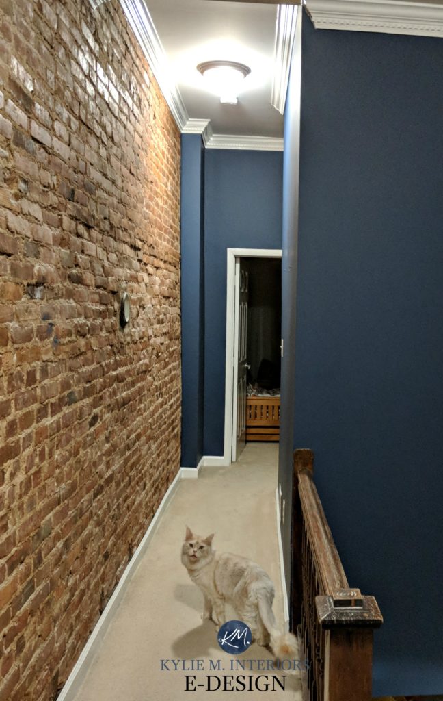
BLUE PAINT COLORS WITH PURPLE UNDERTONES
These blues lean slightly more toward purple/violet without committing all the way. A blue-violet often feels a bit cooler than neutral or softer blues. Technically, these are blues with a touch of red (and you know how technical I am – wink wink).
Benjamin Moore Steel Wool
In our last home (above), it was a toss-up as to whether our guests thought the paint colour was blue, blue-purple, or gray!
BLUE PAINT COLORS WITH GREEN UNDERTONES
I’m not going to say that blue-greens are WARM, but they’re definitely a bit softer and more inviting looking than shades of blue-violet. Blue-greens ‘technically’ have a touch of yellow in them.
Benjamin Moore Beach Glass
Sherwin Williams Tidewater
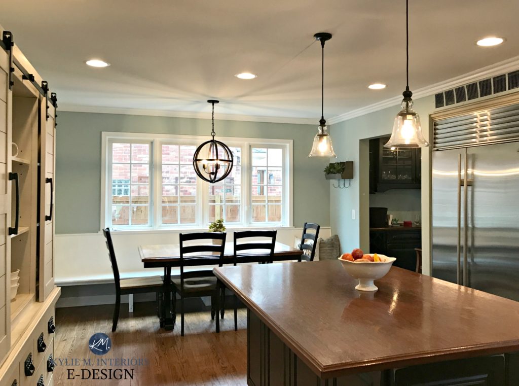
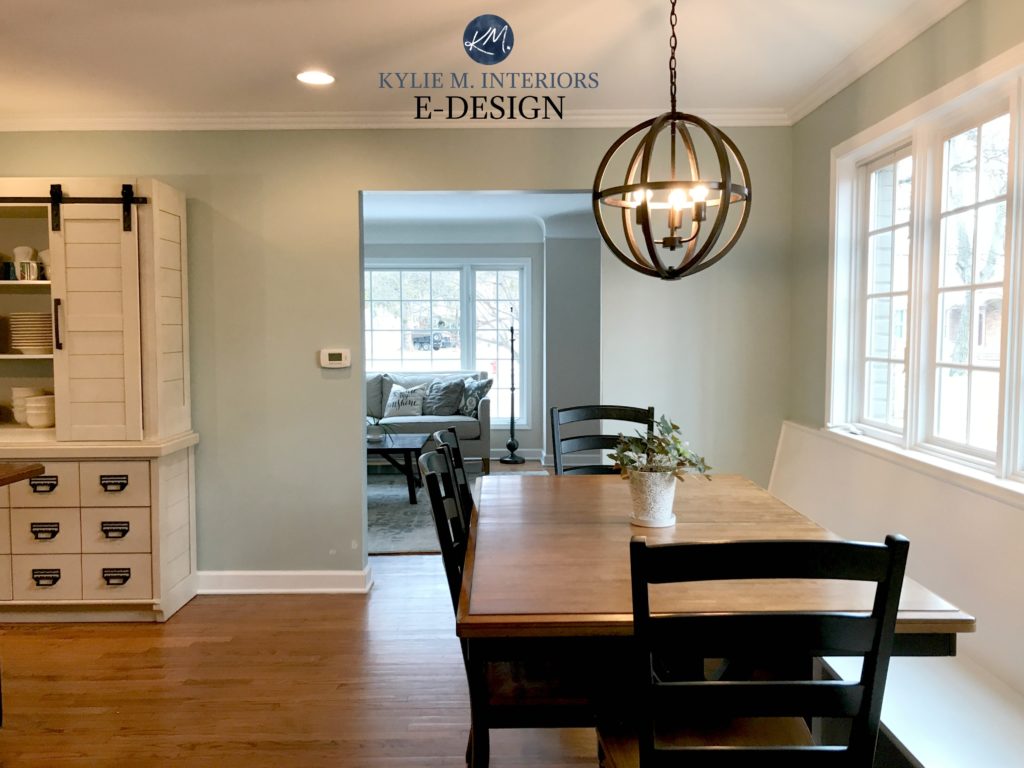
Above two photos: Benjamin Moore Silver Marlin
In the above two photos of Silver Marlin, things look pretty darn green in spots! However, this combines lighting and exposure, as Silver Marlin is a beautiful blend of blue, green, and gray!
Why does all of this matter?
Because you want to make sure you pick the type of blue you like and avoid the ones you don’t. For example, if you don’t like purple, there is a whole WHACK of blues that you’ll want to avoid; the same thing for green.
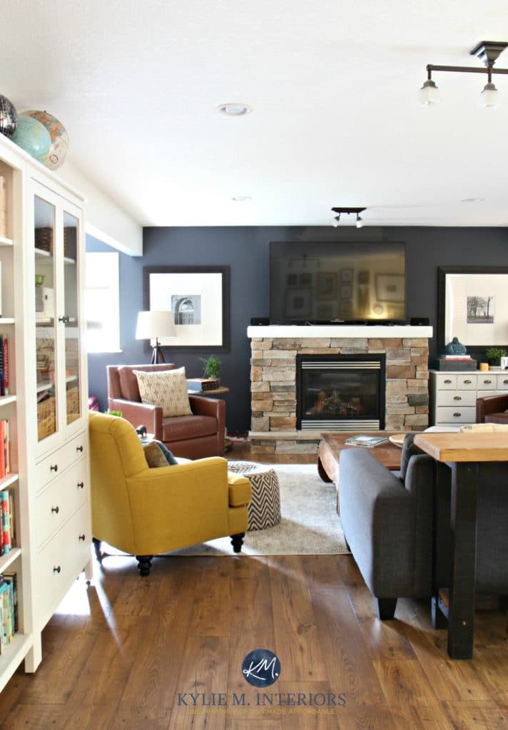
Sherwin Williams Cyberspace. See the whole room here
Paint Color Review: Sherwin Williams Cyberspace
HOW DO YOU FIGURE OUT WHICH SHADE OF BLUE IS BEST?
- Ask the paint store which side of the blue scale your fave sits on.
- Compare. Pick your FAVE four to six shades of blue and compare them (even if one or two are faves, grab some more). This will help you notice how undertones shift from one to another.
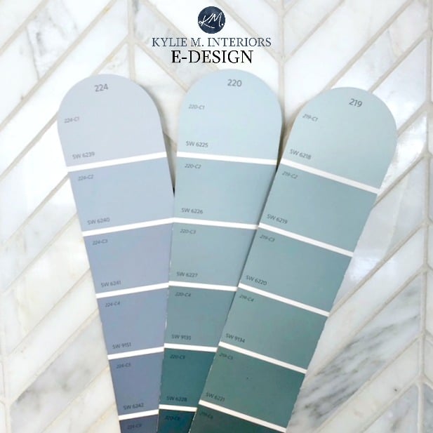
The above photo shows three of Sherwin William’s more popular blue paint colors.
LEFT: BLUE-PURPLE. This includes Windy Blue, Bracing Blue, and Indigo Batik.
CENTER: BLUE (touch of green). A popular color strip, including Languid Blue, Tempe Star, and Whirlpool. As this strip gets darker, the green comes up more.
RIGHT: MORE OBVIOUS BLUE-GREEN. The TOP blue strip these days, including hits like Tradewind, Rain, and Moody Blue.
For each one of these color strips, there are MORE comparables if you want to shift more green or violet – it just depends on which direction you’re heading in!
Sherwin Williams Jubilee
BLUE PAINT COLORS IN NORTH-FACING ROOMS
To paint your north-facing room a beautiful blue, you need to tread carefully. Northern exposure is a cool gray/blue light. Adding blue to the walls will only compound the ‘cool look’ of the room, and northern light also enhances cool colors.
Benjamin Moore Woodlawn Blue
If you’ve fallen in love with a cool-toned blue, get ready for some serious interior work with lighting, accents, and texture to add balance and visual warmth to the space.
Benjamin Moore Lucerne
However, if you’re worried about blue looking too cool for your room, consider a blue leans into green so that it’s a bit softer.
Read more: The Best Paint Colours for North-Facing Rooms
BLUE & SOUTH-FACING ROOMS
Unlike a north-facing room, a southern room just loooooves blue. Why? South-facing light is warm/yellow, and painting a southern room a warm colour only packs on the heat! By painting the walls a cool blue tone, you’ll help balance the warm sun rays and add serious colour balance to the space.

Benjamin Moore Mount Saint Anne and Benjamin Moore Beach Glass
However, it’s important that you LOVE blue, as in the evening, you won’t have that warm sunshine to balance things and will have to rely on your interior lighting to add balance.
Read more: The Best Paint Colors for South-Facing Rooms
BLUE & THE BEST LIGHT BULBS/KELVINS
How your blue looks can be subject to the type of light you shine on it…
WARM-TEMPERATURE LIGHT BULBS
When there isn’t any daylight, you might find that warm bulbs (particularly old-school bulbs) can cast a yellow/gold glow on the walls. When this mixes with blue, it can create a kind of blue/green blend (especially the 2700K range, give or take).
DAYLIGHT LIGHT BULBS
While personally, I find daylight bulbs a bit too crisp for everyday living; they can be nice in a bathroom.
Shown above: BM Stonybrook. See the entire home palette here
Daylight bulbs will show your blue at its most true, but remember that this higher Kelvin isn’t a warm, friendly-looking light. I’ve found that men often prefer daylight bulbs, whereas women often like the softness of a warmer light (3500K is often a happy medium).
COLD-TEMPERATURE LIGHT BULBS
There’s not a single room that I would recommend these for – nada.
WHAT ARE THE BEST WHITE TRIM COLORS FOR BLUE?
There are three ways to paint your trim when you’re using blue.
1. COOL WHITE
Cool whites can keep up the crisp, clean, cool vibe of your blues. Remember, it’s best if your white trim is consistent throughout your home, and a cool white trim won’t accommodate a wide range of colors.
2. TRUE WHITE
Choosing a simple white like Benjamin Moore’s Chantilly Lace is often the safest bet when painting with blue. However, it ALL depends on your décor style and other features, such as any white cabinets/existing whites – it’s best not to mix and match your whites!
3. WARM WHITE
A warm white will slightly contrast with the blue, creating a pretty combo as long as you don’t go TOO warm on the white; subtle and simple is best (i.e., Benjamin Moore White Dove.)

The 8 Best Benjamin Moore White Paint Colors
So, now that we’ve covered the basics of blue, it’s time to pick your FAVE, so head over to this blog post to see some of my faves!
PEOPLE ALSO ASK…
WHAT’S THE MOST POPULAR SHADE OF BLUE?
It depends on which depth you’re looking for. Benjamin Moore Hale Navy is one of the best darker navy blues, as is Sherwin Williams Cyberspace. In the light range, Sherwin Williams Tradewind is popular, as well as Benjamin Moore Palladian Blue and Ocean Air.
Paint Color Review of Benjamin Moore Hale Navy
WHAT’S THE MOST CALMING SHADE OF BLUE?
The answer is open to personal tastes. Many find darker shades of blue more calming and relaxing, whereas others prefer lighter shades of blue mixed with gray and green.
READ MORE:
The 8 Best Blue and Green Paint Colours BM and SW
Sherwin Williams Upward: Color Review (Color of the Year 2024)
Colour Review: Sherwin Williams Network Gray
Benjamin Moore Smoke Paint Color Review
Not sure which blue is right for you?
Check out my FUN E-Design packages!

Chat soon,

ORIGINALLY WRITTEN IN 2018, AWESOME UPDATED FOR YOU IN 2023


SW Moody Blue looks great in north Facing bedrooms!
Oooo ya, it’s a beauty, isn’t it!
I love the look of Benjamin Moore Stonybrook! Would it tend to go more green or blue with northwest light?
Hi there ! Great timing on this e-newsletter as I’m literally at the point of choosing a lovely blue to carry throughout my home. Can you tell me what paint colour was shown in the picture just under the three whites please ? It’s absolutely gorgeous. I’m assuming that the paint colour in the hallway would be something like a BM Navajo White or the sort, right ? It appears to be a bit more on the creamy side than the painted trim. I’m utterly in love with that picture ! Thanks for your input.
Hi Christianne, that was SW Wall Street, super gorgeous, eh?! And that hallway is SW Wool Skein which I just did a colour review on last week!
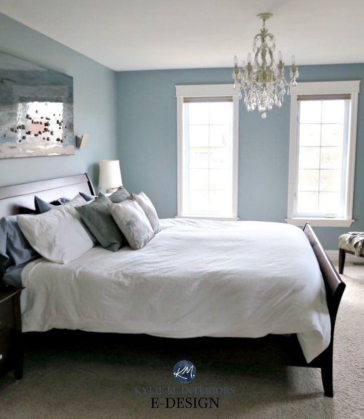
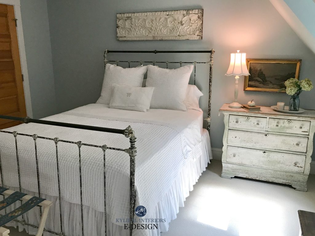
Hello! Could you please tell me the color of the walls in the bedroom pic with the white comforter?? Its gorgeous!!
Thank you Michelle! That’s BM Mount Saint Anne 🙂
Hi, Can you tell me the difference between BM Tranquility and SW comfort grey? Thinking of painting our master bedroom one of these colors. Thank you!
Hi Wendy, they are SO similar, Comfort Gray leans just a wink more green, but really it would be hard to really clarify the exact difference. Normal BM or SW colours are usually made up of 3-4 colours, whereas BM’s AFfinity line can have 7-8, meaning they are far more complex and prone to change throughout the day – and Tranquility is one of those!
~Kylie
Hi Kylie, Love your website!! You are so talented!! I am looking for a soft blue (LRV 60s) paint color with no green undertones for a west facing master bedroom. Our furniture is medium brown sleigh bed style and our linens are white. Do you think BM Beacon Gray would work? Any other thoughts? Many thanks!
Hi Bernie, thank you! Now I do try to give as much complimentary info as i can on my blog and if that doesn’t work, it might be time for some E-design, this way I can throw colours at you after seeing your room/exposure/flooring/etc…if that interests you, it’s affordable and fun! https://www.kylieminteriors.ca/online-decorating-design-services/
~Kylie
Hi Kylie,
I am in Australia and embarking on colour for a new home. I have a few hurdlles to conquer (slate floors). Are you able to advise on an e design course or are yhe ptoducts too different here?
Hi Natasha! I think the problem I came across with Australia before was that you only had CIL dulux paint. If you happen to have a Benjamin Moore or Sherwin Williams, I can definitely help, and understand that the exposure are reversed compared to where I live 😉 We also use a lot of slate up here in Canada, so I’m familiar with many of them…
~Kylie
Any suggestions for a gray blue for living room dining room, kitchen and family room, open floor plan.same color, thank you.leaning toward gray
Hi Jeffrey, thank you so much for your note! When it comes to personal questions I do refer to my E-design, which is my main business. I try to give as much complimentary info on my blog and if that doesn’t work it might be time for me to take a closer look! https://www.kylieminteriors.ca/online-decorating-design-services/
~Kylie
Hi Kylie: I’d very much like a consultation but just wanted to first check which paint companies you use. My painter has a strong preference for Dulux and I didn’t know if you worked with their palette or now. Thanks very much
Hi Patti! Unfortunately I just use SW and BM. I’ve tried doing it with Dulux but just found their ranges too limiting!
Hi Kylie, whenever we have a psinting job in front of us, I look to your website. Great info and insight!
We are thinking of painting SW tradewind for our exterior front door and shutters. For the body of the house, what neutral colors complement tradewind? Whites/off whites/beiges? Thanks!
Have you ever used SW Mild Blue? Wondering what your opinion is on it as a nursery color with white trim and ceilings. We don’t want something too bold or gray that looks gloomy. Hoping for a nice peaceful, blue/gray that looks relaxing!
Hi,
I love Newburyport blue, would bm cloud white trim go with it in a south facing room?
Hi Leanne, I think it could be QUITE pretty!
Hello! Do you know the blue color on the ceilings and above the wainscoting? The hall looks like a cream. Thank you
Yup, that’s Sherwin Williams Wall Street 🙂
I really love love your blogs and videos! With that said, I have a bedroom facing South South West. Room size 10×12 with one tall window mostly facing South West with oak trees outside. This room is connected to another room with a bathroom between. These room do not face each other but you can see them both when your in the bathroom. The wall color in the other bedroom is a BM Manchester Tan and the hallway leading to these two rooms are BM Bennington Gray (a designer helped with this many year ago). I need to refresh this current bedroom and the bathroom that join the two rooms together.
All the colors mentioned are definitely on the warm side but I do want to incorporate some coolness to the bathroom and current room having it all make sense and so there still is a good flow.
The bathroom is very small with one window above the toilet facing the west only. The midday sun is over the house and there are trees in the neighbors yard. This bathroom does see both rooms. I would like to lighten it up with some softness and character. I was looking at SW Lullaby and SW North Star and SW Upward. I don’t want a pure blue room totally but don’t mind the undertones. It can look like a light blue but something pretty and soft with shade and sun.
The connecting bedroom, I am struggling with. I definitely do not want creamy or green. Green comes in very strong when room in shaded from the trees outside. I need the color to flow to the hallway (BM Bennington Gray). I can’t have the color to close to the hallway color, its too much. So need more a neutral with a coolness perhaps to blend with bathroom hallway. Not asking for much am I, haha. I really need help. I have watched the videos and read your blogs and keep getting paint swatchs and putting them on white background but am feeling I am not getting any closer. Oh, I only have a ceiling fan with a light kit in this room with warm light. when there is shade, there is shade in both rooms.
I am praying you can help with suggestions on both rooms. The trims are a crisp white, extra white.
Thank you so much.
A couple years ago when we bought our house, I could swear I read a post where you described a light blue as…if light blue could be navy blue… but I can’t find it again. Am I crazy?
Oh man, I’d LOVE to help, but this doesn’t ring a bell at all; I’m sorry!!!
Hi Kylie
We are doing a washroom reno at our marina. Looking to paint the walls a blue to give some life to the mostly white tiles/ some grey accent tiles. Any suggestions ?
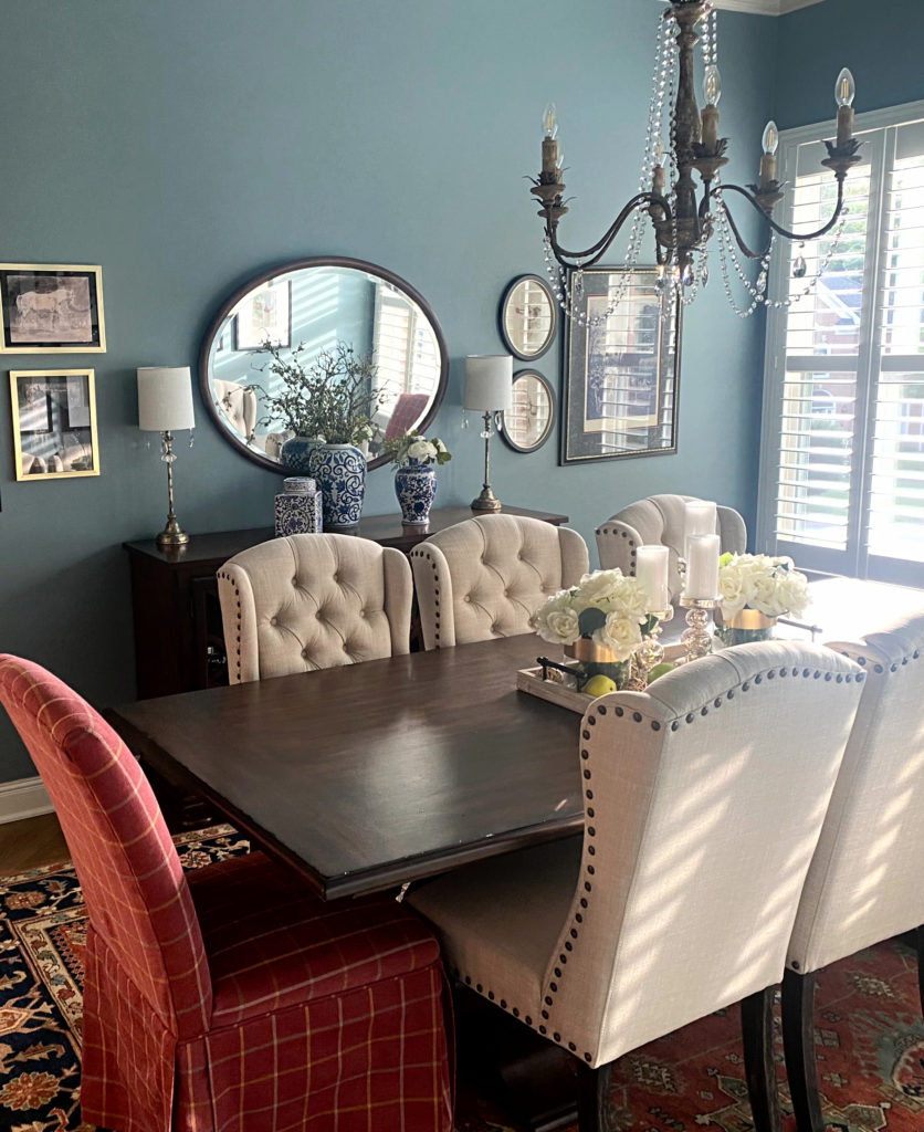
Hello! What is the name of the wall
Paint in the dining room picture that has the red end chair?
Kylie, the dining room picture toward the bottom of your blog with the red brick or rust color head chair, cream side chairs and chinoiserie on the buffet is STUNNING! I have a couple of rooms with these colors and really think this could be the background color I’m looking for to bring it together. Please tell me the name of this amazing color.
I love your your videos and tutorials so much!
SO, that’s BM Van Courtland Blue, but to look at that image, I mighty look at SW Moody Blue, too, as it looks a bit more like that :).