
Sherwin Williams Network Gray SW 7073: Paint Color Review
One of the Best Gray-Blue Paint Colors: Sherwin Williams Network Gray!
If you’re familiar with gray paint colors, you’ll be WELL aware of the fact that they love to pick up wild and wonderful undertones, and Sherwin Williams Network Gray is no exception.
And while I’ve spent a lot of time reviewing some of the more popular grays like Gray Owl, Revere Pewter and Repose Gray, there’s something to be said for a gray that’s a bit more unique and NOT as popular – although after this blog post it just might start popping up in our Pinterest feeds!
What type of paint color is Network Gray & what are its undertones?
Network Gray is gray paint color with a ‘decent’ blue undertone. This means it won’t have the stormy blue subtlety of Sherwin William’s Big Chill nor the muddy hint of green in Benjamin Moore Revere Pewter. In fact, Network Gray could ALMOST be called Network Blue in comparison to more traditional gray paint colors!
Now, you might look at that wee little color chip and think to yourself, ‘time to put down the wine Kylie – that’s gray’, and you’d be right on both accounts. But, it’s a gray with blue in it- trust the crazy Ginger (and remember, we steal souls on a regular basis).
Gray Paint Colors – The 3 Undertones You HAVE to Consider
And there are two things that blue just LOVES to do, and that is a) lean to the green side, or, b) lean to the purple side (read more HERE). The wicked cool thing about Network Gray is that it doesn’t cater obviously to EITHER side, offering some great flexibility.
North, East, South, West: Which Paint Color is the Best?
What’s the LRV of Network Gray?
Network Gray is a great way to get out of the safer, lighter range as it has more depth, body and visual interest, without going too heavy or dense. With an LRV of 37, Network Gray is a medium tone, but its cool look keeps it looking fresh and modern if you have adequate lighting.
The Ultimate Guideline to LRV – Don’t Choose a Color Without It!
Where does Network Gray work the best?
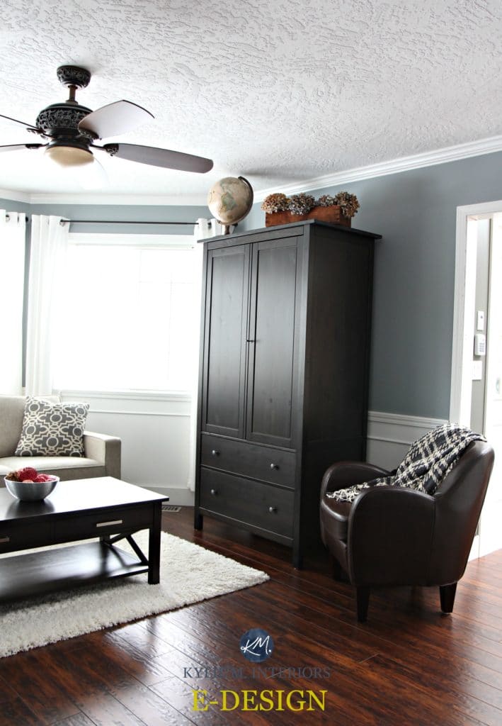
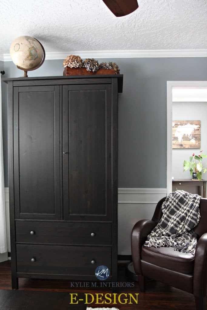
Network Gray just loooooves south-facing rooms. With their warm-toned exposure, south-facing rooms are the perfect foundation for Network Gray to add some cool balance.
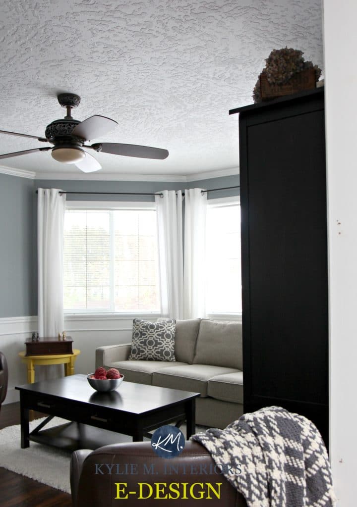
See how Network Gray balances out the warm tones coming in the living room windows? The warm tones of the natural sunlight soften Network Gray a bit, while Network Gray takes the warm edge off of the sunlight.
Network Gray also works really well with wood tones as long as you want to enhance your wood tones. Do you have cherry or oak wood cabinets? Network Gray will bounce off those warm tones, creating a lower contrast palette with its depth, but a high contrast look because it’s a cool color (opposites attract and create a dynamic palette).

Click HERE or on the above image to see available packages
Let’s take a quick break to talk about paint samples…
Undoubtedly, you’ll be heading out soon to grab paint samples – stop right there! I want you to check out SAMPLIZE. Samplize offers peel and stick paint samples that are more AFFORDABLE, EASIER and more ENVIRONMENTALLY FRIENDLY than traditional paint pots. Here are just a FEW reasons why I recommend Samplize to my clients…
- samples arrive ON YOUR DOORSTEP in 1-3 business days, depending on location
- they’re more affordable than the samples pots/rollers/foam boards that are needed for traditional paint sampling
- if you keep the samples on their white paper, you can move them around the room
Visit the SAMPLIZE website HERE
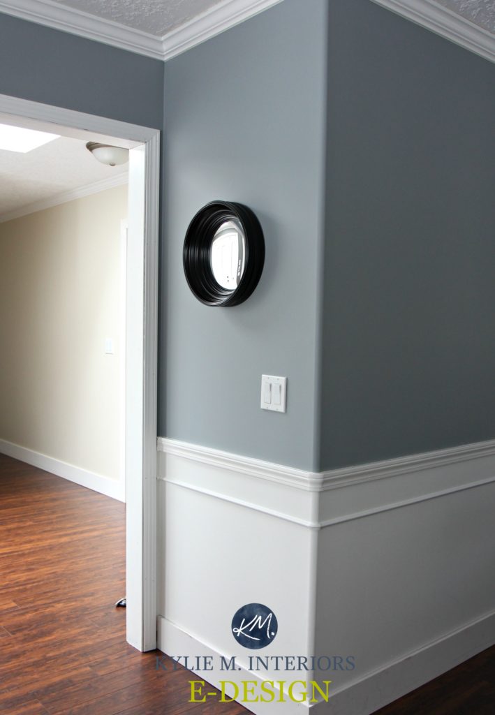
Where to AVOID colors like Network Gray
Like any paint color, Network Gray will be at its BEST on walls with at least a reasonable amount of lighting. And while some colors can rise above the shadows, Network Gray isn’t one of them. If you have a dark room or shadowed hallway, you may want to look at another paint color (although it can be gorgeous in a dark room if you have the right decor/interior lighting to visually support it!).
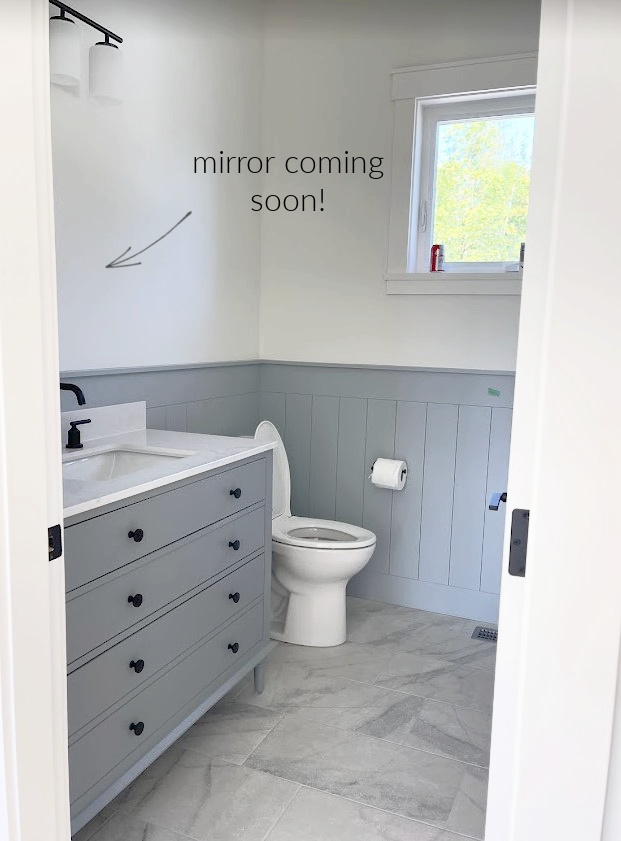
What’s the best white paint color with Network Gray (for trim)?
Network Gray is pretty versatile. If you want to enhance that cool look, check out one of Sherwin William’s warm white paint colors. Sherwin Williams High Reflective White or Extra White can be great partners if you want to keep things a bit more crisp and clean.
Which paint colors go with Network Gray?
When coordinating paint colors with Network Gray, you have quite a bit of flexibility, including colors such as:
- many warm and cool off-white paint colors
- light depth warm gray and taupe paint colors with violet hues
- darker, moody gray paint colors
- warm and cool white paint colors
READ MORE
The Best Sherwin Williams Gray and Greige Paint Colors
The 12 Best WHOLE HOME Gray & Greige Paint Colors
The 9 Best Benjamin Moore Gray Paint Colors
Paint Color Review: Benjamin Moore Stonington Gray
Not sure if Network Gray could work for you?
Check out my Online Color Consulting and E-Design Packages; I’d love to help!

Chat soon,

Originally written in 2017, awesome updated for you in 2022


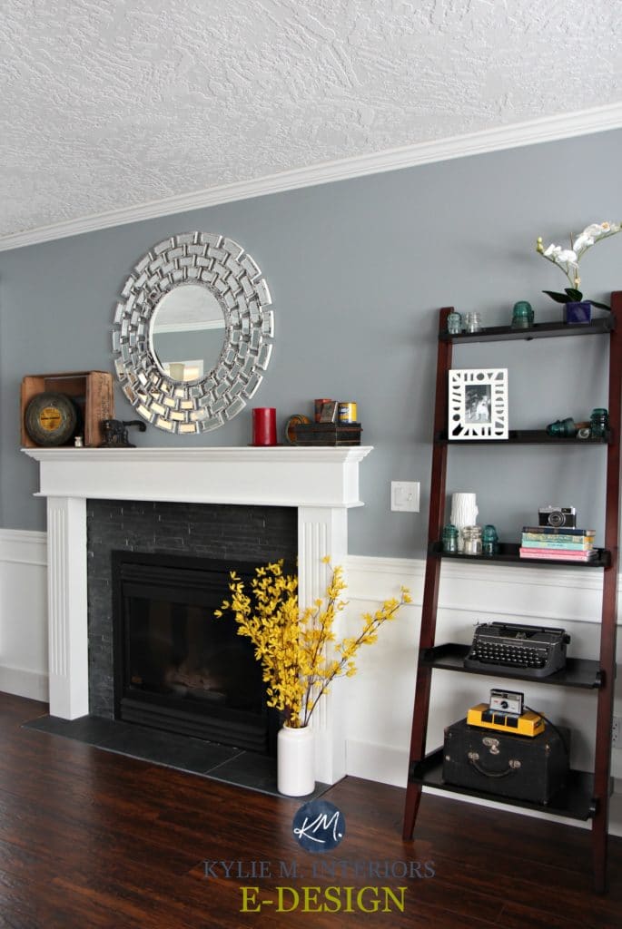
Hi Kylie! I always love your in- depth analysis of a paint color–even if it isn’t a color that I am particularly considering at the moment. However, what really caught my eye in this article is the simple, but elegant and unique wainscot trim detail used in the living room featured in the photos above! Did you come up with that detail of adding the small trim about 5 or 6″ beneath the chair rail? I’ve never seen anything like that done before, but I love it! Is it one of your client’s home (or yours?) I love how it adds interest and beefs up” the wainscot trim without being too formal or “fake” looking!
I actually have been trying to figure out what to do with the wainscot area in my own dining room, and I think this will be a great solution! Currently we just have chair rail trim in there, and the wall below it is just plain drywall; I’ve been wanting to “beef it up” somehow, and then paint the wainscot all white like shown above. I’ve thought about adding the typical rectangles made out of panel moulding (or base cap trim), but it seems a bit too formal for our house, now that we opened up the dining room to the kitchen (and maybe a bit fake, as it is simulating “real” wainscot paneling, after all– though it has become so ubiquitous–at least around here in Maryland with all our faux colonial style homes— that perhaps it isn’t even thought of as fake anymore?)
I’ve even thought about adding beadboard or shiplap, but I think those options would seem a bit too “informal” and not in keeping with the colonial style of the home anyway (and my husband would really be upset if I made him take off the chair rail, which we’d probably have to do to do those options right, LOL.) So the wainscot trim detailing above seems like the perfect solution (and an easy and inexpensive one, at that!) If you did design that detail, would you mind sharing more about it, i.e, how far below the chair rail, and what kind of trim did you use and anything else? Thanks so much. I love your posts!
Hi Phyllis, that is TOTALLY my clients doing. It looks to me like some type of angled molding. Something kind of like the moldings you can see in this blog post here… http://beautifullycontained.blogspot.ca/2012/03/how-to-spice-up-flat-panel-door.html
I think that could be a GREAT solution for you!
Hi Kylie
Thanks for the great advise, have been scouring Pinterest and the internet for 6 weeks trying to decide on a colour for my open plan living, dining and kitchen , in fact my entire house. Boy!! I had no idea how complex this entire process is. Family and I live in South Africa, Durban and we do not have BM and SW boohoo(that is the sound of sadness)
So happy that I have come across your post – now I feel armed and dangerous ( amazing how a little info can make you feel empowered) Big thumbs up to you 🙂
Hi Mercia – what on earth do you do without a BM or SW? I would go crazy!!! I’m sure you have other great brands though. I hope the info helped you out! So when you look at your local brands, you want a nice light/medium gray with a stormy blue undertone. And a blue that doesn’t have ANY green in it!
~Kylie
Hi, I’m getting alittle confused with all the grey-blue/grey-green etc. Can you please tell me if the Network Grey would be good color in my entry way to match my living room that will have SW7071 (grey screen). I have a nice grey couch that I am looking to make the grey pop. Any recommendations would be great! Thanks!
Hi Megan, I hear ya, it can be confusing! You are definitely good to go with Network Gray and Gray Screen, no problem!
Hi Kylie,
My cabinets will be network gray. Do you have any ideas on coordinating colors? I’m wanting to do a contrast trim. I was looking at drift or mist or revere pewter.
Hi Kylie, the SW Network Gray looks similar to BM gullwing grey to me. Have I got that right. You suggested gullwing grey for me and I love it. Just wanted to know if they are similar because I also love the network gray!
HI Kylie:
I’m repainting my house and am not loving the Stonington Gray just painted in my master yesterday. Bummer! This weekend I will be in SW looking to replace, at extra cost (so a time constraint for me!) My bedroom has taupe carpet, a beige headboard and dark gray lamps. I had hoped to have a gray that would feel warm and cozy, but stonington gray looks washed out and too light. Of course I’m in shock somewhat as I’ve had Ralph Lauren up until now, which are much more distinctive. I’m wondering and hoping you can let me know if you think the network gray will give me a deeper/richer feel to the bedroom…I like a bit darker and cozier. Thanks s much, I which I had found your site before I started this project!
Hi Susan, yes Network Gray definitely would as it does have more body to it as well as a bit more undertone! Generally speaking, the darker cool colours get, the better chance they have of feeling cozy! Grays with a blue-green undertone vs a blue-purple can often look a wink softer as well, but that can be personal perception too ;).
Does Network Gray work well for an exterior with white trim? I’m looking for a blue leaning gray that won’t wash out in the Florida sunshine.
Hi Lisa, it could be pretty as long as it suits your roof/brick/stonework!~ Network Gray can be a bit cool for some of the warmer hued roofs or not GREEN enough for some of the greenish ones.
My accent wall is network gray around fireplace. The fireplace is white with marble.
I need a color to paint my MAIN living room walls and trim that will contrast effectively yet give a smooth transition.
I’m thinking Extra white trim and SW Snowbound on walls.
NEED HELP
I can confirm there is definitely a blue undertone in Network Gray. I’ve had this color in my kitchen for two years and just now came across this article. I knew I wasn’t crazy, there’s blue in that there gray! 😂. I love the color it’s a softer dreamier gray with a soft blue undertone.
Ahhhh, you knew it! Doesn’t it feel good to find out you were right?! 🙂 I would also LOVE to see how it turned out if you want to send some pics! (kylie@kylieminteriors.ca)