
Sherwin Williams 4 Best Warm White Paint Colors
You’ll find Sherwin Williams near the top of every list regarding the most popular warm white paint colors. However, with many of us being sensitive to yellow undertones, we have to be careful.
Warm white paint colors can easily overcommit to yellow, leaving you with walls that look more creamy yellow than white. And while Sherwin’s whites certainly offer some warmth, you can choose from a range, leaving you room to commit to as little or as much yellow as you like!
That’s right, you need COLOR for a white to be warm. Warm colors are yellow, red (pink), and orange. While orange isn’t a thing in the top shades of white, yellow is the leading undertone in all popular warm whites. As for pink, few people want a pink-based white as it’s too limiting on a large scale.
If the term ‘undertone’ is new to you, it’s a homeowner-friendly (slang) way of describing a paint color’s tendency to lean one way or another (or its natural bias).
But before we take a look at these wondrous whites, let’s have a little chat about exposure (not the indecent kind…not this time, anyway).
WHITE PAINT COLORS & EXPOSURE
More so than any other paint color, white responds to its environment.
Why?
White paint colors have the highest LRVs. If you don’t know about LRV, the quick n’ dirty is that every paint color has a number on a scale of 0-100 that tells you how light or dark it is. 100 is the brightest, and 0 is the darkest (well, 94 is actually the WHITEST white we can get, but I don’t want to totally nerd out on you).
LRV stands for LIGHT REFLECTANCE VALUE, which lets you know how much light a color will reflect.
White paint colors run between 82-94 (approx), meaning they reflect a heck of a lot of light. So, if you give your white walls a tint (e.g., from your green grass outside), they might pick it up. And while you might never have realized it, different exposures can cast a variety of colors on your walls!
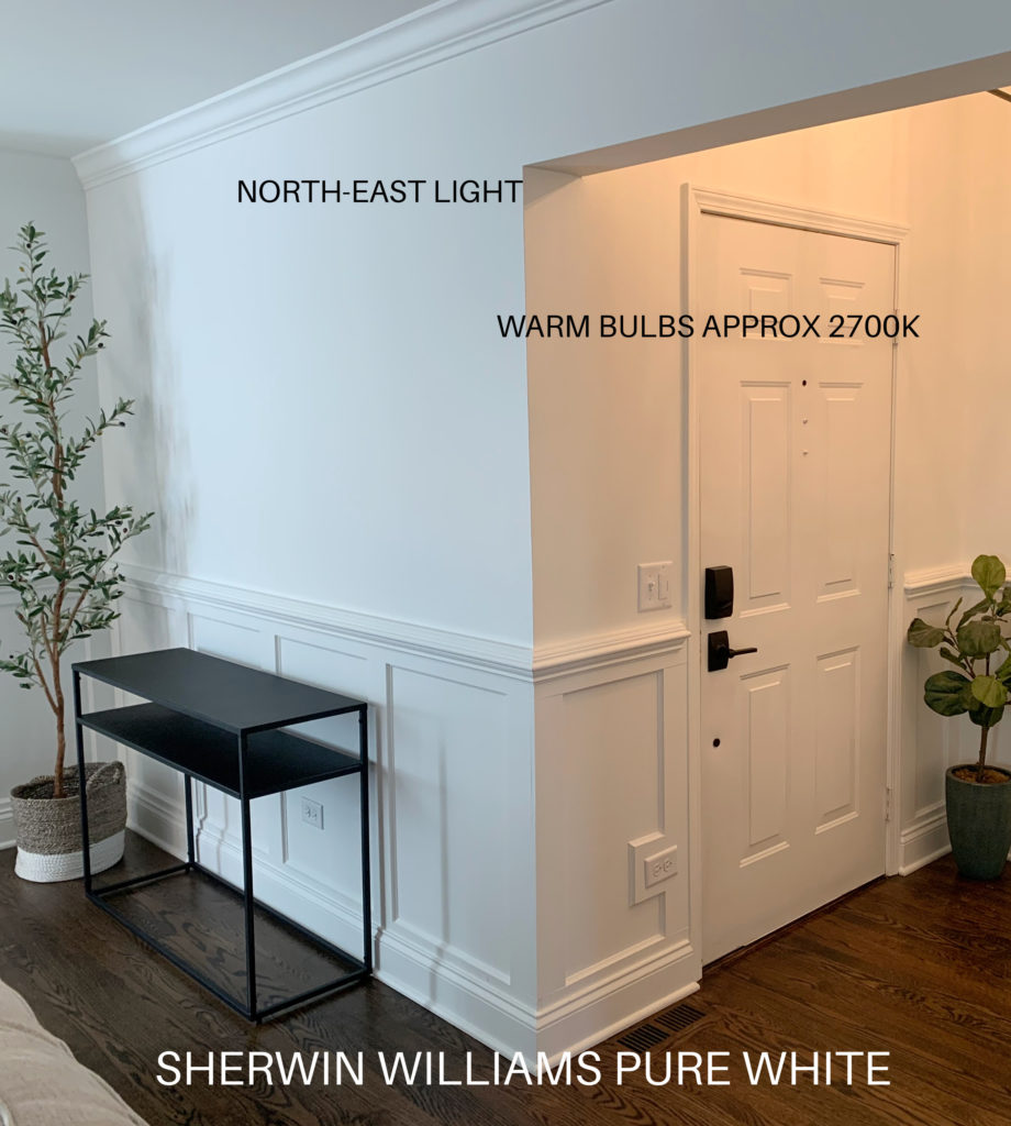
Here’s Sherwin Williams High Reflective White in north-facing light…
And here it is in afternoon western sunshine…
This is a great example of how even a well-intentioned TRUE, not even warm white,, can lean warm in the right conditions.
EXPOSURES & TEMPERATURES
- SOUTH-FACING LIGHT – a warm, yellow hue
- NORTH-FACING LIGHT – gray with a wink of cool blue
- EAST – nothing notable in the morning, flattens colors in the afternoon (slightly gray)
- WEST – flattens colors somewhat in the morning, adds yellow-orange-pink in the afternoon
The Ultimate Guide to Choosing Paint Colors Using LRV
What does this mean to YOU?
As it relates to whites, if you choose an overly warm white and have a south-facing light or western afternoon sunshine, it’s going to look even warmer. If this is cool beans with you, great. If not, you may want to consider a warm white that’s a bit more muted (e.g., Pure White, which you’ll see shortly).
On the other hand, if you have north-facing light and choose a warm white that’s more subtle, you risk picking up some of the cool gray-blue light from your exposure. In this case, you might choose a white that leans MORE into its warmth (i.e., Alabaster or Greek Villa, which are coming up shortly).
And funny enough, having more than ONE of the above exposures can make life easier as you often have a bit more balanced, flexible light in your space.
North, East, South, West – Which Paint Color is The Best?
Can you tell I’ve drunk WAY TOO MUCH COFFEE TODAY? Must be time for wine.
Anyway, let’s get onto the colors you came for!
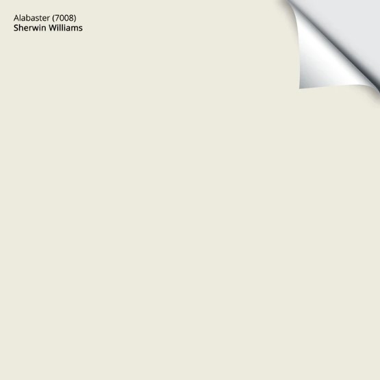
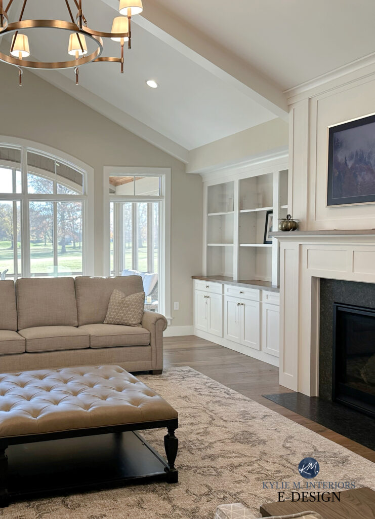
1. SHERWIN WILLIAMS ALABASTER 7008
Alabaster is one of the softest, creamiest warm whites from Sherwin. Any darker, and it will be more off-white. This is because Alabaster has an LRV of 82, putting it right on the edge of the off-white range.
As long as Alabaster is the whitest white in your space, and you don’t partner it with a finish that’s WHITER than it (in other words, I would never wear shorts in a room with Alabaster walls), it will act more like white (albeit, a soft one).
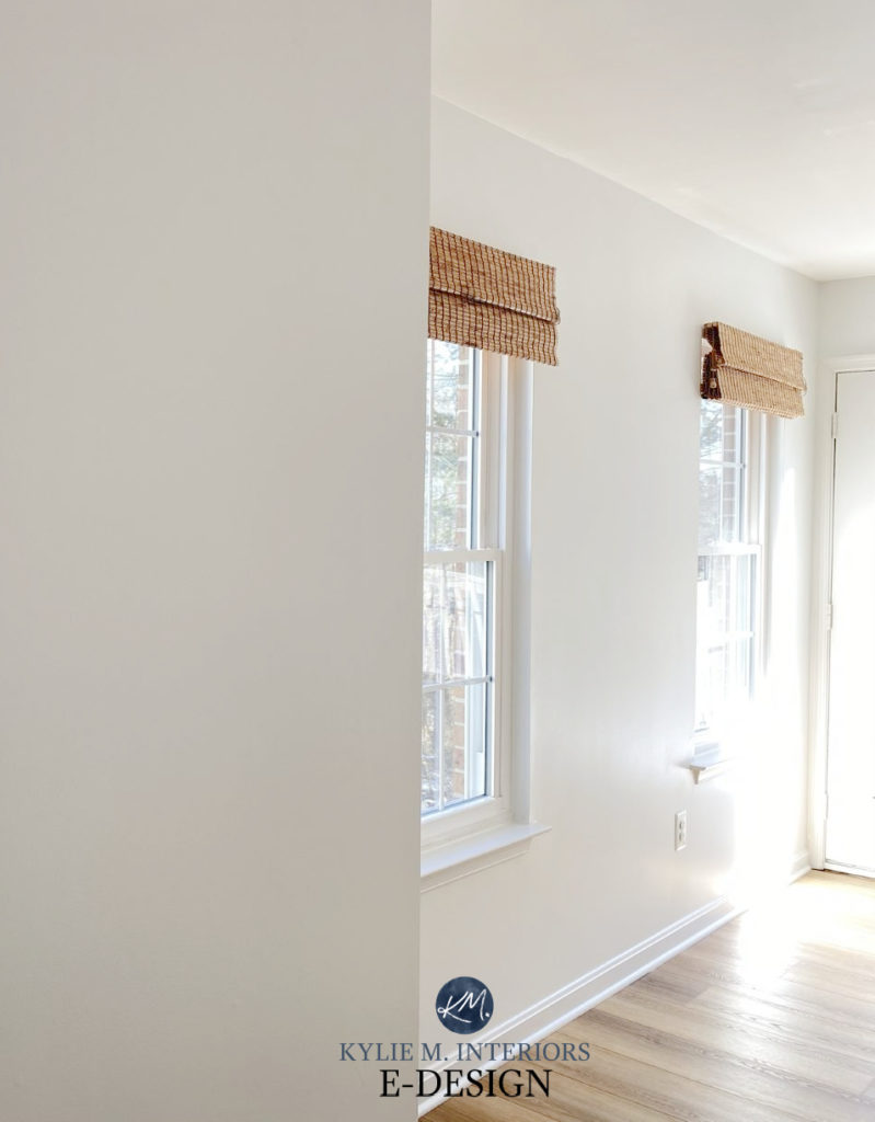
In this mudroom/hallway, Alabaster is partnered with Extra White trim, which makes Alabaster look warmer in comparison…
Paint Color Review of Sherwin Williams Alabaster
Get your Peel & Stick sample of Alabaster HERE
2. SHERWIN WILLIAMS PURE WHITE 7005
While I have mad love for Alabaster’s soft warmth, it’s Pure White that has my heart. Well, Pure White and Ryan Reynolds or Ryan Gosling, but there’s only 1 of them I can plaster on my walls (although a girl can dream).
Pure White is also Sherwin Williams’ most popular shade of white – and for good reason. While no white is fool-proof, it’s one of the few that satisfies a wide range of homes, finishes, and tastes.
What makes Pure White so great is that while it’s a soft white with warmth, it’s the most subtle warm white with the least yellow undertone – especially when you compare it to shades like Alabaster and Greek Villa (coming up next).
According to SW’s website, Pure White has an LRV of 84, so it’s not only less warm than Alabaster (82), but also a bit brighter.
If you’re choosing between Alabaster and Pure White and have a home with both south- and north-facing rooms, please note that Pure White is far more likely to pick up a cool hue in northern light. On the other hand, Alabaster is better at handling a cooler exposure without losing as much of its warmth.
As far as warm whites go, Pure White is the white with the least yellow undertone. In fact, it can look a touch grayish at times. It’s by far the least warm, but the most flexible of the whites.
Paint Color Review of Sherwin Williams Pure White

Get your Peel & Stick Sample of Pure White HERE
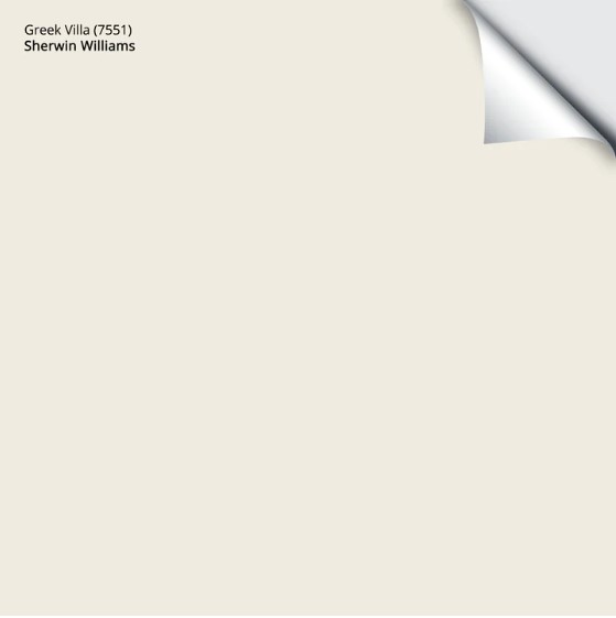
3. SHERWIN WILLIAMS GREEK VILLA 7551
Greek Villa is like a hybrid between Alabaster and Pure White. While it has a similar warmth to Alabaster, it’s a bit brighter, having the same LRV as Pure White. So, if you find Pure White not warm enough, but you like its depth, Greek Villa could be the perfect choice for you!
As for depth, Greek Villa’s stated LRV is 84, so it’s the same depth as Pure White, but brighter than Alabaster.

I would be cautious of Greek Villa in a south-facing room, worrying it will look TOO yellow. However, if you have moderate light and mixed exposures, it can be gorgeous.
Paint Color Review of Sherwin Williams Greek Villa
Get your Peel & Stick sample of Greek Villa HERE
What’s interesting (to a color nerd like me) is that the above 3 whites are warm, but have a touch of green in their profile (L*a*b*). That said, it’s on such a small scale that we only see it when the surroundings influence it. This means you shouldn’t see green, but it’s something to consider, especially if you already have a lot of greenery out your windows.
On the other hand, Benjamin Moore has much more balanced warm whites.
4. SHERWIN WILLIAMS FROST BITE SW 9595
While it’s been out for a few years, Frost Bite is one of Sherwin Williams’ newest shades of white from their Emerald Designer Collection.
Frost Bite has the least chance of picking up a green hue and owns its yellow undertone a bit more (though the others don’t REALLY carry much green either). It’s also brighter than the previous 3 whites, with its LRV of 88, so it’s worth checking out.
But, being a newer shade, I haven’t had many Online Color Consulting clients use it (they chose one of the previous shades instead), but that doesn’t mean it isn’t the perfect color for you!
Here’s your Peel & Stick sample of Frost Bite…

From there, we could get into Sherwin Williams Shell White (LRV 83) and White Flour (LRV 87). Their natural bias has a bit of red (pink), which, combined with their yellow undertone, can offer a very (ahem, very) slight peach/beige hue, but these aren’t as versatile or popular with the average interior finish.
Here’s Shell White on the trims/door. Very pretty, but limiting when you want to change wall colors…
The Best Colors to Update Cream Trim & Cabinets
Here’s White Flour on the ceiling of this living room – pretty, but like Shell White, it’s limiting…
Why?
Because their undertones are stronger – they aren’t as subtle, making them more popular for walls. On the other hand, previous whites are more likely to appear on a range of finishes.
WHICH WHITE IS BEST…
For walls: It depends on your needs. For softness and warmth, Sherwin Williams Alabaster. For flexibility in a range of exposures with minimal yellow – Pure White.
Here’s Alabaster looking soft and warm in north-facing light…
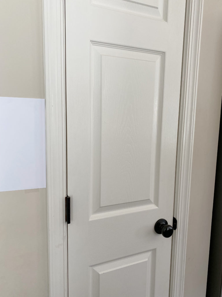
If you want a more noticeable warmth, White Flour and Shell White are very pretty. That said, Greek Villa is pretty if you want a bit more brightness…

It’s easier to see Greek Villa’s yellow hue against the white trims
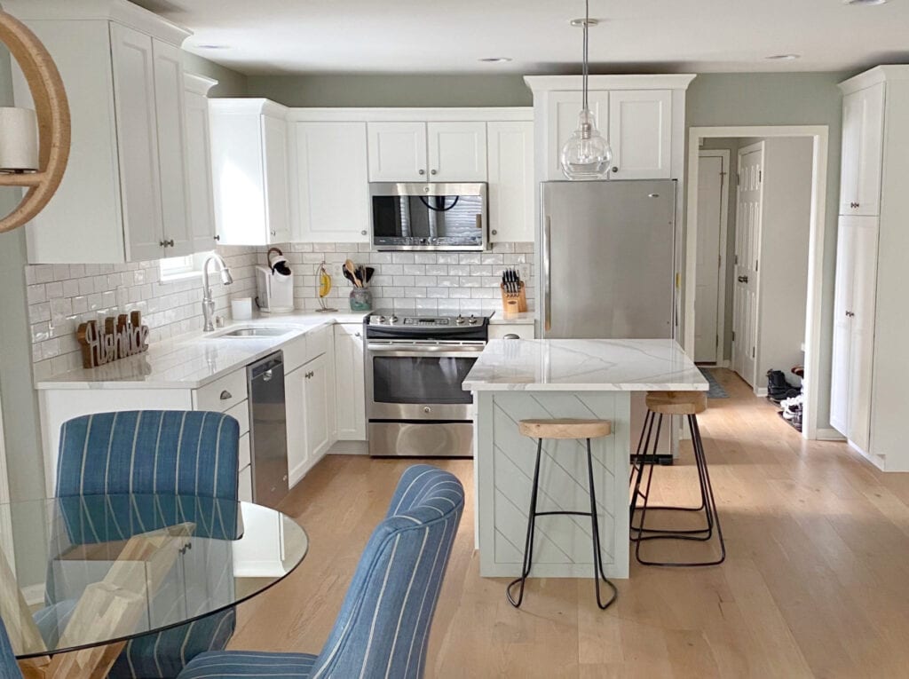
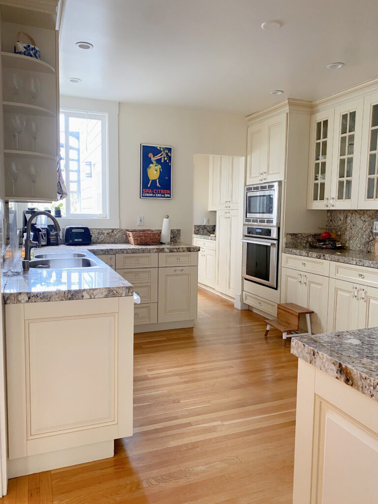
For cabinets: While Alabaster is popular, especially with some of the granite countertops from the early 2000s, Pure White is pretty darn flexible toward more modern interior finishes.

For trims: If your home has warm, soft finishes (beiges/creams), Alabaster is usually best, but Greek Villa can be pretty, too. If you have a blend of colors and temperatures, Pure White is pretty flexible.
Pure White with Benjamin Moore Edgecomb Gray walls
Exterior trims: Pure White is by far the most versatile, popular exterior trim color. While some want a creamier warmth, in which case Alabaster can work, Pure White humors more siding colors.
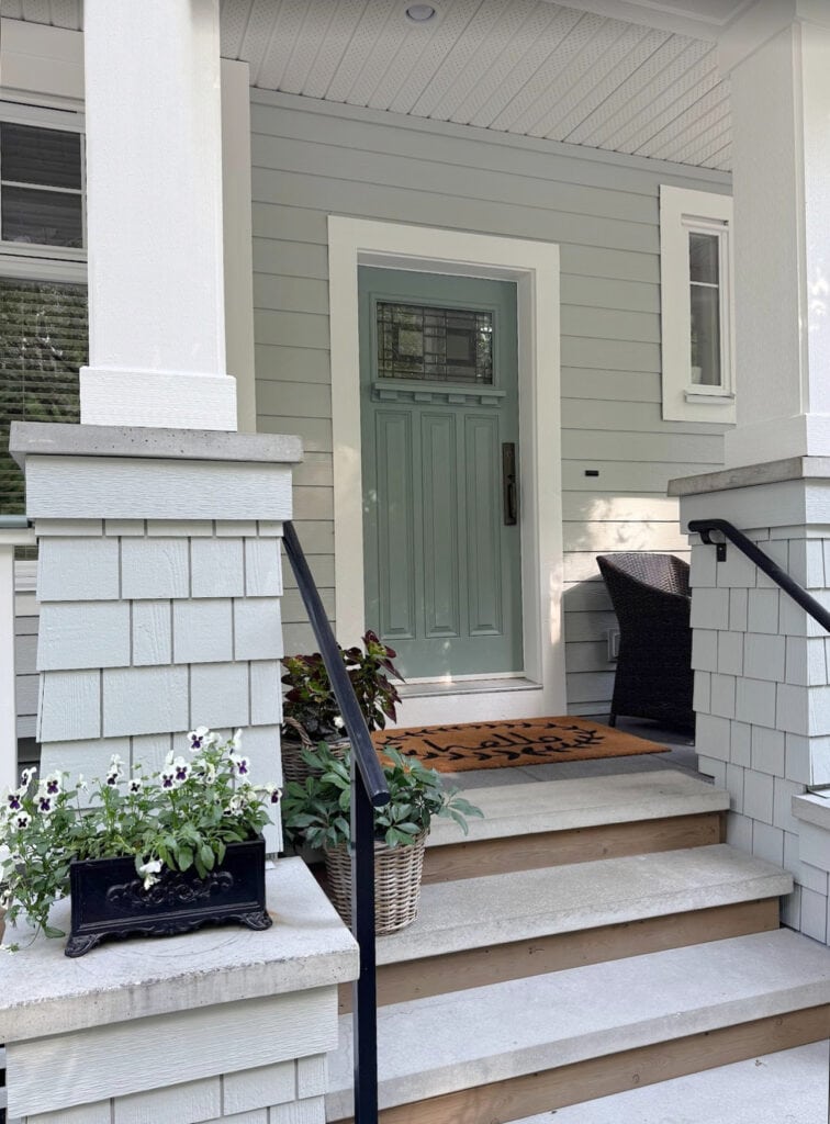
The Best Front Door Paint Colors
Exterior siding: Many homeowners are shifting from white exteriors to softer, gentler off-white shades. If you REALLY want white and your home isn’t south-facing, Alabaster or Greek Villa are great. If your home faces south, you might consider Pure White instead.
Which White Paint Colors Go Together?
FREQUENTLY ASKED QUESTIONS
In case you have a few lingering thoughts or concerns…
WHICH SHERWIN WILLIAMS WARM WHITE IS THE MOST POPULAR?
Sherwin Williams Alabaster takes the title. However, that’s only because some people find Pure White a bit too muted. In my daily consulting, Pure White is by far the top choice, but that’s because it’s not always perceived as being very warm.
Alabaster on all painted surfaces
WHICH WHITE HAS THE LEAST YELLOW?
Remember, if you want a warm white, it needs some yellow. That said, for the most MUTED approach to warmth, Sherwin-Williams Pure White is it (amongst Benjamin Moore and Sherwin).
WHAT’S THE DIFFERENCE BETWEEN ALABASTER & GREEK VILLA?
As the 2 most noticeable warm whites, homeowners often ask me what the difference is between Alabaster and Greek Villa…
- Alabaster’s LRV is 82, Greek Villa’s LRV is 84, making it whiter/brighter
- Of the 2, Greek Villa is a ‘touch’ less likely to lean green; that said, both rarely do.
- They have a comparable yellow hue, with Alabaster’s being only a wink higher.
SUMMARY OF WARM WHITES
- Sherwin Williams best warm whites include Alabaster, Pure White, Greek Villa, and Cold Foam
- All of the popular warm whites have a yellow undertone (natural bias)
- Consider your exposure before choosing a white – see how each changes as your natural light changes throughout the day.
- For a more noticeable warmth, consider Shell White or White Flour; however, they’re often better as wall colors rather than trim/cabinets.
READ MORE
Benjamin Moore’s Best Warm White Paint Colors
The Ultimate Guide to White Paint Colors
The 11 Best Warm Neutrals That AREN’T BEIGE!
Get expert paint color advice with Kylie M’s Online Paint Color Consulting PACKAGES

Updated with relevant content and new images for 2026


We have WHitetail everywhere – walls, trim, bookcases, upper kitchen cabs — love it. It feels warm & cozy while still white. Also it’s an amazing backdrop for brightly coloured art.
THANK you for this, it’s these comments that help others make their own choice!
Hi Kylie,
I absolutely love your content and mean this with the most love – I so appreciate your advice, but the ads on these articles are making it almost impossible to read. I’m sure it’s part of the game but just offering feedback as it is a noticeable deterrent to enjoying the content.
Thank you, Jordan! I know, to be honest, they make me cringe, too. Q4 is our highest earnings for the year, which is HUGE in this world where the writing is free – it’s the big quarter where we can really earn. I’m working on finding that happy medium, as we have an ad company that manages them for us, and I strongly feel like they need to be cut back – it’s a work in progress and thank you for the kind feedback!
i finally pulled the plug on alabaster cabinets, trim doors in my house built in 2000. Elsewhere in the house it looks good with a light beige walls and the alabaster trim/builtins. In the kitchen its reading too white with my tumbled travertine backsplash (which before alabaster looked really light but its not next to alabaster). And the granite is an upgraded with mostly black, brown, golds etc – a little cream in there but not alot. So of course I’m in a panic as I’ve spent the last year researching, had a paid designer that recommended these colors last year. And recently had a SW color consultant who affirmed the colors. Im hoping if I change out the backsplash that will help some. Just stressed as i truly thought I used all my tools. There is a kitchen onyour blog that has alabaster cabinets and a warmer granite. Its just reading so white in my house 🙁 no warmth to it.
I’m going to go out here and say I love Dover White on trim. I have it in all my bedrooms. It looks nice and this is with South, east and north facing rooms. So I’m not sure why it’s the bane of your existence. I’m getting ready to paint my bathroom vanity with it. So we are going to have to agree to disagree.
It’s all good Nanci, as long as you love it! It’s only for those who want to branch out, as the degree of yellow in it can be a bit limiting :).
Hi Kylie, I love your blog!! I’m wondering if Alabaster or SW Creamy could be good options for my kitchen cabinets I’m looking to paint. I have BM Cloud white on all my doors, trim and ceiling. My walls are BM Edgecomb grey. My cabinets go all the way up to my ceiling too. So would these off whites be enough contrast from my Cloud White ceiling? I know that you’re probably going to suggest I stick with Cloud White on my cabinets but I really love the look of creamy off white cabinets (not too yellow of course), like Studio McGee 😉☺️. Really appreciate your thought!
Could I do creamy on my walls and my kitchen cabinets? Thank you!
Yup, as long as it’s the same color on both!
Our entire home is Sherwin Williams Kilim Beige walls with SW Divine White trim. I cannot find any other beiges in SW or Benjamin Moore (used by our painter) that I like better. We don’t have any grays, and don’t want to see green or strong yellow undertones. What are some light, neutral, warm color options for the walls that would compliment Divine White trim and doors? Does lightening Kilim Beige provide good results? I’ve read MANY of your reviews and value your opinion.
Divine White is VERY (VERY) finicky. Your best bet would be to use a darkened version of it on the walls (try 50%) or try lightening Kilim Beige to see how that looks :).
Thank you for your suggestions! Which SW white would be best for the ceilings with Kilim Beige walls and Divine White trim?
Help!! We are building a home and need to select colours for our walls, trim and cabinets… ( I am not a fan of grey) and would like to keep things warm and cozy. (Modern farmhouse?) I am completely overwhelmed and usually always make wrong choices.
Hi Lori, check out my paint color packages, we try to open them up most mornings! https://www.kylieminteriors.ca/hire-kylie/
Hi! Thank you so much Kylie you have helped me so very much with my paint choice! It’s a daunting task! I’ve decided on alabastar. I am considering adding a contrast wall, is that old fashioned? What would pair nicely with alabastar? I would like to go with a color such as pumpkin…cinammon..etc.
Thank you!!
Hi Debra! Accent walls CAN look out of place in the wrong spot or in the wrong color. I have many in my home and love them! Alabaster is also pretty happy with an accent color and it’s about choosing the one that Alabaster loves, but that ALSO speaks to your surrounding finishes, you know?
And you might find this handy… https://www.kylieminteriors.ca/where-should-i-do-a-feature-wall-and-what-colour-should-it-be/
Hi Kylie, what color is the trim in the first Creamy picture? Thinking about painting my house in either Creamy or Shoji White (or maybe White Duck per your recommendation over Shoji).
Hey Michael, that’s Benjamin Moore Cloud White 🙂 If you land on White Duck/Shoji White, I would shift over to SW Pure White or BM White Dove for the trim!
Hi Kylie,
I have been trying for weeks now trying to decide on paint colors for my bedroom, bathroom and kitchen. Currently the bedroom and bath are Amazing Gray and kitchen is Comfort Gray. Bathroom cabinets have just been painted and now a medium gray. Trim in all rooms are walnut stain. I’m wanting to go with a warm white and have always liked Dover White as it is the color of shiplap in bathrooms and over my fireplace. Question is, will this work in these rooms? My rooms all have north light coming in. I don’t want the rooms to look yellow.
I just found your blog and short videos. So informative!
Thank you!
Karen
Hi Karen! Well, Dover White is a considerably yellow-based white, so I would be careful. Personally, I might shift to something less yellow. Alabaster still has a yellow based warmth, but can come up a bit more grounded looking 🙂 Also, assuming you have white bath fixtures, I feel like Dover White could look quite yellow in comparison!
Kylie,
First, thank you for all the wonderful education on paint colors and their tricky undertones! I have been following you for about a year and trying to decide on a cabinet color for my kitchen. But, I’m still stumped!
I have the late 90’s tropic brown granite and a fairly new tile which has a variation of colors (gold, gray, beige, cream) and no backsplash. Walls in the kitchen are SW Mannered Gold (which looks wonderful with our new tile). I’m toying with White Dove, Creamy and Alabaster. Maybe even Cheviot or cotton. Would you have any other recommendations? I have fairly good light in my kitchen but just can’t pull the trigger on a color.
Hello Kylie. I have read thru several of your posts on painting kitch cabs and kitch walls white. Very, very informative and helpful! Thank you. A few years back, I painted my oak kitch cabs Sherwin Williams City Loft (which may have broken the cardinal rule of not going pure white 😬). At any rate, my cabs are City Loft, ceiling is Greek Villa and walls are Mega Griege (all Sherwin). I feel it works as our kitch has a southern exposure, so lots of bright sunlight. I’d like to paint our walls ‘white’ also. Question: I am assuming I should go with the City Loft for the walls to match the cabs? And .. we also have oak floors, oak interior doors and oak window trim (house was built in 1989 🤷🏻♀️). It’s one thing to paint my walls to match my cabinets .. However, I’m not sure I am too crazy about tackling all of the woodwork to also paint. If I chose to leave the oak trim, which matches the oak floor and doors, do you think that would still be acceptable? Last question: We have somewhat of an open concept from our kitchen into our family room. Currently family room walls are also Mega Griege and built ins are also painted with City Loft. Should I also paint the family room walls the same City Loft as the kitchen in order to achieve a cohesive look? Thank you for your help.
Hey Judith! If the cabinets are City Loft and you want white walls, I would definitely check out SW Pure White and Extra White or Snowbound for a bit more interest!
HELP! My cabinets are going to be painted fundamental white. What would be a good complimentary white to paint the walls?
Love all your information. We are painting our walls agreeable grey from SW. What color white do you recommend for cabinets and trim?
Without seeing your home and just knowing Agreeable Gray, I lean into Sherwin Williams Pure White the most 😉
Hello
We are building. I have already chose Whitetail and it’s already on most ceilings. I hope we didn’t mess up. We were going to do it everywhere and our kitchen perimeter in creamy. Will this go together?