
How to Update Venetian Gold & Santa Cecilia Granite Countertops
If you have Venetian Gold, Santa Cecilia, Giallo Ornamental, or a similar granite countertop, I understand why you’re here. On the other hand, if you’re considering installing one of these countertops, you might have caught your breath at the word ‘outdated.’ But it’s true: These countertops were popular in the early 2000s and are now the bane of many homeowners’ existence.
Why?
These countertops indicate when a home was built or updated—usually in the early 2000s.
In other words, Cecilia and her friends aren’t trendy.
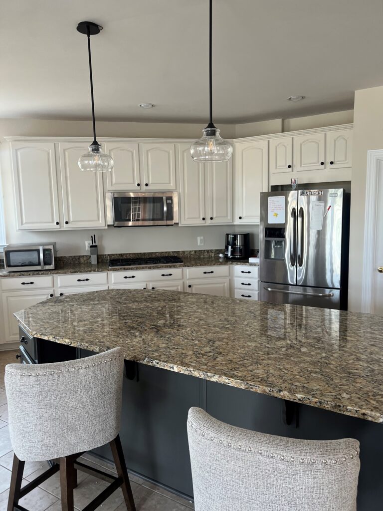
This isn’t to say you can’t love them or install them (or keep them if you have them); they only pose a challenge if you’re considering resale or an ‘updated look’. Personally, I think they’re beautiful and have Venetian Gold in my primary bathroom. Would I choose it NOW? Heck no, as resale matters a lot to me, but I’m not mad that I have it (it will get updated…eventually).
SIMILAR COUNTERTOPS
To make sure I cover the bases for those of you with this general look, Venetian Gold and Santa Cecilia aren’t the only challenging countertops. Similar countertops include…
- Venetian Ice
- Giallo Ornamental
- New Venetian Gold
But even finishes that are seen as outdated can be updated – maybe not to current standards, but there’s almost always room for improvement. And what’s the BEST way to update a space on a budget?
With paint!

This gorgeous granite has a similar color palette to the ones we’re discussing.
Oh, a new backsplash, hardware, and lighting can help, too (but you’ll find links to THOSE blog posts at the end).
Now, let’s get down to the meat n’ potatoes of this blog post to see what this color cowgirl has in store for you…
SANTA CECILIA, VENETIAN GOLD/ICE GRANITE COUNTERTOP UPDATE IDEAS
Oh, Ceciiiiilia, you’re breakin’ my heart…well, as far as countertops go, she really is.
Why?

The Best White Paint Colors with Wood Finishes
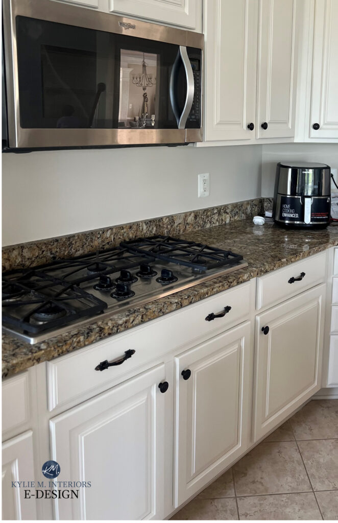
Many people are over St. Cecilia, Venetian Gold, Venetian Ice, and Giallo Ornamental. They’re tired of the gold, the taupe, and the lack of a nice, modern white base to work with. And I get it (as mentioned, I have this countertop in my home).
However, all is not lost. Amazing things can happen once you know how to work WITH your countertop rather than against it!

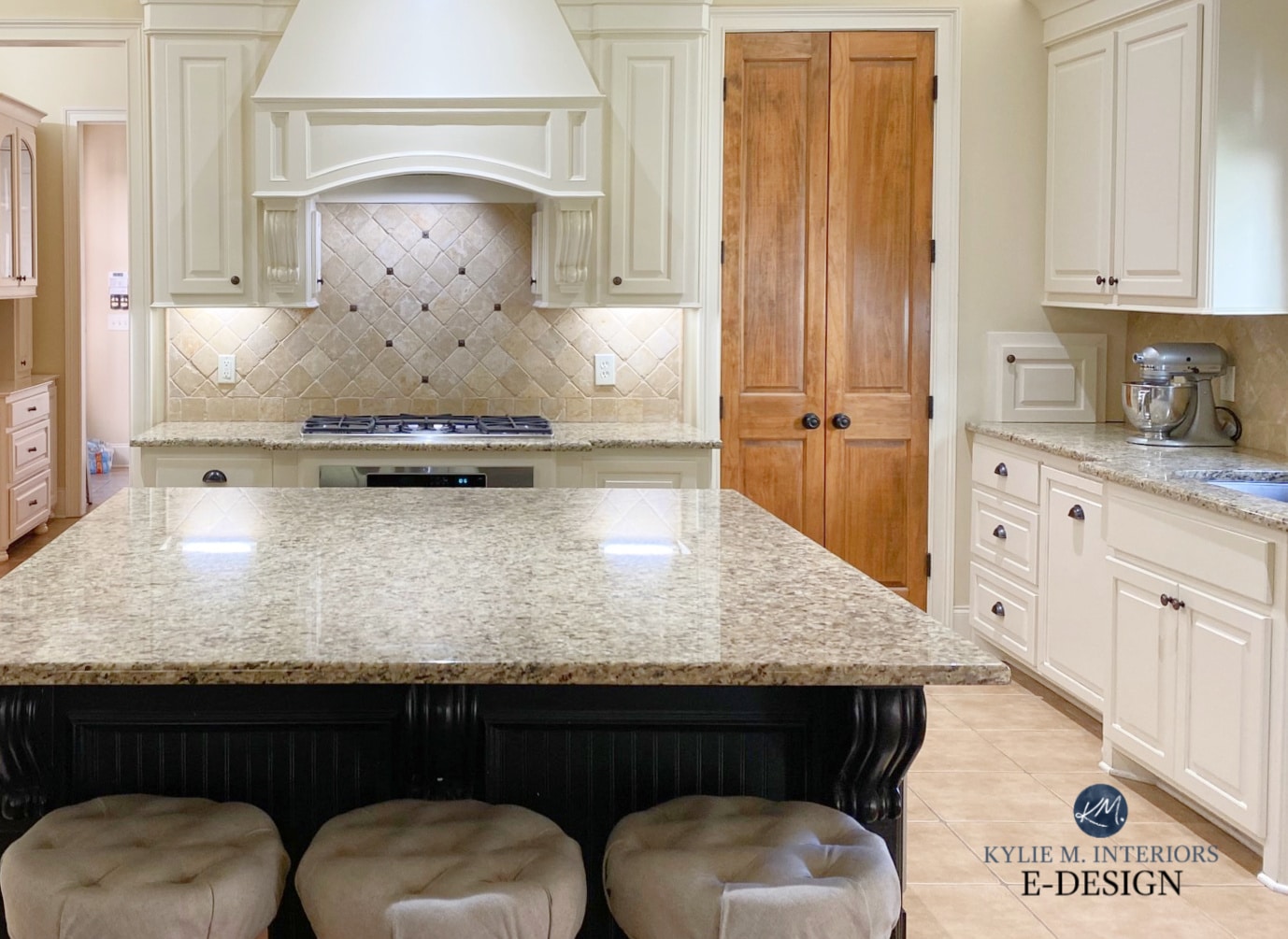
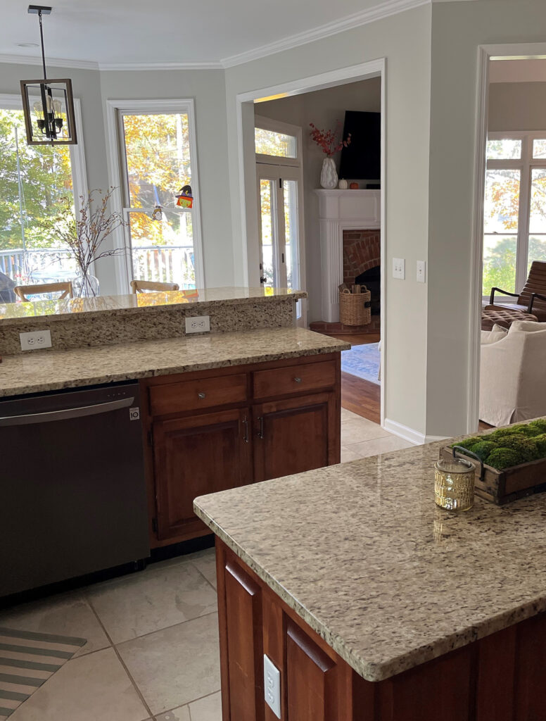
Let’s chat about what we’re working with here. Santa Cecilia and similar countertops are warm granite options that come in the following blends (dependng on which one you have):
- creamy, soft, off-white paint colors (links coming shortly)
- warm golden tones and some beige/tan hues
- varying shades of light to dark taupe
- a touch of burgundy/maroon
- almost black-brown
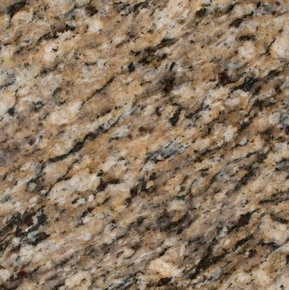


Venetian Ice: Notice how this slab is slightly more muted and less golden than the others, especially Venetian Gold.
Granite is a natural product, and there is variation between slabs. The examples might not show the exact Santa Cecilia, Venetian Gold/Ice, or Giallo Ornamental you have, but they should be similar.

FUN FACT: When it comes to lighter colors, you shouldn’t introduce a color on your cabinets or walls that doesn’t exist in the countertop (don’t forget to humor your backsplash, too).
If you add a new color, there won’t be a visual connection between your cabinets and countertops—you could have a hot mess on your hands. Any new color should be an accent, not a full-scale commitment.
By the way, when I write ‘Santa Cecilia, Venetian Gold, etc.’ I’m referring to them AND the similar countertops listed earlier (listing them all is a huge PITA).

I bet the above finishes look pretty darn familiar. While they might not be trendy, they sure can be pretty!
But here’s the deal…
I make my living doing Online Color Consulting – it’s how I support my family. If I give away all of the specifics, I won’t have a job and won’t be able to give you AWESOME free content!
Instead, I’m here to provide guidance and tips. You’ll find links to helpful blog posts full of wickedly pretty paint colors to sample and compare.
Another reason I’m cautious about specifics is that we’re talking about 4+ granite variations (with similar but not identical bones). A color that’s PERFECT with Santa Cecilia might be a bit off with your Venetian Ice or Gold. A backsplash that’s dreamy with Giallo Ornamental might be butt-ugly with New Venetian Gold. In other words, there’s room for error with specifics.
SAMPLE & COMPARE…and have fun!
THE TYPES OF WHITES THAT GO WITH SANTA CECILIA GRANITE, VENETIAN GOLD, ETC.
Not every countertop, backsplash, and floor combination can handle white cabinets, especially if they were originally chosen for wood cabinets. If the stars align, yes, you can try a shade of white, but it must be a considerably warm and soft shade of white, not stark or clean, and even then, depending on the space, it can be a stretch. Venetian Ice can be an exception, as some slabs hold a more muted, less creamy, warm white.
Sample carefully & visually CONNECT with your countertop!
If white seems overwhelming in your kitchen, a happy medium is painting your main cabinets a soft off-white that matches the lightest, most subtle shade of your countertop.
Links to blog posts are listed shortly – keep on readin’!
Remember, even if you crave a brighter, cleaner shade of white, your kitchen probably disagrees. The same can be said for cream – be careful with how much yellow you commit to! As shown below, Sherwin Williams Antique White is too yellow for the backsplash, countertop, and tile floor combination.
A muted off-white would look much better. Even a warm white would be better than this commitment to yellow.
Remember, it’s not JUST your countertop that needs to suit white. Your best chance at coordinating with ALL of your finishes is a WARM WHITE. Cross your fingers!
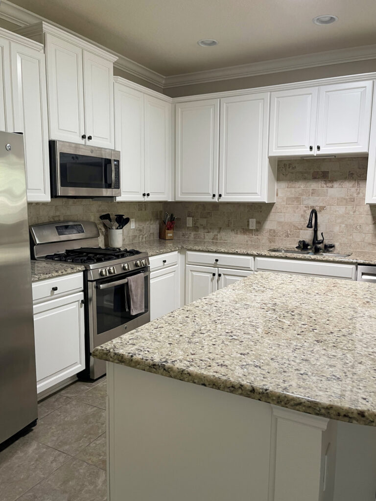
As shown in this next photo, while MOST of my clients are getting rid of their cream cabinets (especially when they’re glazed), a well-chosen cream or off-white can be a great choice for countertops like Santa Cecilia, Giallo, and New Venetian…
‘Well-chosen’ doesn’t always mean ‘updated to today’s standards,’ but it’s best to work with your finishes rather than against them!
And as promised, here are some great blog posts to check out…
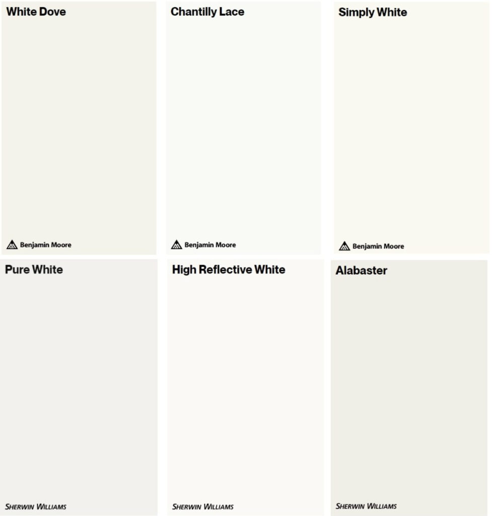
THE BEST WHITE PAINT COLORS…
- The 4 Best Warm White Paint Colors: Benjamin Moore
- Sherwin Williams 3 Best Warm White Paint Colors
- Stay away from true, bright, and cool whites
THE BEST OFF-WHITE PAINT COLORS
- The Best Off-White Paint Colors for Walls
- The 8 Best Off-White Paint Colors for Cabinets
- Stay away from cool off-whites – keep things warm, baby!
Keep reading, I’ve got more color suggestions coming up!
I also have a premade Samplize bundle full of my FAVORITE WHITES to compare for almost any kitchen.
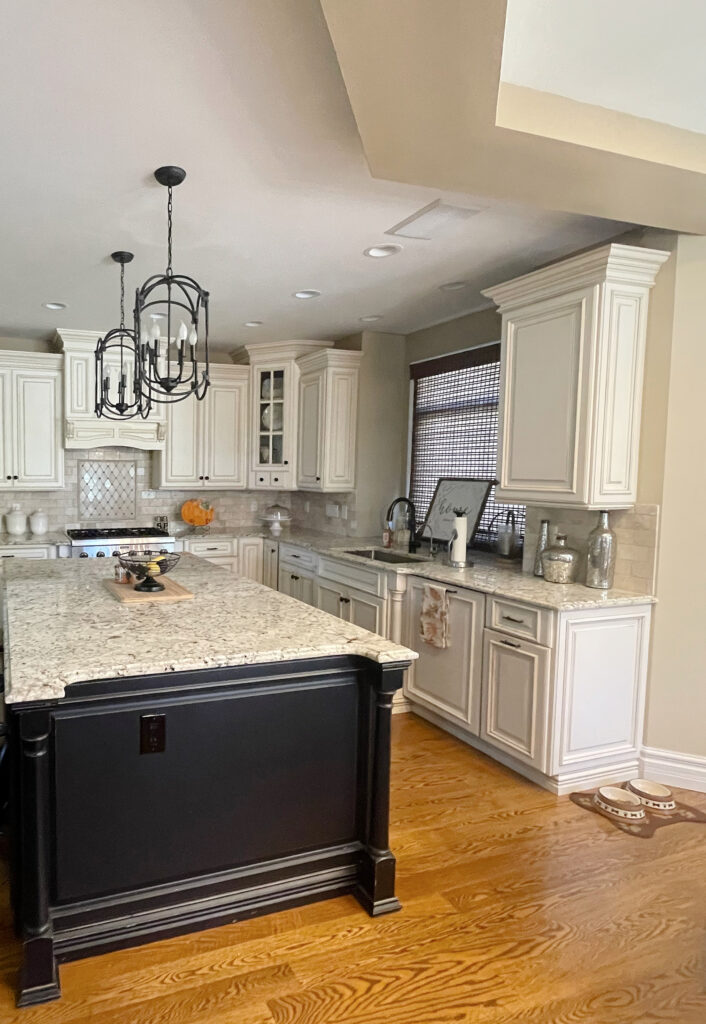
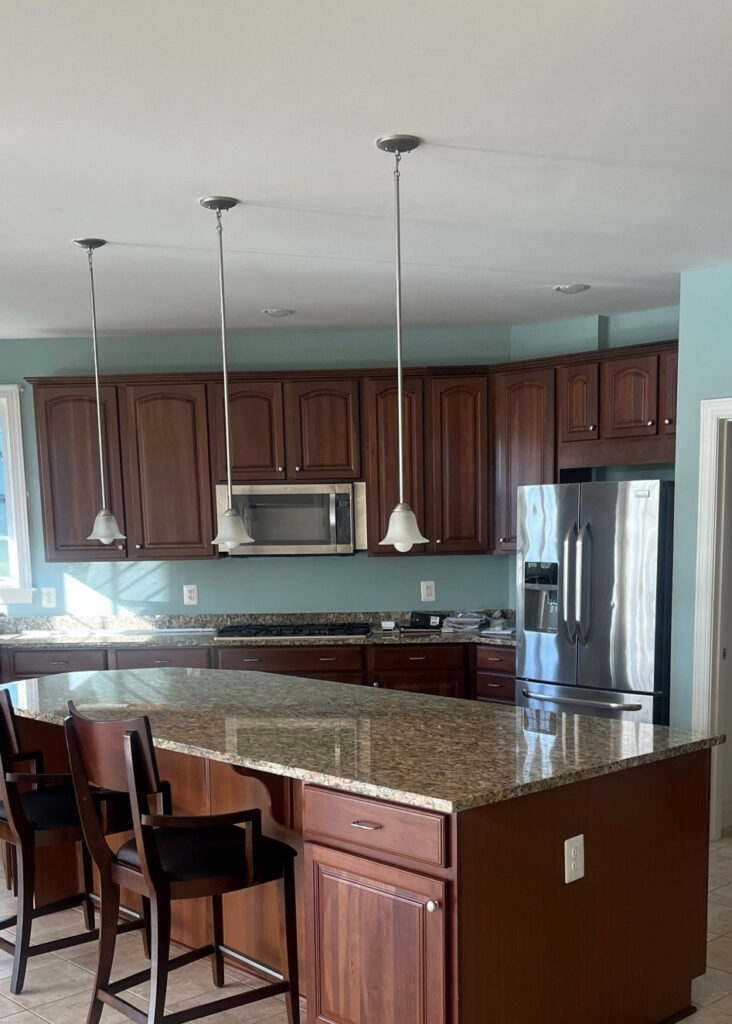
DO GRAY CABINETS OR WALLS GO WITH SANTA CECILIA GRANITE?
Nope. The gray you think you’re seeing in Santa Cecilia and Venetian Gold is more of a taupe, so it’s warm neutral with a subtle violet or violet-pink undertone. While some can handle a VERY warm gray, if you paint your cabinets the wrong shade, you risk enhancing the warmth of your counters and clashing with the colors they actually hold.

Don’t worry; this backsplash is being updated, too!
To show you how gray rarely makes the cut (on walls or cabinets), this next photo shows Sherwin Williams Repose Gray looking okay, thanks to the natural light warming it up a bit…
However, from a different angle, it’s too cool to connect…
This isn’t to say it’s a hot MESS; it just isn’t the best choice.
When it comes to wall colors, some of these countertops can handle a well-chosen lighter taupe (listed below). As for cabinets, darker greiges can be a huge hit as they add contrast. The same goes for some medium-depth shades of taupe.
Please remember, I’m trying to cover 3-4 different versions of countertops that are SIMILAR, but not the same. The advice would vary depending on your exact countertop/backsplash combo.
WALL PAINT COLOR IDEAS FOR SANTA CECILIA, GIALLO, VENETIAN, ETC.
These countertops can be a bit fussy about their wall colors, especially if you’re also painting the cabinets – everything needs to be pulled into a palette. This means the color you choose for your wood cabinets may not match the color you choose for your walls. And of course, there are only so many things I can cover/hit in one blog post – I’M ONLY ONE WOMAN!
Generally speaking, wall colors that can work include (links to blog posts coming up shortly)…
- Various shades of beige-tan (nothing too yellow-green OR overly orange).
- Some soft, muted cream paint colors – don’t go too hard on the yellow.
- As mentioned earlier, depending on the backsplash and flooring, some kitchens can pull off a light-to-medium shade of taupe.
- Some of my favorite colors are in the flexible off-white category. That link takes you to Samplize, but I have a review for each on my blog.
- Stay away from blues. And while greens can be pretty, some green walls can make these types of kitchens look dated – not updated.
WALL COLOR BLOG POSTS TO EXPLORE…
While you can also explore these for your cabinets, most are intended for your walls…
- The 14 Best TRENDY Beige & Tan Paint Colors
- 5 Best Creamy White or Off-White Paint Colors
- The Best Light Taupe (& Greige) Paint Colors (ignore the greige)
- The 10 Best Warm, Off-White Paint Colors
- Again, if you want a CURATED PEEL & STICK COLOR BUNDLE of my favorite shades, leave a comment with the colors you’d like to see!
Subscribe to my YOUTUBE channel for more great Kylie M. content!
THE BEST FUN, DARKER CABINET COLORS WITH ST. CECILIA GRANITE
If you’re craving a little color, I’ve got some wicked pretty shades for you to explore! The idea behind these colors is that, in the lighter end, it’s best to lean into your backsplash and countertop. However…
Once you hit the medium-dark to dark range, you can start ACCENTING the colors in your finishes!
So, while in their ‘lighter version’ these light colors can clash with your kitchen or bathroom finishes, adding depth can make them complement each other!
Of course, the best color choice doesn’t depend only on your countertop and backsplash; you also need to consider your flooring and lighting. Some rooms are too dark to support a darker accent color, and some tiles and linoleum won’t agree with the color your countertop and backsplash love. Sample carefully, and have some fun!
3 IDEAS: How to Update ANY Granite Countertop Without REPLACING it!

I recommend including a black like Tricorn Black when sampling darker colors, just for reference.
When it comes to countertops like Santa Cecilia, the best accent colors for cabinets and islands include (links coming up shortly)…
- Medium to dark shades of green (BM Ashwood Moss is one of my faves).
- Darker shades of greige can look amazeballs (links below)
- Dark blue makes me nervous with these countertops (with very few exceptions)
- You might try a dark gray like SW Gauntlet Gray, but it doesn’t suit every slab.
While this next kitchen isn’t as warm as St. Cecilia or New Venetian, it looks similar to them. The reduced warmth and simple subway tile leave room for a fantastic green hue on the cabinets!
THE BEST DARKER COLORS & NEUTRALS TO READ ABOUT…
- The Best Medium to Dark Green Paint Colors for Cabinets
- Sherwin Williams Best Dark Greige Paint Colors
- Benjamin Moore’s Most Popular Dark Greige Paint Colors
THE BEST BACKSPLASH TILE COLORS TO UPDATE SANTA CECILIA, VENETIAN GOLD, ETC.
This is where many people hop on the wrong bus – STOP, YOU’RE GOING THE WRONG WAY!
In this next example, my client was looking for a paint color for her cabinets. I had to break it to her that paint wasn’t going to fix things and could, in fact, further the disconnect between her backsplash and countertop—she needed a new backsplash. And of course, I can’t find the after photos to show you, but maybe my client is reading this and will resend them (wink wink nudge nudge…).
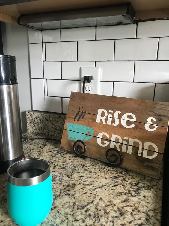
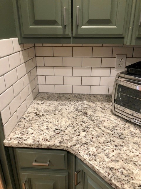
If you’re considering doing a white subway tile backsplash or heaven-forbid, MARBLE (yes, I’ve seen it all), put on the brakes and shift into a new gear.
STANDARD WHITE SUBWAY TILE ISN’T GREAT FOR THESE COUNTERTOPS.
The tones in this popular Zellige tile backsplash are a bit too light and cool for the warmth of this countertop. Instead, notice how the warmth of this paint sample leans into the countertop…

THE BEST TILE BACKSPLASH COLORS TO SAMPLE…
Suggesting specific tiles (online shopping) is risky, as even a small dye-lot change can skew things, and your particular countertop can differ from another slab! Instead, here’s some pretty specific written guidance to help you on your way…
- SOFT OFF-WHITE SUBWAY TILES that match the soft off-white colors in your St. Cecelia, Venetian Gold, etc. countertop – match being the keyword! For a subtle look, match it with soft white grout. If you want to add visual interest, choose a light-to-medium grout that matches the taupe on the countertop, but this can be a more graphic look (since the countertop is already a busy pattern, I lean into simple).
- light-medium to medium-depth TAUPE TILES with the same warm violet undertones as the flecks in your countertop. For this look, you might choose a soft white/off-white grout to add a bit of contrast and visual interest, but again, with a busier countertop, matching the tile is often best.
The goal is to MATCH one of the colors in your countertop – a color that’s easily noticeable from at least 4-6 feet away.
4 Subway Tile Ideas for Your Bathroom or Backsplash
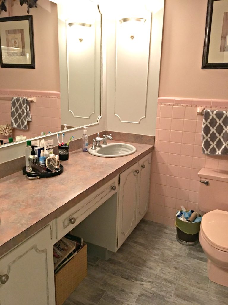
Travertine tile is/was often used with various versions of Santa Cecilia, but it’s almost always too beige (orange-pink) compared to the more golden (yellow-orange) in this granite. Also, the paint color is too cool, flat, and drab for the countertop’s warmth…

This countertop and backsplash combo is one hot mess of undertones. I can say this as it was our home when we first moved in!
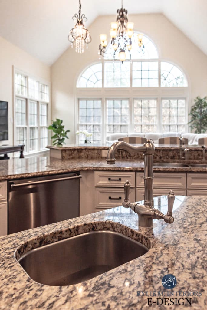
Before we go, I want to share a gorgeous kitchen with Santa Cecilia granite counters and WOOD CABINETS!
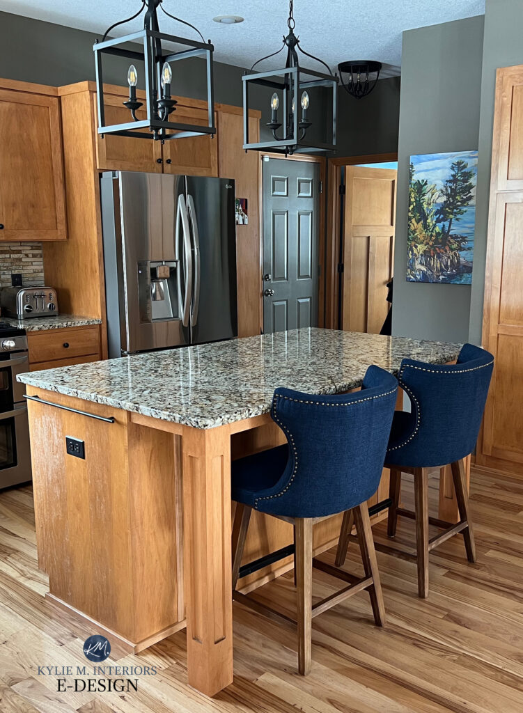
The backsplash is pretty but busy for this countertop; a soft off-white subway tile would be stunning!
Some kitchens were designed with wood cabinets in mind, not painted cabinets. If all else fails, consider keeping your wood cabinets and updating other elements in your space.
Wood Kitchen Cabinet Updates: Real Homes, Real Budgets
READ MORE
How to Update Granite Countertops Without REPLACING Them!
Painted Kitchen Cabinet Updates: Before & Afters
Quartz vs Granite Countertops – Which One is BEST For YOUR Home?
5 Ideas to Update Your 1990s Home
Get the best paint color advice with Kylie M’s Online Paint Color Consulting!


Hi Kylie
We would like to know if you can give us a consult for paint color of kitchen cabinets and adjoining room walls. we have the dreaded Venitian Gold granite and backsplash in our kitchen along with cherry wood color cabinets. We need some guidance on this and also for updating the exterior paint color of our house. We live in Thousand Oaks , Ca. We may be selling or renting our home.
Can we set up a 15/20 min consult? What would be your fee? We can send photos.
Thank you ,
Jennifer and Richard
Hey Jennifer and Richard! I actually have consuting exactly for this! https://www.kylieminteriors.ca/hire-kylie/
I’ve never read a blog post with less advice. You might title it “How to be pointed in the general direction of an update”. This has almost no suggestions for paint colors to use with these kinds of countertops. If you want to save your advice for a paying client, no problem, but don’t try to hook people into reading your post with a “how-to” when you give no suggestions!
Hi Katie, thank you for commenting.
I have to walk a fine-line between sharing free information – which I do A TON OF in over 600+ blog posts) – and earning a living as a Color Consultant. The particular blog post is titled ‘How to Update…etc’. It’s not meant to provide one-on-one, specific colors for your project – especially since it involves 3-4 versions of a ‘similar countertop’. It’s mean to get you going in the right direction.
That said, this blog post gives you EXACT COLOR GROUP recommendations with links to those blog posts – for example, with the whites you literally have 7 whites to choose from – you just need to read the blog posts provided (given the hundreds of whites out there, I’d say that’s pretty good). This blog post also clearly explains which direction NOT to take when trying to update your granite. Not only are you getting direction, you’re being steered away from wrong decisions. If you’re looking for exact colors tailored to your home, that’s a service I provide professionally – not for free. Again, the title doesn’t say ‘The exact best paint colors…’ It’s a basic ‘how-to’ to get you started.
In a time where you no longer need to go to a bookstore to get a How-To book or magazine, or hire a Designer, I do find it interesting that content designed to GUIDE, educate, and eliminate bad options is viewed as ‘unhelpful’ simply because it doesn’t give an exact answer…for free. Hmmm.
I appreciate the feedback, and hope the broader guidance in this blog post at least helps you avoid potential mistakes.
Kylie