
The 7 Best White Paint Colors for Gray Floors, Cabinets, & Counters
If your home has gray finishes, including countertops, cabinets, carpet, or tiles, you might be panicking because gray is no longer trendy. Or you might not be worried at all if gray is your jam and resale isn’t in the cards for the next 5-10 years.
Either way, you want to freshen up your walls (or cabinets/trims) and are looking for the best paint colors—in this case, WICKED shades of WHITE.
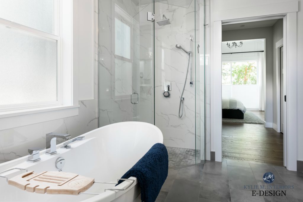
If you’ve drank my ginger-infused Kool-Aid for a few years, you know I have a close relationship with the wild world of whites and have my faves. But just because I love a color doesn’t mean it’s fool-proof or destined for every home. And when it comes to gray finishes, you have to be careful, as a little undertone can go a long way…or the wrong way.
The first thing to know about your gray finishes is that they aren’t just gray.
Gray will have undertones of purple, pink, blue, or green (often, a mix).

This carpet has purple undertones
So, when choosing the best color for your walls, cabinets, or trim, it’s about finding one that complements the undertone of your flooring/countertops, and that undertone is probably purple (violet).

Why?
I don’t know; you tell me, but all I know is that manufacturers greatly favor purple undertones. Sure, the odd green and a rare flash of blue pop up, but they’re few and far between. This is why most of the colors listed below are geared towards the most common gray countertops and flooring, whether tile, carpet, LVT, LVP, or wood, with the typical violet undertones.

That said, should your gray finish lean green or blue, these shades will probably work, too.
TIPS FOR CHOOSING YOUR BEST WHITE
- Be careful with creamy whites. Cream = yellow, and yellow can look a little contrasting, and overreact against some gray finishes (making your walls look even more yellow and your finish look more gray-purple). While warmth is good, a little can go a looong way.
- If your room’s best white seems a bit too cold, you’ll find more links at the bottom of this blog post, showing you some softer, warmer alternatives.
- If your room has north-facing natural light, you might find that many whites look too cold and clinical. Again, check out my other blog posts near the end for warmer options.
1. SHERWIN WILLIAMS PURE WHITE SW 7005
I love Pure White for walls, cabinets, trims, and exteriors—heck, I’ll even toss it on my toenails. And with gray rooms being so darn fussy, I love how Pure White offers a slightly warm look without being overtly yellow or creamy (LRV of 84).

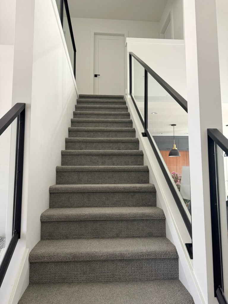
This carpet in this staircase has a purple undertone
The laminate or LVP in this dining room (below) has a purple-pink undertone. Notice how well Pure White complements the floor—it doesn’t appear too warm or overly stark, and also doesn’t accentuate the purple tones in the flooring.
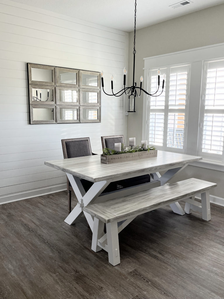
Pure White is a soft shade of white, not a bright one, but it does the job in the absence of a brighter white.
By the way, if your gray surface has green or blue undertones, Pure White is worth sampling; just remember to check it in your room’s exposure to make sure it shows up the way you want it to!
This next staircase actually has a green undertone (IT’S A CHRISTMAS MIRACLE), and looks great with its Pure White walls…
My FULL Review of Sherwin Williams Pure White
If you love Pure White and think it’s the shade for you, stop there. Never pick a paint color based on how it looks by itself – SAMPLE AND COMPARE similar shades, as you never know which one you’ll end up with!
2. BENJAMIN MOORE DECORATOR’S WHITE CC-20
Decorator’s White isn’t like the average shade of white, and that’s because of its undertones. Whereas the most popular white paint colors have a warm, yellow undertone, Decorator’s White can lean a touch purple, making it a popular color with gray flooring and countertops.

TOP TO BOTTOM: SW High Reflective White | BM Super White | BM Chantilly Lace | BM Decorator’s White
While this next home doesn’t have a large-scale gray finish, look at the crown molding to see how gray-purple Decorator’s White CAN appear (but not always, as shown by the wainscoting on the lower wall, which is more subtle)…
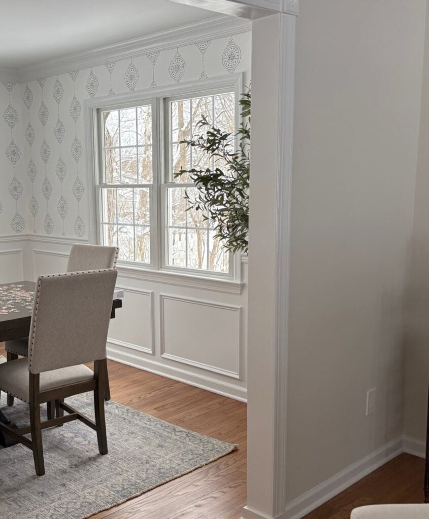
However, if your goal is to make your gray room look warmer, Decorator’s White usually doesn’t make the cut. More people lean toward a soft, slightly warm approach over the potentially stark or sterile look of bright or cool whites. However, if your tastes and finishes call for a slightly cooler approach, Decorator’s White could answer that call with a HELLLLLS YEAH!
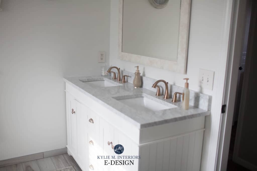
Benjamin Moore’s Decorator’s White: IMAGES, Info, & More
The countertop in the above bathroom is marble-look quartz with noticeable gray-violet veining. The tile floor is a touch warmer and picks up some taupe along the way.
How to Get The Look of Marble Without The Price
3. SHERWIN WILLIAMS SNOWBOUND SW 7004
Snowbound has become a popular color in recent years. However, while it sits in the white world with its LRV of 83, its slightly stronger undertones make it tricky in the average home with non-gray surfaces. But, for those with gray flooring, countertops, or even cabinets, it’s a contender.
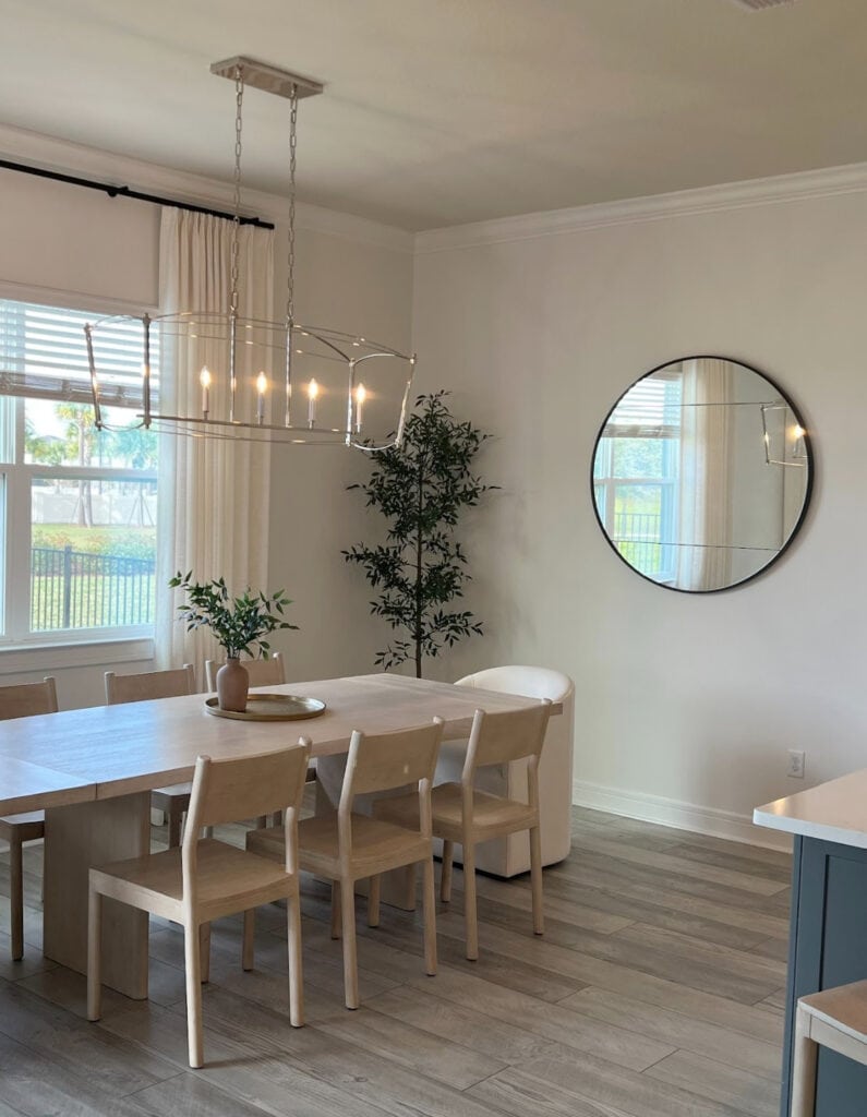
Snowbound potentially offers a soft, subtle approach to white with an interesting, passive warmth that isn’t as cream-yellow-inclined as some others. That said, it’s more unpredictable than many, and it CAN go a bit warmer than expected in some conditions (above).
While the floors in this next room are gray…ish, they obviously aren’t done yet. All the same, you can see Snowbound lean a bit toward purple, especially when compared to the more legit white on the door…
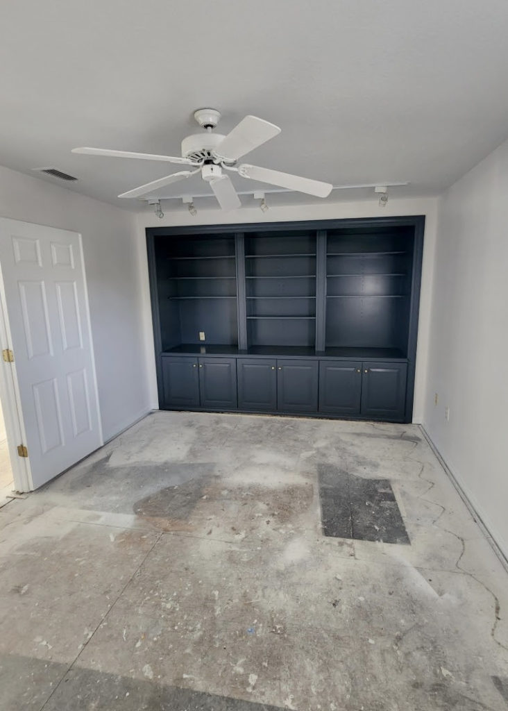
Sherwin Williams Snowbound: IMAGES, Info, & More
Remember, whites have high LRVs, and they reflect a LOT OF LIGHT and can change a lot depending on your room’s exposure – it’s not just about your gray interior finishes!
4. BENJAMIN MOORE CHANTILLY LACE OC-65
I have mad love for Chantilly Lace. Not only does she have a pretty face (yes, I am that old), but she’s a great partner for a wide range of gray surfaces—no matter what the undertones are.
Ignoring the arrows (I used this image for a different blog post), notice how great Chantilly Lace looks with this light gray quartz countertop…

By the way, 99.5% of the photos in my blog are of REAL HOMES from my Online Color Consulting clients, readers, and friends. While not always magazine-perfect, they’re packed with ideas and proven color choices to help you create a home you’ll love.
This next image (ignore the words ‘new sample’) shows an off-white warm gray cabinet (Benjamin Moore Silver Satin) with Chantilly Lace on the wall…

A white like Chantilly Lace is one of the very few whites that go with a color that’s this light and gray.
As shown in the next bathroom, Chantilly Lace offers a simple, clean palette featuring a wood vanity, white quartz countertop, and a dark, charcoal gray tile floor (purple undertones)…
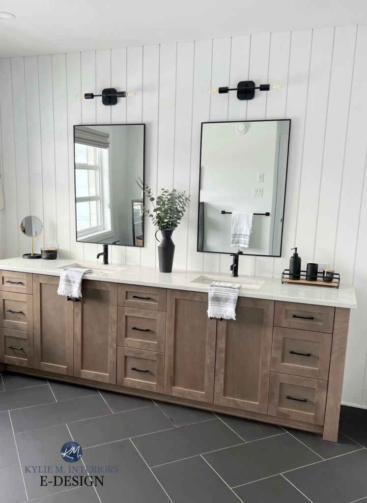
Benjamin Moore Chantilly Lace: FULL Paint Color Review
Chantilly Lace is one of the brightest shades of white on this page and is certainly one of Benjamin Moore’s whitest paint colors. With its LRV of 90.04, it’s a great way to get white without a stark look (although that can be open to perception).
Here’s another look at a previous image, with the samples up against the marble…

If you love Chantilly Lace, compare it to Sherwin Williams White Snow (coming up next) and these other comparable shades of white. These whites also suit many gray surfaces with blue or green undertones.
The Best Paint Colors to Go With Marble
5. SHERWIN WILLIAMS WHITE SNOW SW 9541
White Snow is a newer shade of white from Sherwin Williams. While it hasn’t quite hit the ground running, it’s not because it isn’t pretty – it’s gorgeous; it’s because…
a) It’s hard to get a sample of, as they’re only available through Samplize (you can’t even get a sample pot/quart made, urgh)
b) It’s in their most expensive line, so not everyone is lining up for gallons at a time.
Here’s White Snow on the exterior trim with Benjamin Moore Classic Gray siding and a dark gray-blue paint color on the front door…

Here’s your Peel & Stick sample of White Snow.
This said, it’s friggin’ gorgeous. White Snow is a bright shade of white, comparable to Chantilly Lace. I love it because of its passive warmth – not as white as Chantilly Lace, but also not as yellow as the popular warm white look of Benjamin Moore’s Simply White (which has a comparable LRV but more warmth).
My FULL Paint Color Review of Sherwin Williams White Snow
Now, as we dive into the slightly warmer white world, you need to sample and compare carefully, as not every type of gray floor can handle these warmer shades…
6. BENJAMIN MOORE WHITE DOVE OC-17
White Dove is my personal favorite white paint color, but I love soft, warm whites. This said, not everyone loves warm whites, and not every gray flooring, countertop, or finish can handle them.

The darker your gray flooring, countertop, or tile are, the more likely they are to tolerate a wide range of whites.
This next hallway features White Dove with dark gray tile and Benjamin Moore Revere Pewter on the interior doors…
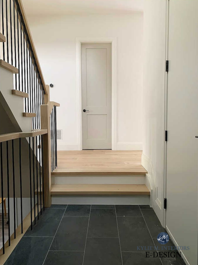
My Paint Color Review of Benjamin Moore White Dove
If warm whites are up your alley, sample and compare some of my FAVORITE SHADES in this WARM WHITE SAMPLER!
7. SHERWIN WILLIAMS ALABASTER SW 7008
Alabaster is a soft, reasonably warm white (warmer than Pure White and White Dove) with an LRV of 82. This number indicates how dark it is, and 82 is on the edge of the white/off-white worlds.
The carpet in this next family room has a soft violet undertone that complements Alabaster’s subtle warmth without overreacting.

The walls are painted Benjamin Moore Anchor Gray (it’s amazeballs with many gray finishes).
While Alabaster works as a trim color in this space, I wouldn’t use it on the walls, as its warmth could show up more on a large scale and be a bit overwhelming for this carpet’s depth (which is considerably light, as far as gray carpets go).
Just note: The warmer your white is, the greater the chance it will react with any overt undertones in your gray finish.
Not all gray finishes suit the creamy warmth of Alabaster, and it’s the warmest shade I would sample. The darker your gray surface is, the more likely it will handle a white like Alabaster, as shown in this bathroom below…
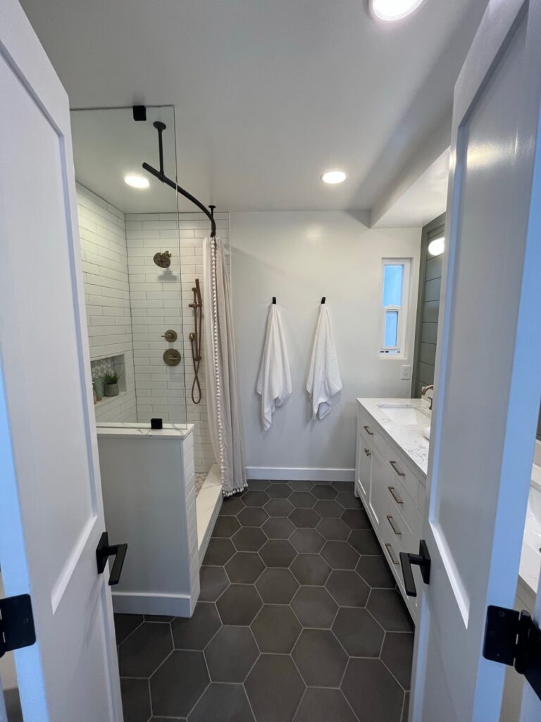
FULL Paint Color Review of Sherwin Williams Alabaster
If Alabaster is the white you love, it’s important to sample and compare it to other shades—you never know, there might be an even better one!
FREQUENTLY ASKED QUESTIONS
For any lingering quandaries or queries…
CAN I USE WARM WHITES WITH ANY GRAY FINISH?
Heck no. The lighter your gray is, the fussier it can be with warm, creamy whites. Your safest whites are Sherwin Williams Pure White and true white paint colors.
SHOULD I USE A WARM OR COOL WHITE WITH MY GRAY FINISHES?
Few gray finishes and gray rooms actually look their best with a cool white paint color. Most do well with a true white or a soft white, so long as they aren’t too creamy warm (with exceptions, depending on your finish and its depth/undertones/temperature).

WILL A CREAMY WHITE LOOK DIRTY OR DINGY NEXT TO GRAY?
It can. A lot comes down to whether your gray is warm or cool and how light or dark it is. It also depends on how creamy your white is. If your gray finish is crisp, clean, and cool, yes, a warm creamy white could look dirty in comparison. However, that same white could be perfect for some gentle, warm gray finishes. This is why sampling and comparing a range of whites is so important.
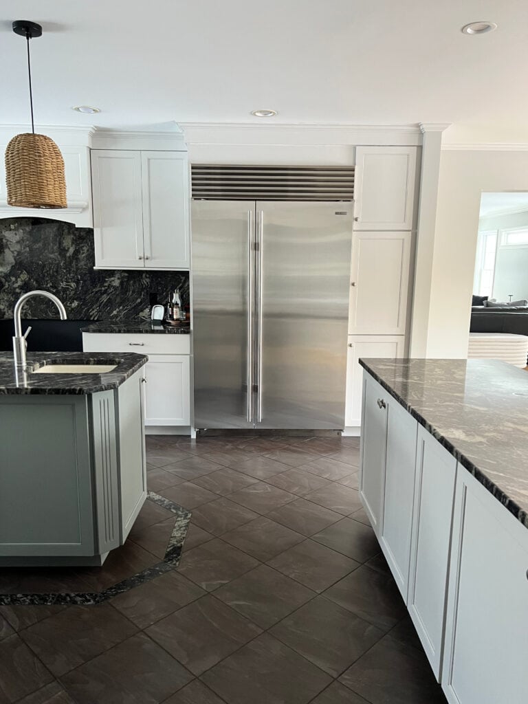
SUMMARY
- More gray interior finishes cater to a purple hue, especially gray cabinets, countertops, tiles, and carpet. The odd one has a green hue, and fewer have a blue hue.
- Gray interior finishes look good with a range of white paint colors, from cool whites to warm whites.
- The lighter your gray finish (countertop, tile, cabinet, etc) is, the more it could be fussy with a warm, creamy white.
- Darker gray finishes suit a wider range of whites, including cool, bright, true, and creamier warm whites.
READ MORE
The Best Beige Paint Colors with Gray Floors
The Best Neutral (Warm) Paint Colors with Gray Finishes
How to Transition From Gray to Beige
Everything You Need to Warm Up a Gray Home: A Complete Collection
Get the best paint color & home update advice with Kylie M’s Online Paint Color Consulting!

Updated with new content and images for 2026


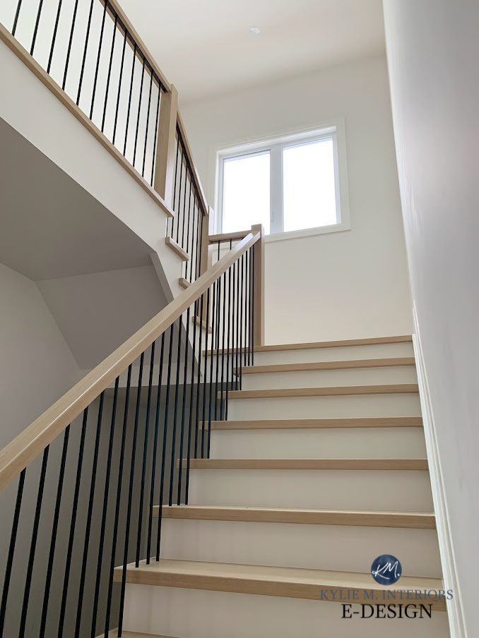



I wish I saw this post before picking Simply White. Most costly decision ever. Turned so yellow in my north west facing house. It clashed so badly with my grey countertops and white subway backsplash. Had to repaint it to white dove in one room and pure white in another room based on Kylie’s recommendation and wow what a difference it made. Please please read her blog before you start any painting project.
Oh Ann, I’m so sorry to hear this! But I’m glad you found me eventually and I definitely appreciate you supporting my blog – THANK YOU!!!