
The Best Paint Colors To Warm-Up Your Gray Home (Neutrals)
Update your millennial-gray cabinets, countertops, flooring, tile & more…
It seems crazy to be writing about updating your gray home, but alas, here we are in a new trend cycle. I’ll give it to gray for lasting longer than many, but its time has come, as many lean into warmer colors on their walls, cabinets, and floors.
But transitioning out of gray and into something warmer isn’t always easy. In fact, depending on how much gray you have, it can be darn hard (insert wine and funnel HERE). Wait, you don’t need wine—you have a little Ginger tucked in your back pocket (who pinches upon request—wink, wink).

I won’t tell you these colors are fool-proof – no colors are, no matter your situation. However, they’re great GUIDELINE colors, giving you a place to start.
Then, depending on your exact finishes and their needs, you can adjust accordingly. And if all else fails, you know who can help.
But while these neutral shades are helpful ‘guideline colors,’ there are also a few rules…
I CAN’T GIVE YOU WHAT DOESN’T EXIST (I’m good, but not THAT good)
Depending on your exact gray surface, how much you have of it, and the surrounding finishes, there might not be a ‘perfect color’ – a color that makes your gray finishes AND YOU 100% happy. The reality is that some gray homes don’t transition well into a new style, and the only way into a new style is with new finishes (#sometimesthetruthhurts).
Remember to choose colors for the home you HAVE, not the home you WISH you had.
In some cases, your best bet is to paint your walls a color that leans into your gray finishes or a suitable shade of white (I’ll provide links to those, don’t worry).
But that’s not what this blog post is about. This is about colors that help you gray home TRANSITION into a warmer, more inviting style with paint color!

BIG FAT TIP: COOLER VS. WARMER VS. LIGHTER VS. DARKER
If you want your walls to be warmer-toned than your gray finish, they’ll need to be LIGHTER than your finish.
While you can learn more about coordinating warm and cool colors here, the gist is that cool finishes (like gray) don’t always like paint colors that are warmer AND darker than them. Another way to think about that is that warm colors/finishes don’t always love colors that are cooler AND lighter than them. I know, it’s a lot to wrap the noggin’ around.
If that goes too deep, ignore me and keep on reading (that’s what he said).
Now, you don’t get off THAT easy. I’m not just a ‘tell you what to do‘ type of blogger (although I am a bossy lil’ thang); I’m a ‘help you LEARN what to do’ blogger. Learning about your home and its finishes can help you make smart choices or avoid a potential hot mess.
LET’S TALK ABOUT GRAY FLOORING: RIP 2020
Replacing a huge expanse of flooring or updating a kitchen is expensive, and most want to work with what they have rather than replace it (the same goes for husbands).
But guess what, Buttercup?
You may THINK your surface is ‘just gray,’ but there’s a 99.9% chance it isn’t as ‘gray’ as you think.
The challenge is that, like with gray paint colors, gray finishes have undertones. The difference is that while you can choose from blue, green, purple, or a blend of colors for paint, the options for floors and countertops are less varied. In fact, there is ONE undertone/color that dominates the others by a long shot, so let’s find out what that is…
GRAY CARPET
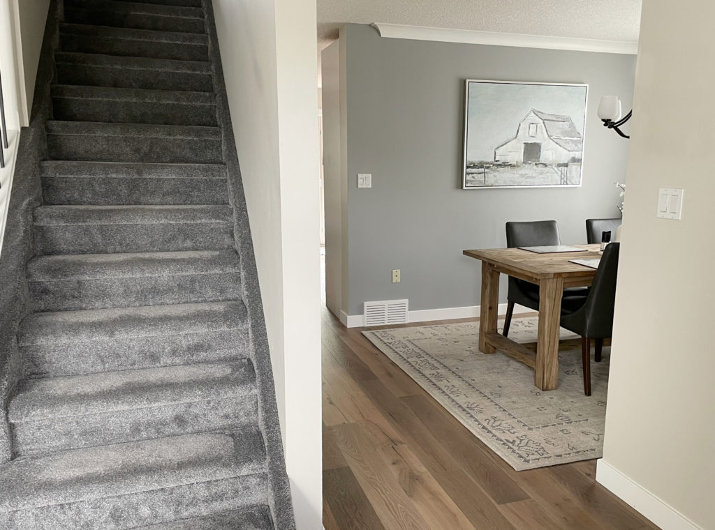
Whether warm or cool-toned, gray carpet usually has a purple or purple-pink undertone. Sure, there’s the odd green hue (which I have in my home), but blue is rarer.
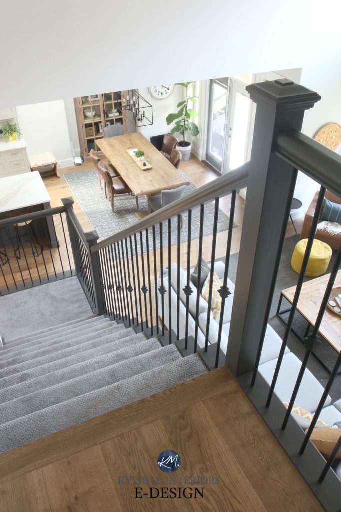
This is the carpet on my stairs, as I prefer green undertones over blue or purple.
If your carpet resembles one of these (below), it has a purple undertone. The ones on the left (top three) are warmer (pink-violet), whereas those on the right and the bottom left aren’t nearly as warm but still have a purple hue.

Do any of these look somewhat familiar?
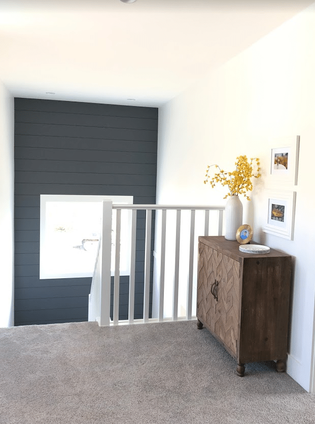
The carpet in this next staircase has a warm purple (purple-pink) undertone…
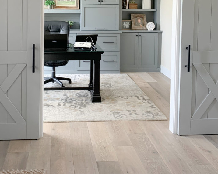
GRAY LAMINATE FLOORING & LVP
I bet your cute little booty that your gray laminate flooring has a purple or, more likely, purple-pink undertone. It’s rare to find blue or green. The laminate flooring in this next image has a purple-pink undertone, but not an overly warm one…
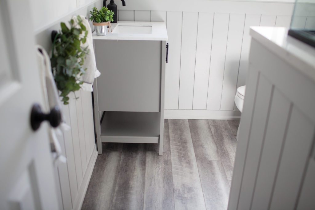
As for gray LVP, just like laminate, it almost always has a PURPLE (violet) undertone; rarely green or blue. This can be a soft purple or a warmer one that leans more purple-pink.

Do any of these look somewhat familiar?
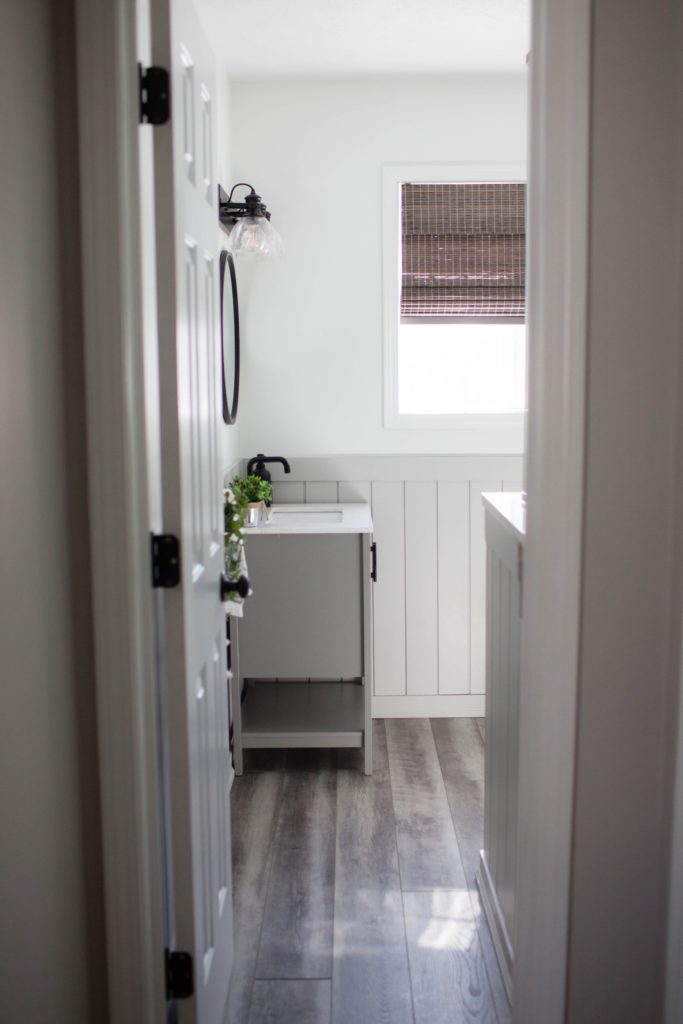
This LVP bathroom floor has a warm purple (purple-pink) undertone…
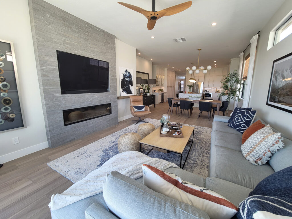
This next floor has a more subtle, warm purple-pink hue. If you’re having trouble seeing it, compare it to the stone on the fireplace…
LVT (Luxury Vinyl Tile)
What’s the difference between LVT and LVP?
- LVT differs from LVP because LVT is available in tile format (e.g., 12×24) and resembles a tile.
- LVP is a long, narrow plank that resembles wood.
FUN FACTS! Anywaaaaay, there can be a range with LVT, depending on the type of tile they created/tried to mimic. Most often, there’s purple, but I’ve seen some green. Again, blue isn’t as common.
GRAYWASH WOOD FLOOR
Whether solid or engineered (or laminate/LVP), most gray wash wood floors have a purple-pink undertone. Sure, the odd one pops up a touch of green or blue, but purple is the main currency. The solid wood floor in this next image has a warm purple (purple-pink) undertone.
However, unlike most wood-look products, wood flooring can have some interesting variations. These variations can potentially offer more wall color options. While these exceptions are not the rule, if your floor has gray-purple tones and a good dose of brown or orange-yellow warmth, you could have a bit more room to move.

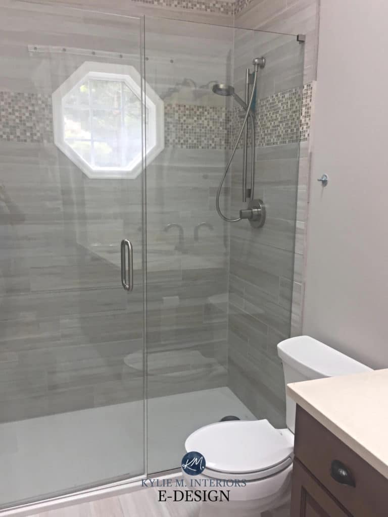
GRAY TILE FLOORING
While there can be some variety, the most common tiles cater to purple. This next beautiful bathroom has a dark floor tile that’s still trendy and usable because it’s so dark and grounding (the light and mid-toned grays can be trickier). It has a purple undertone.
That covers gray flooring – moving along…
WHAT ABOUT GRAY COUNTERTOPS?
While there are some gorgeous gray laminate countertops (I’ve installed a few myself), gray quartz is the most popular choice from the previous decade.
The challenge with gray quartz countertops is that while medium to darker ones can be uber flexible and almost timeless, light gray quartz (or laminate) is fussier about its color partners and demands colors that are warmer and LIGHTER than them.
As for undertones, most gray countertops cater to a purple undertone – sue-prize sue-prize.
Very schlong story short, violet/purple is the common undertone/factor in most gray interior surfaces, and I’ll base my suggestions on it.
We’d be here all day if I were to base my recommendations on all three undertones (however, you’d get to see me transition from coffee and Baileys to gin and tonic, which is always an adventure).

But here’s the deal, Aly McBeal (dating myself, which I’d never do, as I’m SUPER NEEDY). My Online Color Consulting clients have just started transitioning.
While gray fell out of trend in flooring (and countertops*) a few years ago, it’s only NOW that we’re seeing the masses shifting their attention to warmer/non-gray wall colors.
*Gray countertops are still rolling in here and there – gray floors are definitely long gone.
Heck, 70% of my clients are still hiring me to update their 1990s and Tuscan-style 2000s homes – the 2010s-2020s are just starting to roll in!
SUPER IMPORTANT NOTE
Before you jump feet first and buck-nekkid into the color pool, please note that the colors listed below are IN ORDER.
These colors are listed from WARMEST TO COOLEST.
- If you sample a color and find it too warm for your finishes, tastes, and room, nudge things a bit cooler.
- If you go too far (story of my life, right, Mom?), tip back towards the warm range again and, hopefully, by the time you’re done sampling, you’ll have your perfect shade!
Listen carefully to your home and its needs!
But most importantly, don’t just pick and sample one color – sample a range. I’ll include links to similar shades and some CURATED SAMPLER PACKS for you to play with!
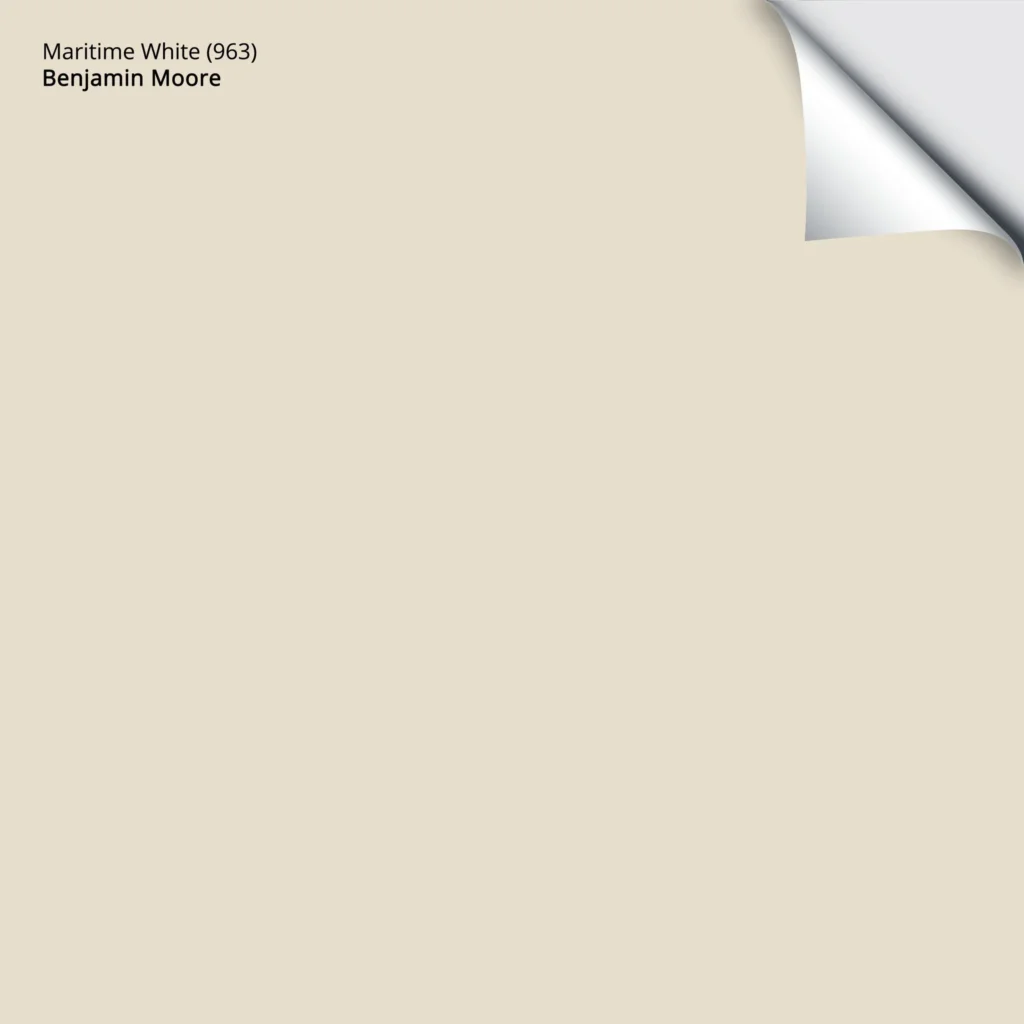
1. BENJAMIN MOORE MARITIME WHITE
Maritime White is a gentle, warm, neutral color stuck between the off-white and light worlds. Its beige base offers warmth without resembling the heavier beiges and tans of the early 2000s (which are back, btw).
Generally speaking, the lighter your color, the better your chances of it working with your gray finish.

While this kitchen’s tile floor, maple cabinets, and granite are more 1990s, the gray in the floor is where I’m focusing my eyeballs.
With an LRV of 71.6, Maritime White is at the lightest end of the light range (approx. 55-73) while still offering a nice contrast with a brighter white trim. This isn’t to say it’s foolproof, but this approach has a better chance than colors with more depth (lower LRVs).
Here’s your Peel & Stick sample of Maritime White…
My Paint Color Review of Benjamin Moore Maritime White
If you love the look of Maritime White, compare it to…
- Sherwin Williams Moderate White
- Sherwin Williams Divine White
- Benjamin Moore Muslin
- Sherwin Williams Kestrel White, which is coming up next!
Or, try an OFF-WHITE BEIGE SAMPLER (and add Kestrel White to the mix) to compare it to all the popular shades!
2. SHERWIN WILLIAMS NATURAL LINEN 9109
While Maritime White has similarly warm intentions as Maritime White, it approaches beige with a bit more depth.

The doors are painted a gorgeous shade of medium-depth greige and look amazeballs
This is because Natural Linen is a light-depth shade of beige with an LRV of 66. But unlike more golden shades of beige, Natural Linen is considerably grounded and muted, which is why it has a better chance of working with some gray interior finishes.

If you like Natural Linen, you need a few colors to compare it with – sometimes a wee tweak is all you need to make a color work!
- Benjamin Moore Muslin offers a bit more warmth/brightness
- Sherwin Williams Moderate White is an interesting, lighter option to explore
Sherwin Williams Natural Linen: IMAGES, Info, & More
3. SHERWIN WILLIAMS KESTREL WHITE SW 7516
I love Kestrel White. For gray surfaces with varying neutrals/tones, Kestrel White can add the touch of taupe some grays need while nodding at the warmer world.
Here’s your Peel & Stick sample of Kestrel White…
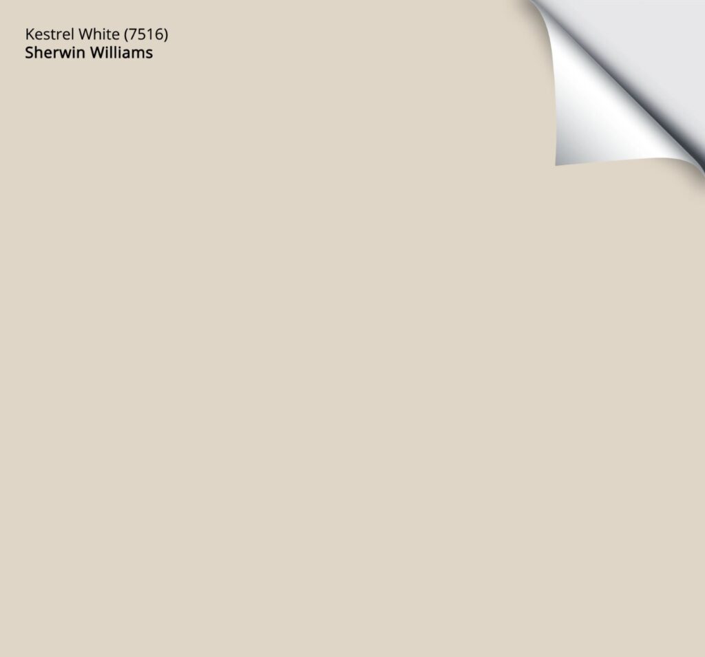
With an LRV of 68, Kestrel White offers a bit more depth than some of the other popular, subtle shades of beige, without picking up the depth of some of the top shades like Benjamin Moore Muslin and Sherwin Williams Natural Linen.
If you love the look of Kestrel White, try an OFF-WHITE BEIGE SAMPLER (and add Kestrel White to the mix) to compare it to other popular shades!
4. BENJAMIN MOORE CEDAR KEY 982
Cedar Key is an interesting shade. It sits on the edge of beige while still holding onto taupe for dear life!
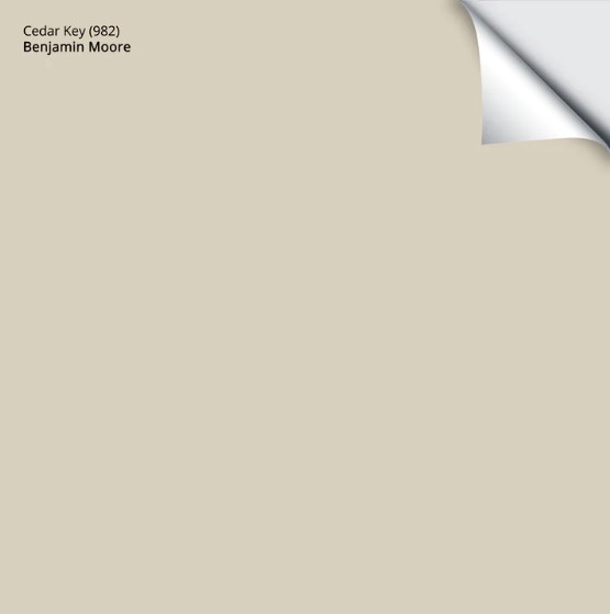
Get your Peel & Stick sample of Cedar Key
Along with that dusky, taupe-gray backdrop, Cedar Key has an LRV of 61.05, which puts it on the slightly darker end of the light range.
My Paint Color Review of Benjamin Moore Cedar Key
If you love the look of Cedar Key, try an OFF-WHITE & LIGHT BEIGE SAMPLER to compare it to other popular shades!
5. BENJAMIN MOORE EDGECOMB GRAY HC-173
Edgecomb Gray is a classic shade. It’s considerably warmer than gray but seems much grayer than beige. This is because Edgecomb Gray is a bridge color between the two worlds!
But (a big, Kardashian-inspired one), you need to sample it carefully to ensure it satisfies your particular gray flooring, as some grays demand a noticeable and committed undertone – which Edgecomb Gray doesn’t offer.
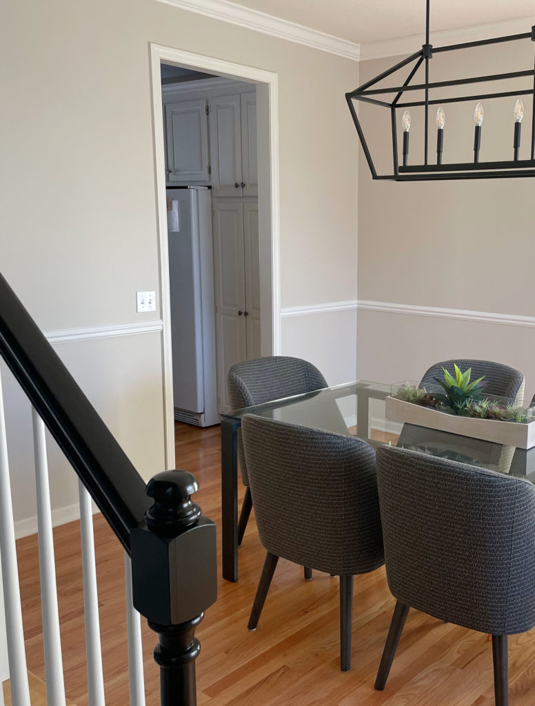
While the wood floor is a warm, golden oak, the dining chairs are a gorgeous, dark gray and look beautiful paired with Edgecomb Gray.
Here’s your Peel & Stick sample of Edgecomb Gray…
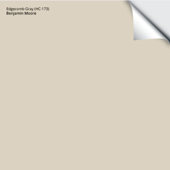
Edgecomb Gray is one of this page’s most ‘neutral’ options.
As for depth, Edgecomb Gray comes in at 63.09, which is right in my happy range!
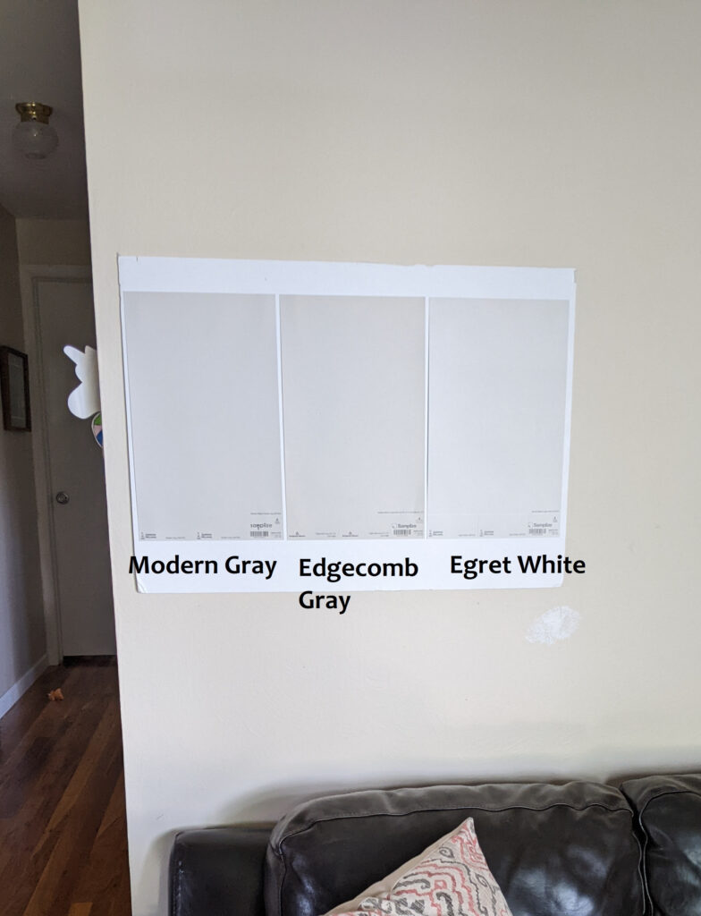
SW Modern Gray | SW Egret White
If you love the look of Edgecomb Gray, compare it to these gorgeous alternatives…
- Sherwi Williams Modern Gray
- Sherwin Williams Accessible Beige, which is a great comparison, but a bit less likely to suit the average gray finish – but hey, you never know!
- Or, try a LIGHT TAUPE SAMPLER to compare it to other popular shades!
If you’re looking for more COLORFUL SHADES to partner with your gray home, that blog post is HERE!
If you want to check out some WHITES – click HERE!
My Paint Color Review of Benjamin Moore Edgecomb Gray
6. BENJAMIN MOORE PALE OAK OC-20
Pale Oak is a beautiful shade of taupe. Its noticeable but not overwhelming violet-pink undertones make it a great fit with gray wood-look flooring or tiles in varying shades.
Many people get nervous about the ‘p’ word and consider it a four-letter word. Don’t be scared, as if your flooring has some of this color/undertone, you might be pleasantly surprised at how STUNNING your room looks when your walls and flooring coordinate properly!
Here’s your Peel & Stick sample of Pale Oak…
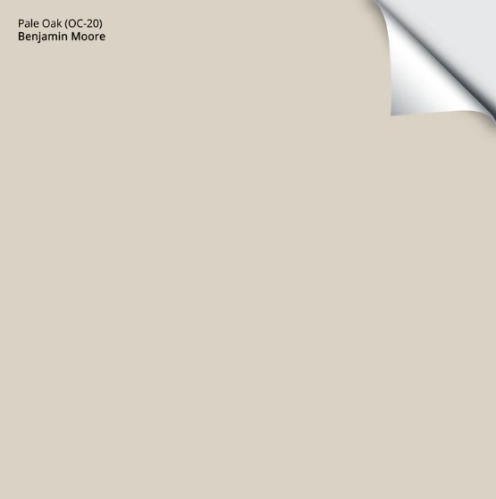
Pale Oak is a light depth, thanks to its LRV of 68.64. However, unlike most other ‘light’ shades on this page, it’s on the higher end of this range.
My Paint Color Review of Benjamin Moore Pale Oak
If you love the look of Egret White, try an OFF-WHITE & LIGHT TAUPE SAMPLER to compare it to similar shades (many of which are listed in this blog post, btw)!
7. SHERWIN WILLAMS EGRET WHITE SW 7570
I have mad love for Egret White. This great transitional color nods to the warm and cool worlds without a hardcore commitment. Sure, it can look warm compared to a traditional shade of gray, but put it next to beige, and you’ll see just how much gray it’s hiding!
Egret White is one of my favorite, flexible taupe paint colors.
The oak wood floor in this next home is whitewashed, which isn’t quite gray, but has similar high needs in terms of purple-pink undertones…

Compared to many other taupe colors, Egret White has the least noticeable undertones, which is why it’s becoming one of my top recommended shades. As for depth, Egret White has an LRV of 70, which brings it pretty darn close to the off-white world while offering a bit more depth and contrast than most off-whites.
Here’s your Peel & Stick sample of Egret White…
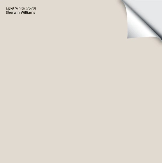
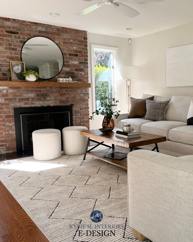
While this next living room only has a warm gray-taupe in the mortar around the brick fireplace, it’s still easy to see how friggin’ gorgeous Egret White can be…

Which is better, Classic Gray (coming up next) or Egret White?
Oooo, that’s a good question. Off the top, Classic Gray is more popular, for sure. However, I find many of my clients leaning into the slightly more purposeful warmth and depth of Egret White.
My FULL Paint Color Review of Sherwin Williams Egret White
If Egret White seems like it could work, hang tight and compare it to a few similar shades – there might be something even better!
- Sherwin Williams City Loft
- Benjamin Moore Classic Gray
- Benjamin Moore Balboa Mist
- Sherwin Williams Modern Gray
8. BENJAMIN MOORE CLASSIC GRAY OC-23
Classic Gray has been in style for a long time, and with trends shifting out of gray and toward warmer shades, it’s one of those grays that will last (compared to cooler shades of gray). As for undertones, Classic Gray winks at violet-pink with a first Tinder date level of commitment.
Here’s your Peel & Stick sample of Classic Gray…
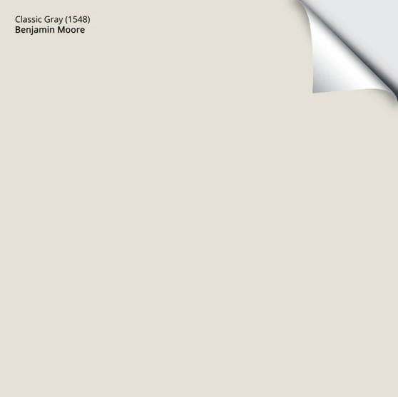
Not everyone loves seeing violet or pink hues on their walls – I get it, I don’t love them either. Just remember…
Sometimes, it’s about the right color in the right room.
For example, would I put Classic Gray in my living room and kitchen? HECK NO; the violet-pink undertones would make me twitch and cry in the corner with an empty wine bottle at my feet. However, I painted my YouTube studio in Classic Gray, as it suits the surrounding finishes and overall vibe, and ended up falling in love with its gentle, taupe-inspired look!
Classic Gray is an off-white gray with an LRV of 73.67. This depth offers a more subtle contrast with white trim than grays with lower LRVs. For this reason, it’s best if Classic Gray is partnered with a reasonably bright shade of white.
My Paint Color Review of Benjamin Moore Classic Gray
Seriously, compare Classic Gray to the previous 4 paint colors – they’re some of the best options.
Remember, paint colors can reflect a LOT OF LIGHT and change depending on your room’s exposure – it’s not JUST about your interior finishes!
9. BENJAMIN MOORE BALBOA MIST 0C-27
Balboa Mist is right up there with Collingwood (coming up next) in popularity; however, not everyone loves its slightly more committed undertones. That’s right, Balboa Mist grabs the purple and pink that most gray floors, counters, and tiles are looking for, but takes them up a small notch.

Here’s your Peel & Stick sample of Balboa Mist…
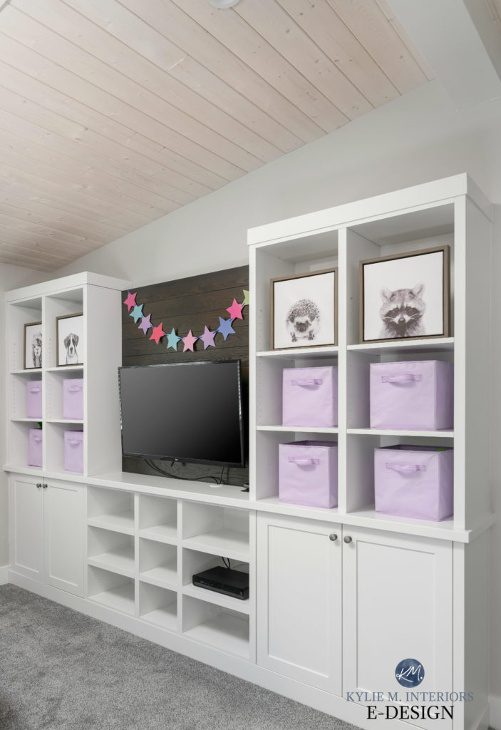
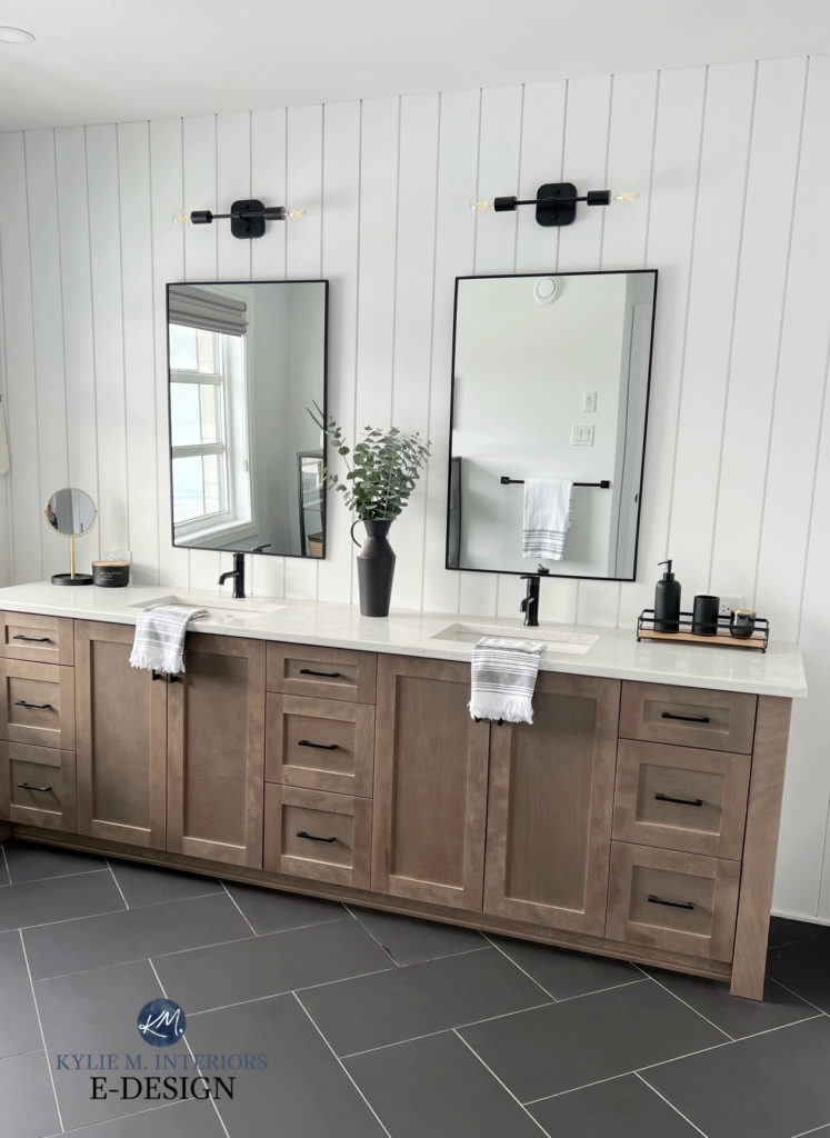
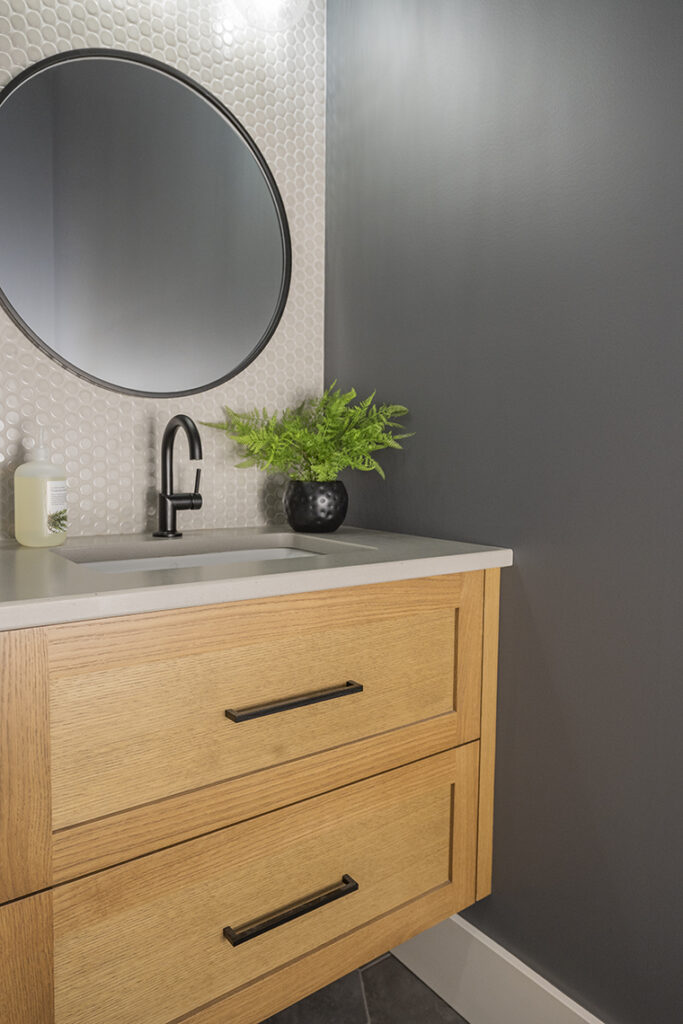
As for depth, Balboa Mist has an LRV of 65.53, which is right in the sweet spot for the average room. While this next bathroom doesn’t have gray flooring, it’s easy to see how pretty Balboa Mist looks with the medium-toned gray vanity.
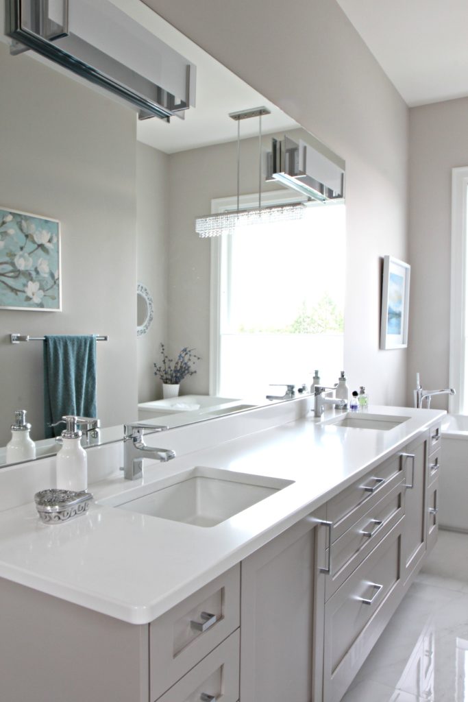
My FULL Paint Color Review of Benjamin Moore Balboa Mist
If you love the look of Balboa Mist, sample and compare it to similar shades with a LIGHT WARM GRAY SAMPLER!
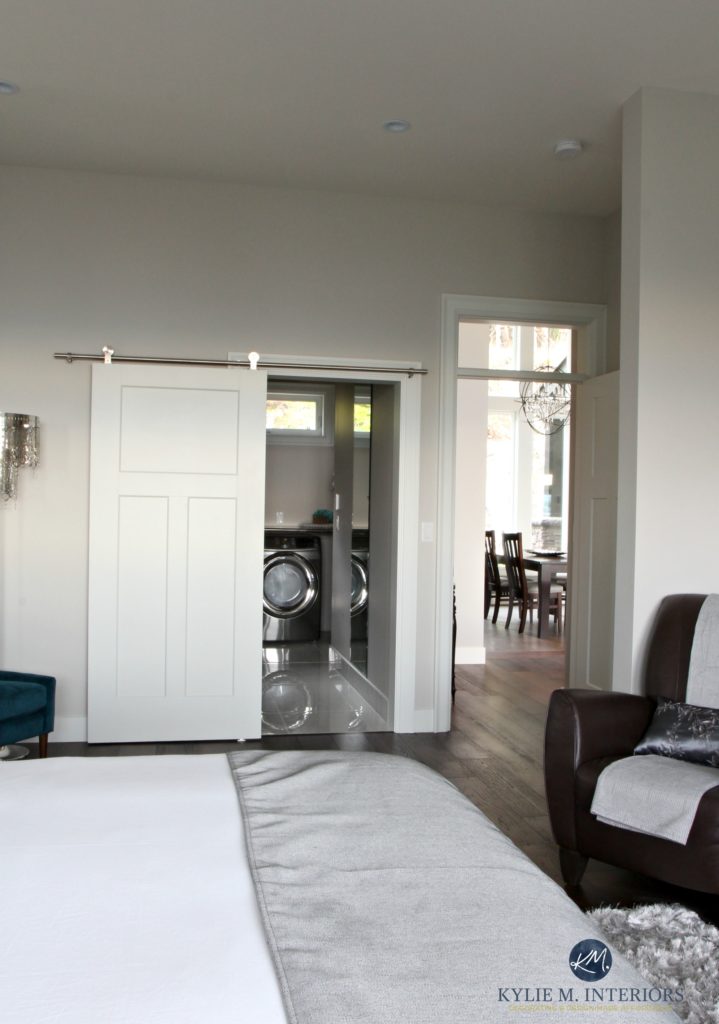
10. SHERWIN WILLIAMS CITY LOFT SW 7631
City Loft is a super gorgeous, flexible shade of taupe, that winks at the warm gray world.
While it’s similar to Egret White (previously mentioned), it can be great for interior finishes that crave a more noticeable purple-pink undertone (without going balls-out).
As shown in this home with gray laminate flooring (stronger purple undertone), City Loft is a great fit…
Here’s your Peel & Stick sample of City Loft…
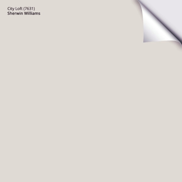
My Paint Color Review of Sherwin Williams City Loft
If you love the look of City Loft, sample and compare it with the previous 4 samples – one of them could be it!
11. BENJAMIN MOORE COLLINGWOOD OC-28
Collingwood is one of my favorite go-to gray paint colors when I want a soft, pretty, warm purple undertone. With a bit more depth than previous options, Collingwood works well with some gray tiles/countertops/etc. without leaning too far into an obnoxious, bossy undertone.
If you’re looking for a gray with a reasonable depth that won’t weigh down your room (assuming your room has a reasonable amount of light), Collingwood’s LRV of 61.52 is a great place to start.
Here’s your Samplize Peel & Stick sample of Collingwood…
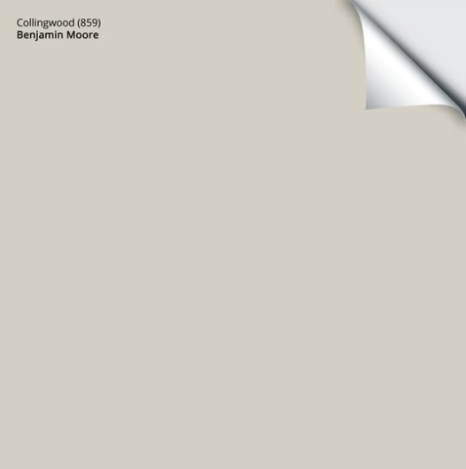
I’ve been suggesting Collingwood to my Online Paint Color Consulting clients for YEARS, and I don’t see that changing anytime soon. While trends are leaning warmer, Collingwood can be a great solution for trickier gray-inspired spaces.

My Paint Color Review of Benjamin Moore’s Collingwood
If Collingwood is hitting your home’s happy place, I suggest reading this blog post for some great alternatives and comparisons…The Best Paint Colors to Go With Gray Finishes
But if those just aren’t cool enough for your finishes…
All the colors previously listed have a reasonably good chance of working with the average gray surface – some WAY more than others.
But what if gray really IS the best color for your gray carpet, tile, or countertop?
Well, I’ve got your cute lil’ booty covered on that front too. However, before I give you that particular blog post link, let’s look at…
THE IN-BETWEENERS
Some warmer grays are hard to read. Do they have purple or green undertones? Or maybe there’s a flash of blue? WHO THE HECK KNOWS?!
The same can be said for the odd gray finish – they aren’t always easy to read (although, really, MOST have a purple undertone – for reals).
When unsure of what you’re dealing with, it’s important to sample and compare, including colors like the three listed below…
BENJAMIN MOORE RODEO 1534
Rodeo is an interesting one for those with gray that potentially has green undertones. While Rodeo can politely nod at the violet world, it loves flooring with a flash of green, as shown in the carpet on this staircase.
How to Update Your 1990s Staircase
With an LRV of 59.84, Rodeo has some meat on its bones and is best for rooms or spaces with a reasonable amount of natural light.

Get your Peel & Stick sample of Rodeo
If Rodeo sounds like it will hit the spot, compare it to other popular shades with this LIGHT GREIGE SAMPLER!
SHERWIN WILLIAMS AGREEABLE GRAY SW 7029
When it comes to flexibility, it’s hard to beat Agreeable Gray. This color is stuck between warm gray, taupe, and greige, and can politely nod at all three with minimal allegiance.
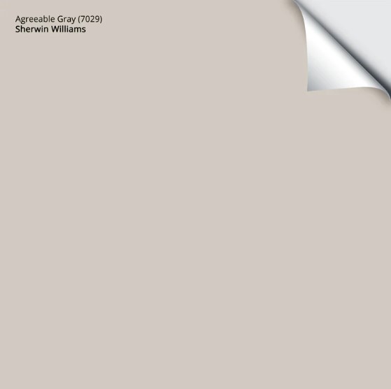
Get your Peel & Stick sample of Agreeable Gray HERE
For example, this next carpet has navy blue, but it also has an interesting light gray in the pattern that doesn’t cater hard to violet or green. In this case, Agreeable Gray is the perfect color…

As for its depth, Agreeable Gray has an LRV of 60, which is about as low as I would go for the average, reasonably well-lit space.
However, before you jump on the Agreeable Gray bandwagon (as many have), it’s not foolproof, ESPECIALLY if you’re gray really does cater to violet or pink undertones. For example, while Agreeable Gray is ‘okay’ in this next space, it doesn’t have the committed violet undertone that this LVP flooring would prefer…
Because of the warm violet-pink of the flooring, Agreeable Gray looks a touch green in comparison.
FULL Paint Color Review of Sherwin Williams Agreeable Gray
If Agreeable Gray sounds like the color for you and your home, sample and compare it to other shades in this LIGHT & LIGHT-MEDIUM GREIGE SAMPLER!
READ MORE
How to Update a Gray Room Without Repainting
How to Transition from Gray to Beige
How to Use Lighting to Warm Up Your Gray Room
Is Gray Still Trendy for Exteriors, Walls, & Cabinets?
Is Gray Flooring Still Trendy?
NEED HELP?
Check out my Online Paint Color Consulting!


This couldn’t have come at a more perfect time. We are in the process of house hunting and the amount of Gray flooring, walls, trim and often cabinets is mind boggling. I’ve always lived with warm tones and I’ve been wondering how I could possibly transition Gray if we end up buying one of these homes.
Will grab a cup of coffee and read the article thoroughly. I was so excited to see it that I had to get to comments first!!
Thank you!
WAHOOO, I’m so glad, as this is exactly why I wrote it – I hope it helps you with your home search/choice and gets you excited to play with your new home!
What about ballet white?
Yeaaaah, it can depend on your gray and its depth/undertones, but it’s worth at least sampling.
Glad I found this. I bought a condo (remodeled in 2023) that used gray LVP and gray cabinets in the kitchen. I never cared for the gray, but the condo was reasonably priced, remodled, and close to work.
Anyway, I’ve always been a sucker for wood furniture, so that’s helping to warm the place up a bit, but I’d like to add some more colors to the walls in the Blue or Green range. I’ve got no idea what would work tho and it seems like those colors won’t really work with the gray floor….Hmm.
Curse my millenial generation and their obsession with industrial/gray!