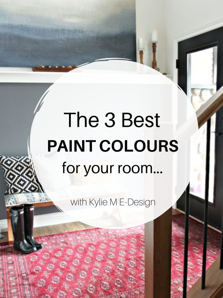
The Best Colors to ACCENT Gray Cabinets, Floors, & Countertops
COLORFUL shades to paint your walls
Gray, whether on flooring, tiles, countertops, or painted cabinets, is becoming a royal PITA (pain in the…) for those wanting to update their homes. That’s right, ‘update.’ Gray was all the rage from 2010 to 2020, and while it had a good run, it’s ready to retire its sneakers as trends lean warmer.
But gray finishes are tricky as they don’t easily shift into another gear or another year when it comes to suiting the ‘next best neutral’.
This post may contain affiliate links. If you make a purchase through links on our site, we may earn a commission.However, gray has more flexibility when it comes to COLORS—I’m talking about blues, greens, purples, and more!
In a world filled with white, beige, and gray, it’s easy to forget how many gorgeous colors there are – colors just begging to be slathered on your walls! This is why I’ve written this blog post.
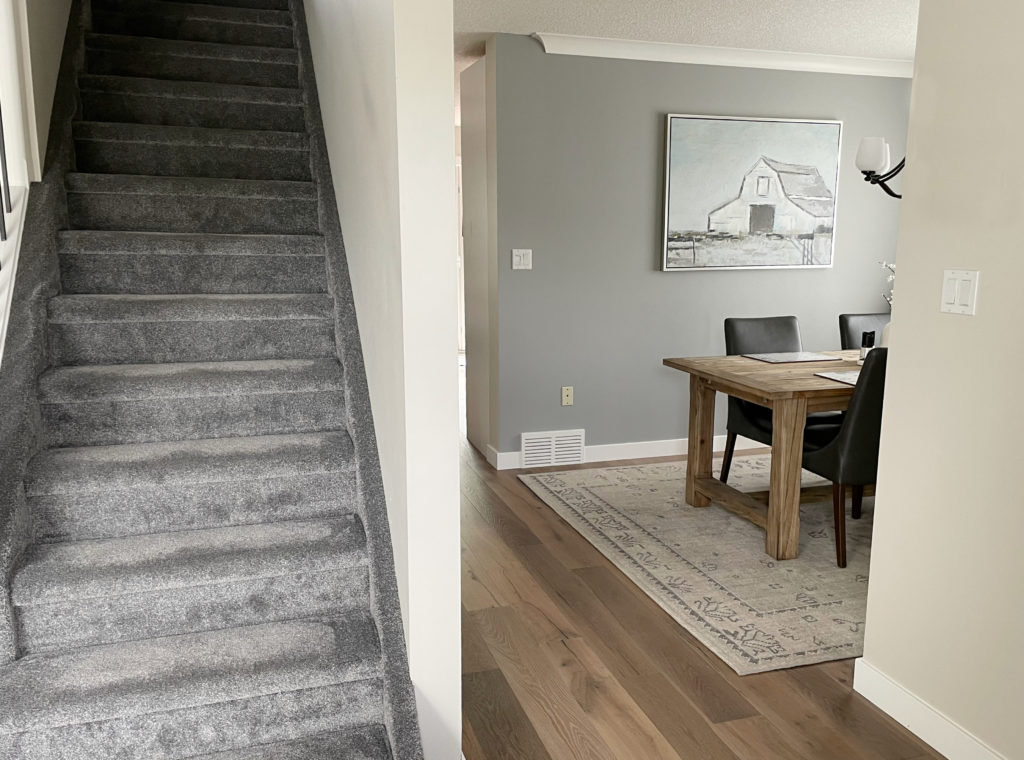
This wood floor has a graywash, making the wood look more violet-pink.
Let’s do a quick refresher on the undertones found in gray finishes…
- PURPLE is the most common undertone in 90% of gray finishes (including quartz counters, cabinets, laminate, tile, wood, carpet, etc.). You might not believe me, but it’s true!
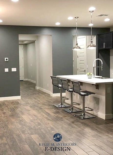
- GREEN pops up once in a while, but more often in carpet, rarely in wood/laminate/countertops, and the odd time in tile.
- BLUE is rare, for sure. Your best chance of finding it is in a gray tile, but even then, not often.
Schlong story short, due to popularity, I focus most of my color recommendations on gray finishes with purple-pink undertones as they’re, hands-down, the most common.

While my other blog posts contained a lot of ‘pre-info,’ this one gets right to the point. Just joking; you KNOW I love to hear myself talk (and type). Seriously though, two quick points…
1. This blog post focuses on DARKER colors to accent gray (there are a few lighter options near the end). You know where to find me if you’re looking for more specific advice or personalized colors.
2. I’m still helping homeowners update their 90s and Tuscan-style homes from the 2000s. It’s just NOW that my clients are approaching me with ideas to update their 2010-2020 gray-on-gray homes. For this reason, I don’t always have the AFTER images I need. However, I still have some kickass info and colors to share.
The above carpet has a green undertone, which isn’t nearly as common as purple.
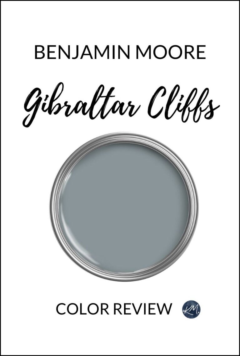
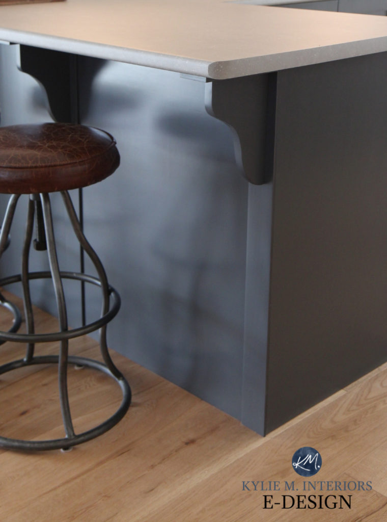
1. BENJAMIN MOORE ANCHOR GRAY 2126-30
Anchor Gray is near and dear to my heart, as I chose it for our last home. While we didn’t live there long (for many reasons), I fell in LOVE with how Anchor Gray looked with our light gray carpet (purple) undertone and stacked stone fireplace with its white and gray-violet hues.

Anchor Gray is a dark color often used as an accent color for feature walls (although I used it in the entire room as I loved it SO HARD). It has an LRV of 13.57, which makes it a very skookum medium-dark color. As for its color, some call it dark blue, others call it gray with a blue undertone.
If you ask this color cowgirl, it’s a straight-up blue-gray and it’s amazeballs.
My FULL Paint Color Review of Benjamin Moore’s Anchor Gray
2. SHERWIN WILLIAMS GRANITE PEAK SW 6250
Granite Peak is another color inspired by blue. One reason why it works with many gray finishes (with violet undertones) is that blue and violet can be closely related, especially when it’s a cool shade of violet (violet-blue) vs. a warm one (violet-pink). This said, Granite Peak can be a pretty complement to both!

Get your Samplize PEEL & STICK sample of Granite Peak HERE!
Granite Peak has an LRV of 14, making it a medium-depth blue-gray shade. It’s a good chunk lighter than Anchor Gray and flashes a bit more blue.
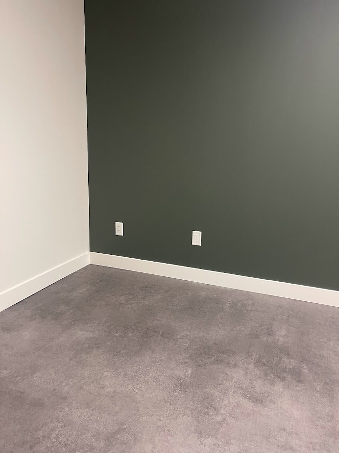
3. SHERWIN WILLIAMS GRIZZLE GRAY SW 7068
Grizzle Gray is one of the best colors to gray accent floors, countertops, or cabinets. Whereas the previous colors picked up varying degrees of blue, purple, and gray, Grizzle Gray grabs GREEN. So, rather than leaning into your finishes’ undertones, we’re contrasting them.
The flooring in this next home isn’t overtly gray, but it’s definitely grayed out with a vague, warm violet undertone. Notice how Grizzle Gray offers a soft contrast…
Thank you to my Online Color Consulting clients and readers who send in their AFTER PHOTOS – you make my colorful little world go round!
With Grizzle Gray, we’re offering a contrast in color that plays with the average gray surface’s purple undertones rather than leaning into them. However, because Grizzle Gray is a green-gray with a solid whack of gray, its approach isn’t shocking.
FULL Paint Color Review of Sherwin Williams Grizzle Gray
As for depth, Grizzle Gray has an LRV of 13, making it a medium-dark shade of green-gray.
Compare Grizzle Gray to other top shades with a DARK GRAY-GREEN SAMPLER BUNDLE!
4. BENJAMIN MOORE CHARCOAL LINEN (DIOR GRAY) 2133-40
If you love purple and want to add some drama to your room, I highly suggest Charcoal Linen (previously known as Dior Gray).
With the degree of purple in Charcoal Linen, your gray finish needs to cater to this undertone…for sure. This is because, more so than some others, Charcoal Linen is more of a gray with a STRONG purple undertone.
Benjamin Moore’s 10 Best Dark Gray Paint Colors
5. SHERWIN WILLIAMS CAST IRON SW 6202
If your gray leans a bit warmer (e.g., violet-pink undertones), a color like Cast Iron can be a beautiful contrast and complement it. Of course, if your carpet, cabinets, or tile has green undertones that are slightly warmer, it could be gorgeous, too, but those aren’t common.
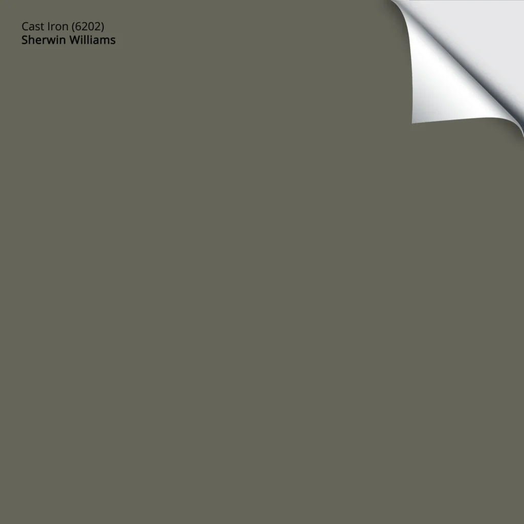
Get your Peel & Stick sample of Cast Iron HERE!
Cast Iron is a reasonably dark shade of green with an LRV of 12. If you compare it to Grizzle Gray (which I highly suggest you do, as your surface likely prefers one over the other), notice how Cast Iron seems a bit warmer and slightly more earth-toned and green than Grizzle Gray.
Check out these stunning shades: The Best Medium to Dark Green Paint Colors
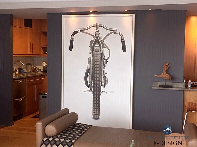
6. BENJAMIN MOORE CHEATING HEART 1617
Whether for an accent wall, island, or bathroom vanity (or an entire room), Cheating Heart is one badass shade of navy blue to accent gray interior finishes.
Coming in HOT with an LRV of 8.79, Cheating Heart packs a wallop and grounds a room with its muted blue hue. This is because it is one of the DARKEST shades of navy blue that’s heavily blended with gray-black.
Here’s a great shot of Cheating Heart looking bodacious and beautiful with this gray laminate countertop (concrete-look). I chose this combo for my sister-in-law’s home bar area because Cheating Heart is a stunner, and we wanted to save money with an affordable but cool-looking countertop.
My FULL Paint Color Review of Benjamin Moore’s Cheating Heart
7. SHERWIN WILLIAMS PEWTER GREEN
If you’re pining for some green, Pewter Green is one of the most popular colors to accent gray finishes. Its depth (LRV of 12) is the same as Cast Iron, but you’ll notice a slightly cleaner, committed approach to green.
The flooring in this commercial space is a gray sheet vinyl with a strong violet hue (made more violet-pink by the fluorescent lights)…
Any greens on this page are gorgeous for a ‘whole room’ approach, but are more commonly used as accent walls, kitchen cabinets/islands, and the inside of front doors.
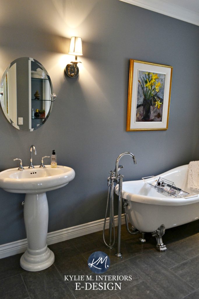
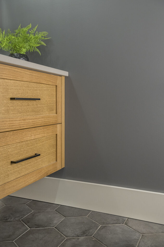
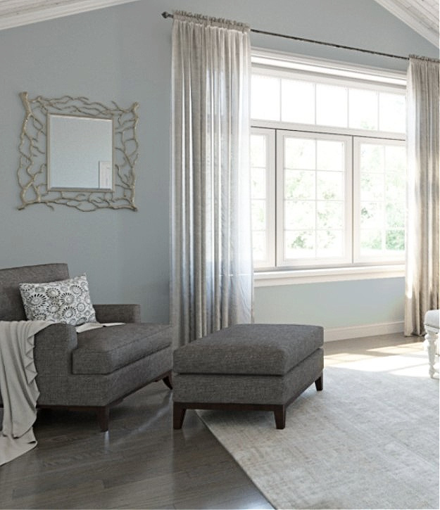
8. BENJAMIN MOORE STORMY SKY 1616
Stormy Sky is another shade I love, as I chose it for the powder room in our home! While my gray tile floor isn’t dated (but will be soon, thanks to its enlarged hexagon shape), its colors resemble those of many gray tiles from the previous decade.
How to Make a Cool Gray Room Look More Inviting
Because my tile floor is dark gray with violet-blue undertones, I wanted to pick those up on the walls—hence the choice of Stormy Sky. It was a toss-up between this and Gray 2121-10 (coming up next), but I loved how Stormy Sky committed a wink more to its colors.
Because our powder room is only 33″ wide and has no natural light, it’s VERY FRIGGIN’ HARD to get a good photo of it. Thankfully, HA Photography hopped over to help me out…
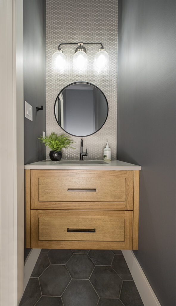
As for its depth, Stormy Sky’s LRV is 13.75, making it a medium-dark shade of gray-blue-violet.
Compare Stormy Sky to my other faves in this DARK GRAY (BLUE-VIOLET) SAMPLER BUNDLE!
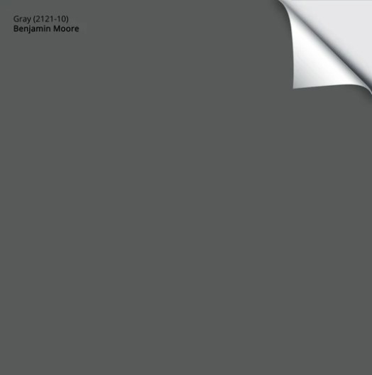
9. BENJAMIN MOORE GRAY 2121-10
I can’t even tell you how many times I’ve recommended Gray 2121-10 to my Online Color Consulting clients. Front doors, islands, accent walls, entire rooms—you name it, we’ve covered it in Gray.
Get your Samplize Peel & Stick sample of Gray 2121-10 HERE!
The key to ORDERING/finding Gray is always to include its number 2121-10. Otherwise, you’ll forever be searching for a Benjamin Moore Gray, of which there are dozens.
Gray has a WHOPPING LRV of 11.51—not as dark as Cheating Heart, but still darker than most of the previous shades. Gray is a wickedly gorgeous blend of gray, violet, and blue—more subdued than Anchor Gray and very similar to Stormy Sky.
Why sample both?
Sometimes, a wee shift in undertone, depth, or temperature makes one color the best choice over another.
Gray makes for a pretty badass accent wall!
Even better, compare Stormy Sky and Gray to other top shades with this SAMPLER BUNDLE!
WANT SOMETHING LIGHTER & BRIGHTER
What if you want some color on your walls but crave something a bit lighter? While I don’t have enough suggestions for a full blog post, here are a few to whet your whistle.
1. SHERWIN WILLIAMS UPWARD
While Upward can be a tough sell in many spaces, if your flooring has a slightly cool violet undertone or even violet-blue, Upward could fit in quite well.
This gorgeous violet-blue was Sherwin Williams’s Color of the Year for 2024. While it didn’t fly off the shelves, it can hit the spot with the right interior finishes (including some white).
Sherwin Williams simulator has a great gray wood floor example.
Just watch, as Upwards can be tricky. In some lights, it leans into a more violet-blue hue with a reasonably strong gray backdrop. In others, it can be surprisingly colorful! Sample carefully and compare it to similar shades to make sure it sits how you want it.
Paint Color Review of Sherwin Williams Upward
2. SHERWIN WILLIAMS RAINWASHED
Rainwashed is a beautiful blue-green paint color. Sure, some gray calms it down, but its glorious blue-green bones shine through, with blue being the boss of the two.
Rainwashed has an LRV of 59. When mixing colors like this with gray finishes, those with a bit more depth work most often compared to those with considerably higher LRVs, which is why I honed in on this gorgeous shade.

Get your PEEL & STICK sample of Rainwashed HERE!
In particular, I love the idea of Rainwashed with a medium-depth or darker gray floor. It doesn’t matter if it’s tile, carpet, LVP, or wood; if your gray flooring has the right violet undertone, this could be a beautiful contrast/complement to it.
My FULL Paint Color Review of Sherwin Williams Rainwashed
3. BENJAMIN MOORE ICE CAP 1576
If your gray surface is dark or light gray, Ice Cap can be an interesting partner. Ice Cap is a light-depth blend of blue, green, and gray, but it has much more gray than Rainwashed.
The tile floor in this bathroom is a light, warm gray/taupe. Notice how Ice Cap’s gentle blends step away from the tile floor and light gray countertop without creating too much contrast…

The Best Blue-Green Blend Paint Colors
Ice Cap has an LRV of 66.94, putting it in the middle of the light range. SMACK DAB is in my happy place! Again, just like Rainwashed, Ice Cap’s goal is to contrast the undertones in your gray flooring (assuming they’re violet) without being as colorful or purposeful as Rainwashed.
READ MORE
The Best White Paint Colors with Gray Floors
Popular Neutral Paint Colors with Gray Flooring
5 Ideas to Warm Up a Cool Gray Room
The Best Blue-Green Paint Colors
NEED HELP?
Check out my Online Paint Color Consulting