The 10 Best Interior Door Colors (Non-White) With White Trim
Elevate Your Interior Doors With These Popular Shades
While light-colored (non-white) interior trims and doors are trendy, many (myself included) are a bit intimidated by the thought of all that trim being painted non-white. Sure, it’s no biggie for a single room, but on a larger scale, it’s risky.
Why?
1. Darker trim and door colors are more flexible towards a range of coordinating wall colors. However, unless you have an older home or a unique one, dark trims aren’t currently trending; instead, light trims and doors are.
However, in the lighter range, especially those colors with LRVs around 60 (give or take 5-10), you’ll have a heck of a time finding a range of coordinating wall colors. Oh, you’ll find a handful—if you have small hands.
2. Let’s say you find your perfect paint color—sweet potato! But what happens when you want to change your wall color? You might not even be able to, as your trims/doors might only have one great wall color partner.

Now, let’s say you want WHITE TRIM with non-white interior doors.
White trim often leaves more room for a slightly darker door color (although you can still dabble in the lighter depths if you want).
Why is this a good thing?
The darker your door color, the better your chances of finding a fabulous color to match it! The thought of this gets this little Ginger darn excited, as I love to change things up; I don’t want to be limited by my trim or door color (which I currently am – lesson learned).
If I were starting again, would I still paint my cabinets and doors Revere Pewter or any light-depth paint color?
Hellllls no. Don’t get me wrong; I love them. However, they hold me back, big time. It’s white for me next time, baby. Or I’d keep the non-white to a few rooms.
This said, I’m a huge fan of choosing key interior doors—accent doors if you will—and have several around my home.
With this approach, you could paint your miscellaneous doors white and choose something special for a few key doors.

EXAMPLES OF ACCENT DOORS
- The inside of your front door
- The door going into your backyard
- French doors into a home office or den
- A door that goes into a family room or laundry room
With this approach, embracing a darker color or one with a bit more personality can be easier without feeling like it’s a scary, large-scale commitment.

Now, without further ado, let’s check out some badass and beautiful shades to get you started on your color journey!

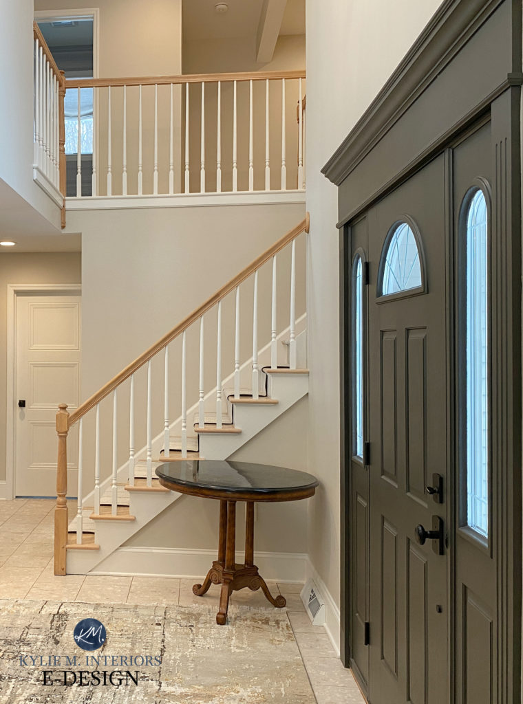
1. BENJAMIN MOORE REVERE PEWTER HC-172
As shown in my blog post on the best colors for non-white doors AND trims, Benjamin Moore Revere Pewter is a hot option. For this blog post, Revere Pewter is on the edge, as its LRV of 55 leaves you pretty limited for coordinating wall colors. This is one reason I darkened my doors (below) by 25%.

While the 25% wasn’t a dealbreaker, it didn’t hurt, and I like the wink more depth it offers.
My FULL Paint Color Review of Benjamin Moore Revere Pewter
COLORS TO COMPARE WITH REVERE PEWTER
You never want to sample one color, as it’s through comparison that you see the ebb and flow of undertones, depths, and temperatures. Here are some similar shades to compare with Revere Pewter
- Sherwin Williams Colonnade Gray for a bit more gray/less green.
- Sherwin Williams Amazing Gray for a bit more depth and greige.
- Benjamin Moore Rodeo is great if you want to lighten things up a bit.
2. BENJAMIN MOORE BOOTHBAY GRAY HC-165
Boothbay Gray is a gorgeous color, especially if you want a beachy or coastal vibe. This glorious shade of gray offers a good dose of blue-green, for a nice, balanced look.
Check out Boothbay Gray in this stunning foyer, with soft, warm white walls and wood flooring…

This beautiful home belongs to one of the owners of LeMel jewelry (which I love).
Boothbay Gray has an LRV of 42.6, winking pretty hard at the gray-blue medium depths without as much visual weight. This added depth offers so much more room for color coordination!
When it comes to interior doors (and trims), err on the side of a bit more neutral vs. a bit more colorful—too much undertone can be overwhelming.
The Best Blue-Gray Paint Colors
COLORS THAT ARE SIMILAR TO BOOTHBAY GRAY
Oh, where do I even START? There are so many, but here are a few of my favorites…
- Sherwin Williams Gris is similar to Boothbay Gray but has a bit less undertone.
- Sherwin Williams Mineral Deposit is super similar but has a wink more green in it.
- Benjamin Moore Puritan Gray picks up what Boothbay Gray is a throwin’ down, with a bit more depth.
Or, to make your life easier, check out my CURATED COLOR BUNDLE. (I made these for every color family & depth—just ask!)

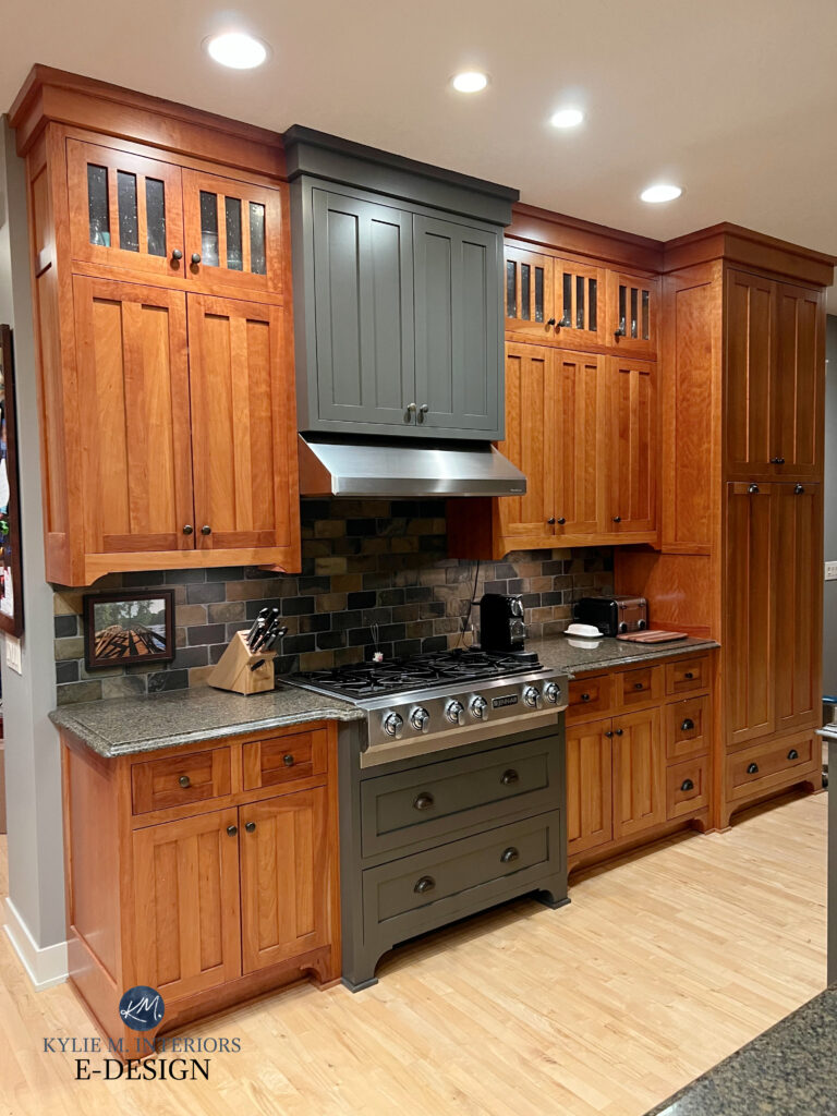
3. BENJAMIN MOORE PASHMINA AF-100
I’m obsessed with Pashmina. Not only does one look beautiful wrapped around my neck, but it also looks gorgeous on doors, cabinets, walls, and trim. I wanted to use it on the board-and-batten in one area of my home, but it doesn’t jibe with my Revere Pewter doors (ahem, again, they’re a bit limiting).
Pashmina is a soft, medium-depth greige that caters more towards beige than gray. Along with a subtle green undertone, Pashmina has an LRV of 44.2, so it has more meat on its bones than Revere Pewter.
I rely 99% on photos from my Online Color Consulting clients, readers, and friends. I don’t always have the exact image I need to show an idea, but I have some great info!
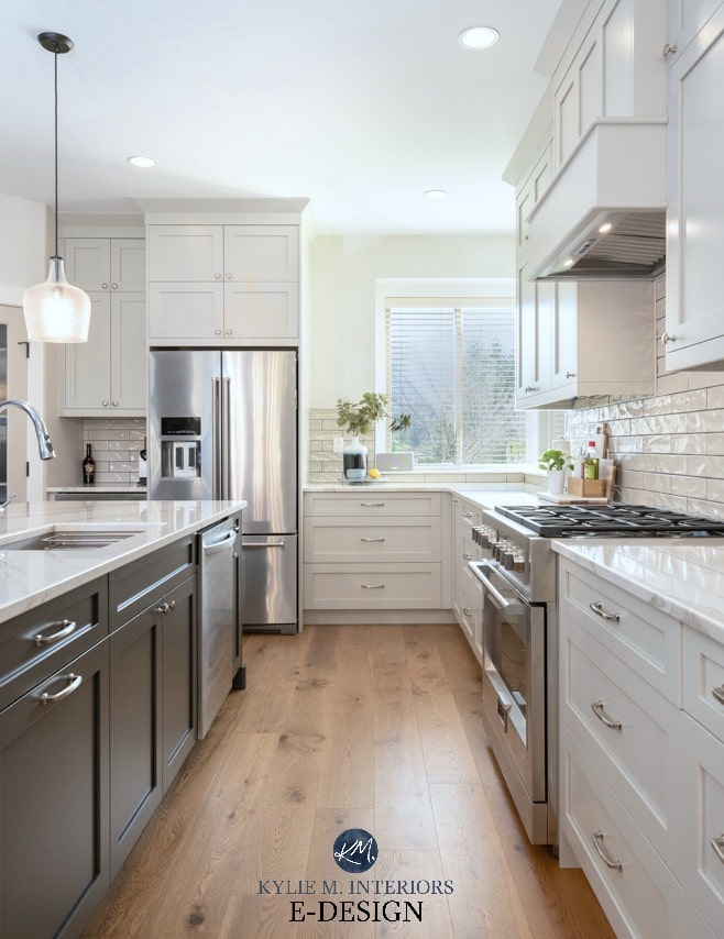
Here’s Pashmina on kitchen cabinets (below). The best paint finish for cabinets and interior doors is satin, so seeing it in this kitchen gives you a good idea of how it can settle…
COLORS TO COMPARE WITH PASHMINA
Again, comparison is one of the most critical parts of your color-picking journey—sample and compare! Few colors compare to Pashmina, so it’s not about finding similar shades but about showing you colors that I’d sample with Pashmina for my own home.
- Sherwin Williams Balanced Beige is along similar lines but is warmer.
- Benjamin Moore Stone Hearth (which is similar to Balanced Beige but a bit tweaked).
- Sherwin Williams Anew Gray is grayer and softer than Pashmina.
- Sherwin Williams Amazing Gray is probably the closest comparable…but it still ain’t that close.
4. SHERWIN WILLIAMS DOVETAIL 7018
If you’re looking for a happy medium between the light and dark worlds, Sherwin Williams Dovetail could be it. Dovetail is a medium-depth shade of warm gray, between the equally popular Sherwin Williams Gauntlet Gray (darker) and the lighter Acier.
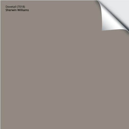
Get your Peel & Stick sample of Dovetail HERE!
One thing I love about Dovetail is its lack of commitment. Many warm grays commit to either purple or green undertones – not Dovetail.
It’s like the Hugh Hefner of the gray world – dating a range of undertones without committing to any.
This means it can be super flexible and easy to coordinate with.
Paint Color Review of Sherwin Williams Dovetail
Here’s Dovetail compared to a wide range of colors, many of which can be awesome interior door colors…
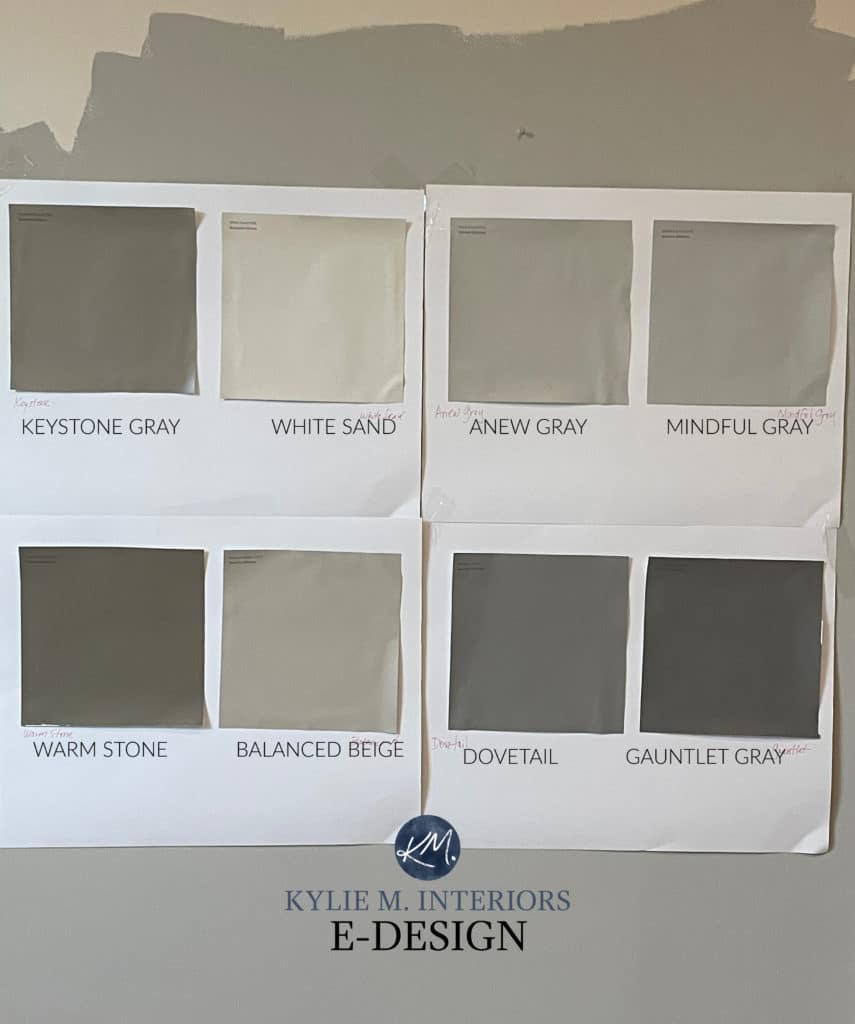
Keystone Gray | White Sand (not good for doors) | Anew Gray | Mindful Gray | Warm Stone | Balanced Beige | Gauntlet Gray
5. SHERWIN WILIAMS KEYSTONE GRAY
It was a toss-up between Keystone Gray and Mega Greige. However, with its bit more depth, Keystone Gray is a bit more versatile when coordinating with wall colors (but you can check out both, fo sho).
Keystone Gray is a medium-depth greige-taupe. This means that, unlike legit taupes that commit to violet-pink undertones (like Perfect Greige) or legit greiges that commit to green undertones (Felted Wool), Keystone Gray hovers in the middle. With its LRV of 29, she’s skookum and opens you up to some great coordinating colors for your walls.

Get your Samplize Peel & Stick of Keystone Gray
WHAT COLORS ARE SIMILAR TO KEYSTONE GRAY?
Let’s do some sampling and comparing!
- Sherwin Williams Mega Greige is great if you want a slightly lighter color with a wink more gray.
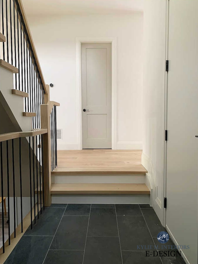
- Benjamin Moore Kingsport Gray is a darker, warmer approach to greige-taupe with a minimal undertone. It’s warmer than Keystone Gray, and I have mad love for it.
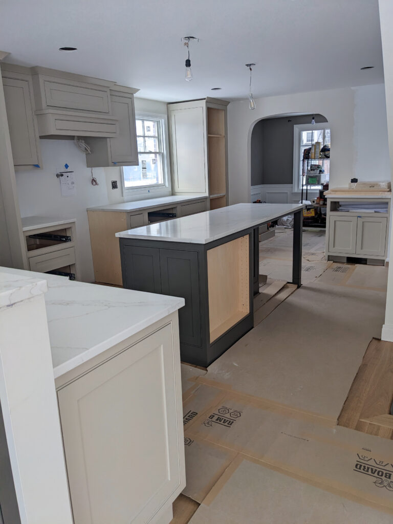
Here’s Kingsport Gray on a bathroom vanity, just to get a feel for it…

Paint Color Review of Sherwin Williams Keystone Gray
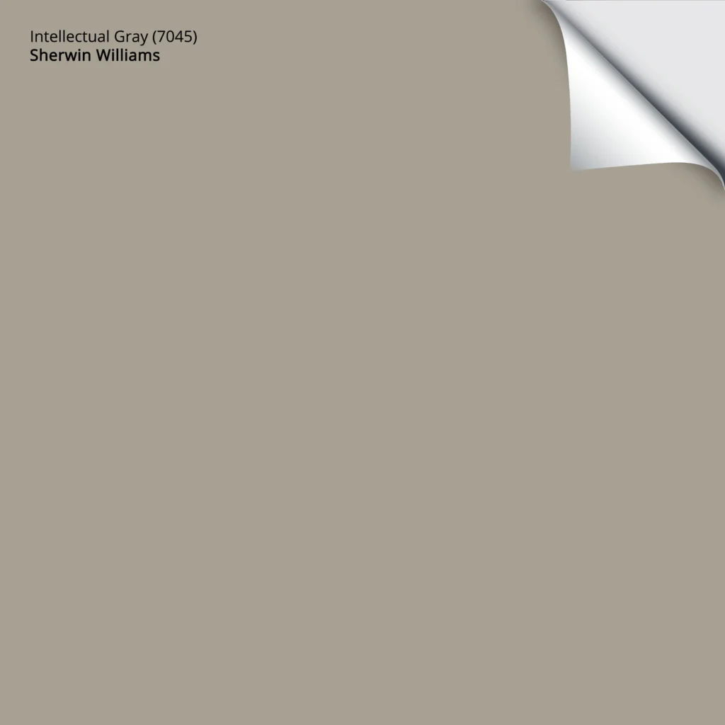
6. SHERWIN WILLIAMS INTELLECTUAL GRAY 7045
Sherwin Williams Intellectual Gray is one of my favorite neutrals (this month, anyway). With its soft warmth and undertones, it’s an awesome option for interior doors.

Intellectual Gray has a soft, organic, earth-toned green undertone. Again, being a bit darker, with its LRV of 36, it allows for easier coordination with a range of wall colors, especially soft beiges, tans, and warm off-white paint colors.
The Best Greige Paint Colors – Light to Medium
Here’s your Peel & Stick sample of Intellectual Gray…
While you can use the above colors on ALL of your interior doors, if you’re painting one or two accent doors, you might want to level things up in the color department, so let’s do that…
DARKER, MORE COLORFUL SHADES FOR INTERIOR ACCENT DOORS
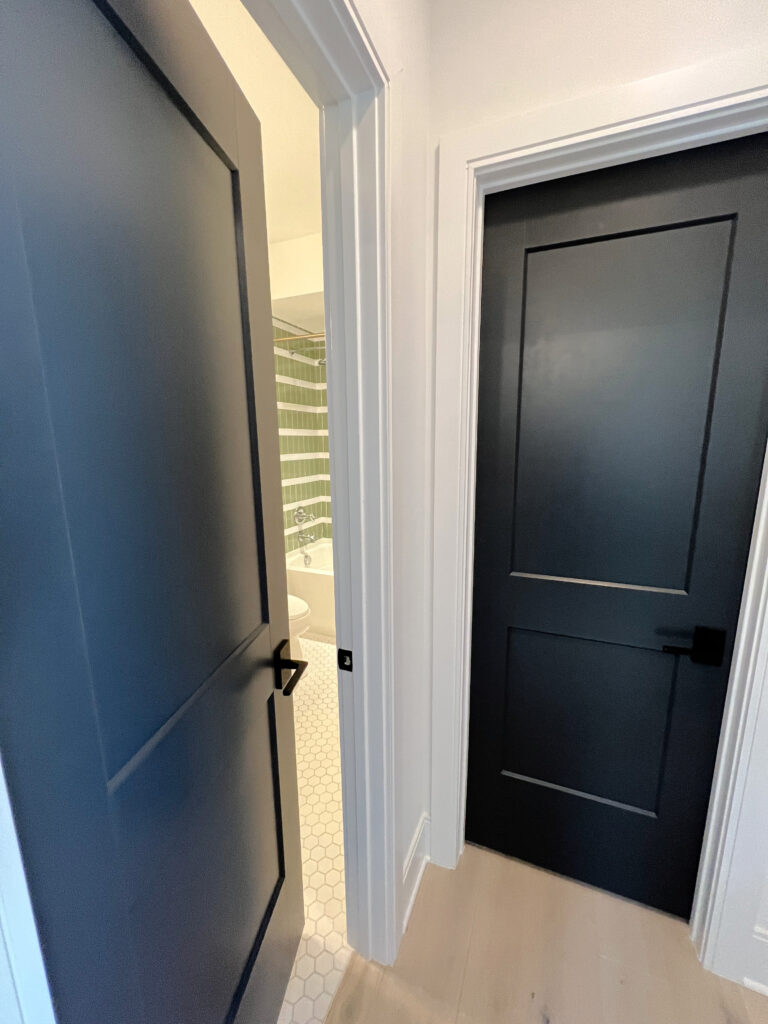
If you’re feeling brave but not so brave that you want to paint ALL of your doors, these colors are great accents for a few special doors in your home.
This said, if you love a dramatic, moody, or contrasting look, these colors can work on all of your doors – you do you, boo!
7. SHERWIN WILLIAMS STILL WATER 6223
While Still Water is way too overwhelming for every interior door, it’s friggin’ gorgeous for one or two key doors. This is because Still Water is like a dark teal, which means it’s a blue-green blend.
Now, some teals can be pretty shocking (others are equally as gorgeous) – not this one. Still Water has some gray, which calms it down, making it a great option for a great set of French Doors…
As for depth, Still Water has an LRV of 10, so it’s dark, but doesn’t wink at the black world.
The Best Teal (blue-green) for Cabinets & Islands
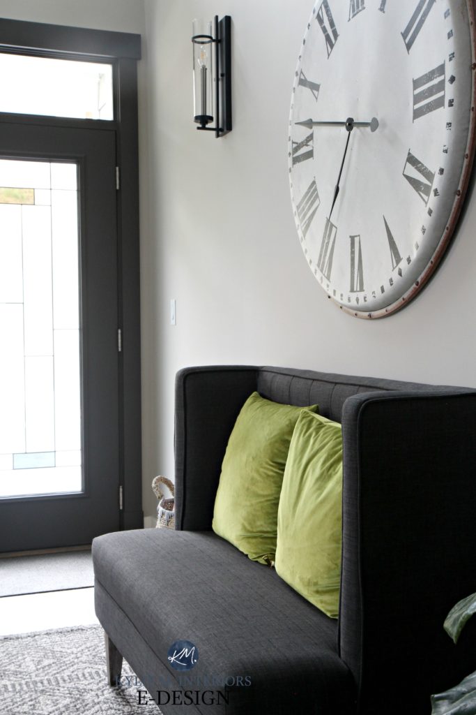
8. BENJAMIN MOORE CHEATING HEART 1617
Benjamin Moore’s Cheating Heart is a wickedly pretty, dark shade of blue. Sure, it has a ton of gray and black in it, calming it down, but there’s still a reasonable degree of blue. For this reason, I suggest painting a few key doors rather than EVERY door – no one wants to be a door whore.
I chose Cheating Heart for two interior doors—one leading into my home office and one to our family room…
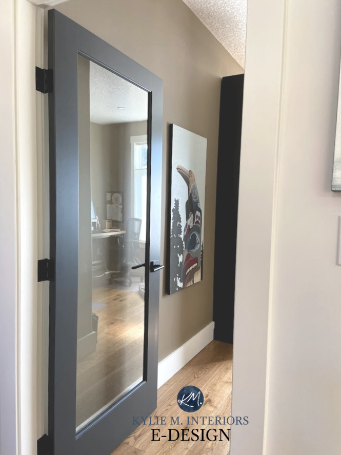
With a color like this, more isn’t always better. Sometimes, a little says a lot!
Cheating Heart has an LRV of 8.79. That doesn’t seem much darker than Still Water’s LRV of 10, but Cheating Heart has less color, making it seem a bit darker. With colors like Cheating Heart, the addition of black hardware really showcases their color/undertone.
Paint Color Review of Benjamin Moore Cheating Heart
COLORS THAT ARE SIMILAR TO CHEATING HEART
While Cheating Heart has my heart, it’s also important to sample and compare.
- Benjamin Moore’s Wrought Iron is SUPER similar, with just a bit less blue, a touch more violet, and more black-gray.
- Sherwin Williams Cyberspace is for those who want more commitment to blue without hitting the classic look of Benjamin Moore Hale Navy.
Benjamin Moore Wrought Iron painted interior doors
On the other hand, if you’re still thinking about painting your trims along with your doors, you might want to check out this blog post, too!
The Best Non-White Trim AND Door Colors
9. SHERWIN WILLIAMS URBANE BRONZE 7048
Son of a biscuit, is this ever an awesome color. Urbane Bronze has been rockin’ the color world on walls, accent walls, cabinets, islands, painted front doors – inside and out, and more, so it’s no surprise that it’s a great option for interior doors.
Of the dark colors, it’s the one I’m most likely to paint on all of my interiors doors.
Urbane Bronze is a rugged and rustic, uber-dark shade of greige. This means it’s a warm paint color that’s a gray-brown blend with a green undertone. Urbane Bronze can be a gorgeous partner for those leaning into current, warmer trends, including trendy warm off-white paint colors and medium-depth stone-inspired shades.
Here’s Urbane Bronze inside a front door. Notice how the trim is also painted Urbane Bronze, which is a cool look for some front door/trim combos…
My FULL Paint Color Review of Sherwin Williams Urbane Bronze
Would I paint ALL of my interior doors Urbane Bronze? Personally, no, but that’s only because I already have it on my kitchen island and stair railings.
You can have too much of a good thing (except Ryan Reynolds, wine, and Cornuts – there’s never enough).
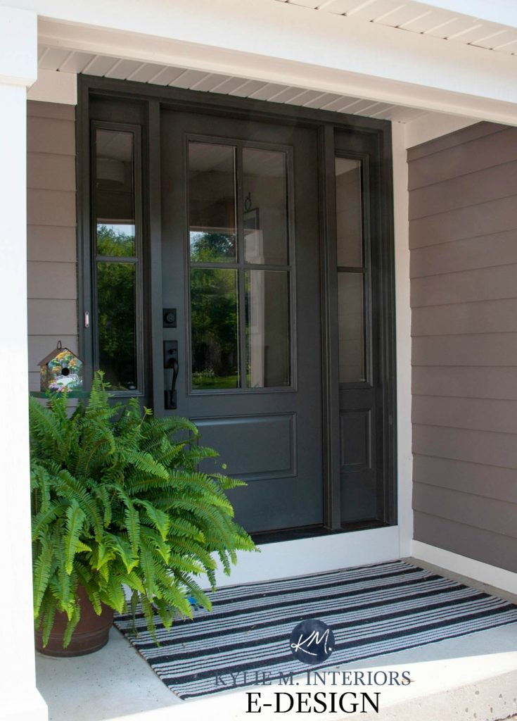
10. SHERWIN WILLIAMS IRON ORE 7069
Previous trends showed us a lot of black doors (and exteriors…yikes). While many are still picking up this timeless (and trendy) color on their doors, they’re opting for a softer look, which is where Sherwin Williams Iron Ore comes in handy.
Compared to a more legit shade of black (Sherwin Williams Tricorn Black), Iron Ore is a soft shade of black with a more gentle approach. This is because Iron Ore has an LRV of 6, which is a decent shift compared to Tricorn Black’s LRV of 3.

Iron Ore does the job of black without as much sharpness.
Along with this softness, Iron Ore has undertones, specifically green, but the very odd time I’ve seen a wee flash of blue (rare). You’re a bit more likely to see these undertones if you use black door hardware, as it will contrast and show off Iron Ore’s innards.
For example, here’s Iron Ore on the outside of a front door with black hardware…ain’t she purdy?
My FULL Paint Color Review of Sherwin Williams Iron Ore
The 3 Best Black Paint Colors for Front Doors
COMMON QUESTIONS…
While I try to cover ideas and tips in the above info, you might still have questions, including…
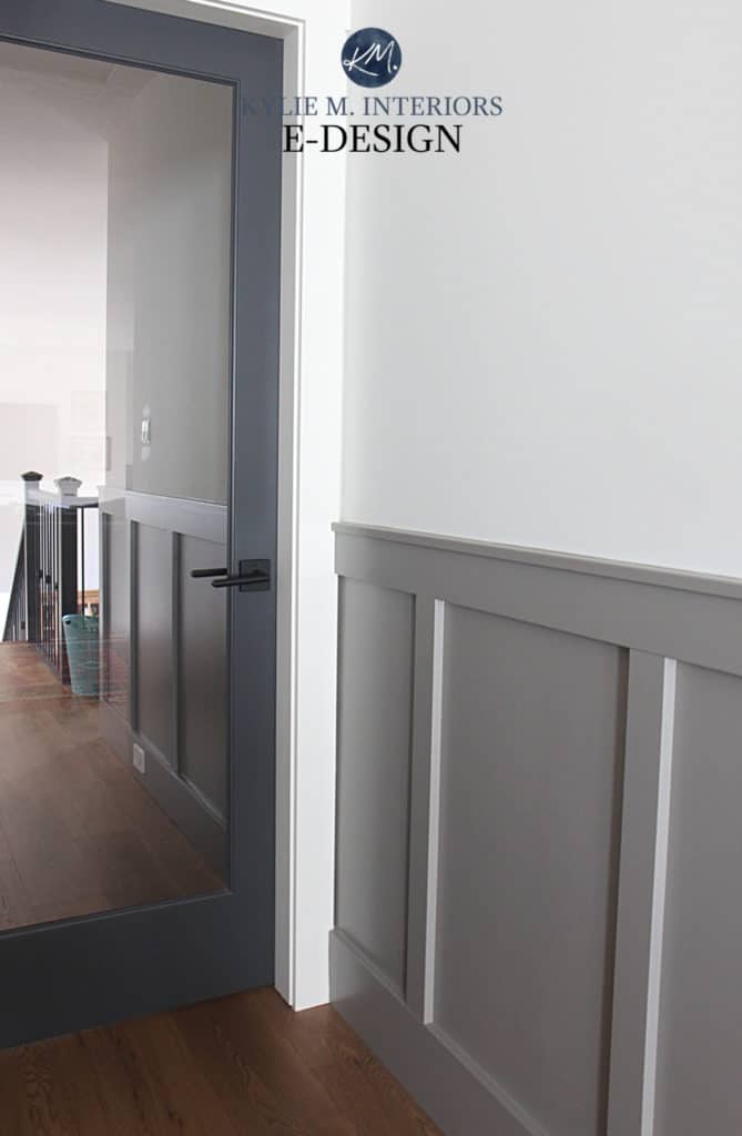
IS PAINTING YOUR WALLS & TRIMS THE SAME COLOR A GOOD IDEA?
It depends – there is no 100% answer.
- If you’re painting your walls white, then yes, painting your trim (and doors) the same white is the BEST idea.
- If you’re painting your walls and an off-white or light-depth paint color, consider how flexible this color is. Not every light color (even some neutrals) is easy to coordinate with, should you want to change things around in the future.
- For medium- to darker-colored walls, painting the trims and doors the same color really hits the trendy, color-drenched look. While this can be timeless in older, historic homes, it’s only a trend for the average space.
SHOULD TRIMS & DOORS BE PAINTED THE SAME COLOR?
- If you’re painting both of them white, you bet your boot scootin’ booty they should be the same color – absolutely.
- If you’re painting your trims white and want non-white doors, it can look gorgeous – they don’t HAVE to match. However, consider that this is currently a trend and isn’t as timeless as white doors.
READ MORE
The Best Medium-Dark Paint Colors for Interior Doors & Trims
The Best Off-White Cabinet Paint Colors
The Whites & Off-Whites I’d NEVER Paint My Trim or Cabinets
Paint Colors for the Inside of Your Front Door
Get the best paint color advice…
Check out my ONLINE PAINT COLOR CONSULTING!