
The Best Teal Paint Colors for Cabinets, Islands, & More
POPULAR BLUE-GREEN HUES FOR YOU & YOUR CABINETS
Teal is like the love child of blue and green, letting you choose your level of commitment to each color and the degree of overall intensity you want to see. While teal isn’t the most popular cabinet color (navy blue and dark green are), it has a cult-like following, as those who love teal are obsessed with it.
Teal is known by many names, including aquamarine, blue-green, azure, and turquoise. But no matter what you call it, this bodaciously badass, blue-green blend can be beautiful on cabinets, especially islands and bathroom vanities. And let me tell you, Benjamin Moore, Sherwin Williams, and Farrow & Ball have you covered in teal paint – head to toe.
To paint your island or cabinets teal, your kitchen would ideally have the following:
- White or wood main cabinets.
- White, black, off-white, gray, or butcher block countertops are the most popular choices with teal cabinets.
- White subway tile or a backsplash/floor tile with green/teal in it that is the same type of green/teal as your island color.
- There are a few granites from the ’90s and early 2000s that can work well (update ideas for that era HERE)
- If your countertop has a mix of warm tones, the chances of pulling off a brighter teal are pretty slim.
The Best Blue-Green Blend Paint Colors

So stinkin’ gorgeous. I’m talking about the paint color…of course.
By the way, my clients and readers know me so well that they send me ‘after’ photos showing my two main obsessions—paint colors and Ryan Reynolds (don’t worry, Tim is fully aware – Ryan is my hall pass). Just toss me a bottle of Aviator Gin (as that’s his line of alcohol), a lime, some tonic, and a bag of Doritos, and this little Ginger is pretty darn happy to sit and stare at this photo for hours – for the paint color, of course.
Anyway, back to teal.
How do you know if teal is the right color for your kitchen cabinets? You either hire me or you SAMPLE, SAMPLE, SAMPLE! Now, let’s get this color party started…

1. BENJAMIN MOORE DARK PEWTER 2122-10
If you can’t decide whether to commit to a strong teal or want a bit more softness, Dark Pewter could hit the spot. In fact, it could hit the spot so good that your hubby will beg to know its tricks (wink wink).
With an LRV of 10.79, Dark Pewter offers a very modest approach to teal with less color and more gray. This fabulous shade is often missed as it’s tucked in the Color Preview Fan Deck. However, in the right kitchen, it can be the perfect touch.
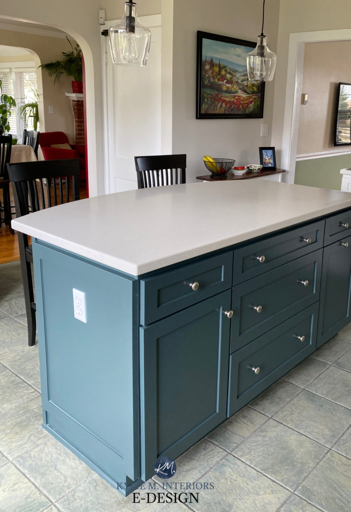
Dark Pewter is often found on front doors, but as shown above, a kitchen with some teal finishes can look great with a blue-green island! This gorgeous muted teal looks great when sandwiched between the off-white Corian countertop and mixed-color tile floor (that has teal in it, which is why it jibes).
COLORS THAT ARE SIMILAR TO DARK PEWTER
- Sherwin Williams Still Water (coming up shortly) is an awesome color to compare with Dark Pewter. You might like how Still Water hits ‘teal’ a bit harder, or it might show how much you really do love the muted, slightly more green look of Dark Pewter.
- If you’re looking for an even more muted look with some gorgeous blue-green undertones, check out Sherwin Williams Roycroft Pewter (shown on the above island). To call it teal is a stretch of the imagination, but you never know what you’ll fall in love with.
2. BENJAMIN MOORE BELLA BLUE 720
Bella Blue is as pretty as she sounds. With a perfect blend of blue, green, and gray, Bella Blue has just the right saturation to make a statement without overwhelming the average palette. However, because I only use photos from my readers and Online Color Consulting clients, I don’t always have the images I need. Instead, check out how beautiful it looks on this front door…
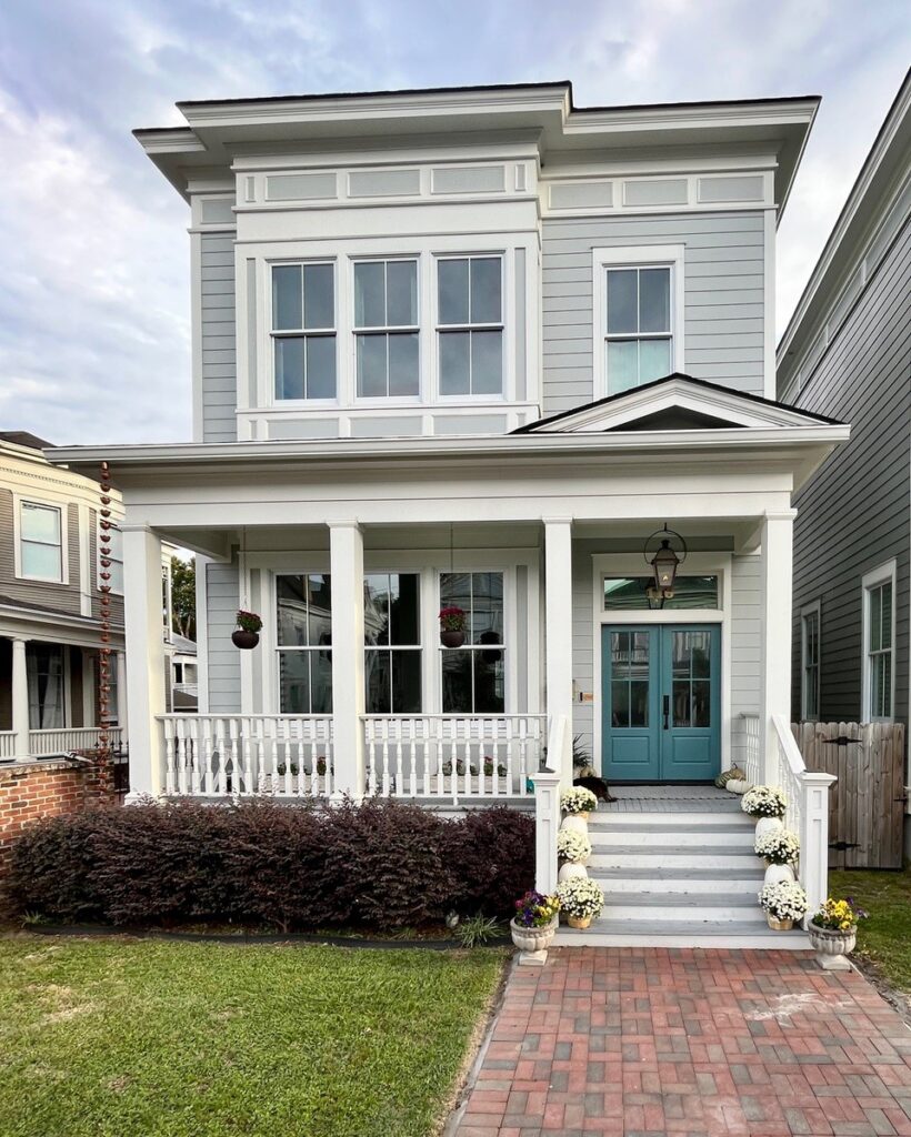
Front Door Paint Colors Even Your HOA Will Love
Bella Blue caters to blue but overall settles as a reasonably well-balanced teal. With an LRV of 17.5, it tiptoes into the medium-dark range without adding too much visual weight.
3. BENJAMIN MOORE KITTY GRAY 1589
With its blend of green, blue, and gray, Kitty Gray is a great way to make a statement without going remotely over the top with color. While Kitty Gray does cater a bit more to green, it’s heavily grounded by gray and has blue mixed in for moderation. Compared to the others, Kitty Gray is more neutral, but it doesn’t quite dip its toes in the ‘solid gray’ pool, which makes sense, as cats don’t like water.
Ideas to Update Your 1990s Bathroom
If you like Kitty Gray’s approach but want a slightly lighter color, check out Benjamin Moore Gray Pinstripe, a beautiful hybrid of blue, green, and gray with an LRV of 22. If you like to see a commitment to color, this might not cut the mustard, but if you prefer a passive approach, it could be right up your alley.
4. SHERWIN WILLIAMS DEEP SEA DIVE SW 7618
Deep Sea Dive is not for the faint of heart. While it’s not shockingly colorful, it offers more commitment than the previous shades.

The Best White & Off-White Quartz Countertops
Deep Sea Dive has an LRV of 10, making it a reasonably dark color without winking at the blackish end. Just LOOK at its saturation – it’s amazeballs, to say the least.
COLORS THAT ARE SIMILAR TO DEEP SEA DIVE
While no colors quite compare, there are a few worth trying!
- For more color and intensity, check out Benjamin Moore’s Bermuda Turquoise, a shockingly beautiful (and colorful) take on teal.
- If you want a color with more depth but a similar approach, check out Sherwin Williams Mount Etna.
5. FARROW & BALL INCHYRA BLUE No.289
While Farrow & Ball’s colors might not get the attention that Benjamin Moore and Sherwin Williams do, DAMN, they have some pretty shades. As far as blue-green-gray blends go, Inchyra Blue is right up my teal-tinted alley with its titillating tints.
Inchyra Blue is a muted take on teal, with a reasonable but not overpowering gray foundation calming it down. While I don’t have any photos from my clients or readers of Inchyra Blue in action, you can get a sample delivered to your front door in one day!

Get your Samplize Peel & Stick sample of Inchyra Blue HERE!
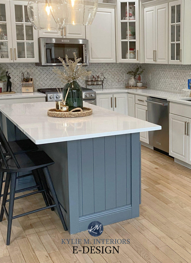
6. SHERWIN WILLIAMS RIVERWAY SW 6222
My favorite of the bunch (yes, I play favorites) is Riverway, a gorgeous approach to teal. With enough blue and green to make a point but a solid dose of gray for good measure, Riverway calls the shots without being overly bossy…
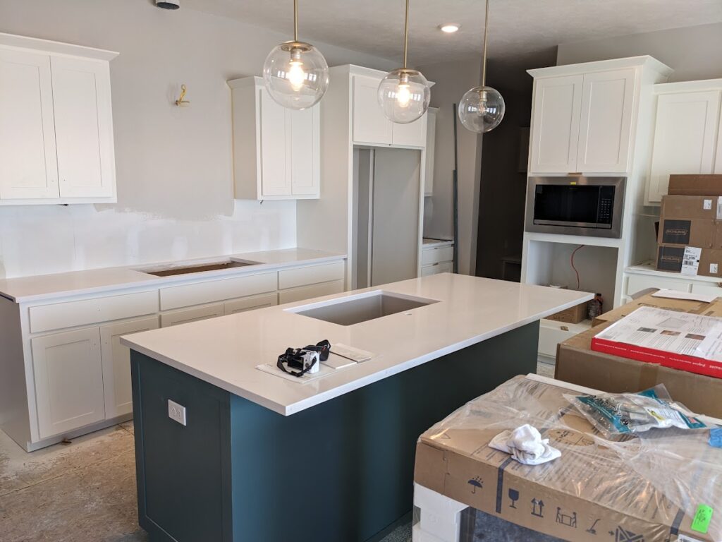
Riverway looks darker in the above image as the boxes block the light from hitting it. If you have a room with low lighting or no natural light, sure, it can look darker, but it usually looks lighter and brighter than this.
COLORS THAT ARE SIMILAR TO RIVERWAY
What if a lighter, darker, or more colorful option is better for your finishes? You won’t know until you sample and compare!
- Sherwin Williams Moody Blue is KILLER and a great color to explore.
- For the look of Riverway but with more gray, take a look at Benjamin Moore Knoxville Gray.
- And, of course, check out its darker version, Still Water, which is coming up next!
- If you realize this strong of a blue-green blend isn’t for you, you might want to embrace a more green-committed hue like Sherwin Williams Rocky River.
7. SHERWIN WILLIAMS STILL WATER 6233
If I had to pick a dark teal RIGHT NOW with a good chance of working on the average kitchen island (or front door), it would be Still Water.
Why?
While I love the overall balance and depth of the previously mentioned Riverway, Still Water’s depth can make it more flexible toward interior finishes, especially ones that aren’t naturally inclined toward a blue-green blend.

COME TO MOMMA! Again, talking about the paint color (obviously…)
As you can see, Still Water approaches teal in an obvious but not overwhelmingly colorful way.

The 13 Best White & Off-White Quartz Countertops
COLORS THAT ARE SIMILAR TO STILL WATER
If I’ve said it once, I’ll say it again (and again): COMPARE, COMPARE, COMPARE!
- Farrow & Ball Inchyra Blue (listed previously) is SUPER similar to Still Water and a great comparison.
- You’ll want to compare Still Water and the previously mentioned Benjamin Moore Dark Pewter.
- You can also order a sample of Sherwin Williams Riverway to see which depth best suits your finishes (and your tastes).
Now, if you’re more of a ‘go big or go home’ teal-lover, you might be looking for more colorful shades. I don’t have clients who use brighter teals often, so I don’t have images to show you, but I still have the information you need!
8. FARROW & BALL VARDO No.288
If you want a little kick in your teal pants, you’ll love Vardo. Whereas the previous shades approach teal more tentatively, Vardo makes no bones about it—it’s teal and coming for you and your island.
With a strong commitment to blue and green, Vardo is a great example of the ‘average teal paint color.’ Of course, this can be open to perception as you might see teal as more blue, green, or gray, but overall, this one hits the main points.

Get your Peel & Stick sample of VARDO HERE!
COLORS THAT ARE SIMILAR TO VARDO
- You can’t explore Vardo without checking out Sherwin Williams Grand Canal (which is coming up next).
- For more blue and less green, look at Benjamin Moore’s Calypso Blue.
9. SHERWIN WILLIAMS GRAND CANAL SW 6488
If the above colors look a little lame, you might be looking for a brighter, bossier shade of teal. Look no further than Grand Canal. This glorious blue-green blend packs a punch without being fluorescent or obnoxious (although that could be open to perception.) Grand Canal isn’t for the ‘average home’ because the average home’s finishes can’t handle a color that’s this clean – sample carefully!

Get your Samplize Peel & Stick sample of Grand Canal HERE!
Sherwin Williams Cloudburst is like a lighter take on Grand Canal, but equally as fussy with its surrounding finishes. Don’t get me wrong—these colors are wickedly gorgeous; just make sure they suit your interior finishes!
This next photo isn’t great, but you at least get the general idea of what Cloudburst looks like…

The Best Medium to Dark Teal (Blue-Green) Paint Colors
COLORS THAT ARE SIMILAR TO GRAND CANAL FOR COMPARING
Never pick a color all on its lonesome – compare it to at least 3-4 similar shades.
- Benjamin Moore Calypso Blue is a great blue-green blend that caters to blue more than Grand Canal.
- Benjamin Moore Rendezvous Bay is like a lighter, bluer version of Grand Canal (similar in depth to Cloudburst.)
- If you’re looking for a color that’s a bit darker than Grand Canal with similar intentions, check out Sherwin Williams Really Teal, which is exactly what its name says (for once).
The Best Blue-Green Blend Paint Colors
10. SHERWIN WILLIAMS PEACOCK PLUME SW 0020
If you want to shake your tail feathers with a more moderate teal – both in depth and color, take a gander at Peacock Plume (it’s also great as an accent wall color). While the more popular teal cabinet colors are usually darker, Peacock Plume is a great happy medium, both depth-wise and color-wise!

Get your Samplize Peel & Stick sample of Peacock Plume HERE!
Peacock Plume has an LRV of 27, putting it almost smack-dab in the middle of the ‘medium-depths.’ And while it’s definitely ‘color-forward,’ it has a reasonable degree of gray to calm it down. This doesn’t make it a real earth tone, but it takes the edge off its potential intensity.
COLORS THAT ARE SIMILAR TO PEACOCK PLUME
- Benjamin Moore Hemlock picks up what Peacock Plume throws down but grabs a bit more blue on the way.
- If Peacock Plume turns out too colorful, check out Sherwin Williams Jasper Stone for a grayer (slightly greener) take on teal.
- Benjamin Moore’s Fort Pierce Green and Boca Raton Blue are great colors to compare with Peacock Plume—each offers a slightly different take on a tantalizing teal!
READ MORE
The Best Medium to Dark Teal (Blue-Green) Paint Colors
The Best Dark Blue & Green Paint Colors for Cabinets
Best Off-White & Light-Depth Paint Colors for Cabinets
The Best Gray & Greige Paint Colors for Islands & Cabinets
Trendy & Popular Paint Colors for your Kitchen Island (A Mixed Bag)
NEED HELP?
Check out my Online Color Consulting packages; I’d love to help!


Once again you nailed it !! I read read read everything and LOVE you’re humour .. especialy the wood on wood lmao, great Saturday morning humor! I’ve been searching for an answer to no avail so here goes 🙂 I need to paint a little white kitchen island butcher block top we bought off wayfair .. its for my 26yr old daughter, moving into an ultra modern, ( 2023 built ) apartment with tons of windows 18th flr. The upper cabinets white but the floor and lowers ( pottery barn inspired ) are wood toned with a subtle pinkish hue .. all open space.. She wants blues, I LOVE greens ( Stillwater, Dark Olive Dark Pewter, Chimichurri ) .. but I keep leaning to Tricorn Black because here’s the question .. do blues and greens jive with pink undertones . I thought I’ve read somewhere where most interior finishes humor a pink undertone so how do we make these greiges/blues/greens work ? I think as long as the color is darker ? Is that the key? So sorry for the wordy wordy question 🙁 Thank you for your AMAZING work!
What color are the walls in the Stillwater bar photo?