
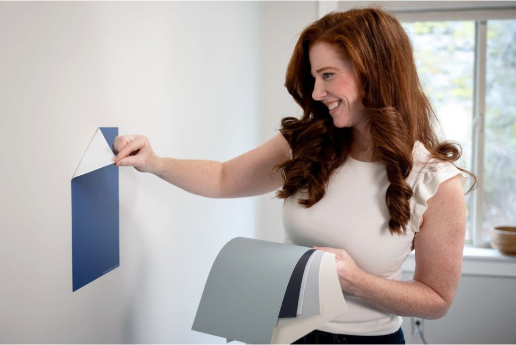
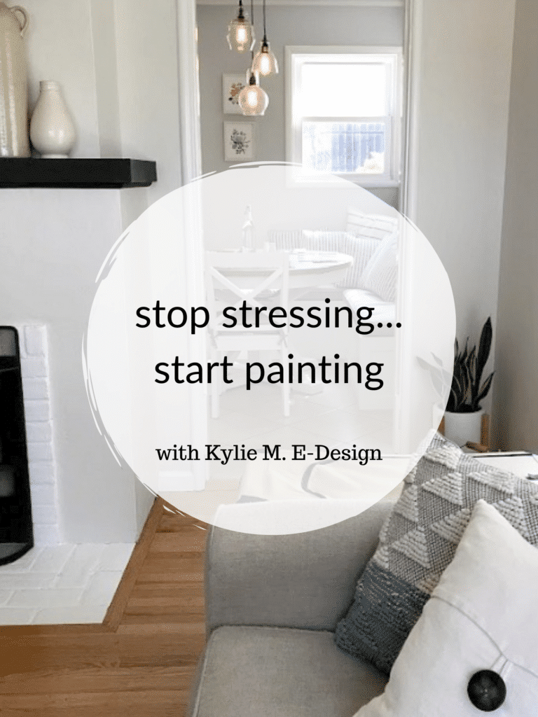
Paint Color Ideas to Update Your Outdated 2000s Home (PART 1)
The Best Paint Colors for Walls, Cabinets, Doors, & More
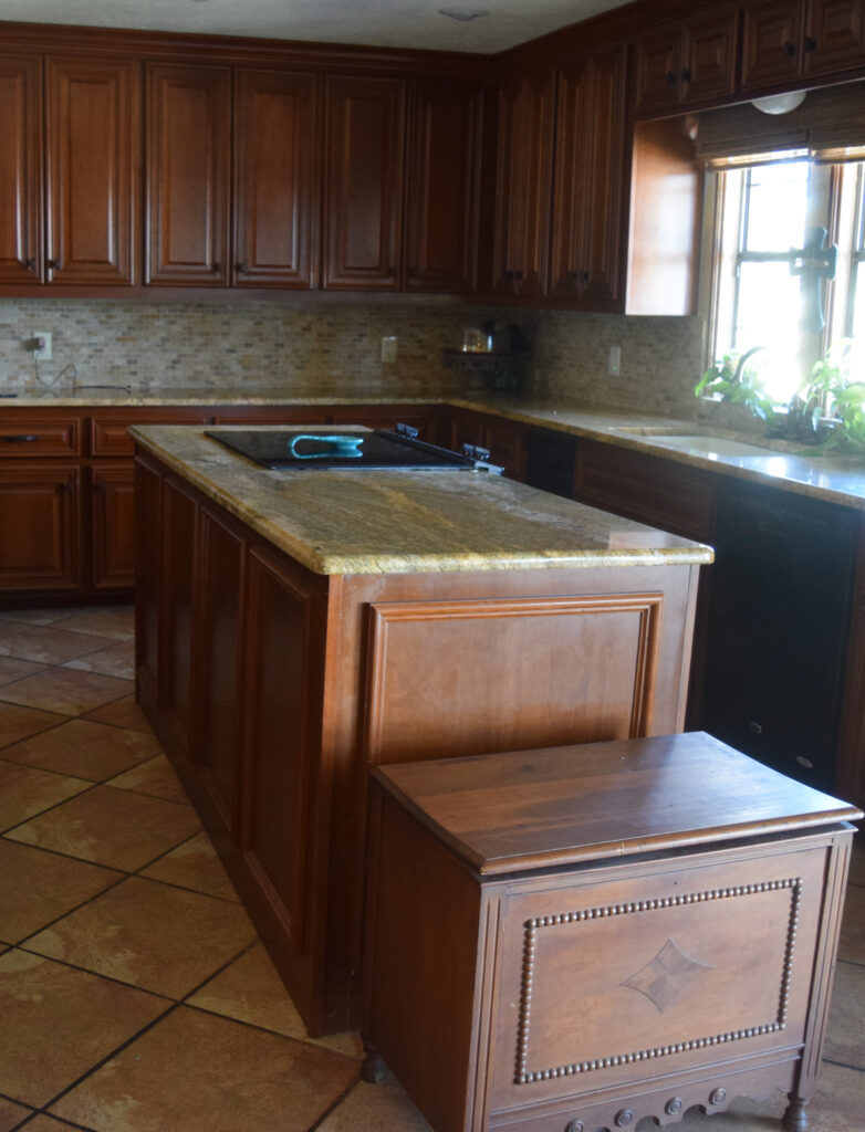
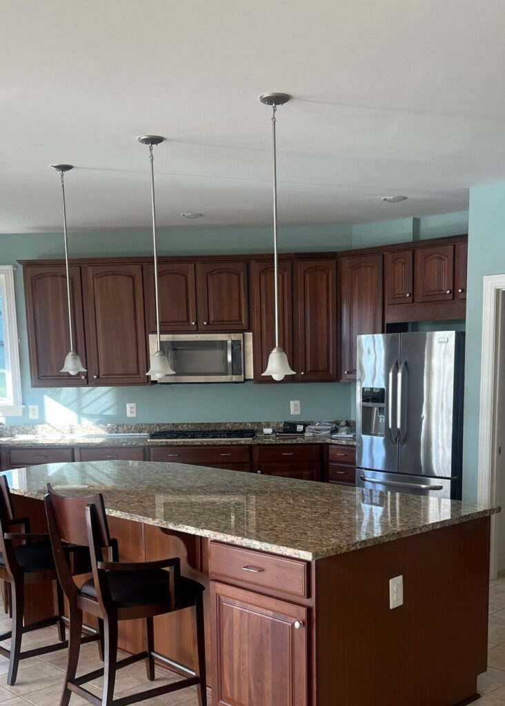
As with any trend cycle, when building (or updating) a home, we commit HARD to certain colors and finishes – and homes built in the 2000s are no exception. Infused with a Tuscan style, 2000s homes give us a run for our money. Sure, these homes looked great for 10-15 years, but try to get them OUT of that style, and you’re in for a boatload of pain and a buttload of money.
Built on the backbone of beige, homes from the 2000s are pretty committed to their original look – beige tile, beige carpet, beige backsplash, and beige walls, with splashes of Tuscan or Meditteranean finishes for sharts n’ giggles. And while it might seem overwhelming to consider a full home remodel, you don’t need to worry; I’m here to help.
But what makes me, Kylie M, an expert in paint colors and home updates?
Experience. I’ve been invited into over 10,000 homes, locally and online (via my consulting). I’m also ADHD and OCD, which means I’m certifiably crazy about this stuff and can hardly help myself (my certificate is in the mail, I’m sure). And I’VE SEEN IT ALL – the good, the bad, and the fugly. I love it all – seriously, I do. I like travertine tile, and I don’t suggest painting all wood cabinets or whitewashing every brick fireplace. I also embrace the idea that sometimes, ‘anything is better than what’s currently there.’
What does this mean?
In an ideal world, we’d all have the budget to blow out walls and install new quartz countertops and hardwood floors, among other things. In the real world, we usually have to work with what we have and make modest and thoughtful updates to shift our home’s look.
This means that sometimes ANY change is good if it gets us a step closer to the home of our dreams.
Would you change it all or consider some affordable update ideas?
Paint colors and lighting – that’s it! Affordable, transitional update ideas for the win!
Thank you to my consulting clients for sending your after photos – you make my colorful world go round!
Update ideas often have to be transitional. In other words, if you love greige walls but your beige-inspired home doesn’t SUIT greige walls, it isn’t going to look good. But MAYBE (just maybe), there’s another way to integrate the greige you love via a darker version of it on your kitchen island, bathroom vanity, or the inside of your front door. SERIOUSLY, there are so many things we can do together…starting with reading this blog post.
And yes, I use FULL CAPS a lot – I talk that way in real life, too. The Ginger gets a little excited sometimes…
This paint color makes me twitch as it clashes with the travertine tile.
So, how does one update a home from the 2000s without going too far or NOT far enough? By reading this blog post (and a few others as well).
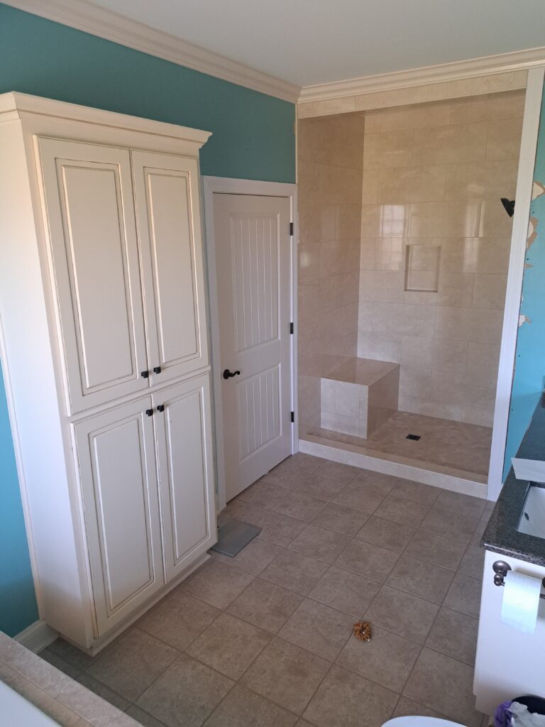
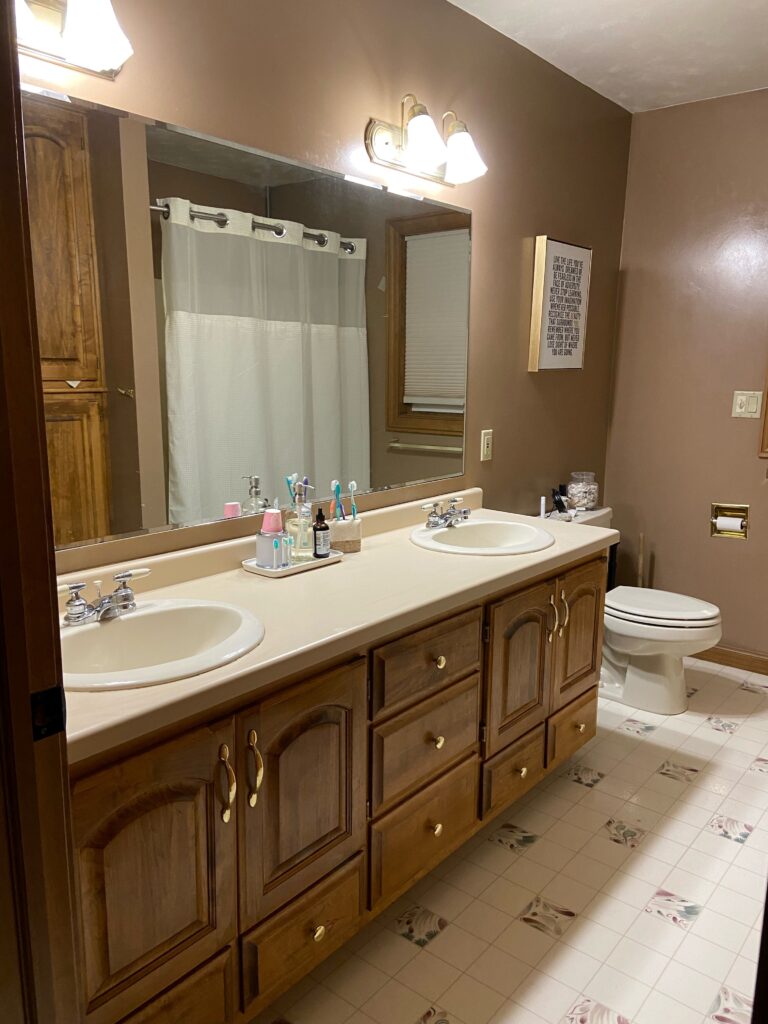
This bathroom has the BONES to be awesome – it just needs a few tweaks!
And while I want to hit it out of the park for YOUR home, if you need a bit more KLC than these ideas offer, you know who to call. Just joking, don’t call me – email me (I never answer my phone). There’s also a LOT TO COVER, so for the sake of both of our limited sanity (of which I have very little left), this will be a SIX-PART SERIES (by the way, it started at two). I’ll include links to all of these at the end.
COMMON FEATURES IN A 2000s HOME
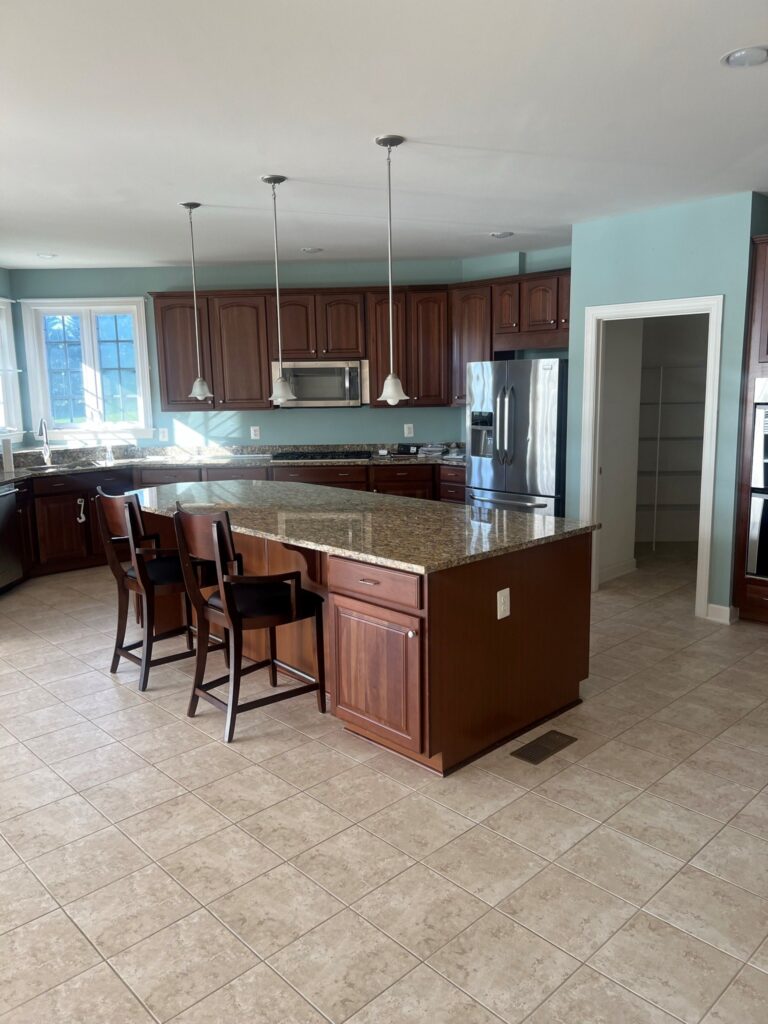
- maple or cherry cabinets – usually mid-toned or darker, but sometimes lighter
- granite countertops with warm colors in them (e.g. St. Cecilia, Venetian Gold)
- some granites from the 90s also pop up, including Baltic Brown, Peacock Green, and Uba Tuba
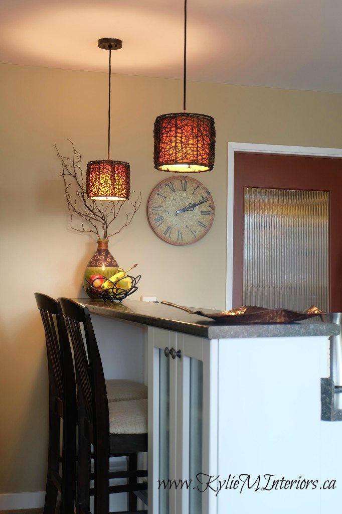
- light fixtures with an ombre/golden glass shade
- nickel light fixtures with a lot of curves (a LOT of Home Depot/big box style lights as this was pre-Wayfair).
- oil-rubbed bronze cabinet and door hardware (often with a curved handle on doors)
- cathedral-style doors (not so much in kitchen, but on bedroom/bathroom doors – also common in the 90s)
- over-the-range microwaves
- travertine flooring, backsplashes, fireplace surrounds, and bathrooms
- beige carpet with multi-colored flecks in it
- beige tile (not just travertine, but multi-toned porcelain tiles made to look like it)
That’s a big list. And while I could go on…and on, you get the gist, and I’m sure you see some familiar items. And what’s the BEST WAY to update an outdated home on a budget?
PAINT!
Needless to say, this is not an updated color and doesn’t do this kitchen any favors.
1. UPDATE WITH MODERN BUT COORDINATED WALL COLORS
When working with a 2000s home, there’s usually a lot of beige. And it makes sense that you want to get rid of this beige and combat it by painting your walls a non-beige color. While this can work in ‘some’ homes, most beige-inspired homes really like beige/tan walls.
The key is choosing a MODERN, UPDATED shade of beige – they exist!
I know, you’re probably crying and twitching in the corner, begging me for a dose of Sherwin Williams Agreeable Gray, Accessible Beige, or Benjamin Moore Edgecomb Gray. By all means, sample them, maybe your home CAN pull them off (75% chance it can’t).
The thing is, sometimes you have to go the long way to get what you want. It’s tough to hear, but…
You need to decorate and update the home you HAVE, not the home you WISH you had.
In most cases, I’m able to offer my Online Color Consulting clients a wall color that suits their home – that the homeowners can also live with. From there, it’s about filling in the blanks with more personalized color ideas that suit YOUR specific tastes, while still accenting your home the right way.
How do I do this?
I have mad color skills, empathy, and first-hand understanding. I know how it feels to want a certain look and not be able to have it (I have three bathrooms that are currently rockin’ the 2000s Tuscan vibe). I want to help you save money, not just tell you to rip everything out and start from scratch (although I can help with that, too). Sometimes, there are happy mediums that listen to your home while nodding to your tastes.
I’m here to teach you how to listen to your home.
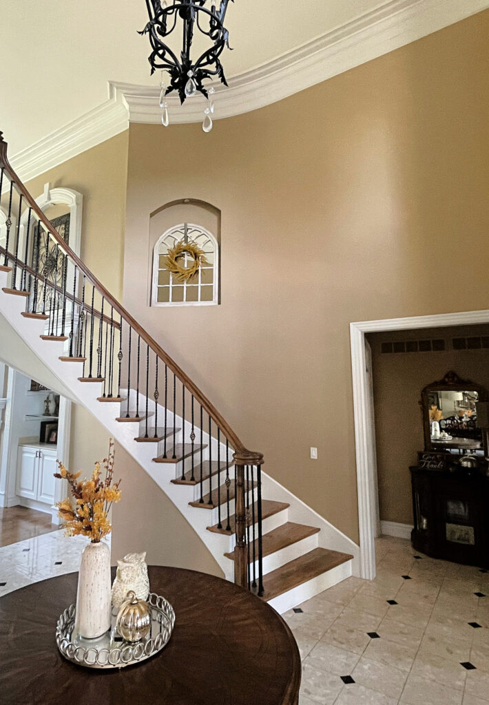
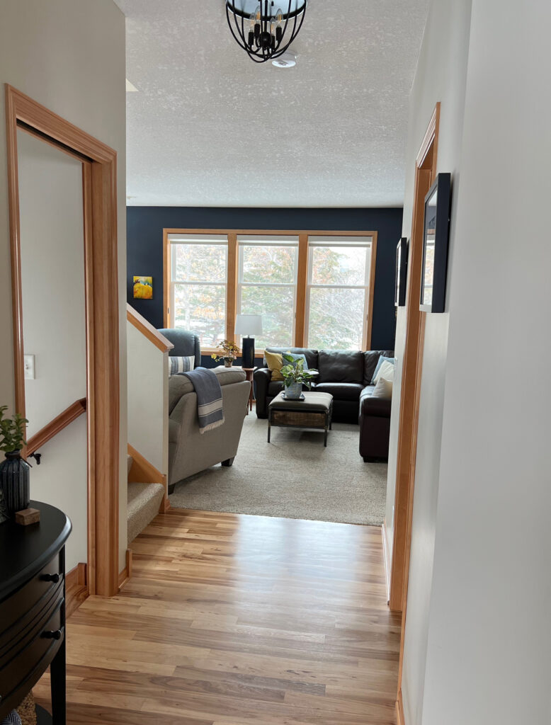
Changing the paint colors, detail on the stair spindles, and the light fixture would be BIG SHIFTS for this room.
CHOOSE YOUR MAIN COLOR WISELY
Your main living areas, including your hallways, set the stage for your other rooms to work off of. If you hit this right, you leave room for flexibility in secondary spaces and feature areas.
What colors work best?
It GREATLY depends on the home. Most homes with beige finishes look REALLY GOOD in modern, subtle shades of beige. As to which exact shade of beige or sometimes even taupe and greige will do the trick, that remains to be seen; it depends on your exact finishes/exposure/etc. Heck, I’ve even found room for the odd warm gray!
To get started, focus on your room’s bossiest features (usually the vertical ones like backsplashes and brick or stone fireplaces) and see which colors flow. Sure, you want to humor your beige carpet and tile too, but often, the vertical surfaces call the first shots.
In this next transition area, you see a LOT of beige and most of it is too expensive to replace all at once…
There’s one of those light fixtures you learned about in PART 3!
The best way to update the above space is with an off-white or light-depth shade of beige. While greige or gray might be in the homeowner’s sights, these will contrast with the warm finishes and can make them look more dated. Save the cooler tones for ACCENT areas and decor.
The next thing to notice in the above space is the trim. While normally, I might suggest painting it white because it’s quite narrow (like 2 1/2″),. That would be a lot of work for a trim that will still have the 90s/2000s profile. Instead, I’d keep it as-is until I could afford to update it to a larger, more simple trim profile (read more about that in PART 3).
Do you HAVE to paint your room beige if you have beige carpet or tile?
Not always. Some tiles have a variety of tones and colors in them, including a wink of warm gray (with a violet undertone). In this case, you can often shift into a warm gray wall color…
The Best Warm Grays With Violet Undertones
The 12 Best Light Taupe & Greige Paint Colors
Some 2000s homes can even handle a more muted, non-beige off-white or greige-taupe blend – it all comes down to the actual blend/color of your tile or carpet.
Rooms with beige finishes often suit TAUPE over GREIGE.
While this next home was more likely built in the 90s (tile size/trim profile/wood floor style/stain), it’s a great example of an older finish suiting a more modern color…
LOOK at the striking accent color in the dining room – this space is a happy medium between the home’s/homeowner’s needs.
While I’d love to narrow it down to THE BEST OPTIONS for your home, there are a few reasons why I can’t…
1. Your home’s finishes could be different from the next person’s. What works in one home can be a hot mess in another.
2. You’re here to LEARN, and I’m here to HELP with over 400 blog posts and a great SEARCH function.
3. I’m including helpful links to some of my TOP blog posts (shortly) that include ALL the colors you should check out.
4. A girl’s gotta make money (I AM a Color Consultant, after all).
My goal here is to get you on the right path. To empower you to sample, compare, and see what you find. If that doesn’t work (and it should work), you know who to call.
COLOR TIPS & BLOG POST LINKS
Seriously, there are some great colors in these links – the colors you’ve been looking for. Click on the link, but come right on back, as I still have some good info to share with you in THIS blog post!
- The most modern shades of beige are in the off-white to light range. This means their LRVs sit around 60-76 (usually the higher the better for beiges).
- There’s the odd warm off-white (non-beige) that can work too – it just depends on your exact finish/combo of finishes.
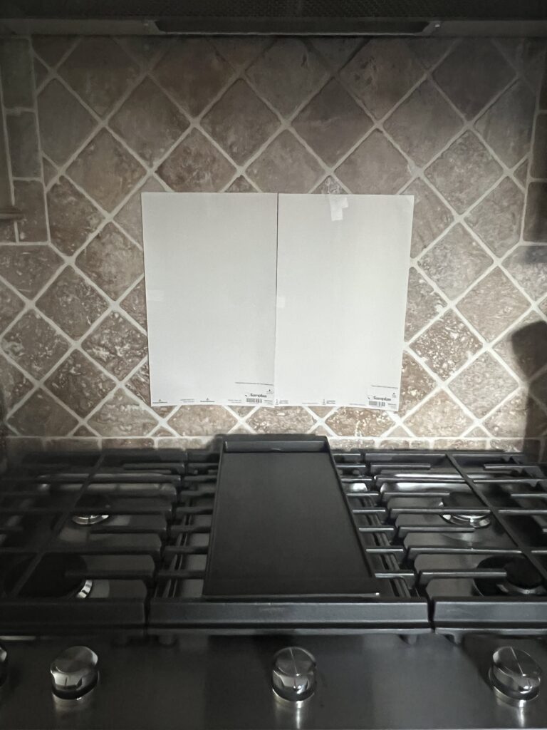
- Beige finishes can sometimes handle gentle shades of taupe as the violet-pink undertones in taupe speak to the VERY common orange-pink undertone found in beige finishes. For example, you might have a travertine backsplash, tile floor, or bathroom. And you may (or may not) think this tile is cream…it’s not cream, it’s beige. I know, mind-blowing, but this is why the creams you’ve been sampling aren’t jibing with it. This is also why the cream cabinets of the 2000s often clash with the travertine tile backsplash they’re partnered with.
- If you’re thinking of painting your walls taupe and aren’t sure what the difference is between taupe and greige – READ THIS.
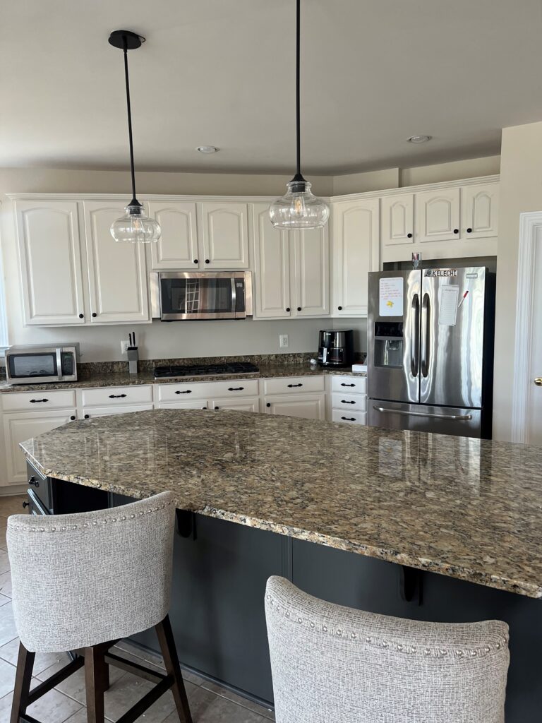
Once you get the right foundation color on your walls, you can move on to your cabinets!
2. PAINT YOUR CABINETS THE RIGHT COLOR
The temptation to paint your cabinets white is huge, I get it. And sure, some 2000s homes can pull it off. However, due to their particular countertop, backsplash, and flooring combo, many don’t SUIT white cabinets. In fact, some kitchens from this decade don’t suit any painted cabinets. Why?
Because they were originally designed to coordinate with wood cabinets – there might not BE a cabinet paint color that will look great.
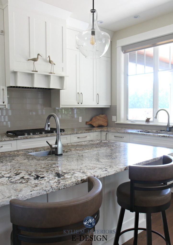
This kitchen looks GREAT with its soft white cabinets and muted beige walls
If your kitchen suits painted cabinets, just as with coordinating your backsplash (Part 2), it’s about pulling into the colors that already exist in your kitchen. However, there’s ONE SURFACE that calls most of the shots in the average kitchen – the backsplash.
In this next kitchen, the original cabinet color is too warm-yellow for the white and gray in the backsplash. The sample you see (High Reflective White) is a much better partner…
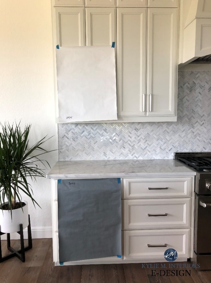
This owner probably wanted ‘warm white cabinets’ without thinking about the backsplash’s needs first.
Because the backsplash is on the same vertical sightline as the cabinets, the connection made between these two surfaces is more obvious than that between the cabinets and the horizontal countertop. IF…your backsplash and countertop are well-coordinated, then you’re good to go (there’s a 50/50 chance they are, based on what shows up in my inbox). But on the chance that they aren’t (which is more common than not in 2000s homes), you need to humor the backsplash first.
The granite and backsplash in this next kitchen are well-coordinated. Unfortunately, the GLAZE on the painted cabinets (and the cursed racing stripe detail on the backsplash) is dating this kitchen…
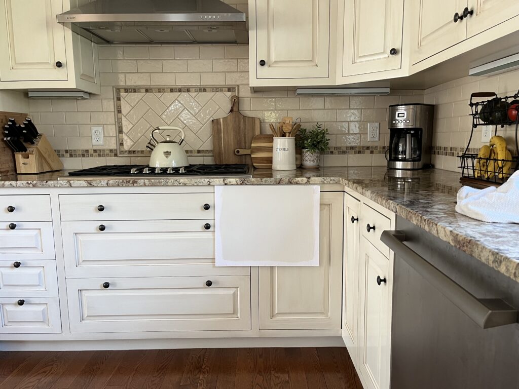
The best, UPDATED paint color choice for these cabinets would be similar to what’s there – an off-white cream/beige with NO GLAZE. Why? Because the countertop and backsplash agree that they don’t suit white cabinets.
Just because you WANT white cabinets, doesn’t mean your kitchen agrees with you.
Let’s take a quick moment to talk about cream.
If your home is from the 2000s, there’s a reasonable chance you have cream cabinets – either solid or glazed. On top of that, you might also/or have cream trim to bargain with. These are always a challenge.
- No, you can’t paint your walls white (#sadbuttrue).
- There aren’t many light colors you CAN paint your walls.
- Many times, it’s best to hang tight until you can budget to get the cabinet/trim painted – BUT NOT ALWAYS!
While I want you to finish reading this blog post first, at the end and RIGHT HERE, I’m including a link to a blog post specific to cream cabinets and their best wall paint colors.
IF YOU HAVE A WHITE BACKSPLASH
If you have a white backsplash and it coordinates with your countertop, choose the SAME WHITE for your cabinets. However, I see a lot of white subway tile backsplashes that are too white for the counter beneath them. If your backsplash is a bit too white/stark for your countertop, you might consider white upper cabinets and a darker, more moderate color that matches your countertop for your lower cabinets. This can be a great way to transition a mix-and-match space.

This kitchen is well-coordinated with Sherwin Williams Pure White
Then again, depending on your exact finishes, you might be able to do non-white cabinets – entertaining the wild and wonderful world of light, medium, and dark colors – including those with a bit more personality and interest!
The 5 Best White Paint Colors for Kitchen Cabinets
The 15 Best Dark Green Paint Colors
REAL PAINT samples delivered to your door in 1 DAY!
Visit the SAMPLIZE SITE HERE
IF YOU HAVE A SOLID COLORED NON-WHITE BACKSPLASH
The best color for your cabinets is hit-and-miss as it depends on your backsplash color and countertop. I’d be shootin’ in the dark to say ‘Do this exact thing‘. Generally, you might find a lighter or darker shade of your backsplash color OR find a color in your countertop that also coordinates with the backsplash.
Benjamin Moore Cloud White 25% darker
The Best Off-White & Light Depth Cabinet Paint Colors (PART 2)
IF YOUR BACKSPLASH HAS A MIX OF COLORS, TINTS, & TONES
When painting your cabinets, you’ll want to perfectly match one of the colors in your backsplash – DON’T introduce a new color to the scene.
While this next kitchen is more likely 1990s (judging by the tile and moldings), it’s a great example of colored cabinets that jibe with the backsplash…
The 13 Best Medium-Depth Shades of Blue
By the way, notice how I labeled this home as being built in the late 90s – maaaybe early 2000s based on the floor tile’s SIZE, colors, as well as the profile of the trims (and cabinets). It’s not just 2000s home that struggle with showing their age, every decade has its challenges.
And regarding something I said a few minutes earlier, ESPECIALLY if you can’t seem to find a color that suits your kitchen, remember that…
…some kitchens were originally designed and coordinated around wood cabinets, so there might not BE a ‘best paint color’ for your cabinets.
While I LOVE this wall color, a lighter, flexible warm neutral would be pretty too.
To say this next space had a lot going on is an understatement. Many people would say it’s hopeless and needs a full remodel…
HOWEVER, not everyone has the moula for a full kitchen renovation. Plus, there are some great bones here…
- cabinets installed to the ceiling (they look custom)
- great cabinet profile (no arched tops or exposed hinges)
- a backsplash with a variety of colors to coordinate and play with
- a countertop that’s coordinated with the backsplash (WAHOO!)
- for me, the only surface that leaves me a little wanting is the tile floor, due to its 12×12 size, diagonal installation, and strong palette of orange and yellow
But even then, it’s ALL WORKABLE and worth an update! Let’s see how it turned out…
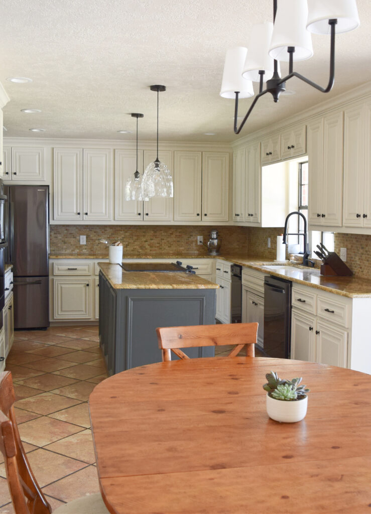
We kept the original countertop, backsplash tile, AND floor tile – this lovely space got new light fixtures and paint colors on the cabinets, island, and walls. What’s awesome is that while the cabinets aren’t white (this kitchen’s finishes don’t suit white), the look is considerably brighter and more updated and looks BETTER than it would had they done white!
How to Update Your Outdated Granite Countertops
By the way, if your tile (floor or backsplash) is great, but the grout is throwing your color palette off, check out MAPEI ULTRACARE GROUT REFRESH. This product seals and re-colors your grout and it’s EASY to do. Just be cautious with natural finishes like travertine, as if the tile isn’t sealed properly, it can get stained.
For example (ignoring the paint samples), if the grout were a bit darker/more brown-taupe, the dated pattern of this next backsplash would be less obvious – it would blend more with the tiles…
The grout on this next tile floor is too orange and dark for the tile. This mismatch accents the tile layout and clashes with the colors of the tile. The grout color should be a bit lighter and have a bit more taupe/pink in it…
IF YOU HAVE NO BACKSPLASH
Well, we need to talk. I would LOVE you consider a subway tile backsplash. This glossy, classic tile adds energy to a kitchen and is an updated nod, without having to change the bones of your space. Not only that, there are affordable peel-and-stick options if your tiling skills are lackluster and you’re looking for an ‘in the meantime’ project (meaning it’s here for a good time, not a long time, depending on the quality).
4 Ideas to Jazz Up a Subway Tile Backsplash
Get the best expert color advice…
If you don’t want a backsplash, your cabinet color will be inspired by your countertop. You might think your wall color would be the muse, but the wall color is changeable – the counters ain’t (assuming you want to save money and use what you have).
A gorgeous update via my Online Color Consulting services!
Here are some helpful links – your color is in these!
- The Best Off-White & Light Cabinet Paint Colors
- The 5 Best White Paint Colors for Kitchen Cabinets
- 4 Gorgeous Colors for Kitchen Islands & Bathroom Vanities
- How to Update Your Wood Cabinets WITHOUT a Drop of Paint!
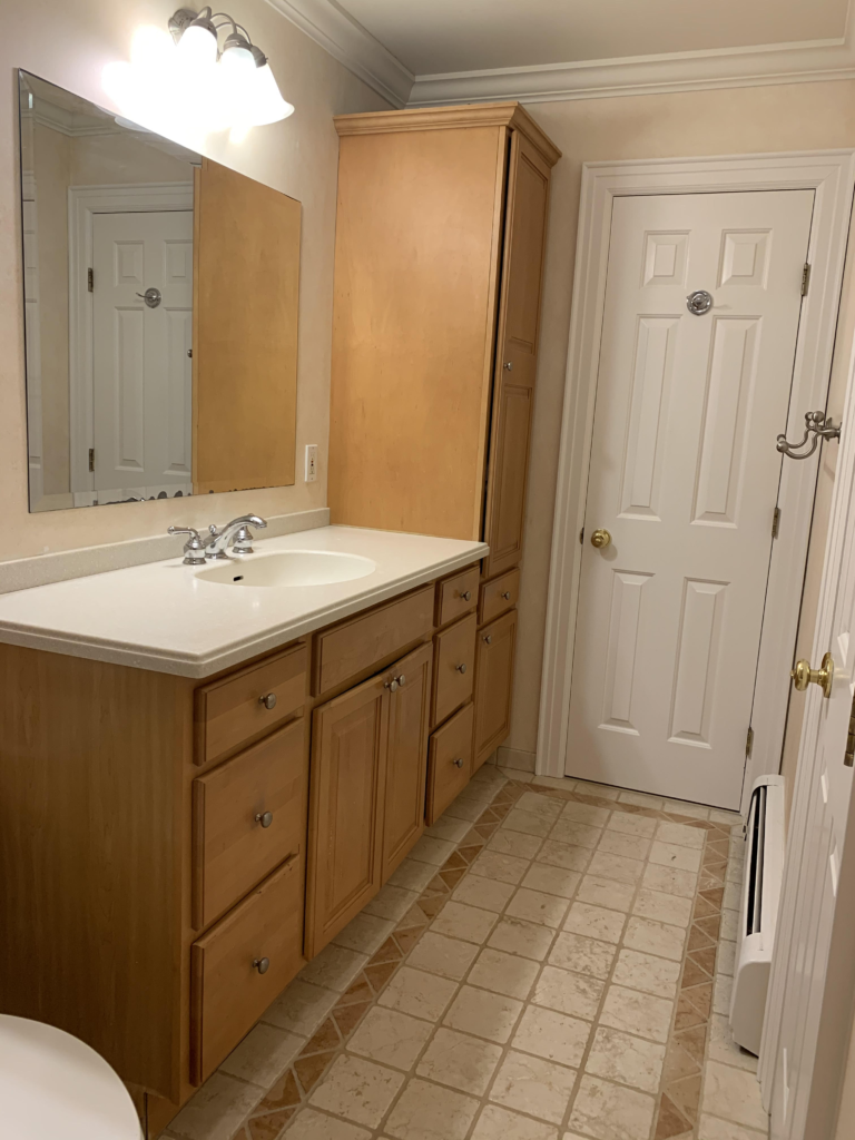
3. ADD COLOR TO YOUR VANITY, KITCHEN ISLAND, OR DOORS
Nothing offsets the disappointment of not getting to paint your walls the color you want like a bottle of wine and a funnel and a Ryan Reynolds/Gosling movie marathon a well-chosen vanity, island, or front door color.
PAINT YOUR BATHROOM VANITY
This is where you get to have some FUN. Let’s say you want to paint your walls a light warm gray with a green undertone or a subtle shade of greige. However, every shade you look at clashes with your 2000s finishes. The COOL thing is that whereas a particular color might clash/compete in the lighter range, once it gets dark enough, it can act as an ACCENT to your finishes!
For example, in a beige-ish bathroom, a light blue-green wall could date the beige finishes. HOWEVER, get this color dark enough, and rather than competing with the beige finishes, it ‘accents’ them…
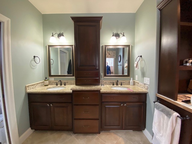
This 90s bathroom shows the best of both worlds – the needs of the home and the tastes of the homeowner!
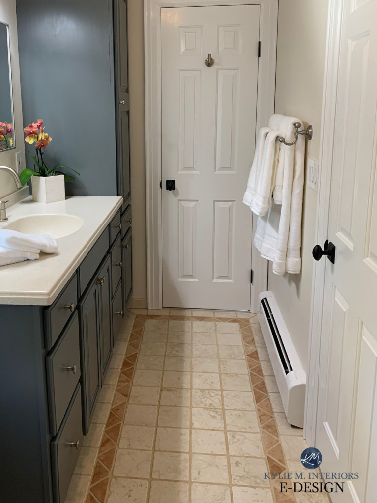
- Budget-friendly update ideas shifted the look of this bathroom without breaking open the kid’s piggy bank.
- The dark blue-green-gray vanity color contrasts with the travertine tile (a lighter version of it would compete with the tile).
- The off-white beige wall color is soft, and subtle and works WITH the beige tile, rather than against it.
- The polished nickel knobs, faucet, and towel hardware are a great choice for this space – updated and simple. While I might’ve done the door hardware all polished nickel, the black isn’t bad. Really, it’s only the hook on the back of the door that sits a bit off. Also, if the rest of the home has black door hardware, it’s important to be consistent throughout.
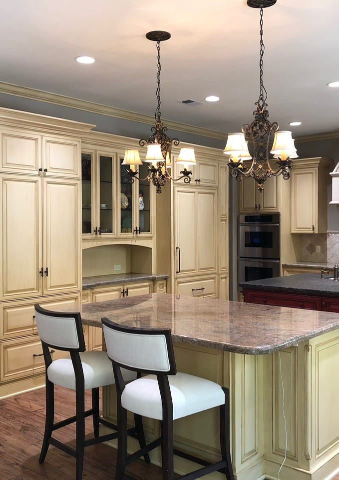
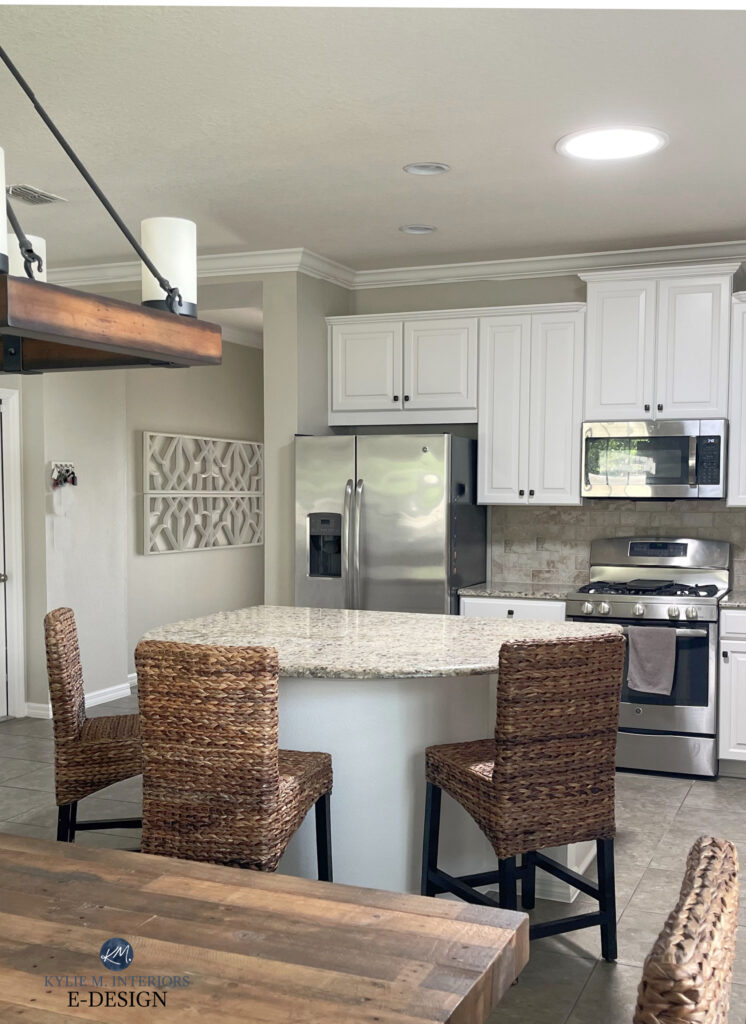
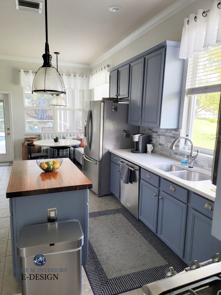
PAINT YOUR KITCHEN ISLAND A BEAUTIFUL ACCENT COLOR
Whether you want a pop of color or a grounded neutral (which 2000s homes more often suit), the kitchen island is a great place to infuse a little personality…
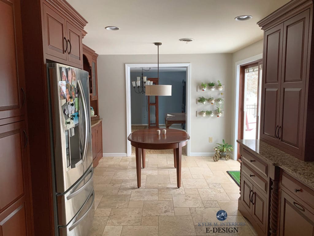
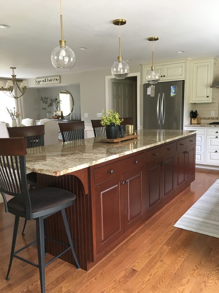
New countertops, original red stained perimeter cabinets, original beige tile floor – new island color!
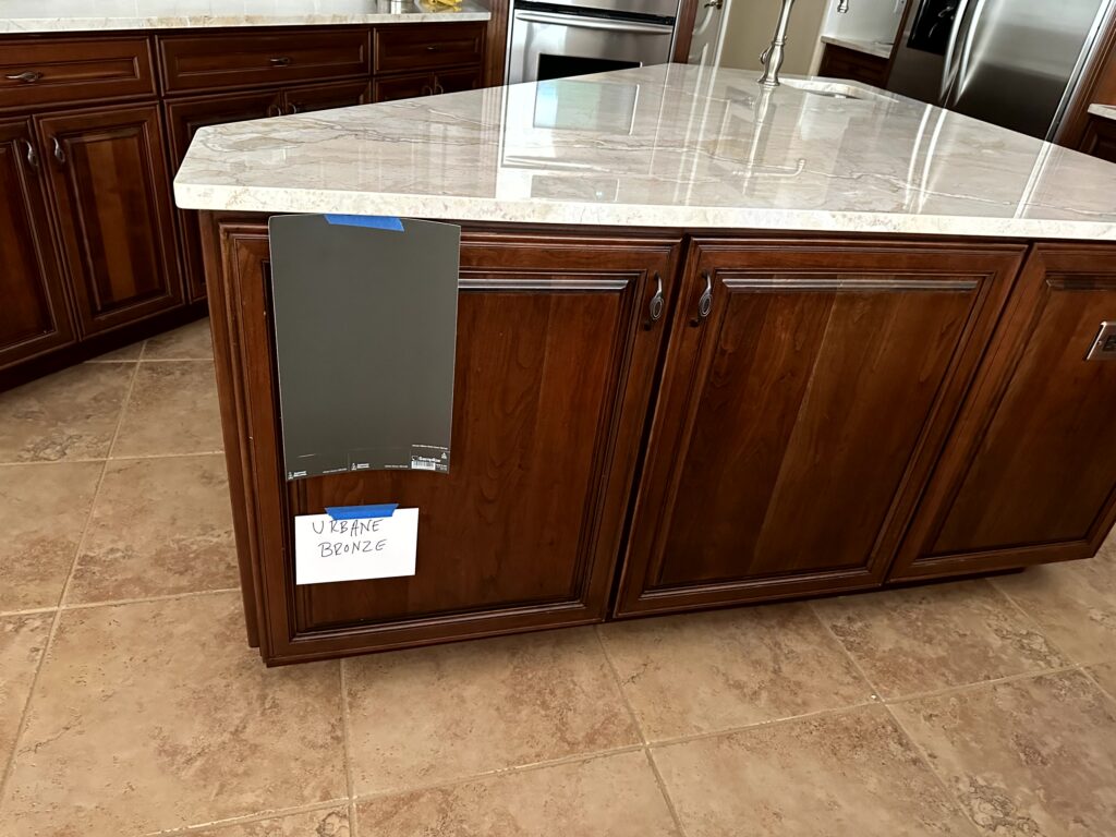
Starting from scratch in this next kitchen would cost a small fortune. Instead, my client hired me to jazz up the island with a new, more modern color…
Sherwin Williams Urbane Bronze
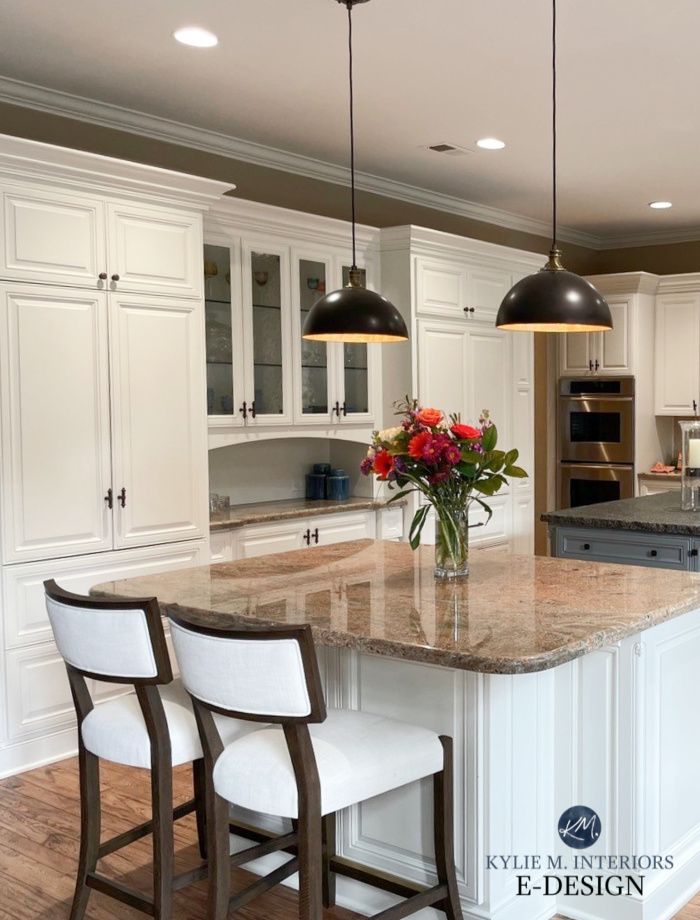
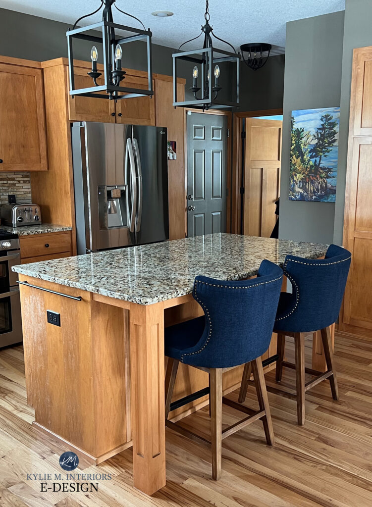
This next kitchen has a fun, dark shade of green on the island and new quartz counters. Notice how the travertine tile floor becomes more of a backdrop to the space rather than a feature.
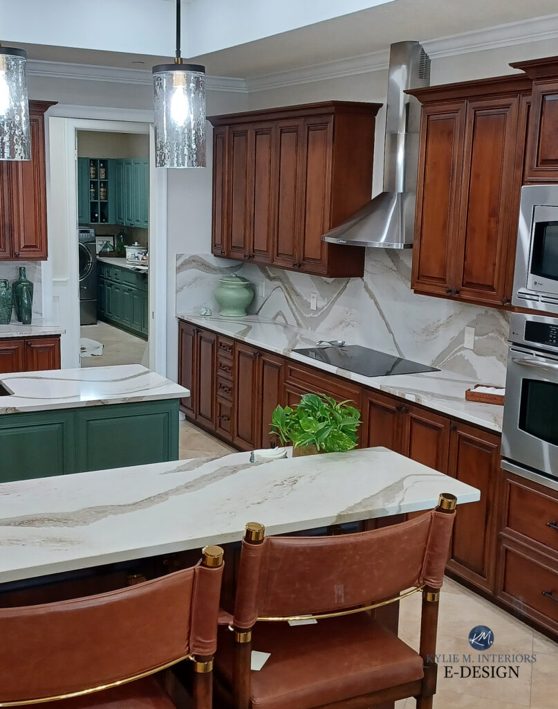
Personally, I’d paint the above island a more muted dark greige, just to lower the contrast with the red-stained cabinets, but YOU DO YOU, BOO, and if you love green and your space can technically handle it – fill yer lil green boots!
Fun fact, the above main cabinets ARE getting painted in a color chosen via my Online Color Consulting services – I can’t wait to see how it turns out!
Let the best online paint color expert pick YOUR colors!
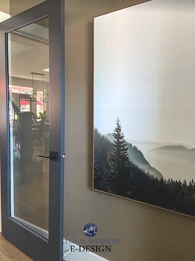
PAINT THE INSIDE OF YOUR FRONT DOOR
The right color creates a focal point in your entryway, but can also be used on…
- pantry doors
- back doors
- french doors
- doors leading into the garage
- office doors
- all interior doors!
While the walls in this next foyer are a more modest, muted neutral, this space looks AMAZEBALLS with its front door painted in a striking dark accent color…
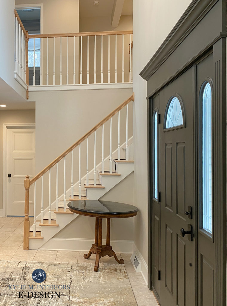
I could do without the round table, but the colors are gorgeous.
Staircase & Railing Trends: Update Ideas for Your Stairs
The Best Dark Greige Paint Colors: Sherwin Williams
I love the style and color of this Craftsman-style front door…
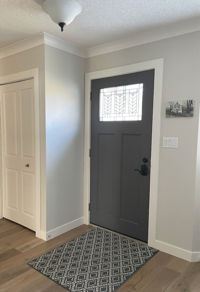
I see a…BOOBY LIGHT!
To learn more about the best door styles, read PART 3.
The Best Paint Colors to Paint the INSIDE of Your Door
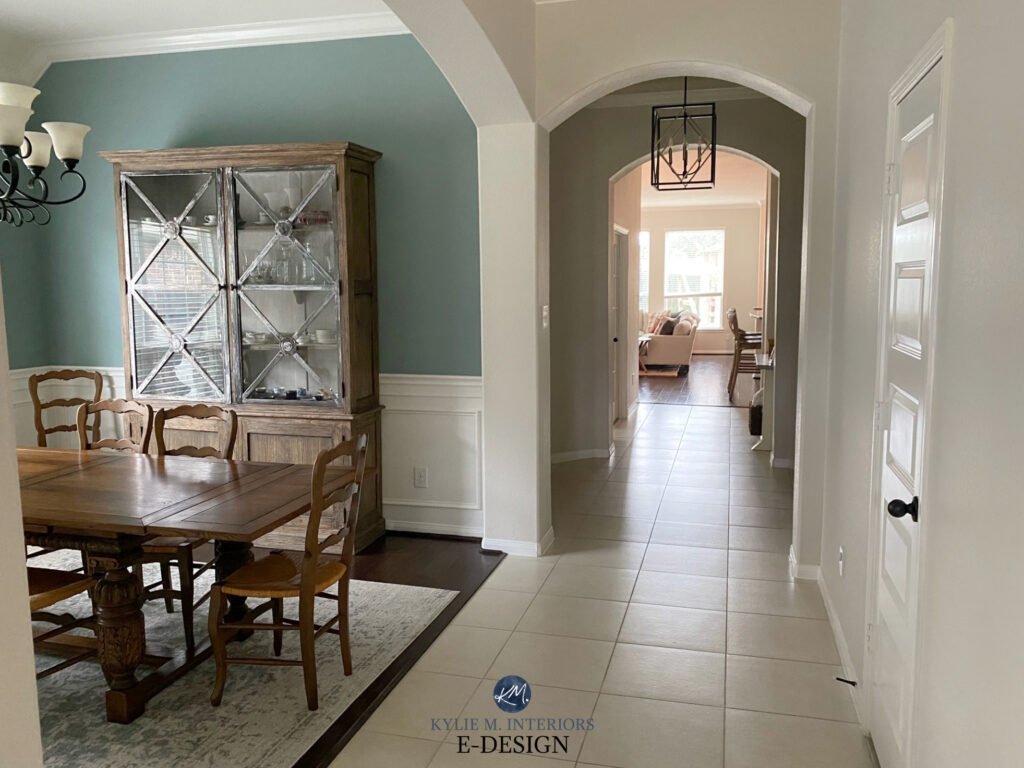
4. ADD AN ACCENT WALL
Again, while beige walls might seem boring, a well-placed accent wall can give you a color fix without clashing with your finishes. However, are accent walls even in style?
It all comes down to the RIGHT color on the RIGHT wall.
It’s also about what you love. If you aren’t selling your home, you do you. I have five accent walls in my home, and because they’re the right colors on the right walls, they look dang good (if I say so myself). However, some rooms or spaces can’t pull off an accent wall, whereas others are screamin’ for one…

WHERE & What Color to Paint Your Accent Wall
Can I get a HALE YES for Benjamin Moore Hale Navy?
Remember, while a certain color or undertone might clash with your beige finishes in the lighter range, a DARKER version of this same color might be the perfect accent! (Learn more about this approach HERE).
5. EMBRACE YOUR FAVORITE COLORS ON YOUR HOME DECOR & LINENS
Painting your room a color OTHER than your dream color can be a bummer. But all is not lost! You can make just as much impact, if not more, by painting your walls the RIGHT color and using your fave accent colors in your decor, accessories, linens, etc.
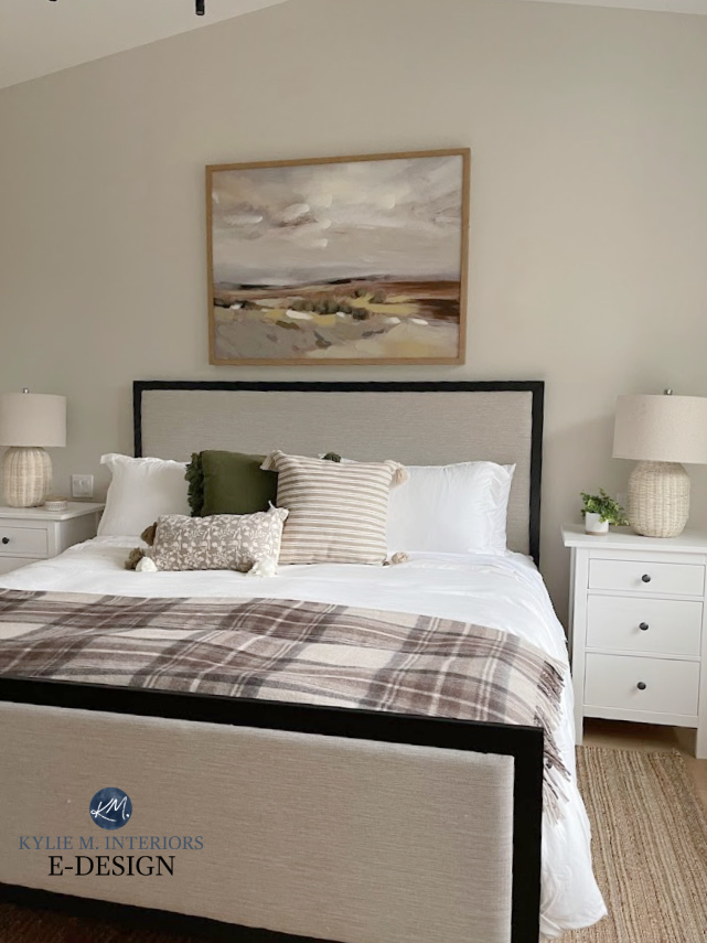
This next primary bedroom looks great because the main wall color tunes into the carpet (although, if they went half to one tone lighter, it would look a bit more modern)…
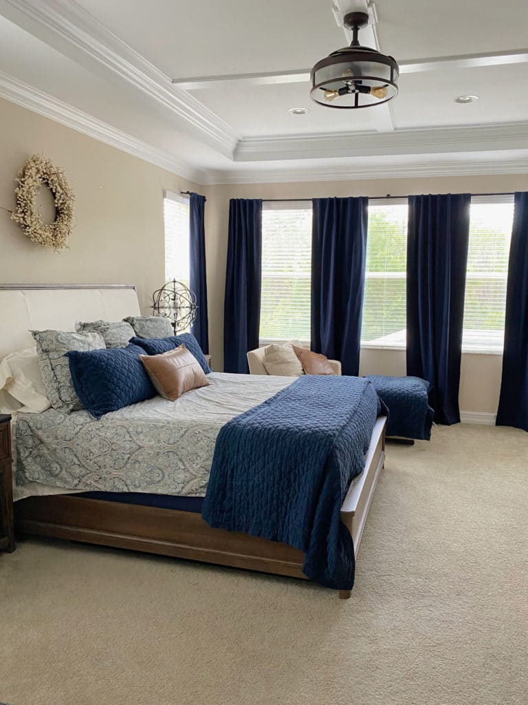
If the homeowner had painted the walls a light blue or blue-green it would make the carpet look more pink in comparison. Instead, by painting the walls a soft beige and using a DARKER shade of navy blue in the accents, along with cognac leather accents, this room looks its very best.
Would it look MORE updated with non-beige walls and carpet?
For sure, however, this blog post focuses on using what you have, and making smart, affordable updates as you go.
The best places to add your personal tastes (home decor/linen related)
- area rugs and curtains
- toss cushions and throw blankets
- main bedding items are often better left neutral
- plants (green), vases, accessories
- painted furniture pieces (not home decor, but still a good idea)
- books
- artwork

Looooong story short (as usual)…
Don’t be afraid of beige!
There you have it! I hope the above tips, links, and ideas inspire you to update your home affordably. Just remember, I’ve got more ideas in this blog post listed below.
DON’T MISS THE OTHER BLOG POSTS IN THIS SERIES!!
READ MORE BLOG POSTS IN THIS 5-PART SERIES
The Best Backsplash Ideas to Update a 2000s Kitchen (PART 2)
Ideas to Update Your 2000s Home: Hardware & Lighting (PART 3)
Ideas to Update Your Outdated Granite Counters (mostly 90s & 2000s) PART 4
5 CASE STUDIES: 2000s Kitchen Updates: Tuscan, Travertine, & More (PART 5)
Ideas to Update Your 1990s or 2000s Bathroom (PART 6)
Tile Trends: Subway Tile, Zellige, Herringbone & More
NEED HELP?
Check out my Online Paint Color Consulting


Love the series. My Mom just passed recently and I got the house. They built it in 1960, a Holiday Home? More Mid Century with some upgrades but not much. I’m not sure if I’m going to sell, rent it out or live in it but it definitely needs some upgrades…Where to start first? I did get the original bedroom floors (red oak) refinished and am ripping out the carpeting in the LV/DN now.
Oooo, sounds like you have some fun on your hands. And I’m very sorry for your loss – it might be good to distract yourself with some projects.
And you know, i DO want to write a blog post on updating 60s homes (without losing their charm – or losing it if it’s just a hot mess). You’re welcome to send me some of the rooms in your home. If I think I can work with it, I could do a blog post featuring it with a whole bunch of update tips!
Hi, I love your blog first of all. I am a bit overwhelmed though by choosing paint colors. I have baltic brown granite and a kitchen with North and East facing windows. I was thinking about Accessible Beige, but worry it will be too dark. What do you think? What color are the cabinets in the picture above that has a black island? Thanks for your help!
cheryl
I forgot to mention the color will be for the cabinets. The current cabinets are marked nutmeg stained. Thanks again!