
The TOP 13 Shades of MEDIUM Blue Paint Colors
BLUE-VIOLET, BLUE-GREEN, BLUE-GRAY, OH MY!
Whether you’re searching on Pinterest, Instagram, or your fave design magazine, there’s no shortage of beautiful homes, bathed in bountiful shades of blue. From bold and ballsy to breezy and bright, blue is a color that offers endless inspiration. But while visuals can be helpful, they’re not always applicable to you and your home – sometimes you need REAL help (insert wine HERE).
Why are blues SO DARN HARD to choose?
Because you don’t just need a blue that you fall in love with; it also needs to coordinate with your finishes and suit your room’s exposure. If you need help with that, I have an awesome Online Paint Color Consulting service, but otherwise, READ ON!
Blue is a classic paint color in the world of Design. Inspired by nature and driven by trends, blue never goes out of style; it just depends on the TYPE of blue that’s currently trending. This makes blue a great choice if you want to create a timeless home. But as with any color…
It’s about the right color, in the right depth, in the right place.
The tricky part is that not all blues are created equal. This is why I’ve compiled a list of my favorite MEDIUM depth shades of blue – colors I repeatedly recommend to my clients.
But first, let’s talk about the basics…
WHAT MAKES A BLUE A ‘MEDIUM’ BLUE?
While you can visually explore a color, the best way to know its actual depth is to find its LRV number.
LRV stands for Light Reflectance Value and is a number every paint color has on a scale from 0 (black) to 100 (white).
Medium-depth paint colors have LRVs between 20-40 (approx).
If you have two shades of blue, one with an LRV of 36 and the other with 38, it might not be easy to see the difference with your naked eye (or naked anything, really, keep your pants on ya weirdo). However, the two-point difference tells you that the color with the LRV of 36 is the darker shade.
Benjamin Moore Charlotte Slate (also known as Providence Blue)
The blues you’ll be looking at today are medium-depth blues because their LRVs are moderate, making them great for accent walls, kitchen cabinets, islands, and more.
And while I could talk until I’m BLUE in the face, let’s zoom like a blue-arsed fly and get this color party started…
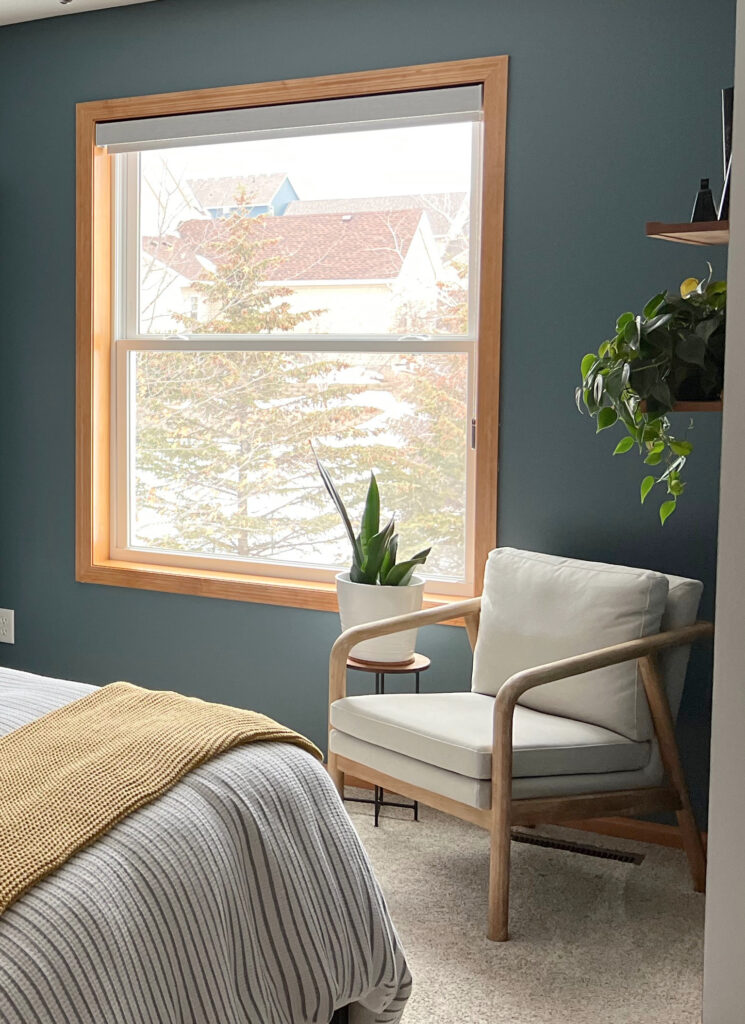
1. BENJAMIN MOORE MOUNT SAINT ANNE 1565
Mount Saint Anne is one of my favorite shades of blue for a calming, coastal-style home. Just like many other mixed colors, Mount Saint Anne is open to perception. Most of the time, it shows up to the party as BLUE-GREEN with a modest dollop of gray in it.
As shown in this next bedroom, colors like Mount Saint Anne look great with wood trim and furniture, enhancing the wood’s color and creating a well-balanced palette…
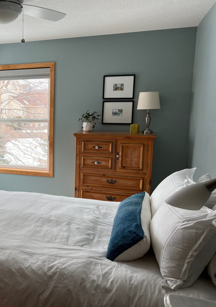
Mount Saint Anne has an LRV of 41.9, making it a medium-depth color, but one that’s on the LIGHTER end of that range (it can also pass as a darker light-medium shade of blue).
COLORS THAT ARE SIMILAR TO MOUNT SAINT ANNE
While there will never be a perfect match, comparing colors with slightly different looks is the best way to find your perfect paint color.
- Benjamin Moore Raindance is a bit more green
- Sherwin Williams Eventide is softer and slightly more green than Mount Saint Anne
- Benjamin Moore Beach Glass is like a lighter version of Mount Saint Anne
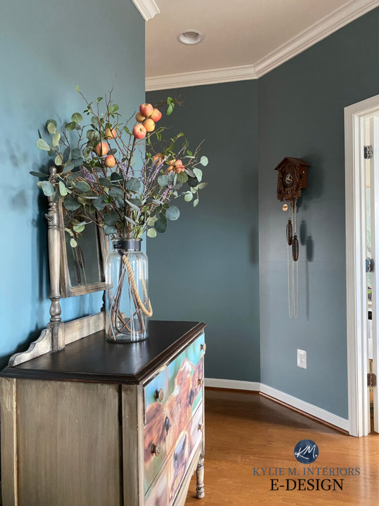
2. SHERWIN WILLIAMS DEBONAIR 9139
Debonair is as aloof as it sounds. With a blue base, a whisper of green, and a reasonable shot of gray, this shade of blue is a modest, calm approach to color. If you want to NOD at blue on your walls or cabinets without being smacked in the face with it, Debonair could be your perfect color.
Debonair has an LRV of 34. This means it’s a medium-depth paint color, more or less in the middle of the range, with enough depth to offer a reasonably high contrast with white trim.
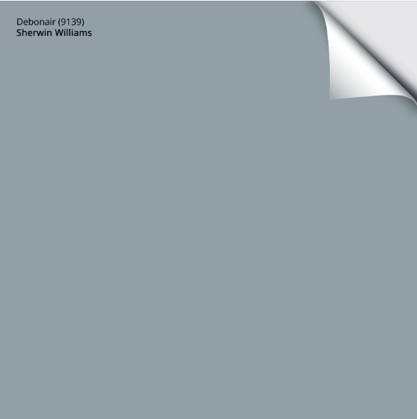
Get your PEEL & STICK SAMPLE OF DEBONAIR!
COLORS THAT ARE SIMILAR TO DEBONAIR
- Sherwin Williams Blustery Sky is darker than Debonair but has similar tendencies
- Benjamin Moore Mount Saint Anne is a smokier, slightly green approach to blue compared to Debonair
- Sherwin Williams Meditative
3. BENJAMIN MOORE KNOXVILLE GRAY HC 160
Knoxville Gray is a color ninja, changing its look on a whim. You might see it as a green with some gray and blue in it, and others might see it as a blue with some green and gray in it – it just depends on which color seems most DOMINANT to you.
But unlike the other shades on this page, Knoxville Gray is the ONE color that dips into the medium-dark range; thanks to its LRV of 15.68 – this badass blue-green ain’t messin’ around.
This next photo shows Benjamin Moore Texas Leather (also known as Stampede), a gorgeous mid-tone greige, with Knoxville Gray in the adjoining office – I love both of these colors with the wood trim and cabinets…
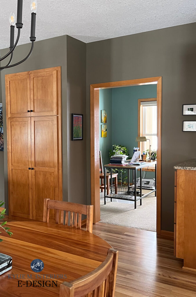
Paint Colors to Go With Wood Trim
COLORS THAT ARE SIMILAR TO KNOXVILLE GRAY
Comparing similar paint colors is the BEST way to find the right shade for your room.
- Benjamin Moore Steep Cliff Gray is a bit lighter than Knoxville Gray
- Benjamin Moore Porch Swing is lighter and a bit grayer
- Sherwin Williams Riverway has a bit more color/higher chroma
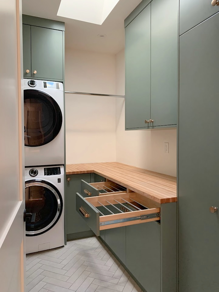
4. BENJAMIN MOORE BACHELOR BLUE 1629
Bachelor Blue is one of my favorite blues. While the lighter end of the blue-violet world isn’t as popular, once you hit the medium depths, colors like Bachelor Blue pop up on kitchen cabinets and even exteriors. With an LRV of 23.52, this muted, but purposeful shade of blue is a great choice if you don’t love blue-greens, but still want a blue with some interest to it.
Blue violets look gorgeous with wood, as shown with the butcher block countertop
One of the tricky things about blue-violets like Bachelor Blue is that the shift between BLUE-violet and a VIOLET dominant color happens very quickly and is open to interpretation. If we go much farther into violet, the scales start tipping. Bachelor Blue is single and ready to mingle.
COLORS THAT ARE SIMILAR TO BACHELOR BLUE
- Benjamin Moore Oxford Gray is more colorful/less gray than Bachelor Blue
- Sherwin Williams Storm Cloud is a moodier, much grayer take on blue-violet
- Sherwin Williams Bracing Blue is a lighter, more colorful shade of blue-gray-violet
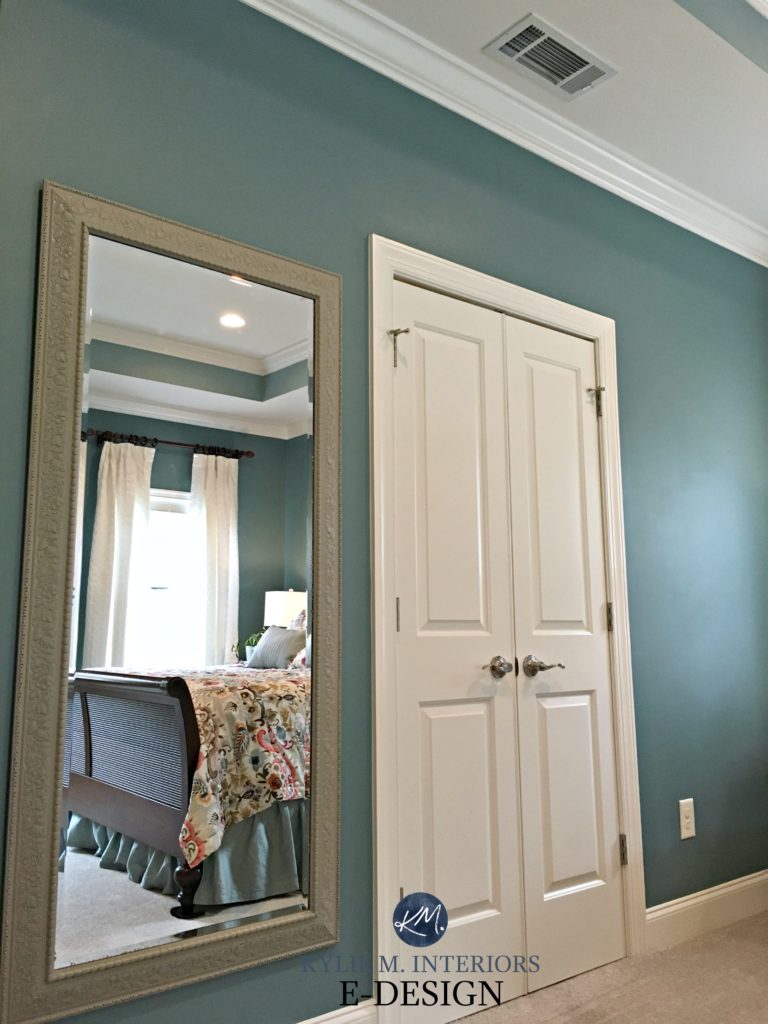
5. BENJAMIN MOORE WATERS EDGE 1635
Benjamin Moore Water’s Edge, also known as Van Courtland Blue, is an elegant take on blue. In the fan deck, it comes across as more or less ‘blue-gray.’ However, when you compare it with other colors and slap it on your walls, you’ll see some green and a modest, but noticeable gray backdrop.
Water’s Edge/Van Courtland Blue has an LRV of 31.47, making it a medium-depth paint color (in the middle of the range).
COLORS THAT ARE SIMILAR TO WATER’S EDGE
- Sherwin Williams Delft is more blue
- Sherwin Williams Debonair is grayer than Water’s Edge
- Benjamin Moore Jamestown Blue is like a more colorful take on things
- Benjamin Moore Santorini Blue is like a lighter version with a touch less green
- Sherwin Williams Morning at Sea, from the Emerald Designer Edition, is very similar to Water’s Edge
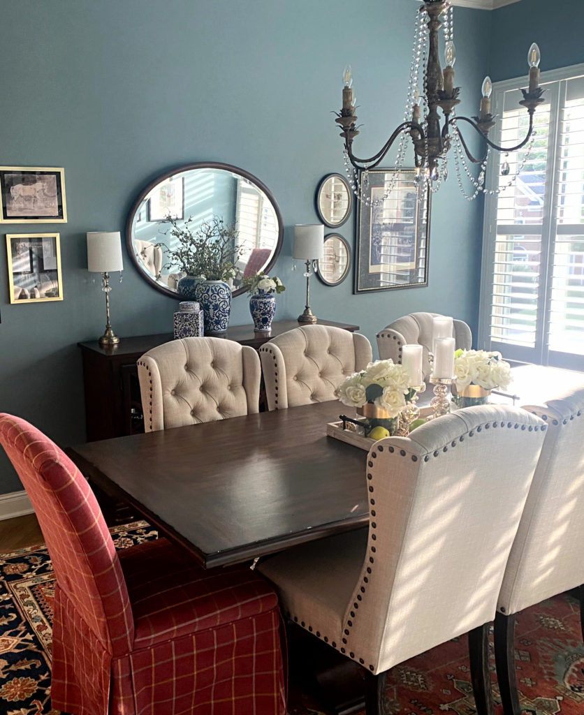
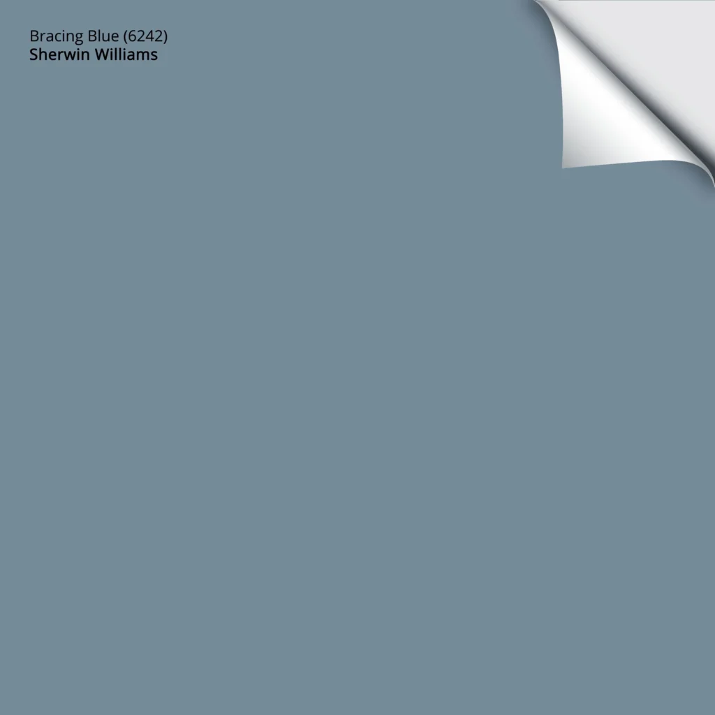
6. SHERWIN WILLIAMS BRACING BLUE 6242
Bracing Blue is a gorgeous, classic take on blue-violet. With a more subtle gray backdrop than some of the blends on this page, Bracing Blue approaches blue-violet with a strong dose of blue and a mild (at best) violet backdrop.
Get your PEEL & STICK SAMPLE OF BRACING BLUE HERE!
With an LRV of 25, Bracing Blue is also one of the darker blues in this blog post, without heading into the medium-dark shades like Distance (also stunning, with an LRV of 15).
COLORS THAT ARE SIMILAR TO BRACING BLUE
Comparing paint colors is the BEST WAY to find your perfect shade.
- Sherwin Williams Daphne is like a lighter version of Bracing Blue
- Benjamin Moore Oxford Gray is VERY similar to Bracing Blue with its depth and overall approach
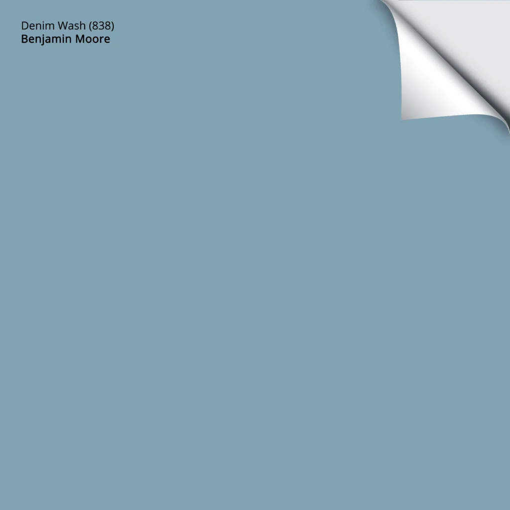
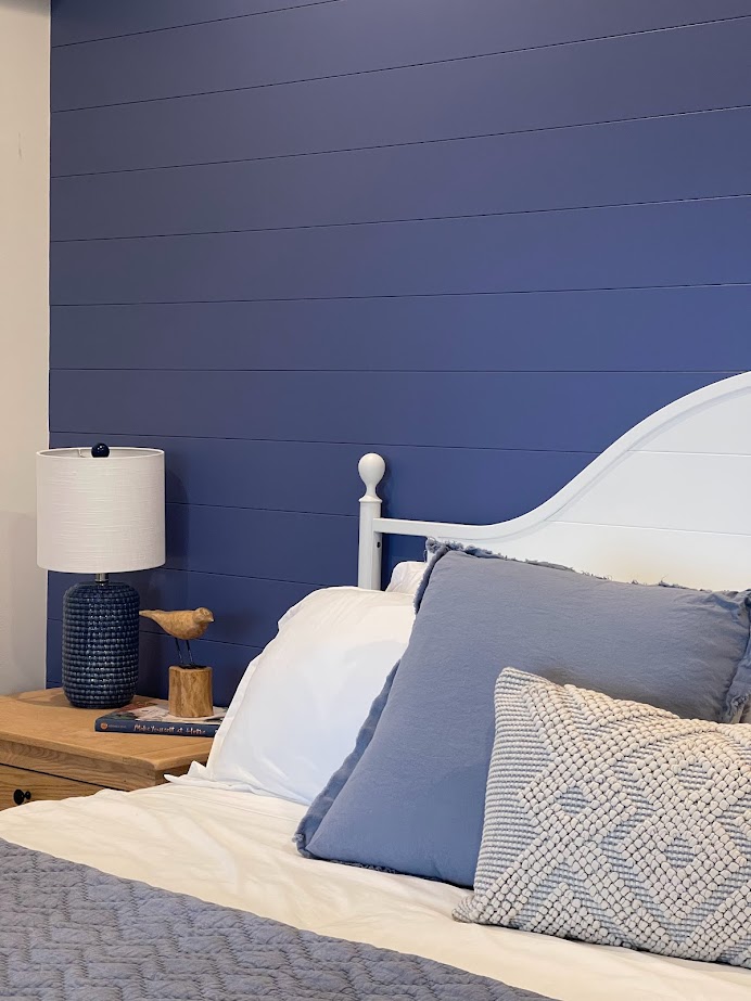
7. BENJAMIN MOORE DENIM WASH CC 770
Denim Wash is one of the more TRUE blue hues on this page. With a commitment to blue, and barely a wink of green or violet in sight, Denim Wash is inspired by…pants. That’s right, pants.
However, between green and violet, Denim Wash is sliiightly more likely to favor violet over green, given the right room exposure/environment.
Get your PEEL & STICK SAMPLE OF DENIM WASH
COLORS THAT ARE SIMILAR TO DENIM WASH
- Benjamin Moore Colonial Blue looks to have a wink of green compared to Denim Wash, but they’re VERY comparable
- Benjamin Moore Harlequin Blue and its subtle blue-violet hue shows how TRUE BLUE Denim Wash is
- Sherwin Williams Daphne is like a more gray take on Denim Wash
In fact, Daphne is so gorgeous; let’s take a look at it here (I wish I had a client photo, but I don’t)…

Get your PEEL & STICK SAMPLE OF DAPHNE
8. BENJAMIN MOORE STRATTON BLUE HC 142
Stratton Blue, also known as Del Mar Blue, is a popular shade of blue for entire rooms, accent walls, kitchen islands, and even front doors! Do you see it as a BLUE-green blend or a GREEN with a bit of blue in it?
Stratton Blue has an LRV of 37.77, making it a medium-depth blue-green paint color (but on the higher end of this range). You can also explore Stratton Blue’s closely related, but slightly darker, Sioux Falls, which is shown on this front door…
As this type of color darkens, the green often overtakes the blue, which you’ll see the start of if you compare Stratton Blue and Sioux Falls in person.
PAINT COLORS THAT ARE SIMILAR TO STRATTON BLUE
- Benjamin Moore Wythe Blue is lighter than Stratton Blue
- Benjamin Moore Azores is slightly darker
- Sherwin Williams Halycon Green appears a bit softer/grayer
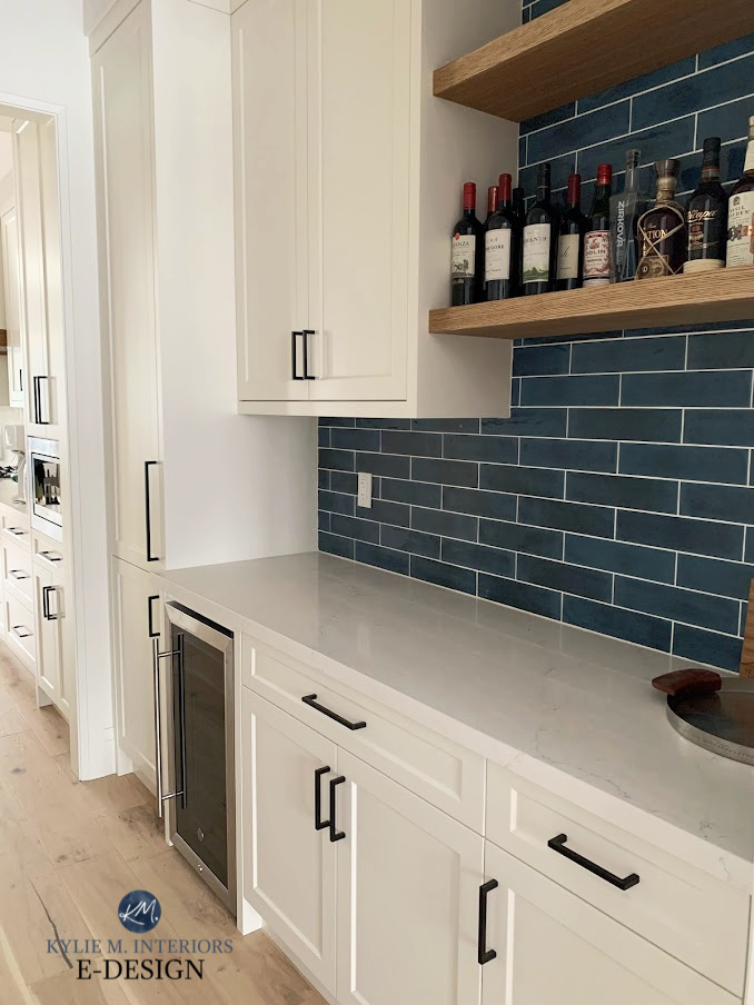
9. SHERWIN WILLIAMS SMOKY AZURITE 9148
Smoky Azurite is a shade of blue that can look legit blue in some spaces while winking towards blue-green in others (only by a bit). And while it has gray in it, Smoky Azurite is a blue-forward color in any space.
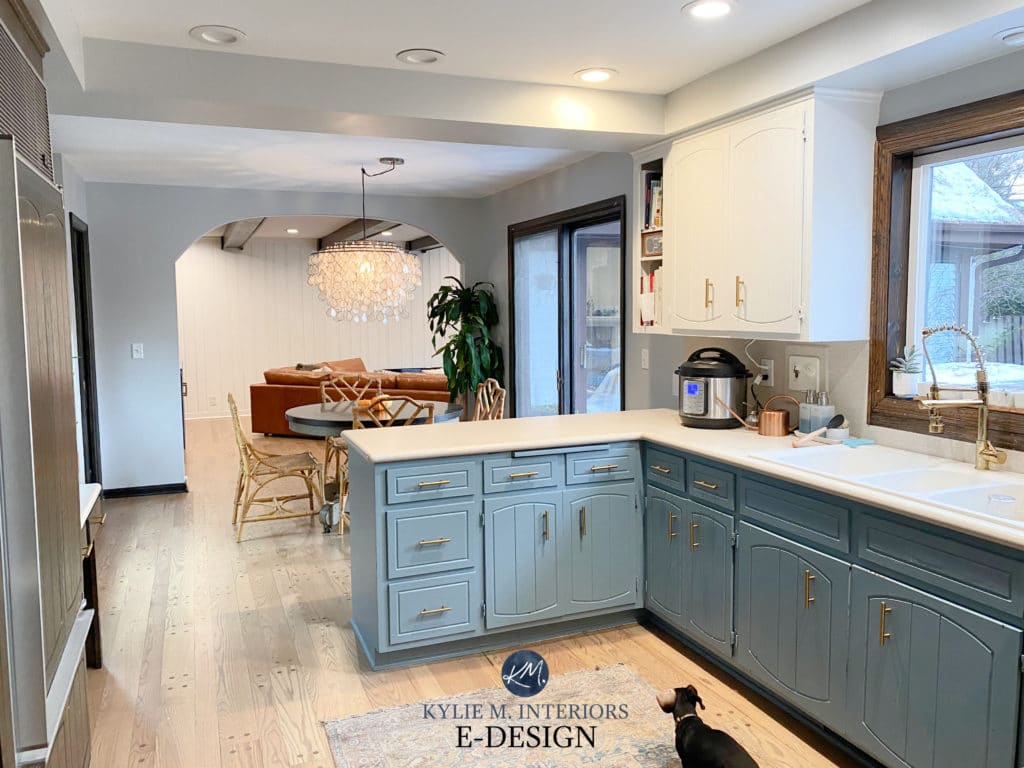
Sherwin Williams Denim is on the kitchen cabinets
Smoky Azurite has an LRV of 25, giving it a solid medium-depth look. However, even in a dark space, this shade of blue has enough color to show up to the party and won’t fall as flat as some other blue-grays can.
COLORS THAT ARE SIMILAR TO SMOKY AZURITE
- Sherwin Williams Favorite Jeans is like the lighter version of Smoky Azurite
- Benjamin Moore West Coast, with its slightly committed blue-green, shows how legit ‘blue’ Smoky Azurite looks
10. SHERWIN WILLIAMS MOODY BLUE 6221
Moody Blue is a rich, stunning blue-green shade, without dipping into the ‘overly colorful or saturated end of things.’ This is because while Moody Blue has some gray to calm it down, its blue-green blend is more dominant (emphasis on the blue over the green).
Moody Blue has an LRV of 27, making this moody shade of blue-green a super skookum medium-depth paint color.
COLORS THAT ARE SIMILAR TO MOODY BLUE
- Sherwin Williams Delft is a bit lighter and gentler
- Benjamin Moore Templeton Gray is more dense, grayer, and moodier than Moody Blue
- Benjamin Moore Sea Star is lighter
11. BENJAMIN MORE SEA STAR 2123-30
Like the other blends on this page, Sea Star is blue-green with more emphasis on the blue. It’s also tempered by a gray undertone, calming it down and giving it a more coastal, beachy vibe.
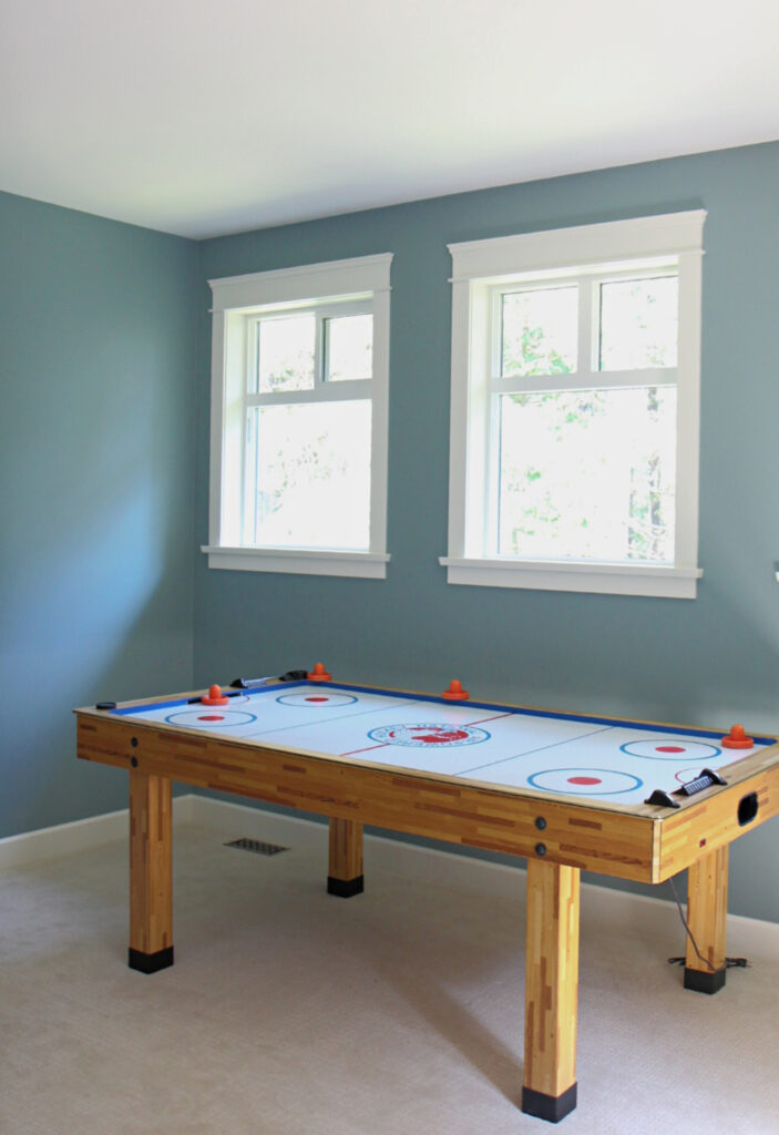
Sea Star has an LRV of 32.99, putting it smack dab in the middle of the medium depths. As shown in my client’s games room above, this depth offers wicked contrast with white trim without weighing down a reasonably well-lit room.
PAINT COLORS THAT ARE SIMILAR TO SEA STAR
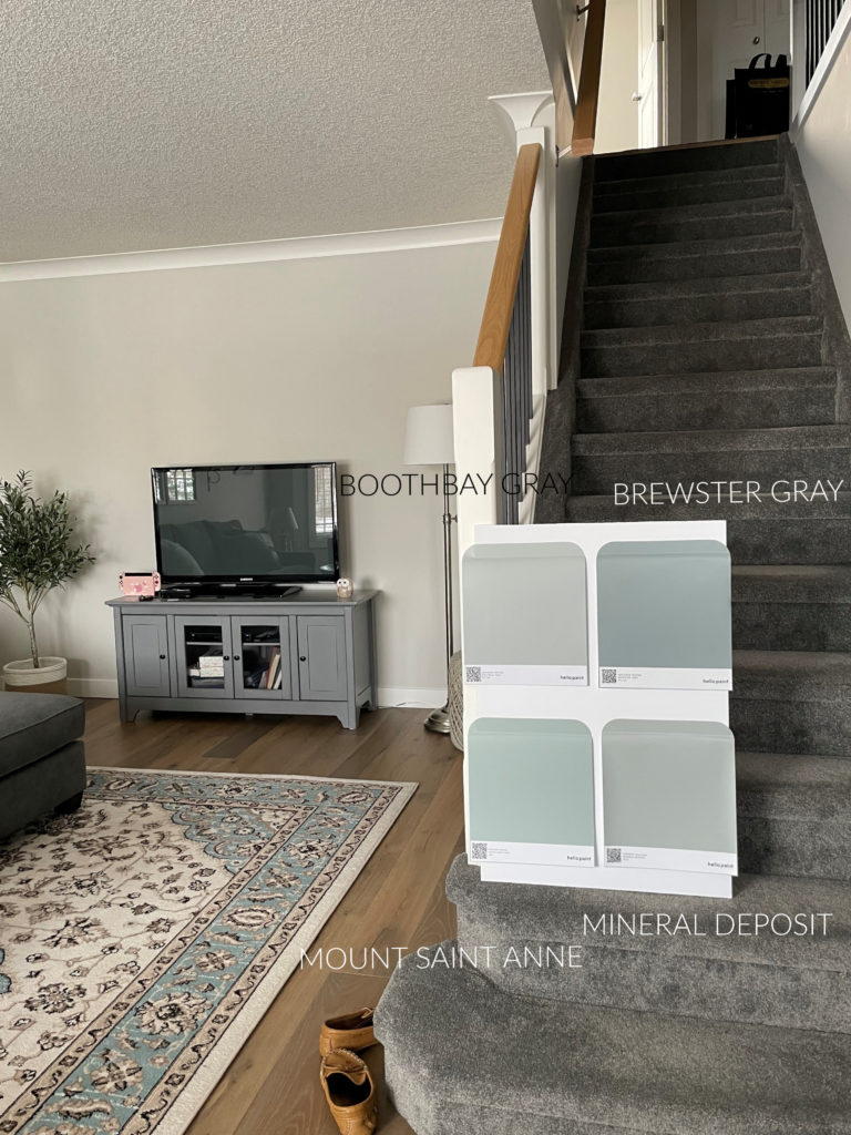
- Benjamin Moore Brewster Gray is similar to Sea Star, but the gray takes over much more
- Benjamin Moore Atmospheric is more green, but not by a lot
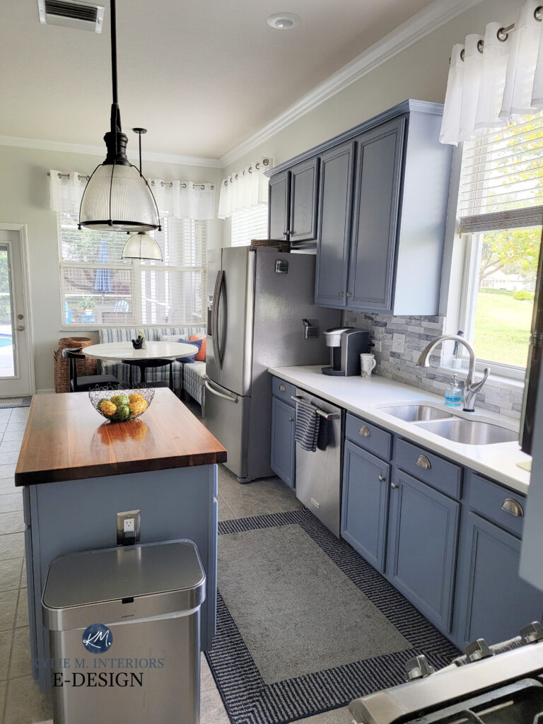
12. SHERWIN WILLIAMS WHIRLPOOL 9135
Whirlpool is a medium-depth blue-green with JUST enough gray to slow it down without leaving it muted or flat.
The 6 Best Paint Colors for Kitchen Islands & Bathroom Vanities
With an LRV of 29, Whirlpool is smack-dab in the middle of the medium range. In the above photo, notice how it looks lighter where light hits (via the satin finish of cabinet paint), but darkens where there isn’t direct light.
COLORS THAT ARE SIMILAR TO WHIRLPOOL
- Sherwin Williams Refuge is a darker version of Whirlpool that grabs a touch more green
- Benjamin Moore Water’s Edge is similar but slightly greener than Whirlpool
- Benjamin Moore Mineral Alloy has the same blue as Whirlpool, but rather than a green undertone, it leans into violet
13. BENJAMIN MOORE BLUE NOVA 825
Blue Nova is my favorite, more striking shade of blue. With an LRV of 16.98, Blue Nova isn’t messing around. However, while its LRV makes it a medium-dark shade of blue, the degree of color it has gives it more life so that it plays in the same field as the other colors on this page.
Blue Nova is a blue-violet. And while it has a bit of gray calming it down, it’s the brightest blue on this page.
Benjamin Moore Blue Nova Color Review: COLOR OF THE YEAR FOR 2024
READ MORE
The Best DARK Blue-Gray Paint Colors
The 12 Best Navy Blue Paint Colors for Doors, Walls, & Cabinets
The 13 Best Blue-Green Blend Paint Colors
The Best Warm Neutrals That AREN’T BEIGE!
NEED HELP?
CHECK OUT MY ONLINE PAINT COLOR CONSULTING – let me choose your colors for you!
Chat soon,


Do you know the color of the brick wall next to the front door in Stratton Blue with the orange and yellow wreath?
Oooo, i THINK it’s Sherwin Williams White Duck – it was a few years ago now!
Kylie,
I’ve been loving your posts for a long time. I wanted to tell you that, and also that your colour comments and advice are spot on. Congratulations on your success!
Kind regards,
Maureen MacDonald
ex-VUI and Malaspina Professor
Oh wow, what an awesome comment to get – and from someone LOCAL, I love it! You made my day :).
Hi. I love the look of Stratton Blue in your photos. How might it lean in a west facing room? I’m looking for something slightly more green leaning for a kids’ space (punchy, but not overwhelming) compared to Colorado Gray in the next room which looks very blue (also west). Thanks!
Hmmm, hard to say, but I would think it could be a TOUCH too blue, if you’re looking for a more purposeful green to pop up :). Check out BM Scenic Drive. Compare the two and that should tell you how much green makes you happy :). Get as BIG samples as you can, either through Samplize or a sample pot so you can really see how the light affects them!
This is the color range I’m looking for for my kitchen cabinets. What do you think of eventide for kitchen cabinets? Too much? Should I just paint the island that color and the others white?
Eventide is GORGEOUS and not at all overwhelming – I mean, I say that without seeing your kitchen, but off teh top, it’s pretty.
Hi! Any thoughts on Mineral Alloy? I’ve been going back and forth on the color for our office/music room (and the feature wall of my son’s room). Originally leaning Van Deusen, thought for a second about Brittania, but I’m now thinking the medium blue range is better choice. The others are just too dark for me. I love blues with green undertones but my husband really doesn’t. We’re now between Bachelor Blue and Mineral Alloy. Lots of natural light. Main house color is Edgecomb Gray. My son’s room will be Gray Owl. Help please!
Oh, I definitely love Mineral Alloy, Rachel! Now, of course, I haven’t seen your home, but I do find these types of grays to be a bit more liveable than one like Van Deusen – OR you need to go much darker, but I do find Van Deusen can be an awkward depth for some spaces, you know?
Between Bachelor Blue and Mineral Alloy, considering Edgecomb Gray and Gray Owl, Bachelor Blue has too much violet in it – you’ll need a blue that caters a bit to green over violet. Mineral Alloy/Brittania Blue are always interesting as while the cater to green, it’s SO MINOR, you’d hardly know it. I worry that Gray Owl would prefer a biiiiit more green mixed in, like Waters Edge, maybe 25% darker or Providence Blue lightened a bit?
Wow! Thank you for such a comprehensive response!
Hi Kylie,
I’m wondering if you could recommend a warm off white that would go well with Bachelor Blue? Also, for a separate bathroom, do you have some whites that work well for putting on makeup?
Thank you and love your blogs!
Laurie
Hi,
Your content has helped me so much with choosing paints for my new house. I painted one of the guest rooms eventide and I love the color. We have a beige upholstered bed with some specks of dark gray within it. Now I’m having a hard time finding a color for the curtains. Should I go with a similar color to the eventide or close to the beige bed color?
Thanks,
Cathy
Thank you for this, the explanations are great. I found you trying to search for what color to drench my husbands office. I want something moody and masculine but not cold in a 10×13 room. I’m stuck between BM Knoxville gray, rainy afternoon(I wish this had a hair more blue) and sw mountain pass. But while I want moody I am nervous about it being too dark since obviously looking at squares on a light gray wall that is reflecting light from the large north facing double window is not the same as the whole room being that color. So then I was looking up templeton gray and it lead me here. Still stuck on what to do, I’m afraid I’m going to pick one and then it’s going to be more bright turquoise than a moody gray blue green! I’m probably overthinking but Paint picking is hard but thank you for this intel, impressed which how much info is here! Any insight you have would be amazing! Thank you!
Hmmmm, so it sounds like you want to see SOME color, but not too much. You want more MOODY than colorful.I’d say that’s often my goal in my own home, and have had Knoxville Gray (not color-drenched, but all the same). So, if I take cues from Rainy Afternoon and pick up a bit more blue, I’d try BM Kitty Gray. Seriously, i’m so obsessed with this color – but that’s ME, it doesn’t mean you have to love it. I find Rainy Afternoon FAR too green (for what I usually want), whereas Kitty Gray still has green, but it’s far mor subtle. I also LOOOOVE SW Grays Harbor, which is a really neat blue-green-gray blend but FAR more blue than the other two.