
Urbane Bronze vs. Iron Ore, Porpoise, & 6 Popular Greige Paint Colors
Undertones, LRV, & More
In the underworld of dark greige paint colors, there’s only one leader: Sherwin Williams Urbane Bronze. But just because it’s popular doesn’t mean it’s the best greige for your space.
So how do you KNOW?
You compare. Comparison is the best way to find husbands, as well as the best shade of greige or your walls, cabinets, front door, or exterior. So while we reviewed the ins and outs of Urbane Bronze in its color review, today, we’re looking at similar colors that are making a run at the title.
*This blog post has been updated for relevant ideas and new images for 2026.
But first, let’s touch base with LRV.
Every paint color has an LRV number. This number (on a scale of 0-100) tells you how light or dark a paint color is: 0 is black, 100 is white.
In our USEABLE paint world, we only go down to the mid-2s with Sherwin Williams Tricorn Black. The colors listed below fall between 6 and 13, making them medium-dark to dark —but not quite black.

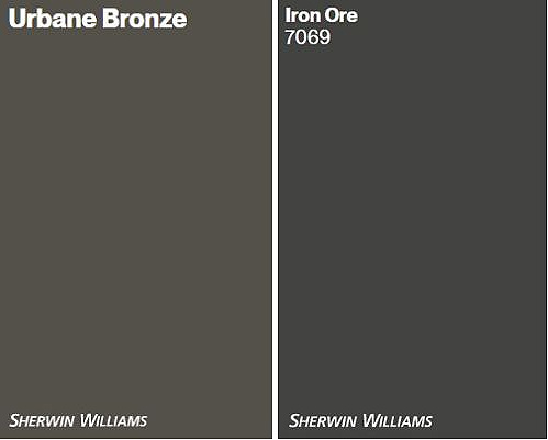
1. SHERWIN WILLIAMS URBANE BRONZE vs. SW IRON ORE
What’s the biggest difference between Urbane Bronze and Iron Ore? DEPTH. But depth isn’t the only thing; there’s a temperature shift, too, so let’s check the deets.
Urbane Bronze has an LRV of 8; Iron Ore has an LRV of 6. This lower LRV means that Iron Ore is DARKER than Urbane Bronze (Iron Ore is a soft black). While both are used for similar projects, Iron Ore offers more contrast and a cleaner look.

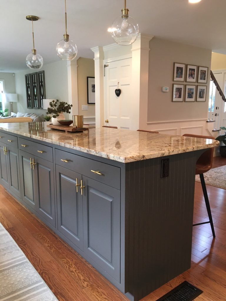
Here’s Iron Ore looking badass and beautiful on a kitchen island | Agreeable Gray main cabinets
While both are warm colors, Urbane Bronze has a more noticeable greige-green undertone/warmth. Iron Ore’s warm green undertone is way more passive and less warm. In this next image, there’s not much green to be seen on these Iron Ore built-ins…
Iron Ore built-ins with Sherwin Williams Aesthetic White walls
However, in this next photo, Urbane Bronze’s undertone is a bit more noticeable…

- Both colors are popular for kitchen islands, front doors, and accent walls (they’re also great on stair railings!).
- On the exterior, Iron Ore is a soft black, whereas Urbane Bronze isn’t black—it looks like a dark greige, and its green undertones can come up a wink more.
- While Urbane Bronze used to be the most popular of the two, Iron Ore is getting a lot more notice, as people shift away from darker, sharper shades of black.
Here’s your PEEL & STICK sample of Iron Ore
Here’s your PEEL & STICK sample of Urbane Bronze
KYLIE M’S FAVE COLOR
Urbane Bronze has my heart (and a place on my kitchen island and stair railings). This isn’t to say I don’t love Iron Ore in the right place (when I need a soft black), but Urbane is usually my fave choice. If you want a bit more depth and less undertone, Iron Ore could be a contender!
Sherwin Williams Iron Ore Paint Color Review
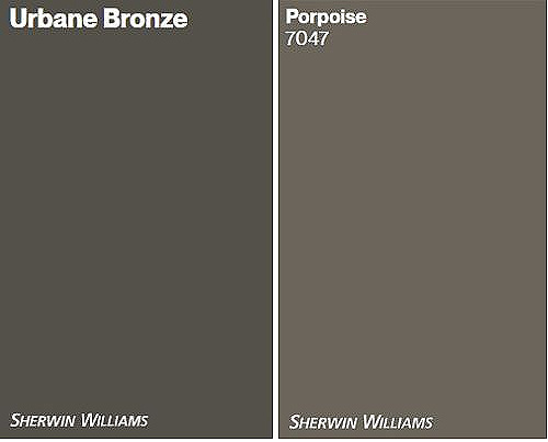
2. URBANE BRONZE vs. SHERWIN WILLIAMS PORPOISE
These two shades are pretty popular and darn similar. This is because they live on the same color strip in the fan deck! However, there is one big difference – LRV.
Porpoise’s LRV is 13, making it a medium-dark color, whereas Urbane Bronze’s LRV of 8 makes it a DARK color.

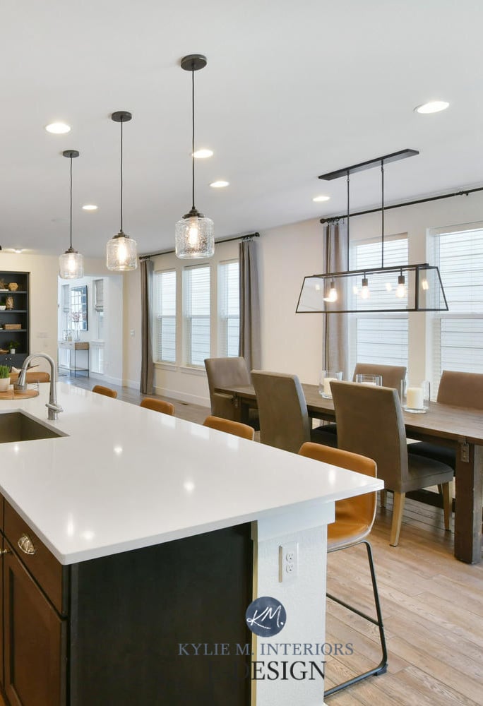
While I’d love to see a softer, muted subway tile backsplash, Porpoise looks great on these kitchen cabinets
Here’s Urbane Bronze on a kitchen island. Both colors are clearly a great way to update older granite countertops…

- Both colors have similar degrees of warmth and a green undertone.
- Urbane Bronze is generally more popular, whether it’s for a front door, exterior, kitchen island, or interior walls.
Here’s your PEEL & STICK sample of Porpoise
KYLIE M’S FAVE COLOR
Again, Urbane Bronze is the winner winner chicken dinner! The depth of Urbane Bronze puts it on the podium, whereas the slightly softer look of Porpoise doesn’t always give me the look I’m going for. On the other hand, if you’re looking for a slightly lighter approach to greige, Porpoise is a shade lighter than Urbane Bronze and could do the trick.
Sherwin Williams Porpoise Paint Color Review
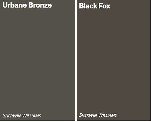
3. URBANE BRONZE vs. SHERWIN WILLIAMS BLACK FOX
While I love Black Fox, I don’t refer to it nearly as often as I do Urbane Bronze (in my Online Paint Color Consulting). Why? Let’s find out!
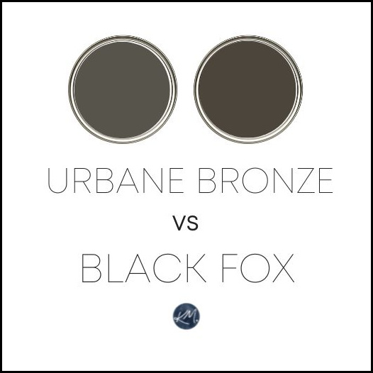
Black Fox has an LRV of 7, so it’s a smidge darker than Urbane Bronze’s LRV of 8. This isn’t a deal-breaker by any means.
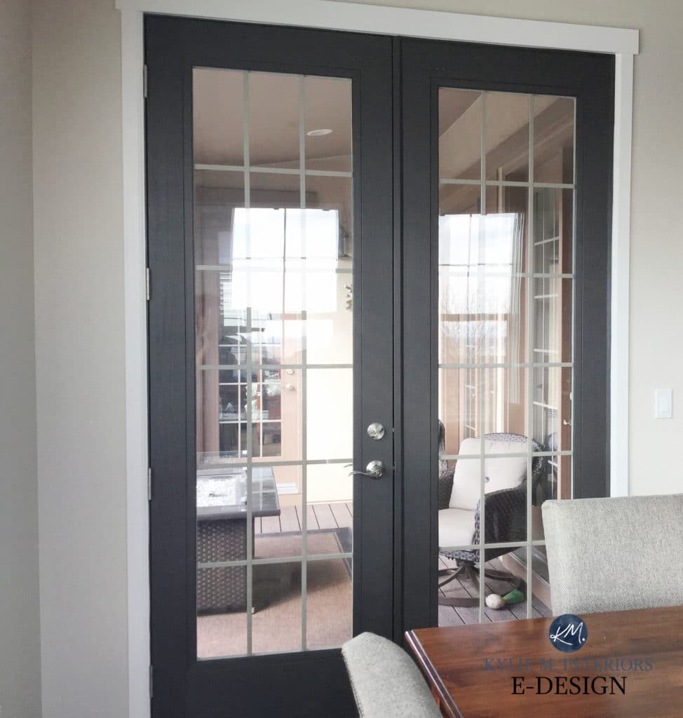
Here’s Black Fox on the inside of French Doors
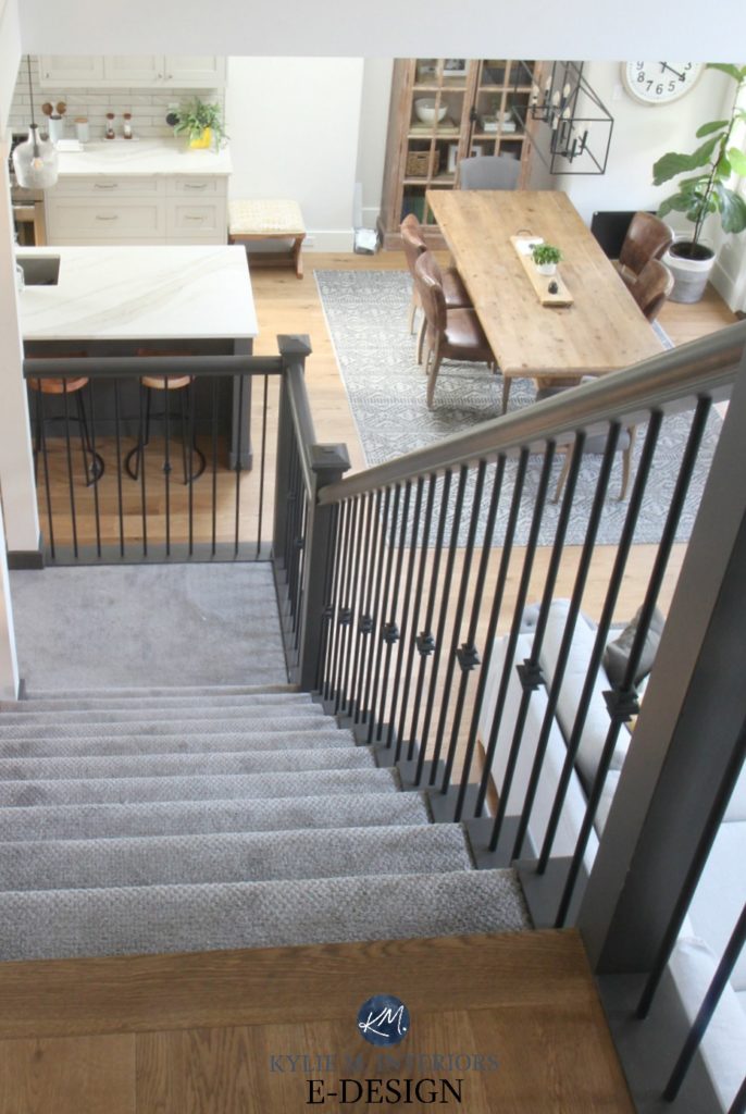
Both colors are warm. However, Black Fox has more brown and a more saturated, richer look than Urbane Bronze, as shown on the stair railings in this next home…
- Both colors are used quite often on exterior trim. Black Fox isn’t used as often on kitchen islands because of its dark brown tone.
- Urbane Bronze is a popular cabinet/island paint color for those with granite countertops from the early 2000s and homes with a Tuscan-style palette.
Here’s your PEEL & STICK sample of Black Fox
KYLIE M’S FAVE COLOR
Insert awkward silence HERE…why? Because once again, Urbane Bronze is my fave option. Black Fox usually has a bit too much brown/saturation to suit the types of finishes I’m coordinating with. But this doesn’t mean it won’t work for YOUR home, so make sure you compare the two!
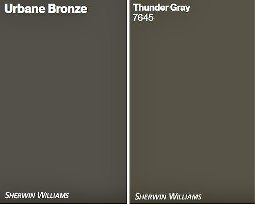
4. URBANE BRONZE vs. SHERWIN WILLIAMS THUNDER GRAY
Urbane Bronze and Thunder Gray are kissin’ cousins! However, while Thunder Gray is a wink lighter than Urbane Bronze, there’s one big difference that separates the two…
Thunder Gray’s LRV is 9, a touch lighter than Urbane Bronze’s 8. This makes them super comparable and often competing for the same project.
Thunder Gray looks gorgeous on this exterior trim (above) and kitchen island (below)

The big difference between these shades is the degree of color (CHROMA). Thunder Gray is a greige-green, just like Urbane Bronze, but Thunder Gray has a more noticeable green hue.
Urbane Bronze is the more popular color, likely due to its passive undertone.
Here’s your PEEL & STICK sample of Thunder Gray
KYLIE M’S FAVE COLOR
Long story short, every single time, Urbane Bronze will be my favorite – that’s why he’s the boss. Thunder Gray is gorgeous, but I only recommend it when I want to see a bit more green coming through.
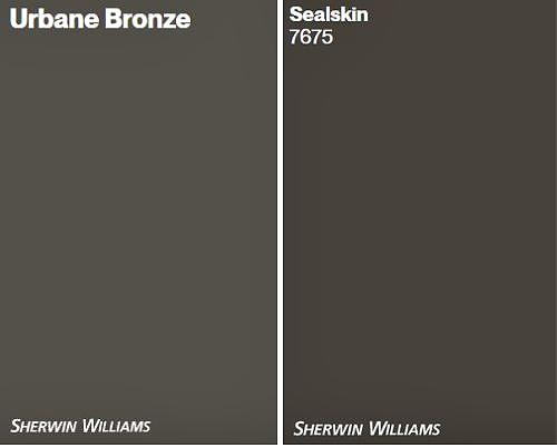
5. URBANE BRONZE vs. SW SEALSKIN
I rarely refer to Sealskin in my Online Color Consulting; in fact, I’ve only suggested it once (in 11,000+ consults), whereas I’ve suggested Urbane Bronze hundreds of times. Let’s find out why it may or may not be the color you’re looking for…
- Sealskin has an LRV of 6, which is more in line with Black Fox (for comparison), though it’s darker than Urbane Bronze, depending on what you want to use it for.
- Sealskin is warmer-looking than Urbane Bronze with a more saturated brown.
- These colors are similar as they harbor a green undertone (Sealskin is super duper passive).
- Urbane Bronze tends to suit more interior and exterior finishes than Sealskin, making it a more versatile color.
Here’s your PEEL & STICK sample of Sealskin
KYLIE M’S FAVE COLOR
I’ll be honest; I don’t even like Sealskin. This doesn’t mean it can’t be the color for YOU, but I can always find an option I like better for myself or my clients.
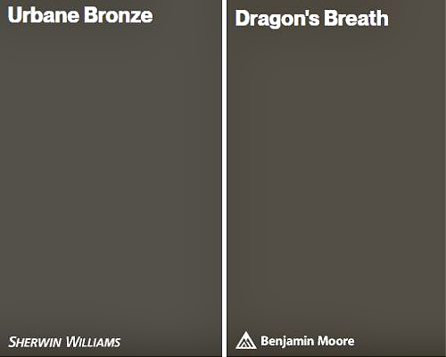
6. URBANE BRONZE vs. BENJAMIN MOORE DRAGON’S BREATH
Urbane Bronze and Dragon’s Breath are very similar, and I love comparing the two, especially if my client’s looking for a Benjamin Moore alternative to Urbane Bronze.
- The LRV of Dragon’s Breath is 9.18, to Urbane Bronze’s 8. This makes Dragon’s Breath a bit lighter than Urbane, although, to eyeball the two, they look pretty darn similar.
- Dragon’s Breath is a bit warmer and richer than Urbane, with a slightly more noticeable green undertone.
- Urbane Bronze tends to be the more popular of the two, whether for cabinets, islands, front doors, walls, or exteriors. Why? They both do the same job; Urbane Bronze is just a bit more muted.
Here’s your PEEL & STICK sample of Dragon’s Breath
KYLIE M’S FAVE COLOR
You guessed it! Urbane Bronze for the win. Dragon’s Breath can be just a touch too muddy for some finishes; however, comparing the two will help you see which is best for you (in other words, you don’t need to humor the crazy lil Ginger ALL the time).
Find Dragon’s Breath quick review in this blog post HERE
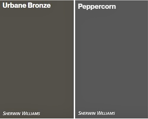
7. URBANE BRONZE vs. SW PEPPERCORN
If you’re wondering how similar Urbane Bronze and Peppercorn are, you’re REALLY looking at a wild range of colors. Let’s find out the key differences between these two bad boys…

- The LRV of Peppercorn is 10, so it’s a shift lighter than Urbane Bronze’s LRV of 8.
- Urbane Bronze is warmer than Peppercorn, and that’s because…
- Urbane Bronze lives in the greige world; Peppercorn is based in the gray world.
- Peppercorn can have a mild green undertone and a touch of purple-blue that sometimes pops through. On the other hand, Urbane Bronze is committed to green—nothing else.
- Peppercorn can be a tricky choice for a kitchen island due to its unpredictable undertones, whereas Urbane is more consistent. As for front doors, the same applies. In all, while these two shades are both dark neutrals, they’re going in opposite directions.
Here’s your PEEL & STICK sample of Peppercorn
KYLIE M’S FAVE COLOR
Comparing these two is like comparing apples to oranges. Sure, they have a similar shape (both are darker), but they don’t taste at all the same. Peppercorn is an interesting solution when I need a slightly more gray-based color with a vague, almost stormy warmth. Urbane Bronze is the choice when I need some definite warmth and a green undertone.
But I still like Urbane Bronze more.
Sherwin Williams Peppercorn: Paint Color Review
WHAT GREIGE IS DARKER THAN URBANE BRONZE?
It depends on what you consider greige. Sealskin is too brown to be greige. Iron Ore is too close to black and not warm enough. This means that Urbane Bronze is the darkest greige paint color.
The Best Island Paint Colors: A Mixed Bag!
If you want a bit more depth, ask your paint store to darken it by 25%. Just note that with some types of paint, they can’t, as the gallon will already be full of tint (since it’s such a dark color).
WHAT COLOR IS A SHADE LIGHTER THAN URBANE BRONZE?
Sherwin Williams Porpoise is lighter than Urbane Bronze, as is the ever-lovely Anonymous.
Sherwin Williams Anonymous: Paint Color Review
WHAT COLOR IS CLOSE TO URBANE BRONZE?
Benjamin Moore Dragon’s Breath and Sherwin Williams Thunder Gray are the most comparable to Urbane Bronze in undertone and intention (being greiges).
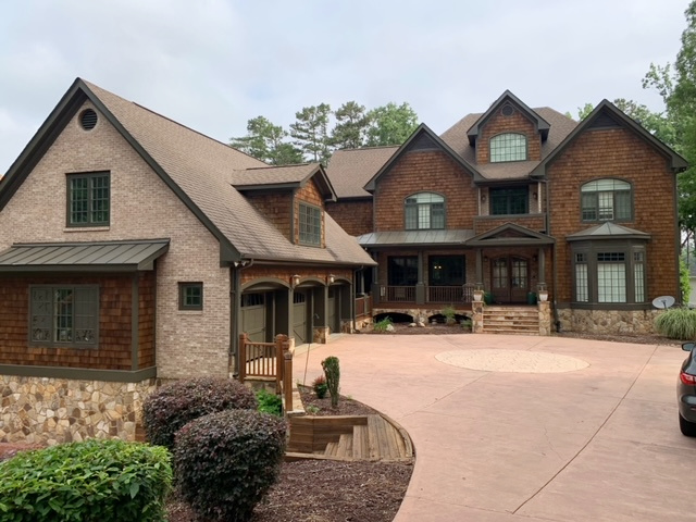
Benjamin Moore Dragon’s Breath exterior
See reviews on both of the above colors in the blog links below!
READ MORE
Sherwin Williams Black Fox Paint Color Review
The 6 Best Dark Greige & Taupe Paint Colors: Sherwin Williams
The Top 8 Dark Greige & Taupe Paint Colors: Benjamin Moore
Get the best ‘real home’ paint color advice
Check out my Online Paint Color Consulting!


I’m a huge fan of Urbane Bronze and have used it numerous times. In fact I painted my barn in Urbane Bronze and it’s a stunning against the colors of nature!
Hi Kylie,
I’ve been following you lately on all your social media channels and you’re fantastic! I’ve especially been trying to understand your blog on the best wall colors to work with my inherited St Cecilia granite and dark espresso cabinets with light blonde (yellow) wood floors. The previous owner painted all sorts of colors throughout the house. Bright yellow, reds, tans, golds… I’m looking to bring some calm and I loooove warm toned colors but have too much. Would you do me the honor of specifically stating the best options as my ADHD and other learning disabilities are keeping it a secret to me. 🤞sorry to ask but it’s necessary for me. Good thoughts! A new fan 💝
Kathy
Hey Kathy, I’m JUST catching up on my comment section – i definitely got behind! I was just flipping through and your mention of ADHD caught me, as I also have ADHD. I would check out BEnjamin Moore Navajo White, Benjamin Moore Gentle Cream, Sherwin Williams Casa Blanca – these are all LOVELY warm, but calm colors (I’ve lived with the first two, personally!).
I hope this helps!~
Hello Kylie
Could you do an online consultation if I only have the pictures onZillow? I haven’t closed yet. Thanks Joan
Yup, I can do consults off Zillow. I mean, IDEALLY, I would close-ups of the finishes, but many of my clients have just purchased a home and don’t have those available :).
Kylie, I really enjoy your posts on color. I think this is the first place I heard about samplize, and I’ve ordered several samples from them!
It beats my prior method of getting paint samples, and painting them on posterboard.
WAHOOOOO, I love to hear this – they’ve TOTALLY changed how i sample and explore colors too – I was tired of doing poster boards!!!
I wanted to use Urban Bronze and Iron Ore, but they just weren’t enough for our already too gray house. Thunder gray and Tricorn black helped. No we didn’t pick the cabinets or flooring! When we bought the house, all of the walls and ceiling were an Agreeable Gray knockoff with a knockoff White Dove trim. So gray and not enough light. We painted the walls Alabaster, but I felt a need for an accent wall. The kitchen island is Gossamer Veil with inside alcove walls Drift of Mist. They were the only colors that didn’t clash with the cabinets. I still dislike the counter and cabinets but they don’t stand out as much now.
Hi Kylie,
I’ve been looking at Urbane Bronze for awhile now to paint the exterior of my ranch style home. I’m just a real chicken when it comes to using dark colors. After having read your post, I’m one step closer to doing it. Thanks. Nina
Awesome! It really is a stunner. If my home suited it, I’d do it for SURE! If you bite the bullet, I’d love to see it all done! Actually, if you want me to get my QUICK eyeballs on it, for a quick YES OR NO, why don’t you send me a few photos. Full frontal and maybe slightly close-up – kylie@kylieminteriors.ca
Hello, and thank you for sharing more info on all of these great colors!
We painted our shingle-style home from a yucky light yellowy/mustard color to Dragon’s Breath with crisp white trim, last summer. It was a huge leap, and took me a couple years mulling over before finally biting the bullet…but we LOVE it!!!
My question is, what color would you suggest for our front door? Everything I look at is either too light it looks pastel, or so dark and moody that it blends in. I was honestly debating a warm medium to dark peacock blue or navy, then hand painting a Scandinavian art design, since it would be the only color breaking up all the dark (and because I love to be different – as well as bite off more than I can chew.) But once again I’m stuck mulling and mulling.
Any suggestions? Thank you in advance! ♡
Hey Heidi! It’s SO hard to say without seeing your home, as Dragon’s Breath and the trim definitely call some shots, but so does the roof, LANDSCAPING, and any stonework on your home or patio concrete. I could throw ideas out there, but they would just be random and guesswork!
I HAVE been thinking of doing a new front door blog post on some more ‘funky ish’ door colors, which could work for your home. If you want to email me some photos of your exterior, I’m happy to take a look at them, and if the photos are a good example, I’ll include them (this way, you’ll get some free, EXACT advice AND help other people).
If that interests you, send it to kylie@kylieminteriors.ca (make sure the subject line says ‘Kylie photos for a possible blog post.’
🙂
Love this color breakdown! I’ve looked at most of these colors as possibilities in the past (and came back to Urbane Bronze in most instances). My interior was painted UB but I recently updated it all to Simply White. However, I’m planning to repaint my kitchen cabinets soon and have decided on Urbane Bronze. I’m excited because it is richer and not as stark for the space as black would be. I think it will look nice with the other gold and stainless finishes in the room.
All that said, I did use Black Fox to paint the exterior of the house. The roof is a rust-orange-brown color and I felt the brown undertones went better. It looks less brown outside than it does inside. I painted the front door in Warm Earth and I love how it all looks together.
YESSSS, Eve, I love the sounds of all of this! And Black Fox is wicked awesome, isn’t it? I bet you’re going to love your new cabinets :).
Im about to paint a brick exterior BM Andiron and very nervous about it. How would it compare to Urbane Bronze which Ive seen more. Thank you!
After watching a ton of your YT videos, I’ve still trying to decide on a color for our home reno and can’t pick one. I don’t like blue under tones. I’m doing all of the work myself and have already done the kitchen, which has grey Ikea cabinets which have a violet undertone. My flooring is a natural white oak with a slight smokey tint to it (flooret opera). The trim will all be painted white, but I want to go with darker colored doors. Pashmina, Revere Pewter, Agreeable Gray, Collanade Gray have all caught my eye for wall color. I am still clueless. Feels like trying to drink from a firehose.
You made me giggle :). So, I think I know the gray cabinets you’re talking about. Of course, they’ll naturall gravite towards other colors with purple undertones, but I’ve used Colonnade Gray before and found it easy to live with. It has a subtle green undertone. SW Amazing Gray is another great one. Pashmina? PROBABLY my fave from what you’re explaining :).
Hi Kylie! Great post!! I always learn so much from your advice. We are going back and forth for our new build exterior. Urbane Bronze body, and either Iron Ore trim or Tricorn Black. Lots of trees all around the home. Tricorn seems to be somewhat harsh against the UB where there is sunlight, whereas Iron Ore seems softer and doesn’t highlight the brown in UB as much, which we like. Garage doors are straight black, which offer some dimension against the Iron Ore. roof is also black/dark charcoal. Front door is medium stained wood, as well as stained wood gables and posts. Off white stone accents. Do you have an opinion on whether or not choosing the Iron Ore would be a mistake?