
SHERWIN WILLIAMS SILVER STRAND SW 7057: Paint Color Review
THE BEST BLUE-GREEN BLEND: Sherwin Williams Silver Strand
When it comes to calming and relaxing paint colors, it’s hard to beat the look of Sherwin William Silver Strand. With its soft blend of colors, Silver Strand is a great way to NOD towards color on your walls, without 100% commitment. However, it’s a bit of a ninja…
IS SILVER STRAND BLUE, GREEN, OR GRAY?
While some see Silver Strand as neutral compared to more COLORFUL shades, Silver Strand has more chroma than a typical neutral, making it a legit COLOR. And with its beautiful mix of hues, Silver Strand is a blue-green blend…with some gray in it.
WHAT’S THE LRV OF SILVER STRAND?
Silver Strand has an LRV of 59, which makes it a light – but not necessarily the lightest and freshest color choice. My magical LRV number is 62, and Silver Strands falls about 25% shy of that. Compared to an LRV of 62, Silver Strand has just a wink more contrast with white trim and is slightly darker as an overall wall color, especially when compared to a soft, cool gray like Benjamin Moore’s Gray Owl or the gentle warmth of Benjamin Moore Collingwood.
The Ultimate Guide to Choosing Paint Color with LRV
DOES SILVER STRAND HAVE UNDERTONES?
You’ll hear from some experts that color is NOT subjective. And they’re right; the color itself is NOT subjective – it is what it is. However, how it LOOKS is hugely subjective based on who’s looking at it and the room/environment it’s in!
For example, I had Silver Strand in our last primary bedroom. My Mom walked in and said, ‘Oooh, what a beautiful gray-green.’ I asked Tim what color HE thought it was (you guys KNOW what a chatter-box he is), and he said, ‘blue-green.’ Thanks for comin’ out, Tim. When I walked in, I saw a gray-blue with a wee wink o’ green – so really, the OPPOSITE of my Mom. As I said, it’s a ninja.
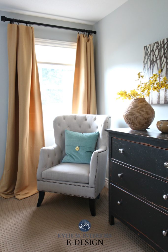
You can also expect a big shift depending on your exposure, the time of day, furnishings, AND the interior lighting.
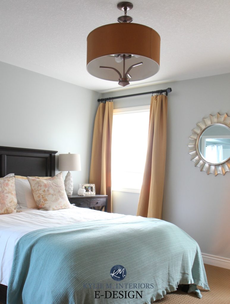
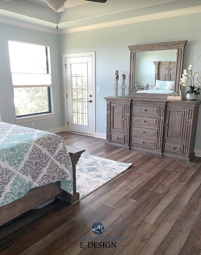
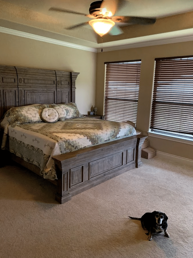
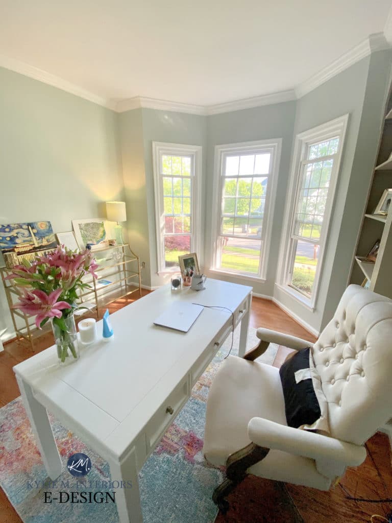
Check out Silver Strand in this photo; the color comes to the surface considerably with the gray dropping back – and hardly a wink of green in sight!
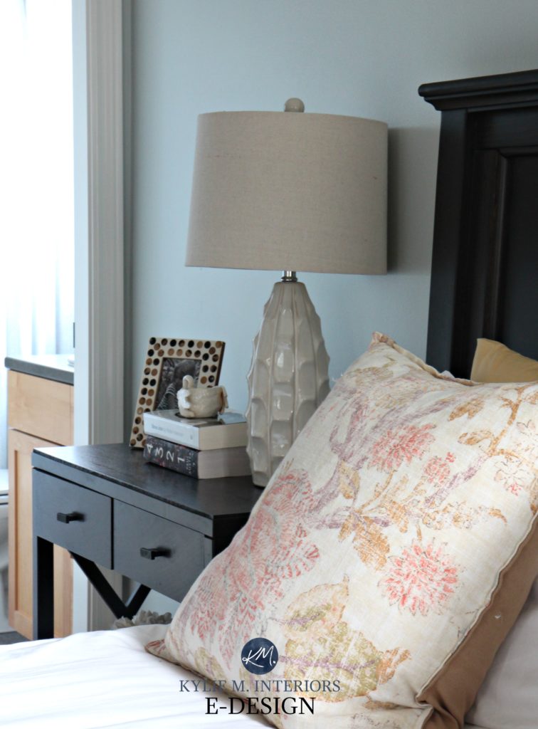
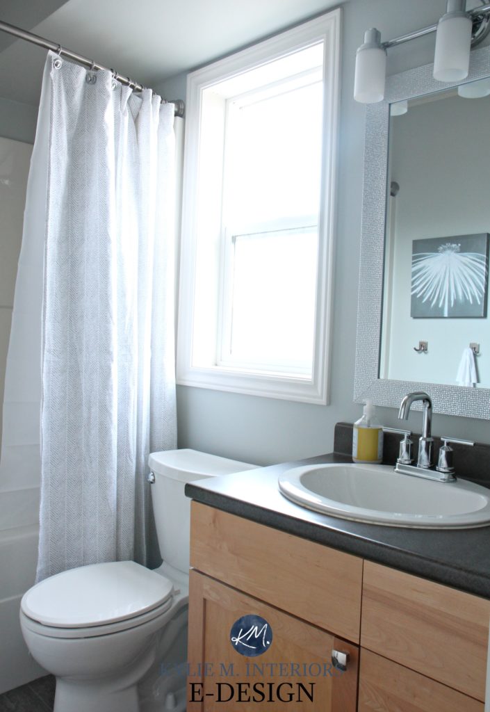
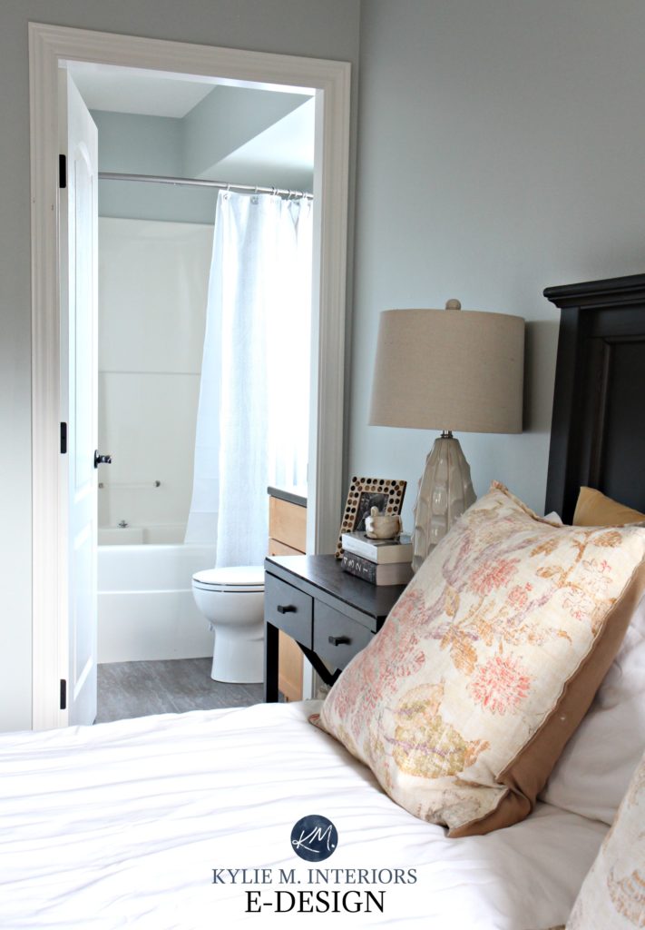
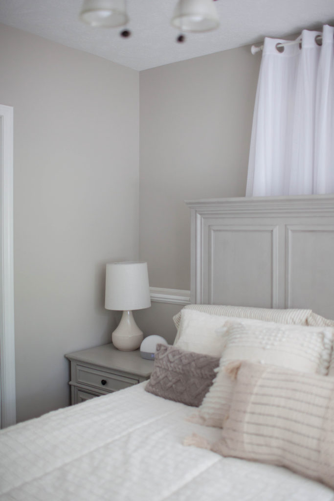
In the ensuite bathroom (which happens to be east-facing), notice how it grayed out…
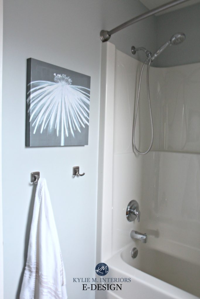
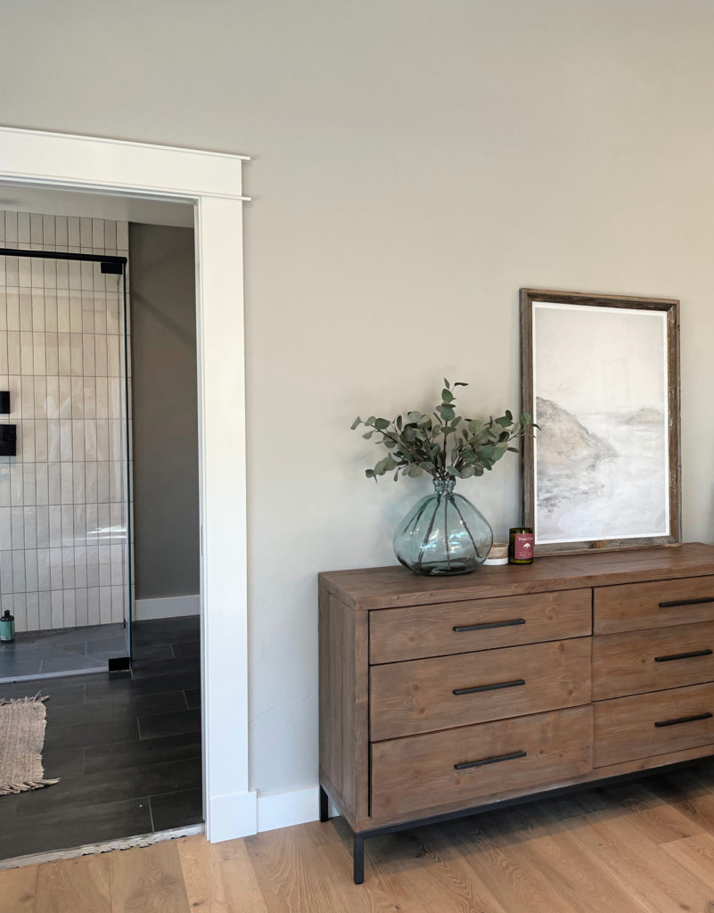
And on a sunny morning, look at the reflection in the mirror – GREEN! Stuff like this excites me to no end (I’m easily excitable, though…).
Undoubtedly, you’ll be heading out in the near future to grab paint samples – stop right there! I want you to check out SAMPLIZE.
- Samples arrive ON YOUR DOORSTEP in 1-3 business days, depending on the location.
- they’re more affordable than the sample pots/rollers/foam boards needed for traditional paint sampling.
- If you keep the samples on their white paper, you can move them around the room.
Now, back to Silver Strand…
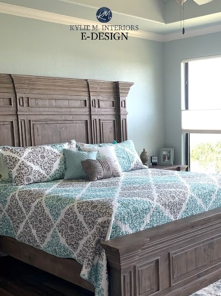
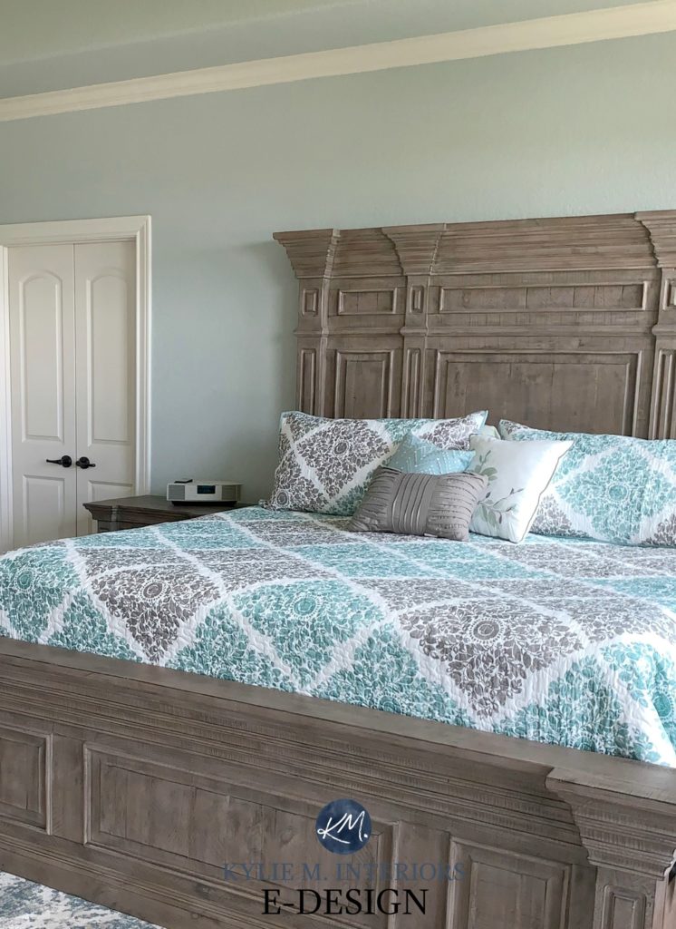
One of my Online Color Consulting clients used Silver Strand in her bedroom, which turned out GORGEOUS!
Whereas my bedroom was south-facing, hers is north/northeast, showing how it can shift depending on a room’s exposure.
North, East, South, West: Which Paint Color is the Best?
To sum it all up, when it comes to Silver Strand, it’s safe to say that it will look like a gray-blue-green blend (because it is). A lot of grays do this because of the type of black that’s used in their recipe, which can lean slightly to the blue side. But let’s put a finer point on things so that should you choose Silver Strand, you aren’t disappointed with the results…
- If you don’t like blue-green blends, you probably won’t like this color.
- If you prefer blue-green blends that cater to blue over green, this is USUALLY a winner.
- For flexibility, Silver Strand has more moves than a 12-year-old gymnast.
WHAT COLORS GO WITH SILVER STRAND?
Because of its depth and color blend, Silver Strand is a popular color partner and goes with some of the following…
- SUBTLE warm off-white paint colors
- lighter grays with a subtle warm violet undertone
- darker blue-gray blends (with green in them)
- warm and bright whites, as well as cool ones (there’s not many Silver Strand doesn’t love, so long as they aren’t TOO yellow)
The 5 Types of White Paint Colors
WHAT’S THE BEST WHITE TRIM OR CABINET COLOR WITH SILVER STRAND?
As mentioned above, Silver Strand is pretty easy to please regarding whites. But if I were to choose my FAVES…
- Benjamin Moore Chantilly Lace
- Sherwin Williams Pure White
- Sherwin Williams Extra White
SILVER STRAND vs. OTHER POPULAR SHADES
Comparing paint colors is the BEST WAY to find your room’s best color – especially when you have Samplize Peel & Stick to help you.
SILVER STRAND vs. SEA SALT
Silver Strand and Sea Salt are often mentioned in my Online Paint Color Consulting. Why? Both shades are popular for a spa or beach-vibe space, adding a calming vibe. However, there are a few key differences between these two colors.
- Sea Salt has more CHROMA (color), which means it has less gray in it. However, both are still reasonably muted paint colors.
- Sea Salt is more likely to lean into green compared to Silver Strand.
- Silver Strand has a stormier, moodier look, whereas Sea Salt looks more fresh and hip.
Sherwin Williams Sea Salt Paint Color Review
SILVER STRAND vs. SILVERPOINTE
- Silver Strand and Silverpointe have a few things in common, but not enough to make them really SIMILAR.
- Silver Strand’s LRV of 59 makes it darker than Silverpointe’s LRV of 64. This makes Silverpointe the lighter, fresher option.
- Whereas Silver Strand is more of a ‘blue-green with gray in it’, Silverpointe is the opposite – a ‘gray with blue-green undertones.’ This means the gray is stronger in Silverpointe.
- Silverpointe’s undertones are reasonably subtle, whereas the blue-green of Silver Strand is noticeable.
SILVER STRAND vs. AGREEABLE GRAY
I’m not sure why so many people are comparing these two shades when they’re going in different directions! Comparison is best kept to similar colors. Sure, these two have a similar depth, but that’s about it.
- Silver Strand is a COLOR with gray in it. Agreeable Gray is a neutral (greige-taupe) with a minimal undertone.
- Agreeable Gray is a subtly warm neutral. Silver Strand is a cool paint color.
- Both colors are in the light range. Agreeable Gray’s LRV is 60, which is DANG CLOSE to Silver Strand’s 59.
- Silver Strand and Agreeable Gray go with each other in a palette, but I wouldn’t use them in the same room (i.e., one on the main walls and one as an accent wall).
Paint Color Review: Sherwin Williams Agreeable Gray
The same goes for Repose Gray. For those of you comparing Silver Strand and Repose Gray, there’s even LESS of a comparison to be had. Repose Gray is a neutral paint color that’s a smidge darker than Agreeable Gray.
While Repose Gray and Silver Strand go well in a palette together, again, I wouldn’t use them in the same room (neither is great as the other’s accent color).
Paint Color Review: Sherwin Williams Repose Gray
So there you have it, Silver Strand. Hopefully, these tips helped you determine if it’s the best gray paint color for you!
READ MORE
Benjamin Moore Quiet Moments Paint Color Review
Paint Color Review: Benjamin Moore Gray Owl
The 3 Undertones of Cool Gray Paint Colors
The 8 Best Blue-Green Paint Colors
Need HELP?
Check out my E-Design and Online Paint Color Consulting packages!
Chat soon,

ORIGINALLY WRITTEN IN 2018, UPDATED IN 2023


Love your blog! Would you recommend silver strand for an office off an open fourier that is agreeable gray?
Thank you!
Susie H